Beginning Excel 2019 by Noreen Brown; Barbara Lave; Hallie Puncochar; Julie Romey; Mary Schatz; Art Schneider; and Diane Shingledecker is licensed under a Creative Commons Attribution 4.0 International License, except where otherwise noted.
This work is licensed under the Creative Commons Attribution 4.0 International License. To view a copy of this license, visit http://creativecommons.org/licenses/by/4.0/.
Introduction
1
This core Microsoft® Excel® text provides students with the skills needed to execute many personal and professional activities. It also prepares them to go on to more advanced skills using the Excel software. The text takes the approach of making decisions using Excel. Personal decisions introduced include important purchases, such as homes and automobiles, savings for retirement, and personal budgets. Professional decisions include budgets for managing expenses, merchandise items to mark down or discontinue, and inventory management. Students are given clear, easy-to-follow instructions for each skill presented and are also provided with opportunities to learn additional skills related to the personal or professional objectives presented. For example, students learn the key terms with respect to home mortgages and understand the impact interest rates have on monthly mortgage payments. This text also places an emphasis on “what-if” scenarios so students gain an appreciation for the computational power of the Excel application. In addition, students learn how Excel is used with Microsoft® Word® and Microsoft® PowerPoint® to accomplish a variety of personal and professional objectives.
Screenshots that appeared in How to Use Microsoft Excel: The Careers in Practice Series, adapted by The Saylor Foundation, were used with permission from Microsoft Corporation, which owns their copyright. How to Use Microsoft® Excel®: The Careers in Practice Series is an independent publication and is not affiliated with, nor has it been authorized, sponsored, or otherwise approved by Microsoft Corporation. Our adapted work uses all Microsoft Excel screenshots under fair use. If you plan to redistribute our book, please consider whether your use is also fair use.
Microsoft® Excel® is a tool that can be used in virtually all careers and is valuable in both professional and personal settings. Whether you need to keep track of medications in inventory for a hospital or create a financial plan for your retirement, Excel enables you to do these activities efficiently and accurately. This chapter introduces the fundamental skills necessary to get you started in using Excel. You will find that just a few skills can make you very productive in a short period of time.
Examine the value of using Excel to make decisions.
Learn how to start Excel.
Become familiar with the Excel workbook.
Understand how to navigate worksheets.
Examine the Excel Ribbon.
Examine the right-click menu options.
Learn how to save workbooks.
Examine the Status Bar.
Become familiar with the features in the Excel Help window.
Microsoft® Office contains a variety of tools that help people accomplish many personal and professional objectives. Microsoft Excel is perhaps the most versatile and widely used of all the Office applications. No matter which career path you choose, you will likely need to use Excel to accomplish your professional objectives, some of which may occur daily. This chapter provides an overview of the Excel application along with an orientation for accessing the commands and features of an Excel workbook.
Making Decisions with Excel
Taking a very simple view, Excel is a tool that allows you to enter quantitative data into an electronic spreadsheet to apply one or many mathematical computations. These computations ultimately convert that quantitative data into information. The information produced in Excel can be used to make decisions in both professional and personal contexts. For example, employees can use Excel to determine how much inventory to buy for a clothing retailer, how much medication to administer to a patient, or how much money to spend to stay within a budget. With respect to personal decisions, you can use Excel to determine how much money you can spend on a house, how much you can spend on car lease payments, or how much you need to save to reach your retirement goals. We will demonstrate how you can use Excel to make these decisions and many more throughout this text.
Figure 1.1 shows a completed Excel worksheet that will be constructed in this chapter. The information shown in this worksheet contains sales data for a hypothetical merchandise retail company. The worksheet data can help a retailer analyze the business and determine the number of salespeople needed for each month for example.
Figure 1.1 Example of an Excel Worksheet
Starting Excel
Locate Excel on your computer.
Click Microsoft Excel to launch the Excel application where you are presented with workbook options to help get you started.
Click the first option; “Blank Workbook”.
Excel for Windows vs Excel for Mac
The Excel for Windows and Excel for Mac software versions are very similar. Most of the features, tools and commands are available in both versions. There are, however, some differences with the Excel interface. There are also a few features that are not available in the Excel for Mac version. The screenshots and step-by-step instructions in this textbook are specific to Excel for Windows. We have attempted to provide alternate screenshots and instructions for the Mac version when the differences are significant. When you see this icon , it means we are providing information specific to Mac users.
The Excel Workbook
A workbook is an Excel file that contains one or more worksheets (referred to as spreadsheets). Excel will assign a file name to the workbook, such as Book1, Book2, Book3, and so on, depending on how many new workbooks are opened. Figure 1.2 shows a blank workbook after starting Excel. Take some time to familiarize yourself with this screen. Your screen may be slightly different based on the version you’re using.
Your workbook should already be maximized (or shown at full size) once Excel is started, as shown in Figure 1.2. However, if your screen looks like Figure 1.3 after starting Excel, you should click the Maximize button, as shown in the figure.
Figure 1.3 Restored Worksheet
Navigating Worksheets
Data are entered and managed in an Excel worksheet. The worksheet contains several rectangles called cells for entering numeric and non-numeric data. Each cell in an Excel worksheet contains an address, which is defined by a column letter followed by a row number. For example, the cell that is currently activated in Figure 1.3 is A1. This would be referred to as cell location A1 or cell reference A1. The following steps explain how you can navigate in an Excel worksheet:
Place your mouse pointer over cell D5 and click.
Check to make sure column letter D and row number 5 are highlighted, as shown in Figure 1.4.
Figure 1.4 Activating a Cell Location
Move the mouse pointer to cell A1.
Click and hold the left mouse button and drag the mouse pointer back to cell D5.
Release the left mouse button. You should see several cells highlighted, as shown in Figure 1.5.
This is referred to as a cell range and is documented as follows: A1:D5. Any two cell locations separated by a colon are known as a cell range. The first cell is the top left corner of the range, and the second cell is the lower right corner of the range.
Figure 1.5 Highlighting a Range of Cells
At the bottom of the screen, you’ll see a sheet tab indicated by “Sheet1″. Clicking on the + adds additional worksheets. This is how you open or add a worksheets within a workbook. To see how this works, click on the + to add another worksheet so that you now have two sheets
Click the Sheet1 worksheet tab at the bottom of the worksheet to return to the worksheet shown in Figure 1.5.
Keyboard Shortcuts
Basic Worksheet Navigation
Use the arrow keys on your keyboard to activate cells on the worksheet.
Hold the SHIFT key and press the arrow keys on your keyboard to highlight a range of cells in a worksheet.
Hold the CTRL key while pressing the PAGE DOWN or PAGE UP keys to open other worksheets in a workbook.
Mac Users: Hold down the Fn and Command keys and press the left or right arrow keys
The Excel Ribbon
Excel’s features and commands are found in the Ribbon, which is the upper area of the Excel screen that contains several tabs running across the top. Each tab provides access to a different set of Excel commands. Figure 1.6 shows the commands available in the Home tab of the Ribbon. Table 1.1 “Command Overview for Each Tab of the Ribbon” provides an overview of the commands that are found in each tab of the Ribbon.
Figure 1.6 Home Tab of Ribbon
The Excel for Mac ribbon, as shown in Figure 1.6a below, has two primary differences:
The older dropdown menu structure is still available with Excel for Mac.
The specific commands and tools within each tab are slightly different between the two Excel Ribbons. Some of the commands found within the Excel for Windows Ribbon tabs are located within the dropdown menu structure in the Excel for Mac version. So, if you can’t find the tool on the Excel for Mac Ribbon, then try to find the tool by looking through the dropdown menu instead.
Figure 1.6a Home tab of Excel for Mac Ribbon with dropdown menu structure
Group Title Names on the Ribbon
If you look closely at the Excel Ribbon (See Figure 1.6 above), you will see that the Ribbon is separated in groups of tool buttons, and each group has a title name. On Home tab, the group title names are “Clipboard”, “Font”, “Alignment”, “Number”, “Styles”. “Cells”, “Editing”, etc. The tool buttons within each group are all related to the group title.
Mac Users Only: The default “View” for the Excel for Mac ribbon does not display these “group title names”. Notice in Figure 1.6a above, there are no group title names. It is a good idea to change this “view” so you can see the group title names. Here are the steps:
Click the “Excel” menu option at top left above the Ribbon
Choose “Preferences”
Click the “View” button
Scroll down and check the box for “Group Titles”
Close the “View” dialog box. The group title names should now display as shown in Figure 6.1 (not Figure 6.1a) above
Table 1.1 Command Overview for Each Tab of the Ribbon
Tab Name
Description of Commands
File
Also known as the Backstage view of the Excel workbook. Contains all commands for opening, closing, saving, and creating new Excel workbooks. Includes print commands, document properties, e-mailing options, and help features. The default settings and options are also found in this tab.
Home
Contains the most frequently used Excel commands. Formatting commands are found in this tab along with commands for cutting, copying, pasting, and for inserting and deleting rows and columns.
Insert
Used to insert objects such as charts, pictures, shapes, PivotTables, Internet links, symbols, or text boxes.
Page Layout
Contains commands used to prepare a worksheet for printing. Also includes commands used to show and print the gridlines on a worksheet.
Formulas
Includes commands for adding mathematical functions to a worksheet. Also contains tools for auditing mathematical formulas.
Data
Used when working with external data sources such as Microsoft® Access®, text files, or the Internet. Also contains sorting commands and access to scenario tools.
Review
Includes Spelling and Track Changes features. Also contains protection features to password protect worksheets or workbooks.
View
Used to adjust the visual appearance of a workbook. Common commands include the Zoom and Page Layout view.
Help
This tab provides access to help and support features such as contacting Microsoft support, sending feedback, suggesting a new feature, and community discussion groups. This tab is not available with Excel for Mac.
Draw
Provides drawing options for using a digital pen, mouse or finger depending on the type of device (laptop with touch screen, tablet, computer, etc). This tab is not visible by default. See below on how to customize the Ribbon to add or remove tabs.
Developer
Provides access to some advanced features such as macros, form controls, and XML commands. This tab is not visible by default. See below on how to customize the Ribbon to add or remove tabs.
The Ribbon shown in Figure 1.6 and Figure 1.6a (above) is full, or maximized. The benefit of having a full Ribbon is that the commands are always visible while you are developing a worksheet. However, depending on the screen dimensions of your computer, you may find that the Ribbon takes up too much vertical space on your worksheet. If this is the case, you can minimize the Ribbon by clicking the button shown in Figure 1.6. When minimized, the Ribbon will show only the tabs and not the command buttons. When you click on a tab, the command buttons will appear until you select a command or click anywhere on your worksheet.
To hide the Ribbon with Excel for Mac you can use the keyboard shortcut:
Hold down the “Command and Option” keys and tap the “R” key
The same keyboard shortcut will unhide the Ribbon as well.
How to Customize the Excel Ribbon
Here are the steps to add additional tabs to the Excel Ribbon
Click the File tab and choose Options
Click on “Customize Ribbon” at the left side of the Options screen
Click the checkbox next to the Tab name that you want to add (See Figure 1.7 below)
Figure 1.7 Customize the Ribbon Dialog Box
Keyboard Shortcuts
Minimizing or Maximizing the Ribbon
Hold down the CTRL key and press the F1 key.
Hold down the CTRL key and press the F1 key again to maximize the Ribbon.
Mac Users: Hold down the Command and Option keys and press R
Quick Access Toolbar and Right-Click Menu
The Quick Access Toolbar is found at the upper left side of the Excel screen above the Ribbon, as shown in Figure 1.7. This area provides access to the most frequently used commands, such as Save and Undo. You also can customize the Quick Access Toolbar by adding commands that you use on a regular basis. By placing these commands in the Quick Access Toolbar, you do not have to navigate through the Ribbon to find them. To customize the Quick Access Toolbar, click the down arrow as shown in Figure 1.8. This will open a menu of commands that you can add to the Quick Access Toolbar. If you do not see the command you are looking for on the list, select the More Commands option.
Figure 1.8 Customizing the Quick Access Toolbar
In addition to the Ribbon and Quick Access Toolbar, you can also access many commands by right clicking anywhere on the worksheet. Figure 1.9 shows an example of the commands available in the right-click menu.
There is no “Right-click” option for Excel for Mac. To access the same commands with Excel for Mac, hold down the Control key and click the mouse button.
Figure 1.9 Right-Click Menu
The File Tab
The File tab is also known as the Backstage view of the workbook. It contains a variety of features and commands related to the workbook that is currently open, new workbooks, or workbooks stored in other locations on your computer or network. Figure 1.10 shows the options available in the File tab or Backstage view. To leave the Backstage view and return to the worksheet, click the arrow in the upper left-hand corner as shown below.
Figure 1.10 File Tab or Backstage View of a Workbook
Included in the File tab are the default settings for the Excel application that can be accessed and modified by clicking the Options button. Figure 1.11 shows the Excel Options window, which gives you access to settings such as the default font style, font size, and the number of worksheets that appear in new workbooks.
Figure 1.11 Excel Options Window
To access these same options in Excel for Mac, you must click the “Excel” menu option and choose “Preferences” (see Figure 1.12 below)
Figure 1.12 The Excel for Mac “Excel” menu option
Saving Workbooks (Save As)
Once you create a new workbook, you will need to change the file name and choose a location on your computer or network to save that file. It is important to remember where you save this workbook on your computer or network as you will be using this file in the Section 1.2 “Entering, Editing, and Managing Data” to construct the workbook shown in Figure 1.1. The process of saving can be different with different versions of Excel. Please be sure you follow the steps for the version of Excel you are using. The following steps explain how to save a new workbook and assign it a file name.
Saving Workbooks in Excel 365
If you have not done so already, open a blank workbook in Excel.
Click the File tab and then the Save As button in the left side of the Backstage view window. This will open the Save As dialog box.
Determine a location for saving on your computer by clicking Browse on the left side to open the Save As dialog box.
Click in the File Name box near the bottom of the Save As dialog box. Type the new file name: CH1 Merchandise City Sales Data
Review the settings in the screen for correctness and click the Save button.
Figure 1.13 Save As Dialog entries for Excel 365
Keyboard Shortcuts
Save As
Press the F12 key and use the tab and arrow keys to navigate around the Save As dialog box. Use the ENTER key to make a selection.
Or press the ALT key on your keyboard. You will see letters and numbers, called Key Tips, appear on the Ribbon. Press the F key on your keyboard for the File tab and then the A key. This will open the Save As dialog box.
The Mac shortcut is: Hold down the Command and Shift keys and press S
Skill Refresher
Saving Workbooks (Save As)
Click the File tab on the Ribbon.
Click the Save As option.
Click on Browse to select a location on your PC to save.
Click in the File name box and type a new file name if needed.
Click the down arrow next to the “Save as type” box and select the appropriate file type if needed. Excel will default to the file type of .xlsx
Click the Save button.
The Status Bar
The Status Bar is located below the worksheet tabs on the Excel screen (see Figure 1.13). It displays a variety of information, such as the status of certain keys on your keyboard (e.g., CAPS LOCK), the available views for a workbook, the magnification of the screen, and mathematical functions that can be performed when data are highlighted on a worksheet. You can customize the Status Bar as follows:
Place the mouse pointer over any area of the Status Bar and right click to display the “Customize Status Bar” list of options (see Figure 1.14). Mac Users: use “Control-click” on the Status Bar to display the “Customize Status Bar” options.
Select the Caps Lock option from the menu (see Figure 1.14).
Press the CAPS LOCK key on your keyboard. You will see the Caps Lock indicator on the lower right side of the Status Bar.
Press the CAPS LOCK on your keyboard again. The indicator on the Status Bar goes away.
Figure 1.14 Customizing the Status Bar
Excel Help
The Help feature provides extensive information about the Excel application. Although some of this information may be stored on your computer, the Help window will automatically connect to the Internet, if you have a live connection, to provide you with resources that can answer most of your questions. You can open the Excel Help window by clicking the question mark in the upper right area of the screen or ribbon. With newer versions of Excel, use the query box to enter your question and select from helpful option links or select the question mark from the dropdown list to launch Excel Help windows.
Figure 1.15 Excel Help Window
Keyboard Shortcuts
Excel Help
Press the F1 key on your keyboard.
Mac Users: Press F1 or hold down the Command key and press /
Key Takeaways
Excel is a powerful tool for processing data for the purposes of making decisions.
You can find Excel commands throughout the tabs in the Ribbon.
You can customize the Quick Access Toolbar by adding commands you frequently use.
You can add or remove the information that is displayed on the Status Bar.
The Help window provides you with extensive information about Excel.
Understand how to delete data from a worksheet and use the Undo command.
Examine how to adjust column widths and row heights in a worksheet.
Understand how to hide columns and rows in a worksheet.
Examine how to insert columns and rows into a worksheet.
Understand how to delete columns and rows from a worksheet.
Learn how to move data to different locations in a worksheet.
In this section, we will begin the development of the workbook shown in Figure 1.1. The skills covered in this section are typically used in the early stages of developing one or more worksheets in a workbook.
Entering Data
You will begin building the workbook shown in Figure 1.1 by manually entering data into the worksheet. The following steps explain how the column headings in Row 2 are typed into the worksheet:
Click cell location A2 on the worksheet.
Type the word Month.
Press the RIGHT ARROW key. This will enter the word into cell A2 and activate the next cell to the right.
Type Unit Sales and press the RIGHT ARROW key.
Repeat step 4 for the words Average Price and then again for Sales Dollars.
Figure 1.15 shows how your worksheet should appear after you have typed the column headings into Row 2. Notice that the word Price in cell location C2 is not visible. This is because the column is too narrow to fit the entry you typed. We will examine formatting techniques to correct this problem in the next section.
Figure 1.15 Entering Column Headings into a Worksheet
Integrity Check
Column Headings
It is critical to include column headings that accurately describe the data in each column of a worksheet. In professional environments, you will likely be sharing Excel workbooks with coworkers. Good column headings reduce the chance of someone misinterpreting the data contained in a worksheet, which could lead to costly errors depending on your career.
Click cell B3.
Type the number 2670 and press the ENTER key. After you press the ENTER key, cell B4 will be activated. Using the ENTER key is an efficient way to enter data vertically down a column.
Enter the following numbers in cells B4 through B14: 2160, 515, 590, 1030, 2875, 2700, 900, 775, 1180, 1800, and 4560.
Click cell C3.
Type the number 9.99 and press the ENTER key.
Enter the following numbers in cells C4 through C14: 12.49, 14.99, 17.49, 14.99, 12.49, 9.99, 19.99, 19.99, 19.99, 17.49, and 14.99.
Click cell D3.
Type the number 26685 and press the ENTER key.
Enter the following numbers in cells D4 through D14: 26937, 7701, 10269, 15405, 35916, 26937, 17958, 15708, 23562, 31416, and 75125.
When finished, check that the data you entered matches Figure 1.16.
Why?
Avoid Formatting Symbols When Entering Numbers
When typing numbers into an Excel worksheet, it is best to avoid adding any formatting symbols such as dollar signs and commas. Although Excel allows you to add these symbols while typing numbers, it slows down the process of entering data. It is more efficient to use Excel’s formatting features to add these symbols to numbers after you type them into a worksheet.
Integrity Check
Data Entry
It is very important to proofread your worksheet carefully, especially when you have entered numbers. Transposing numbers when entering data manually into a worksheet is a common error. For example, the number 563 could be transposed to 536. Such errors can seriously compromise the integrity of your workbook.
Integrity Check
Figure 1.16 shows how your worksheet should appear after entering the data. Check your numbers carefully to make sure they are accurately entered into the worksheet.
Figure 1.16 Completed Data Entry for Columns B, C, and D
Editing Data
Data that has been entered in a cell can be changed by double clicking the cell location or using the Formula Bar. You may have noticed that as you were typing data into a cell location, the data you typed appeared in the Formula Bar. The Formula Bar can be used for entering data into cells as well as for editing data that already exists in a cell. The following steps provide an example of entering and then editing data that has been entered into a cell location:
Click cell A15 in the Sheet1 worksheet.
Type the abbreviation Tot and press the ENTER key.
Click cell A15.
Move the mouse pointer up to the Formula Bar. You will see the pointer turn into a cursor. Move the cursor to the end of the abbreviation Tot and left click.
Type the letters al to complete the word Total.
Click the check mark to the left of the Formula Bar (see Figure 1.17). This will enter the change into the cell.
Figure 1.17 Using the Formula Bar to Edit and Enter Data
Double click cell A15.
Add a space after the word Total and type the word Sales.
Press the ENTER key.
Keyboard Shortcuts
Editing Data in a Cell
Activate the cell that is to be edited and press the F2 key on your keyboard.
Same for Mac Users
Auto Fill
The Auto Fill feature is a valuable tool when manually entering data into a worksheet. This feature has many uses, but it is most beneficial when you are entering data in a defined sequence, such as the numbers 2, 4, 6, 8, and so on, or nonnumeric data such as the days of the week or months of the year. The following steps demonstrate how Auto Fill can be used to enter the months of the year in Column A:
Click cell A3 in the Sheet1 worksheet.
Type the word January and press the ENTER key.
Click cell A3 again.
Move the mouse pointer to the lower right corner of cell A3. You will see a small square in this corner of the cell; this is called the Fill Handle (See Figure 1.18) When the mouse pointer gets close to the Fill Handle, the white block plus sign will turn into a black plus (+) sign.
Figure 1.18 Fill Handle
Left click and drag the Fill Handle to cell A14. Notice that the Auto Fill tip box indicates what month will be placed into each cell (see Figure 1.19). Release the mouse button when the tip box reads “December.”
Figure 1.19 Using Auto Fill to Enter the Months of the Year
Once you release the left mouse button, all twelve months of the year should appear in the cell range A3:A14, as shown in Figure 1.20. You will also see the Auto Fill Options button. By clicking this button, you have several options for inserting data into a group of cells.
Figure 1.20 Auto Fill Options Button
Click the Auto Fill Options button.
Click the Copy Cells option. This will change the months in the range A4:A14 to January.
Click the Auto Fill Options button again.
Click the Fill Months option to return the months of the year to the cell range A4:A14. The Fill Series option will provide the same result.
Deleting Data and the Undo Command
There are several methods for removing data from a worksheet, a few of which are demonstrated here. With each method, you use the Undo command. This is a helpful command in the event you mistakenly remove data from your worksheet. The following steps demonstrate how you can delete data from a cell or range of cells:
Click cell C2.
Press the DELETE key on your keyboard. This removes the contents of the cell. Mac Users: Hold down the Fn key and press the Delete key
Highlight the range C3:C14. Then left click and drag the mouse pointer down to cell C14.
Place the mouse pointer over the Fill Handle. You will see the white block plus sign change to a black plus sign (+).
Click and drag the mouse pointer up to cell C3 (see Figure 1.21). Release the mouse button. The contents in the range C3:C14 will be removed.
Figure 1.21 Using Auto Fill to Delete Contents of Cell
Click the Undo button in the Quick Access Toolbar (see Figure 1.2). This should replace the data in the range C3:C14.
Click the Undo button again. This should replace the data in cell C2.
Keyboard Shortcuts
Undo Command
Hold down the CTRL key while pressing the letter Z on your keyboard.
Same for Mac Users.
Highlight the range C2:C14 by placing the mouse pointer over cell C2. Then left click and drag the mouse pointer down to cell C14.
Click the Clear button in the Home tab of the Ribbon, which is next to the Cells group of commands (see Figure 1.22). This opens a drop-down menu that contains several options for removing or clearing data from a cell. Notice that you also have options for clearing just the formats in a cell or the hyperlinks in a cell.
Click the Clear All option. This removes the data in the cell range.
Click the Undo button. This replaces the data in the range C2:C14.
Figure 1.22 Clear Command Drop-Down Menu
Adjusting Columns and Rows
There are a few entries in the worksheet that appear cut off. For example, the last letter of the word September cannot be seen in cell A11. This is because the column is too narrow for this word. The columns and rows on an Excel worksheet can be adjusted to accommodate the data that is being entered into a cell using three different methods. The following steps explain how to adjust the column widths and row heights in a worksheet:
Bring the mouse pointer between Column A and Column B in the Sheet1 worksheet, as shown in Figure 1.23. You will see the white block plus sign turn into double arrows.
Click and drag the column to the right so the entire word September in cell A11 can be seen. As you drag the column, you will see the column width tip box. This box displays the number of characters that will fit into the column using the Calibri 11-point font which is the default setting for font/size.
Release the left mouse button.
Figure 1.23 Adjusting Column Widths
You may find that using the click-and-drag method is inefficient if you need to set a specific character width for one or more columns. Steps 1 through 6 illustrate a second method for adjusting column widths when using a specific number of characters:
Click any cell location in Column A by moving the mouse pointer over a cell location and clicking the left mouse button. You can highlight cell locations in multiple columns if you are setting the same character width for more than one column.
In the Home tab of the Ribbon, left click the Format button in the Cells group.
Click the Column Width option from the drop-down menu. This will open the Column Width dialog box.
Type the number 13 and click the OK button on the Column Width dialog box. This will set Column A to this character width (see Figure 1.24).
Once again bring the mouse pointer between Column A and Column B so that the double arrow pointer displays and then double-click to activate AutoFit. This features adjusts the column width based on the longest entry in the column.
Use the Column Width dialog box (step 6 above) to reset the width to 13.
Figure 1.24 Column Width Dialog Box
Keyboard Shortcuts
Column Width
Press the ALT key on your keyboard, then press the letters H, O, and W one at a time.
This keyboard shortcut is not available for Excel for Mac
Steps 1 through 4 demonstrate how to adjust row height, which is similar to adjusting column width:
Click cell A15.
In the Home tab of the Ribbon, left click the Format button in the Cells group.
Click the Row Height option from the drop-down menu. This will open the Row Height dialog box.
Type the number 24 and click the OK button on the Row Height dialog box. This will set Row 15 to a height of 24 points. A point is equivalent to approximately 1/72 of an inch. This adjustment in row height was made to create space between the totals for this worksheet and the rest of the data.
Keyboard Shortcuts
Row Height
Press the ALT key on your keyboard, then press the letters H, O, and H one at a time.
This keyboard shortcut is not available for Excel for Mac
Figure 1.25 shows the appearance of the worksheet after Column A and Row 15 are adjusted.
Figure 1.25 Sales Data with Column A and Row 15 Adjusted
Skill Refresher
Adjusting Columns and Rows
Activate at least one cell in the row or column you are adjusting.
Click the Home tab of the Ribbon.
Click the Format button in the Cells group.
Click either Row Height or Column Width from the drop-down menu.
Enter the Row Height in points or Column Width in characters in the dialog box.
Click the OK button.
Hiding Columns and Rows
In addition to adjusting the columns and rows on a worksheet, you can also hide columns and rows. This is a useful technique for enhancing the visual appearance of a worksheet that contains data that is not necessary to display. These features will be demonstrated using the GMW Sales Data workbook. However, there is no need to have hidden columns or rows for this worksheet. The use of these skills here will be for demonstration purposes only.
Click cell C1.
Click the Format button in the Home tab of the Ribbon.
Place the mouse pointer over the Hide & Unhide option in the drop-down menu. This will open a submenu of options.
Click the Hide Columns option in the submenu of options (see Figure 1.26). This will hide Column C.
Figure 1.26 Hide & Unhide Submenu
Keyboard Shortcuts
Hiding Columns
Hold down the CTRL key while pressing the number 0 on your keyboard.
Same for Mac Users
Figure 1.27 shows the workbook with Column C hidden in the Sheet1 worksheet. You can tell a column is hidden by the missing letter C.
Figure 1.27 Hidden Column
To unhide a column, follow these steps:
Select the range B1:D1.
Click the Format button in the Home tab of the Ribbon.
Place the mouse pointer over the Hide & Unhide option in the drop-down menu.
Click the Unhide Columns option in the submenu of options. Column C will now be visible on the worksheet.
Keyboard Shortcuts
Unhiding Columns
Highlight cells on either side of the hidden column(s), then hold down the CTRL key and the SHIFT key while pressing the close parenthesis key ()) on your keyboard.
Mac Users: Hold down Control and Shift keys and press the number 0
The following steps demonstrate how to hide rows, which is similar to hiding columns:
Click cell A3.
Click the Format button in the Home tab of the Ribbon.
Place the mouse pointer over the Hide & Unhide option in the drop-down menu. This will open a submenu of options.
Click the Hide Rows option in the submenu of options. This will hide Row 3.
Keyboard Shortcuts
Hiding Rows
Hold down the CTRL key while pressing the number 9 key on your keyboard.
Same for Mac Users
To unhide a row, follow these steps:
Select the range A2:A4.
Click the Format button in the Home tab of the Ribbon.
Place the mouse pointer over the Hide & Unhide option in the drop-down menu.
Click the Unhide Rows option in the submenu of options. Row 3 will now be visible on the worksheet.
Keyboard Shortcuts
Unhiding Rows
Highlight cells above and below the hidden row(s), then hold down the CTRL key and the SHIFT key while pressing the open parenthesis key (() on your keyboard.
Mac Users: Hold down Control and Shift keys and press the number 9
Integrity Check
Hidden Rows and Columns
In most careers, it is common for professionals to use Excel workbooks that have been designed by a coworker. Before you use a workbook developed by someone else, always check for hidden rows and columns. You can quickly see whether a row or column is hidden if a row number or column letter is missing.
Skill Refresher
Hiding Columns and Rows
Activate at least one cell in the row(s) or column(s) you are hiding.
Click the Home tab of the Ribbon.
Click the Format button in the Cells group.
Place the mouse pointer over the Hide & Unhide option.
Click either the Hide Rows or Hide Columns option.
Skill Refresher
Unhiding Columns and Rows
Highlight the cells above and below the hidden row(s) or to the left and right of the hidden column(s).
Click the Home tab of the Ribbon.
Click the Format button in the Cells group.
Place the mouse pointer over the Hide & Unhide option.
Click either the Unhide Rows or Unhide Columns option.
Inserting Columns and Rows
Using Excel workbooks that have been created by others is a very efficient way to work because it eliminates the need to create data worksheets from scratch. However, you may find that to accomplish your goals, you need to add additional columns or rows of data. In this case, you can insert blank columns or rows into a worksheet. The following steps demonstrate how to do this:
Click cell C1.
Click the down arrow on the Insert button in the Home tab of the Ribbon (see Figure 1.28). Figure 1.28 Insert Button (Down Arrow)
Click the Insert Sheet Columns option from the drop-down menu (see Figure 1.29). A blank column will be inserted to the left of Column C. The contents that were previously in Column C now appear in Column D. Note that columns are always inserted to the left of the activated cell. Figure 1.29 Insert Drop-Down Menu
Keyboard Shortcuts
Inserting Columns
Press the ALT key and then the letters H, I, and C one at a time. A column will be inserted to the left of the activated cell.
Mac Users: First hold down the Control key and press the spacebar to select the column; then hold down the Shift and Controls keys and press the + symbol
Click cell A3.
Click the down arrow on the Insert button in the Home tab of the Ribbon (see Figure 1.28).
Click the Insert Sheet Rows option from the drop-down menu (see Figure 1.29). A blank row will be inserted above Row 3. The contents that were previously in Row 3 now appear in Row 4. Note that rows are always inserted above the activated cell.
Keyboard Shortcuts
Inserting Rows
Press the ALT key and then the letters H, I, and R one at a time. A row will be inserted above the activated cell.
Mac Users: First hold down the Shift key and press the spacebar to select the row; then hold down the Shift and Controls keys and press the + symbol
Skill Refresher
Inserting Columns and Rows
Activate the cell to the right of the desired blank column or below the desired blank row.
Click the Home tab of the Ribbon.
Click the down arrow on the Insert button in the Cells group.
Click either the Insert Sheet Columns or Insert Sheet Rows option.
Moving Data
Once data are entered into a worksheet, you have the ability to move it to different locations. The following steps demonstrate how to move data to different locations on a worksheet:
Select the range D2:D15.
Bring the mouse pointer to the left edge of cell D2. You will see the white block plus sign change to cross arrows (see Figure 1.30). This indicates that you can left click and drag the data to a new location. Figure 1.30 Moving Data
Mac Users: when the mouse hovers over the left edge of cell D2, the pointer will turn into a small hand that looks like this:
Left Click and drag the mouse pointer to cell C2.
Release the left mouse button. The data now appears in Column C.
Click the Undo button in the Quick Access Toolbar. This moves the data back to Column D.
Integrity Check
Moving Data
Before moving data on a worksheet, make sure you identify all the components that belong with the series you are moving. For example, if you are moving a column of data, make sure the column heading is included. Also, make sure all values are highlighted in the column before moving it.
Deleting Columns and Rows
You may need to delete entire columns or rows of data from a worksheet. This need may arise if you need to remove either blank columns or rows from a worksheet or columns and rows that contain data. The methods for removing cell contents were covered earlier and can be used to delete unwanted data. However, if you do not want a blank row or column in your workbook, you can delete it using the following steps:
Click cell A3.
Click the down arrow on the Delete button in the Cells group in the Home tab of the Ribbon.
Click the Delete Sheet Rows option from the drop-down menu (see Figure 1.31). This removes Row 3 and shifts all the data (below Row 2) in the worksheet up one row.
Keyboard Shortcuts
Deleting Rows
Press the ALT key and then the letters H, D, and R one at a time. The row with the activated cell will be deleted.
Mac Users: First hold down the Shift key and press the spacebar to select the row; then hold down Control key and press the – symbol
Figure 1.31 Delete Drop-Down Menu
Click cell C1.
Click the down arrow on the Delete button in the Cells group in the Home tab of the Ribbon.
Click the Delete Sheet Columns option from the drop-down menu (see Figure 1.31). This removes Column C and shifts all the data in the worksheet (to the right of Column B) over one column to the left.
Save the changes to your workbook by clicking either the Save button on the Home ribbon; or by selecting the Save option from the File menu.
Keyboard Shortcuts
Deleting Columns
Press the ALT key and then the letters H, D, and C one at a time. The column with the activated cell will be deleted.
Mac Users: First hold down the Control key and press the spacebar to select the column; then hold down Control key and press the – symbol
Skill Refresher
Deleting Columns and Rows
Activate any cell in the row or column that is to be deleted.
Click the Home tab of the Ribbon.
Click the down arrow on the Delete button in the Cells group.
Click either the Delete Sheet Columns or the Delete Sheet Rows option.
Key Takeaways
Column headings should be used in a worksheet and should accurately describe the data contained in each column.
Using symbols such as dollar signs when entering numbers into a worksheet can slow down the data entry process.
Worksheets must be carefully proofread when data has been manually entered.
The Undo command is a valuable tool for recovering data that was deleted from a worksheet.
When using a worksheet that was developed by someone else, look carefully for hidden columns or rows.
Use formatting techniques as introduced in the Excel Spreadsheet Guidelines to enhance the appearance of a worksheet.
Understand how to align data in cell locations.
Examine how to enter multiple lines of text in a cell location.
Understand how to add borders to a worksheet.
Examine how to use the AutoSum feature to calculate totals.
Use the Cut, Copy, and Paste commands to manipulate the data on a worksheet.
Understand how to move, rename, insert, and delete worksheet tabs.
This section addresses formatting commands that can be used to enhance the visual appearance of a worksheet. It also provides an introduction to mathematical calculations. The skills introduced in this section will give you powerful tools for analyzing the data that we have been working with in this workbook and will highlight how Excel is used to make key decisions in virtually any career. Additionally, Excel Spreadsheet Guidelines for format and appearance will be introduced as a format for the course and spreadsheets submitted.
Formatting Data and Cells
Enhancing the visual appearance of a worksheet is a critical step in creating a valuable tool for you or your coworkers when making key decisions. There are accepted professional formatting standards when spreadsheets contain only currency data. For this course, we will use the following Excel Guidelines for Formatting. The first figure displays how to use Accounting number format when ALL figures are currency. Only the first row of data and the totals should be formatted with the Accounting format. The other data should be formatted with Comma style. There also needs to be a Top Border above the numbers in the total row. If any of the numbers have cents, you need to format all of the data with two decimal places.
Figure 1.31a
Often, your Excel spreadsheet will contain values that are both currency and non-currency in nature. When that is the case, you’ll want to use the guidelines in the following figure:
Figure 1.31b
The following steps demonstrate several fundamental formatting skills that will be applied to the workbook that we are developing for this chapter. Several of these formatting skills are identical to ones that you may have already used in other Microsoft applications such as Microsoft® Word® or Microsoft® PowerPoint®.
Select the range A2:D2. Click the Bold button in the Font group of commands in the Home tab of the ribbon.
Click the Border button in the Font group of commands in the Home tab of the Ribbon (see Figure 1.32). Select the Bottom Border option from the list to achieve the goal of a border on the bottom of row 2 below the column headings. Figure 1.32 Font Group of Commands
Keyboard Shortcuts
Bold Format
Hold down the CTRL key while pressing the letter B on your keyboard.
Mac Users: Hold the Control key and press the letter B or hold down the Command key and press the letter B
Select the range A15:D15.
Click the Bold button in the Font group of commands in the Home tab of the Ribbon.
Click the Border button in the Font group of commands in the Home tab of the Ribbon (see Figure 1.32). Select the Top Border option from the list to achieve the goal of a border on the top of row 15 where totals will eventually display.
Keyboard Shortcuts
Italics Format
Hold the CTRL key while pressing the letter I on your keyboard.
Mac Users: Hold the Control key and press the letter I or hold down the Command key and press the letter I
Keyboard Shortcuts
Underline Format
Hold the CTRL key while pressing the letter U on your keyboard.
Mac Users: Hold the Control key and press the letter U or hold down the Command key and press the letter U
Why?
Format Column Headings and Totals
Applying formatting enhancements to the column headings and column totals in a worksheet is a very important technique, especially if you are sharing a workbook with other people. These formatting techniques allow users of the worksheet to clearly see the column headings that define the data. In addition, the column totals usually contain the most important data on a worksheet with respect to making decisions, and formatting techniques allow users to quickly see this information.
Select the range B3:B14.
Click the Comma Style button in the Number group of commands in the Home tab of the Ribbon. This feature adds a comma as well as two decimal places. (see Figure 1.33). Figure 1.33 Number Group of Commands
Since the figures in this range do not include cents, click the Decrease Decimal button in the Number group of commands in the Home tab of the Ribbon two times (see Figure 1.33).
The numbers will also be reduced to zero decimal places.
Select the range C3:C14.
Click the Accounting Number Format button in the Number group of commands in the Home tab of the Ribbon (see Figure 1.33). This will add the US currency symbol and two decimal places to the values. This format is common when working with pricing data. As discussed above in the Formatting Data and Cells section, you will want to use Accounting format on all values in this range since the worksheet contains non-currency as well as currency data.
Select the range D3:D14.
Again, select the Accounting Number Format; this will add the US currency symbol to the values as well as two decimal places.
Click the Decrease Decimal button in the Number group of commands in the Home tab of the Ribbon.
This will add the US currency symbol to the values and reduce the decimal places to zero since there are no cents in these figures.
Select the range A1:D1.
Click the down arrow next to the Fill Color button in the Font group of commands in the Home tab of the Ribbon (see Figure 1.34). This will add background fill color the range for a worksheet title when entered. Figure 1.34 Fill Color Palette
Click the Blue, Accent 1, Darker 25% color from the palette (see Figure 1.34). Notice that as you move the mouse pointer over the color palette, you will see a preview of how the color will appear in the highlighted cells. Experiment with this feature.
Click on A1 and enter the worksheet title: Merchandise City, USA and click on the check mark in the formula bar to enter this information.
Since the black font is difficult to read on the blue background, you’ll change the font color to be more visible. Click the down arrow next to the Font Color button in the Font group of commands in the Home tab of the Ribbon; select White as the font color for this range (see Figure 1.32).
Select the range A1:D1 and format for Italics by clicking on “I” in the Font group.
Click the drop-down arrow on the right side of the Font button in the Home tab of the Ribbon; select Arial as the font for this range and format for Bold click on “B” in the Font group. (see Figure 1.32).
Notice that as you move the mouse pointer over the font style options, you can see the font change in the highlighted cells.
Expand the column width of Column D to 14 characters.
Why?
Pound Signs (####) Appear in Columns
When a column is too narrow for a long number, Excel will automatically convert the number to a series of pound signs (####). In the case of words or text data, Excel will only show the characters that fit in the column. However, this is not the case with numeric data because it can give the appearance of a number that is much smaller than what is actually in the cell. To remove the pound signs, increase the width of the column.
Figure 1.35 shows how the Sheet1 worksheet should appear after the formatting techniques are applied.
Figure 1.35 Formatting Techniques Applied
Data Alignment (Wrap Text, Merge Cells, and Center)
The skills presented in this segment show how data are aligned within cell locations. For example, text and numbers can be centered in a cell location, left justified, right justified, and so on. In some cases you may want to stack multiword text entries vertically in a cell instead of expanding the width of a column. This is referred to as wrapping text. These skills are demonstrated in the following steps:
Select the range A2:D2.
Click the Center button in the Alignment group of commands in the Home tab of the Ribbon (see Figure 1.36). This will center the column headings in each cell location.
Figure 1.36 Alignment Group in Home Tab
Click the Wrap Text button in the Alignment group (see Figure 1.36). The height of Row 2 automatically expands, and the words that were cut off because the columns were too narrow are now stacked vertically.
Keyboard Shortcuts
Wrap Text
Press the ALT key and then the letters H and W one at a time.
There is no equivalent shortcut for Excel for Mac
Why?
Wrap Text
The benefit of using the Wrap Text command is that it significantly reduces the need to expand the column width to accommodate multiword column headings. The problem with increasing the column width is that you may reduce the amount of data that can fit on a piece of paper or one screen. This makes it cumbersome to analyze the data in the worksheet and could increase the time it takes to make a decision.
Select the range A1:D1.
Click the down arrow on the right side of the Merge & Center button in the Alignment group of commands in the Home tab of the Ribbon.
Click the Merge & Center option (see Figure 1.37). This will create one large cell location running across the top of the data set and center the text in that cell.
Keyboard Shortcuts
Merge Commands
Merge & Center: Press the ALT key and then the letters H, M, and C one at a time.
Merge Cells: Press the ALT key and then the letters H, M, and M one at a time.
Unmerge Cells: Press the ALT key and then the letters H, M, and U one at a time.
There are no equivalent shortcuts for Excel for Mac
Figure 1.37 Merge Cell Drop-Down Menu
Why?
Merge & Center
One of the most common reasons the Merge & Center command is used is to center the title of a worksheet directly above the columns of data. Once the cells above the column headings are merged, a title can be centered above the columns of data. It is very difficult to center the title over the columns of data if the cells are not merged.
Figure 1.38 shows the Sheet1 worksheet with the data alignment commands applied. The reason for merging the cells in the range A1:D1 will become apparent in the next segment.
Figure 1.38 Data Alignment Features Added
Skill Refresher
Wrap Text
Activate the cell or range of cells that contain text data.
Click the Home tab of the Ribbon.
Click the Wrap Text button.
Skill Refresher
Merge Cells
Highlight a range of cells that will be merged.
Click the Home tab of the Ribbon.
Click the down arrow next to the Merge & Center button.
Select an option from the Merge & Center list.
Entering Multiple Lines of Text
In the Sheet1 worksheet, the cells in the range A1:D1 were merged for the purposes of adding a title to the worksheet. This worksheet will contain both a title and a subtitle. The following steps explain how you can enter text into a cell and determine where you want the second line of text to begin:
Click cell A1. Since the cells were merged, clicking cell A1 will automatically activate the range A1:D1. Position your mouse to the end of the title, directly after the “A” in the word “USA” and double-click to get a cursor (flashing I-beam).
Hold down the ALT key and press the ENTER key. This will start a new line of text in this cell location.
Type the text Retail Sales and press the ENTER key.
Select cell A1. Then click the Bold buttons in the Font group of commands in the Home tab of the Ribbon so that the titles are now in Bold and Italics.
Increase the height of Row 1 to 30 points. Once the row height is increased, all the text typed into the cell will be visible (see Figure 1.39).
Figure 1.39 Title & Subtitle Added to the Worksheet
Skill Refresher
Entering Multiple Lines of Text
Activate a cell location.
Type the first line of text.
Hold down the ALT key and press the ENTER key.
Type the second line of text and press the ENTER key.
Borders (Adding Lines to a Worksheet)
In Excel, adding custom lines to a worksheet is known as adding borders. Borders are different from the grid lines that appear on a worksheet and that define the perimeter of the cell locations. The Borders command lets you add a variety of line styles to a worksheet that can make reading the worksheet much easier. The following steps illustrate methods for adding preset borders and custom borders to a worksheet:
Click the down arrow to the right of the Borders button in the Font group of commands in the Home page of the Ribbon to view border options. (see Figure 1.40). Figure 1.40 Borders Dropdown Menu
Select the range A1:D15. Left click the All Borders option from the Borders drop-down menu (see Figure 1.40). This will add vertical and horizontal lines to the range A1:D15.
Select the range A2:D2 .
Click the down arrow to the right of the Borders button.
Left click the Thick Bottom Border option from the Borders drop-down menu.
Select the range A14:D14 and apply a Thick Bottom Border from the drop-down menu. The thick border will help maintain the Excel Formatting Guidelines.
Select the range A1:D15.
Click the down arrow to the right of the Borders button.
Click More Borders… at the bottom of the List.
This will open the Format Cells dialog box (see Figure 1.41). You can access all formatting commands in Excel through this dialog box.
In the Style section of the Borders tab, click the thickest line style (see Figure 1.41).
Click the Outline button in the Presets section (see Figure 1.41).
Click the OK button at the bottom of the dialog box (see Figure 1.41).
Figure 1.41 Borders Tab of the Format Cells Dialog Box
Figure 1.42 Borders Added to the Worksheet
Skill Refresher
Preset Borders
Highlight a range of cells that require borders.
Click the Home tab of the Ribbon.
Click the down arrow next to the Borders button.
Select an option from the preset borders list.
Custom Borders
Highlight a range of cells that require borders.
Click the Home tab of the Ribbon.
Click the down arrow next to the Borders button.
Select the More Borders option at the bottom of the options list.
Select a line style and line color.
Select a placement option.
Click the OK button on the dialog box.
AutoSum
You will see at the bottom of Figure 1.42 that Row 15 is intended to show the totals for the data in this worksheet. Applying mathematical computations to a range of cells is accomplished through functions in Excel. Chapter 2 will review mathematical formulas and functions in detail. However, the following steps will demonstrate how you can quickly sum the values in a column of data using the AutoSum command:
Click cell B15 in the Sheet1 worksheet.
Click the Formulas tab of the Ribbon.
Click the down arrow below the AutoSum button in the Function Library group of commands (see Figure 1.43). Note that the AutoSum button can also be found in the Editing group of commands in the Home tab of the Ribbon.
Figure 1.43 AutoSum List
Click the Sum option from the AutoSum drop down menu. The first click will display a flashing marquee around the range. Click the check mark next to the Formula bar to complete the function.
Excel will provide a total for the values in the Unit Sales column.
Click cell D15. It would not make sense to total the averages in column C so C15 will be left blank.
Repeat steps 3 through 5 to sum the values in the Sales Dollars column (see Figure 1.44).
Click cell C15 to explore other AutoSum selections. Select the COUNT function from the list; Excel will return “12” for the number of months (rows). Excel will also display indicators of a green arrow in the corner of C15 and an exclamation point in yellow. These indicate that the function in this cell varies from the other functions in row 15. They can be ignored and do not print.
Click cell C15 again; this time selecting the MAX option from the list. Excel will display $19.99. This reflects the Maximum Average Price in column C.
Click cell C15 and delete the contents in this cell. Figure 1.44 Totals Added to the Sheet1 Worksheet
Skill Refresher
AutoSum
Highlight a cell location below or to the right of a range of cells that contain numeric values.
Click the Formulas tab of the Ribbon.
Click the down arrow below the AutoSum button.
Select a mathematical function from the list.
Moving, Renaming, Inserting, and Deleting Worksheets
The default names for the worksheet tabs at the bottom of workbook are Sheet1, Sheet2, and so on. However, you can change the worksheet tab names to identify the data you are using in a workbook. Additionally, you can change the order in which the worksheet tabs appear in the workbook. The following steps explain how to rename and move the worksheets in a workbook:
Double click the Sheet1 worksheet tab at the bottom of the workbook (see Figure 1.45). Type the name Sales by Month.
Press the ENTER key on your keyboard.
Click the + to the right of the newly named worksheet.
Type the name Unit Sales Rank to prepare the worksheet for future use.
Press the ENTER key on your keyboard.
Figure 1.45 Renaming a Worksheet Tab
Click the + to add another worksheet tab.
Click the Home tab of the Ribbon.
Click the down arrow on the Delete button in the Cells group of commands.
Click the Delete Sheet option from the drop-down list. This removes the unneeded worksheet.
Click the Delete button on the Delete warning box (if a warning box appears).
Complete the steps above to delete the newly named Unit Sales Rank worksheet since it’s decided that worksheet is also unnecessary so that you are left with just one worksheet.
Excel incorporates Spell Check which is located on the Review Ribbon. Clicking on the tool will allow Excel to check Spelling of alphabetic entries and allow for corrections. It’s a good habit to always use Spell Check your work before saving/printing. Figure 1.45a Spell Check Tool
Save the changes to your workbook by clicking either the Save button on the Home ribbon; or by selecting the Save option from the File menu.
Integrity Check
Deleting Worksheets
Be very cautious when deleting worksheets that contain data. Once a worksheet is deleted, you cannot use the Undo command to bring the sheet back. Deleting a worksheet is a permanent command.
Keyboard Shortcuts
Inserting New Worksheets
Press the SHIFT key and then the F11 key on your keyboard. Same for Excel for Mac.
Figure 1.46 shows the final appearance of the Merchandise City, USA workbook.
Figure 1.46 Final Appearance of the Merchandise City, USA Workbook
Skill Refresher
Renaming Worksheets
Double click the worksheet tab.
Type the new name.
Press the ENTER key.
Moving Worksheets
Left click the worksheet tab.
Drag it to the desired position.
Deleting Worksheets
Open the worksheet to be deleted.
Click the Home tab of the Ribbon.
Click the down arrow on the Delete button.
Select the Delete Sheet option.
Click Delete on the warning box.
Key Takeaways
Formatting skills are critical for creating worksheets that are easy to read and have a professional appearance.
A series of pound signs (####) in a cell location indicates that the column is too narrow to display the number entered.
Using the Wrap Text command allows you to stack multiword column headings vertically in a cell location, reducing the need to expand column widths.
Use the Merge & Center command to center the title of a worksheet directly over the columns that contain data.
Adding borders or lines will make your worksheet easier to read and helps to separate the data in each column and row.
You cannot use the Undo command to bring back a worksheet that has been deleted.
Use the Page Layout tab to prepare a worksheet for printing.
Add headers and footers to a printed worksheet.
Examine how to print worksheets and workbooks.
Once you have completed a workbook, it is good practice to select the appropriate settings for printing. These settings are in the Page Layout tab of the Ribbon and discussed in this section of the chapter.
Page Setup
Before you can properly print the worksheets in a workbook, you must establish appropriate settings. The following steps explain several of the commands in the Page Layout tab of the Ribbon used to prepare a worksheet for printing:
Open the CH1 Merchandise City Sales Data workbook, if it is not already open.
Click the Page Layout tab of the Ribbon.
Click the Margins button in the Page Setup group of commands. This will open a drop-down list of options for setting the margins of your printed document.
Click the Wide option from the Margins drop-down list. (see Figure 1.47)
Click the Orientation button in the Page Setup and select Landscape.
Click on the arrow to the bottom right of the Page Setup category to launch the Page Setup options dialog box. Mac Users: there is no “arrow at the bottom right of the Page Setup category”. Simply click the Page Setup button on the Page Layout tab.
Click the Margins tab and locate “Center on Page”. Click the boxes to Horizontally and Vertically center the data on the worksheet. Click OK.
Why?
Use Print Settings
Because professionals often share Excel workbooks, it is a good practice to select the appropriate print settings in the Page Layout tab even if you do not intend to print the worksheets in a workbook. It can be extremely frustrating for recipients of a workbook who wish to print your worksheets to find that the necessary print settings have not been selected. This may reflect poorly on your attention to detail, especially if the recipient of the workbook is your boss.
Figure 1.47 Page Layout Commands for Printing
Table 1.2 Printing Resources: Purpose and Use for Page Setup Commands
Command
Purpose
Use
Margins
Sets the top, bottom, right, and left margin space for the printed document
1. Click the Page Layout tab of the Ribbon.
2. Click the Margin button.
3. Click one of the preset margin options or click Custom Margins.
Orientation
Sets the orientation of the printed document to either portrait or landscape
1. Click the Page Layout tab of the Ribbon.
2. Click the Orientation button.
3. Click one of the preset orientation options.
Size
Sets the paper size for the printed document
1. Click the Page Layout tab of the Ribbon.
2. Click the Size button.
3. Click one of the preset paper size options or click More Paper Sizes.
Print Area
Used for printing only a specific area or range of cells on a worksheet
1. Highlight the range of cells on a worksheet that you wish to print.
2. Click the Page Layout tab of the Ribbon.
3. Click the Print Area button.
4. Click the Set Print Area option from the drop-down list.
Breaks
Allows you to manually set the page breaks on a worksheet
1. Activate a cell on the worksheet where the page break should be placed. Breaks are created above and to the left of the activated cell.
2. Click the Page Layout tab of the Ribbon.
3. Click the Breaks button.
4. Click the Insert Page Break option from the drop-down list.
Background
Adds a picture behind the cell locations in a worksheet
1. Click the Page Layout tab of the Ribbon.
2. Click the Background button.
3. Select a picture stored on your computer or network.
Print Titles
Used when printing large data sets that are several pages long. This command will repeat the column headings at the top of each printed page.
1. Click the Page Layout tab of the Ribbon.
2. Click the Print Titles button.
3. Click in the Rows to Repeat at Top input box in the Page Setup dialog box.
4. Click any cell in the row that contains the column headings for your worksheet.
5. Click the OK button at the bottom of the Page Setup dialog box.
Headers and Footers
When printing worksheets from Excel, it is common to add headers and footers to the printed document. Information in the header or footer could include the date, page number, file name, company name, and so on. The following steps explain how to add headers and footers to the Merchandise City, USA Retail Sales worksheet.
Click the Insert Ribbon and click on Header & Footer at the right end of the ribbon (located in the Text group). You will see the Design tab added to the Ribbon; this is used for creating the headers and footers for the printed worksheet. Also, this will convert the view of the worksheet from Normal to Page Layout (see Figure 1.48). This Page Layout view makes adding Headers & Footers easy and provides key features to incorporate.
Click on the Current Date icon to add the date to the left section of the worksheet Header. The &[Date] symbols which will toggle to a Date format when you click outside of this area. 1.48 Design Tab for Creating Headers and Footers
Figure 1.48 Design Tab for Creating Headers and Footers
Type your name in the center section of the Header.
Place the mouse pointer over the left section of the Header and left click (see Figure 1.48).
Click the Go to Footer button in the Navigation group of commands in the Design tab of the Ribbon.
Place the mouse pointer over the far right section of the footer and left click.
Click the Page Number button (you may need to click on the Design tab again) in the Header & Footer Elements group of commands in the Design tab of the Ribbon. This view will display as &[Page] until printed or until you return to normal view.
Click any cell location outside the header or footer area. The Design tab for creating headers and footers will disappear.
Click the Normal view button in the lower right side of the Status Bar (see Figure 1.49).
Figure 1.49 Worksheet in Page Layout View
Printing Worksheets and Workbooks
Once you have established the print settings for the worksheets in a workbook and have added headers and footers, you are ready to print your worksheets. The following steps explain how to print the worksheets in the Merchandise City, USA Sales workbook:
Click the File tab on the Ribbon.
Click the Print option on the left side of the Backstage view (see Figure 1.50). On the right side of the Backstage view, you will be able to see a preview of your printed worksheet. Figure 1.50 Backstage View Print option
Click the Print Active Sheets button in the Print section of the Backstage view (see Figure 1.50).
If your instructor has asked you to print your work, click the Print button.
Click the Home tab of the Ribbon.
Save and close the workbook.
Key Takeaways
The commands in the Page Layout tab of the Ribbon are used to prepare a worksheet for printing.
You can add headers and footers to a worksheet to show key information such as page numbers, the date, the file name, your name, and so on.
The Print commands are in the File tab of the Ribbon.
Creating and maintaining budgets are common practices in many careers. Budgets play a critical role in helping a business or household control expenditures. In this exercise you will create a budget for a hypothetical medical office while reviewing the skills covered in this chapter.
Open the file name PR1 Data, then Save As PR1 Medical Office Budget.
Activate all the cell locations in the Sheet1 worksheet by clicking the Select All button in the upper left corner of the worksheet.
In the Home tab of the Ribbon, set the font style to Arial and the font size to 12 points. Then click any cell to Deselect.
Increase the width of Column A so all the entries in the range A3:A8 are visible. Place the mouse pointer between the letter A and letter B of Column A and Column B. When the mouse pointer changes to a double arrow, left click and drag it to the right until the character width is approximately 18.00.
Enter Quarter 1 in cell B2.
Use AutoFill to complete the headings in the range C2:E2. Activate cell B2 and place the mouse pointer over the Fill Handle.
Select the range B2:E2 and click the Format button in the Home tab of the Ribbon. Click the Column Width option, type 11.57 in the Column Width dialog box, and then click the OK button in the Column Width dialog box.
Enter the words Medical Office Budget in cell A1.
Insert a blank column between Columns A and B by clicking on any cell in Column B. Then, click the drop-down arrow of the Insert button in the Home tab of the Ribbon. Click the Insert Sheet Columns option.
Enter the words Budget Cost in cell B2.
Adjust the width of Column B to approximately 12.0 characters.
Select the range A1:F1 and click the Merge & Center button in the Home tab of the Ribbon to merge the cells in that range.
Make the following format adjustments to the range A1:F1: bold; italics; change the font size to 14 points; change the cell fill color to Aqua, Accent 5, Darker 50%; and change the font color to white.
Increase the height of Row 1 to approximately 24.75 points.
Make the following format adjustment to the range A2:F2: bold; and fill color to Tan, Background 2, Darker 10%. Center the column titles so that they are horizontally centered in each cell.
Select B2 and choose the Wrap Text button in the Home tab of the Ribbon. Increase the height of Row 2 to approximately 30 points.
Copy cell C3 and paste the contents into the range D3:F3.
Copy the contents in the range C6:C8 by highlighting the range and clicking the Copy button in the Home tab of the Ribbon. Then, highlight the range D6:F8 and click the Paste button in the Home tab of the Ribbon.
Calculate the total budget for all four quarters for the salaries. Click cell B3 and click the down arrow on the AutoSum button in the Formulas tab of the Ribbon. Click the Sum option from the drop-down list. Then, highlight the range C3:F3 and press the ENTER key on your keyboard.
Copy the formula in cell B3 and paste them into the range B4:B8.
Format the range B3:F8 with Accounting format and zero decimal places.
If any of the cells display pound symbols (######), simply widen the column to display the values again.
Select the range A1:F8 and click the down arrow next to the Borders button in the Home tab of the Ribbon. Select the All Borders option from the drop-down list.
Double click the Sheet1 worksheet tab to change the name of Sheet1 to the word Budget, and press the ENTER key. Delete any unnecessary worksheets.
Change the orientation of the Budget worksheet so it prints landscape instead of portrait.
Use Fit to 1 page so the Budget worksheet prints on one piece of paper, if it does not already.
Add a header to the Budget worksheet that shows the date in the upper left corner and your name in the center.
Add a footer to the Budget worksheet that shows the page number in the lower right corner.
Check the spelling on the worksheet and make any necessary changes. Save PR1 Medical Office Budget workbook.
Compare your work to the screenshot below and then submit the PR1 Medical Office Budget workbook as directed by your instructor.
A key activity for marketing professionals is to analyze projected sales and inventory information. This is especially important for retail environments. This exercise utilizes the skills covered in this chapter to analyze sales and inventory data.
Open the file named SC1 Data and then Save As SC1 Sales and Inventory
In the Sheet1 worksheet, enter the word Totals in cell C14.
Format all the cells in Sheet1 to Century font style and a 12-point font size.
Set the column width for Columns A through G to 13.5.
Edit the entry in cell B2 to read “Item Number.”
Use AutoFill to fill the Item Numbers from B3 into the range B4:B13. The item numbers should increase by one as they are filled through the range.
Copy the contents of cell A3 and paste them into the range A4:A8.
Delete Column F.
Format the range A1:F2 so the text is Bold.
Set the alignment in the range A2:F2 to Wrap Text.
Prepare A1:F1 for the title text by changing the fill color of the cells in the range A1:F1 to Red, Accent 2, Darker 25%.
Make the following font changes to the range A1:F1: set the font color to white, add italics, and set the font size to 14.
Merge and center the cells in the range A1:F1.
Enter the title for this worksheet in the range A1:F1. The title should appear on two lines. The first line should read Status Report. The second line should read Sales and Inventory by Item.
Increase the height of Row 1 so the entire title is visible.
Format the values in the range C3:C13 with dollar signs and two decimal places.
Format the values in the range E3:F13 with comma style, zero decimal places.
In cell E14, use AutoSum to calculate the sum of the values in the range E3:E13.
In cell F14, use AutoSum to calculate the sum of the values in the range F3:F13.
Apply All Borders to the range A1:F14.
Add a thick bottom border to row 2; add a thick bottom border to row 13.
Add a thick line border around the perimeter of the range A1:F14.
Insert a new blank worksheet in the workbook (this will be Sheet4).
Delete Sheet3.
Move Sheet4 ahead of Sheet2 so the order of the worksheets is Sheet1, Sheet4, and Sheet2.
Rename the Sheet1 worksheet tab to “Status Report.”
Change the orientation of the Status Report worksheet so it prints landscape instead of portrait.
Add a header to the Status Report worksheet that shows the date (needs to update) in the upper left corner and your name in the center.
Add a footer to the Status Report worksheet that shows the page number in the lower right corner with the word “Page” before the number.
Center the worksheet both horizontally and vertically on the sheet.
Check the spelling of the worksheet and make any necessary changes. Save the SC1 Sales and Inventory workbook.
Submit the SC1 Sales and Inventory workbook as directed by your instructor.
Perhaps the most valuable feature of Excel is its ability to produce mathematical outputs using the data in a workbook. This chapter reviews several mathematical outputs that you can produce in Excel through the construction of formulas and functions. The chapter begins with the construction of formulas for basic and complex mathematical computations. The second section reviews statistical functions, such as SUM, AVERAGE, MIN, and MAX, which can be applied to a range of cells. The last section of the chapter addresses functions used to calculate mortgage and lease payments as well as the valuation of investments. This chapter also shows how you can use data from multiple worksheets to construct formulas and functions. These skills will be demonstrated in the context of a personal cash budget, which is a vital tool for managing your money for long-term financial security. The personal budget objective will also provide you with several opportunities to demonstrate Excel’s what-if scenario capabilities, which highlight how formulas and functions automatically produce new outputs when one or more inputs are changed.
Understand relative referencing when copying and pasting formulas.
Work with complex formulas by controlling the order of mathematical operations.
Understand formula auditing tools.
This section reviews the fundamental skills for entering formulas into an Excel worksheet. The example used for this chapter is the construction of a personal budget. Most financial advisors recommend that all households construct and maintain a personal budget to achieve and maintain strong financial health. Organizing and maintaining a personal budget is a skill you can practice at any point in your life. Whether you are managing your expenses during college or maintaining the finances of a family of four, a personal budget can be a vital tool when making financial decisions. Excel can make managing your money a fun and rewarding exercise.
Open the Data file named CH2 Data and use the File/Save As command to save it with the new name CH2 Personal Budget.
Figure 2.1 shows the completed workbook that will be demonstrated in this chapter. Notice that this workbook contains four worksheets. The first worksheet, Budget Summary, serves as an overview of the data that was entered and calculated in the second and third worksheets, Budget Detail and Loan Payments. The second worksheet, Budget Detail, provides a detailed list of all the expenses and the third worksheet, Loan Payments, provides information regarding car payment and mortgage payment amounts. The last worksheet, Prepare to Print, has data that is unrelated to the budget worksheets but will be used in Section 2.4 – Preparing to Print.
Figure 2.1 – The completed Budget Summary worksheet
Creating a Basic Formula
When formulas and cell references are used Excel will automatically recalculate when data is changed
Formulas are used to calculate a variety of mathematical outputs in Excel and can be used to create virtually any custom calculation required for your objective. Furthermore, when constructing a formula in Excel, you use cell addresses that, when added to a formula, become cell references. This means that Excel uses, or references, the number entered into the cell location when performing the calculation. As a result, when the numbers in the cells that are referenced are changed, Excel automatically recalculates the formula and produces a new result. This is what gives Excel the ability to create a variety of what-if scenarios, which will be explained later in the chapter.
To demonstrate the construction of a basic formula, we will begin working on the Budget Detail worksheet, which is shown in Figure 2.2. To complete this worksheet, we will enter some data, and then create several formulas and functions. Table 2.1 provides definitions for each of the spend categories listed in the range A3:A11. When you develop a personal budget, these categories are defined on the basis of how you spend your money. It is likely that every person could have different categories or define the same categories differently. Therefore, it is important to review the definitions in Table 2.1 to understand how we are defining these categories before proceeding.
Figure 2.2 Budget Detail Worksheet
Table 2.1 Spend Category Definitions
Category
Definition
Utilities
Electricity, heat, water, home phone, cable, Internet access
Cell Phone
Cell phone plan and equipment charges
Food
Groceries
Gas
Cost of gas for vehicle
Clothes
Clothes, shoes, and accessories
Insurance
Renter, homeowner, and/or car insurance
Entertainment
Activities like dining out, movie and theater tickets, parties, and so on
Vacation
Vacation expenses
Miscellaneous
Any other spending categories
The amount of money spent each month for each category, as well as the amount of money spent last year, is already entered into the worksheet. We will write formulas that will calculate the annual (yearly) amount spent, the percent of the total spent each category represents, as well as the percent change from last year’s spending to the current year.
The first formula will calculate the Annual Spend values. The formula will be constructed so that it takes the values in the Monthly Spend column and multiplies them by 12 (the number of months in a year). This will show how much money will be spent per year for each of the categories listed in Column A. Since the first category is Utilities, we will start by creating the formula to multiply the Monthly Spend amount in B3 by 12. This formula will be created in D3 – the Annual Spend cell for the Utilities category. This formula will be written as: =B3*12
Switch to the Budget Detail worksheet if needed. Click cell D3.Formulas always start with the equal sign. This signifies to Excel that the contents of the cell should be calculated, not just displayed as basic text or numbers.
Type an equal sign = When the first character entered into a cell is an equal sign, it signals Excel to perform a calculation.
Type B3. This adds B3 to the formula, which is now a cell reference. Excel will use whatever value is entered into cell B3 in the calculation.
Type the * . This is the symbol for multiplication in Excel. As shown in Table 2.2 the mathematical operators in Excel are slightly different from those found on a typical calculator.
Type the number 12. This multiplies the value in cell B3 by 12. In this formula, a number, or constant, is used instead of a cell reference because it will not change. In other words, there will always be 12 months in a year.
Press the ENTER key. This enters the formula into the cell.
Table 2.2 Excel Mathematical Operators (move up)
Symbol
Operation
+
Addition
−
Subtraction
/
Division
*
Multiplication
^
Power/Exponent
Why?
Use Cell References
Cell references enable Excel to automatically recalculate when one or more inputs in the referenced cells are changed. Cell references also allow you to trace how results are being calculated in a formula. You should never use a calculator to determine a mathematical output and type it into the cell location of a worksheet. Doing so eliminates Excel’s cell-referencing benefits as well as your ability to trace a formula to determine how results are being calculated.
Use Universal Constants
There will be times when you are writing formulas that you will need to use universal constants, or numbers that do not change, such as the number of days in a week, weeks or months in a year, and so on. For example, if you are calculating the monthly cost of an item when you know the yearly cost, you will always divide by 12 since there are 12 months in a year. In this case, you use the constant of 12 instead of a cell reference because the number of months in a year never changes.
Figure 2.3 shows how the formula appears in cell D3 before you press the ENTER key. Figure 2.4 shows the result of the formula after you press the ENTER key, as well as the formula bar which displays the formula as it was entered in the cell.
The Annual Spend for Utilities is $3,000 because the formula is taking the Monthly Spend in cell B3 and multiplying it by 12. If the value in cell B3 is changed, the formula automatically produces a new result.
Figure 2.3 Adding a Formula to a Worksheet
Figure 2.4 Formula Output for Annual Spend
Relative References (Copying and Pasting Formulas)
Once a formula is typed into a worksheet, it can be copied and pasted to other cell locations. For example, in cell D3 we have calculated the annual spend for the Utilities category, but this calculation needs to be performed for the rest of the cell locations in Column D. Since we used the B3 cell reference in the formula, Excel automatically adjusts that cell reference when the formula is copied and pasted into the rest of the cell locations in the column. This is called relative referencing and is demonstrated as follows:
Click cell D3.
Place the mouse pointer over the Auto Fill Handle in the bottom right corner of the cell.
When the mouse pointer turns from a white block plus sign to a black plus sign, click and drag down to cell D11. This pastes the formula into the range D4:D11.
Double click cell D6. Notice that the cell reference in the formula is automatically changed to B6.
Press the ENTER key.
Figure 2.5 shows the results added to the rest of the cell locations in the Annual Spend column. For each row, the formula takes the value in the Monthly Spend column and multiplies it by 12. You will also see that cell D6 has been double clicked to show the formula. Notice that Excel automatically changed the original cell reference of B3 to B6. This is the result of relative referencing, which means Excel automatically adjusts a cell reference relative to its original location when it is pasted into new cell locations. In this example, the formula was pasted into eight cell locations below the original cell location. As a result, Excel increased the row number of the original cell reference by a value of one for each row it was pasted into.
Figure 2.5 Relative Reference Example
Why?
Use Relative Referencing
Relative referencing is a convenient feature in Excel. When you use cell references in a formula, Excel automatically adjusts the cell references when the formula is pasted into new cell locations. If this feature were not available, you would have to manually retype the formula when you want the same calculation applied to other cell locations in a column or row.
Creating Complex Formulas (Controlling the Order of Operations)
The next formula to be added to the Personal Budget workbook is the percent change over last year (Column F). This formula determines the difference between this year’s Annual Spend values (Column D) and the values in the Last Year Spend column (Column E) and shows the difference in terms of a percentage. This requires that the order of mathematical operations be controlled to get an accurate result.
Excel uses the standard mathematical order of operations, as defined in Table 2.3. When writing complex formulas it is important to remember this order of operations. You want to be sure that your formulas will calculate in the order you intend. To help you remember which operations will be performed first, you can use the acronym PEMDAS.
P – parentheses
E – exponents
MD – multiplication and division
AS – addition and subtraction
Table 2.3 shows the standard order of operations (PEMDAS) for a typical formula. To change the order of operations shown in the table, you can use parentheses to process certain mathematical calculations first.
Table 2.3 Standard Order of Mathematical Operations (PEMDAS)
Symbol
Order
( )
Any calculation inside parentheses will be done first.
If there are layers of parentheses used in a formula, Excel computes the innermost parentheses first and the outermost parentheses last.
^
Excel executes any exponential computations next.
* or /
Excel performs any multiplication or division computations next.
When there are multiple instances of these computations in a formula, they are executed in order from left to right.
+ or −
Excel performs any addition or subtraction computations last.
When there are multiple instances of these computations in a formula, they are executed in order from left to right.
To create the Percent Change formula, we will need to use parentheses to control the order of the calculations. We need the difference of the two values to be found before the division is done, so we will use parentheses around the subtraction portion of the formula to indicate that calculation needs to be done first. This formula is added to the worksheet as follows:
Click cell F3 in the Budget Detail worksheet.
Type an equal sign =.
Type an open parenthesis (.
Click cell D3. This will add a cell reference to cell D3 to the formula. When building formulas, you can click cell locations instead of typing them.
Type a minus sign −.
Click cell E3 to add this cell reference to the formula.
Type a closing parenthesis ).
Type the slash / symbol for division.
Click cell E3. This completes the formula that will calculate the percent change of last year’s actual spent dollars vs. this year’s budgeted spend dollars (see Figure 2.6).
Press the ENTER key.
Click cell F3 to activate it.
Place the mouse pointer over the Auto Fill Handle.
When the mouse pointer turns from a white block plus sign to a black plus sign, click and drag down to cell F11. This pastes the formula into the range F4:F11.
Figure 2.6 shows the formula that was added to the Budget Detail worksheet to calculate the percent change in spending. The parentheses were added to this formula to control the order of operations. Any mathematical computations placed in parentheses are executed first before the standard order of mathematical operations (see Table 2.3). In this case, if parentheses were not used, Excel would produce an erroneous result for this worksheet.
Figure 2.6 Adding the Percent Change Formula
Figure 2.7 shows the result of the percent change formula if the parentheses are removed. The formula produces a result of a 299900% increase. Since there is no change between the LY spend and the budget Annual Spend, the result should be 0%. However, without the parentheses, Excel is following the standard order of operations. This means the value in cell E3 will be divided by E3 first (3,000/3,000), which is 1. Then, the value of 1 will be subtracted from the value in cell D3 (3,000−1), which is 2,999. Since cell F3 is formatted as a percentage, Excel expresses the output as an increase of 299900%.
Figure 2.7 Removing the Parentheses from the Percent Change Formula
Integrity Check<
Does the Output of Your Formula Make Sense?
It is important to note that the accuracy of the output produced by a formula depends on how it is constructed. Therefore, always check the result of your formula to see whether it makes sense with data in your worksheet. As shown in Figure 2.7, a poorly constructed formula can give you an inaccurate result. In other words, you can see that there is no change between the Annual Spend and LY Spend for Household Utilities. Therefore, the result of the formula should be 0%. However, since the parentheses were removed in this case, the formula is clearly producing an erroneous result.
Skill Refresher
Formulas
Type an equal sign =.
Click or type a cell location. If using constants, type a number.
Type a mathematical operator.
Click or type a cell location. If using constants, type a number.
Use parentheses where necessary to control the order of operations.
Press the ENTER key.
Auditing Formulas
Excel provides a few tools that you can use to review the formulas entered into a worksheet. For example, instead of showing the outputs for the formulas used in a worksheet, you can have Excel show the formula as it was entered in the cell locations. This is demonstrated as follows:
With the Budget Detail worksheet open, click the Formulas tab of the Ribbon.
Click the Show Formulas button in the Formula Auditing group of commands. This displays the formulas in the worksheet instead of showing the mathematical outputs.
Click the Show Formulas button again. The worksheet returns to showing the output of the formulas.
You can also toggle Show Formulas on and off using the keyboard. Hold down the CTRL key while pressing the ` key.
Figure 2.8 shows the Budget Detail worksheet after activating the Show Formulas command in the Formulas tab of the Ribbon. As shown in the figure, this command allows you to view and check all the formulas in a worksheet without having to click each cell individually. After activating this command, the column widths in your worksheet increase significantly. The column widths were adjusted for the worksheet shown in Figure 2.8 so all columns can be seen. The column widths return to their previous width when the Show Formulas command is deactivated.
Figure 2.8 Show Formulas Command
Skill Refresher
Show Formulas
Click the Formulas tab on the Ribbon.
Click the Show Formulas button in the Formula Auditing group of commands.
Click the Show Formulas button again to show formula outputs.
Keyboard Shortcuts
Show Formulas
Hold down the CTRL key while pressing the accent symbol `. Same for Excel for Mac.
Two other tools in the Formula Auditing group of commands are the Trace Precedents and Trace Dependents commands. These commands are used to trace the cell references used in a formula. A precedent cell is a cell whose value is used in other cells. The Trace Precedents command shows an arrow to indicate the cells or ranges (precedents) which affect the active cell’s value. A dependent cell is a cell whose value depends on the values of other cells in the workbook. The Trace Dependents command shows where any given cell is referenced in a formula. The following is a demonstration of these commands:
Click cell D3.
Click the Trace Dependents button in the Formula Auditing group of commands in the Formulas tab of the Ribbon. A blue arrow appears, pointing to cell F3 (see Figure 2.9). This indicates that cell D3 is referenced in a formula entered in cell F3.
Click the Remove Arrows command in the Formula Auditing group of commands in the Formulas tab of the Ribbon. This removes the Trace Dependents arrow.
Click cell F3.
Click the Trace Precedents button in the Formula Auditing group of commands in the Formulas tab of the Ribbon. A blue arrow with dots in cells D3 and E3, and pointing to cell F3 appears (see Figure 2.10). This indicates that cells D3 and E3 are references in a formula entered in cell F3.
Click the Remove Arrows command in the Formula Auditing group of commands in the Formulas tab of the Ribbon. This removes the Trace Precedents arrow.
Save the CH2 Personal Budget file.
Figure 2.9 shows the Trace Dependents arrow on the Budget Detail worksheet. The blue dot represents the activated cell. The arrows indicate where the cell is referenced in formulas.
Figure 2.9 Trace Dependents Example
Figure 2.10 shows the Trace Precedents arrow on the Budget Detail worksheet. The blue dots on this arrow indicate the cells that are referenced in the formula contained in the activated cell. The arrow is pointing to the activated cell location that contains the formula.
Figure 2.10 Trace Precedents Example
Skill Refresher
Trace Dependents
Click a cell location that contains a number or formula.
Click the Formulas tab on the Ribbon.
Click the Trace Dependents button in the Formula Auditing group of commands.
Use the arrow(s) to determine where the cell is referenced in formulas and functions.
Click the Remove Arrows button to remove the arrows from the worksheet.
Trace Precedents
Click a cell location that contains a formula or function.
Click the Formulas tab on the Ribbon.
Click the Trace Precedents button in the Formula Auditing group of commands.
Use the dot(s) along the line to determine what cells are referenced in the formula or function.
Click the Remove Arrows button to remove the line with the dots.
Key Takeaways
Mathematical computations are conducted through formulas and functions.
An equal sign = precedes all formulas and functions.
Formulas and functions must be created with cell references to conduct what-if scenarios where mathematical outputs are recalculated when one or more inputs are changed.
Mathematical operators on a typical calculator are different from those used in Excel. Table 2.2 “Excel Mathematical Operators” lists Excel mathematical operators.
When using numerical values in formulas and functions, only use universal constants that do not change, such as days in a week, months in a year, and so on.
Relative referencing automatically adjusts the cell references in formulas and functions when they are pasted into new locations on a worksheet. This eliminates the need to retype formulas and functions when they are needed in multiple rows or columns on a worksheet.
Parentheses must be used to control the order of operations when necessary for complex formulas.
Formula auditing tools such as Trace Dependents, Trace Precedents, and Show Formulas should be used to check the integrity of formulas that have been entered into a worksheet.
Use the COUNT function to count cell locations with numerical values.
Use the AVERAGE function to calculate the arithmetic mean.
Use the MAX and MIN functions to find the highest and lowest values in a range of cells.
Learn how to copy and paste formulas without formats applied to a cell location.
Use absolute references to calculate percent of totals.
Learn how to set a multiple level sort sequence for data sets that have duplicate values or outputs.
In addition to formulas, another way to conduct mathematical computations in Excel is through functions. Excel functions apply a mathematical process to a group of cells in a worksheet. For example, the SUM function is used to add the values contained in a range of cells. Functions are more efficient than formulas when you are applying a mathematical process to a group of cells. If you use a formula to add the values in a range of cells, you would have to add each cell location to the formula one at a time. This can be very time-consuming if you have to add the values in a few hundred cell locations. However, when you use a function, you can highlight all the cells that contain values you wish to sum in just one step.
The components of a function are as follows:
=FunctionName(Arguments)
Functions are a type of formula, therefore they start with an equal sign. The next component is the name of the function. A list of commonly used functions is shown in Table 2.4. After the function name comes the arguments for the function, which are always enclosed in parentheses. The arguments are the cell locations and/or values that will be used in the function. The number and type of arguments varies based on the the function being used, although in this section we will only work with a range of cells for the function arguments. Some examples of different functions with their arguments are:
=SUM(B2:B15) – adds the values in B2 through B15
=SQRT(A5) – finds the square root of the value in A5
=COUNTA(A1:A20) – finds the number of cells from A1 through A20 that contain text or a number
Throughout Section 2.2 we will add a variety of mathematical functions to the Personal Budget workbook. In addition to creating functions, this section also reviews percent of total calculations and the use of absolute references.
Table 2.4 Commonly Used Functions
Function
Output
ABS
The absolute value of a number
AVERAGE
The average or arithmetic mean for a group of numbers
COUNT
The number of cell locations in a range that contain a numeric value
COUNTA
The number of cell locations in a range that contain text or a numeric value
MAX
The highest numeric value in a group of numbers
MEDIAN
The middle number in a group of numbers (half the numbers in the group are higher than the median and half the numbers in the group are lower than the median)
MIN
The lowest numeric value in a group of numbers
MODE
The number that appears most frequently in a group of numbers
PRODUCT
The result of multiplying all the values in a range of cell locations
SQRT
The positive square root of a number
SUM
The total of all numeric values in a group
It is important to note that there are several methods for adding a function to a worksheet, and we will explore each of them throughout this section.
Typing the function directly into a cell
Selecting from the function list
Using the Function Library on the ribbon
Using the Insert Function button
The SUM Function
The SUM function is used when you need to calculate totals for a range of cells or a group of selected cells on a worksheet. With regard to the Budget Detail worksheet, we will use the SUM function to calculate the totals in row 12, starting with the Monthly Spend total in B12. The following illustrates how a function can be added to a worksheet by typing it into a cell location:
Switch to the Budget Detail worksheet if needed.
Click cell B12.
Type an equal sign =.
Type the function name SUM.
Type an open parenthesis (.
Click cell B3 and drag down to cell B11. This places the range B3:B11 into the function.
Type a closing parenthesis ).
Press the ENTER key. The function calculates the total for the Monthly Spend column, which is $1,427.
Figure 2.11 shows the appearance of the SUM function added to the Budget Detail worksheet before pressing the ENTER key.
Figure 2.11 Adding the SUM Function to the Budget Detail Worksheet
As shown in Figure 2.11, the SUM function was added to cell B12. However, this function is also needed to calculate the totals in the Annual Spend and Last Year Spend columns. The function can be copied and pasted into these cell locations because of relative referencing. Relative referencing serves the same purpose for functions as it does for formulas. To complete the Totals in row 12, we need to copy and paste the SUM function into D12 and E12. Since we will then have totals in D12 and E12, we can paste the percent change formula into F12.
Click cell B12 in the Budget Detail worksheet.
Click the Copy button in the Home tab of the Ribbon.
Highlight cells D12 and E12.
Click the Paste button in the Home tab of the Ribbon. This pastes the SUM function into cells D12 and E12 and calculates the totals for these columns.
Click cell F11.
Click the Copy button in the Home tab of the Ribbon.
Click cell F12, then click the Paste button in the Home tab of the Ribbon.
Figure 2.12 shows the output of the SUM function that was added to cells B12, D12, and E12. In addition, the percent change formula was copied and pasted into cell F12. Notice that this version of the budget is planning an increase in spending compared to last year.
Figure 2.12 Results of the SUM Function in the Budget Detail worksheet
Integrity Check
Cell Ranges in Functions
When you intend to use a function on a range of cells in a worksheet, make sure there are two cell locations separated by a colon and not a comma. If you enter two cell locations separated by a comma, the function will calculate only the two cell locations listed instead of an entire range of cells. For example, the SUM function shown in Figure 2.13 will add only the values in cells C3 and C11, not the range C3:C11.
Figure 2.13 SUM Function Adding Two Cell Locations
The COUNT Function
Data file: Continue with CH2 Personal Budget.
The next function that we will add to the Budget Detail worksheet is the COUNT function. The COUNT function is used to determine how many cells in a range contain a numeric entry. The COUNT function will not work for counting text or other non-numeric entries. If you want to count text instead of, or in addition to, numeric entries you use the COUNTA function. For the Budget Detail worksheet, we will use the COUNT function to count the number of items that are planned in the Annual Spend column (Column D). The following explains how the COUNT function is added to the worksheet by selecting from the function list:
Click cell D13.
Type an equal sign =.
Type the letter C (to start spelling the name of the function).
Click the down arrow on the scroll bar of the function list (see Figure 2.14) and find the word COUNT. Mac Users can scroll down with touchpad or mouse to find COUNT
Double click the word COUNT from the function list. Mac Users should single click the word “COUNT” do not double-click
Highlight the range D3:D11.
You can type a closing parenthesis ) and then press the ENTER key, or simply press the ENTER key and Excel will close the function for you. The function produces an output of 9 since there are 9 items planned on the worksheet.
Figure 2.14 shows the function list box that appears after completing steps 2 and 3 for the COUNT function. The function list provides an alternative method for adding a function to a worksheet.
Figure 2.14 Using the Function List to Add the COUNT Function
Figure 2.15 shows the output of the COUNT function after pressing the ENTER key. The function counts the number of cells in the range D3:D11 that contain a numeric value. The result of 9 indicates that there are 9 categories planned for this budget.
Figure 2.15 Completed COUNT Function in the Budget Detail Worksheet
The AVERAGE Function
The next function we will add to the Budget Detail worksheet is the AVERAGE function. This function is used to calculate the arithmetic mean for a group of numbers. For the Budget Detail worksheet, we will use the function to calculate the average of the values in the Annual Spend column. We will add this to the worksheet by using the Function Library on the Formulas ribbon. The following steps explain how this is accomplished:
Click cell D14 in the Budget Detail worksheet.
Click the Formulas tab on the Ribbon.
Click the More Functions button in the Function Library group of commands.
Place the mouse pointer over the Statistical option from the drop-down list of options.
Click the AVERAGE function name from the list of functions that appear in the menu (see Figure 2.16). This opens the Function Arguments dialog box.
Click the Collapse Dialog button in the Function Arguments dialog box (see Figure 2.17). For Mac Users, the Collapse Dialog button may not collapse. Just continue with Step 7 and press Enter after selecting the range.
Highlight the range D3:D11.
Click the Expand Dialog button in the Function Arguments dialog box (see Figure 2.18). You can also press the ENTER key to get the same result.
Click the OK button on the Function Arguments dialog box. This adds the AVERAGE function to the worksheet. Mac Users should click the DONE button
Figure 2.16 illustrates how a function is selected from the Function Library in the Formulas tab of the Ribbon.
Figure 2.16 Selecting the AVERAGE function from the Function Library
Figure 2.17 shows the Function Arguments dialog box. This appears after a function is selected from the Function Library. The Collapse Dialog button is used to hide the dialog box so a range of cells can be highlighted on the worksheet and then added to the function.
Figure 2.17 Function Arguments Dialog Box
Figure 2.18 shows how a range of cells can be selected from the Function Arguments dialog box once it has been collapsed.
Figure 2.18 Selecting a range from the Function Arguments Dialog Box
Figure 2.19 shows the Function Arguments dialog box after the cell range is defined for the AVERAGE function. The dialog box shows the result of the function before it is added to the cell location. This allows you to assess the function output to determine whether it makes sense before adding it to the worksheet.
Figure 2.19 Function Arguments Dialog Box after a Cell Range Is Defined for a Function
Figure 2.20 shows the completed AVERAGE function in the Budget Detail worksheet. The output of the function shows that on average we expect to spend $1,903 for each of the categories listed in Column A of the budget. This average spend calculation per category can be used as an indicator to determine which categories are costing more or less than the average budgeted spend dollars.
Figure 2.20 Completed AVERAGE function
The MAX and MIN Functions
Data file: Continue with CH2 Personal Budget.
The final two statistical functions that we will add to the Budget Detail worksheet are the MAX and MIN functions. These functions identify the highest and lowest values in a range of cells. The following steps explain how to add these functions to the Budget Detail worksheet using the Insert Function button:
Click cell D15 in the Budget Detail worksheet.
Click the Insert Function button on the Formulas ribbon. (see Figure 2.21)
This brings up the Insert Function dialog box. Type the word MIN in the search box and then click the Go button. (see Figure 2.22)
Double-click MIN in the list. This opens the Function Arguments dialog box.
Click the Collapse Dialog button in the Function Arguments dialog box.
Highlight the range D3:D11.
Click the Expand Dialog button in the Function Arguments dialog box.
Click the OK button on the Function Arguments dialog box. This adds the MIN function to the worksheet. (see Figure 2.23)
Click cell D16.
Repeat steps 2-8 (using MAX instead of MIN) to add the MAX function to the worksheet. (see Figure 2.24)
Figure 2.21 Insert Function button on the Formulas RibbonFigure 2.22 Insert Function Dialog Box2.23 MIN function added to the Budget Detail worksheetFigure 2.24 MAX function added to the Budget Detail worksheet
Skill Refresher
Typing a function or selecting from the function list
Type an equal sign =.
Type the function name followed by an open parenthesis ( or double click the function name from the function list.
Highlight the range of cells to use or click individual cell locations followed by commas.
Type a closing parenthesis ) and press the ENTER key or press the ENTER key to close the function.
Inserting a function using the ribbon
On the Formulas ribbon, select the correct category in the Function Library. Click the desired function in the list.
In the Function Dialog box, click the Collapse Dialog button and highlight the range of cells to use.
Click the Expand Dialog button and then click the OK button in the Function Arguments dialog box.
Inserting (and searching for) a function using the Insert Function button
On the Formulas ribbon, click the Insert Function button and search for the function to use. Double-click on the desired function in the list.
In the Function Dialog box, click the Collapse Dialog button and highlight the range of cells to use.
Click the Expand Dialog button and then click the OK button in the Function Arguments dialog box.
Copy and Paste Formulas (Pasting without Formats)
Data file: Continue with CH2 Personal Budget.
As shown in Figure 2.24, the COUNT, AVERAGE, MIN, and MAX functions are summarizing the data in the Annual Spend column. You will also notice that there is space to copy and paste these functions under the Last Year Spend column. This allows us to compare what we spent last year and what we are planning to spend this year. Normally, we would simply copy and paste these functions into the range E14:E16. However, you may have noticed the thicker style border that was used around the perimeter of the range D13:E16. If we used the regular Paste command, the thick line on the right side of the range D13:E16 would be replaced with a single line. Therefore, we are going to use one of the Paste Special commands to paste only the functions without any of the formatting treatments. This is accomplished through the following steps:
Highlight the range D14:D16 in the Budget Detail worksheet.
Click the Copy button in the Home tab of the Ribbon.
Click cell E14.
Click the down arrow below the Paste button in the Home tab of the Ribbon.
Click the Formulas option from the drop-down list of buttons (see Figure 2.25).
Figure 2.25 shows the list of buttons that appear when you click the down arrow below the Paste button in the Home tab of the Ribbon. One thing to note about these options is that you can preview them before you make a selection by dragging the mouse pointer over the options. When the mouse pointer is placed over the Formulas button, you can see how the functions will appear before making a selection. Notice that the thick line border does not change when this option is previewed. That is why this selection is made instead of the regular Paste option.
Figure 2.25 Paste Formulas Option
Skill Refresher
Paste Formulas without formatting
Click a cell location containing a formula or function.
Click the Copy button in the Home tab of the Ribbon.
Click the cell location or cell range where the formula or function will be pasted.
Click the down arrow below the Paste button in the Home tab of the Ribbon.
Click the Formulas button under the Paste group of buttons.
Absolute References (Calculating Percent of Totals)
Data file: Continue with CH2 Personal Budget.
To further analyze your budget, you want to see what percentage of your total monthly spending is spent in each category. Since totals were added to row 12 of the Budget Detail worksheet, a percent of total calculation can be added to Column C beginning in cell C3. The percent of total calculation shows the percentage for each value in the Monthly Spend column with respect to the total in cell B12. However, after the formula is created, it will be necessary to turn off Excel’s relative referencing feature before copying and pasting the formula to the rest of the cell locations in the column. Turning off Excel’s relative referencing feature is accomplished through an absolute reference.
First we will create the formula, which needs needs to divide the amount in B3 by the total monthly spend in B12.
Click cell C3 in the Budget Detail worksheet.
Type an equal sign =.
Click cell B3.
Type a forward slash /.
Click cell B12.
Press the ENTER key. You will see that Utilities represent about 17.5% of the Monthly Spend budget (see Figure 2.26).
Figure 2.26 Adding a Formula to Calculate the Percent of Total
Figure 2.26 shows the completed formula that is calculating the percentage that Utilities represents to the total Monthly Spend for the budget (see cell C3). Normally, we would copy this formula and paste it into the range C4:C11. However, because of relative referencing, both cell references will increase by one row as the formula is pasted into the cells below C3. This is fine for the first cell reference in the formula (C3) but not for the second cell reference (C12).
Figure 2.27 illustrates what happens if we paste the formula into the range C4:C12 in its current state. Notice that Excel produces the #DIV/0 error code. This means that Excel is trying to divide a number by zero, which is impossible. Looking at the formula in cell C4, you see that the first cell reference was changed from B3 to B4. This is fine because we now want to divide the Monthly Spend for Cell Phone (cell B4) by the total Monthly Spend in cell B12. However, Excel has also changed the B12 cell reference to B13. Because cell location B13 does not contain a number, the formula produces the #DIV/0 error code.
Figure 2.27 #DIV/0 Error from Relative Referencing
To eliminate the divide-by-zero error shown in Figure 2.27 we must add an absolute reference to cell B12 in the formula. An absolute reference prevents relative referencing from changing a cell reference in a formula. This is also referred to as locking a cell. No matter where you copy a formula with an absolute reference, it will always refer back to the locked cell. An absolute reference is indicated by a $ sign in front of both the column letter and the row number. For example, $A$15 is an absolute reference to cell A15.
$A$15 is an example of
an absolute reference
We are going to modify the existing formula in C3 to make the reference to cell B12 an absolute reference. The following explains how this is accomplished:
Double click cell C3.
Place the mouse pointer in front of B12 and click. The blinking cursor should be in front of the B in the cell reference B12.
Press the F4 key. You will see a dollar sign ($) added in front of the column letter B and the row number 12. You can also type the dollar signs in front of the column letter and row number if you prefer. The formula should appear as =B3/$B$12. The F4 key is a cool shortcut for adding the dollar signs. Mac Users: If the F4 key does not insert the $ symbols, check the keyboard settings: click black Apple icon at top left of the screen, choose “System Preferences”, click the Keyboard icon, make sure the checkbox is checked for the item that says: “Use F1, F2, etc. as standard function keys”.
Press the ENTER key.
Click cell C3.
Use the AutoFill Handle or Copy and Paste to copy the formula from C3 to the range C4:C11.
Figure 2.28 shows the percent of total formula with an absolute reference added to B12. Notice that in cell C4, the cell reference remains B12 instead of changing to B13. Also, you will see that the percentages are being calculated in the rest of the cells in the column, and the divide-by-zero error is now eliminated.
Figure 2.28 Adding an Absolute Reference to a Cell Reference in a Formula
Skill Refresher
Absolute References
Click in front of the column letter of a cell reference in a formula or function that you do not want altered when the formula or function is pasted into a new cell location.
Press the F4 key or type a dollar sign $ in front of the column letter and row number of the cell reference.
Sorting Data (Multiple Levels)
Data file: Continue with CH2 Personal Budget.
The Budget Detail worksheet shown in Figure 2.28 is now producing several mathematical outputs through formulas and functions. The outputs allow you to analyze the details and identify trends as to how money is being budgeted and spent. Before we draw some conclusions from this worksheet, we will sort the data based on the Percent of Total column. Sorting is a powerful tool that enables you to analyze key trends in any data set. Sorting will be covered thoroughly in a later chapter, but will be briefly introduced here.
For the purposes of the Budget Detail worksheet, we want to set multiple levels for the sort order. We are going to sort first by the Percent of Total, and then by the Last Year Spend amount. Excel will first sort the items by the Percent of Total, and any items with the same Percent of Total will then be sorted by Last Year Spend. This is accomplished through the following steps:
Highlight the range A2:F11.
Click the Data tab in the Ribbon.
Click the Sort button in the Sort & Filter group of commands. This opens the Sort dialog box, as shown in Figure 2.29.
Click the down arrow next to the “Sort by” box.
Click the Percent of Total option from the drop-down list.
Click the down arrow next to the sort Order box.
Click the Largest to Smallest option.
Click the Add Level button. This allows you to set a second level for any duplicate values in the Percent of Total column. the + symbol at bottom left corner is the “Add Level” button for Excel for Mac
Click the down arrow next to the “Then by” box.
Select the Last Year Spend option. Leave the Sort Order as Smallest to Largest
Click the OK button at the bottom of the Sort dialog box.
Save the CH2 Personal Budget file.
2.29 Sort Dialog Box
Figure 2.30 shows the Budget Detail worksheet after it has been sorted. Notice that there are three identical values in the Percent of Total column. This is why a second sort level had to be created for this worksheet. The second sort level arranges the values of 7.01% based on the values in the Last Year Spend column in ascending order. Excel gives you the option to set as many sort levels as necessary for the data contained in a worksheet.
Figure 2.30 Budget Detail Worksheet after Sorting
Skill Refresher
Sorting Data (Multiple Levels)
Highlight a range of cells to be sorted.
Click the Data tab of the Ribbon.
Click the Sort button in the Sort & Filter group.
Select a column from the “Sort by” drop-down list in the Sort dialog box.
Select a sort order from the Order drop-down list in the Sort dialog box.
Click the Add Level button in the Sort dialog box.
Repeat Steps 4 and 5.
Click the OK button on the Sort dialog box.
Key Takeaways
Statistical functions are used when a mathematical process is required for a range of cells, such as summing the values in several cell locations. For these computations, functions are preferable to formulas because adding many cell locations one at a time to a formula can be very time-consuming.
Statistical functions can be created using cell ranges or selected cell locations separated by commas. Make sure you use a cell range (two cell locations separated by a colon) when applying a statistical function to a contiguous range of cells.
To prevent Excel from changing the cell references in a formula or function when they are pasted to a new cell location, you must use an absolute reference. You can do this by placing a dollar sign ($) in front of the column letter and row number of a cell reference.
The #DIV/0 error appears if you create a formula that attempts to divide a constant or the value in a cell reference by zero.
The Paste Formulas option is used when you need to paste formulas without any formatting treatments into cell locations that have already been formatted.
You need to set multiple levels, or columns, in the Sort dialog box when sorting data that contains several duplicate values.
Use the PMT function to calculate monthly car loan payments.
Use the PMT function to calculate monthly mortgage payments on a house using a down payment.
Learn how to summarize data in a workbook by using worksheet links to create a summary worksheet.
In this section, we continue to develop the Personal Budget workbook. Notable items that are missing from the Budget Detail worksheet are the payments you might make for a car or a home. This section demonstrates Excel functions used to calculate loan payments for a car and to calculate mortgage payments for a house.
The Fundamentals of Loans and Leases
One of the functions we will add to the Personal Budget workbook is the PMT function. This function calculates the payments required for loan repayment. However, before demonstrating this function, it is important to cover a few fundamental concepts on loans.
A loan is a contractual agreement in which money is borrowed from a lender and paid back over a specific period of time. The amount of money that is borrowed from the lender is called the principal of the loan. The borrower is usually required to pay the principal of the loan plus interest. When you borrow money to buy a house, the loan is referred to as a mortgage. This is because the house being purchased also serves as collateral to ensure payment. In other words, the bank can take possession of your house if you fail to make loan payments. As shown in Table 2.5, there are several key terms related to loans.
Table 2.5 Key Terms for Loans
Term
Definition
Collateral
Any item of value that is used to secure a loan to ensure payments to the lender
Down Payment
The amount of cash paid toward the purchase of a house. If you are paying 20% down, you are paying 20% of the cost of the house in cash and are borrowing the rest from a lender.
Interest Rate
The interest that is charged to the borrower as a cost for borrowing money
Mortgage
A loan where property is put up for collateral
Principal
The amount of money that has been borrowed
Residual Value
The estimated selling price of a vehicle at a future point in time
Length
The amount of time you have to repay a loan
Figure 2.31 shows an example of an amortization table for a loan. A lender is required by law to provide borrowers with an amortization table when a loan contract is offered. The table in the figure shows how the payments of a loan would work if you borrowed $100,000 from a lender and agreed to pay it back over 10 years at an interest rate of 5%. You will notice that each time you make a payment, you are paying the bank an interest fee plus some of the loan principal. Each year the amount of interest paid to the bank decreases and the amount of money used to pay off the principal increases. This is because the bank is charging you interest on the amount of principal that has not been paid. As you pay off the principal, the interest rate is applied to a lower number, which reduces your interest charges. Finally, the figure shows that the sum of the values in the Interest Payment column is $29,505. This is how much it costs you to borrow this money over 10 years. Indeed, borrowing money is not free. It is important to note that to simplify this example, the payments were calculated on an annual basis. However, most loan payments are made on a monthly basis.
Figure 2.31 Example of an Amortization Table
The PMT (Payment) Function for Loans
Data file: Continue with CH2 Personal Budget.
If you own a home, your mortgage payments are a major component of your household budget. If you are planning to buy a home, having a clear understanding of your monthly payments is critical for maintaining strong financial health. In Excel, mortgage payments are conveniently calculated through the PMT (payment) function. This function is more complex than the statistical functions covered in Section 2.2 “Statistical Functions”. With statistical functions, you are required to add only a range of cells or selected cells within the parentheses of the function, also known as the argument. With the PMT function, you must accurately define a series of arguments in order for the function to produce a reliable output. Table 2.6 lists the arguments for the PMT function. It is helpful to review the key loan terms in Table 2.5 before reviewing the PMT function arguments.
Table 2.6 Arguments for the PMT Function
Argument
Definition
Rate
This is the interest rate the lender is charging the borrower. The interest rate is usually quoted in annual terms, so you have to divide this rate by 12 if you are calculating monthly payments.
Nper
The argument letters stand for number of periods. This is the term of the loan, which is the amount of time you have to repay the bank. This is usually quoted in years, so you have to multiply the years by 12 if you are calculating monthly payments.
Pv
The argument letters stand for present value. This is the principal of the loan or the amount of money that is borrowed.
[Fv]
The argument letters stand for future value. The brackets around the argument indicate that it is not always necessary to define it. It is used if there is a lump-sum payment that will be made at the end of the loan terms. This is also used for the residual value of a lease. If it is not defined, Excel will assume that it is zero.
[Type]
This argument can be defined with either a 1 or a 0. The number 1 is used if payments are made at the beginning of each period. A 0 is used if payments are made at the end of each period. The argument is in brackets because it does not have to be defined if payments are made at the end of each period. Excel assumes that this argument is 0 if it is not defined.
By default, the result of the PMT function in Excel is shown as a negative number. This is because it represents an outgoing payment. When making a mortgage or car payment, you are paying money out of your pocket or bank account. Depending on the type of work that you do, your employer may want you to leave your payments negative or they may ask you to format them as positive numbers. In the following assignments, the payments calculated using the PMT function will be made positive to make them easier to work with. To do this, you will place a negative sign between the equal sign and the function name PMT.
We will first use the PMT function in the Personal Budget workbook to calculate the monthly loan payments for a car. These calculations will be made in the Loan Payments worksheet and then displayed in the Budget Summary worksheet through a cell reference link. So far we have demonstrated several methods for adding functions to a worksheet. When working with more complex functions such as the PMT, it is easiest to use the Function Dialog box.
Remember to use cell references for the arguments of the PMT function whenever possible. This will allow you the flexibility to change aspects of the loan, such as a lower interest rate or more expensive car, and have the payment automatically recalculate.
Using cell references for the arguments provides greater flexibility in trying different scenarios.
The following steps use the Insert Function command covered in Section 2.2 to add the PMT function:
Switch to the Loan Payments worksheet.
Click cell B5.
Click the Formulas tab on the Ribbon.
Click the Insert Function button to bring up the Insert Function dialog box.
Type loan payment in the search box and click Go. the Excel for Mac search box does is not the same as the “Search for a function: input box”. Mac Users must type: PMT in the search box instead. Then press Enter.
Double-click the PMT option in the “Select a function:” box. This will open the Function Arguments dialog box.
Drag the Function Arguments dialog box out of the way so that you can see the worksheet cells you want to use in the function. Refer to Figure 2.31for the completed Function Arguments dialog box as you complete the next steps.
Click in the Rate argument box in the dialog box, then click cell B3 in the worksheet. This will add B3 (the annual interest rate) to the Rate argument.
Type a forward slash / for division.
Type the number 12. Since our goal is to calculate the monthly payments for the loan, we need to divide the rate, which is stated in annual terms, by 12. This converts the annual rate to a monthly rate.
Click the Nper argument box (or use the Tab key) and then click cell B4 in the worksheet. This will add B4 (the number of years to repay the loan) to the Nper argument.
Type an asterisk * for multiplication.
Type the number 12. Since our goal is to calculate the monthly payments for the loan, we need to multiply the terms of the loan by 12. This converts the terms of the loan from years to months.
Click the Pv argument box (or use the Tab key) and then click cell B2 in the worksheet. This will add B2 (the amount of the loan) to the Pv argument.
You will now see the Rate, Nper, and Pv arguments defined for the function. (see Figure 2.31)
Click the OK button at the bottom of the Function Arguments dialog box. The function will now be placed into the worksheet. Since we are not paying any lump sums of money at the end of the loan, there is no need to define the Fv argument. Also, we will assume that the monthly payments will be made at the end of each month. Therefore, there is no need to define the Type argument.
Notice that the result of the formula in cell B5 is showing as a negative number (see Figure 2.32). To fix this, double-click on cell B5 and type a negative sign between the equal sign and the letters PMT in the formula (see Figure 2.33).
The finished formula in cell B5 should be =-PMT(B3/12,B4*12,B2)
Figure 2.31 shows the completed Function Arguments dialog box for the PMT function. Notice that the dialog box shows the values for the Rate and Nper arguments. The Rate is divided by 12 to convert the annual interest rate to a monthly interest rate. The Nper argument is multiplied by 12 to convert the terms of the loan from years to months. Finally, the dialog box provides you with a definition for each argument. The definition appears when you click in the input box for the argument.
Figure 2.31 Function Arguments Dialog Box for the PMT function
Figure 2.32 Result of the PMT Function as a Negative Number
Figure 2.33 The PMT Function Modified to Result in a Positive Number
Keyboard Shortcuts
Insert Function
Hold the SHIFT key while pressing the F3 key.
Function Arguments Dialog Box
After the equal sign = and function name are typed into cell a location, hold down the CTRL key and press the letter A on your keyboard.
Integrity Check
Comparable Arguments for PMT Function
When using functions such as PMT, make sure the arguments are defined in comparable terms. For example, if you are calculating the monthly payments of a loan, make sure both the Rate and Nper argument are expressed in terms of months. The function will produce an erroneous result if one argument is expressed in years while the other is expressed in months.
The PMT Function when there is a down payment
In addition to calculating the loan payments for a car, the PMT function will be used in the Personal Budget workbook to calculate the mortgage payments for a home. The details for the mortgage payments are also found in the Loan Payments worksheet. Unlike the car loan, there is a down payment with the mortgage. A down payment on a mortgage is usually a percentage of the price of the home, which is paid up front and reduces the amount of the loan itself. The down payment amount and amount of the loan will both need to be calculated using formulas. While we did not use a down payment in the car loan example, it is fairly common to have a down payment when purchasing a car too.
Write the formulas to calculate the Down Payment Amount and new Loan Amount by following these steps:
Click cell B11.
Write the formula =B9*B10. This will calculate 20% of the price of the house.
Click cell B12. Write the formula =B9-B11. This will subtract the down payment amount from the price of the house (see Figure 2.34 for the Show Formulas View and Figure 2.35 for the formula results).
Figure 2.34 Show Formulas ViewFigure 2.35 Results of the Down Payment Amount and Revised Loan Amount Formulas
Now that we have the revised Loan Amount in cell B12, we can write the PMT function following the same process we did for the car loan.
Click cell B15.
Click the Formulas tab on the Ribbon.
Click the Insert Function button to bring up the Insert Function dialog box.
Type PMT in the search box and click Go.
Double-click the PMT option in the “Select a function:” box. This will open the Function Arguments dialog box.
Enter the following arguments (see Figure 2.36)
Rate: B13/12 –> divide by 12 to convert the annual rate to a monthly one
Nper: B14*12 –> multiply by 12 to convert the number of years into number of months
Pv: B12 –> this is the cell with the actual loan amount, not the price of the house
Click OK in the Function Arguments dialog box.
Modify the formula in cell B15 to display the result as a positive number. Remember to type a negative sign between the equal sign and the letters PMT.
Cell B15 should contain the function: =-PMT(B13/12,B14*12,B12) and the result should be $708.60 (see Figure 2.37).
Figure 2.36 shows how the the completed Function Arguments dialog box for the PMT function for the mortgage should appear before pressing the OK button.
Figure 2.36 Function Arguments Dialog Box for the Mortgage Payment PMT Function
Figure 2.37 shows the result of the PMT function for the mortgage. The monthly payments for this mortgage are $708.60. This monthly payment will be displayed in the Budget Summary worksheet.
Figure 2.37 Mortgage Monthly Payment Calculation
Skill Refresher
PMT Function
Type an equal sign =.
Type the letters PMT followed by an open parenthesis, or double click the function name from the function list.
Define the Rate argument with a cell location that contains the rate being charged by the lender for the loan or lease. If the interest rate given is an annual rate, divide it by 12 to convert it to a monthly rate.
Define the Nper argument with a cell location that contains the amount of time to repay the loan or lease. If the amount of time is in years, multiply it by 12 to convert it to number of months.
Define the Pv argument with a cell location that contains the principal of the loan or the price of the item being leased.
Type a closing parenthesis ).
Press the ENTER key.
If the result needs to be shown as a positive number, add a negative sign between the equal sign and the letters PMT.
Linking Worksheets (Creating a Summary Worksheet)
So far we have used cell references in formulas and functions, which allow Excel to produce new outputs when the values in the cell references are changed. Cell references can also be used to display values or the outputs of formulas and functions in cell locations on other worksheets. This is how we will complete the Budget Summary worksheet using values from both the Budget Detail and Loan Payments worksheets.
Outputs from the formulas and functions that were entered into the Budget Detail will be displayed on the Budget Summary worksheet through the use of cell references.
Switch to the Budget Summary worksheet and select cell B4. This cell needs to reference the Total Annual Spend (D12) from the Budget Detail worksheet.
Type an =
Click the Budget Detail worksheet tab.
Click cell D12.
Press the ENTER key on your keyboard.
The formula bar will display the formula =’Budget Detail’!D12 and the cell will display $17,124. (see Figure 2.38)
Figure 2.38 shows how the cell reference appears in the Budget Summary worksheet. Notice that the cell reference D12 is preceded by the Budget Detail worksheet name enclosed in apostrophes followed by an exclamation point (‘Budget Detail’!) This indicates that the value displayed in the cell is referencing a cell location in the Budget Detail worksheet.
Figure 2.38 Cell Reference Showing the Total Annual Spend from the Budget Detail Worksheet
We will use a similar process to enter in the annual car payments and mortgage payments from the Loan Payments worksheet. The payments on the Loan Payments worksheet are monthly payments though, so we will need to multiply each one by 12 to get the annual amount to display in the Budget Summary worksheet.
Click on cell B5. This cell needs to contain a formula that references the monthly car payment cell (B5) on the Loan Payments worksheet and multiplies by 12.
Type an =
Click the Loan Payments worksheet tab.
Click cell B5 on the Loan Payments worksheet.
The formula bar will display the formula =’Loan Payments’!B5
Type an asterisk * for multiplication.
Type the number 12. The formula in the formula bar should read: =’Loan Payments’!B5*12
Press the ENTER key on your keyboard.
Click on cell B6. This cell needs to contain a formula that references the monthly mortgage payment cell (B15) on the Loan Payments worksheet and multiplies by 12.
Type an =
Click the Loan Payments worksheet tab.
Click cell B15 on the Loan Payments worksheet.
The formula bar will display the formula =’Loan Payments’!B15
Type an asterisk * for multiplication.
Type the number 12. The formula in the formula bar should read: =’Loan Payments’!B15*12
Press the ENTER key on your keyboard.
Figure 2.39 shows the results of creating formulas that reference cell locations in the Loan Payments worksheet.
Figure 2.39 Results of the Formulas for the Annual Loan Payments
We can now add other formulas and functions to the Budget Summary worksheet that can calculate the difference between the total spend dollars vs. the total net income in cell B3. The following steps explain how this is accomplished:
Click cell B7 in the Budget Summary worksheet.
Type an equal sign =.
Type the function name SUM followed by an open parenthesis (.
Highlight the range B4:B6.
Type a closing parenthesis ) and press the ENTER key on your keyboard or simply press the ENTER key to close the function. The total for all annual expenses now appears on the worksheet.
Click cell B8 on the Budget Summary worksheet. You will enter a formula to calculate Remaining (Savings) amount in this cell.
Type an equal sign =.
Click cell B3.
Type a minus sign − and then click cell B7.
Press the ENTER key on your keyboard. This formula produces a positive number, indicating our income is greater than our total expenses.
Figure 2.40 shows the results of the formulas that were added to the Budget Summary worksheet. Overall, having your income exceed your total expenses is a good thing because it allows you to save money for future spending needs or unexpected events.
Figure 2.40 Formulas Added to Calculate Amount Remaining for Savings
We can now add a few formulas that calculate both the spending rate and the savings rate as a percentage of net income. These formulas require the use of absolute references, which we covered earlier in this chapter. The following steps explain how to add these formulas:
Click cell C7 in the Budget Summary worksheet.
Type an equal sign =.
Click cell B7.
Type a forward slash / for division and then click B3.
Press the F4 key on your keyboard. This adds an absolute reference to cell B3.
Press the ENTER key. The result of the formula shows that total expenses consume 89% of our net income.
Click cell C7.
Place the mouse pointer over the Auto Fill Handle.
When the mouse pointer turns to a black plus sign, left click and drag down to cell C8. This copies and pastes the formula into cell C8.
Compare your worksheets with Figures 2.41a-c below. Make any necessary changes before moving on to the next section.
Save the CH2 Personal Budget file.
Figure 2.41a shows the completed Budget Summary worksheet
Figure 2.41a Completed Budget Summary worksheet
Figure 2.41b shows the completed Budget Detail worksheet
Figure 2.41b Completed Budget Detail worksheet
Figure 2.41c shows the completed Loan Payments worksheet
Figure 2.41c Completed Loan Payments worksheet
Key Takeaways
The PMT function can be used to calculate the monthly mortgage payments for a house or the monthly lease payments for a car.
When using the PMT function, each argument must be separated by a comma.
To calculate the monthly payment for a loan using the PMT function, the Rate and Nper arguments must be defined in terms of months. The Rate should be divided by 12 to convert it from an annual rate to a monthly rate. The Nper should be multiplied by 12 to convert the term of the loan from years to months.
The PMT function produces a negative output if the Pv argument is not preceded by a minus sign. For the purposes of this textbook, a minus sign will be entered before the PV argument in the PMT dialog box.
Understand how to modify page scaling and margins.
Create custom headers and footers to automatically update information.
In this section, we will review some of the formatting techniques covered in Chapter 1, as well as learn some new techniques. We will also preview a two-page worksheet and set page setup options to present the data in a professional manner. A new data file will be used in this section.
Formatting Worksheet Data
Data File: Continue working with CH2 Personal Budget
You have been given sales data that needs to be formatted in a professional manner. This worksheet will be printed and presented to investors, so it needs to be prepared for printing as well. Figure 2.42 shows how the finished worksheet will appear in Print Preview.
Figure 2.42 Completed Prepare to Print worksheet
Switch to the Prepare to Print worksheet.
To change the font of the entire worksheet, click the Select All button in the top left corner of the worksheet grid (see Figure 2.43). Figure 2.43 Select All button
Change the font to Calibri, Size 12.
Using the skills learned in Chapter 1, make the following formatting changes:
A1:H1 – Merge and Center; format text as bold and apply a font color and size of your choice
A2:H2 – Merge and Center; format text as bold and italic, apply a font color of your choice
A5:H5 – Apply a dark fill color; format text as white and bold
C5:H5 – Center align
A15:H15 – Apply Top Border to the cells; format text as bold
C6:H6 and C15:H15 – Apply Accounting Number format with 0 decimal places
C7:H14 – Apply Comma style with 0 decimal places
Highlight A6:A14 (salespeople’s names) and click the Increase Indent button in the Alignment group on the Home ribbon (see Figure 2.44). This will indent the text from the cell border.
Figure 2.44 Increase Indent button
Using Page Setup Options
Once the worksheet is professionally formatted, you need to look in Print Preview to see how the pages will print.
Go to Backstage View by clicking the File tab on the ribbon. Select Print from the menu. Notice that the worksheet is currently printing on two pages, with the page breaking between the April and May columns. To fix this problem, you will first change the left and right margins while still in Print Preview Mac Users should click the File menu option and select Print from the menu
Click the Margins drop-down arrow in the Settings section (see Figure 2.45)
Select Custom Margins… at the bottom of the list. Mac Users should select “Manage Custom Margins”
Type in 0.5 for the Left Margin and 0.5 for the Right Margin.
Click OK. Changing the margins brought the May column onto the same page, but the June column is still on a separate page. Next you will use Page Scaling to fix this while still in Print Preview.
Click the Scaling drop-down arrow in the Settings section (Figure 2.46). Mac Users: there is no “Scaling drop-down arrow”. Just click the checkbox for “Scale to fit”
Select Fit All Columns on One Page.
Exit Backstage View.
Figure 2.46 Settings section of Print Preview
Creating a Footer using Page Setup
Now that the entire worksheet is printing on one page, you need to add a footer with information about the date the file was printed along with the filename. In Chapter 1 you learned how to create headers and footers using the Insert ribbon. You can also create headers and footers using the Custom Header/Footer dialog box.
Click the Page Layout tab on the ribbon.
Click the dialog box launcher in the Page Setup group. A window similar to Figure 2.47 should appear. Mac Users: there is no “dialog box launcher”. Just click the Page Setup button and continue with Step 3 below.
Figure 2.47 Page Setup Dialog Box
Click the Header/Footer tab in the Page Setup dialog box.
Click the Custom Footer button. The Footer dialog box should appear (see Figure 2.48). Figure 2.48 Footer Dialog Box
Click in the Left section: box and type Printed on.
Making sure to leave a space after the word on, click the Insert Date button.
Click in the Right section: box and type Filename:.
Making sure to leave a space after the colon, click the Insert File Name button.
The Footer dialog box should look like Figure 2.49.
Click the OK button. Click OK again to close the Page Setup dialog box.
Go to Print Preview to see that the current date and file name are displayed in the footer.
Exit Backstage View. Check the spelling on all of the worksheets and make any necessary changes.
Save the CH2 Personal Budget file.
Compare your work with the completed worksheet shown in Figure 2.42 and then submit the CH2 Personal Budgetworkbook as directed by your instructor.
Figure 2.49 Completed Custom Footer Dialog Box
Key Takeaways
It is important to always check your workbooks in Print Preview to ensure that the data is printed in a professional and easy to read manner.
Adjust margins and page scaling as needed to keep columns of data together on one page if possible.
Use headers and footers to display information in the top and bottom margins of the printed worksheet. Use the Insert buttons to insert changing information, such as dates and file names, instead of typing them in directly.
Running your own lawn care business can be an excellent way to make money over the summer while on break from college. It can also be a way to supplement your existing income for the purpose of saving money for retirement or for a college fund. However, managing the costs of the business will be critical in order for it to be a profitable venture. In this exercise you will create a simple financial plan for a lawn care business by using the skills covered in this chapter.
There are two worksheets in the workbook you will be using.
Annual Plan – provides calculations to determine how much money the lawn care business brings in for one year, based on the average price per lawn cut and the number cut per year, as well as the expenses for the year.
Equipment Loans – calculates the monthly payments for the various lawn care equipment loans.
Annual Plan Worksheet
Open the file named PR2 Data and then Save As PR2 Lawn Care.
Switch to the Annual Plan worksheet if needed.
Enter the following data into cells B14, B15, and B16:
Gasoline cost (per cut) = $10
Number of customers = 30
Annual lawn cuts per customer = 20
In cell B3, enter the average price per lawn cut of $50.
In cell B4, write a formula that calculates the total number of lawns cut in the year. This is the number of customers multiplied by the annual lawn cuts per customer.
In cell B5, write a formula that calculates the total annual sales. This is found by multiplying the average price per lawn by the total number of lawn cuts.
In cell B8, write a formula to calculate the total cost of gasoline for the year. This is found by multiplying the gasoline cost per cut by the total number of lawns cut.
You will finish the rest of this worksheet after completing the Equipment Loans worksheet.
Equipment Loans Worksheet
Switch to the Equipment Loans worksheet.
In cell E3, write a PMT function to calculate the monthly payment for the Commercial Lawn Mower. Don’t forget the negative sign in between the equal sign and the PMT! Remember to convert the interest rate and years to monthly terms and to use cell references. The arguments of the PMT function should be as follows:
RATE: B3/12
NPER: C3*12
PV: D3
Copy the PMT function from cell E3 to the other equipment items.
In cell E10, use the SUM function to calculate the total for the monthly loan payments. Make sure that the blank rows (7 through 9) were included in the range for the SUM function so that you can add more equipment items later if needed.
In cell E11, write a formula that calculates the total annual loan payments. This will be the monthly total multiplied by 12 (the number of months in a year).
If needed, apply Accounting format to all of the monetary values so that the placement of the dollar sign is consistent throughout the worksheet.
Sort the data in the range A3:E6 first by Interest Rate and then by Loan Amount using the following steps:
Select the range A3:E6.
Click the Sort button in the Data tab of the Ribbon.
In the Sort dialog box, select the Interest Rate option in the “Sort by” drop-down box. Select Largest to Smallest for the sort order.
Click the Add Level button in the Sort dialog box.
Select the Loan Amount option in the “Then by” drop-down box. Select Largest to Smallest for the sort order.
Click the OK button in the Sort dialog box.
Add a header with the date on the left and the worksheet name on the right. Be sure to insert the date and worksheet name so that they will automatically update.
Check Print Preview and make any other changes necessary for professional printing.
Complete the Annual Plan Worksheet
Switch back to the Annual Plan worksheet.
In cell B9, write a formula that displays the annual monthly payments total from cell E11 in the Equipment Loans worksheet using the following steps:
Type an equal sign =
Click the Equipment Loans worksheet
Click cell E11
Press the ENTER key
In cell B10, calculate the Total Expenses by adding the Gasoline Cost and the Annual Equipment Payments.
In cell B12, calculate the Annual Profit by finding the difference between the Total Annual Sales and the Total Expenses. Hint: This will hopefully be a positive number which shows that your business is making money instead of losing money.
Format all cells that contain monetary amounts in the Annual Plan worksheet for Accounting Number Format ($) with no decimal places. Format all other numerical values as Comma format with no decimal places.
Add a header with the date on the left and the worksheet name on the right. Be sure to insert the date and worksheet name so that they will automatically update.
Check Print Preview and make any changes necessary for professional printing.
Check the spelling on all of the worksheets and make any necessary changes.
Compare both worksheets with the answer keys below.
The hotel management industry presents a wide variety of career opportunities. These range from running a bed and breakfast to a management position at a large hotel. No matter what hotel management career you choose to pursue, understanding hotel occupancy and costs are critical to running a successful operation. This exercise examines the occupancy rate and expenses of a small hotel.
There are three worksheets in the workbook for this assignment.
Occupancy – calculates and displays the maximum hotel capacity for each month (based on the number of rooms, the capacity of each room, and the number of days in the specific month), the actual occupancy (how many actually stayed in the hotel that month), and the occupancy percentage (what percentage of capacity was the hotel each month).
Statistics – calculates and displays the highest, lowest, and average actual occupancy and occupancy percentages form the Occupancy worksheet.
Shuttle Purchase – calculates three different down payment options for a loan to purchase a shuttle for the hotel.
Occupancy Worksheet
Open the file named SC2 Data and then Save As SC2 Hotel.
Switch to the Occupancy worksheet if needed.
Replace the [Insert Year] in A1 with the year number for last year.
You need to calculate the January capacity for the hotel in C5. The capacity shows how many people the hotel can hold during the month. It is calculated by first multiplying the occupants per room by the number of rooms in the hotel. This result is then multiplied by the number of days in the month (cell B5 for January). Create this formula using absolute references so that the appropriate cells do not change when the formula is pasted throughout column C. Hint: two of the cells in the formula need to be absolute references.
Copy the formula in cell C5 and paste it into the range C6:C16. Use a paste method that does not remove the border at the bottom of cell C16.
Format the numbers in columns C and D for comma format with zero decimal places.
In cell C17, enter a function that finds the sum of the monthly hotel capacity values. Do the same in cell D17 to find the sum of the monthly actual occupancy values.
Enter a formula in cell E5 to calculate the Percent Occupied of the hotel (this statistic shows what percentage of the hotel is full or occupied). Your formula should divide the Actual Occupancy by the Hotel Capacity. Then copy and paste the formula into the range E6:E17. Use a paste method that does not remove the borders at the bottom of cell E16 and E17. Format the results in E5:E17 as percentages with two decimal places.
Format the Totals (C17:E17) as bold.
Apply any number formatting that aids in the readability and professionalism of the worksheet.
Check Print Preview and make any changes necessary for professional printing.
Statistics Worksheet
Replace the [Insert Year] in A1 with the year number for last year.
Enter a function in cell B3 that finds the highest value in the Actual Occupancy column from the Occupancy worksheet.
Enter a function in cell B4 that finds the lowest value in the Actual Occupancy column from the Occupancy worksheet.
Enter a function in cell B5 that shows the average value of the Actual Occupancy column on the Occupancy worksheet.
Use the Auto Fill handle to copy the formulas in the range B3:B5 to the range C3:C5.
Apply any number formatting that aids in the readability and professionalism of the worksheet. The numbers should be formatted similarly to the Occupancy worksheet.
Check Print Preview and make any changes necessary for professional printing.
Shuttle Purchase Worksheet
The hotel is considering buying a car to shuttle customers to and from the airport. You need to decide how much of a down payment to make, so you are going to calculate the monthly payment based on three different down payment percentages. The number of years to pay off the loan will vary for each of the down payment percentage options. Remember, the down payment amount is found by multiplying the price of the car by the down payment percentage. This amount is then subtracted from the price of the car to find the amount of the loan.
In cell B5 write a formula that will calculate the amount of the down payment. Be sure to use cell references as much as possible. Copy the formula to the other down payment options.
In cell B6 write a formula to calculate the amount of the loan. Be sure to use cell references as much as possible.Copy the formula to the other down payment options.
In cell B9 create a PMT function to calculate the monthly payment. Make sure the arguments in the PMT function are converted into months and that the monthly payment is a positive number. Be sure to use cell references as much as possible. Copy the function to the other down payment options.
In cell B10 create a formula that calculates how much will be paid in total for the vehicle, including the down payment and the total amount paid on the loan in the given number of years. Copy the formula to the other down payment options.
In cell A12, write an explanation of which down payment option is the best and why.
Apply any number formatting that aids in the readability and professionalism of the worksheet.
Make the following page setup changes to the worksheet:
Center horizontally on the page
Create a footer with the date on the left and the file name on the right. Make sure that both the date and the file name will update automatically.
Check the spelling on all of the worksheets and make any necessary changes.
Save the SC2 Hotel workbook and submit the workbook as directed by your instructor.
Chapter 3 – Formulas, Functions, Logical and Lookup Functions
III
Excel workbooks are designed to allow you to create useful and complex calculations. In addition to doing arithmetic, you can use Excel to look up data, and to display results based on logical conditions. We will also look at ways to highlight specific results. These skills will be demonstrated in the context of a typical gradebook spreadsheet that contains the results for an imaginary Excel class.
In this chapter, we will:
Use the Quick Analysis Tool to find the Total Points for all students and Points Possible. (Note for Mac Users: the Quick Analysis Tool is not available with Excel for Mac. We have alternate steps for Mac Users)
Write a division formula to find the Percentage for each student, using an absolute reference to the Total Points Possible.
Write an IF Function to determine Pass/Fail – passing is 70% or higher.
Write a VLOOKUP to determine the Letter Grade using the Letter Grades scale.
Use the TODAY function to insert the current date.
Review common Error Messages using Smart Lookup to get definitions of some of the terms in your spreadsheet.
Apply Data Bars to the Total Points values.
Apply Conditional Formatting to the Percentage, Pass/Fail, and Letter Grade columns.
Printing Review – Change to Landscape, Scale to Fit Columns on One Page and Set Print Area.
Figure 3-1 shows the completed workbook that will be demonstrated in this chapter. Notice the techniques used in columns O and R that highlight the results of your calculations. Notice, also that there are more numbers on this version of the file than you will see in your original data file. These are all completed using Excel calculations.
Examine the Quick Analysis Tool to create standard calculations, formatting, and charts very quickly.
Create Percentage calculation.
– Use the Smart Lookup tool to acquire additional information about percentage calculations.
– Review the use of Absolute cell reference in a division formula.
Another use for =MAX
Before we move on to the more interesting calculations we will be discussing in this chapter, we need to determine how many points it is possible for each student to earn for each of the assignments. This information will go into Row 25. The =MAX function is our tool of choice.
Open the data file CH3 Data and save the file to your computer as CH3 Gradebook and Parks.
Make B25 your active cell.
Start typing =MAX (See Figure 3.2) Note the explanation you see on the offered list of functions. You can either keep typing ( or double click MAX from the list. Figure 3.2 Entering a function
Select the range of numbers above row 25. Your calculation will be: =MAX(B5:B24).
Press Enter after selecting the range.
Now, use the Fill Handle to copy the calculation from Column B through Column N.
Note that as you copy the calculation from one column to the next, the cell references change. The calculation in column B reads: =MAX(B5:B24). The one in column N reads: =MAX(N5:N24). These cell references are relative references.
By default, the calculations that Excel copies change their cell references relative to the row or column you copy them to. That makes sense. You wouldn’t want column N to display an answer that uses the values in column L.
Want to see all the calculations you have just created? Press Ctrl ~ (See Figure 3.3.) Ctrl ~ displays your calculations (formulas). Pressing Ctrl ~ a second time will display your calculations in the default view – as values.
Figure 3.3 Relative References – Displayed as calculations.
Quick Analysis Tool
The Quick Analysis Tool allows you to create standard calculations, formatting, and charts very quickly. In this exercise we will use it to insert the Total Points for each student in Column O.
Mac Users: the Quick Analysis Tool is not available with Excel for Mac. We have alternate steps for Mac Users below. Skip down below Figure 3.5 to continue.)
Be sure to press Ctrl ~ to return your spreadsheet to the normal view (the formula results should display, not the formulas themselves).
Select the range of cells B5:N25
In the lower right corner of your selection, you will see the Quick Analysis tool (see Figure 3.4). Figure 3.4 Quick Analysis Tool
When you click on it, you will see that there are a number of different options. This time we will be using the Totals option. In future exercises, we will use other options.
Select Totals, and then the SUM option that highlights the right column (see Figure 3.5). Selecting that SUM option places =SUM() calculations in column O.
Figure 3.5 Quick Analysis Tool – Totals, Sum Column
Alternate steps for Mac Users:
Select the range B5:O25 then click the AutoSum button on the Ribbon (Home tab or Formulas tab)
Select the range O5:O25 and click the Bold button.
Percentage calculation
Column P requires a Percentage calculation. Before we launch into creating a calculation for this, it might be handy to know precisely what it is we are looking for. If you are connected to the internet and are using Excel 365, you can use the Smart Lookup tool to get some more information about calculating percentages.
In general, the Smart Lookup tool allows you to get more information and definitions about unfamiliar terms or features. This tool is available in all of the Microsoft Office applications.
Select cell P4.
Find the Smart Lookup tool on the Review tab (see Figure 3.6) and click it. You can also “Right-click” the specific cell and choose Smart Lookup. Mac Users: The Smart Lookup tool is only on the Review tab in the latest versions of Excel for Mac. If you can’t find the Smart Lookup tool on the Review tab, you will find it by clicking on the “Tools” menu bar option. Note for all users: there is a keyboard shortcut for using the Smart Lookup tool. You can hold down the Control key and click in the specific cell (in this case, P4)
If this is the first time you have used the Smart Lookup tool, you may need to respond to a statement about your privacy. Press the Got it button. We think the Wikipedia article does a pretty good job explaining the calculation, don’t you?
Close the Smart Lookup pane after reading through the definitions.
Figure 3.6 Smart Lookup tool
Now that we know what is needed for the Percentage calculation, we can have Excel do the calculation for us. We need to divide the Total Points for each student by the Total Points of all the Points Possible. Notice that there is a different number on each row – for each student. But, there is only one Total Points Possible – the value that is in cell O25.
Make sure that P5 is your active cell.
Press = then select cell O5. Press /, then cell O25. Your calculation should look like this: =O5/O25. The result of the formula should be 0.95641026. (So far, so good. DeShea Andrews is doing well in this class – with a percentage grade of almost 96%. Definitely an “A”!)
Next use the Fill handle to copy the calculation down through row 24 to calculate the other students’ grades. You should get the error message #DIV/0!. This error message reminds us that you can’t divide a number by 0 (zero). And that is just what is happening. If you look at the calculation in P9, the calculation reads: =O9/O29. The first cell reference is correct – it points to Moesha Gashi’s total points for the class. But the second reference is wrong. It points to an empty cell – O29.
Before copying the calculation, we have to make the second reference (O25) an absolute cell reference. That way, when we copy the formula down, the cell reference for O25 will be locked and will not change.
Make P5 your active cell. In the Formula Bar click on O25 (see Figure 3.7).
Press F4 (on the function keys at the top of your keyboard). That will make the O25 reference absolute. It will not change when you copy the calculation (see Figure 3.8). (If you are working on a laptop and do not have an F4 function key, you can type in a $ before the O and another one before the 25.)
The calculation now looks like this: =O5/$O$25.
Use the Fill Handle to copy the formula down through P24 again. Now, when you copy the formula, you will get correct values for all of the students.
Those long decimals are a bit nonstandard. Let’s change them to % by applying cell formatting.
Select the range P5:P24.
On the Home tab, in the Number Group, select the % (Percent Style) button.
Skill Refresher
Absolute References
Click in front of the column letter of a cell reference in a formula or function that you do not want altered when the formula or function is pasted into a new cell location.
Press the F4 key or type a dollar sign ($) in front of the column letter and row number of the cell reference.
Keyboard Shortcuts
Smart Lookup Tool
Hold down the CTRL key and click the specific cell that you are working with. Then choose “Smart Lookup“
Mac Users: Same as above
Key Takeaways
Functions can be created using cell ranges or selected cell locations separated by commas. Make sure you use a cell range (two cell locations separated by a colon) when applying a statistical function to a contiguous range of cells.
To prevent Excel from changing the cell references in a formula or function when they are pasted to a new cell location, you must use an absolute reference. You can do this by placing a dollar sign ($) in front of the column letter and row number of a cell reference or by using the F4 function key.
The #DIV/0 error appears if you create a formula that attempts to divide a constant or the value in a cell reference by zero.
Use an IF Function to make logical comparisons between a value and what you expect.
Create a VLOOKUP calculation to look up information in a table.
Understand error messages.
Understand how to enter and format Date/Time Functions.
In addition to doing arithmetic, Excel can do other kinds of functions based on the data in your spreadsheet. In this section, we will use an =IF function to determine whether a student is passing or failing the class. Then, we will use a =VLOOKUP function to determine what grade each student has earned.
IF Function
The IF function is one of the most popular functions in Excel. It allows you to make logical comparisons between a value and what you expect. In its simplest form, the IF function says something like:
If the value in a cell is what you expect (true) – do this. If not – do that.
The IF function has three arguments:
Logical test – Here, we can test to see if the value in a selected cell is what we expect. You could use something like “B7=14” or “B7>12” or “B7<6”
Value_if_true – If the requirements in the logical test are met – if B7 is equal to 14 – then it is said to be true. For this argument, you can type text – “True”, or “On budget!” Or you could insert a calculation, like B7*2 (If B7 does equal 14, multiply it by 2). Or, if you want Excel to put nothing at all in the cell, type “” (two quotes).
Value_if_false – If the requirements in the logical test are not met – if B7 does not equal 14 – then it is said to be false. You can enter the same instructions here as you did above. Let’s say that you type the double quotes here. Then, if B7 does not equal 14, nothing will be displayed in this cell.
In column Q we would like Excel to tell us whether a student is passing – or failing the class. If the student scores 70% or better, he/she will pass the class. But, if he/she scores less than 70%, he/she is failing.
Make sure that Q5 is your active cell.
On the Formulas tab, in the Function Library group, find the IF function on the Logical pulldown menu (see Figure 3.9). Mac Users: There is no “Function Library” group for Excel for Mac. Mac Users should click on the Formulas tab, then click the “Logical” tool list arrow, and choose IF (see Figure 3.9).Figure 3.9 IF Function
Now you will see the IF Function dialog box, with a place to enter each of the three arguments. Mac Users: There is no “dialog box”. The “Formula Builder” pane will display at the right side of the Excel window. It has the same layout as Figure 3.10 below.
Click in the box for Logical Test. We need to test whether a student’s score is less than .7. So, in this box, type P5<.7
Click in the box for Value_if_true. If the student’s score is less than .7, then they are failing the class. In this box, type Fail.
Click in the box for Value_if_false. If the student’s score is NOT less than .7, then they are passing the class. In this box, type Pass.
Make sure that your dialog box matches Figure 3.10. Figure 3.10 IF Function Dialog Box
While we are here, let’s take a look at the dialog box. Notice that as you click in each box, Excel gives you a brief explanation of the contents (in the middle below the boxes.) In the lower left-hand corner, you can see the results of the calculation. In this case, DeShae is passing the class. Below that is a link to Help on this function. Selecting this link will take you to the Excel help for this function – with detailed information on how it works.
Once you have typed in the required arguments and reviewed to make sure they are correct, press OK. Mac Users should click the “Done” button, then close the Formula Builder pane.
(The text Pass should be displayed in Q5 because DeShae is passing the class.)
Use the Fill handle to copy the IF function down through row 24.
Click on Q5. When you look in the formula bar, you will see the IF calculation: =IF(P5<0.7,”Fail”,”Pass”) (see Figure 3.11).
Figure 3.11 IF Function Results
VLOOKUP Function
You need to use a VLOOKUP function to look up information in a table. Sometimes that table is on a different sheet in your workbook. Sometimes it is in another file entirely. In this case, we need to know what grade each student is getting based on their percentage score. You will find the table that defines the scores and the grades in A28:B32.
There are four pieces of information that you will need in order to build the VLOOKUP syntax. These are the four arguments of a VLOOKUP function:
The value you want to lookup, also called the Lookup_value. In our example, the lookup value will be the student’s percentage score in column P.
The Table_array is the range (table) where the lookup values and the values you want returned by the function are located. In our example, this is the table of percentages and corresponding letter grades in the range A28:B32. The lookup value should always be in the first column in the table array for VLOOKUP to work correctly. For example, in our table_array the lookup value is in cell A28, so the range should start with A.
The Col_index_num is the column number in the range that contains the value to return. In our example, when you specify A28:B32 as the Table_array range, you should count A as the first column (1), B as the second column (2), and so on. You will enter the appropriate column number in this box as 1, 2, or 3 and so on.
In the Range_lookup, you can optionally specify TRUE if you want an approximate match or FALSE if you want an exact match of the return value. If you leave this blank, the default value will always be TRUE, or approximate match.
Let’s create the VLOOKUP to display the correct Letter Grade in column R.
Make sure that R5 is your active cell.
On the Formulas tab, in the Function Library, find the VLOOKUP function on the Lookup & Reference pull-down menu (see Figure 3.12). Mac Users should click the Lookup and Reference tool list arrow to find the VLOOKUP function.
Figure 3.12 VLOOKUP Function
Fill in the dialog box so that it looks like the image in Figure 3.13.
Mac Users will use the “Formula Builder” pane at the right side of the Excel Window.
Lookup_value – In this case, we will use the Percentage score. So, P5 for the first lookup value.
Table_array – This is the range that contains the value you want returned by the function. In this case, that range is A28:B32. Note that this range does NOT include the label in row 27; just the actual data. The cell references for the Table_array need to be absolute – $A$28:$B$32. When we copy this function to the other cells, we do not want these cell references to change. It should always be $A$28:$B$32. This is very important! They must have the absolute reference symbols or the calculations will not work.
Col_index_number – This is the column in the table array range that includes the information that we are looking up. In our case, the actual grades are in the 2nd column of the range. So, the column index will be 2.
Range_lookup – In some cases, you will need something in the Range_lookup box. Since we are looking for an approximate match for the percentages, we want the default value of TRUE, so we do not need to enter anything for this argument.
While you are in the dialog box, be sure to look at all the helpful definitions that Excel offers.
When you have filled in the dialog box, press OK. Mac Users should click the “Done” button, then close the Formula Builder pane.
The calculation you will see in the formula bar is: =VLOOKUP(P5,$A$28:$B$32,2)
Use the fill handle to copy the function down through row 24. The results displayed should match Figure 3.14.
Figure 3.13 VLOOKUP completed dialog box
Figure 3.14 VLOOKUP Complete
Note: What if it didn’t work? What if you get a result different from the one predicted? In this case, either you have made a previous error, resulting in different % scores than this exercise anticipated, or you made a mistake entering your VLOOKUP function.
To make repairs in the function, make sure that R5 is your active cell. On the Formula bar, press the Insert Function button (see Figure 3.15). That will reopen the dialog box so you can make your repairs. Did you forget to make the cell references for the Table_array absolute? Did you use the wrong cell for the Lookup_value? Press OK when you are done and recopy the corrected function.
Figure 3.15 Insert Function
Error Messages
Sometimes Excel notices that you have made errors in your calculations before you do. In those cases Excel alerts you with some slightly mysterious error messages. A list of common error messages can be found in Table 3.1 below.
Table 3.1 – Common Error Messages
Message
What Went Wrong
#DIV/0!
You tried to divide a number by a zero (0) or an empty
cell.
#NAME
You used a cell range name in the formula, but the name isn’t
defined. Sometimes this error occurs because you type the name
incorrectly.
#N/A
The formula refers to an empty cell, so no data is available
for computing the formula. Sometimes people enter N/A in a cell as
a placeholder to signal the fact that data isn’t entered yet.
Revise the formula or enter a number or formula in the empty
cells.
#NULL
The formula refers to a cell range that Excel can’t understand.
Make sure that the range is entered correctly.
#NUM
An argument you use in your formula is invalid.
#REF
The cell or range of cells that the formula refers to aren’t
there.
#VALUE
The formula includes a function that was used incorrectly,
takes an invalid argument, or is misspelled. Make sure that the
function uses the right argument and is spelled correctly.
Very often dates and times are an important part of Excel data. Numbers that are correct today may not be accurate tomorrow. So, it is frequently useful to include dates and times on your spreadsheets.
These dates and times fall into two categories – ones that:
Remain the same. For instance, if a spreadsheet includes data for May 15th, you don’t want the date to change each time you re-open the spreadsheet.
Change to reflect the current date/time. When it is important to have the current date or time on a spreadsheet, you want Excel to update the information regularly.
Take a look at the list of Date and Time functions offered in the Function Library on the Formulas tab (see Figure 3.16).
Figure 3.16 Date & Time Functions
For our gradebook, we want the date and time to be displayed in A2, and it needs to update whenever the workbook file is opened.
Make A2 your active cell. Notice that A2 extends all the way from column A to Column R. Previously, someone has used the Merge & Center tool on this cell to make it match the title above.
On the Formulas tab, in the Function Library, select NOW from the Date & Time drop-down list and then click OK. Mac Users click the “Done” button in the “Formula Builder” pane at the right side of the Excel window; then close the pane.
The result you will see in the formula bar is: =NOW(). The result you will see in A2 depends on the current date and time. The NOW function is a very handy function. It takes no arguments and is Volatile! That is not as alarming as it may seem. This just means that you don’t need to give it any more information to do its job and that your results will change frequently. You can update the date and time whenever you want – you don’t have to wait until you open the workbook again.
Make sure that A1 is your active cell and press the F9 function key (along the top of your keyboard.) The time will update.
Excel will update this field independently whenever you save and re-open the file, or print it. It may happen more frequently than that – depending on how you have set this up in your installation of Excel.
Another variation of the current date is the TODAY function. Let’s try that one next.
Make sure A2 is your active cell. Press Delete to remove the NOW function.
From the Date & Time drop-down list in the Function Library on the Formulas tab (see Figure 3.16), select TODAY and then click OK. Mac Users click the “Done” button in the “Formula Builder” pane; then close the pane.
The result you will see in the formula bar is: =TODAY(). The result you will see in A2 depends on the current date. Since we haven’t asked for the time, the time you are seeing is likely 12:00. That is not very helpful so we need to change the format of the date.
On the Home tab, in the Number group, press the Number Format Launcher button (see Figure3.17).
In the Format Cellsdialog box, click the Number tab. Choose the Datecategory and select Wednesday, March 14, 2012(this format is called Long Date). Mac Users: there is no Number Format Launcher button or “Format Cells” dialog box.
Click the list arrow next to “Date” and choose “Long Date”
The current day and date will display in A2.
Figure 3.17 Number Format Launcher
Keyboard Shortcuts
Sometimes you want the date or the time to show up in your spreadsheet, but you don’t want it to change. You can simply type in the date or time. Or, you can use shortcut keys.
CTRL ; (semi colon) will bring you the current date Mac Users: same as above
CTRL : (colon or CTRL SHIFT ; ) will bring you the current time. Mac Users: SHIFT COMMAND :
Key Takeaways
Functions don’t always have to be about arithmetic. Excel provides functions that will help you perform logical evaluations, look things up, and work with dates and times.
Excel displays error messages when your formulas and functions are not constructed properly.
Use Conditional Formatting techniques to provide flexible highlighting, applying specified formatting only when certain conditions are met. Techniques include:
Data bars — to make it easy to visualize values in a range of cells.
Cells Rules — to highlight values that match the requirements you specify.
You now have all the calculations you need in your CAS 170 Grades spreadsheet. There is a lot of data here. To make it easier to pick out the most important pieces of data, Excel provides Conditional Formatting. The best thing about Conditional Formatting is that it is flexible, applying specified formatting only when certain conditions are met.
Select the values in the Total Points column (O5:O24).
At the bottom of your selection, click on the Quick Analysis Tool. On the Formatting tab, select Data Bars (see Figure 3.18). Mac Users: as stated previously, there is no Quick Analysis Tool for Excel for Mac. Use the alternate steps as shown below.
Excel places blue bars on top of your values; long blue bars for larger numbers, shorter ones for smaller numbers. This makes it easier to see how well each student did in the class – without having to look at the specific numbers.
Figure 3.18 Data Bars on the Quick Analysis tool
Another way to apply Data Bars is to:
Select the range that needs data bars
On the Home tab, in the Styles group, select Data Bars from the Conditional Formatting tool.
From there you can select data bars of different colors and opacities (see Figure 3.19).
Mac Users: Alternate Steps:
On the Home tab select Data Bars from the Conditional Formatting tool .
From there you can select data bars of different colors and opacities (see Figure 3.19).
Figure 3.19 Data Bars on the Conditional Formatting tool
It is even more important to highlight the students who are failing in the class. To practice further with Conditional Formatting we will do that in two places, in the Percentages column and on the Letter Grade column. To start with, we want any F letter grades to be formatted with a light red fill color and dark red text.
Select the Letter Grades (R5:R24).
On the Home tab, in the Styles group, select Highlight Cell Rules from the Conditional Formatting tool (see Figure 3.20).
Select Equal To
Fill out the Equal to dialog box so that cells that are equal to: F have Light Red Fill with Dark Red Text (see Figure 3.21).
Figure 3.20 Conditional Formatting Equal To
Figure 3.21 Conditional Formatting Equal To Dialog Box
Let’s try that one more time – to highlight those students who are passing the class. This time we will use the Pass/Fail text in the Pass/Fail column. If the text for a student is Pass we want the cell to be formatted with a yellow fill with dark yellow text.
Select the Pass/Fail grades (Q5:Q24).
On the Home tab, in the Styles group, select Highlight Cell Rules from the Conditional Formatting tool (see Figure 3.20).
Select Equal To
Fill out the Equal to dialog box so that cells that are equal to: Pass have Yellow Fill with Dark Yellow Text. (To find the Yellow Fill with Dark Yellow text option, click the the down arrow at the end of the last (with) box).
You do not have to use the default styles to make your data stand out. You can set any formatting you want. When you do, it is probably a good idea to include other styling in addition to color. Your spreadsheet might be printed in black and white. You would hate to lose your Conditional formatting. Now we are going to use conditional formatting to display any Percentages that are less than 60% with red text formatted in bold and italic.
Select the Percentage grades (P5:P24).
On the Home tab, in the Styles group, select Highlight Cell Rules from the Conditional Formatting tool (see Figure 3.20).
Select Less Than
Fill out the Less Than dialog box so that cells that are less than .6 will be have conditional formatting. But, instead of using the default red text on a light red fill, press the down arrow at the end of that box and select Custom Format.
On the Font tab of the Format Cells dialog box, in the Font style box, select Bold Italic. In the Color box, select Red (see Figure 3.22).
Press OK. Then press OK again.
Figure 3.22 Conditional Formatting Custom Format Cells Dialog box
Conditional Formatting is valuable in that it reflects the current data. It changes to reflect changes in the data. To test this, delete DeShea’s final exam score. (Select N5. Press Delete on your keyboard.) Suddenly, DeShae is failing the course and the Conditional Formatting reflects that. This is a little unfair to DeShae – who has worked so hard this quarter. Let’s give him back his grade. Press CTRL Z (Undo). His test score reappears and the Conditional formatting reflects that as well.
Making Changes
What if you have made a mistake with your Conditional Formatting? Or, you want to delete it altogether? You can use the Conditional Formatting Manage Rules tool. In our example, we want to remove the conditional formatting rule that formats the Pass text with yellow. We are also going to modify the minimum passing percentage for the conditional formatting rule that is applied to the percentages.
On the Home Tab, in the Styles Group, select Manage Rules at the very bottom of the Conditional Formatting drop-down list.
Show formatting rules for: This Worksheet (see Figure 3.23).
We don’t really need to highlight the students who are passing the class, so select that rule in the Rules Manager and press the Delete Rule button. Mac Users should click the minus symbol – at bottom left corner to delete the rule. Figure 3.23 Conditional Formatting Manage Rules
In a previous exercise (the IF function), we decided that students were failing if they got a percentage score of less than 70%, so the Conditional Formatting rule in the Percentage column needs repair.
Select the rule that reads Cell Value <0.6.
Select the Edit Rule button, and change the .6 to .7 (see Figure 3.24).
Click OK (or Apply) twice. Double check that your completed workbook matches Figure 3.25.
Before you consider this workbook finished, you need to prepare it for printing. The first thing you will do is set the Print Area so that the table of Letter Grades in A27:B32 does not print.
Select A1:R25. This is the only part of the worksheet that you want to have print.
On the Page Layout ribbon, click the Print Area button. Choose Set Print Area from the menu.
Next you will preview the worksheet in Print Preview to check that the print area setting worked, as well as make sure it is printing on one page.
View the workbook in Print Preview. Mac Users should choose Print from the File menu to view Print Preview.
Set the page orientation to Landscape.
Change the page scaling if needed so that the entire worksheet prints on one page.
Use Print Titles to repeat rows and columns on each page of a multiple page worksheet.
Control where page breaks occur in a multiple page worksheet.
In this section, we will review a worksheet for formatting consistency, as well as learn two new formatting techniques. This worksheet currently prints on four pages, so we will learn new page setup options to control how these pages print. A new data file will be used for this section.
Reviewing Formatting for Consistency
Open the “CH3-Gradebook and Parks” workbook if it isn’t already open.
Click on the “Park Size” sheet tab within your “CH3-Gradebook and Parks” workbook .
You have been given a spreadsheet with data about the national parks in the western United States. Your coworker formatted the workbook and has asked you to review it for consistency. You also need to prepare it for printing. Figure 3.26 shows how the second page of the finished worksheet will appear in Print Preview.
Figure 3.26 Completed National Parks worksheet
Reviewing Formatting for Inconsistencies
The first thing you are going to do is review the worksheet for formatting inconsistencies.
Scroll through the worksheet and locate the following formatting errors:
The formatting of the Utah label does not match the other states.
The Year Established values for Hawaii are not center aligned like the other years.
The cells for the Nevada data should have the same green fill color as the other alternating states.
The number of digits after the decimal place for the Size values is inconsistent. Also, these values should be formatted with Comma style to make them easier to read.
To fix these errors, complete the following steps:
Merge & Center A34:A38. Change the font size to 16 and apply Bold format.
Center align C28:C29.
Apply the green fill color to A31:E31 (be sure to match the green fill color of the other states).
Select E4:E43 and apply Comma Style. Use Increase Decimal and/or Decrease Decimal until one digit appears after the decimal place for all values.
While you’re fixing errors, proofread the sheet and correct any typos.
Finally, let’s add color to the two sheet tabs. The use of colored tabs assists in navigating between sheet tabs.
Right-click the “Park Size” sheet tab (Mac users hold down Ctrl key and click the sheet tab)
Point to Tab Color and choose a “blue” color.
Now right-click the “Grades” sheet tab, point to Tab Color and choose an “orange” color. That’s it!
Fine-tuning Formatting
Now that you have fixed the inconsistencies in the formatting, you decide to apply some formatting techniques to make the worksheet look even better. You are going to start by vertically aligning the names of the states within the cells.
Select A4:A43 (the cells with the state labels).
Click the Home tab on the ribbon.
In the Alignment group, click the Middle Align button (see Figure 3.26). Notice that the names of the states are now centered between the top and bottom borders of the cells.
Figure 3.26 Alignment Group
The next new formatting skill is to change the label in E3 from Size (km2) to Size (km2) with the 2 after km formatted with superscript.
Double-click on cell E3 to enter Edit mode
Select just the 2 (be careful not to select anything else).
On the ribbon (Home tab) click the dialog box launcher arrow in the Font group. Mac Users: there is no dialog box launcher for Excel for Mac. Instead, choose Format from the Menu Bar, click Cells: then continue with Steps 4 and 5
In the Effects section of the Format Cells dialog box, check the box for Superscript (see Figure 3-27). Click OK.
Save the CH3 Gradebook and Parks file.
Figure 3.27 Font Tab in Format Cells Dialog Box
Repeating Column (and Row) Labels
Now that you have fixed the cell and text formatting, you are ready to review the worksheet in Print Preview. You will notice that the worksheet is printing on multiple pages, and you cannot tell what each column of data represents on some of the pages.
With the CH3-Gradebook and Parks file still open, and the Parks tab selected, go to Backstage View by clicking the File tab on the ribbon. Select Print from the menu. Mac Users: choose File from the Menu Bar, and then choose Print
Click through each of the pages. The worksheet is currently printing on four pages ( Mac users may only see three pages but that is ok), with the City and Sizes columns printing on separate pages from the rest of the data.
Change the Orientation from Portrait to Landscape. This fits all of the columns on one page. All of the columns are now on the same page, but the second and third pages have no column labels to identify what information is in each column. You are going to use Print Titles to repeat the first three rows of the worksheet on each of the printed pages. To set Print Titles you need to exit Print Preview.
Exit Backstage View then click the Page Layout tab on the ribbon.
Click the Print Titles button in the Page Setup group on the ribbon. The dialog box shown in Figure 3.28 should appear.
Click the Sheet tab if necessary.
Click in the Rows to repeat at top: box. Be sure your insertion point is blinking in that box before moving on to the next step.
In the worksheet, select Rows 1 through 3. The text $1:$3 should now appear in the Rows to repeat at top: box.
Click OK.
You will not see a change to the worksheet in Normal view, so you will need to return to Print Preview. While looking in Print Preview, you will notice that the pages are breaking in inconvenient places.
Go to Print Preview and look at each of the pages. Notice that the first three rows are now repeated at the top of each page.
Exit Backstage View.
Skill Refresher
Creating Print Titles
Open the Page Setup dialog box and click the Sheet tab.
Click in the Rows to repeat at top: box or the Columns to repeat at left: box.
Click in the worksheet and select the row(s) or column(s) that you want to repeat on each page.
Inserting Page Breaks
Notice that the data for California is split between the first and second pages. You want all of the data for each state to be together on the same page, so you need to control the page breaks. You are going to start by inserting a page break before the California data to force it to start on the second page, then you will move the page break for the third page if needed. To make these changes you are going to work in Page Break Preview.
Click the View tab on the ribbon then click Page Break Preview in the Workbook Views Group. Your screen should look similar to Figure 3.29.
Figure 3.29 Page Break Preview
Mac Users: in the next paragraph below, the location of the automatic page breaks may be in different locations. That’s ok.
In Page Break Preview, automatic page breaks are displayed as dotted blue lines. Notice the dotted blue lines after rows 13 and 28. These lines indicate where Excel will start a new page. For this worksheet, you want the first page to break before the California data, so you are going to insert a manual page break.
Select cell A15. When inserting a page break, you select the cell below where you want the page break to appear.
Click the Page Layout tab on the ribbon.
Click the Breaks button in the Page Setup group (see Figure 3.30).
Select Insert Page Break from the menu. There is now a solid blue line after row 14, which indicates a manual page break that was inserted.
Go to Print Preview. Notice that the California data now starts on the second page.
Figure 3.30 Breaks Button on Page Layout tab
While looking at each page in Print Preview you decide that the third page should start with Montana. To make this change you are going to move the automatic page break that appears after Nevada.
Exit Backstage View. Switch back to Page Break Preview if needed.
Locate the next dotted blue line (automatic page break).
Put your pointer over the dotted blue line and it will switch to a vertical double-headed arrow. Click on the dotted blue line and drag it above Montana.
Release the mouse button when the line is above row 30 (above Montana). The line will now be a solid blue line, indicating a manual page break.
Go to Print Preview. The Montana data now appears at the top of the third page.
While evaluating the pages in Print Preview you decide that there is too much white space at the bottom of the pages. To fix this, you are going to center the contents vertically on the pages.
Click the Page Setup link at the bottom of the Settings section of Backstage View to open the Page Setup dialog box. Mac Users: there is no “Page Setup link” in Print Preview for Excel for Mac. Click the Margins list arrow instead, and choose “Manage Custom Margins” then continue with the steps below.
Click on the Margins tab.
In the Center on page section, check the box for Vertically then click OK.
Review each page in Print Preview to see the changes. Exit Backstage View.
Creating a Header and Footer using Page Layout View
Now that the worksheet is printing on three pages, with page breaks in appropriate places, you are ready to add a header with the current date and filename. You will also add a footer with the page number and the total number of pages that will appear as Page 1 of 3. You are going to edit the header and footer in Page Layout View.
Click the View tab on the ribbon and click the Page Layout button in the Workbook Views group.
The white space at the top of the worksheet should say Add header. Place the mouse pointer over the left section of the Header and click to activate that section. Mac Users should make sure the mouse pointer turns into a small page icon then click in the left section of the Header
Click the Header & Footer Tools Design tab on the ribbon.
Click the Current Date button in the Header & Footer Elements group (see Figure 3.31). Inserting the date this way will insert a field that will update every time the workbook is opened.
Click in the right section of the Header. Click the Filename button in the Header & Footer Elements group (see Figure 3.31). Inserting the filename this way will insert a field that will update if the filename is changed.
Click the Go to Footer button in the Navigation group of commands.
In the center section of the footer, type the word Page with a space after it.
Click the Page Number button in the Header & Footer Elements group (see Figure 3.31), then type a space after the &[Page] code that appears.
Type the word of with a space after it, then click the Number of Pages button in the Header & Footer Elements group (see Figure 3.31). The footer should match Figure 3.32.
Click anywhere on the worksheet to close the Footer editing.
Review the worksheet again in Print Preview. Pay careful attention to the page numbers in the footer to ensure they will print correctly, then exit Backstage View.
View the correct print preview screenshot below in Figure 3.33
Check the spelling on all of the worksheets and make any necessary changes. Save and submit the CH3-Gradebook and Parks workbook.
Figure 3.31 Header & Footer Elements buttons
Figure 3.32 Completed Footer
Figure 3.3 – Print Preview of Parks sheet
Skill Refresher
Inserting Page Numbers
In Page Layout View, click in the section of the header or footer where you want the page number to appear.
Type the word Page, followed by a space, and then click the Page Number button in the Header & Footer Elements group on the Header & Footer Tools Design ribbon. This will create Page 1.
If desired, type a space after the &[Page] code then type the word of followed by a space. Then click the Number of Pages button. This will create Page 1 of 4.
Key Takeaways
Always check the formatting of your worksheets for consistency.
If a worksheet is printing on multiple pages, use Print Titles to repeat rows at the top and/or columns at the left of every page to make it easier to interpret the data.
Insert manual page breaks as needed in Page Break Preview to control where a new page begins.
Multiple page worksheets should include the page number in either the header or footer. Be sure to insert the Page Number element so that the correct page number will display on each page of the worksheet.
Etta and Lucian Redding are a recently married couple living in Portland, Oregon. Lucian works part time and attends the local community college. Etta works as a marketing manager at a clothing company in North Portland. They are trying to decide if they can afford to move to a better apartment, one that is closer to work and school. They want to use Excel to examine their household budget. They have started their budget spreadsheet, but they need your help with it.
Open the file named PR3 Data and then save it as PR3 Redding.
Insert two new rows at the top of the worksheet.
Enter the following text:
A2 Category
B2 Item
C2 January
O2 Yearly Total (adjust column width as needed to fit this text)
Using the text in cell C2, use Autofill to fill in the months February through December in cells D2:N2. Adjust column widths as needed to fit the names of the months in these columns.
Bold and center align all of the headings in Row 2.
Type “Redding Family Budget” in A1. Merge & Center A1:O1. Make this text 22 point bold.
Next you need to complete the monthly values for some of the income and expense items. In the rows for Income #1, Income #2, Mortgage/Rent, Homeowners/Rent Insurance, Car Insurance, Car Payment, and Gym Fees/Memberships, copy the values for January to the cells for February through December.
Use the Totals tab in the Quick Analysis tool to add the SUM to Column O. Delete the formulas from O7, O17, O24, O32, and O38. Mac Users should use the AutoSum tool to calculate the totals in Column O. Since you are using the AutoSum tool, you may not have to delete any formulas in the cells listed in Step 5 above. Also, the Quick Analysis tool will automatically bold the values in Column O. Mac Users should bold cells O3:O45.
In C6: N6, use the SUM function to calculate the Total Income for each month.
Similar to step 6, use the SUM function to calculate the Total Home Expenses, Total Daily Living Expenses, Total Transportation Expenses, Total Entertainment Expenses, and Total Personal Expenses for each month.
Use the SUM function to calculate the Yearly Total Personal Expenses in cell O45.
Format the numerical data in Row 3 as Currency with no decimal places, and with a top border. Format all the total rows as Currency with no decimal places and with a top border (Rows 6, 16, 23, 31, 37, and 45).
Apply the Comma format with no decimal places in all the other rows.
In A47, type “Total Expenses”.
In C47, enter a formula that adds together all of the expense categorytotals for January. Copy the formula in C47 to D47:O47.
In A49, type “Net Income”. Bold and indent this text. Also bold C49:N49
In C49, enter a formula that calculates the difference between Total Income and Total Expenses (=Total Income-Total Expenses) for January. Copy this formula to D49:O49.
Format the data in Rows 47 and 49 as Currency with no decimal places. Bold O47 and O49. Add a Top and Double Bottom Border to the data in Row 49.
Select C49:N49. Use the Quick Analysis tool to add data bars to this data. Mac Users should use the Conditional Formatting tool on the Ribbon. The negative values should automatically have a red data bar and the positive values will have a blue data bar.
In B50, type “New Home?”. Enter an IF statement in C50 that displays the word “No” if the amount in C49 is less than or equal to zero and “Maybe” if the amount is greater than zero. Copy C50 to D50:N50.
Check to see if your IF statement worked correctly in row 50. If the cells say “No” when the data bar in the cell above it is red and “Maybe” when the data bar in the cell above it is blue, your IF statement is correct.
Review the worksheet in Print Preview. Make any changes needed to make the worksheet print on one page with landscape orientation.
Rename the “Sheet 1” sheet tab:
Double-click the “Sheet 1” tab
Type: Budget and press Enter
Change the color of the sheet tab:
Right-click the “Budget” sheet tab
Mac Users should hold down the CTRL key and click the Budget sheet tab
Point to “Tab Color”, choose a green color
Check the spelling on all of the worksheets and make any necessary changes. Save the PR3 Redding workbook.
Compare your work with the self-check answer key below and then submit the PR3 Redding workbook as directed by your instructor.
MidasCoffee: Ruth Kobran owns a coffee supply company named MidasCoffee. She needs some help writing the formulas for the order form she uses to invoice customers. You will need to write the formulas for all of the calculations on the form. Some of the more complex parts are determining if the customer will get a discount (based on the customer status) as well as the shipping charge (orders over $199 get free shipping). You will use IF functions for both of those calculations.
Open the SC3 Data workbook and save the workbook as SC3 MidasCoffee.
Enter the following order information:
Order #: 56894
Order Date: use a function that displays the current date
Enter the following Billing Information: Samantha Raitt 4270 SW Cooper Ln, Portland, OR 97225 503-674-1632 samantha.raitt@zmail.com
For the Shipping Information, create formulas using cell references to display the corresponding information from the Billing Information section. For example, the Customer cell will display the name of the customer in cell C11.
In the range B19:E22, enter the following item orders:
Item #
Description
Qty
Unit Price
K56
Dark Mocha K-Cups (12 pack)
1
11.99
G03
Decaf Dark Roast – Ground (1 lb.)
3
12.99
B07
Organic Dark Roast – Whole Bean (1 lb.)
2
14.99
K52
Chai Latte K-Cups (12 pack)
3
10.99
In cell F19, enter an IF function that tests whether the order quantity in cell D19 is greater than 0 (zero). lf it is, return the value of the Qty (in D19) multiplied by the Unit Price (in E19); otherwise, return no text by entering “”. Hint: You will need to use a formula for the Value if True argument.
Copy/fill this formula into the other cells in the range F19:F25. Hint: be sure to copy the formula to all of the Item Total cells, even if it is a blank row. You want the worksheet to be prepared for orders with more items in the future.
In cell F26, calculate the sum of all of the Item Total cells.
In cell F27, use an IF function to calculate the discount amount for this order based on the customer’s status (which is found in F16). If the customer’s status is Preferred, the discount amount will be the Order Subtotal times the discount percentage found in cell B29; otherwise the discount amount will be 0 (zero). Hint: You will need to use a formula for the Value if True argument.
Test your IF function to make sure that it still works if the customer is NOT preferred by deleting the word Preferred in F16. Make sure you do not end up with an error message! If you get an error message, check the IF function and make the changes needed.
Calculate the Discounted Total for this order in cell F28. Hint: Use a simple subtraction formula.
In cell F29, use an IF function to display the correct Shipping Charge, based on the amount of the Discounted Total. If the Discounted Total is greater than or equal to the Free Shipping Minimum found in cell B28, the Shipping Charge is 0 (zero); otherwise, the Shipping Charge is 5% of the Discounted Total. Hint: You will need to use a formula for the Value if False to calculate what 5% of the Discounted Total will be.
Calculate the Invoice Total in cell F31. Hint: This will be the total of the Discounted Total and the Shipping Charge.
Take a critical look at your worksheet to ensure that all of the number and cell formatting is professional.
Review the worksheet in Print Preview. Make any changes needed to make the worksheet print on one page.
Check the spelling on all of the worksheets and make any necessary changes. Save the SC3 MidasCoffee workbook.
Submit the SC3 Midas Coffee workbook as directed by your instructor.
One of the most important things to consider when using charts in Excel is that they are intended to be used for communicating an idea to an audience. Your audience can be reading your charts in a written document or listening to you in a live presentation. In fact, Excel charts are often imported or pasted into Word documents or PowerPoint slides, which serve this very purpose of communicating ideas to an audience. Although there are no rules set in stone for using specific charts for certain data types, some chart types are designed to communicate certain messages better than others. This chapter explores numerous charts that can be used for a variety of purposes. In addition, we will examine formatting charts and using those charts in Word and PowerPoint documents.
Construct a line chart to show timeline and comparison trends.
Learn how to use a column chart to show one and two frequency distributions.
Create and format a map chart.
Insert a funnel chart.
Learn how to use a pie chart to show the percent of the total for a data set.
Compare the difference between a column chart and a bar chart.
Construct column charts to show how a percent of total changes over time.
This section reviews the most commonly used Excel chart types. To demonstrate the variety of chart types available in Excel, it is necessary to use a variety of data sets. This is necessary not only to demonstrate the construction of charts but also to explain how to choose the right type of chart given your data and the idea you intend to communicate.
Choosing a Chart Type
Before we begin, let’s review a few key points you need to consider before creating any chart in Excel.
The first is identifying your idea or message. It is important to keep in mind that the primary purpose of a chart is to present quantitative information to an audience. Therefore, you must first decide what message or idea you wish to present. This is critical in helping you select specific data from a worksheet that will be used in a chart. Throughout this chapter, we will reinforce the intended message first before creating each chart.
The second key point is selecting the right chart type. The chart type you select will depend on the data you have and the message you intend to communicate.
The third key point is identifying the values that should appear on the X and Y axes. One of the ways to identify which values belong on the X and Y axes is to sketch the chart on paper first. If you can visualize what your chart is supposed to look like, you will have an easier time selecting information correctly and using Excel to construct an effective chart that accurately communicates your message. Table 4.1 “Key Steps Before Constructing an Excel Chart” provides a brief summary of these points.
Integrity Check
Carefully Select Data When Creating a Chart
Just because you have data in a worksheet does not mean it must all be placed onto a chart. When creating a chart, it is common for only specific data points to be used. To determine what data should be used when creating a chart, you must first identify the message or idea that you want to communicate to an audience.
Table 4.1 Key Steps before Constructing an Excel Chart
Step
Description
Define your message.
Identify the main idea you are trying to communicate to an audience. If there is no main point or important message that can be revealed by a chart, you might want to question the necessity of creating a chart.
Identify the data you need.
Once you have a clear message, identify the data on a worksheet that you will need to construct a chart. In some cases, you may need to create formulas or consolidate items into broader categories.
Select a chart type.
The type of chart you select will depend on the message you are communicating and the data you are using.
Identify the values for the X and Y axes.
After you have selected a chart type, you may find that drawing a sketch is helpful in identifying which values should be on the X and Y axes. In Excel, the axes are:
The “category” axis. Usually the horizontal axis – where the labels are found.
The “value” axis. Usually the vertical axis – where the numbers are found.
Time Series Trend: Line Chart 1
The first chart we will demonstrate is a line chart. Figure 4.1 shows part of the data that will be used to create two line charts. This chart will show the trend of the NASDAQ stock index.
This chart will be used to communicate a simple message: to show how the index has performed over a two-year period. We can use this chart in a presentation to show whether stock prices have been increasing, decreasing, or remaining constant over the designated period of time.
Before we create the line chart, it is important to identify why it is an appropriate chart type given the message we wish to communicate and the data we have. When presenting the trend for any data over a designated period of time, the most commonly used chart types are the line chart and the column chart. With the column chart, you are limited to a certain number of bars or data points. As shown below in Figure 4.1, as the number of bars increases on a column chart, it becomes increasingly difficult to read. In our first example, there are 24 points of data used to construct the chart. This is generally too many data points to put on a column chart, which is why we are using a line chart.
Figure 4.1 Chart Types
Our line chart will show the Volume of sales for the NASDAQ on the Y-axis and the Month number on the X-axis. Notice when we select the information we are including the column headings/labels. Excel will use the column headings/labels to identify each axis. Excel named the horizontal axis labels Month and the Vertical axis series Volume.
The following steps explain how to construct this chart:
1. Open data file CH4 Data and save a file to your computer as CH4 Charting.
2. Navigate to the Stock Trend worksheet.
3. Highlight the range B4:C28 on the Stock Trend worksheet. (Note – you have selected a label in the first row and more labels in column B. Watch where they show up in your completed chart.)
4. Click the Insert tab of the ribbon.
5. Click the Line button in the Charts group of commands. Click the first option from the list, which is a basic 2D Line Chart (see Figure 4.2). Notice Excel adds, or embeds, the line chart into the worksheet.
Figure 4.2 Selecting the Basic Line Chart
Why?
Line Chart vs. Column Chart
We can use both a line chart and a column chart to illustrate a trend over time. However, a line chart is far more effective when there are many periods of time being measured. For example, if we are measuring fifty-two weeks, a column chart would require fifty-two bars. A general rule of thumb is to use a column chart when twenty bars or less are required. A column chart becomes difficult to read as the number of bars exceeds twenty.
Figure 4.3 shows the embedded line chart in the Stock Trend worksheet. Do you see where your labels showed up on the chart?
Notice that additional tabs, or contextual tabs, are added to the ribbon. We will demonstrate the commands in these tabs throughout this chapter. These tabs appear only when the chart is activated.
Note: Excel 2010 uses three contextual tabs for charts. Later versions use only two. Each has all the same tools. They are just organized a little differently.
Figure 4.3 Embedded Line Chart in the Stock Trend Worksheet
As shown in Figure 4.3, the embedded chart is not placed in an ideal location on the worksheet since it is covering several cell locations that contain data. The following steps demonstrate common adjustments that are made when working with embedded charts:
1. Moving a chart: Click and drag the upper left corner of the chart to the corner of cell B30.
Note: Keep an eye on your pointer. It will change into when you are in the right place to move your chart.
2. Resizing a chart: Place the mouse pointer over the bottom lower corner sizing handle, drag and drop to approximately the end of Column I, and Row 45.
Note: keep an eye on your pointer. It will change into when you are in the right place to resize your chart
3. Adjusting the chart title: Click the chart title once. Then click in front of the first letter. You should see a blinking cursor in front of the letter. This allows you to modify the title of the chart.
4. Type the following in front of the first letter in the chart title: May 2014-2016 Trend for NASDAQ Sales.
5. Click anywhere outside of the chart to deactivate it.
6. Save your work.
Figure 4.4 shows the line chart after it is moved and resized. Notice that the sizing handles do not appear around the perimeter of the chart. This is because the chart has been deactivated. To activate the chart, click anywhere inside the chart perimeter.
Figure 4.4 Line Chart Moved and Resized
Integrity Check
When using line charts in Excel, keep in mind that anything placed on the X-axis is considered a descriptive label, not a numeric value. This is an example of a category axis. This is important because there will never be a change in the spacing of any items placed on the X-axis of a line chart. If you need to create a chart using numeric data on the category axis, you will have to modify the chart. We will do that later in the chapter.
Skill Refresher
Inserting a Line Chart
Highlight a range of cells that contain data that will be used to create the chart. Be sure to include labels in your selection.
Click the Insert tab of the ribbon.
Click the Line button in the Charts group.
Select a format option from the Line Chart drop-down menu.
Adjusting the Y-Axis Scale
After creating an Excel chart, you may find it necessary to adjust the scale of the Y-axis. Excel automatically sets the maximum value for the Y-axis based on the data used to create the chart. The minimum value is usually set to zero. That is usually a good thing. However, depending on the data you are using to create the chart, setting the minimum value to zero can substantially minimize the graphical presentation of a trend. For example, the trend shown in Figure 4.4 appears to be increasing slightly in recent months. The presentation of this trend can be improved if the minimum value started at 500,000. The following steps explain how to make this adjustment to the Y-axis:
1. Click anywhere on the Y (value or vertical) axis on the May 2014-2016 Trend for NASDAQ Sales Volume line chart (Stock Trend worksheet).
2. Right Click and select Format Axis. The Format Axis Pane should appear, as shown in Figure 4.5.
Mac Users: Hold down the Control key and click the Y axis. Then choose Format Axis.
Note: If you do not see “Format Axis . . . on your menu, you have not right-clicked in the correct spot. Press “Escape” to turn the menu off and try again
3. In the Format Axis Pane, click the input box for the “Minimum” axis option and delete the zero. Then type the number 500000 and hit Enter. As soon as you make this change, the Y axis on the chart adjusts.
Figure 4.5 Format Axis Pane
4. Click the X in the upper right corner of the Format Axis pane to close it.
5. Save your work.
Figure 4.6 shows the change in the presentation of the trend line. Notice that with the Y axis starting at 500,000, the trend for the NASDAQ is more pronounced. This adjustment makes it easier for the audience to see the magnitude of the trend.
Figure 4.6 Adjusted Y-Axis for the S&P 500 Chart
Skill Refresher
Adjusting the Y-Axis Scale
Click anywhere along the Y-axis to activate it.
Right Click.
(Note, you can also select the Format tab in the Chart Tools section of the ribbon.)
Select Format Axis . . .
In the Format Axis pane, make your changes to the Axis Options.
Click in the input box next to the desired axis option and then type the new scale value.
Click the Close button at the top right of the Format Axis pane to close it.
Trend Comparisons: Line Chart 2
We will now create a second line chart using the data in the Stock Trend worksheet. The purpose of this chart is to compare two trends: the change in volume for the NASDAQ and the change in the Closing price.
Before creating the chart to compare the NASDAQ volume and sales price, it is important to review the data in the range B4:D28 on the Stock Trend worksheet. We cannot use the volume of sales and the closing price because the values are not comparable. That is, the closing price is in a range of $45.00 to $115.00, but the data for the volume of Sales is in a range of 684,000 to 3,711,000. If we used these values – without making changes to the chart — we would not be able to see the closing price at all.
The construction of this second line chart will be similar to the first line chart. The X axis will be the months in the range B4:D28.
Highlight the range B4:D28 on the Stock Trend worksheet.
Click the Insert tab of the ribbon.
Click the Line button in the Charts group of commands.
Click the first option from the list, which is a basic line chart.
Figure 4.6.5 shows the appearance of the line chart comparing both the volume and the closing price before it is moved and resized. Notice that the line for the closing price (Close) appears as a straight line at the bottom of the chart.
Figure 4.6.5 Trend Comparison Line Chart
The line representing the closing values is flat along the bottom of the chart. This is hard to see and not very useful as is. Fear not. We will fix that.
1. Move the chart so the upper left corner is in the middle of cell M1.
2. Resize the chart, using the resizing handle so the graph is approximately in the area of M1:U13.
3. Click in the text box that says “Chart Title.” Delete the text and replace it with the following: 24 Month Trend Comparison.
4. Adjust the Closing Price axis, by double-clicking the red line across the bottom of the chart that represents the Closing Price.
5. The Format Data Series dialogue box opens. In the Series Options, select Secondary Axis.
Figure 4.7 Adding a Secondary Axis
Excel adds the secondary axis. Format the values on the secondary axis to represent prices.
1. Double click the Secondary Vertical Axis. (The vertical axis on the right that goes from 0 to 140.)
2. In axis options, scroll down to the Number section.
Mac Users: If needed, click the Number “expand arrow”
3. Use the Symbol list box to add the $.
4. Press the Close button to close the Format Axis pane.
5. Save your work.
Figure 4.8 Modifying the Secondary Axis
Figure 4.9 Final Comparison Line Chart
Skill Refresher
X and Y-Axis Number Formats
Double click anywhere along the X or Y axis to activate it.
Click Number from the list of options on the left side of the Format Axis dialog box.
Select a number format and set decimal places on the right side of the Format Axis dialog box.
Click the Close button in the Format Axis pane.
Frequency Distribution: Column Chart 1
A column chart is commonly used to show trends over time, as long as the data are limited to approximately twenty points or less. A common use for column charts is frequency distributions. A frequency distribution shows the number of occurrences by established categories.
For example, a common frequency distribution used in most academic institutions is a grade distribution. A grade distribution shows the number of students that achieve each level of a typical grading scale (A, A−, B+, B, etc.). The Grade Distribution worksheet contains final grades for some hypothetical Excel classes.
To show the grade frequency distribution for all the Excel classes in that year, the Numbers of Students appear on the Y-axis and the Grade Categories appear on the X-axis. In this situation, notice we do not select the Total row. The totals are a representation of all data and would skew the graph. Essentially you would be graphing the information twice. If you want to display the totals in a chart, the best approach is to create a separate chart that only displays the total values.
The following steps to create the column chart:
1. Select the Grade Distribution worksheet.
2. In Row3, replace the red text at states [Insert Current Year] and replace it with the actual current academic term and year.
3. Select two non-adjacent columns by selecting A3:A8.
4. Press, and hold down the Crtl key.
Mac Users: Hold down the Command key instead.
5. Without letting go of the Ctrl key, select C3:C8
6. From the ribbon click the Insert tab. Choose the Column button.
7. Select the Clustered Column format. (First option listed.)
8. Click and drag the chart so the upper left corner is in the middle of cell H2. Resize the graph to fit in the area of H2: O13.
9. Click any cell location on the Grade Distribution worksheet to deactivate the chart.
10. Save your work.
Figure 4.10 shows the completed grade frequency distribution chart. By looking at the chart, you can immediately see that the greatest number of students earned a final grade in the B+ to B− range.
Figure 4.10 Grade Frequency Distribution Chart
Why?
Column Chart vs. Bar Chart
When using charts to show frequency distributions, the difference between a column chart and a bar chart is really a matter of preference. Both are very effective in showing frequency distributions. However, if you are showing a trend over a period of time, a column chart is preferred over a bar chart. This is because a period of time is typically shown horizontally, with the oldest date on the far left and the newest date on the far right. Therefore, the descriptive categories for the chart would have to fall on the horizontal – or category axis, which is the configuration of a column chart. On a bar chart, the descriptive categories are displayed on the vertical axis.
Creating a Chart Sheet
The charts we have created up to this point have been added, or embedded in, an existing worksheet. Charts can also be placed in a dedicated worksheet called a chart sheet. It is called a chart sheet because it can only contain an Excel chart. Chart sheets are useful if you need to create several charts using the data in a single worksheet. If you embed several charts in one worksheet, it can be cumbersome to navigate and browse through the charts. It is easier to browse through charts when they are moved to a chart sheet because a separate sheet tab is added to the workbook for each chart. The following steps explain how to move the grade frequency distribution chart to a dedicated chart sheet:
Click anywhere on the Final Grades for All Excel Classes chart on the Grade Distribution worksheet.
From the Chart Tools Design tab. Select Move Chart . This opens the Move Chart Dialog box.
Click the New sheet option on the Move Chart dialog box.
The entry in the input box for assigning a name to the chart sheet tab should automatically be highlighted once you click the New sheet option. Type All Excel Classes. This replaces the generic name in the input box (see Figure 4.11).
Click the OK button at the bottom of the Move Chart dialog box. This adds a new chart sheet to the workbook with the name All Excel Classes.
Save your work.
Figure 4.11 Move Chart
Figure 4.12 shows the Final Grades for all the Excel Classes column chart is in a separate chart sheet. Notice the new worksheet tab added to the workbook matches the New sheet name entered into the Move Chart dialog box. Since the chart is moved to a separate chart sheet, it no longer is displayed in the Grade Distribution worksheet.
Figure 4.12 Chart Sheet Added to the Workbook
Frequency Comparison: Column Chart 2
We will create a second column chart to show a comparison between two frequency distributions. Column B on the Grade Distribution worksheet contains data showing the number of students who received grades within each category for the Current Excel Class Class. We will use a column chart to compare the grade distribution for the current class (Column B) with the overall grade distribution for Excel courses for the whole year (Column C).
However, since the number of students in the term is significantly different from the total number of students in the year, we must calculate percentages in order to make an effective comparison. The following steps explain how to calculate the percentages:
1. Highlight the range B4:C9 on the Grade Distribution worksheet.
2. Click the AutoSum button in the Editing group of commands on the Home tab of the ribbon. This automatically sums the values in the selected range.
3. Select cell E4. Enter a formula that divides the value in cell B4 by the total in cell B9. Add an absolute reference to cell B9 in the formula =B4/$B$9. Autofill the formula down to cell E8.
4. Select cell F4 . Enter a formula that divides the value in cell C4 by the total in cell C9. Add an absolute reference to cell C9 in the formula =C4/$C$9.
5. Autofill the down to F8.
6. Select A3:A8, press and hold down the Ctrl key and select E3:F8.
Mac Users: Hold down the Command key
7. Click the Insert tab of the ribbon.
8. Select the Column button. Select the first option from the drop-down list of chart formats, which is the Clustered Column.
9. Click and drag the chart so the upper left corner is in the middle of cell H2.
10. Resize the chart to the approximate area of H2:N12.
11. Change the chart title to Grade Distribution Comparison. If you do not have a chart title, you can add one. On the Design tab, select Add Chart Element. Find the Chart Title. Select the Above Chart option from the drop-down list.
12. Save your work.
Figure 4.13 Completed Data Series for the Class Grade Distribution
Figure 4.13 shows the final appearance of the column chart. The column chart is an appropriate type for this data as there are fewer than twenty data points and we can easily see the comparison for each category. An audience can quickly see that the class issued fewer As compared to the college. However, the class had more Bs and Cs compared with the college population.
Integrity Check
Too Many Bars on a Column Chart?
Although there is no specific limit for the number of bars you should use on a column chart, a general rule of thumb is twenty bars or less.
Map Charts
Data visualization brings more depth in how information, in this case geographically, connects. You can use a map chart to compare values and show categories across geographical regions like countries/regions, states, counties or postal codes. Excel will automatically convert data to geographical locations and will display values on a map. As shown below, in Figure 4.14, in the next steps we will compare West Coast Community College enrollments for Fall of 2019 using a map chart.
Figure 4.14 Map Chart Solution
From the Enrollment Statistics worksheet, select A3:A13. Next, press and hold the CTRL key and select C3:C13.
Click the Insert tab on the Ribbon.
Click Maps, and choose the Filled Map option.
From the Charts Design Tab, choose Move Chart, and select the New Sheet option. In the name box type Map. Click Ok.
To make sure the map and data are vibrant and will stand out in a presentation make the following changes:
a) Select the Title. Type Enrollment Totals. Change the font to bold, size 18.
b) From the top right corner of the Chart area, choose the Charts Elements plus sign.
c) Select the Data Labels checkbox. Notice the values appear on each State.
Mac Users: there is no “Charts Element plus sign”. Follow the alternate steps below.
Click the “Chart Design” tab on the Ribbon
Click the “Add Chart Element” button on the Ribbon
Point to “Data Labels” option and click “Show”
d) Save your work.
FUNNEL CHARTS
Another graph to visualize data is a Funnel chart. Funnel charts provide a visual snapshot of a process. From our data, we will create a Funnel Chart to show how many students we have in the admissions process. You can quickly review the funnel chart to see admissions predicts to have 932 new enrolled students for Winter Term 2020.
Insert a Funnel chart by following the below steps.
From the Admissions sheet, select A3:B7.
From the Insert tab, choose Recommended Charts.
Scroll down the list and select the Funnel Chart. Click OK.
Move and resize the graph to approximately fit in the range of D1:K15.
From the Design Tab, click the 6th style option provided in the styles gallery. (The background is black.) It is okay if your text color is different than the figure below.
Change the Chart Title to Admissions Pipeline Winter 2020.
From the Charts Elements, turn off the Legend. Mac Users: Click the “Add Chart Element” button and change the “Legend” option to “None“
Save your work.
Figure 4.15 Funnel Chart
PERCENT OF TOTAL: DOUGHNUT PIE CHART
The next chart we will demonstrate is a pie chart. A pie chart is used to show a percent of the total for a data set at a specific point in time. Using the Doughnut Pie Chart, show the percentage of students enrolled at a full-time status. As in the last example, the data is located on the Enrollment Statistics sheet.
From the Enrollment Statistics worksheet, select A3:A13. Next, press and hold the CTRL key and select D3:D13.
Click the Insert tab on the ribbon.
Click the Pie button in the Charts group of commands.
Select the “Doughnut” option from the drop-down list of options.
From the Charts Design Tab, choose Move Chart, and select the New Sheet option. In the name box type Full-Time Students. Click Ok.
From the Chart Tools Design Tab, click the Chart Styles gallery and apply Style 7.
On the Chart, expand the Charts Elements tools. Select the Legend Choose to display the legend on the Right. Mac Users: Click “Add Chart Element” button, point to Legend and choose “Right”
From the Charts Elements, select the Data Labels checkbox. Then, drop down the Data Labels menu. Choose, More Options. Mac Users: Click “Add Chart Element” button, point to Data Labels and choose “More Data Label Options”
Figure 4.15 Doughnut Pie Chart Elements
9. From the Format Data Label Options menu, select Percentages, and Deselect Valuesto show the percent of total students that are enrolled at a full-time status.
10. Close the Format Data Labels menu.
Figure 4.16 Doughnut Pie Format Data Labels
Notice the font is small compared to the graph size. Adjust the font size of the Title, Legend, and Data Label by following the below steps:
Select the Title. Change the font to bold, size 18.
Select the Legend. Change the font to bold, size 14.
Select one of the data labels in a doughnut wedge. Notice now all labels are selected. Change the font bold, size 12.
Figure 4.18 Doughnut Pie Solution
Skill Refresher
Inserting a Pie Chart
Highlight a range of cells that contain the data you will use to create the chart.
Click the Insert tab of the ribbon.
Click the Pie button in the Charts group.
Select a format option from the Pie Chart drop-down menu.
Bar chart vs Column chart
We will statistical data to compare a bar and column chart. Both the Bar and the Column chart display data using rectangular bars where the length of the bar is proportional to the data value. Both charts are used to compare two or more values. However, the difference lies in their orientation. A bar chart is oriented horizontally whereas the column chart is oriented vertically. Although alike, they cannot be always used interchangeably. The difference in their orientation, meaning typically the more data values the harder it is to read in a column format. This is where visually a bar chart would be a better choice. Complete the below steps to insert both a bar and column chart comparing not only the gender and age differences of enrolled students but the type of graphs you are viewing the data in.
From the Enrollment Statistics sheet, select A3:A13. Press and hold the CTRL key and select G3:H13.
From the Insert tab, choose Recommended Charts. Scroll down and select the Stacked Bar chart option. Click Ok.
Move and resize the graph so it fits approximately in L1:U13.
Add a chart title. Type Age Comparison.
Notice the age difference. Currently, per State, the majority of students are under 20 years old. Save your work.
Figure 4.19 Stacked Bar chart solutions
Next, insert a column chart comparing gender.
From the Enrollment Statistics sheet, select A3:A13. Press and hold the CTRL key and select I3:J13.
From the Insert tab, choose Recommended Charts. Choose the first option, Clustered Column chart.
Move and resize the graph so it fits approximately in L15:U32.
Add a chart title. Type Gender Comparison.
Notice the ratio of women and men enrolled are pretty equal per State. Save your work.
Figure 4.20 Column Chart Age Comparison
Stacked Column Chart
The last chart types we will demonstrate is the stacked column chart and a bar chart. You will use a stacked column chart to show differences in budgeted expense accounts for the admissions department and a bar chart for age comparisons of enrolled students at the college.
Follow the below steps to insert a stacked column chart.
Click the Expenses sheet. Select the range A4:G9.
Click the Insert tab of the ribbon.
Click the Column button in the Charts group of commands. Select the 3D– Stacked Column format.
Change the Chart Title to Expenses.
Move the Chart to a New Sheet. In the name box type Budget.
Save your work.
Figure 4.21 shows the final stacked column chart.
Figure 4.21 Stacked Column Chart
Skill Refresher:
Inserting a Stacked Column Chart
Highlight a range of cells that contain data that will be used to create the chart.
Click the Insert tab of the ribbon.
Click the Column button in the Charts group.
Select the Stacked Column format option from the Column Chart drop-down menu to show the values of each category on the Y-axis. Select the Stacked Column option to show each category on the Y-axis.
Key Takeaways
Identifying the message you wish to convey to an audience is a critical first step in creating an Excel chart.
Both a column chart and a line chart can be used to present a trend over a period of time. However, a line chart is preferred over a column chart when presenting data over long periods of time.
The number of bars on a column chart should be limited to approximately twenty bars or less.
When creating a chart to compare trends, the values for each data series must be within a reasonable range. If there is a wide variance between the values in the two data series (two times or more), the percent change should be calculated with respect to the first data point for each series.
When working with frequency distributions, the use of a column chart or a bar chart is a matter of preference. However, a column chart is preferred when working with a trend over a period of time.
A pie chart is used to present the percent of total for a data set.
A stacked column chart is used to show how a percent total changes over time.
Assign titles to the X and Y axes that clarify labels and numeric values for the reader.
Apply labels and formatting techniques to the data series in the plot area of a chart.
Apply formatting commands to the chart area and the plot area of a chart.
You can use a variety of formatting techniques to enhance the appearance of a chart once you have created it. Formatting commands are applied to a chart for the same reason they are applied to a worksheet: they make the chart easier to read. However, formatting techniques also help you qualify and explain the data in a chart. For example, you can add footnotes explaining the data source as well as notes that clarify the type of numbers being presented (i.e., if the numbers in a chart are truncated, you can state whether they are in thousands, millions, etc.). These notes are also helpful in answering questions if you are using charts in a live presentation.
X and Y-Axis Formats
There are numerous formatting commands we can apply to the X and Y axes of a chart. Although adjusting the font size, style, and color are common, many more options are available through the Format Axis pane. The following steps demonstrate a few of these formatting techniques on the Grade Distribution Comparison chart. Follow the below steps to make some changes to the percentage numbers on the Y (vertical) axis.
In the Grade Distribution worksheet, click on the Grade Distribution Comparison chart. Double-click the vertical (value) axis. This opens the Format Axis pane.
Select Axis Options. Change the Minimum Bound to .05 to make the differences in the columns more dramatic.
Click the Close button at the top of the Format Axis pane.
Save your work.
Figure 4.22 Format Axis Pane Changes
X and Y-Axis Titles
Titles for the X and Y axes are necessary for defining the numbers and categories presented on a chart. For example, by looking at the Grade Distribution Comparison chart, it is not clear what the percentages along the Y-axis represent. The following steps explain how to add titles to the X and Y axes to define these numbers and categories:
Click anywhere on the Grade Distribution Comparison chart in the Grade Distribution worksheet to activate it.
In the upper right corner of the graph, choose the Charts Element plus sign. Select the Axis Titles, then Primary Horizontal and Primary Vertical. This inserts the place holders that you will type text in. Mac Users click the “Add Chart Element” button in the Design tab, point to “Axis Titles” and click on “Primary Horizontal”. Do this one more time and click on “Primary Vertical”.
Click at the beginning of the Y-axis title and delete the generic title. Type Percent of Enrolled Excel Students.
Click at the beginning of the X-axis title and delete the generic title. Type Final Course Grade.
Figure 4.23 Selecting a Title for the X & Y-Axis
Skill Refresher
X and Y Axis Titles
Click anywhere on the chart to activate it. Choose to open the Charts Element menu.
Select one of the options from the second drop-down list.
Click in the axis title to remove the generic title and type a new title.
Data Series Labels and Formats
Adding labels to the data series of a chart is a key formatting feature. A data series is an item that is being displayed graphically on a chart. For example, the blue bars on the Grade Distribution Comparison chart represent one data series. We can add labels at the end of each bar to show the exact percentage the bar represents. In addition, we can add other formatting enhancements to the data series, such as changing the color of the bars or adding an effect. The following steps explain how to add these labels and formats to the chart:
Click on any of the red columns representing the All Excel Classes data series, then Right-Click to open the menu. Mac Users should hold down the CTRL key and click on any of the red columns.
From the menu, select Format Data Series.
From the Format Data Series pane, click the Fill and Line (paint bucket) button to bring up the Fill and Border group of commands.
Click the word Fill (if needed) to expand the list of Fill options.
Select Pattern Fill. Then select 40% (last option in the top row). Change the Foreground to white, and the Background to Red.
Close the Format Data Series pane.
Figure 4.24 Changing the Fill of a Data Series
Now we are going to add the Data Labels at the end of the columns.
Be sure that your entire chart is selected, not just one of the data series. Click the Design tab in the Chart Tools section of the ribbon.
On the Design tab select the Add Chart Element button, then Data Labels, then Outside End (see Figure 4.25.)
Click on one of the Data Labels. Note that all of the data labels for that data series are selected.
Check the spelling on all of the worksheets and make any necessary changes. Save your work.
Figure 4.25 shows the Grade Distribution Comparison chart with the completed formatting adjustments and labels added to the data series. Note that we can move each individual data label. This might be necessary if two data labels overlap or if a data label falls in the middle of a grid line. To move an individual data label, click it twice, then click and drag.
Figure 4.25 Data Labels Outside End
SkillRefresher:
AddingDataLabels
Click anywhere on the chart to activate it.
Open the Add Chart Element group.
Then, select Data Labels
Select one of the preset positions from the drop-down list.
Key Takeaways
Applying appropriate formatting techniques is critical for making a chart easier to read.
Many formatting commands in the Home tab of the ribbon can be applied to a chart.
To change the number format for an axis or data label, you must use the Number section in the Format Data Labels dialog box. You cannot use the Number format commands in the Home tab of the ribbon.
Axis titles help the reader sees the most accurate representation of the information presented on a chart.
4.3 Using Charts with Microsoft® Word® and Microsoft® PowerPoint®
21
Learning Objectives
Learn how to paste an image of an Excel chart into a Word document.
Learn how to paste a link to an Excel chart into a PowerPoint slide.
Charts that are created in Excel are commonly used in Microsoft Word documents or for presentations that use Microsoft PowerPoint slides. Excel provides options for pasting an image of a chart into either a Word document or a PowerPoint slide. You can also establish a link to your Excel charts so that if you change the data in your Excel file, it is automatically reflected in your Word or PowerPoint files. We will demonstrate both methods in this section.
Pasting a Chart Image into Word
For this exercise you will need two files:
The Excel spreadsheet you have been working on this chapter — CH4 Charting.
Excel charts can be valuable tools for explaining quantitative data in a written report. Reports that address business plans, public policies, budgets, and so. For this example, we will assume that the total enrollment per state from the Enrollment Statistics Map chart is being used in a student’s written report. (see Figure 4.26). The following steps demonstrate how to paste an image, or picture, of this chart into a Word document:
Open CH4 CC Enrollment. Save it as CH4 Enrollment Totals Per State.
Move your cursor to the bottom of the document by clicking below the heading that reads: Figure 1: Enrollment by State. The image of the Map chart will be placed below this heading.
If needed, open the Excel file you have been working with (CH4 Charting). Activate the Map chart.
On the Home tab of the ribbon. Click the Copy button dropdown arrow and select Copy as Picture.
Select OK — Accepting the Copy Pictures defaults:
As shown on Screen
Picture
Go back to the CH4 Enrollment Totals Per State Word document.
Confirm that the insertion point is below Figure 1:Enrollment by State heading, click the Paste button in the Home tab of the ribbon ( or press Crtl-V).
Note the picture of the Map chart will need to be resized. Resize the image by slowly dragging one of the corner sizing handles so it’s large enough to fill space below the text on the first page. Make sure the image does not spill over to the next page. This document should be one page only.
Save your work.
Figure 4.26 CH4 Enrollment Totals Per State
SkillRefresher
PastingaChartImageintoWord
Activate an Excel chart and click the Copy button in the Home tab of the ribbon.
Click on the location in the Word document where the Excel chart will be pasted.
Click the down arrow of the Paste button in the Home tab of the ribbon.
Click the Picture option from the drop-down list.
Click the Format tab in the Picture Tools section of the ribbon.
Resize the picture by clicking the up or down arrow on the Shape Width or Shape Height buttons.
Pasting a Linked Chart Image into PowerPoint
For this exercise you will need two files:
The Excel spreadsheet you have been working on in this chapter — CH4 Charting.
Microsoft PowerPoint is perhaps the most commonly used tool for delivering live presentations. The charts used in a live presentation are critical for efficiently delivering your ideas to an audience. Similar to written documents, a wide range of presentations may require an explanation of quantitative data. This demonstration includes a PowerPoint slide that could be used in a presentation. We will paste the linked Budget chart into the PowerPoint slide. As a result, if we change the chart in the Excel file, the change will be reflected in the PowerPoint file.
Open CH4 PowerPoint CC .pptx. Save it as CH4 PowerPoint CC Enrollment.
Navigate to Slide 6 – Budget To Increase Enrollment. This is the slide where you will place the linked chart.
If needed, open the Excel file you have been working with (CH4 Charting). Activate the Budget chart. Click copy, (not Copy as Picture.)
Go back to the CH4 PowerPoint CC Enrollment presentation.
Make sure you are still on Slide 6. Click into the empty prompt box on the right.
Click the Paste button dropdown arrow in the Home tab of the ribbon in the PowerPoint file, choose the Paste Option Use Destination Theme and Link Data (L).
Mac Users should choose “Use Destination Theme” This pastes an image of the Excel chart into the PowerPoint slide yet changing the appearance to match the current theme of the PowerPoint slide.
Figure 4.27 Use Destination Theme & Link_Data (L)
The benefit of adding this chart to the presentation as a link is that it will automatically update when you change the data in the linked spreadsheet file.
Return to your CH4 Charting Excel file.
Select the Expenses worksheet. The Advertising cost for June was cut. Update the spreadsheet to change. Change the value in cell G5 to 1000.
Select the Budget worksheet. Notice how the chart has changed.
Return to the PowerPoint file. On Slide6, you should see the updated chart.
Save your work. You will submit both the Word and PowerPoint files, along with the Excel file, at the end of the next section.
Figure 4.28 Updated June Advertising Cost
Integrity Check
Refreshing Linked Charts in PowerPoint and Word
When creating a link to a chart in Word or PowerPoint, you must refresh the data if you make any changes in the Excel workbook. This is especially true if you make changes in the Excel file prior to opening the Word or PowerPoint file that contains a link to a chart. To refresh the chart, make sure it is activated, then click the Refresh Data button in the Design tab of the ribbon. Forgetting this step can result in old or erroneous data being displayed on the chart.
Integrity Check
Severed Link?
When creating a link to an Excel chart in Word or PowerPoint, you must keep the Excel workbook in its original location on your computer or network. If you move or delete the Excel workbook, you will get an error message when you try to update the link in your Word or PowerPoint file. You will also get an error if the Excel workbook is saved on a network drive that your computer cannot access. These errors occur because the link to the Excel workbook has been severed. Therefore, if you know in advance that you will be using a USB drive to pull up your documents or presentation, move the Excel workbook to your USB drive before you establish the link in your Word or PowerPoint file.
SkillRefresher:
PastingaLinkedChartImageintoPowerPoint
Activate an Excel chart and click the Copy button in the Home tab of the ribbon.
Click in the PowerPoint slide where the Excel chart will be pasted.
Click the down arrow of the Paste button in the Home tab of the ribbon.
Click the Keep Source Formatting & Link Data option from the drop-down list.
Click the Refresh Data button in the Design tab of the ribbon to ensure any changes in the Excel file are reflected in the chart.
Key Takeaways
When pasting an image of an Excel chart into a Word document or PowerPoint file, use the Picture option from the Paste drop-down list of options – if you want the image to act as an image. You will not be able to make any changes to the content of the picture.
When creating a link to a chart in Word or PowerPoint, you may need to refresh the data if you make any changes in the originating spreadsheet. You should not use the Picture option.
Review each worksheet in a workbook in Print Preview.
Modify worksheets as needed to professionally print data and charts.
In this section, we will take a look at each of the worksheets created in the previous sections. Since these worksheets contain a combination of data and charts, there are specific things to watch for if you will be printing the sheets.
We will start by looking at each worksheet in Print Preview in Backstage View. We will then make any changes necessary, such as changing the orientation and scaling or moving charts around on the worksheet. To make sure we don’t miss any worksheets, we are going to review the worksheets in the order they appear in the tabs.
Previewing Chart Sheets for Printing
Data file: Continue with CH4 Charting.
The All Excel Classes is a chart sheet. This means that it does not contain any data; remember that chart sheets just contain charts. We still need to review it in Print Preview.
Click on the All Excel Classesworksheet tab.
Go to Print Preview by clicking Print in Backstage View.
Notice that the chart will print on the entire page, in Landscape orientation.
There is nothing to change. Exit Backstage View.
Printing Worksheets with Data and Charts
The Stock Trend worksheet has a lot of data and multiple embedded charts. We need to print the data and the charts, which will require modifications to the page setup.
1. Click on the Stock Trend worksheet tab.
2. Go to Print Preview by clicking Print in Backstage View.
Mac Users choose “File/Print…” from the Excel File menu option.
3. Notice that this worksheet is currently printing on seven pages.
4. As you click through each page you should make the following observations:
The data is split between the first and third pages.
The line chart starts on the first page, but part of it is also on the second page.
The double-line chart starts on the third page and then finishes on the fifth page.
The fourth and sixth pages are blank.
The last page (page 7) has a column of seemingly random numbers.
5. Exit Backstage View.
6. The first thing we are going to do is hide the numbers that are appearing on page 7. We are going to hide the column, instead of deleting the numbers, in case the numbers are being utilized somewhere else in the workbook.
7. Scroll to the right on the worksheet until you find the numbers in column AH.
8. Click anywhere in column AH.
9. On the Home ribbon, click the Format button in the Cells group.
10. In the Visibility section, select Hide & Unhide then select Hide Columns.
Figure 4.29 Hide Columns in Format Menu
11. The visible column headings should now go from AG to AI.
12. Return to Print Preview in Backstage View to see the changes to the printed worksheet.
13. Notice that there are now five pages. The data and charts are still splitting across multiple pages, but the numbers in column AH are no longer going to print.
14. Remain in Backstage View for the next steps.
The data is still split between pages 2 and 3, and the charts are splitting oddly as well. The first step we will try to fix these issues is to change the page orientation and scaling.
1. While still in Backstage View, change the page orientation to Landscape (use the Orientation drop-down menu in the Settings section).
Mac Users click the Landscape Orientation button
2. This puts all of the data on one sheet, but the charts are still split between multiple pages.
3. Change the page scaling to Fit Sheet on One Page (use the Scaling drop-down menu in the Settings section).
Mac Users click the Scale to Fit option
4. This fits everything on one page, but it is too small to be able to read.
5. Change the page scaling back to No Scaling.
Mac Users: uncheck the Scale to Fit option
The next thing we will try is moving one, or both, of the charts. In order to move the charts, we need to exit out of Backstage View.
1. Exit Backstage View.
2. Switch to the View ribbon and then select Page Break Preview. Your screen should look similar to Figure 4.30. (Remember that the dotted blue lines indicate automatic page breaks.)
3. Move the 24 Month Comparison (double-line) chart closer to the top of its page.
4. Move the May 2014-2015 Trend for NASDAQ Sales Volume (line chart) so that it is under the 24 Month Comparison chart.
5. The link to the data source is still at the bottom of page 2 (in A50:A51) so you need to move it as well. Using your preferred method, move the text from A50:A51 to M31:M32.
Now your screen should look similar to Figure 4.30.
We don’t want the data source link text to print on its own page, but there is no room to move it onto the same page as the charts. To fix this, we are going to remove the automatic page break between the charts and the text in M31:M32.
1. Place your pointer on the horizontal blue dashed line (automatic page break) between the line chart and the Data Source link text.
2. When your pointer changes to the double arrow (pointing up and down), drag the page break down into the gray area. This removes the page break.
3. If your vertical automatic page break between columns K and L moves, drag it back between columns K and L. This will make it a solid blue line, which will no longer adjust automatically.
Note: you may need to slightly re-size the two charts in order to make your screen look like Figure 4.31. Your “goal” is to only have two pages.
Now you need to do one final check of this worksheet in Print Preview.
1. Go to Print Preview and look at both pages. Page 1 should contain just the data and page 2 should have both charts and the Data Source link text.
2. Exit Backstage View and save the file.
Preview Remaining Worksheets for Printing
The remaining worksheets need to be reviewed. Some of them will need minor changes and some will not need any changes. You will need to preview each one and then make the specified changes. In the following steps, you will preview and modify all other worksheets.
1. Grade Distribution, Enrollment Statistics, and Admissions sheets – the charts split across two pages. Fix this by changing the orientation (Landscape) and scaling (Fit Sheet on One Page).
2. The remaining chart sheets should not need any changes.
Printing a Chart Only
Sometimes you might have a worksheet that has data and a chart, but you only want the chart to print. That is the case with the Enrollment Statistics worksheet.
1. Switch to the Enrollment Statistics worksheet.
2. Select the Gender Comparision chart.
Mac Users: Steps 3-5 will not work in Excel for Mac. See alternate steps below step 5.
3. Go to Print Preview. Only the chart is printing. (If it shows the data printing along with the chart, exit Backstage View and be sure to select just the chart on the worksheet.)
4. If needed, change the orientation to Landscape. This orientation looks better when printing just a chart.
5. Exit Backstage View.
Mac Users: the only way to print a Chart separately is to click on the chart you want to print move it to a new sheet by clicking on the chart, click the Move Chart button on the Chart Design tab, click New Sheet then choose File/Print from the Excel menu and switch to Landscape Orientation if necessary.
Hiding a Worksheet
You have actually decided that you do not want the Expenses sheet to be visible at all, but you do not want to delete it. We are going to hide it from anyone looking at the workbook.
1. Right-click on the Expenses tab.
Mac Users should hold down the CTRL key and click on the Expenses tab
2. Select Hide from the menu that appears. The sheet should no longer be visible.
3. Save the CH4 Charting workbook.
4. Submit all three files from this chapter: CH4 Charting.xlsx, CH4 CC Enrollment.docx, and CH4 PowerPoint CC Enrollment.pptx as directed by your instructor.
To assess your understanding of the material covered in the chapter, please complete the following assignments.
Although Excel is primarily used in business and scientific applications, you will find it useful in other areas of study as well. In these exercises, we will use Excel to create charts using historical, and health data.
Excel is an excellent tool for helping display historical data. In this exercise, we will be examining ways to display information on minimum mage data and life expectancy.
Task1 – National Minimum Wages Changes in The United States 2019-2020
Since the beginning of the previous century, the United States has set a minimum wage, in order to set a “floor” beneath which wages cannot fall. Most states have set their own minimum wages, but none are lower than the national minimum wage. Follow the below steps to insert a Map Chart outlining what the current minimum wage is per state.
1. Open the file named PR4 Data and then Save As PR4 Historical Data.
2. On the Minimum Wage worksheet, select the range B4:B55. Press and hold the CTRL key and select D4:D55.
Mac Users: hold down the “Command” key not the CTRL key
3. Select the Insert tab, then the Map Chart tool in the Charts group.
4. Move the Chart as a New Sheet. Rename the sheet Map.
5. Update the Chart Title to US Minimum Wage 2020.
6. From the Charts Element menu choose to display the Data Labels.
7. From the Charts Element menu, turn off the Legend.
8. Prepare the Minimum Wage worksheet for printing by changing the scaling to Fit Sheet on One Page.
9. Save your work.
Figure 4.32 Map Chart
Task 2 – Oregon: Projected Life Expectancy at Birth
In the past 40 years, between 1970 and 2010, life expectancy for Oregon men improved by 8.7 years and for women by 5.5 years. Oregon’s life expectancy has remained slightly higher than the U.S. average. The life expectancy will continue to improve for both men and women. However, the gain for men has been outpacing the gain for women. Consequently, the difference between men’s and women’s life expectancies has continued to shrink.
2. From the Insert tab choose Recommend Charts. Select the second option, Clustered Column chart.
3. Move the chart to a new sheet. Name the sheet Men.
Figure 4.33 Male Bar Chart Solution
4. Repeat steps above to create a matching chart for Life Expectancy for Oregon Women, by selecting A5:A11. Press and hold the CTRL key and select C5:C11.
Mac Users hold down the Command key
5. Use the Recommended Charts and select the Clustered Column chart.
6. Move the chart to a new sheet. Name the sheet Women.
Figure 4.34 Female Bar Chart
7. Notice on the men’s and women’s vertical axis the min and maximum bounds do not match. To ensure data is comparable, adjust the min and max bounds of both the Mens and Womens chart to chart to match:
Figure 4.35 Axis Bounds
8. Return to the Life Expectancy tab, select A5:D11.
9. Use the Recommended Charts tool to create a simple line chart.
10. Change the Chart Title to Oregon: Projected Life Expectancy at Birth.
11. Leave the chart embedded in the worksheet. Move and resize it accordingly.
12. The line across the bottom of the chart represents the difference between men’s and women’s life expectancy. It is not very helpful as it is. Right-click on the line to open the pop-up menu. Select Format Data Series. In the Format Data Series pane, under the Series Options tab, select the radio button in front of Secondary Axis.
Mac Users should hold down the CTRL key and click the line at the bottom.
Select Format Data Series. In the Format Data Series pane, under the Series Options tab, select the radio button in front of Secondary Axis.
13. Close the Format Data Series pane.
14. Use the Chart Styles tools to change your chart to something a bit more dramatic.
15. Preview the Life Expectancy worksheet in Print Preview and make any necessary changes. The solutions are shown in below in Figure 4.35.
16. Check the spelling on all of the worksheets and make any necessary changes. Save the PR4 Historical Data workbook.
17. Submit the PR4 Historical Data workbook as directed by your instructor.
An effective way to communicate findings in Excel is by graphing data. Graph the attached sales information, visualizing profit margin trends, and production patterns, and the sales pipeline; enabling decision-makers to grasp concepts of current business practices.
Task 1 Revenue & Profit Margin
Following the directions below create the below charts. Note to match each chart exactly, including the chart styles, and axis bounds.
Open the file named SC4 Data and then Save As SC4 Sales.
From the Revenue & Profit Margin sheet, create the below Combination Chart.
Move the chart to a new sheet. Name the sheet Combo.
Save your work.
Figure 4.36 Combination Chart
Task 2 Quartly Production Data
Create the below Pie Chart showing how many locations will be producing products in the North, South, East and West Regions.
From the Products sheet create the below chart.
Move the chart to a new sheet. Name the sheet Doughnut.
Save your work.
Figure 4.37 Doughnut Chart
Task 3 Sales Pipeline
Create the below Funnel Chart to provide our sales team a visual snapshot of the company’s sales process, outlining deals that are expected to close within the month.
From the Sales sheet, create the below Funnel Chart.
Note to leave the chart embedded in the sheet. Resize, and move the chart accordingly.
Check the spelling on all of the worksheets and make any necessary changes. Save your work and submit SC4 Sales as directed by your instructor.
Excel is the leading application for storing, managing and analyzing data. In Chapter 5, you will explore how to import, organize, and analyze data effectively. To manage and analyze a group of related data, users can turn a range of cells into an Excel table.
A table, also called a database, is an organized structure of rows and columns of related data in a worksheet; for example, a list of employee information. In a table of employees, each employee would have a separate record; as shown below, each record might include several fields, such as the Employee ID Number, their Last Name, and First Name, etc. Each row of a table stores records, and each column stores one field for the record. A record also can include fields that contain references, formulas, and functions. Additionally, a row of column headings at the top of the table stores field names that identify the data being collected and stored.
Excel has a vast collection of database and tabling tools that allow users to import, clean, sort, filter, total, subtotal, analyze, visualize, and report. This chapter explores how to import, insert, edit, and examine data with Excel table and PivotTable tools. Demonstrate skills by studying the provided 2017-2018 employee database. Examine employee relations, payroll, benefits, and training options.
Organizing, maintaining, analyzing, and reporting human resources data is essentials across industries. In this chapter, we will import data, and demonstrate tabling skills by examining employee relations, payroll, benefits, and training options.
Figure 5.1 Table Example
TABLE PROPERTIES & STRUCTURE
Turning a range of cells into an Excel table makes related data easier to analyze, visualize, and report. Structuring and planning table layouts are vital for data integrity. Below are guidelines to consider when designing and building a table from scratch:
Figure 5.2 Table Layout Guidelines
OVERVIEW
Excel tables behave independently from the rest of the information on the worksheet. Excel treats the table area as a database locking the record entries together. There are several advantages of Excel treating the data independently. For example, using integrated filters and sort functions you can effortlessly drill down data based on questions and in return get results. Excel will also automatically expand the table to accommodate new data entries and allows for automatic formatting, such as recoloring of banded rows or columns.
You will also notice Excel treats formulas and calculations differently in a table, showing structured column names, along with automatically filling a calculated field to the entire table or offering quick and easy table totaling tools.
When graphing and charting table data you will also see Excel automatically adjusts of associated charts and ranges based on what the user is sorting or filtering at the time.
In industry, data is commonly stored in databases or multiple Excel files. Databases vary drastically, therefore in some cases, it is necessary to import data types into Excel. In our example, we will work with an Excel file that has imported data from a human resources database. The data downloaded from the database is stored in an Excel workbook, however, it’s in a Comma Separated Values (CSV) format. We will import the Excel file into our CH 5 Data file, turn the data into a table for further analysis.
Keeping the above table guidelines in mind, import human resource data into Excel, as a table. Demonstrate tabling skills by examining employee relations, payroll, and benefits. Note you will need to save the CH 5 HR file on your computer as you will import this file into the CH 5 Data file in the below steps.
1. Open data file CH 5 Data and save the file as CH5 HR Report.
2. In the EmployeeData sheet, click on cell A5.
Mac Users: Excel for Mac does not have the tool for “Getting Data” from an Excel Workbook. You will set up this data using alternate steps. Please skip steps 3-11. The alternate steps can be found below after Step 11.
3. From the Data tab, choose Get Data.
4. From the Get Data menu, choose From File, then FromWorkbook.
Figure 5.3 Get Data From File, From Workbook
5. Navigate to the course data files. Find, and select the CH 5 HR file.
6. Click Import.
Figure 5.4 Import File Data CH 5 HR
7. The Navigator dialogue box will open. Select the CH5 CSV File listed in the Display Options pane.
8. At the bottom of the Navigator dialogue box, select Load to expand the menu and choose Load To…
Figure 5.5 Navigator Window
9. The Import dialogue box will open. In the “Where do you want to put the data?” section choose Existing worksheet:
10. In the above steps A5 was already selected when we started the import, so Excel will indicate we want the information to import and display starting at cell =$A$5. If you did not click cell A5, then select the cell now. Click OK.
Figure 5.6 Import Data Dialogue Box
11. The data imports as a table. Close the Queries & Connections dialogue box.
Figure 5.7 Close Queries & Connections
These are the alternate steps for Mac Users Only. If you are using Excel for Windows, please continue with the “Table Tools Design Tab” section below these alternate steps.
Only complete the following steps if you are using a Mac. If you are using a PC, you have already inserted the table. You should already have the CH 5 HR Report open and you should have clicked into cell A5 in the EmploymentData sheet. If you did not do this, please do it now.
Open the CH 5 HR workbook that you downloaded
Use the keyboard shortcut of Ctrl key + letter A to select all of the data in the worksheet. That should be cells A1:J102
Copy this data
Switch back to the CH 5 Report workbook and make sure cell A5 is the active cell
Paste the data into the Employment Data sheet at cell A5
Make sure Cell A5 is still the active cell and click the Insert tab from the Ribbon
Click the Tables button from the Ribbon and then click the Tables icon
The Create Table dialog box should appear with the cell range of A5:J106 as shown here in Figure 5.8. Click “OK” to accept this range for your table. Figure 5.8 Excel for Mac Create Table Dialog Box
Congrats! You just converted the data to an Excel table. Continue following the steps in the section below.
TABLE TOOLS DESIGN TAB
Excel tables require specific tools. The Table Tools Design tab houses these specific tools used for formatting and editing tables. The Table Tools tab is considered a contextual tab; meaning the tabs appear when you are clicked in a table area. When you click out of a table, the Table Tools disappear.
Explore the table tools now. Notice the specific checkboxes to turn on table options, for example, you can choose to display banded rows or banded columns, or a total row etc. We will explore table tools in the following steps.
When importing data as a table, Excel automatically applied table formatting. Follow the below steps to format and edit the table.
1. Click the Table Tools/Design tab on the ribbon.
Mac Users: you don’t have a Table Tools/Design tab. Just make sure the Table tab is selected.
2. From the provided Table Styles, choose the Blue, Table Style Medium 2 option.
Mac Users: the table you just created may already have the “Blue, Table Style Medium 2 option.
Figure 5.9 Blue Table Style Medium 2 Option
Another option for inserting a table is using the Insert button. The Insert Table button, located on the Insert tab will turn a range of information into an unformatted table. We will use the insert table option later on in the chapter.
Skill Refresher
Format Data as a Table
Click on the top-left cell in your data.
Click the Format As Table menu from the Home tab on the Ribbon. Choose a style.
Make sure “My table has headers” is checked. Click OK.
Click on the top-left cell again.
Adjust the widths of the columns so that you can see the complete headings with the filter arrows showing.
VIEWING table data
USING PANES
Data sets can bridge thousands of records with dozens of fields and extend beyond a workbook window. It can be difficult to compare fields and records in widely separated columns and rows. One way of dealing with this problem is by dividing the workbook window into viewing panes by using the Split view option. Excel can split the workbook window into four sections called panes with each pane offering a separate view into the worksheet. By scrolling through the contents of individual panes, you can compare cells from different sections of the worksheet side-by-side within the workbook window.
To split the workbook window into four panes, select any cell or range in the worksheet, and then on the View tab, in the Window group, click the Split button. Split bars divide the workbook window along the top and left border of the selected cell or range. To split the window into two vertical panes displayed side-by-side, select any cell in the first row of the worksheet and then click the Split button. To split the window into two stacked horizontal panes, select any cell in the first column and then click the Split button. To turn off the Spilt window option, simply click Split again on the View tab.
In our specific example the data set is manageable, however freezing the first column, and the top heading could be useful when scrolling through data.
FREEZE PANES
To keep an area of a worksheet visible while you scroll to another area of the worksheet use Freeze Panes. Follow the steps below to freeze, based on selection, the first column, and heading row.
1. If needed, adjust column widths so all heading names in row 5 are visible.
2. Click cell B6 in the table. (By selecting this specific cell, when we apply the freeze pane option, Excel will freeze the table where the first column ends and the heading row is viewable.)
3. Click the View tab.
4. Select Freeze Panes, and for the listed options choose Freeze Panes (See Figure 5.10 below). The column and rows will remain visible based on the cell that was selected above.
Mac Users should just click the Freeze Panes button under the View tab.
Figure 5.10 Freeze Panes
Formatting table Data
After reviewing the table, two columns have data that need to be formatted accordingly. In large data sets, it is useful to know data selection short cuts. In this example, we are going to use keyboard short cuts to select a column of information in the table and apply number formatting.
Format data by following the below steps:
1. In the EmployeeData sheet, click cell E6.
2. On the keyboard press and hold the CTRL and SHIFT and DOWN keys.
3. With the “Years of Service” data selected, click the Home tab. In the Numbers category, format the data as a Number. The number should automatically decrease the decimal to two decimal places.
Mac Users: click the “list arrow” next to “General, and then choose “Number” from the list.
4. Click in cell J6. (Be sure you have clicked J6 so that you are in the first cell in the Current Salary column). Using the same selection process, select the Current Salary column, and format the data as Currency, zero decimal place.
5. Using the non-adjacent selection method, select column headings E, G, and I, and center the data.
Figure 5.11 Number Formatting
NAMING A TABLE
Each time a table is created, Excel assigns a default name. The default naming convention is similar to the way new workbooks are named (Book1, Book2, etc.), however in this case Excel recognizes the area as a table and will assign the name table instead of book: Table1, Table2, Table3, and so on.
Why name a table range? Referring to the table by name rather than by range will make it easier to refer to a table in the future, for example, in a workbook that contains many tables. Seeing tables named Jan or Feb is more informational then seeing Table1 or Table 2. You can custom name each table and in the future connect named tables for reporting purposes.
There are two rules to consider when naming tables. One, Excel does not allow spaces in table names, and two, Excel also requires that table names begin with a letter or underscore.
Follow the next step to assign a custom name to the table.
1. Click anywhere in the table and then display the Table Tools Design tab.
Mac Users: there is no “Table Tools Design” tab in Excel for Mac. Simply click the Tabletab and follow steps 2 and 3 below to give the table a new name.
2. Click the Table Name text box, in the Properties group.
3. Type Employee_DB and then press enter to name the table.
Figure 5.12 Name a Table Range
ENTERING & DELETING RECORDS
Tables require constant updating and may need calculations. When your table needs updating you can add/delete data, by adding/deleting rows, or columns. Excel adjusts the table automatically to the new content. The format applied to the banded rows updates to accommodate the new data set size.
When calculations are needed you can create a calculated column or use the built-in Total Row tool. Excel tables are a fantastic tool for entering formulas efficiently in a calculated column. Excel allows you to enter a single formula in one cell, and then that formula will automatically expand to the rest of the column by itself. There’s no need to use the Fill or Copy commands. This feature can be incredibly time-saving, especially if you have a lot of rows. And the same thing happens when you change a formula; the change will also expand to the rest of the calculated column. The Total Row tool, available on the Table Tools Design tab automatically adds a total row to the bottom of the table. To add a new row, uncheck the Total Row checkbox, add the row, and then recheck the Total Row checkbox. From the total row drop-down, you can select a function, like Average, Count, Count Numbers, Max, Min, Sum, StdDev, Var, and more.
Follow the steps below to update the employee table. You will insert new information just below the table. Data entered in rows or columns adjacent to the table becomes part of the table. Excel will format the new table data automatically.
1. Press and hold the Ctrl and End button to move to the last record in the table.
Mac Users: there is no “End” key on most Mac keyboards. Press and hold the “Command” key and tap the right arrow key. Then press and hold the Command key, again, and tap the down arrow key. That should move to the last record in the table.
2. Click tab to start a new record.
3. Type the new entries below. Click tab to move to the next column.
3297
Alfred
Yelnats
5/29/2015
2.59
2/19/1953
63
Seattle
FT
$95,552
3299
Jackson
Brown
7/15/2013
4
3/16/1953
63
Portland
FT
$98,655
As you enter the data, notice that Excel tries to complete your fields based on previous common entries.
REMOVE DUPLICATES
Duplicate entries may appear in tables. Why? Duplicates sometimes happen when data is entered incorrectly, by more than one person, or from more than one source. The following steps remove duplicate records in the table. In this particular table, Robert Griffin was entered twice by mistake. Delete the duplicate record by following the below steps:
1. Click anywhere in the table.
2. From the Table Tools Design tab click the Remove Duplicates button.
Mac Users: Click the Table tab and click the Remove Duplicates button
3. The Remove Duplicates dialog box will open.
4. If necessary, click the Select All button to deselect all columns.
5. Click OKto remove duplicate records from the table.
Figure 5.13 Excel for Windows and Excel for Mac Remove Duplicates Dialog Box
6. Excel notifies you that 1 duplicate record was removed.
Figure 5.14 Results of Remove Duplicates
CREATE NEW COLUMNS
In this next exercise, we will explore how to add two new columns in the table. Take note, Excel automatically adds the column to the table’s range and copies the format of the existing table heading to the new column heading. The first new column will use the VLOOKUP function to determine what cost of living adjustment (COLA) the employee qualifies for based on the region the employee lives in. The second column added will calculate the projected salary increase based on the COLA. When you use a formula in a table it is considered a calculated column.
A calculated column uses a single formula that adjusts for each row and automatically expands to include additional rows in that column. The formula is immediately extended to those rows. You only need to enter a formula to have it automatically filled down to create a calculated column—there’s no need to use the Fill or Copy commands.
As mentioned in the previous section, Excel assigns a name to the table, and to each column header in the table. When you add formulas to an Excel table, those names can appear automatically as you enter the formula and select the cell references in the table instead of manually entering them.
As a visual reference compare the differences to a formula entered in a cell, compared to in a table:
Formula – Cell References
Formula – Table: Excel shows field names
=SUM(J6:K6)
=SUM([Current Salary]:[COLA])
Excel displaying table and or field names in a formula is called a structured reference. The names in structured references adjust whenever you add or remove data from the table headings. Structured references also appear when you create a formula outside of an Excel table that references table data. The references can make it easier to locate tables in a large workbook. To include structured references in your formula, use point mode method to click the cells you want to reference instead of typing their cell reference in the formula.
Complete the following steps to enter two new columns to determine each employee’s COLA and their projected salaries.
1. Click cell K5, and type COLA. Autofit the column width.
2. Click cell L5, and type Projected Salary Increase. Autofit the column width.
3. Click cell K6. From the Formulas tab, choose the VLOOKUP function (it is located within the “Lookup and Reference” tool) to look up each employee’s Store location. Matching their store location to the COLA table, located on the COLA sheet, bring over their percentage of increase listed in the second (2) column of the col_index. Note this is an EXACT match, so eliminate all FALSE possibilities in the Range_lookup area:
Figure 5.15 COLA VLOOKUP
4. The Excel table will request you to overwrite all cells in the column with the formula. Click the icon, and choose the Overwrite command as shown below:
Mac Users: Excel for Mac will automatically fill in the rest of the cells in the column. You do not have to click the icon. Close the Formula Builder pane.
Figure 5.16 Table AutoCorrect Option
5. Using point mode method click the table cells to calculate the employees Projected Salary Increase by multiplying the Current Salary by the COLA increase:
=[@[Current Salary]]*[@COLA]
6. The Excel table will again request you to overwrite all cells in the column with the formula. Click the icon, and choose the Overwrite command.
Mac Users: You do not have to click the icon. Excel for Mac will auto-fill the rest of the cells in the column.
7. Format the COLA and Projected Salary Increase columns by selecting K6:K107, and applying the percentage number format, and increase the decimal to one place. Autofit the column widths.
(Suggestion: Use the short cut selection method; click in K6, press and hold the CTRL and SHIFT and DOWN arrow keys to select the column data.)
8. Select L6:L107, and apply the Currency number format.
(Suggestion: Use the short cut selection method; click in L6, press and hold the CTRL and SHIFT and DOWN arrow keys to select the column data.)
9. Select L5. Wrap, and right-align the text, then decrease the column width, and increase the row height to show the contents of the heading row wrapped on two lines.
Figure 5.17 Calculated Columns
TOTAL ROW
A useful table tool for data analysis is the Total Row. You can quickly total data in an Excel table by enabling the Total Row option, and then use one of several built-in functions provided in a drop-down list, per column. The Total row, which is added to the end of the table after the last data record can calculate summary statistics, including the average, sum, minimum, and maximum of select fields within the table. The Total row is formatted with values displayed in bold, the double border line option is separating the data records from the Total row.
Apply a Total Row, and follow the below steps to sum three columns of data:
Click anywhere in the table and choose the Table Tools Design tab, and click on the Total Row option.
Mac Users: just click the Table tab and click on the Total Row option
Figure 5.18 Total Row
2. Excel redirects you to the bottom of the table to view the total row, where a SUM defaulted in the Projected Salary Increase column. Click cell J108, select choose the Total Row menu arrow. Choose SUM to total the Current Salary column.
Figure 5.19 Total Row, Current Salary Column, Sum Function
3. Click cell K108, from the total row menu select Average. The average COLA increase will display.
Figure 5.20 Total Row, COLA Column, Average Function
CENTER ACROSS SELECTION
Follow the below steps to center the title in cell A1:L2 using the Center Across Selection tool located in the Format Cells dialog box. In prior chapters, we used the ‘Merge & Center’ button to center text across a range. The Merge & Center tool centers the title but removes access to individual cells. This restriction can present a problem when trying to autofit column widths in a table. The Center Across Selection format centers text across multiple cells but does not merge the selected cell range into one cell making it a better formatting choice when working with tables.
1. Select cell A1:L2, and right-click to access the short cut menu.
Mac Users: hold down CTRL key and click the selected cells to access the short cut menu
2. Choose Format Cells.
3. In the Format Cells dialogue box, choose the Alignment tab.
4. From the Horizontal alignment menu, choose Center Across Selection. Click OK to return to the table.
Use the Advanced Filter option to filter table data.
Analyze data with PivotTables & Subtotals.
INTERMEDIATE TABLE SKILLS
SORT, FILTER, AND ANALYZE DATA WITH PIVOT TABLES & SUBTOTALS
SORTING
Sorting is one of the most common tools for data management. By arranging data sequentially the information becomes more meaningful. Arranging records in a specific sequence is called sorting. If you sort by one column this is considered a single sort. If you need to sort by more than one column, this is considered a custom sort.
The field or fields you select to sort are called sort keys. In Excel, you can sort your table by ascending or descending order. Data in ascending order appears lowest to highest, earliest to most recent, or alphabetically from A to Z. Data in descending order in arranged by highest to lowest, most recent to earliest, or alphabetically from Z to A.
Excel will sort a range of data that is not in a table. However, when working with large sets of information it is wise to make the data a table for integrity. Excel locks the row of information creating a record, thus when sorted, the record remains intact, just reorganized. For example, when you sort the table by last name, all of the records in each row move together. It is always a good idea to save a copy of your worksheet before applying sorts.
There are multiple places you can find and use sorting tools:
When you first create a table, Excel automatically enables AutoFilter buttons; a tool used to sort, query, and filter the records in a table. The filter buttons appear to the right of the column headings. When you click the filter button sorting options appear on the menu options.
Figure 5.23 AutoFilter Buttons
From the Home tab, in the Editing group, click the ‘Sort & Filter’ button, and then click one of the sorting options on the Sort & Filter menu.
Figure 5.24 Sort and Filter Menu
From the Data tab, use the ‘Sort A to Z’ or ‘Sort Z to A’ buttons or for multiple levels select the Sort button to open the Custom Sort dialogue.
Figure 5.25 Data Tab Sort options
Right-click anywhere in a table and then point to Sort on the shortcut menu to display the Sort sub-menu.
Figure 5.26 Right-Click Menu
Complete a single level sort by following the steps:
1. In the EmployeeID heading, click the filter button.
2. Choose to Sort Smallest to Largest.
Mac Users: Click the A-Z Ascending button
Notice Excel arranges in chronological order all the employee data based on the EmployeeID number, however keeping each record together. You will also notice the filter button now displays an up arrow denoting an ascending sort.
Figure 5.27 EmployeeID Sort
The following steps will sort the records in descending order by Current Salary using the ‘Sort Largest to Smallest’ option form the filter button.
1. Click the filter button located in the Current Salary heading.
2. Choose Sort Largest to Smallest option from the menu.
Mac Users: click the “Descending” button
Notice the original sort has been overridden, and the information is now organized based on the largest Current Salary. You will see the small arrow on the EmployeeID filter is gone, and an arrow pointing down for Descending Order is visible on the Current Salary filter button.
Figure 5.28 Current Salary Sort
Skill Refreshed
Sort a Column
Click on the filter Click arrow to the right of the header in the column you want to sort.
Click on the choice AZ↑ or ZA↓ to sort your data by that column.
CUSTOM SORT
When you need to sort by more than one level, you must use the Custom Sort option. Complete the following steps to organize the data by Store, Last Name, Current Salary, all in Ascending Order (A-Z).
1. Select the Data tab, and click the Sort button. Notice the last column sorted by is listed. Change the column heading name by dropping down the Sort by menu and select Store.
2. Click Add Level.
Mac Users: click the + symbol
3. Click the down arrow in the Then by section, and choose the column heading names as shown below in Figure 5.29. Note to click Add Level to add the next column heading. The order you select the headings will determine how the table information is sorted.
Figure 5.29 Sort Dialogue Box
4. Once you select to Sort by column headings, choose the Order by selecting to sort in ascending order (A-Z) for the Store and Last name fields, and Smallest to Largest, for the Current Salary field.
5. Click OK.
Notice the information is now sorted by three levels, per Store, each employee is organized by Last Name, and Current Salaryin ascending order (smallest to largest). Each of the filter buttons indicates the sort with the up arrow.
Figure 5.30 Custom Sort Visual
Skill Refresher
Custom Sort (Multiple Level Sort)
Select the Data tab, and click the Sort button.
Choose Add Level.
Click the down arrow in the Column field and choose the column heading to sort by.
Repeat the above steps to add another level and select the next column heading to sort by.
The order you select the headings will determine how the table information is sorted.
CUSTOM LIST SORT
When sorting you can create custom lists that allow sorting by characteristics that do not sort alphabetically. Example, text items such as high, medium, and low—or S, M, L, XL. Dates commonly require custom lists so you can vary in the way data is sorted by days of the week or months of the year.
In our case, we want to create a custom list that sorts our stores, which is not, in ascending or descending order. The human resources office likes to order the stores based on the location size. The company headquarters is in Seattle and employs the most people. The next biggest location is San Diego etc. Follow the below steps to create a custom list ordering the stores as shown below:
Seattle
San Diego
Portland
San Francisco
Mac Users: The steps to create a custom sort list are different for Excel for Mac. Please skip the below steps and follow the alternate steps below Figure 5.34.
Follow the below steps to create a custom list ordering:
While clicked in the table, choose the Data tab and click the Sort button.
In the Sort by row, click the drop-down menu in the Order Column for the Store heading. Choose Custom List.
Figure 5.31 Custom List Dialogue Box
3. Click in the List entries: box and type Seattle, and press enter. Type the remainder of the locations shown in Figure 5.32, pressing enter after each store location typed. Once all locations are entered, click Add. Then choose Ok.
Figure 5.32 Custom List Entries dialogue box
4. You will see the Order of the Store sort update. Click OK to close the Sort dialogue box.
Figure 5.33 Sort_Dialogue Box Custom List Order
The custom sort is applied and the table is now sorted by Store, using the custom order, then the Last Name of the employee and then by the Current Salary column.
Figure 5.34 Custom List Sort Visual
Mac Users alternate steps for creating a custom sort list:
Click the Excel menu option and choose Preferences
Click on the Custom List button
Type the list of cities in the “List entries” box as shown in Figure 5.32 above then click the Add button and close the Custom List dialog box
Click anywhere in the table, and then click the Data tab and click the Sort button
Click the drop-down menu in the Order Column for the Store heading. Choose Custom List
Click on the custom list of cities that you just created and then click the OK button twice
The custom sort is applied and the table is now sorted by Store, using the custom order, then the Last Name of the employee and then by the Current Salary column. See Figure 5.34 above.
Skill Refresher
Custom List Sort
Select the Data tab, and click the Sort button.
Click the drop-down menu in the Order Column of the field needing a custom list created.
Choose Custom List.
Click in the List entries box and type the custom list desired.
Then click Add.
Click Ok.
FILTER DATA
If your worksheet contains a lot of data, it can be difficult to find information quickly. Applying Filters is an efficient and effective way to only show the information needed. Typically when filtering you are searching the data for specific information. Generally speaking, you are searching the data based on a question, or in other words, querying the data, and returning only the information that satisfies the question. The process of filtering records based on one or more filter criteria is called a query. Filtering data hides the rows whose values do not match the search criteria. The information that does not display is not deleted, it is just hidden, and will be redisplayed by removing the filter or applying a new filter.
Like sorting, Filter options are located in the filter button alongside each field name. By clicking the filter button, you can choose which values in that field to display, hiding the rows or records that do not match that value. The filter lets you choose to display only those records that meet specified criteria such as color, number, or text. In this situation, criteria is defined as; a logical rule by which data is tested and chosen.
For example, you can filter the table to display a specific name or item by typing it in a Search box. The name you selected acts as the criterion for filtering the table, which results in Excel displaying only those records that match the criterion. The selected checkboxes indicate which items will appear in the table. By default, all of the items are selected. If you deselect an item from the filter menu, it is removed from the filter criterion. Excel will not display any record that contains the unchecked item. As with the previous sort techniques, you can include more than one column when you filter by clicking a second filter button and making choices. After you filter data, you can copy, find, edit, format, chart, or print the filtered data without rearranging or moving it.
Figure 5.35 Filter Search Menu
Complete the following steps and filter data according to each query.
How many employees are at a Part-Time (PT) status?
Click the filter button on the Job Status column heading.
Click Select All, to deselect options.
Click the PT box to only display the part-time employees.
From the total row, in cell I108, choose the Count function count the number of employees at a PT status.
The answer to the question is there are currently are 11 employees at a PT time status. The total row will display the part-time total current salaries, and what the projected salary increase for part-time help will be after COLA adjustments.
Figure 5.36 PT Filter Visual
USING CRITERIA FILTERS
The filters created are limited to selecting records for fields matching a specific value or set of values. For more general criteria, you can use criteria filters, which are expression involving dates and times, numeric values, and text strings. Excel will identify what criteria filter to display based on the information in the column. For example, you can filter the employee data to show only those employees hired within a specific date range. Notice the criteria filter changes to Date Filters. If we were looking at the Current Salary column, the filter would be a Numbers Filter.
Using criteria filters, follow the below steps to search for employees who have been with the company for a specific time period.
Identify employees who have been with the company between 2013-2016.
1. While clicked in the table, clear any sort or filter applied by clicking the Data tab. In the Sort & Filter group choose the Clear button.
2. Click the Filter button in the Hire Date column. Select Date Filters, and choose the Between criteria.
Mac Users: uncheck the Select All checkbox before choosing the Between option.
Figure 5.37 Date Filter Menu
3. Search for employees with a hire date between 2013, and 2016. In the “is after or equal to” section type 1/01/2013, and typing in the “is before or equal to” section type 12/31/2016. Then click OK.
Mac Users: Excel for Mac sections simply say “After” and “Before”
Figure 5.38 Date Filter Between Dialogue Box
4. Sort the filtered table from Oldest to Newest by Date Hired.
5. In the total row section, count the last name names of the employees by applying the count function in cell B108.
6. In the total row, select cell I108, and choose None to turn off the count function in the Job Status Column.
Notice the table total row show 47 employees hired between the specified dates. These employees will be evaluated for a COLA adjustment.
Notice the filter button displays a filter symbol and an up arrow indicating the column is filtered and sorted in ascending order.
Figure 5.39 Date Filter and Sort
SLICERS
Another way to filter an Excel table is with slicers. Slicers, generally speaking, are visual filter buttons you can click to filter the table data. Slicers show the current filtered category, which makes it easy to understand what exactly is displayed. For example, a slicer for the Store field would have buttons for the Seattle, San Diego, Portland, and San Francisco locations.
When slicer buttons are selected, the data is filtered to show only those records that match the criteria. Multiple buttons can be selected at the same time, and a table can have multiple slicers, each linked to a different field. When multiple slicers are used, Excel uses the AND logical operator so filtered records must meet all of the criteria indicated in the slicer. When selecting multiple buttons in a Slicer, use the shift key to select adjacent field names. If the field names are not adjacent, use the non-adjacent selection method, pressing the CTL button, and selecting the field names needed.
Follow the below steps to filter the table using visual Slicer buttons.
1. Click in the table area. From the Data tab, choose Clear to remove the current sort and filter applied to the data.
2. To make room for the Slicer buttons at the top of the table, we will add 4 rows between the title and the table area. Right-click cell A3. Choose Insert. Select Entire Row. Repeat these steps until the table heading starts in row A9.
Mac users should hold down CTRL key and click cell A3. Then repeat until the table heading starts in row A9.
Figure 5.40 Added Rows
3. Click back into the table area. Choose the Insert tab. Click Slicer. When the Insert Slicers dialogue box opens, click the Store and Job Status field names to display as slicers. Click OK.
Figure 5.41 Slicer Dialogue Box
4. Move, and re-size the Slicer boxes to fit in the approximate area of I1:J8 and K1:L8. Make sure the buttons remain visible. Below is a visual example.
Figure 5.42 Slicer Layout Example
5. From the Store slicer, click the San Diego button. Notice the data filters to only show the data for San Diego.
6. From the Job Status slicer click PT. Notice the data filters to only show the data for PT employees in San Diego.
Figure 5.43 Slicer Solution
7. Return to the Store slicer and choose Seattle and Portland. Note the non-adjacent selection method is needed. Select Seattle first, then press and hold the Ctrl button on the keyboard, and then select Portland. Mac Users: hold down the Command key not the Ctrl key before you click on Portland.
8. Change the Job Status slicer selection to FT.
The table results show there are 61 FT employees in Seattle and Portland. The Projected Salary Increase after the COLA adjustment for the Northwest region is $150,465.80.
Figure 5.44 Non-Adjacent Slicer Solution
ADVANCED FILTERS
Filter buttons are limited to combining fields using advanced logic or complex criteria. If the data you want to filter requires complex criteria, you can use the Advanced Filter dialog box. The Advanced Filter works differently from the Filter command in several important ways:
It displays the Advanced Filter dialog box instead of the AutoFilter menu.
You type the advanced criteria in a separate criteria range in a worksheet and above the range of cells or table that you want to filter. Excel uses the separate criteria range in the Advanced Filter dialog box as the source for the advanced criteria.
For example, you searched records for employees in the Seattle and San Diego offices AND for employees working at full-time bases, AND have a base salary between the below Salary Ranges:
Figure 5.45 Advanced Filter Criteria
To run the above complex criteria mentioned above follow the below steps:
From the EmployeeData sheet, click in the table, then select the Data tab and clear the current filters by selecting the Clear button.
Select the Table Tools Design tab and turn off the Total Row. Mac Users: just click the Table tab and turn off the Total Row
Select the Advanced Filter sheet. Click cell A10. The criteria mentioned in the above example has already been entered for this advanced filter exercise. Next, you will use an advanced filter to copy the records that match these criteria.
From the Data tab, click the Advanced button. The Advanced Filter dialog box opens.
Click the Copy to another location option button to copy matching records from the data range.
Click in the List range box to make it active, and then navigate to the EmployeesData sheet, click cell A9, and then press and hold the CTRL and SHIFT and SPACEBAR to select the entire table. In the List range box, you will see Employee_DB[#All] in the list range box. Mac Users: The keyboard shortcut of “CTRL, SHIFT, SPACEBAR” does not work in Exel for Mac. You should click in Cell A9, scroll down to the end of the data, hold down the Shift key and click in Cell L112 to select the entire table
Click, or press the tab key, to move to the Criteria Range box.
From the Advanced Filter sheet, select A6:D8. You will see ‘Advanced Filter’!Criteria populate in the criteria range box.
Click, or press the tab key, to move to the Copy to box, and then click cell A10 to specify the location for inserting the copied records. You will see ‘Advanced Filter’!$A$10 in the Copy to criteria range box.
Figure 5.46 Advanced Filter Dialogue Box
9. Click OK to copy the records that match the advanced filter criteria. Save your work.
The advanced search results list 7 employees that meet the criteria. Of these 7 employees, only 1 full-time employee in San Diego has a current salary between $70,000 and $80,000 dollars, and 6 full-time Seattle employees have a current salary between $50,000 and $60,000 dollars.
Figure 5.47 Advanced Filter Results
INSERT TABLE
Let’s review another away to turn a range of data into a table.
Select the Advanced Filter sheet, and click cell A10.
From the Insert tab, choose Table.
The Create Table dialogue box will appear.
Make sure “My table has headers” is selected so Excel recognizes the column headings.
Click OK. Excel turns our advance search data into a table.
Sort the table in ascending order (A-Z), by Store, and Employee ID, then Last Name. Hint: Click the Data tab, Click the Sort button, add levels for the three fields.
Autofit the column widths and row height to make sure the heading row is visible.
Save your work.
Excel turns the information into a table and sorts accordingly:
Figure 5.48 Advanced Filter Table
ANALYZING WORKSHEET DATA
INTRODUCTION TO PIVOT TABLES
Another way to analyze table information is with PivotTables. A PivotTable is a powerful tool that calculates, summarizes, and analyzes table data to compare, patterns, and trends. PivotTables are inserted directly from a table, linking the table data. Generally speaking, when you pivot on the table data you are reorganizing the table information to reveal different levels of detail that allow you to analyze specific subgroups of information and summarize data quickly and easily without having to change the structure or layout of the original table area.
When you pull table data into a PivotTable there are four main area fields: Rows, Columns, Values, and Filters. The Rows and Columns fields can interchange quickly to summarize the data in different ways or to run new reports based on the question or criteria being asked. The Value field is data from the table that can be calculated, or that contain values that the PivotTable will summarize. The Values field has multiple settings to choose how you want to calculate the data; SUM, COUNT, AVERAGE, MIN, MAX, and can even show the displayed values as a percentage of the total, column total, grand total, and so on. Lastly, is the Filters area, which restricts the PivotTable to only show the values matching specified criteria.
Four Primary PivotTable Areas:
Figure 5.49 Four Primary PivotTable Areas
In our situation, shown below, we will create a PivotTable to summarize employee data to show Projected Salary Increases, for both Part-Time (PT) and Full -Time (FT) employees for all store locations.
Figure 5.50 Parts Of A PivotTable
Follow the below steps to explore and build a PivotTable report.
Click the EmployeeData sheet. Click anywhere in the table area.
From the Insert tab, choose PivotTable.
Figure 5.51 Insert PivotTable
3. From the Create PivotTable dialogue box, make sure the PivotTable report will be placed in a New Worksheet, and click OK.
Figure 5.52 Create PivotTable Dialogue Box
4. Notice a new sheet (Sheet1) is inserted, at the bottom of the workbook, that contains the PivotTable1 area and fields dialogue box. Rename the default name (Sheet 1) to StorePT.
Figure 5.53 PivotTable Window
5. From the PivotTable pane, drag and drop the Store heading to the Rows section of PivotTable field area.
Figure 5.54 PivotTable Row Selection
6. From the PivotTable fields list drag and drop the Projected Salary Increase heading to the Values section.
Figure 5.55 PivotTable Value Selection
7. Drag and Drop the Job Status heading to the Columns field section. Notice the Job Status categories display. In this case, displaying Full-Time (FT) and Part-Time (PT) employees.
Figure 5.56 PivotTable Columns Selection
FORMATTING PIVOT TABLES
After creating a PivotTable and adding the fields that you want to analyze, you may want to enhance the report to include slicers, or graphs and or format the data to make it easier to read and scan for details. When clicked in the PivotTable area you will see a contextual tab appear on the ribbon, containing PivotTable Tools and two specific tabs; Analyze and Design. Mac Users: there is not a “PivotTable Tools” tab but you will see two tabs named: PivotTable Analyze and Design. They are only visible when you have clicked inside the PivotTable area.
The Analyze tab contains tools specifically for examining data, for example, the ability to insert Slicers, or PivotCharts. The Design tab contains tools that specifically tie to how the table and data visibly display. For example, when you have a lot of data in your PivotTable, it may help to show banded rows or columns for easy scanning or to highlight important data to make it stand out.
Follow the below steps to add format the PivotTable, and add a PivotChart.
Click in the PivotTable. From the PivotTable Tools choose the Design tab.
In the PivotTable Styles gallery select the Light Blue, Pivot Style Medium Style 2 format.
Figure 5.57 Light_Blue Medium Style Pivot 2
3. To format the PivotTable numbers, select B5: D9. Click the Home tab. Apply the Currency number format and decrease the decimal place to zero decimals.
(The alternative method to number formatting in a PivotTable is to expand the menu on value field; Sum of Projected Salary Increase. Click the Value Field Settings. Choose Number Format and apply the desired number format option. Mac Users should click the small circle with an “i” next to “Sum Projected Salary Increase” in the Values section then click the Number button to change the Number Format. )
NOW LET’S CREATE A PIVOTCHART!
4. Click in the PivotTable. Click the Analyze tab. Choose the PivotChart button on the Ribbon.
5. From the listed chart types, choose Column. And select the 3D Clustered Column option. Click OK.
Mac Users: Only a basic, 2D column chart is available when clicking the Pivot Chart button. In order to select a different chart type, such as the 3D clustered column option, you must do the following:
Click on the 2D chart that was just inserted
Click the Design tab on the Ribbon
Click the Change Chart Type button
Select the 3D Clustered Column option
Figure 5.58 3D Clustered_Column Chart
6. Move the PivotChart under the PivotTable area. Resize accordingly. Save your work.
Note the formatting changes in the new chart below. The “Job Status” and “Store” buttons are column and row “filters” for the Pivot Chart.
Mac Users: Excel for Mac does not insert these formatting changes within a Pivot Chart. You can add a chart title by clicking the “Add Chart Element” button from the Design tab. It is not possible to add the “chart filter” buttons as shown in Figure 5.59. The filters on the pivot table can be used to also filter the columns and rows in the Pivot Chart.
Figure 5.59 PivotTable Solution
SUBTOTALS
Another way to summarize data is by using subtotals. Analyzing a large data range usually includes making calculations on the data. You can summarize the data by applying summary functions such as COUNT, SUM, and AVERAGE to the entire organized range of information. Subtotals, in general, are summary functions applied to parts of an organized data range.
For example, you can SUM Current Salaries for employees from each Store location. To subtotal the information the data must first be sorted by the Store field. For subtotals, the field that you sort is referred to as the control field. For example, if you choose the Store location as your control field, all of the Seattle, San Diego, Portland, and San Francisco entries will be grouped together within the data range. The SUM function then can be applied to SUM the Current Salary fields for each Store location. Excel calculates and displays the subtotal each time the Store location changes.
A new row containing a subtotal of that particular location will be inserted, and wherever the field changes a value will display; a subtotal group of records. Excel updates the subtotal automatically when the control field is changed. In theory, when subtotaling, you are adding a calculation row to the set of data. Adding rows that total information in the middle of a table would compromise the integrity of data in the table. The table tools would look at the total as a record, not a calculation. Therefore the Subtotal feature cannot be used in tabling, and can only be applied to a normal range of data. You must convert all tables to a range prior to subtotaling.
Multiple functions can be applied within the same Subtotal. For example, we will explore how you can SUM Current Salary’s and also provide the AVERAGE Current Salary for each Store location within the same Subtotal. Note Subtotal data can also be filtered.
The best practice when subtotaling is to follow four rules:
Figure 5.60 Subtotal Rules
Follow the below steps to Subtotal the Employee Data and provide a total Current Salary per Store.
Select the Employee Data sheet. If necessary clear any filters applied to the data by clicking the Data tab and choosing the Clear filter option.
From the Data tab, choose Sort button. Sort the Store Location, using the preferred Custom List order of Seattle, San Diego, Portland, and San Francisco. If the list we set up previously is not available type the entries in the List entries area. Choose Add, and then OK.
Figure 5.61 Custom Sort, Custom List Dialogue Box.
3. Choose the Table Tools Design tab. Mac Users: just click the “Table” tab.
Select “Convert to Range.” Excel will display a message asking if you really want to convert the table back to a normal range. Choose Yes.
Figure 5.62 Convert To A Range
4. Click the Data tab, in the Outline group find and select the Subtotal Command. (Notice the heading row no longer has filters buttons. The data looks like a table but is not a table. The table tools are not active, and the information is a normal range.)
5. In the Subtotal dialogue box, choose the Store field in the “At each change in.” For the “Use Function,” choose Sum, and only check Current Salary. Click OK.
Figure 5.64 Subtotal Dialogue Box
6. Notice the Current Salary column is totaled, per location. Save your work.
Figure 5.65 Subtotal Solution
SUBTOTAL OUTLINE VIEW
The Outline views, located on the left side panel, show summary statistics. The Outline tool, with levels, allows you to control the expanse of detail displayed in the worksheet. The EmployeeData worksheet has three levels in the outline of its data range:
Level 1, displays only the grand totals.
Level 2, displays the total spent at each Store.
Level 3, displays the total Salary.
Figure 5.66 above shows the Level 3 Outline, all the employee detail per store location. Clicking the outline buttons located to the left of the row numbers lets you choose how much detail you want to see in the worksheet. (Note that the three level numbers are at the top left side of the worksheet, just below the Name box.)
You will use the outline buttons to expand and collapse different sections of the data range.
Click level 1. Notice it displays the Grand Total.
Click level 2. Notice the totals for all store locations are displayed.
Figure 5.66 Subtotal Outline Level 2
ADDING A SUBTOTAL WITHIN A SUBTOTAL
As mentioned at the beginning of the section, you can use multiple functions within the same subtotal. We will now explore how you can SUM Current Salary’s and also provide the Average Current Salary for each Store location within the same Subtotal.
Click within the Subtotal data, go to the Outline, click Level 3, to display all the subtotal data.
From the Data tab, and click Subtotal.
In the Subtotal dialogue box, select the Store field for the “At each change in:” option.
In the “Use function:” section select to display the Average.
Only check the Current Salary field in the “Add subtotal to section:”. (Note Excel will default check something in this area. Uncheck any other fields.)
Uncheck “Replace current subtotals”; we do not want to replace the current subtotal summing the Current Salary.
Click OK
Figure 5.67 Subtotal Within A Subtotal
8. Notice each location is now subtotaled showing the Average and Total Current Salary. Excel has also added 4th level to the Outline, accounting for the Averages. Save your work.
Figure 5.68 Solution, Subtotal Within A Subtotal
Key Takeaways
A table is made up of a data set that is organized into columns and rows representing fields and records, such as employee information.
You can create a table by clicking formatting the data set as a table, or using the Insert Table feature.
Excel offers pre-built table styles, and options to choose from to format a table.
You can add records (rows) and our fields (columns) to a table. You can then sort to reorganize your data.
Freezing heading keeps your column headings displayed while you scroll through your table data.
You can use the filter arrows in the table headings to sort by a single column. When sorting by more than one field, use the Custom Sort option.
Custom List Sorts can be used when a field needs to be sorted in a special way.
A slicer is a visual filter button (object) used to filter data in an Excel table. Each unique value in the field is a button.
A PivotTable is an interactive table that summarizes data from a data source such as a data range or an Excel table.
The Subtotal tool includes summary statistics for each group of records. Excel organizes subtotals using an outline that can be expanded or contracted to view or hide details about the data.
Preview a worksheet, adjust settings to print in a professional manner.
Insert a 3D Model to enhance the visual appearance of a worksheet.
Previewing a Worksheet
Although printing large data sets is uncommon, it is an industry curiosity to set up Excel workbooks to print correctly, and to also add documentation as to when data was revised. Follow the below steps to prepare the worksheets to print.
1. Click on the AdvancedFilter worksheet. At the bottom of the screen choose the Page Layout option.
Figure 5.67 Page Layout View
2. At the bottom of the page, click into the left section, of the Add Footer panel.
Figure 5.68 Footer Area Left Section
3. From the Header and Footer Design tab, choose to insert the Current Date field.
Figure 5.69 Date field in the Footer Area Left Section
4. Click in the right panel section, insert the File Name field.
Figure 5.70 File Name Footer Area Right Section
5. Click back into the spreadsheet to close the Header and Footer section, and choose the Normal page layout.
6. From the File tab, select Print. Change the Orientation to Landscape. In the Scaling section, choose Fit Sheet on One Page.
Mac Users: click the “Scale to Fit” option
7. Save your work. You don’t have to actually print this sheet. Go back to your worksheet.
Follow the below steps to add a footer to indicate when the last update was made and apply settings to the EmployeeData worksheet to ensure it will print correctly if needed.
1. Click the EmployeeData worksheet. At the bottom of the screen choose the Page Layout option. You may get a message telling you that Page Layout and Freeze Panes are not compatible. You should click OK to remove the Freeze Panes setting.
2. At the bottom of the page, click into the left section, of the Add Footer panel type Revision Date: add a space, then click the Current Date button from the Ribbon. Example: Revision Date: 1/01/2020.
3. Click in the center panel, add the page number field.
4. Click in the right panel section, type Revised by: then type Your Name. Example: Revised by: Jane Doe
5. Click back into the spreadsheet to close the Header and Footer section, and choose the Normal page layout.
6. From the File tab, select Print. Change the Margins to Narrow. In the Scaling section, choose Fit All Columns on One Page.
Mac Users: set the “Scale to Fit” option to 1 page wide by 2 pages tall.
7. Save your work. Again, you do not have to print this sheet. Go back to the worksheet.
Figure 5.65 Footer EmployeeData
Inserting a 3D MOdel to Enhance a Worksheet
Insert a 3D Model to the worksheet to enhance its appearance. In Excel, you can either insert Pictures, Shapes, Icons, SmartArt, Screenshots or 3D Models.
Figure 5.66 Illustrations Group
In this example, we will insert (from online) a 3D Model that looks like the Seattle Space Needle.
1. Click the Advanced Filter sheet tab, then click the Insert tab on the ribbon.
2. Click 3D Models button from the Illustrations group. (If necessary choose From Online Sources or Stock 3D Models.)
Mac Users: click the 3D Model icon button and then choose “Stock 3D Models…“.
3. In the Search box type Tower, and hit Enter from the keyboard.
4. From the results window, choose a model that looks like the Space Needle. And click Insert. Again, if the Space Needle is not available in the gallery, click the Back arrow and find an alternate building or tower from the 3D Model “Buildings” category.
Figure 5.67 3D Model Search Box
5. Notice the model can be manipulated 360 degrees tilted up and down to show a specific feature of the object. Adjust based on your preference.
Figure 5.68 3D Model Image
6. Place, and resize the image to the upper left-hand corner of the sheet, above the last column of data. Make sure it does not overlap on the table.
7. Check the spelling on all of the worksheets and make any necessary changes. Save your work. Submit CH5 HR Report as directed by your instructor.
Figure 5.69 3D Model Solution
Key Takeaways
When working with Excel workbooks, the final step should always be to review the worksheets in Print Preview to make sure they are printing appropriately.
You can add images you have saved, or images you find online, to a worksheet to enhance its appearance. Be sure to resize and move them appropriately so they do not detract from the data.
Travel and tour companies need to keep track of client data, as well as, travel/tour options and tour guides. Keeping up-to-date, accurate records is essential to their bottom line. To run a tour company, employees must be able to manipulate their data quickly and easily. This exercise illustrates how to use the skills presented in this chapter to generate the data needed on a daily basis by a tourism company.
1. Open the data file PR5 Data and save the file to your computer as PR5 Canyon Trails.
2. Click Sheet 1. Choose cell B3.
3. From the Home tab, choose Format as Table. Choose the Orange, Table Style Medium 3.
4. In J4, calculate Total Cost (number of Guests *Per Person Cost). Note Excel will add the formula to the entire column. (If prompted, choose to overwrite the formula to the cells below.)
5. Format Columns I and J with Accounting format, no decimal places.
6. Center all headings in Row 3.
7. Adjust column widths within the table so that all the headings are completely visible.
8. Rename Sheet 1 Current Tours. Sort this sheet alphabetically (A to Z) by Last Name.
Figure 5.70 Current Tours
9. Make a copy of the Current Tours sheet and rename it Tours by Canyon. One way to make a copy of a worksheet is to right-click on the worksheet tab (Mac Users: Ctrl+click) and select Move or Copy. Be sure to check the Create a Copy box. Place the Tours by Canyon sheet to the right of the Current Tours sheet.
10. Sort the Tours by Canyon sheet by Tour Canyon, Home Country, and then Last Name all in Ascending order (A to Z).
Figure 5.71 Tours by Canyon
11. Make another copy of the Current Tours sheet and rename it US Guests. Place the US Guests sheet to the right of the Tours by Canyon sheet.
12. Filter the US Guests sheet to display customers who live in the United States. Sort the filtered data alphabetically (A to Z) by Tour State. Add a Total Row that sums the Guests and Total Cost columns.
Figure 5.72 US Guests
13. Make another copy of the Current Tours sheet and rename it, European Guests. Place the European Guests sheet to the right of the US Guests sheet.
14. Insert a slicer in the European Guests sheet for Home Country. Move the top left corner of the slicer to the top left-hand corner of cell L3. Resize the slicer so all buttons display. Format the slicer to match the table.
15. Using the slicer, filter the data to display customers from Germany and the United Kingdom.
16. Sort the filtered data by the Home Country, and Last Name fields displaying both in Ascending order (A to Z).
Figure 5.73 European Guests
17. Click the Advanced Filter sheet. Using the Advanced Filter option, filter the Current Tours table based on the criteria given. Determine how many guests from Canada are taking tours in Arizona and Utah between the costs indicated in the criteria table. Place the results in A10.
18. Turn the results into a table. Format the table to match the criteria area. Turn on the total row and show the Sum of the Total Cost column.
Figure 5.74 Advanced Filter
19. Select the Current Tours sheet. Click in the table area and insert a PivotTable as a new sheet. Name the sheet ToursPT. Run a report to show the Total Cost per Home Country, for each available Tour States. Format the numbers in currency format, zero decimal places. Choose a PivotStyle format to match the current orange theme.
Figure 5.75 ToursPT
20. Make one more copy of the Current Tours sheet and rename it Tours by State. Place the Tours by State sheet to the right of the European Guests sheet. Go to the Table Tools and turn off the Banded Rows.
21. Subtotal the data by State, summing the Total Cost column. (Note: Remember to follow the four rules of subtotaling!)
22. After you subtotal, turn on filters and filter out 3-day tours in the table.
Figure 5.76 Subtotal
23. On each worksheet, make the following print setup changes:
a) Add a footer with the current date, worksheet name, and your name.
b) Change to Landscape Orientation
c) Set the scaling to Fit All Columns on One Page
d) For any worksheets that print on more than one page, add Print Titles to repeat the first three rows at the top of each page.
24. Check the spelling on all of the worksheets and make any necessary changes. Save the PR5 Canyon Trails workbook. Submit the PR5 Canyon Trails workbook as directed by your instructor.
Retail companies with today’s online, as well as, in-store sales have a lot of data to keep track of! Keeping track of sales, costs, and profits on a daily basis is essential to making the most of a business. This exercise illustrates how to use the skills presented in this chapter to generate the data needed on a daily basis by a retail company.
1. Open the data file SC5 Data and save the file to your computer as SC5 Dynamite Customer Sales.
2. Click the Sales Sheet. Format the data set as a table. Choose a style from the styles gallery.
3. Create the following calculated columns.
a) In I4, and J4, use a VLOOKUP function that will look up the Product Price and Product Cost based on the Product Sold column which lists an ID number. [Hint: The Product Table sheet lists the Price and Cost] If any error messages appear, check the Range Lookup.
b) In K4, use a formula to calculate Profit. Hint: Profit =(Product Price-Product Cost)*Units Sold
4. Format columns I, J, and K as currency with two decimal places.
5. Make a copy of the Salessheet and rename it Online Sales by Date. Place this sheet to the right of the Sales sheet. Answer the following question by filtering the data accordingly. What was the total Profit for Online Sales? Sort the results by Date Sold (A/Z).
6. Make a copy of the Sales sheet and rename it June Sales by Country. Place this new sheet to the right of the Online Sales by Date sheet. Answer the following question by filtering the data accordingly. In June, for all products sold, what was the total profit earned? Sort the results by Country, then Name both in (A/Z).
7. Make another copy of the Sales sheet and rename it Sales by Product. Place this new sheet to the right of the June Sales by Country sheet. Using a slicer, filter the data accordingly to display the average Product Price, Product Cost, and Profit for DETA100 and DETA200 items. Sort the filtered sheet by Product Sold. [Hint: In the total row make sure to type the word Average in column A.]
8. Make one final copy of the Salessheet and rename it Subtotals by Sales Type. Place this new sheet to the right of the Sales by Product sheet. Subtotal the sheet by Sales Type, summing the Profit column.
9. Add a 2nd subtotal to the Subtotals by Type sheet that subtotals by Sales Type and averages the Profit column.
10. From the Sales sheet, create the below PivotTable totaling per product type the Product Cost for Online and Retail sales. Insert the PivotTable as a new sheet. Name the sheet ProductPT.
Figure 5.77 ProductPT
11. For each worksheet, add a footer with the worksheet name in the center and your name in the right panel.
12. Preview each worksheet in Print Preview and make any necessary changes for professional printing. (Hint: Orientation, page scaling, and print titles might need to be used.)
13. Check the spelling on all of the worksheets and make any necessary changes. Save the SC5 Dynamite Customer Sales workbook, and submit the file as directed by your instructor.
Excel workbooks often contain a large amount of data, and worksheets can quickly become overwhelming. When one worksheet becomes cumbersome, data can be broken out into smaller subsets and placed in separate worksheets within the same Excel file. Separating out spreadsheet data into smaller pieces can lead to better data organization within a file and increase its ease of use. When a retail company needs to track overall sales, as well as, individual store sales, it makes sense to place each store’s sales data in a separate sheet within a file. Adding a summary sheet that sums across all the sheets will allow for total company sales data in the same file. This chapter will show how to set up a workbook to make multi-sheet formulas quick and easy.
Other examples of when multiple sheets make the most sense are when you are comparing regional data for a salesforce and wish to evaluate individual salesperson performance along with overall sales, and data over a period of time where sheets can be broken out by year or by month. When comparing data across several sheets, it is essential that all the sheets are laid out in the same way. To facilitate this, a template can be used. A template is the basic pattern for each new sheet that can be used repeatedly to make sure each new sheet has the same setup, formatting, formulas, etc. as the existing sheets in a file. In this chapter, we will use both pre-made, Microsoft Excel templates, as well as, ones we will create from scratch to meet the specific needs of our work.
Throughout our textbook, we have worked with Excel files that have included multiple sheets. Depending on the version of Excel you are using, a new Excel file may start with one or several sheets. In this chapter, we will be working with a personal budget file that contains income and expenses for an entire year. Our file contains a sheet for each month of the year, as well as, a Summary sheet that will add all twelve monthly sheets of data together. To begin with, we’ll get comfortable with moving through the sheets, organizing them, and making sure that all twelve monthly sheets are consistent.
Figure 6.1 shows the January sheet in the Personal Budget file along with all the sheet tabs along the bottom of the window.
1. Open the data file CH6 Data and save the file to your computer as CH6 Personal Budget. Notice that the file has an Expenses Summary sheet at the far left followed by monthly sheets.
2. Click on the different sheets at the bottom of the screen to move through the sheets. Notice that the Expenses Summary sheet is formatted differently from the monthly sheets. Notice also that all the monthly sheets are identical in layout and format.
3. Take a second look at the months at the end of the year. Not all the data has been entered for September through November… and there is no sheet for December. We will enter the remaining data and add an additional sheet for December.
4. Add the following data in the September, October, and November sheets:
September
October
November
Power
$135
$135
$135
Water
$30
$30
$30
Groceries
$300
$325
$400
Miscellaneous
$100
$50
$100
Bonus
Freelance
$500
$150
Other
$100
Copying a Sheet
To make a December sheet, we are going to copy the November sheet.
Point your mouse at the November sheet tab at the bottom of the screen.
Hold down your left mouse button and then press and hold down the CTRL key. Mac Users: hold down your left button while pointing at the November sheet tab and then press and hold down the Option (alt) key
At this point, you will see a black down-pointing arrow to the left of the November sheet tab and your mouse cursor will become a small piece of paper with a plus sign on it.
Drag your mouse to the right (still holding down the left-mouse button and the CTRL key) until the black down-pointing arrow is to the right of the November sheet tab.
Let go of the mouse button and then the CTRL key. You should now have a November (2) sheet to the right of the November sheet as shown in Figure 6.2.
Figure 6.2 Additional November Sheet
Next, we’ll update the November (2) sheet to turn it into our December sheet.
Right-click on the November (2) sheet name at the bottom of the screen and choose Rename. Mac Users: hold down the Ctrl key and click the November (2) sheet name. Choose Rename
Type “December” and press Enter. Note for all users: you can also double-click a sheet tab name to rename it.
Click on the December sheet.
Click on B1 and change “November” to “December”. Be careful not to click on the “Monthly Budget” image.
Make the following data changes:
Miscellaneous: $300
Bonus: $250 (it’s the holidays!)
Freelance: delete amount
Save your work.
Point your mouse at the December sheet tab at the bottom of the screen.
Hold down your left mouse button and then press and hold down the CTRL key ( Mac Users hold down Option key)
Drag your mouse to the right (still holding down the left-mouse button and the CTRL key) until the black down-pointing arrow is to the right of the December sheet.
Let go of the mouse button and then the CTRL key. You should now have a December (2) sheet to the right of the December sheet.
Rename the December(2) sheet Practice.
Skill Refresher
Copying a Sheet
Point your mouse at the sheet you want to copy at the bottom of the screen.
Hold down your left mouse button and then press and hold down the CTRL key ( Mac Users hold down the Option key)
Drag your mouse to the right (still holding down the left-mouse button and the CTRL key) until the black down-pointing arrow is to the right of your existing sheet.
Let go of the mouse button and then the CTRL key. You should now have a Sheetname (2) to the right of the original sheet.
Rename the Sheetname(2) sheet as desired.
Moving and Deleting Sheets
Sometimes your sheets do not end up in the right order, and you need to move them in order to fix this. Let’s try moving our “Practice” sheet to see how this is done.
Point to the Practice sheet and hold down your left mouse button.
Notice this time that there is still a black arrow to the left of the Practice sheet, but the piece of paper is blank. It does not have a plus sign (+) because we are moving, instead of copying, the sheet.
Left-drag the mouse to the left until the black arrow marker is between the October and November sheets.
Release the mouse button.
Try moving the Practice sheet back to the right of the December sheet.
Since our Practice sheet is not a sheet we will need in our Budget file, we’ll go ahead and delete it now.
Right-click on the Practice sheet tab at the bottom of the screen. Mac Users hold down the Ctrl key and click the Practice sheet tab
Click Delete. Figure 6.3 shows the warning message box that will appear on your screen. Your message box might look slightly different depending on the version of Excel you are using. It is important to note that you cannot Undo once you delete a sheet! Figure 6.3 Warning Message Box
Click Delete.
Grouping and Ungrouping Sheets
Take a look at the monthly sheets again. Notice that there is a place in each of these sheets in the range F11:F13 to calculate three pieces of Summary data: Income, Expenses, and Balance; but there aren’t any formulas in these cells. There is also a place for the % of Income Spent (in cell I5), but we will need to add a formula in I6:I7 to calculate this. If we entered these formulas individually in each of the 12 month sheets, it would take a long time! Because this task would be very repetitive, it would also be fairly likely that we would make some mistakes along the way entering the same formulas over and over again. By grouping all the month sheets together, we can enter each of the formulas once and have them appear in all the sheets.
Click on the January sheet to make it active.
Hold the SHIFT key down and click on the December sheet.
Now all 12 sheets should be selected. You can tell this in two ways: the sheet tabs that have been selected are now bold at the bottom of your screen. Also, notice in the Title bar at the top of the screen the word [Group] or – Group (depending on your version of Excel) added to the end of the title. You can see both of these in Figure 6.4.
Figure 6.4 Grouped Sheets
IT IS IMPORTANT TO REMEMBER THAT ANY CHANGES WE MAKE TO THE JANUARY SHEET WILL BE MADE TO ALL THE SHEETS!! This is a very good thing when we want to make changes to all the sheets at once, but we need to be sure to ungroup them when we’re done making these changes. Let’s go ahead and add the formulas to all twelve of the sheets at once:
Click in F11 in the January grouped sheet.
Enter the formula =SUM(F5:F8).
In F12, enter the formula =SUM(C5:C13).
In F13, subtract Expenses from Income. In the January sheet, your balance should be $690. HINT: if your answer is negative, you subtracted Income from Expenses.
Click on I6. (I6 and I7 are formatted and merged together – this is fine.)
Enter a formula that divides Expenses (F12) by Income (F11). Your answer will show as a percentage since this cell has already been formatted to do this. HINT: If you percentage is greater than 100%, you have your numbers reversed.
Notice that a data bar was set up in I5 to visually show the income spent. Do you remember how to do this from earlier in our textbook? Your January sheet should now look like Figure 6.5.
Figure 6.5 January Sheet with Formulas
7. Now that we are done making changes to all the monthly sheets at once, we need to ungroup them. Right-click on one of the grouped sheets and choose Ungroup Sheets. Mac Users hold down Ctrlkey click on one of the grouped sheets and choose Ungroup Sheets.
Notice the sheets tabs are no longer bold and the word [Group] is no longer in the title bar.
8. Click on several of the month sheets to see that all the formulas have been added.
9. Click on the December sheet. Your sheet should now look like Figure 6.6.
Figure 6.6 December Sheet with Formulas
Take a look at the Notes in the September sheet. It says that the rent was raised in September, so we need to cancel our Gym Membership and show $0 for the Gym amount in October, November, and December.
Group the October, November, and December sheets. If you do this successfully, these three sheet names should be bold and the word [Group] or – Group will appear in the Title bar.
Click on C13 and change the amount to $0. Press Enter.
Ungroup the sheets. The balances should be: October $605, November $530, and December $430.
Skill Refresher
To Group Sheets: Click on the leftmost sheet you want to group; then hold the SHIFT key down and click on the rightmost sheet you want to group. Same for Excel for Mac.
To Ungroup Sheets: Right-click on one of the grouped sheets and choose Ungroup Sheets.
Mac Users hold down Ctrlkey click on one of the grouped sheets and choose Ungroup Sheets.
Key Takeaways
You can easily move, copy, delete, and rename sheets in your Excel file.
Grouping sheets allows you to change a group of identically formatted sheets at the same time.
The Summary sheet in many multiple sheet workbooks is utilized to present totaled information from the other sheets in the file. This is done to give a quick synopsis of all the other sheets in one convenient location. For this reason, the Summary sheet is usually the first sheet in multiple sheet files. Summary sheets “pull” data from the other sheets using three-dimensional (3-D) cell references. In order to distinguish between A3 in the Summary sheet, A3 in the January sheet, A3 in the February sheet, etc.; a 3-D cell reference includes the sheet name along with the cell reference. The syntax to reference a cell in a different sheet is =SheetName!CellRange. So, the cell reference for A15 in the March sheet would be =March!A15.
Let’s start working on our summary sheet by trying out some 3-D formulas:
Click on the Expenses Summary sheet tab at the bottom of the screen.
Click on C5 and enter the formula =January!C5. Press Enter.
This will return the amount $700 from cell C5 in the January sheet.
Delete the formula in C5 in the Expenses Summary sheet.
This time, click on C5 and type =. Then click on the January sheet, and then click on C5.
Press Enter. This will put the same formula, =January!C5, in cell C5 in the Expenses Summary sheet and will return the value $700. This is the point and click method. This method reduces the potential for making errors, such as misspellings or typing the wrong amount.
In cell C6 in the Expenses Summary sheet, try entering a formula for the Power amount in the April sheet. You should get $135 as the Power amount, and the formula should be =April!C6.
Delete the formulas in cells C5 and C6 in the Expenses Summary sheet.
For the Annual Amounts in C5:C13 in the Expenses Summary sheet, we don’t need the amount from a single month’s sheets; instead, we need the sum of all the entries in all the monthly sheets. So, we need to sum three-dimensionally through all twelve month sheets.
Let’s try adding up all the monthly amounts in our Expenses Summary sheet:
Click in C5 in the Expenses Summary sheet.
Type =SUM(. (Make sure to type the open parentheses!)
Click on the January sheet.
Hold the SHIFT key down and click on the December sheet.
Click on C5 again and press ENTER. Cell C5 should display the sum amount of $8,400.
Click on C5 in the Expenses Summary sheet. In the formula bar, you should see the following formula: =SUM(January:December!C5). This formula tells Excel to SUM cell C5 in the sheets January through December.
Let’s try another 3-D SUM together. Click on C6.
Type =SUM(. (Make sure to type the open parentheses!)
Click on the January sheet.
Hold the SHIFT key down and click on the December sheet.
Click on C6 again and press ENTER. Cell C6 should now display the sum amount of $1,610.
Click on C6 in the Expenses Summary sheet. In the formula bar, you should see the following formula: =SUM(January:December!C6).
If you feel comfortable with these 3-D formulas, you can copy C6 down through C13 to fill in the rest of the formulas. If you’re not quite comfortable yet, keep practicing the above steps to add 3-D formulas to cells C7:C13. When you’re done, your Expenses Summary sheet should match Figure 6.7.
Figure 6.7 Complete Expenses Summary Formulas
While our 3-D formulas are complete in the Expenses Summary sheet, our summary feels like it is lacking something. Let’s add a visual representation of our summary numbers to the sheet.
Highlight cells B5:C13 in the Expenses Summary sheet.
Click on Pie Chart in the Insert tab in the ribbon and select the 2-D pie.
Move and resize the pie chart so that it fills cells D3:J15.
Delete the chart title.
Move the legend to the right side of the chart. Resize the legend as needed.
Add percentage data labels to the pie slices. Format the data labels to be bold with white font color. Your complete Expenses Summary sheet should look like Figure 6.8 below.
Check the spelling on all of the worksheets and make any necessary changes.
Save your file. If you’re printing your assignment at this point, print ONLY the Summary sheet in regular and formula view. Close your file.
Figure 6.8 Completed Expenses Summary Sheet
Skill Refresher
To SUM across sheets:
Click on the cell where you want the 3-D SUM to appear.
Type =SUM(
Click on the leftmost sheet in the group of sheets you want to sum.
Hold the SHIFT key down and click on the rightmost sheet in the group of sheets you want to sum.
Click on the cell in the sheet you’re in that you want to sum.
Press ENTER.
Skill Refresher
3-D References in Formulas
To reference a cell in another sheet, use the formula syntax =SheetName!CellAddress.
To enter a 3-D reference:
Click on the cell where you want the formula to appear and type =.
Click on the sheet with the cell you want.
Click on the cell in the sheet you want and press ENTER.
Key Takeaways
3-D references in formulas allow you to use data from one or more sheets on another sheet.
Use existing Microsoft Excel templates to create new spreadsheets.
A template is a predefined pattern for a spreadsheet that has already been created for you. Hundreds of templates, already created by Microsoft, are available for you to use in Excel. These templates are very helpful if you have limited time to get a new task done in Excel, and you don’t know where to start. Templates do a lot of the work for you! Templates include all the formulas, formatting, etc. needed in a professional Excel spreadsheet. All that’s left to do is enter the data. Predefined Microsoft templates include everything from billing statements to blood pressure trackers to business cards. Depending on your version of Excel or Office 365, template categories may include: Business, Personal, Planners and Trackers, Lists, Budgets, Charts, and Calendars. In this chapter we will explore using existing Microsoft templates.
To access the templates in Excel, do the following:
Click the File tab in the ribbon.
Click New in Backstage View. Mac Users: Click the File menu option and choose New from Template
The top of your screen should look similar to Figure 6.9. If you have opened templates previously, these may show in this screen as well.
Figure 6.9 New Template Screen in Backstage View
In the Search for online templates box shown above, you can type a description for the template you want to use. Let’s start by searching for a Travel Expense Report.
Click in the Search for online templates box.
Type TravelExpense and press ENTER.
Click on the Travel Expense Report that looks like Figure 6.10 below and click Create. NOTE: If this template is not available, select a similar one.
Your screen should look similar to Figure 6.10 below. Notice the design, layout, and formulas have already been set up for you.
Figure 6.10 Travel Expenses Report Template
Try using this template by doing the following:
Change the Name to your name.
Change the Department to Technology.
Hold down CTRL and click ~ to see where the formulas are in the sheet. Working in formula view helps you see where the formulas are, so you won’t delete them.
In formula view, carefully delete just the data, including the Description of Expense and the dollar amounts. Don’t delete any formulas!
Hold down CTRL and click ~ again to return to Normal view.
Enter Dates, Descriptions and expenses for a trip of your imagining in the first three rows under the column headings.
Save the completed file as CH6 Travel Expenses. Close the file.
We will practice using one more Excel template to create a class schedule. If you already know your schedule for next term, you can use it to complete this template. Otherwise, use your current class schedule.
Click the File tab in the ribbon.
Click New in Backstage View. Mac Users: Click the File menu option and choose New from Template
Click in the Search for online templates box.
Type Class Schedule and press Enter.
Click on the Student schedule that looks like Figure 6.11 below and click Create. NOTE: If this template is not available, select a similar one. Figure 6.11 Class Schedule Template
Click on the Class List sheet. Replace the information in the Class, ID, Day, Location, Start Time and End Time columns with your own class schedule. In the Day column, use the dropdown arrow in the lower right corner of the cell to select the day of the week.
Click back on the Class Schedule sheet to view your completed schedule. Click in cell H2, then click the dropdown arrow in the lower right corner and select 60 MIN for the Time Interval.
Save the completed file as CH6 Class Schedule. Close the file.
Skills Refresher
To use a Microsoft predefined template:
Click on the File tab in the ribbon.
Click on New Mac Users: Click the File option and choose New from Template
Type the desired template description in the Search box, and press ENTER.
Key Takeaway
There are many pre-designed templates in Excel developed in Excel that you can use. This will save you the time and effort of designing and creating these files from scratch.
Printing all of the worksheets in a workbook at one time.
Preparing multiple worksheets for printing using grouping.
Just like consistency in formatting is important when working with workbooks containing multiple worksheets with the same type of data, so is consistency in page setup. Now that the CH6 Personal Budget workbook is complete, you are going to prepare it for printing by changing the page orientation and adding a header. You will also print all 13 worksheets at one time.
Applying Page Setup Options to Grouped Worksheets
Data file: Continue with CH6 Personal Budget.
As always, you need to review your workbook in Print Preview before considering it complete. When you do that with this workbook, you notice that the worksheets are each printing on two pages. You decide to switch all the worksheets to Landscape orientation to see if that helps. You will also add a footer with the worksheet name to each of the worksheets.
Go to Print Preview. To view all of the worksheets at one time, select Print Entire Workbook in the first box in the Settings section. You should now have 26 pages to scroll through in Print Preview. If you were to click the Print button, all of the worksheets would print, not just the active sheet.
Exit Backstage View. You want to change the page orientation of all the sheets, but you cannot change all of them at one time in Print Preview.
Group all of the worksheets together, including the Expenses Summary sheet through the December sheet.
Click on the Page Layout tab on the ribbon, then select Landscape using the Orientation button in the Page Setup group.
Click the Page Setup dialog box launcher arrow in the Page Setup group then click the Header/Footer tab. Mac Users: Click the Page Setup button (there are no “dialog box launcher arrows) in Excel for Mac
Click the Custom Footer button. In the center section, insert the sheet name using the Insert Sheet Name button. The Footer dialog box should look like Figure 6.12. Figure 6.12 Insert Worksheet Name
Click OK to close the Footer dialog box. Click OK again to close the Page Setup dialog box.
Return to Print Preview to confirm that each worksheet is printing on one page, in landscape orientation, with the correct worksheet name appearing in the footer. Mac Users: the monthly sheets may still show as printing on multiple pages. If that is the case, close Print Preview, make sure all of the sheets are still grouped, click the Page Layout tab, click the Page Setup button, and click the Fit to scaling option. It should show “1 pgs wide by 1 tall”. Then click OK.
In Print Preview you notice that the Expenses Summary sheet is not set to print correctly. Part of the chart is appearing on a second page. You can easily fix this by changing the Scaling, but you only want to change the scaling of the Expenses Summary sheet, not the entire workbook. If you make the change in Print Preview while the worksheets are grouped it will change all of the worksheets.
Mac Users can skip steps 1-7 below. You should see in Print Preview that all sheets are now displaying on one page including the Expenses Summary sheet. Continue with Step 8 below.
Exit Backstage View.
Ungroup the worksheets by right-clicking on any of the worksheet tabs and selecting Ungroup Sheets.
If needed, click on the Expenses Summary worksheet tab to make it the active worksheet.
Click on the Page Layout tab on the ribbon and locate the Scale to Fit group of commands. (See Figure 6.13.) Figure 6.13 Scale to Fit
Click the drop-down arrow for Width: and select 1 page. This has the same result as selecting Fit All Columns on One Page in the Scaling setting in Print Preview.
Return to Print Preview to confirm that the Expenses Summary worksheet is now printing on one page only.
Exit Backstage View.
Save the CH6 Personal Budget workbook.
Submit the following files as directed by your instructor.
CH6 Personal Budget
CH6 Travel Expenses
CH6 Class Schedule
Key Takeaways
To print all of the worksheets in a workbook at one time select Print Entire Workbook in the Print Settings.
You can apply page setup options, such as scaling, orientation, and headers/footers, to multiple worksheets at one time by grouping the worksheets.
You have just been hired by Pacific Northwest Soccer Club, and you quickly realize that there isn’t a consistent way for all the coaches to keep track of their team statistics. To help with this, you decide to create a multiple sheet workbook for Season Stats for each team. Since you are also the coach of the High Flyers Team this season, you will need to use the workbook to enter your team’s statistics.
Open the data file PR6 Data and save the file to your computer as PR6Pacific NW Sports Team.
Copy the range B11:G22 in the Season Stats sheet to the same range in the Player Stats sheet.
You will add formulas to this worksheet before entering the data later in the assignment. Group the sheets and add the following formulas to both sheets:
In C22 and D22, you will need to count the Xs (that you will enter later) in rows 12 through 21. To do this, use the COUNTA function. If necessary, review the COUNTA function in Chapter 2. Your formulas will return zeros for now, until you enter the data.
In E22 and F22, sum rows 12 through 21.
In G12, calculate the Goal Percentage by dividing the number of Goals by the number of Shots. This formula will display an error message because there is no data in column E (Excel shows the #DIV/0! error when a number is divided by zero). We don’t want to display error messages, so an IF statement that tests the value of column E will solve this problem.
Change the formula in G12 to an IF Function with the following three arguments:
Test – is E12 greater than zero
If the Test is True – divide the number of Goals by the number of Shots
If the Test is False – enter a zero
Copy G12 down the column through G22. Format these cells as percentages.
Ungroup the sheets.
Save the file.
In the Season Stats sheet, enter the following data:
D3 – High Flyers
D4 – Fall and the current year (i.e. – Fall 2020)
D5 – Pacific Northwest Soccer
Enter your name, phone number, and email address in row 8.
Make two copies of the Player Stats worksheet. Rename the Player Stats worksheets Player 1, Player 2 and Player 3.
Group the Player sheets only. Enter the following formulas:
A formula in D4 that points (links) to cell D3 in the Season Stats sheet. Your formula should be =’Season Stats’!D3.
A formula in D5 that points to cell D4 in the Season Stats sheet.
A formula in D6 that points to cell D5 in the Season Stats sheet.
Ungroup the sheets.
Click on the Player 1 sheet. Enter the Player Name: Juan Ramirez. Enter the following data from Table 1 below:
Table 1: Player 1 Sheet
Played
Started
Shots
Goals
Game 1
x
x
2
1
Game 2
x
x
3
1
Game 3
Game 4
x
Game 5
x
x
2
0
Game 6
x
Game 7
Game 8
x
x
1
1
Game 9
x
x
4
2
Game 10
x
x
3
3
Click on the Player 2 sheet. Enter the Player Name: Zach Johnson. Enter the following data from Table 2 below:
Table 2: Player 2 Sheet
Played
Started
Shots
Goals
Game 1
x
x
1
1
Game 2
x
x
2
1
Game 3
x
x
1
1
Game 4
x
x
1
1
Game 5
x
x
2
0
Game 6
x
x
5
2
Game 7
x
x
4
2
Game 8
x
x
1
1
Game 9
x
x
4
1
Game 10
x
x
3
2
Click on the Player 3 sheet. Enter the Player Name: Vito Lawrenz. Enter the following data from Table 3 below:
Table 3: Player 3 Sheet
Played
Started
Shots
Goals
Game 1
x
x
0
0
Game 2
x
x
1
1
Game 3
x
x
2
0
Game 4
x
1
1
Game 5
x
x
2
0
Game 6
x
x
3
1
Game 7
x
x
2
1
Game 8
x
x
1
1
Game 9
x
x
1
1
Game 10
x
x
1
1
Go to the Season Stats sheet and click on cell C12. Enter a 3-D formula to COUNTA (count the x’s) in C12 for the Player 1 through Player 3 sheets. Copy the formula in C12 through D21.
Change the formulas in C22 and D22 from COUNTA to SUM.
Click on E12. Enter a 3-D formula to SUM cell E12 in the Player 1 through Player 3 sheets. Copy the formulas through F21.
Preview the worksheets in Print Preview. Notice that only part of the data is printing for each worksheet. This is because a Print Area was incorrectly set when the file was first created. You need to clear this Print Area for each worksheet individually (modifying print areas cannot be done on grouped sheets). Exit Backstage View and for each worksheet, click the Print Area button on the Page Layout tab and select Clear Print Area.
Group the sheets and add a Custom Footer that shows the Sheet Name in the center of the footer.
Double check Print Preview to make sure each sheet is printing on one page, and that the Sheet Name shows in the center of the footer.
Your completed Seasons Stats sheet should look like Figure 6.14. Figure 6.14 Completed Seasons Stats Sheet
The formulas in row 12 of the Seasons Stats sheet should match Figure 6.15. Figure 6.15 Season Stats Sheet Formulas in Row 12
Check the spelling on all of the worksheets and make any necessary changes.
Save the PR6 Pacific NW Sports Team workbook and submit as directed by your instructor.
You are working at the Headquarters of the National Parks Department. One of your jobs this week is to develop a workbook for individual park visitor data, along with a Summary sheet of four of the parks visitation data. To do this, you will need to design and create a workbook with summary and individual park worsheets, and then enter park data for four national parks: Blue Ridge Parkway, Crater Lake, Yellowstone, and Yosemite.
When designing your worksheets, be intentional about your formatting choices. Think about font sizes, fill colors, bold and number formatting to make your worksheet aesthetically pleasing. Make sure that all of your worksheets are formatted consistently. In addition, search for and insert a relevant park image into every worksheet. You will enter the visitor data later in the assignment after you have created the individual park and summary worksheets.
Open a blank Excel workbook. Save the file as SC6 National Parks.
Design a professionally formatted worksheet that will be used to display the individual park visitor data (this worksheet will be copied in later steps). Include an area to enter the name of the individual park and the park visitor categories listed in Table 4. Name the worksheet Park Data.
Create four copies of the Park Data worksheet, one for each of the national parks listed in Table 4. Be sure to rename each worksheet!
Enter the data from Table 4 below into the correct park worksheet. Insert a picture of the park and place it appropriately on the worksheet.
Table 4: 2018 National Park Visitors
Blue Ridge Pkwy
Crater Lake NP
Yellowstone NP
Yosemite NP
Recreation Visits
14,862,422
696,337
4,104,444
3,896,657
Non-recreation Visits
1,942,260
49,600
1,223,591
144,420
Concessioner Lodging Overnights
46,001
34,614
663,150
660,362
Concessioner Camping Overnights
0
42,039
616,194
0
Tent Overnights
59,056
6,814
88,304
378,201
Recreation Vehicle Overnights
34,158
0
73,872
270,740
Backcountry Overnights
787
2,641
42,215
124,725
Misc. Overnights
1,294
0
11,834
18,345
Rename the Park Data worksheet to Summary Park Data. Change the Park Name text so that it is appropriate for the Summary sheet.
In the Summary Park Data sheet, create 3D formulas for each category that add up the visitors in the four park sheets.
Insert a picture that represents National Parks.
Group the worksheets and add a Custom Footer that shows the Sheet Name in the center of the footer.
Preview the entire workbook in Print Preview to ensure that it is printing professionally. Make any changes needed.
Check the spelling on all of the worksheets and make any necessary changes. Save the SC6 National Parks workbook.
Submit the SC6 National Parks file as directed by your instructor.

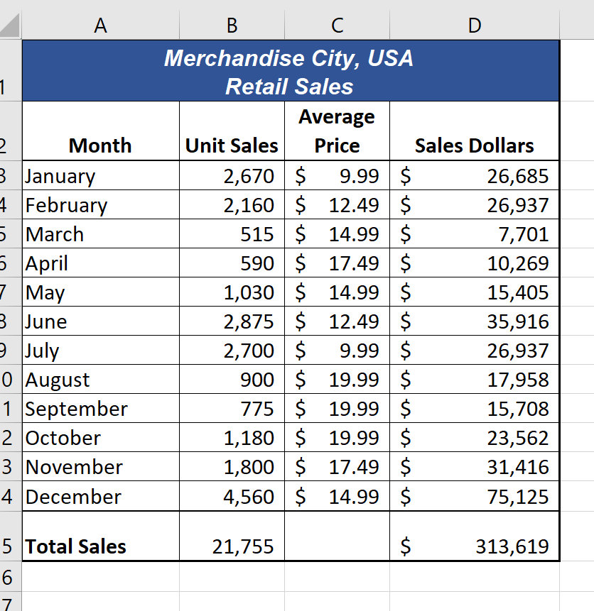
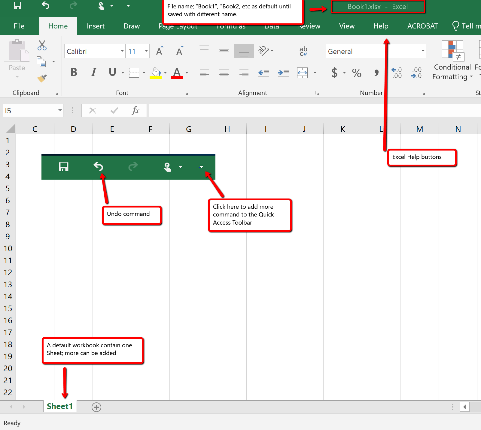
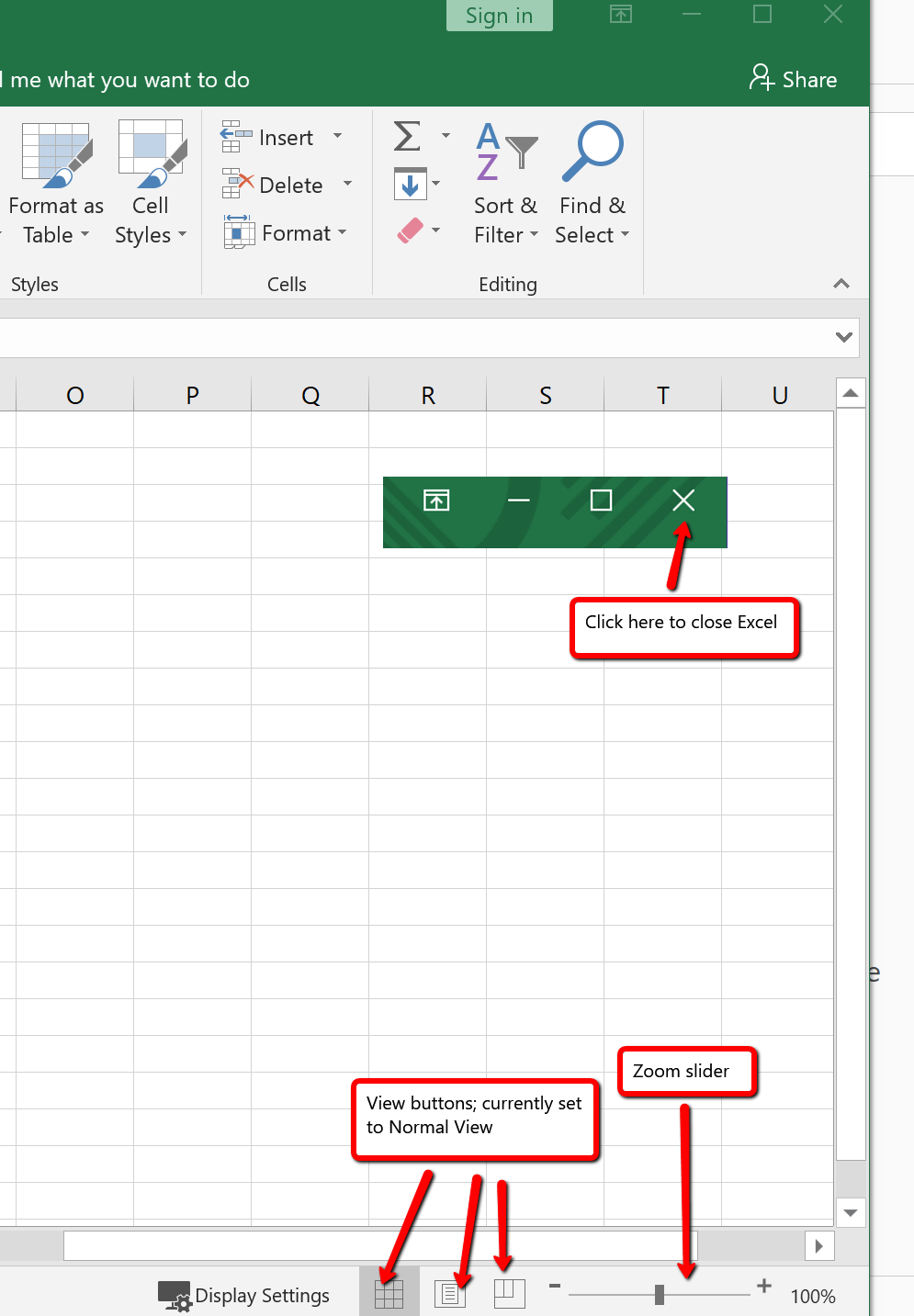
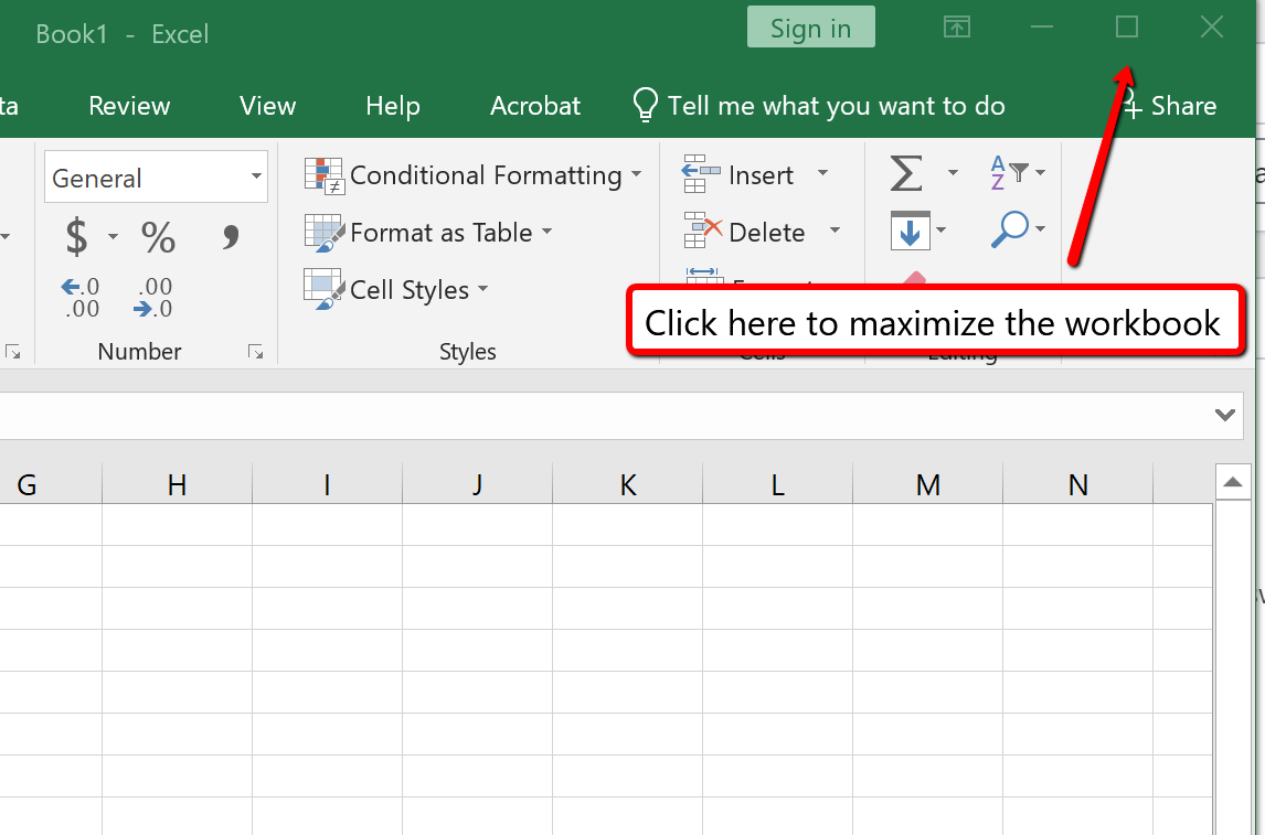
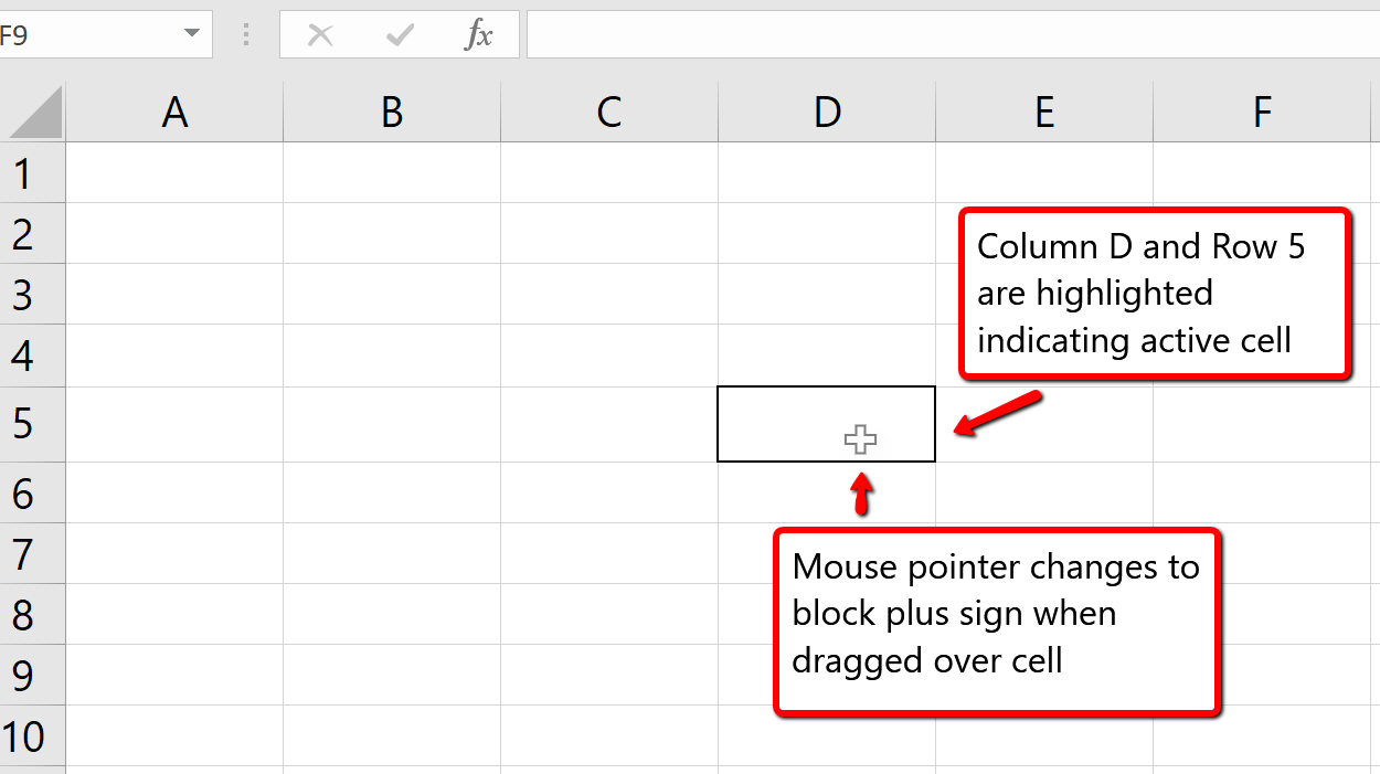
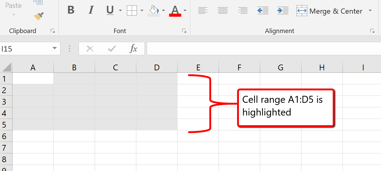
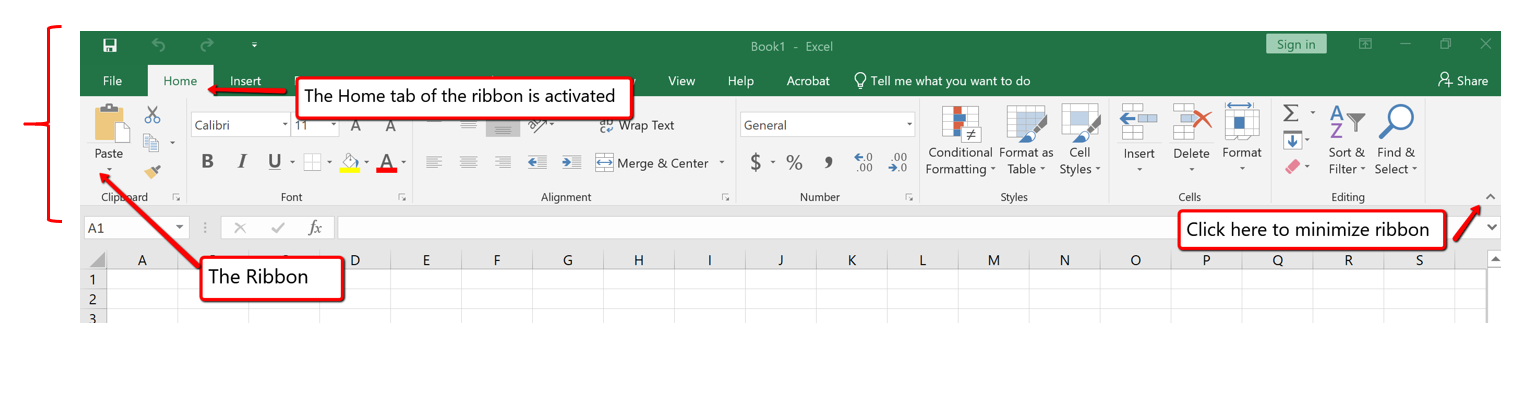
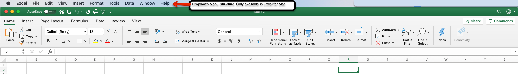
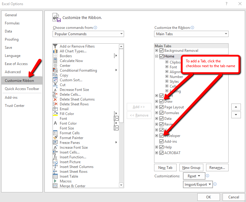
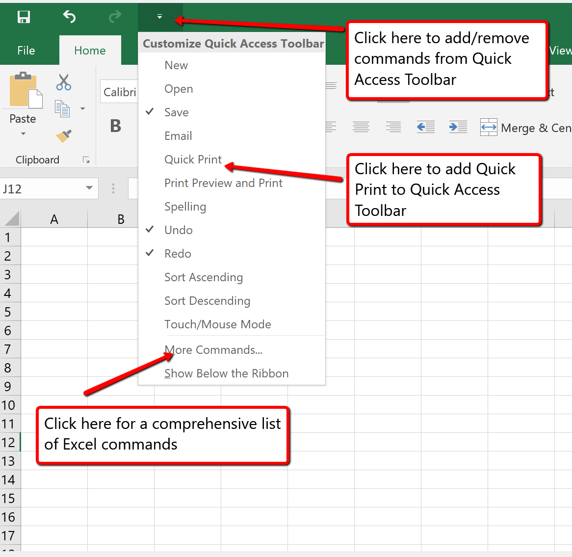
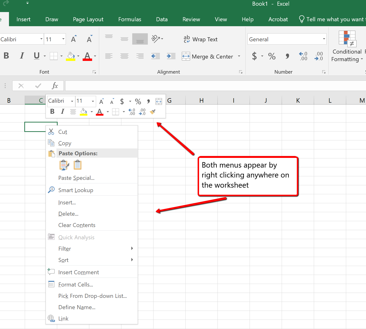
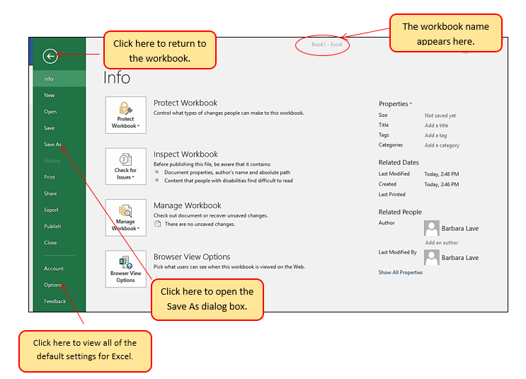
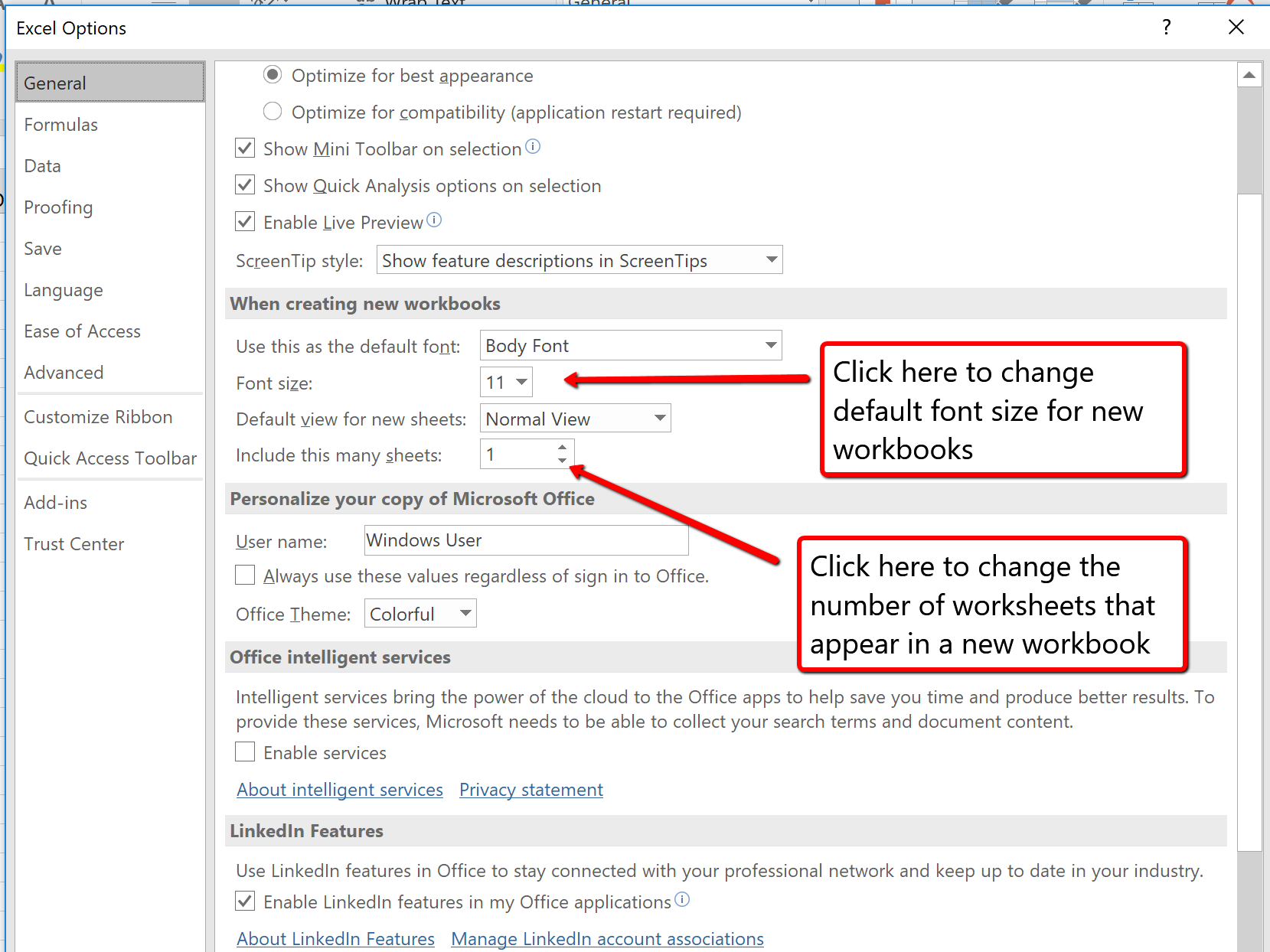
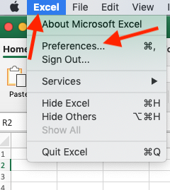
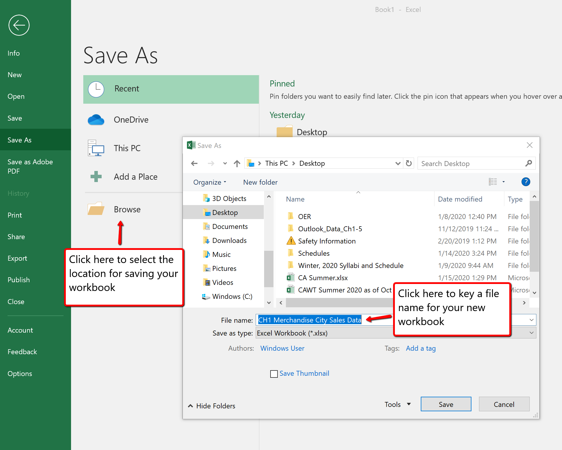
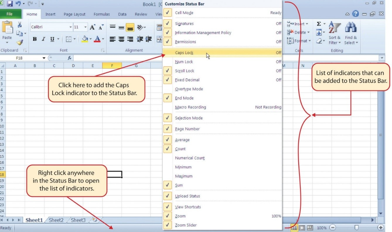
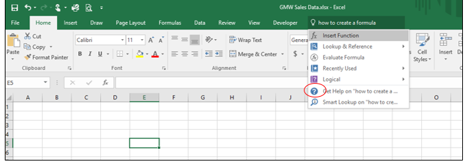
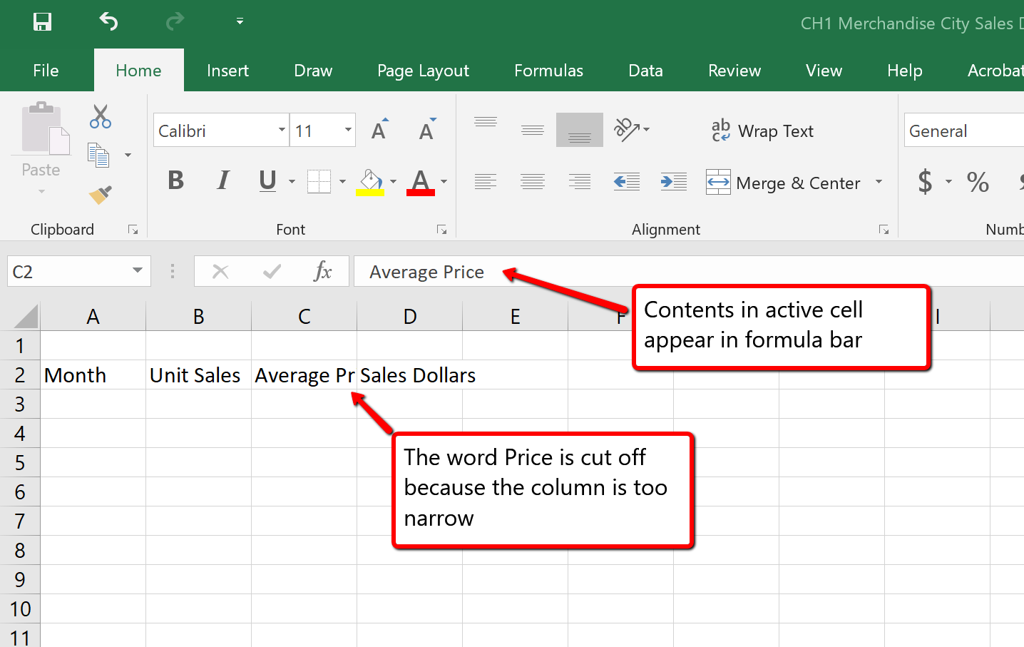
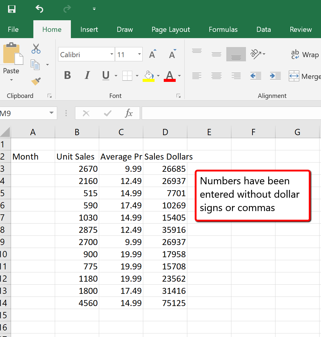
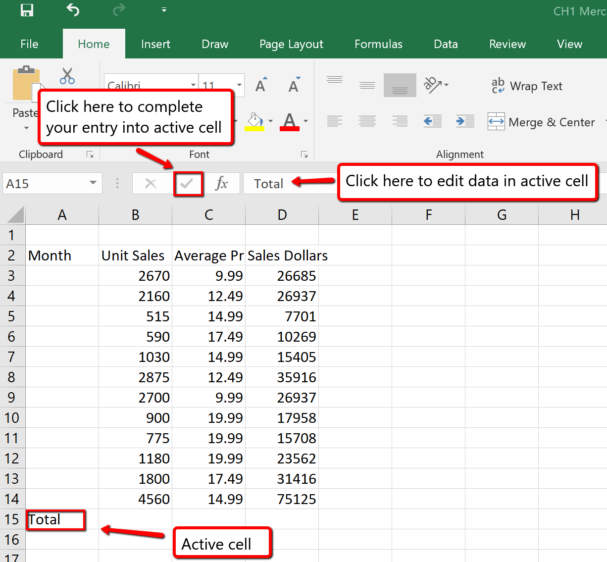
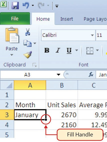
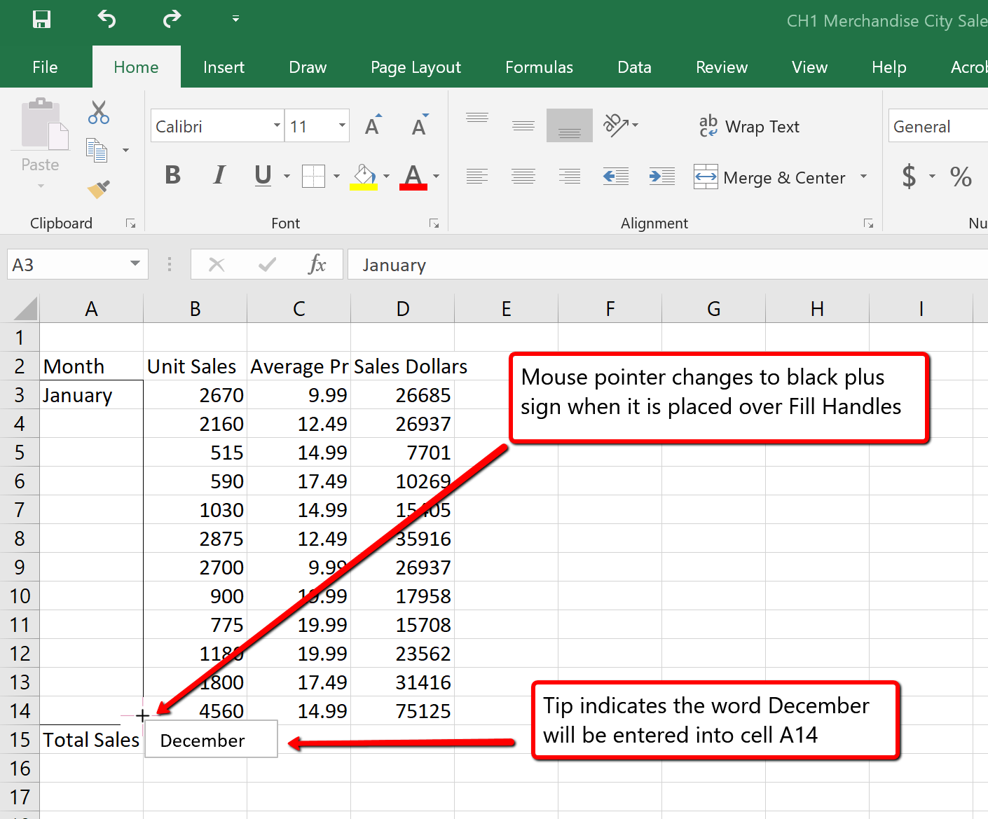
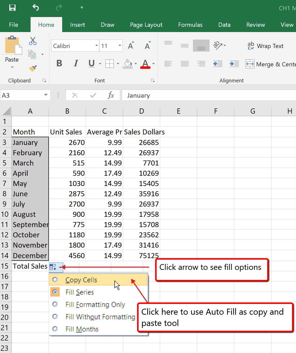
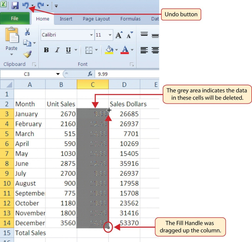
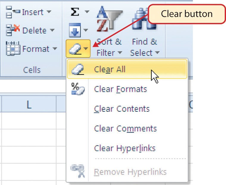
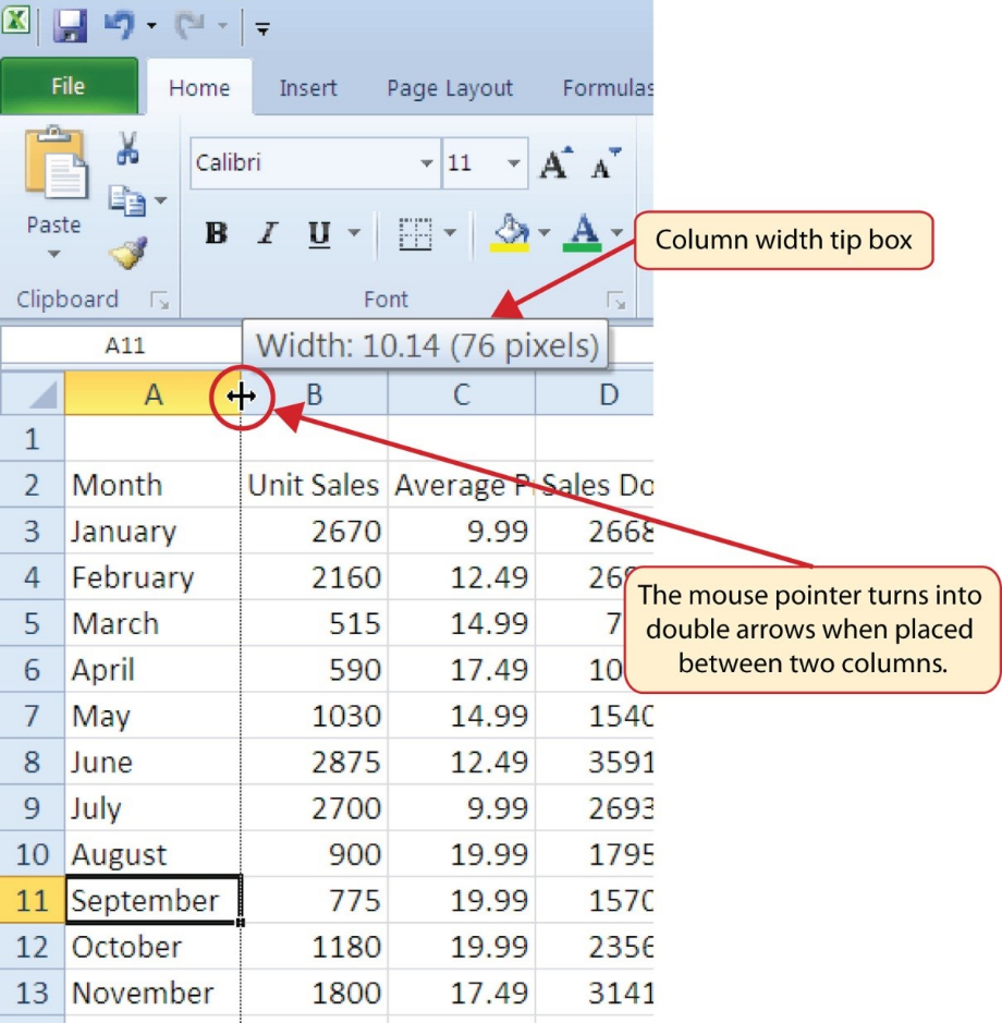
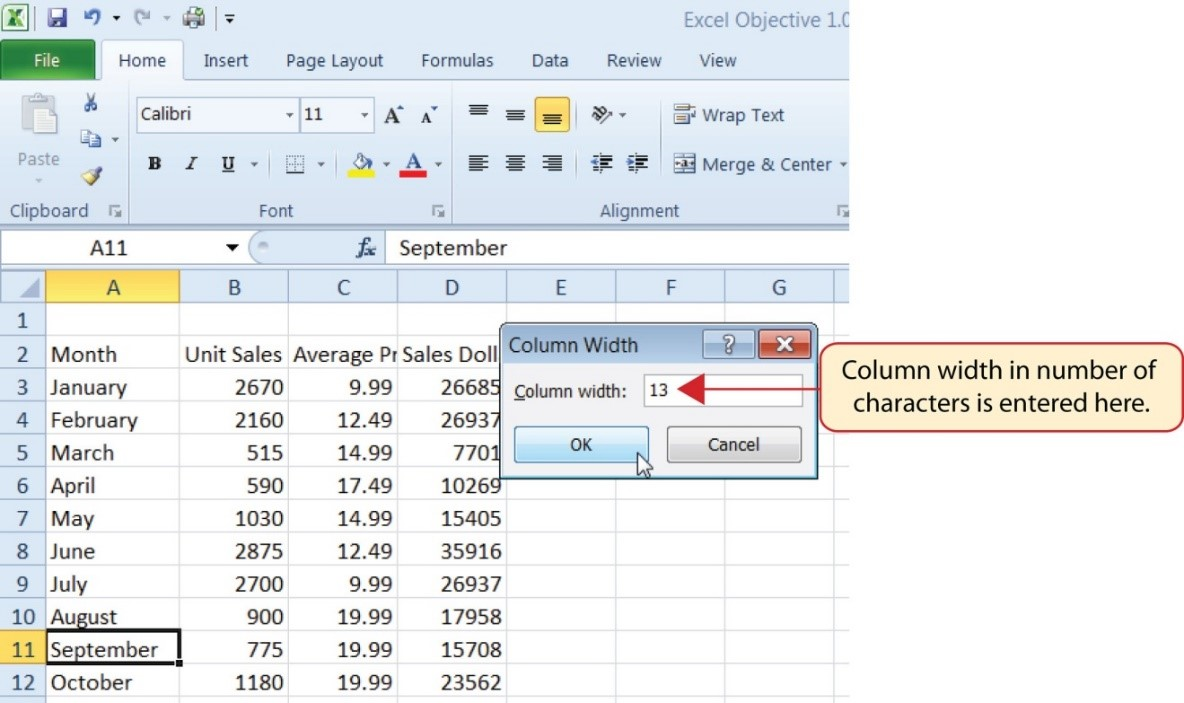
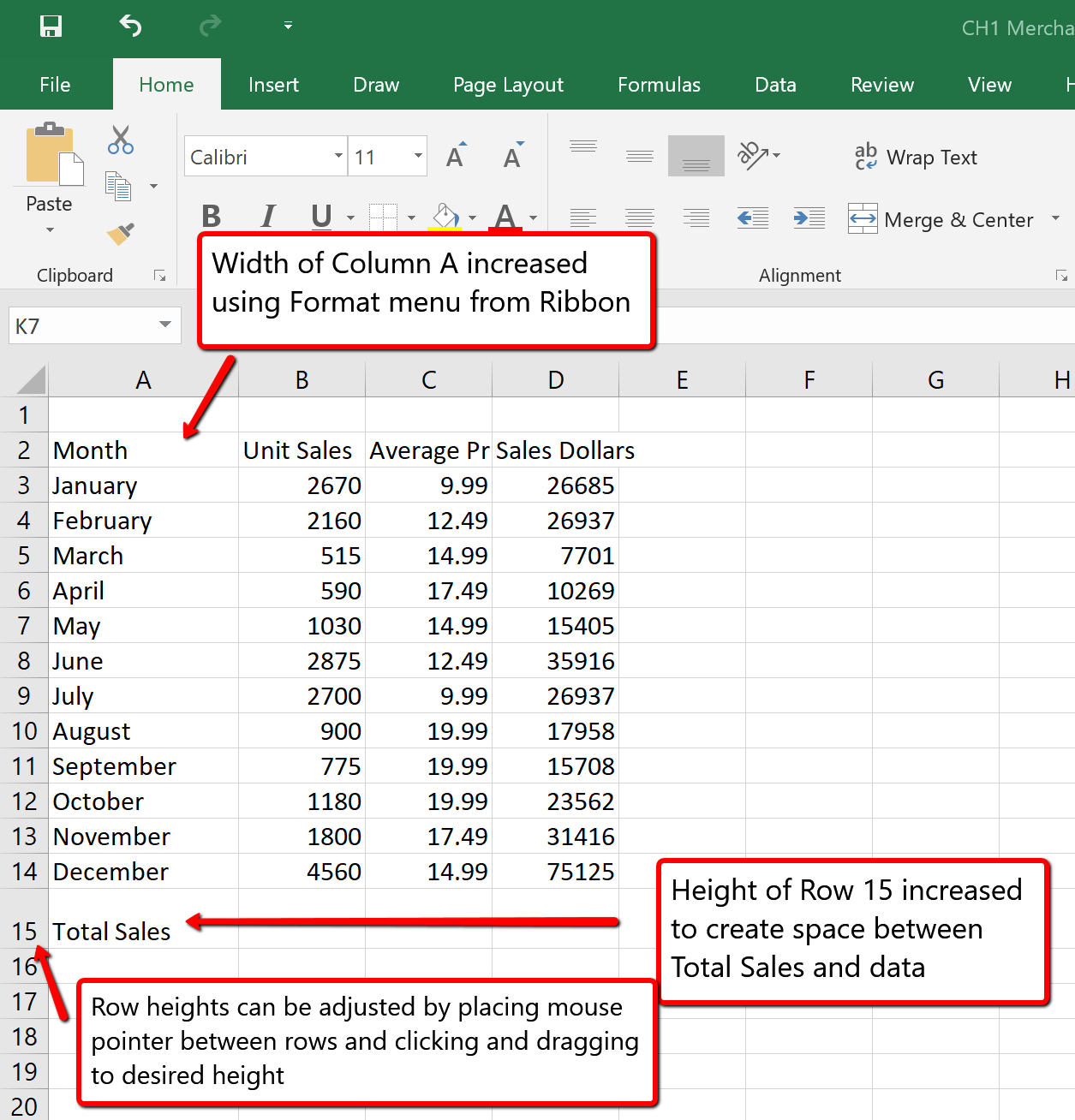
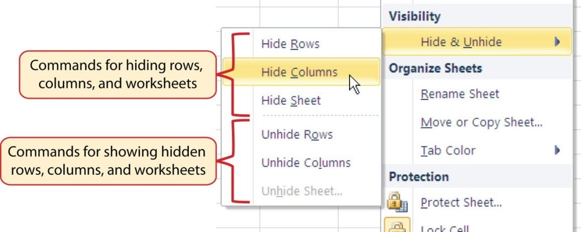
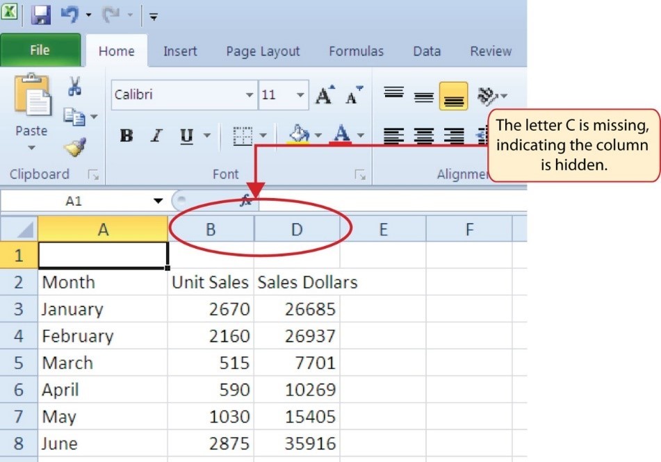
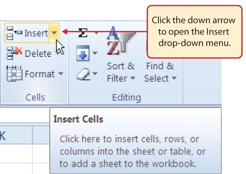
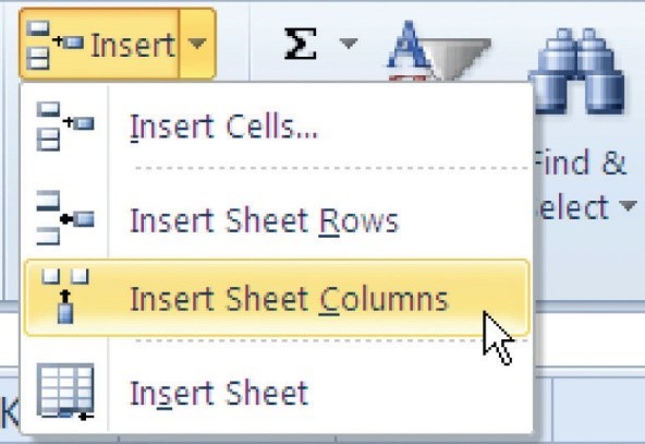
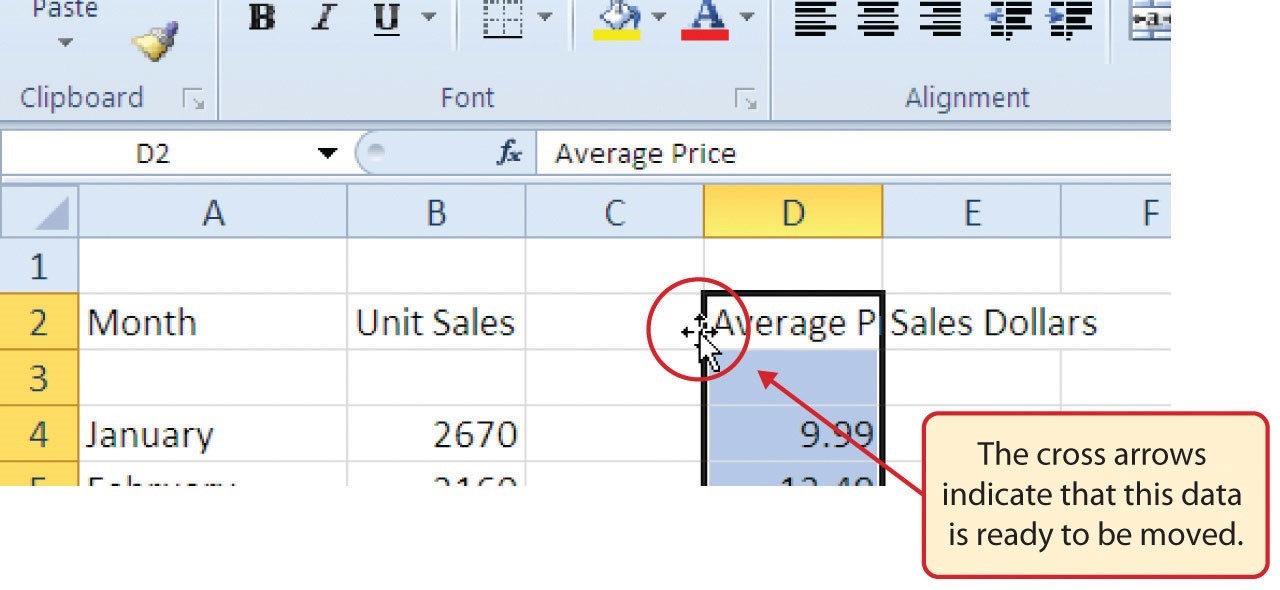


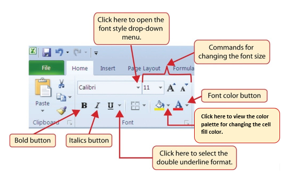
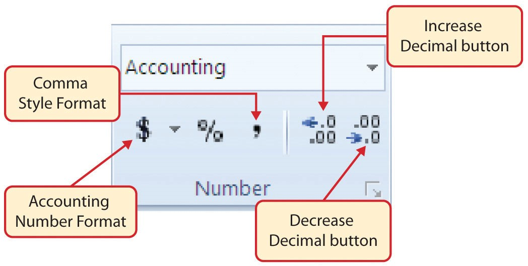
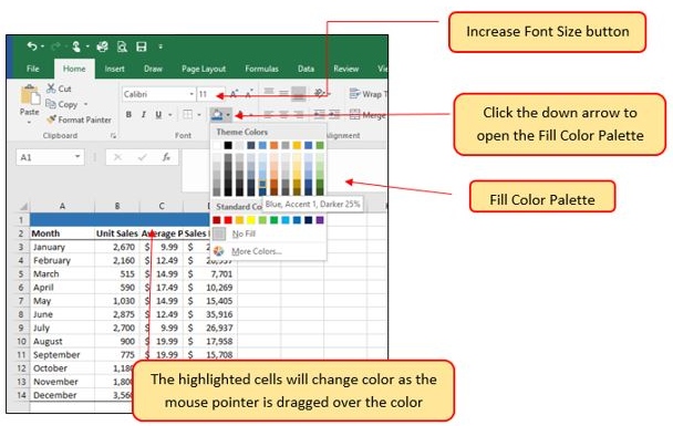
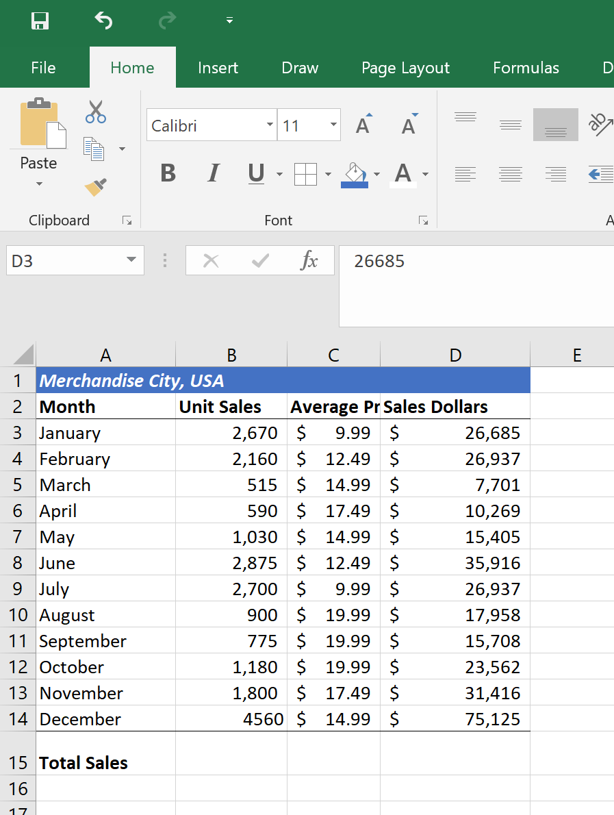
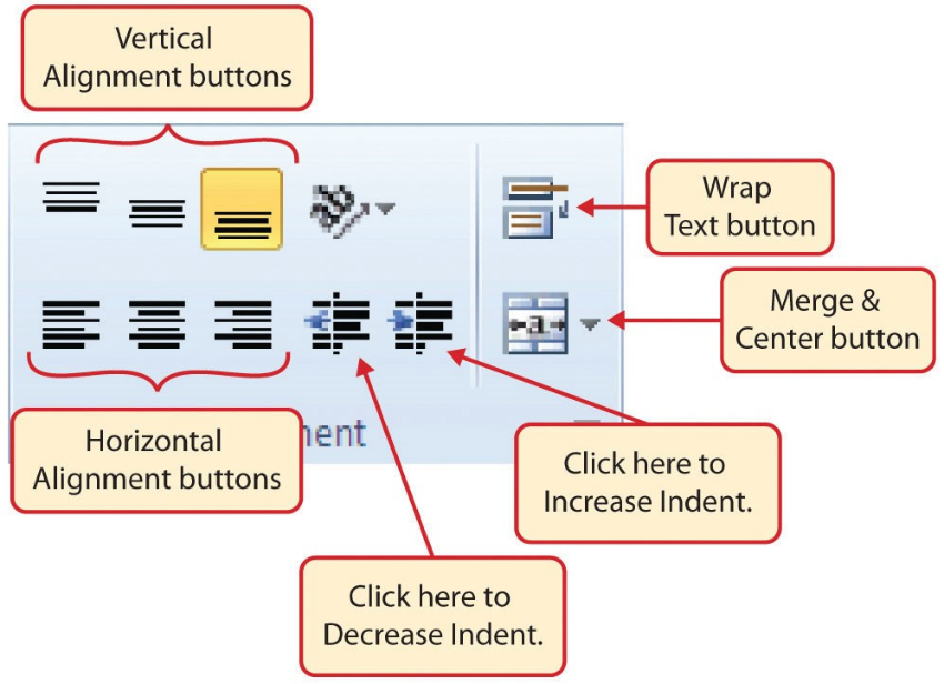
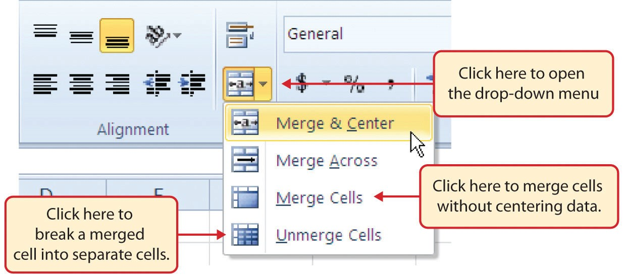
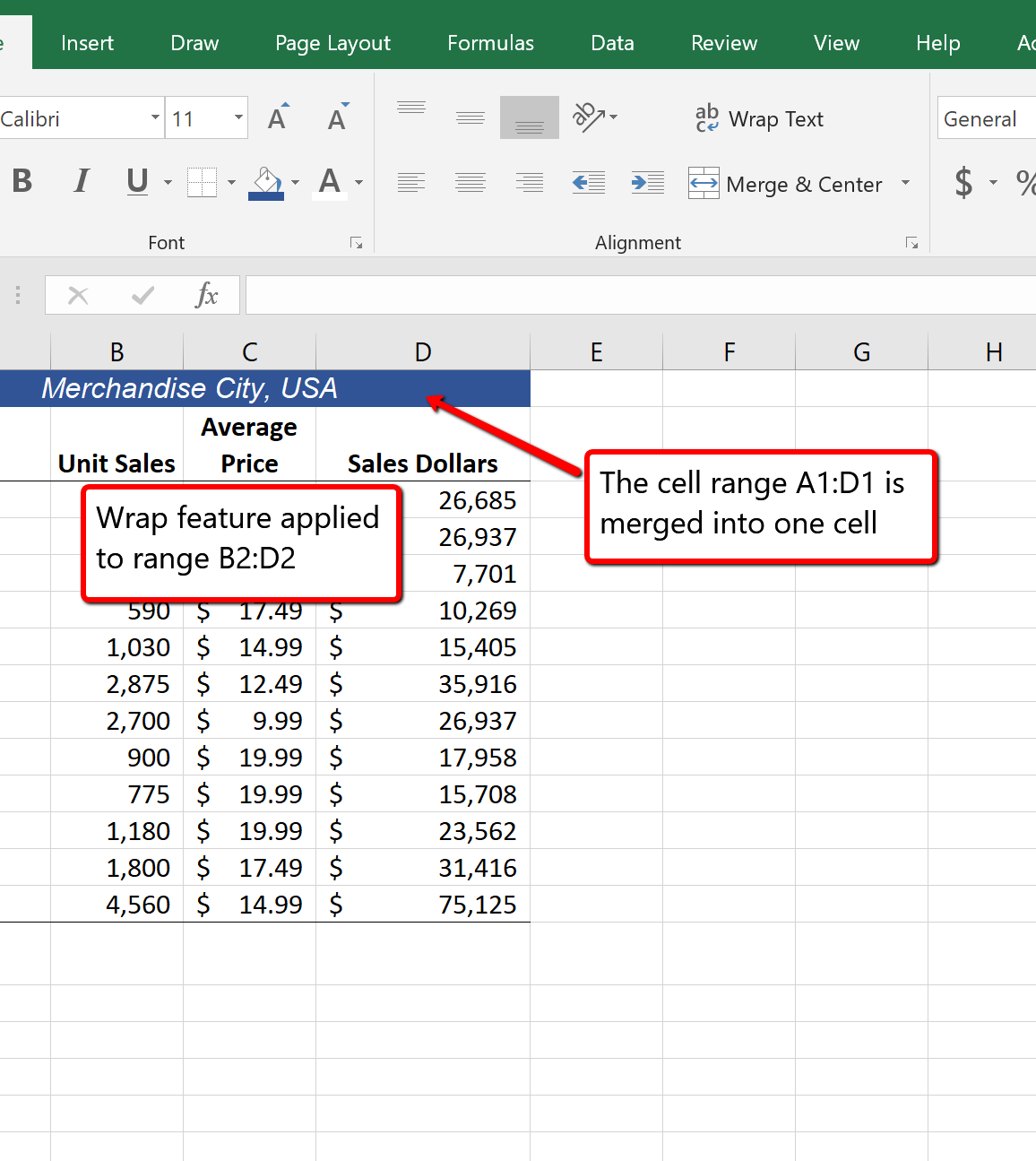
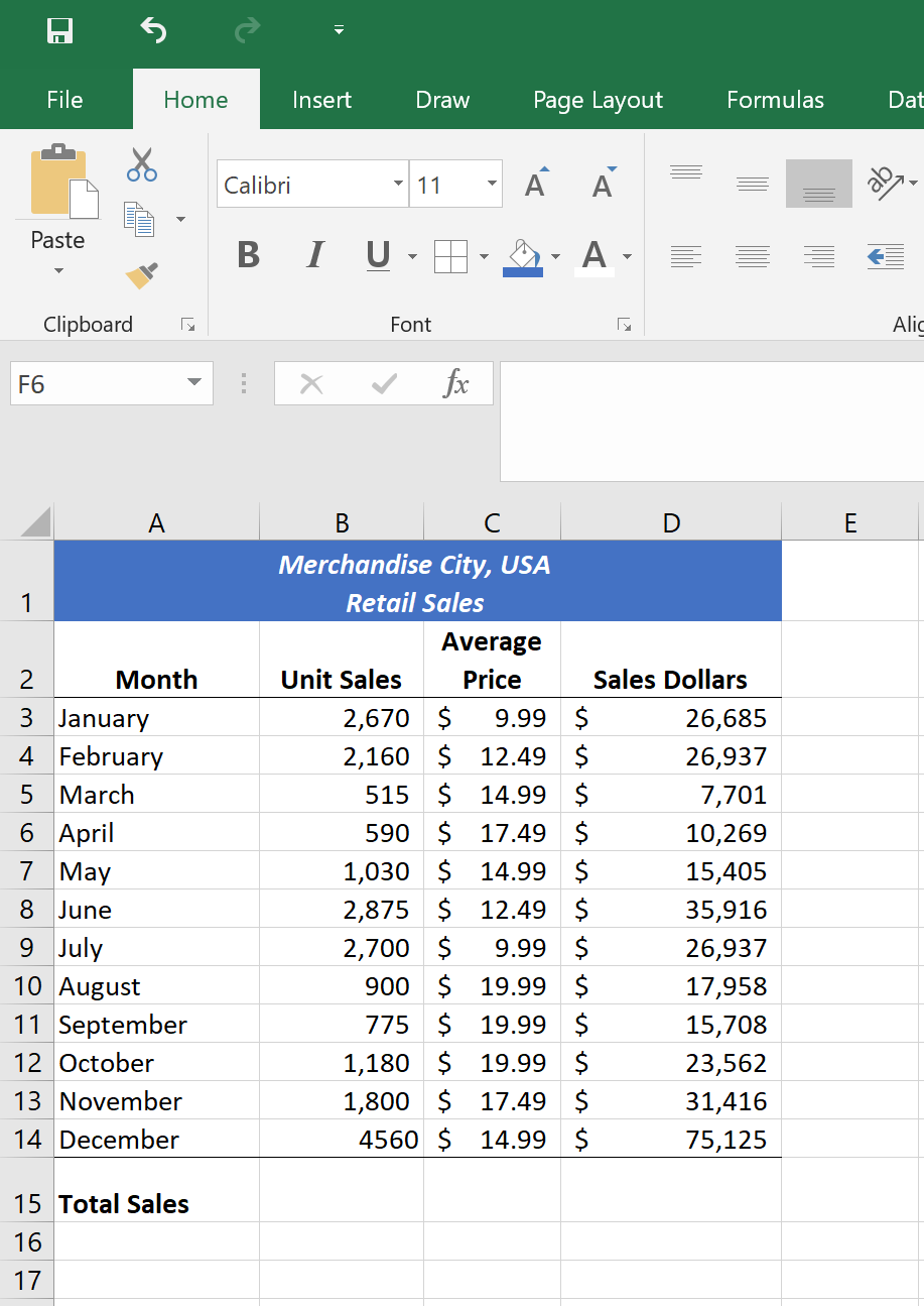
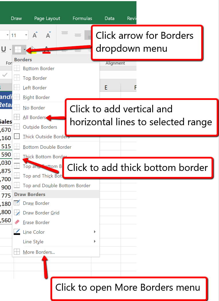
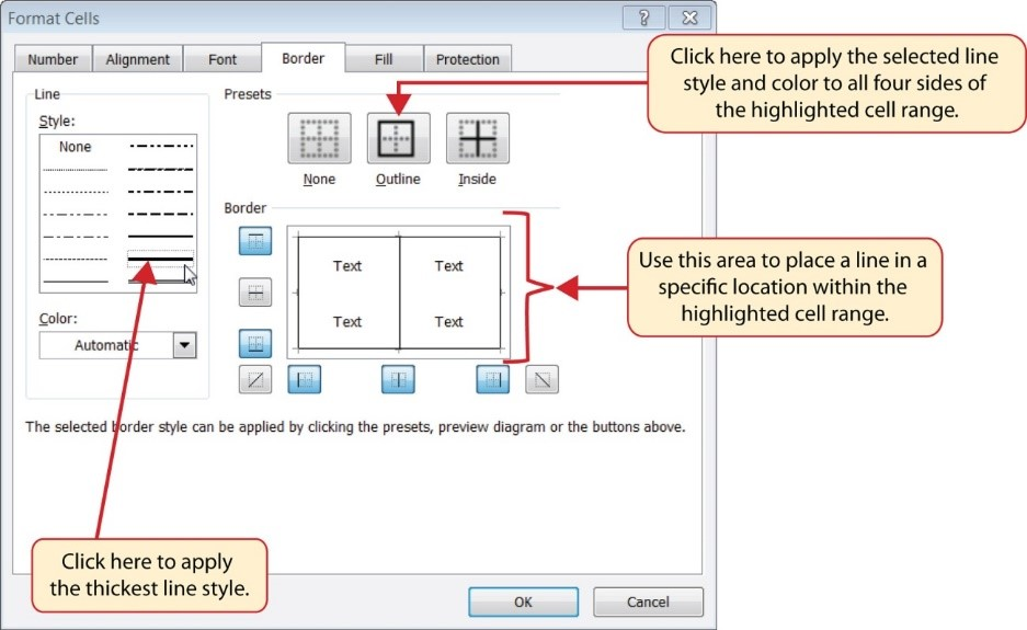
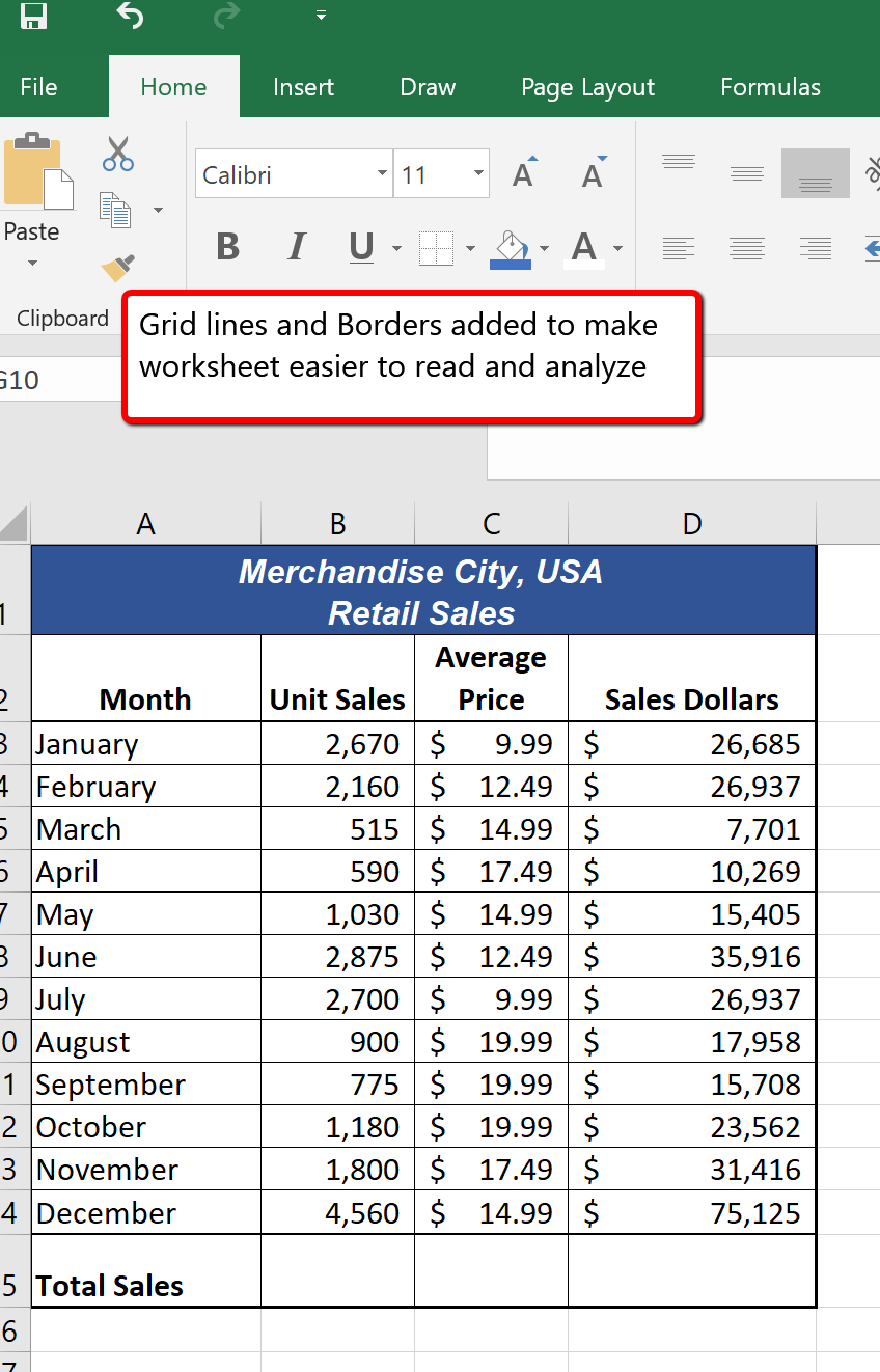
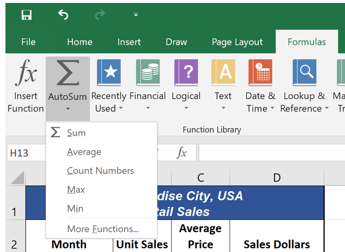
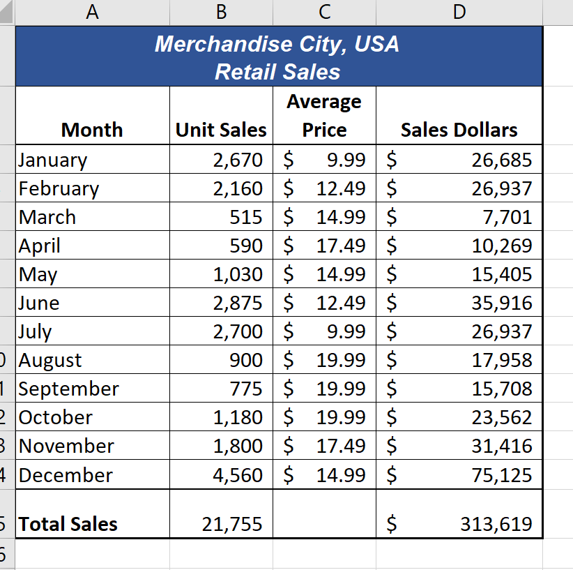
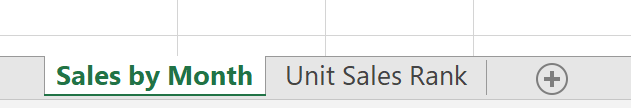
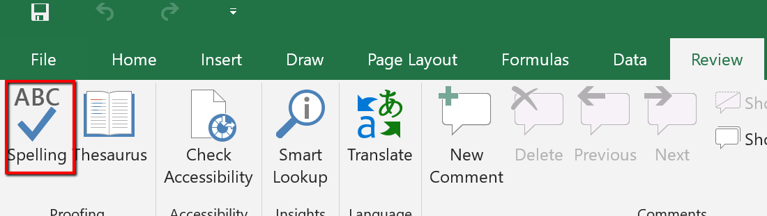

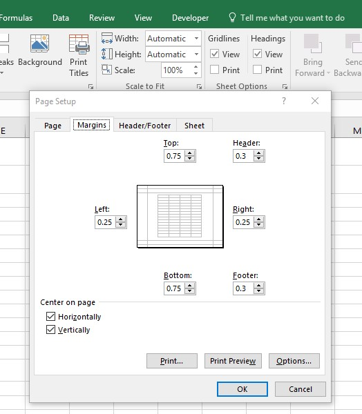
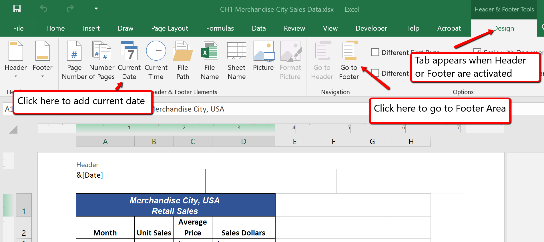
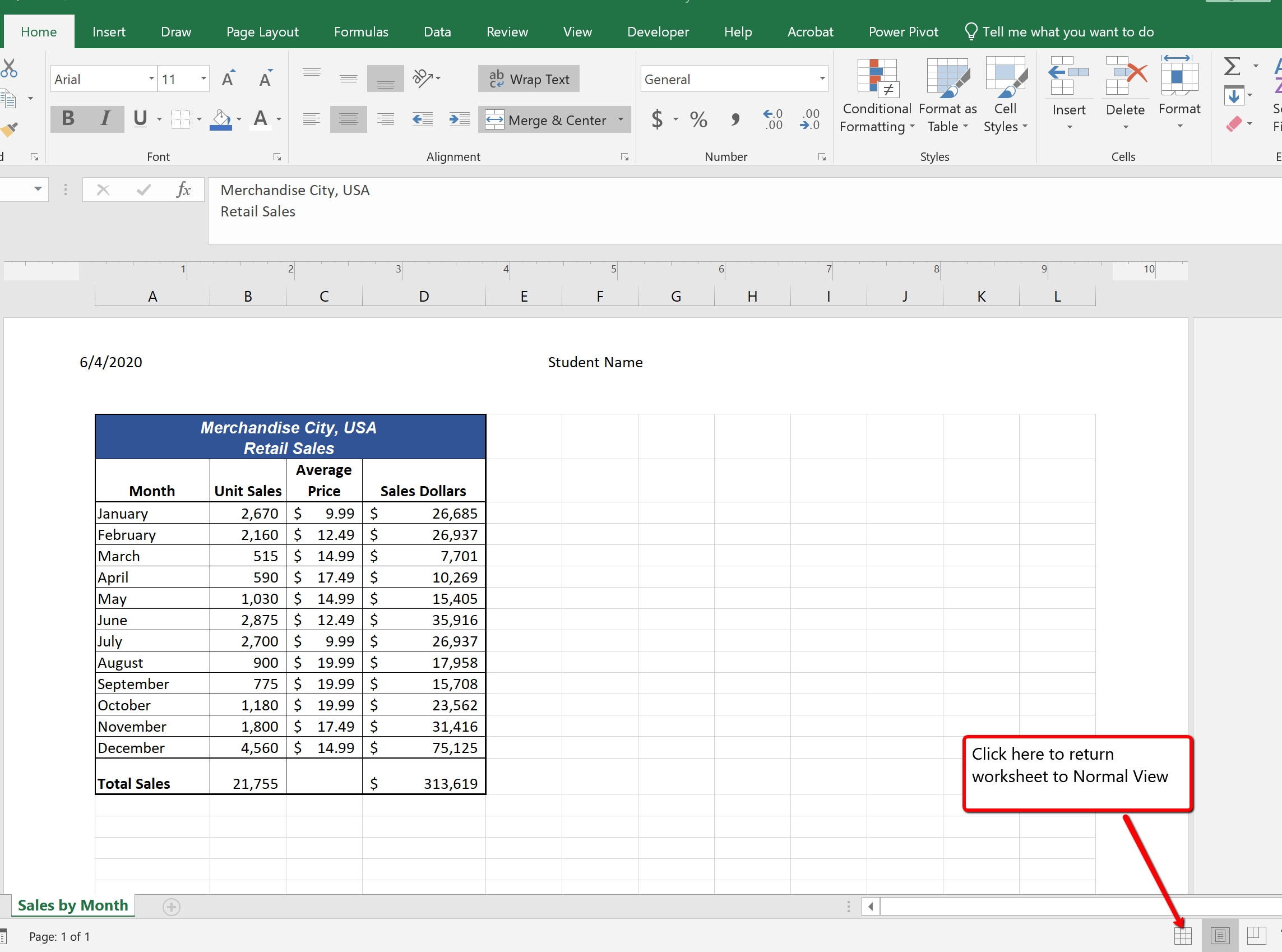
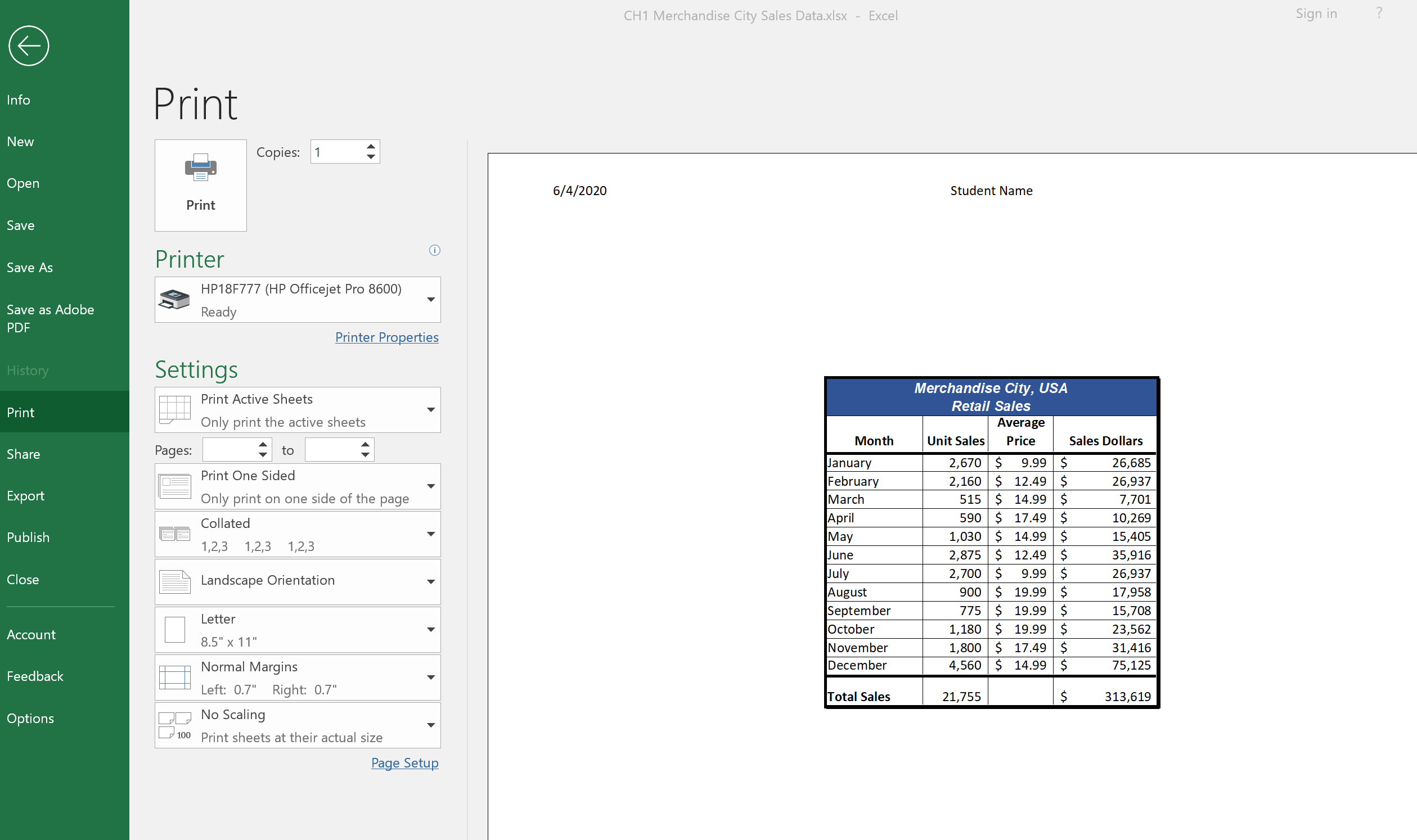
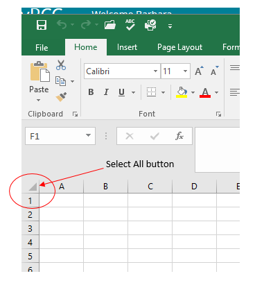
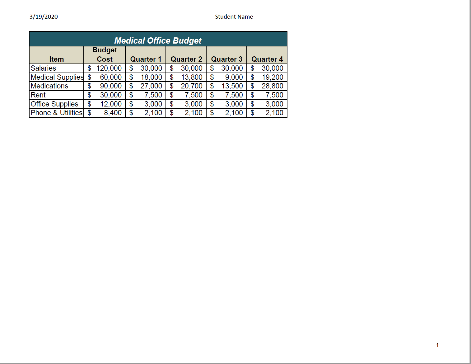
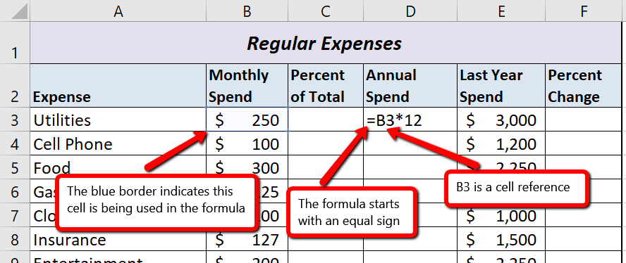
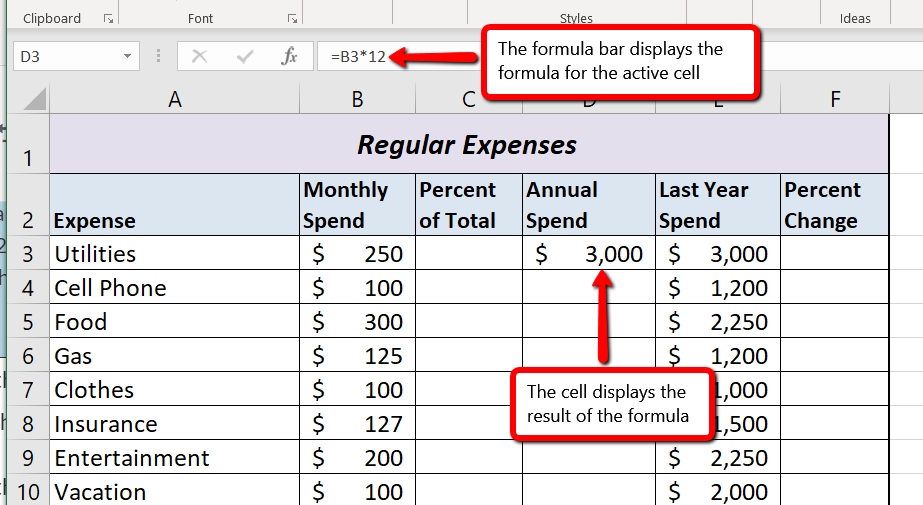
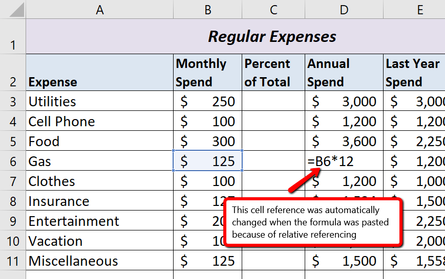
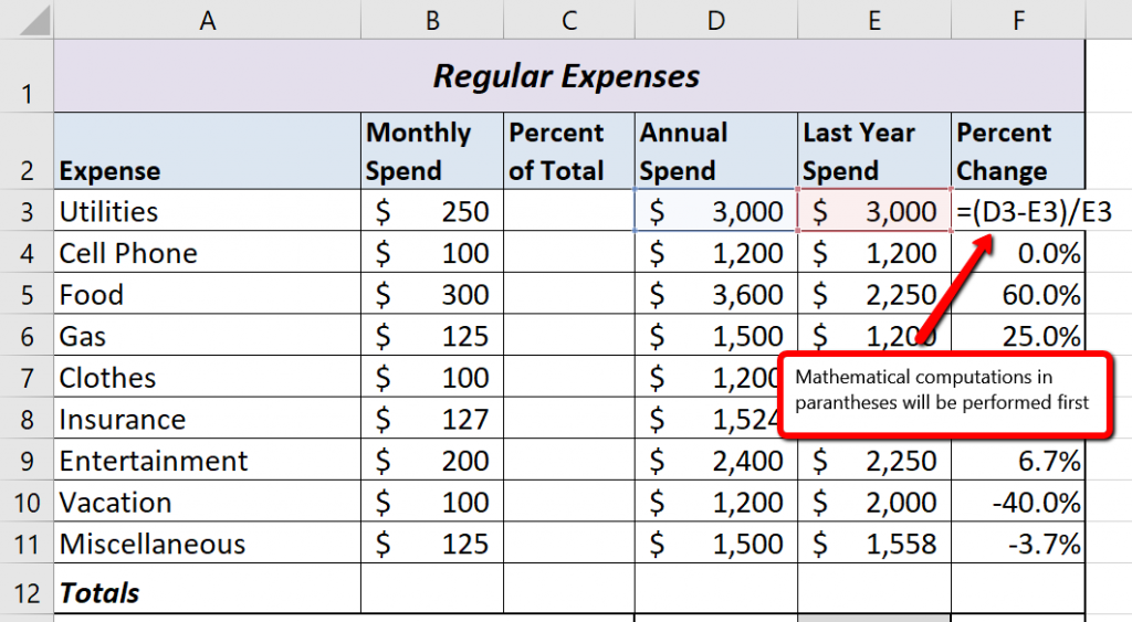
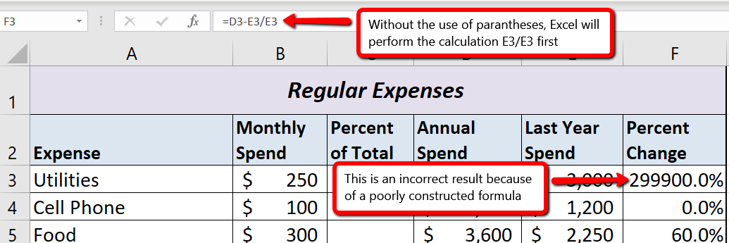
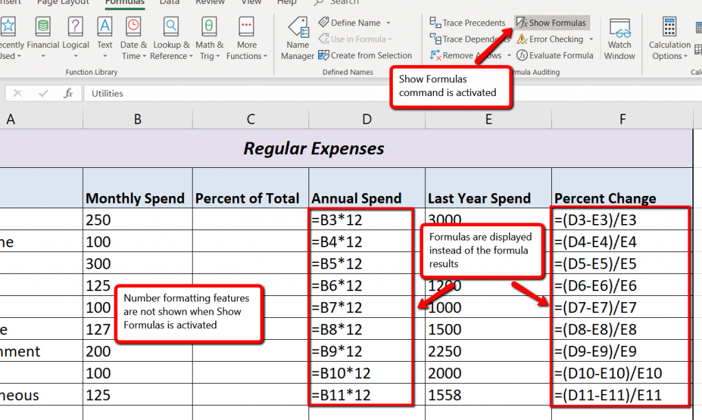
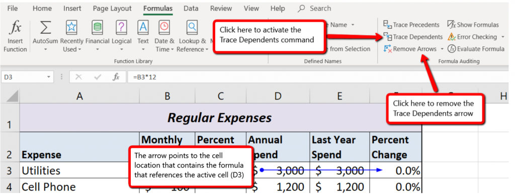
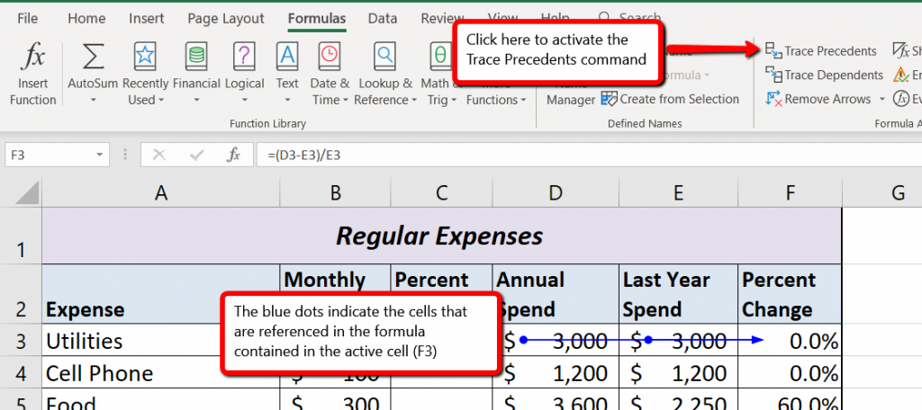
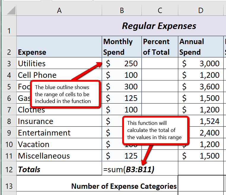
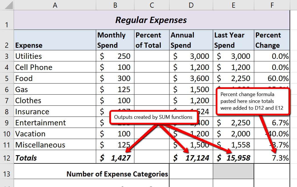
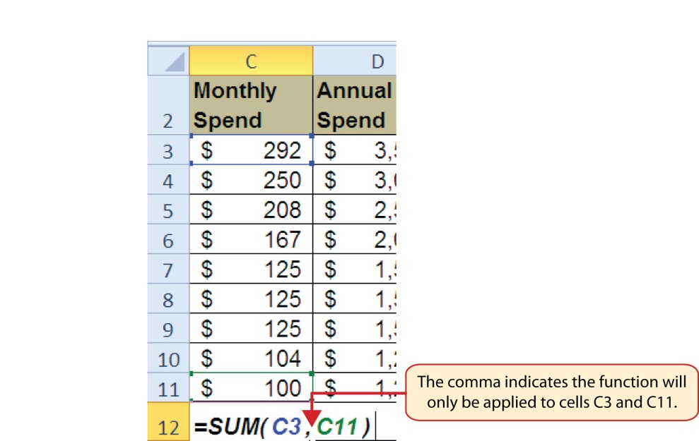
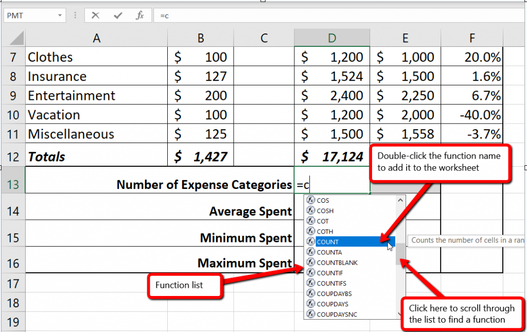
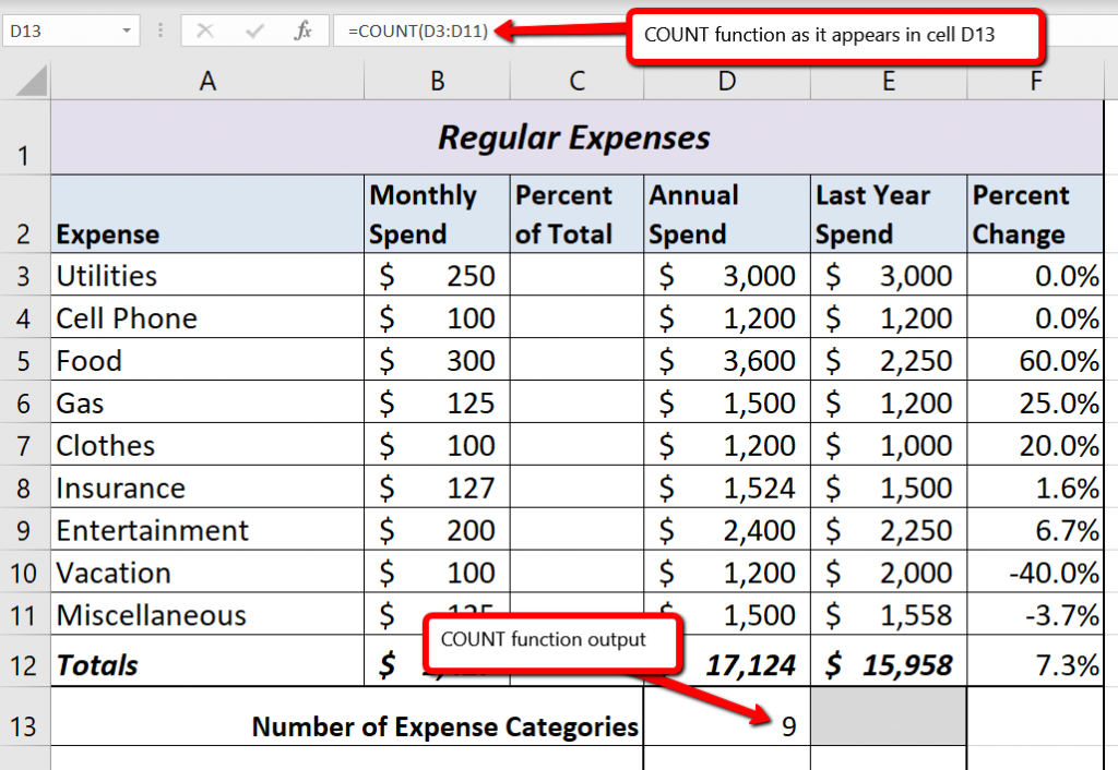
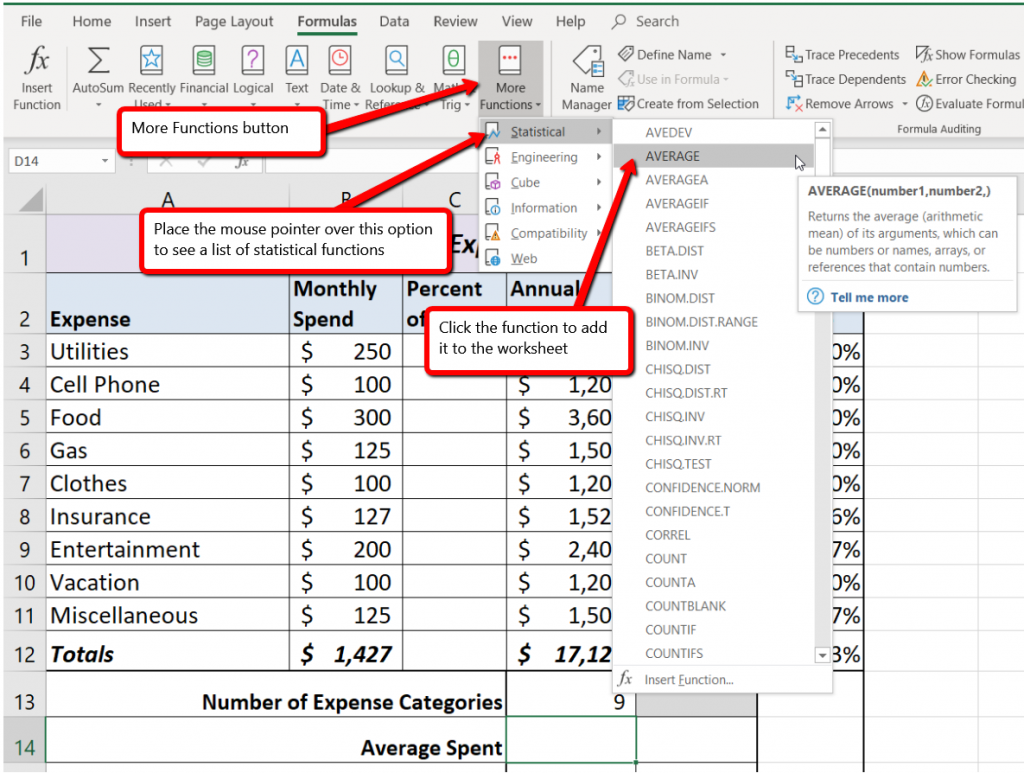
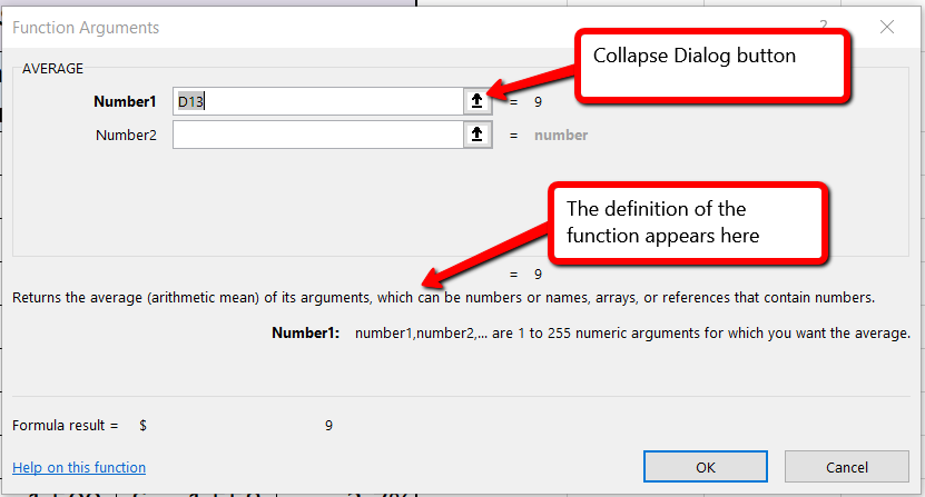
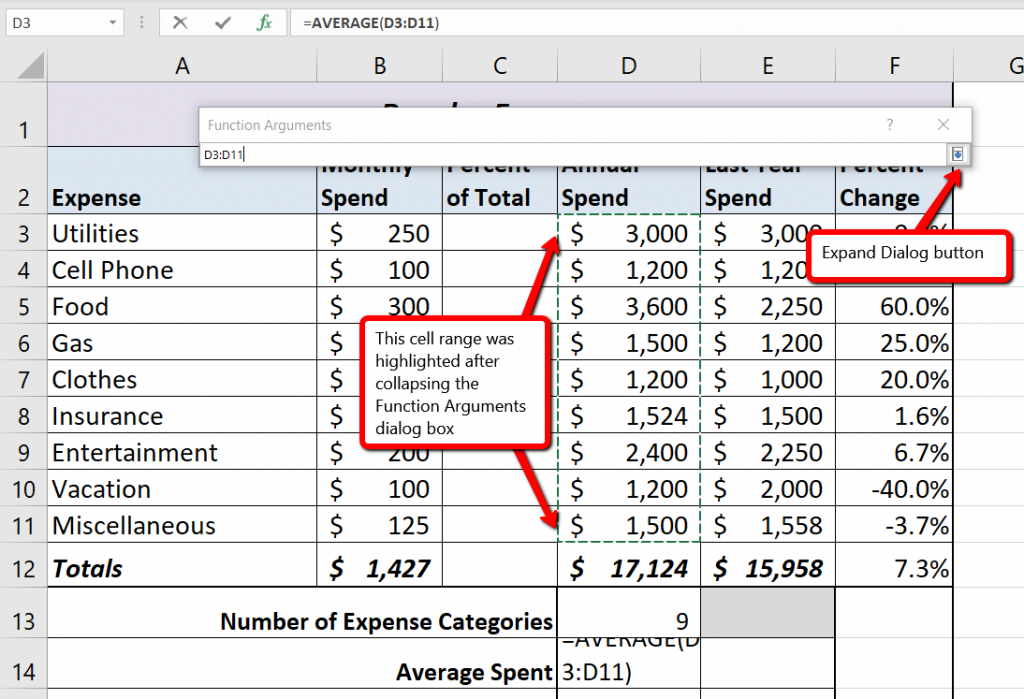
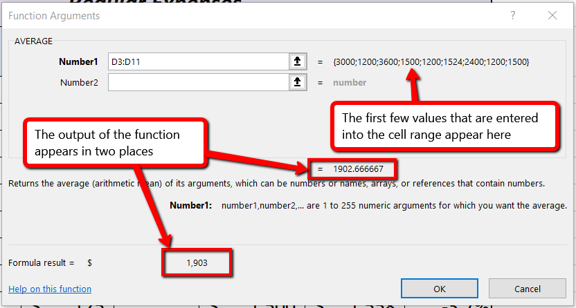
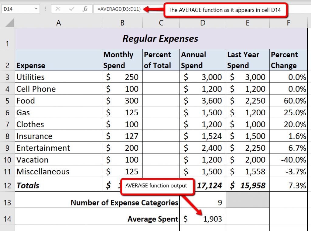
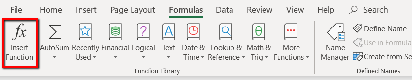
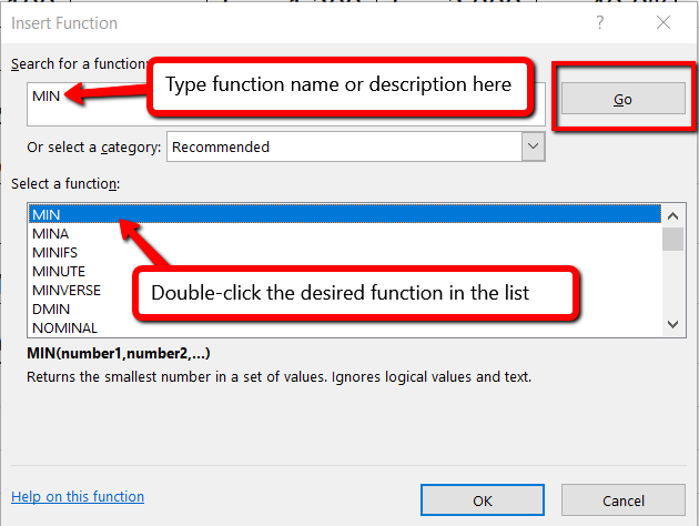
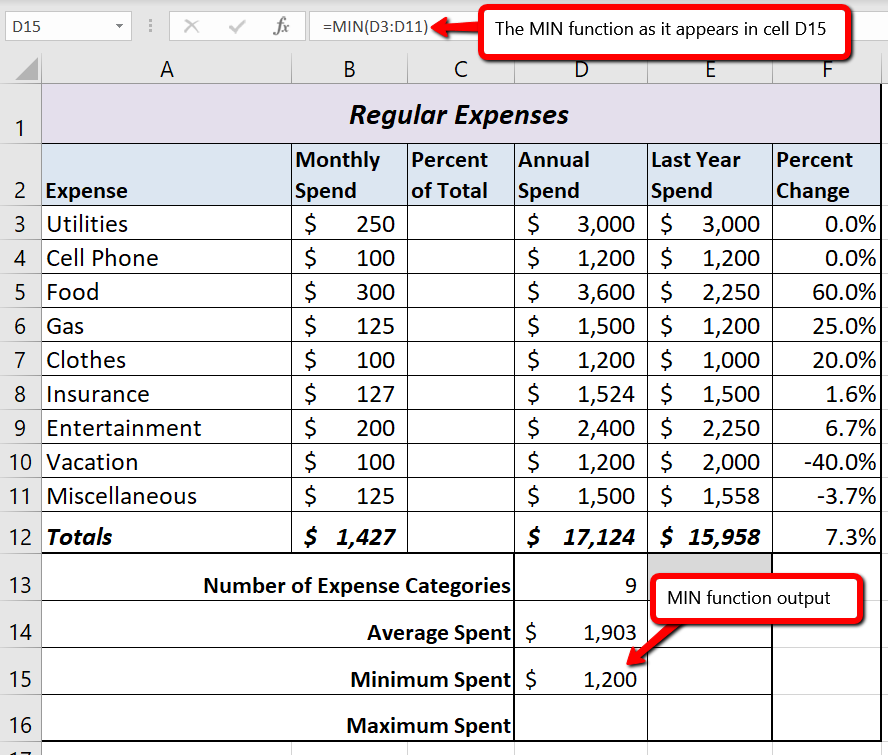
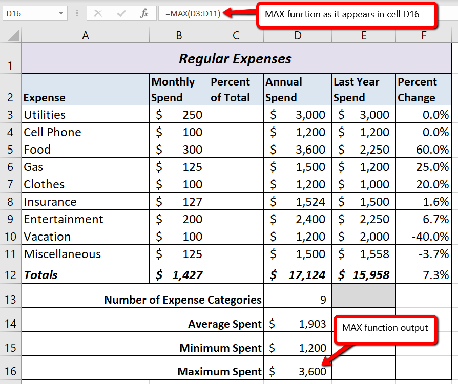
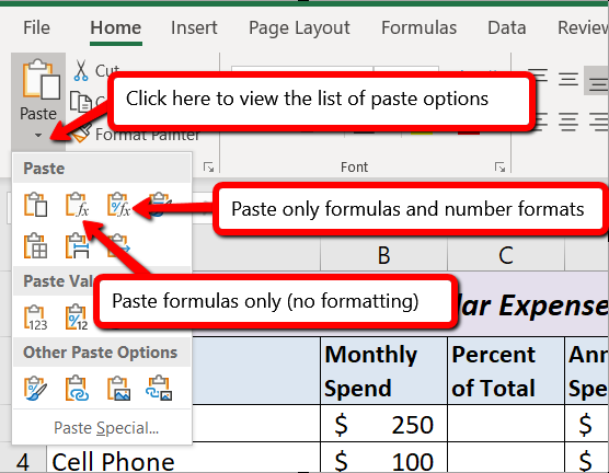
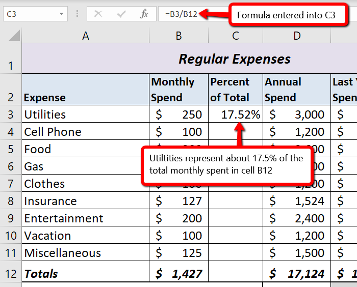
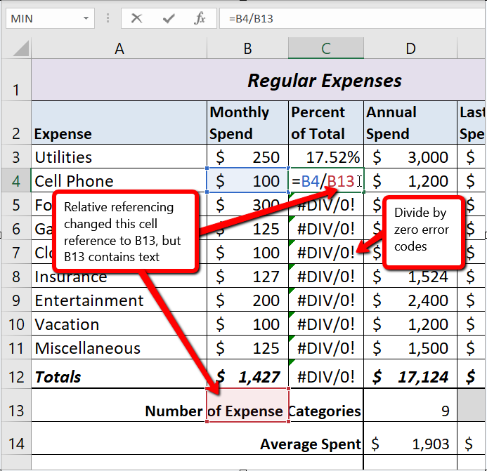
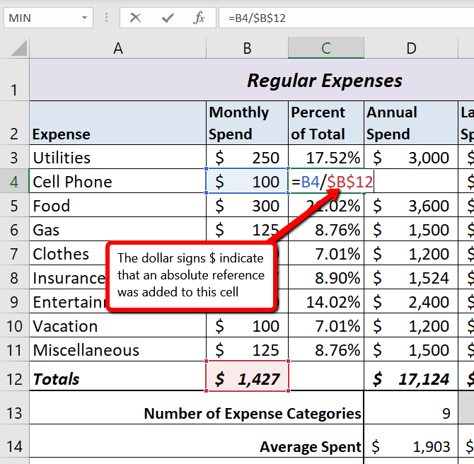
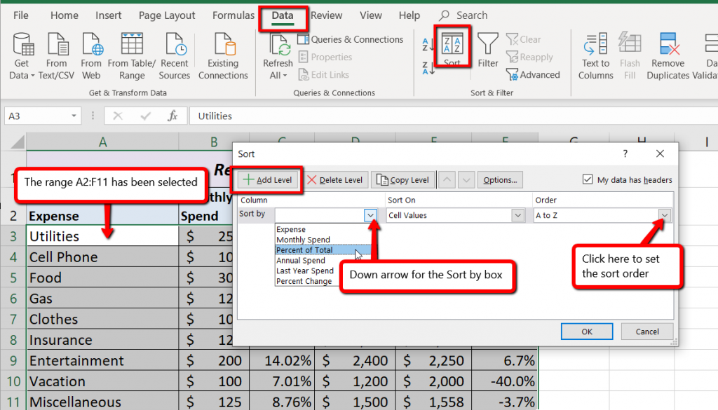
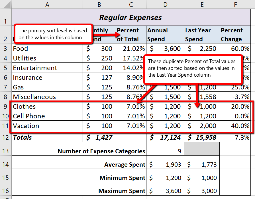
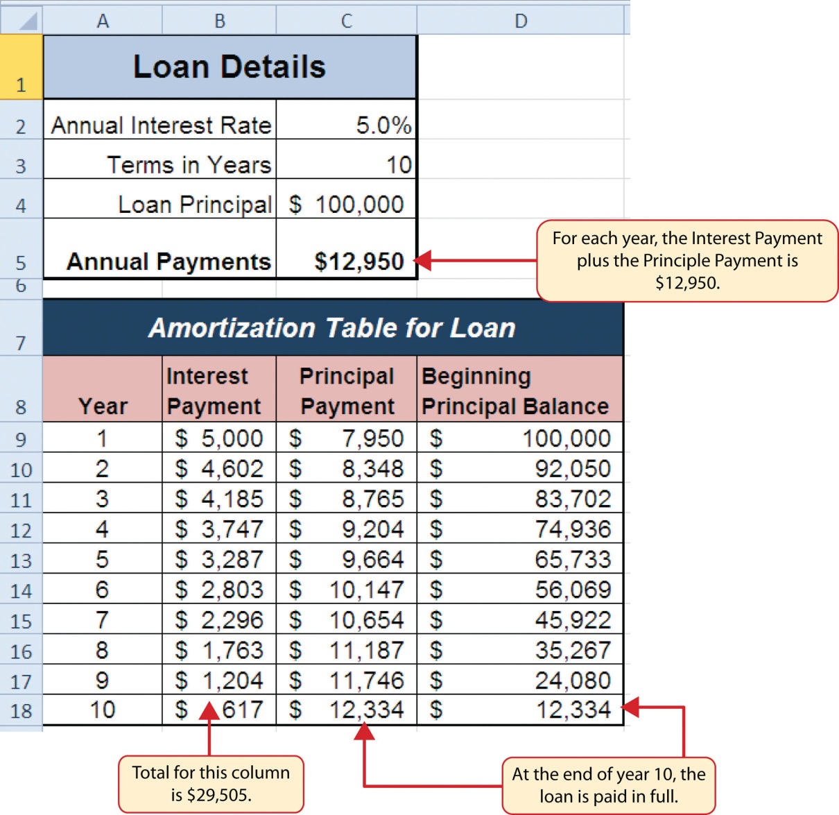
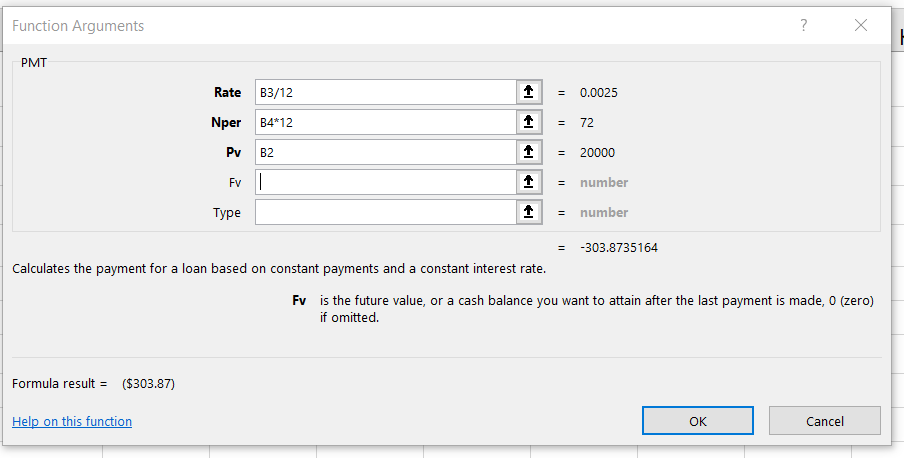
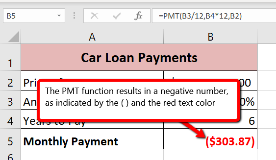
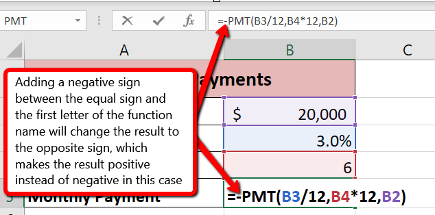
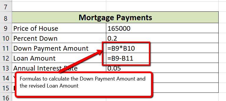
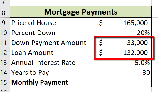
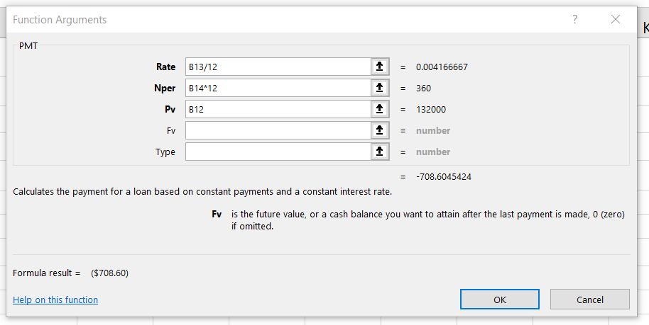
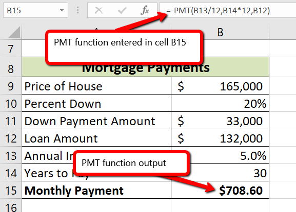
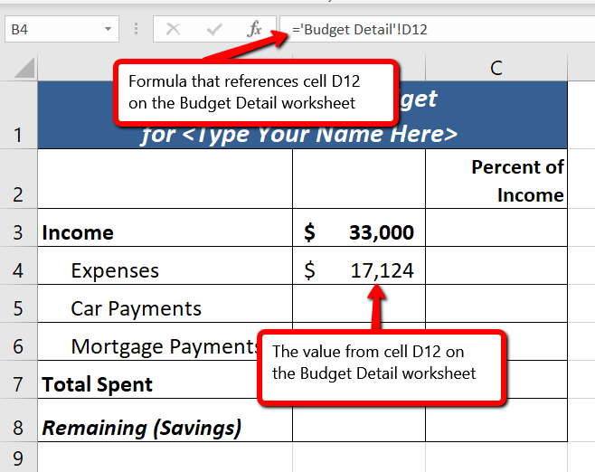
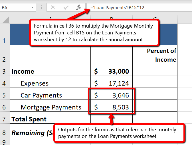
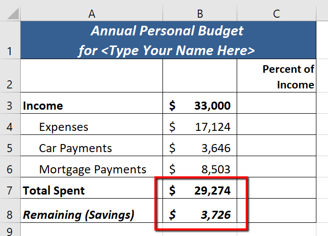
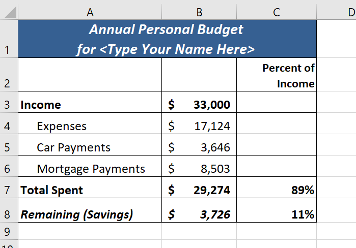
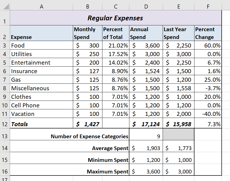
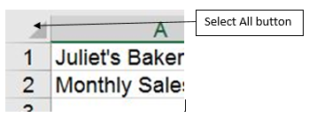
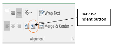

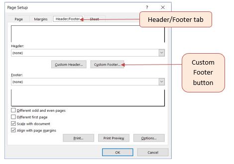
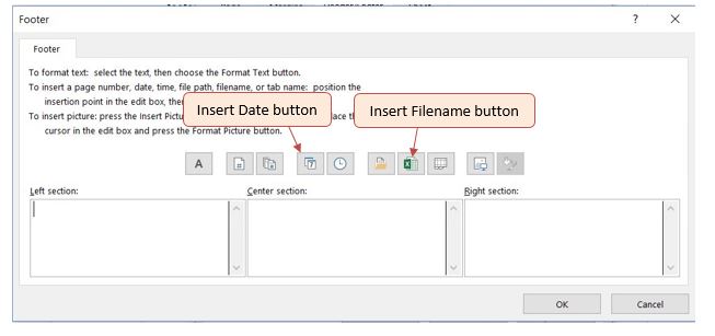
![Completed Custom Footer dialog box. Left section contains "Printed on &[Date]", Center section empty, Right section contains "Filename: &[File]".](https://openoregon.pressbooks.pub/app/uploads/sites/7/2016/10/7-Completed-Footer-Box.jpg)
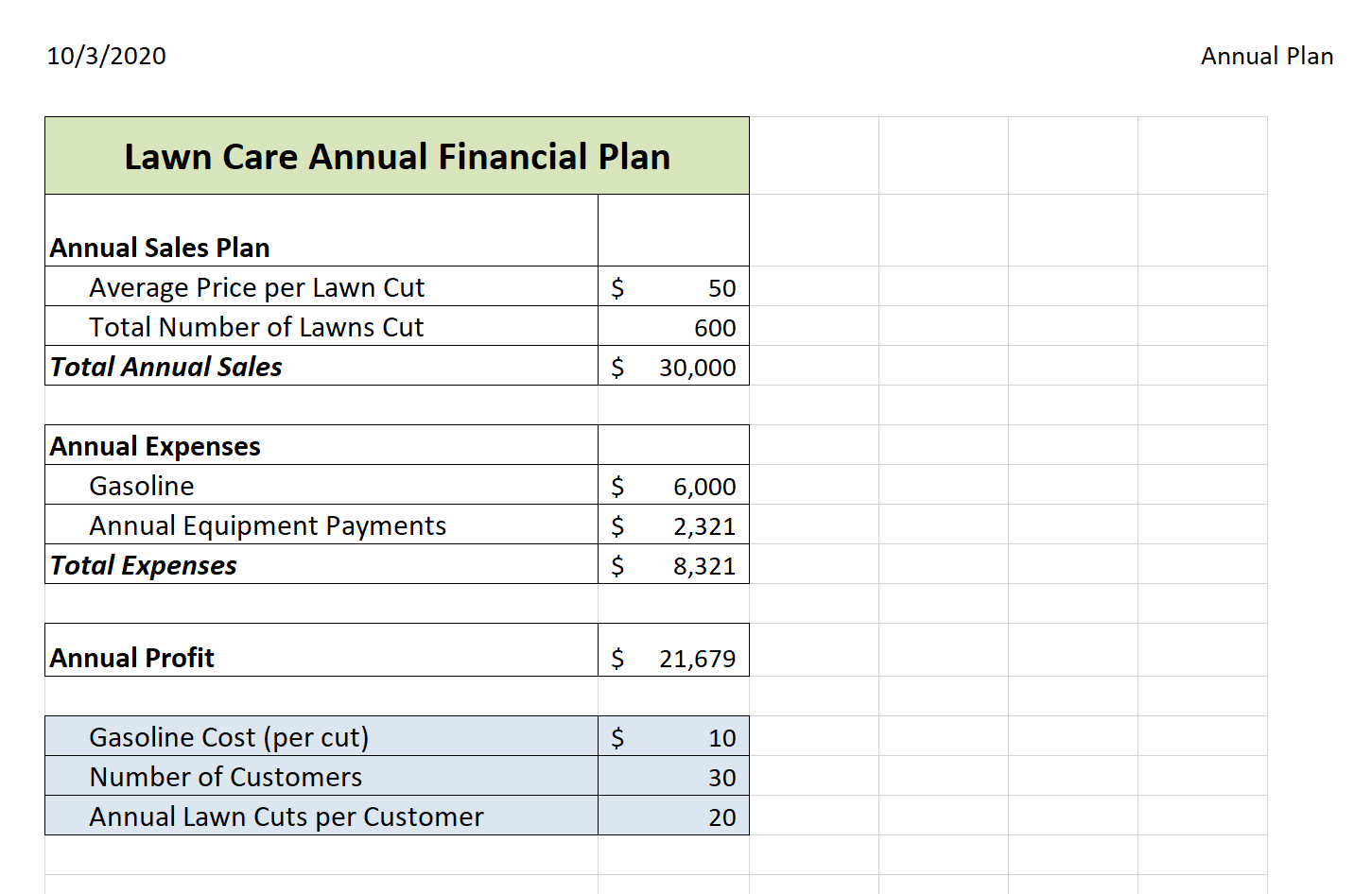
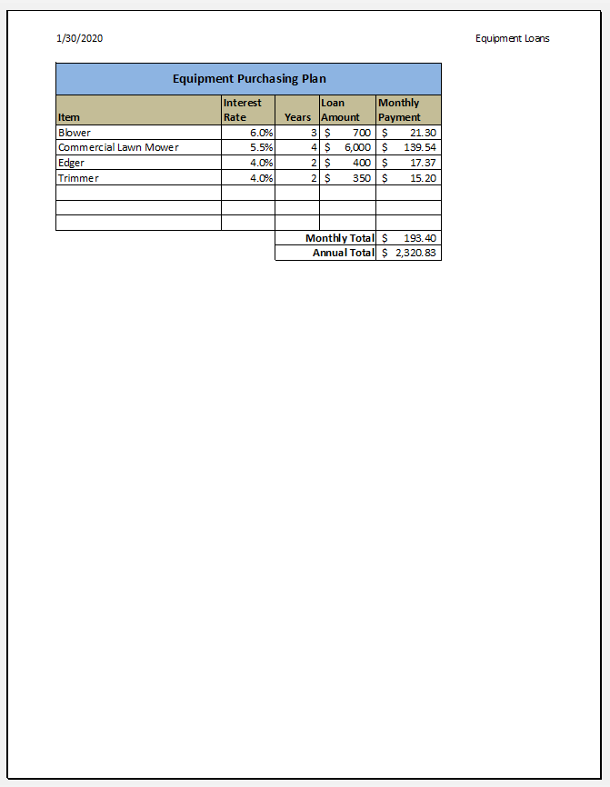
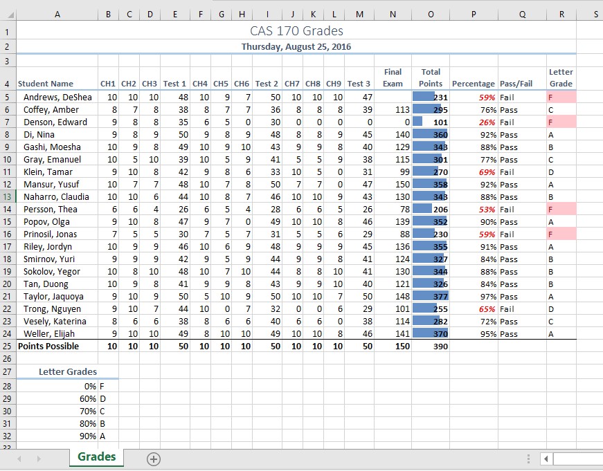
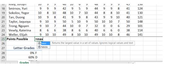
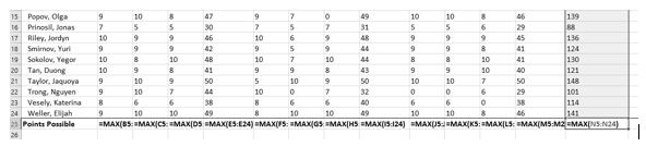
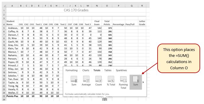
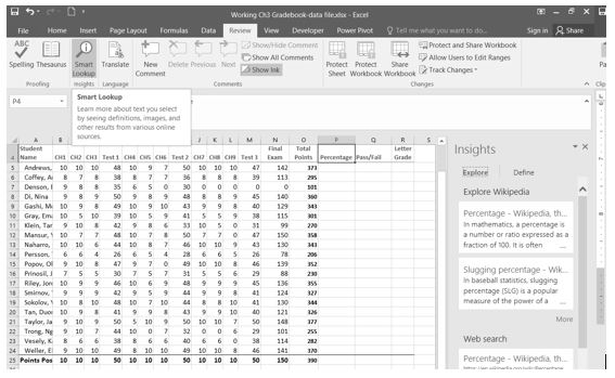
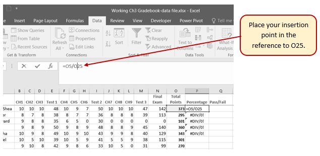
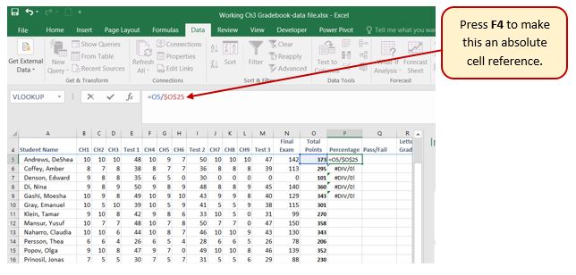
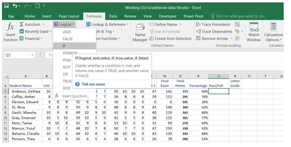
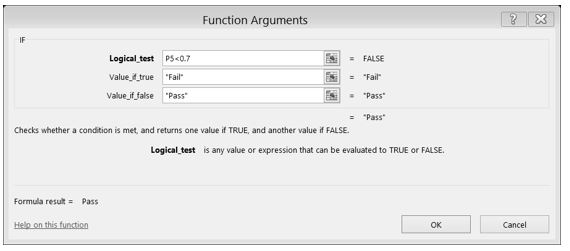
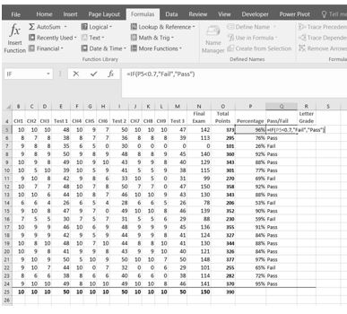
 to find the VLOOKUP function.
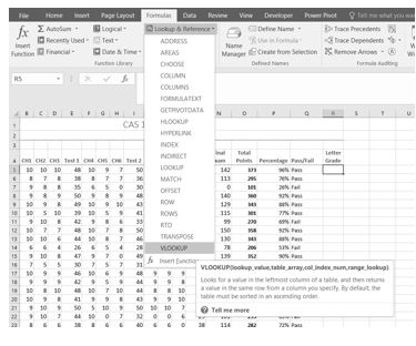

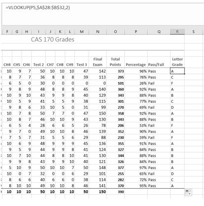
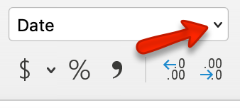
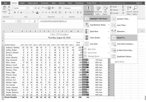
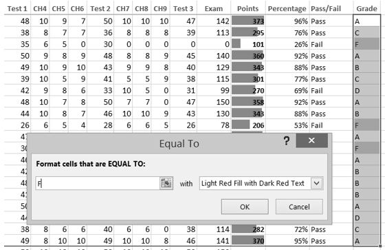
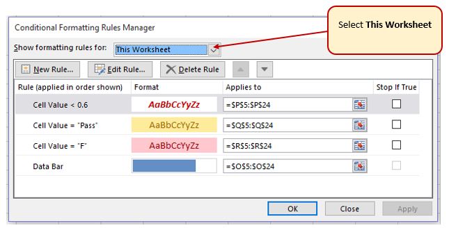
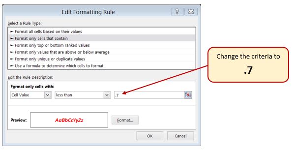
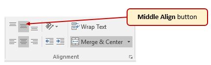
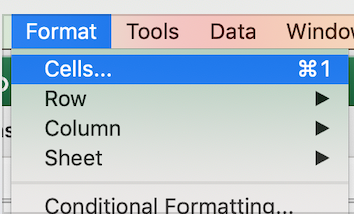 then continue with Steps 4 and 5
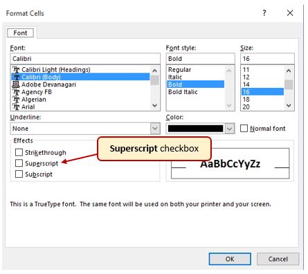
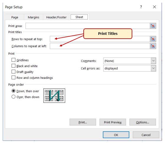
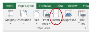
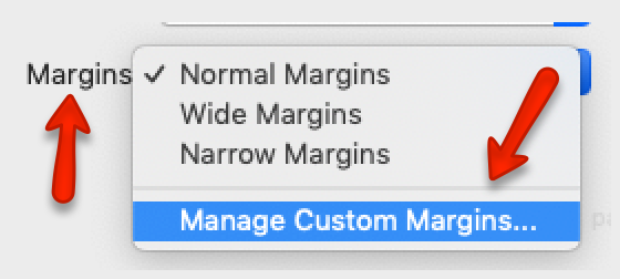
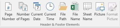
![Completed Footer formula centered: Page & [Page] of & [Pages].](https://openoregon.pressbooks.pub/app/uploads/sites/7/2016/09/image31-2.jpg)
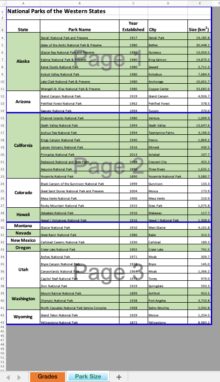
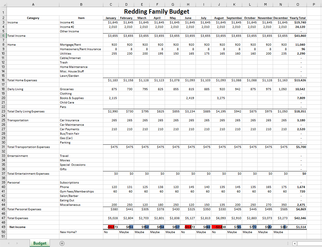
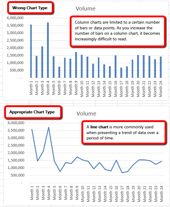
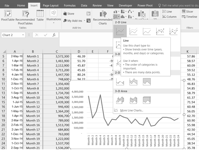
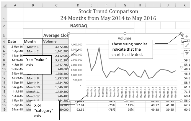
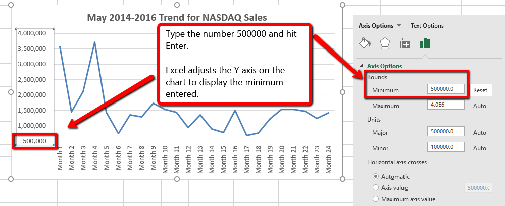
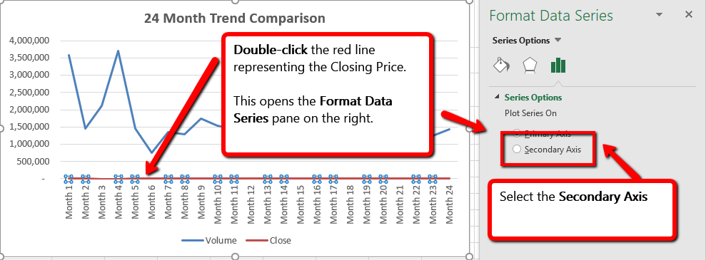
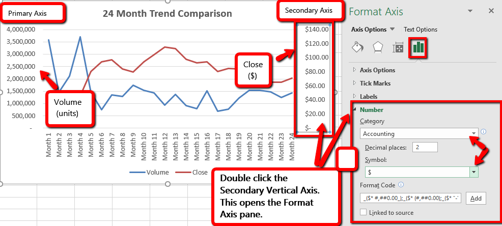
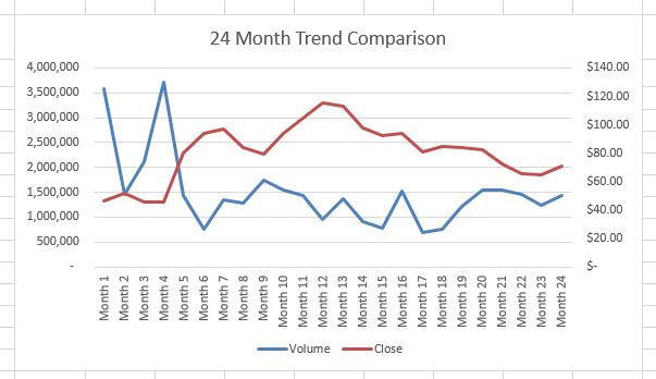
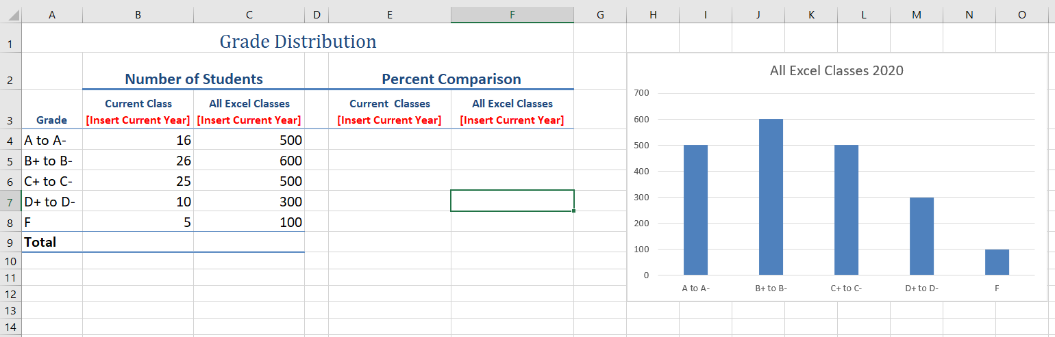
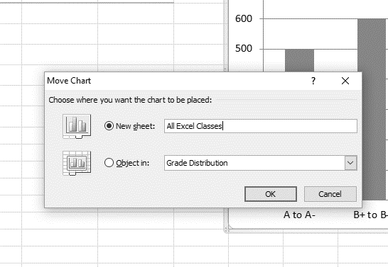
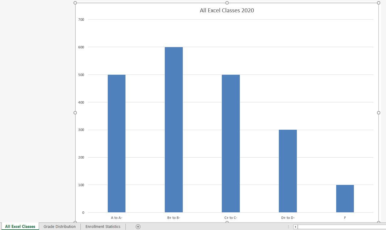
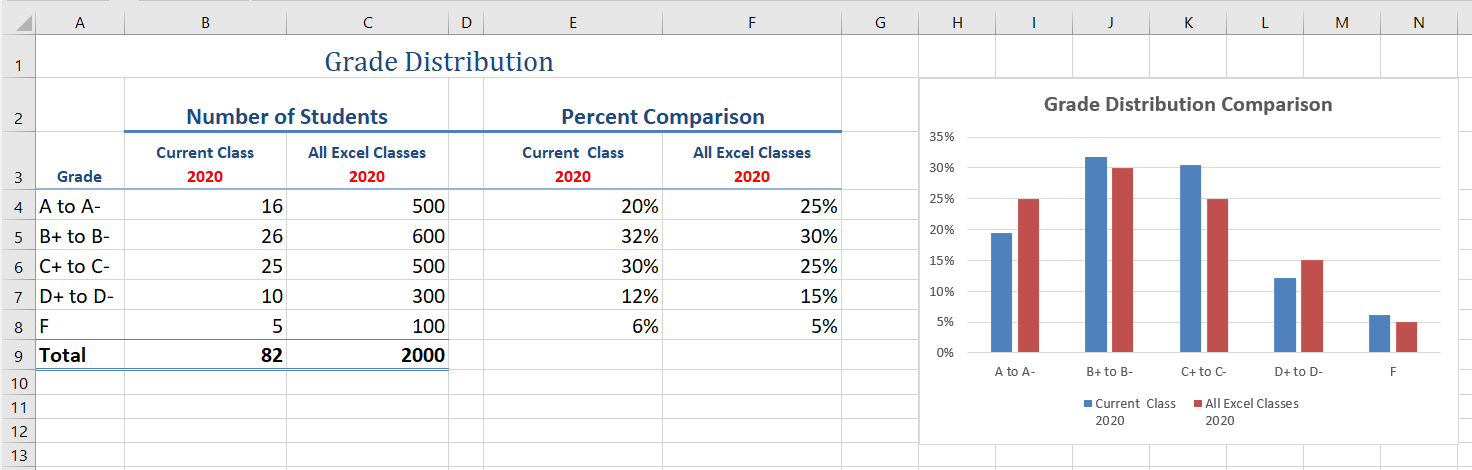
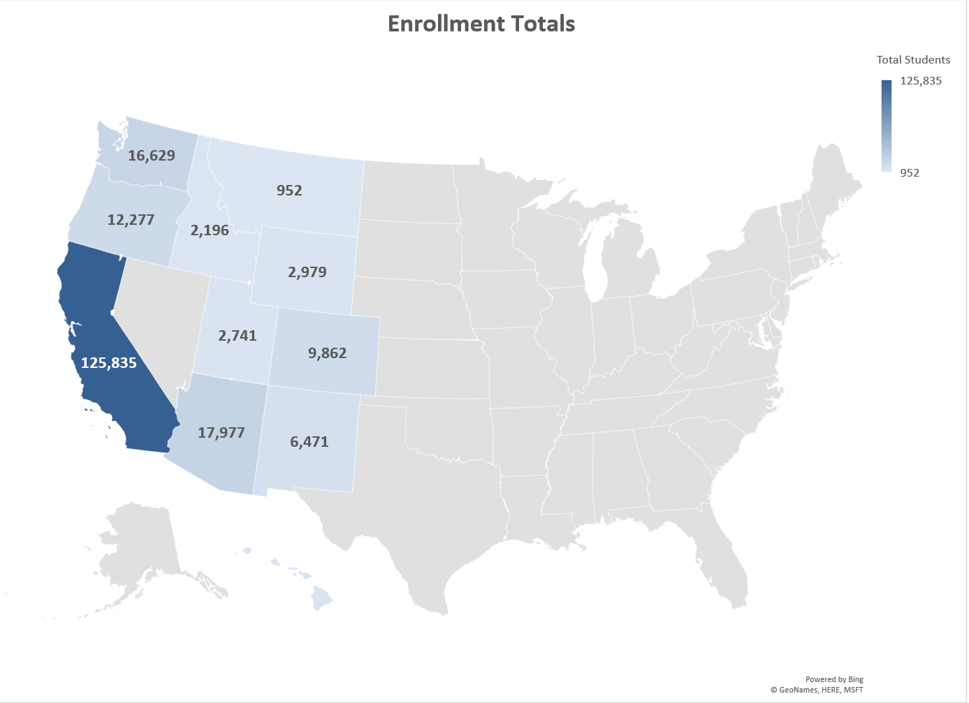


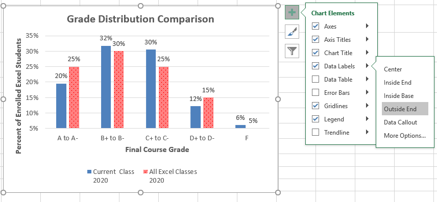

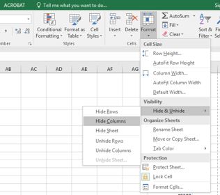

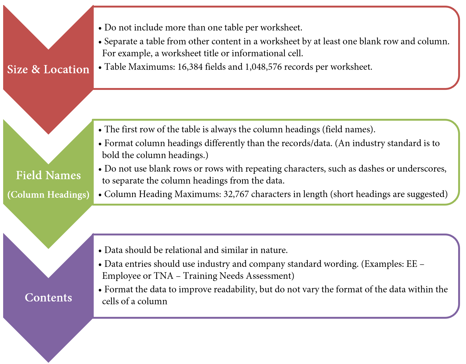
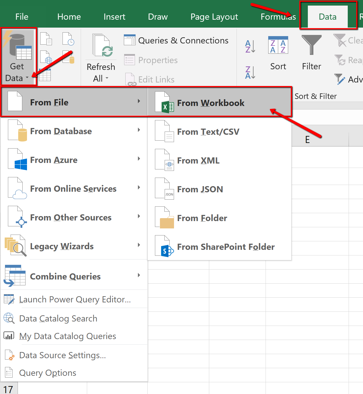
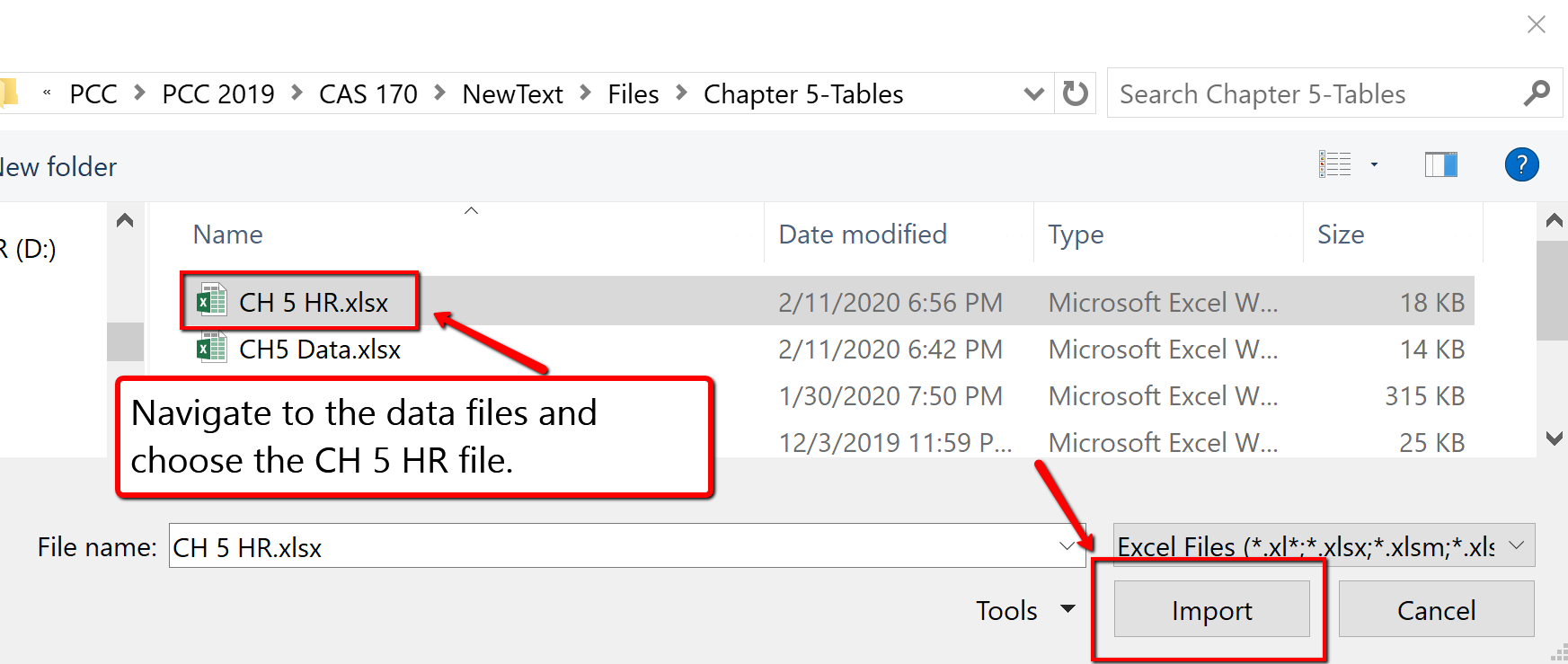
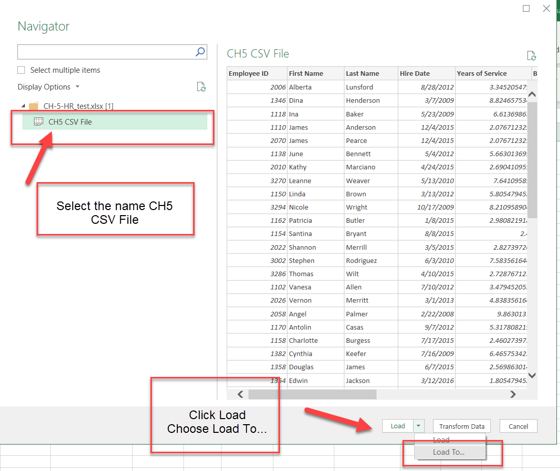
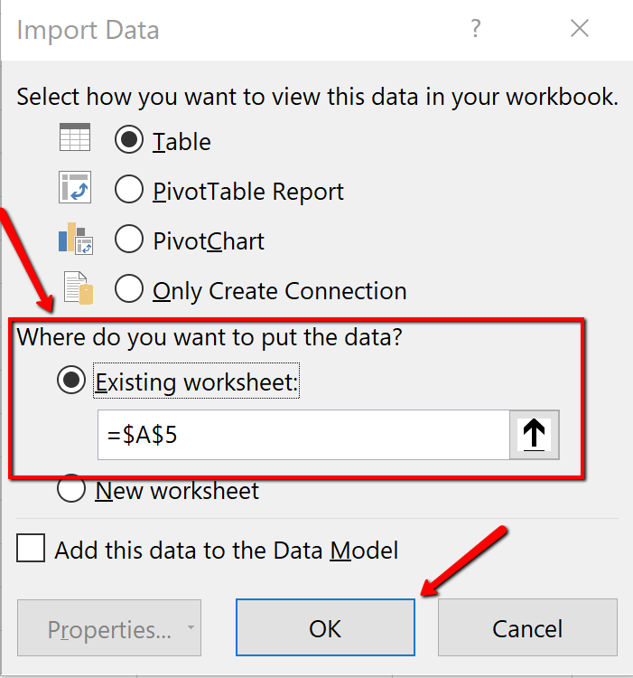
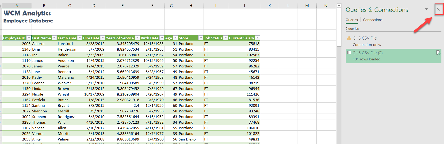
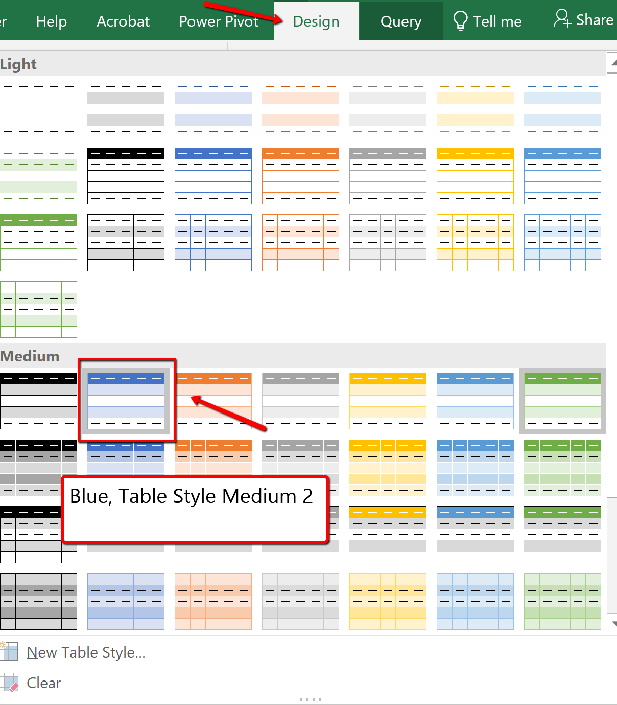
 under the View tab.
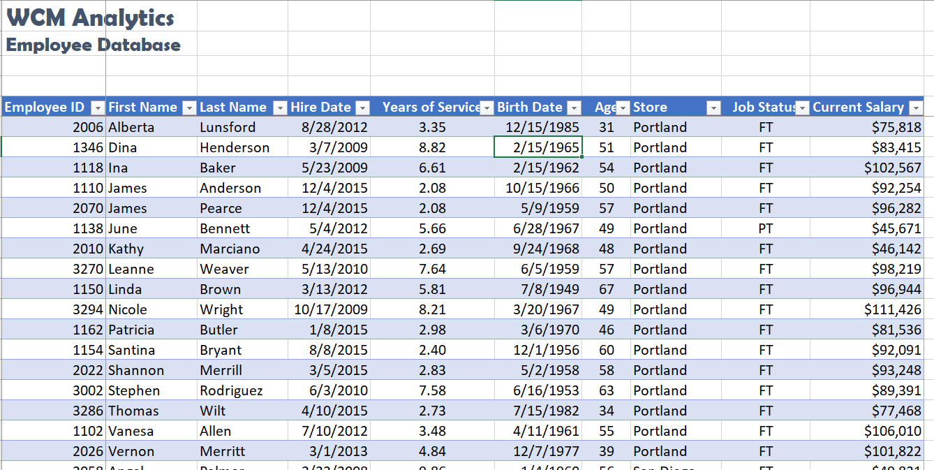
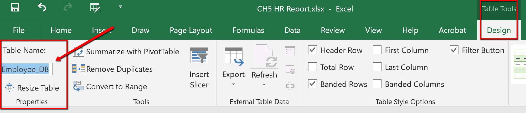
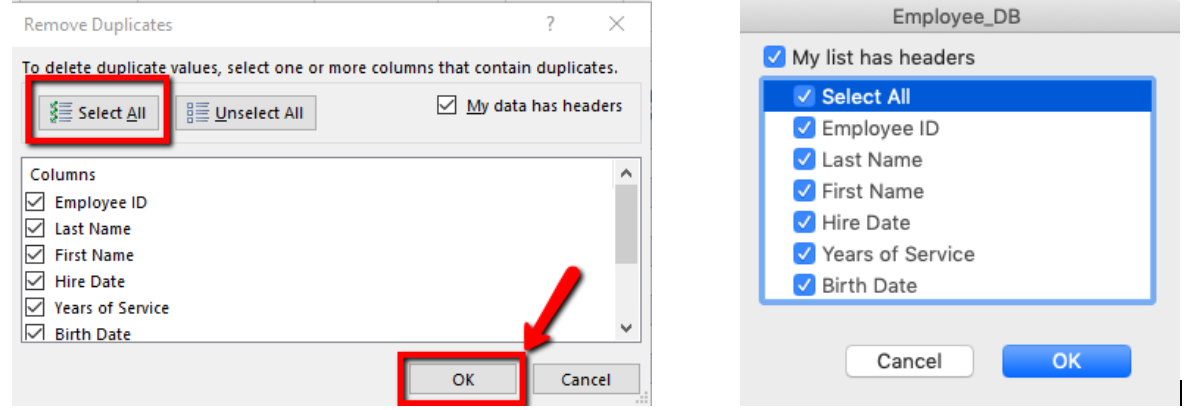
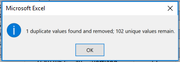
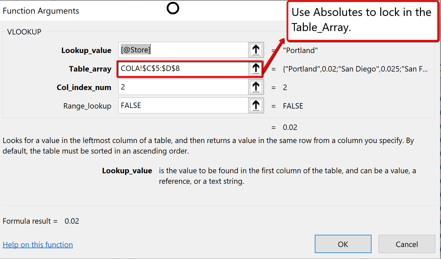
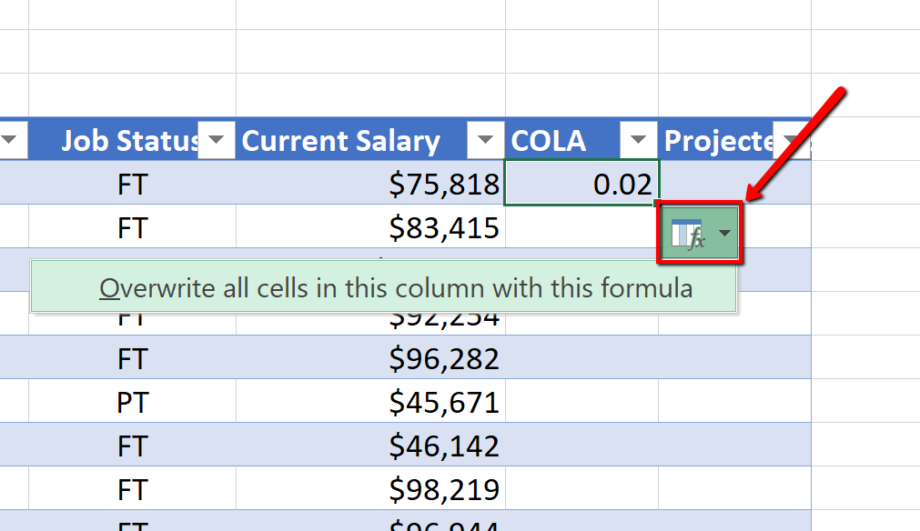
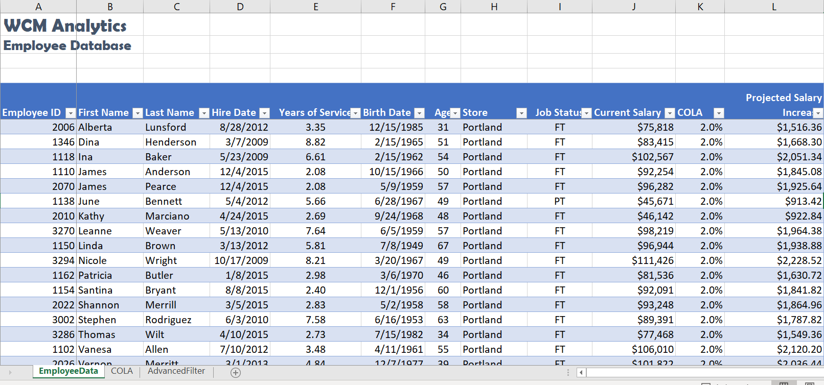
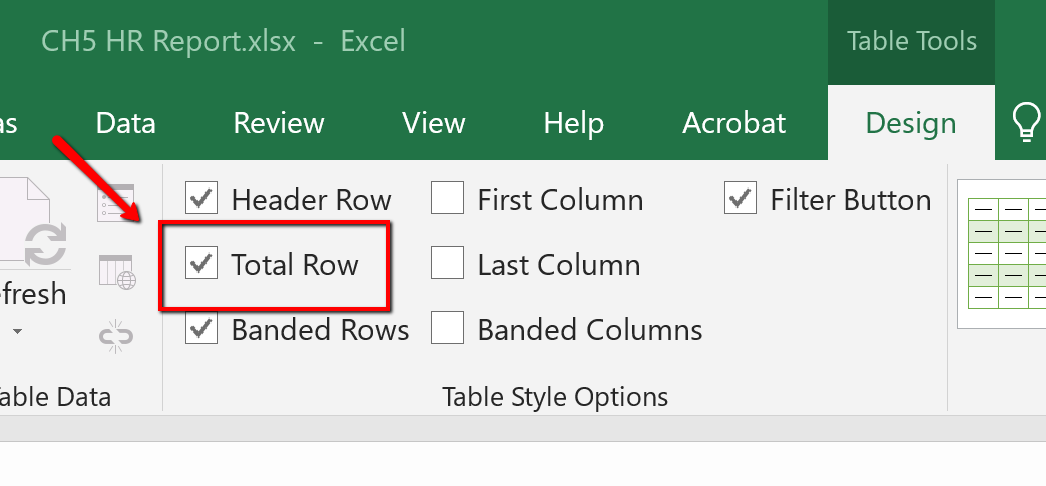
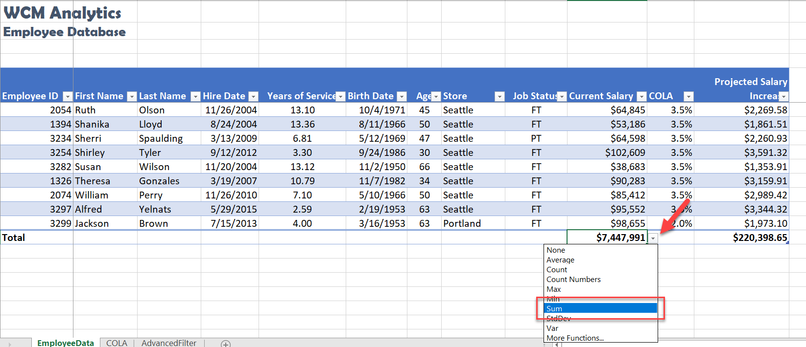
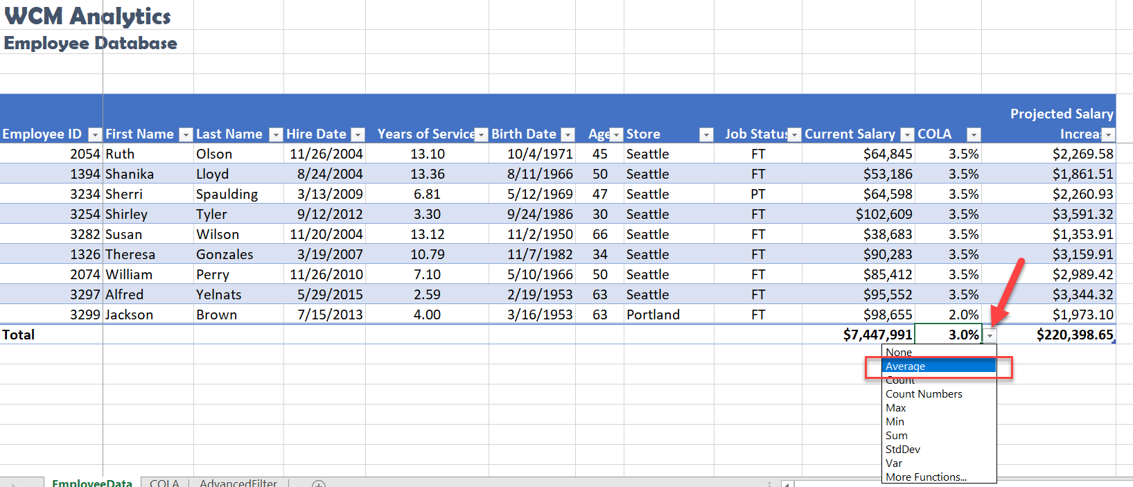
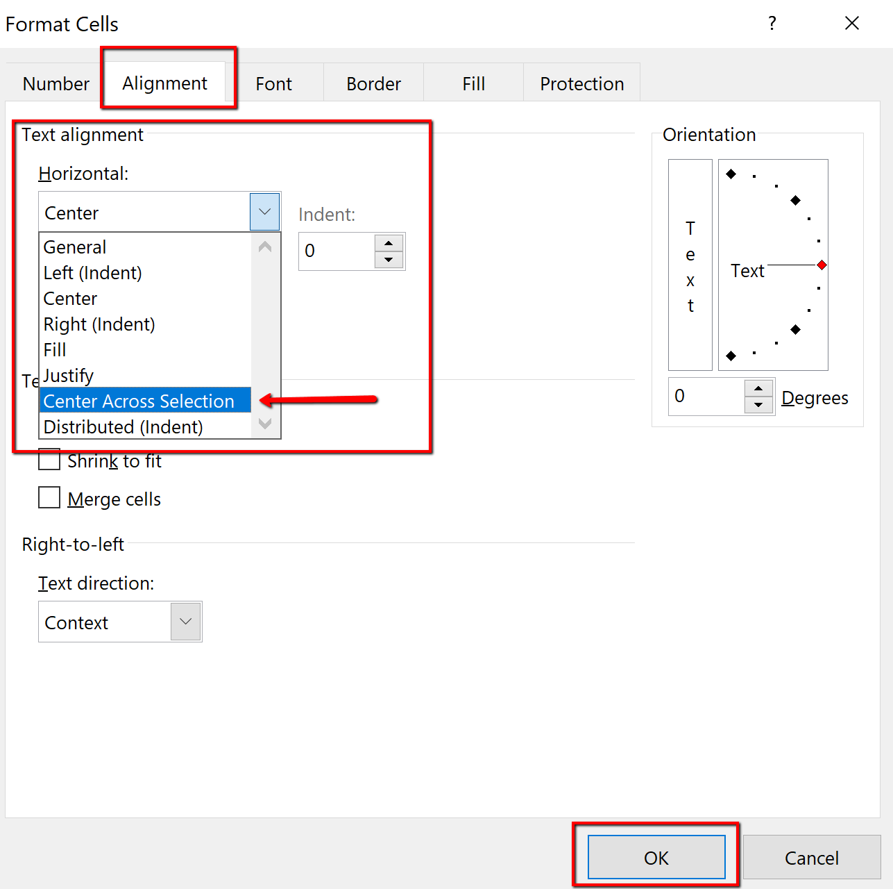
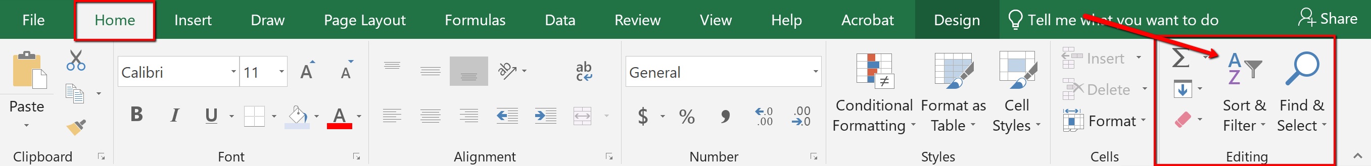
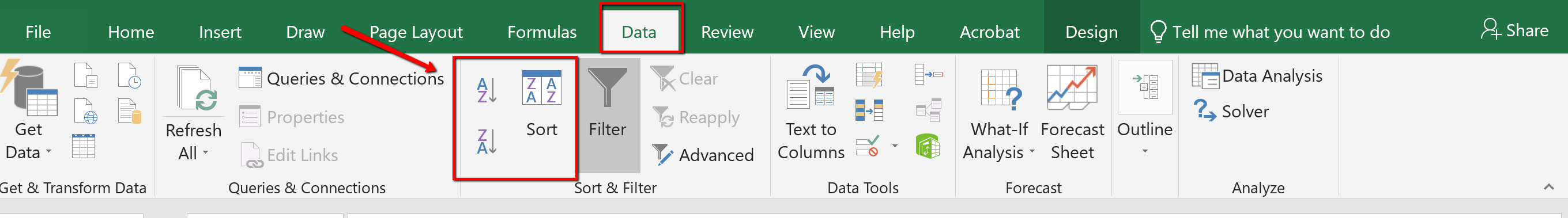
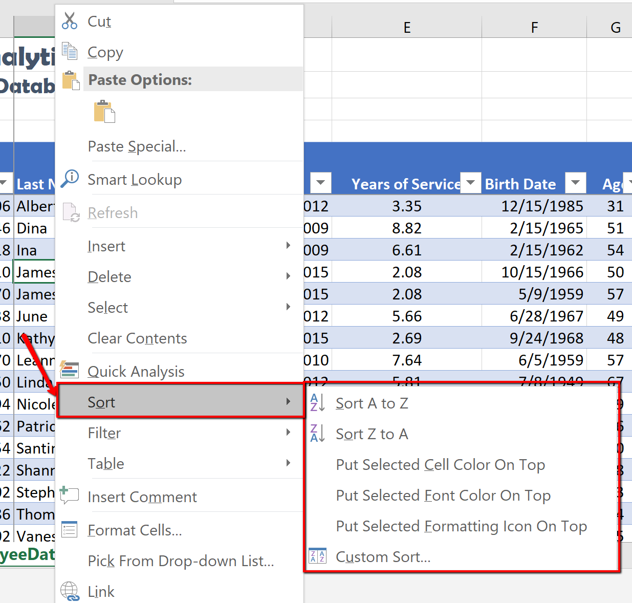
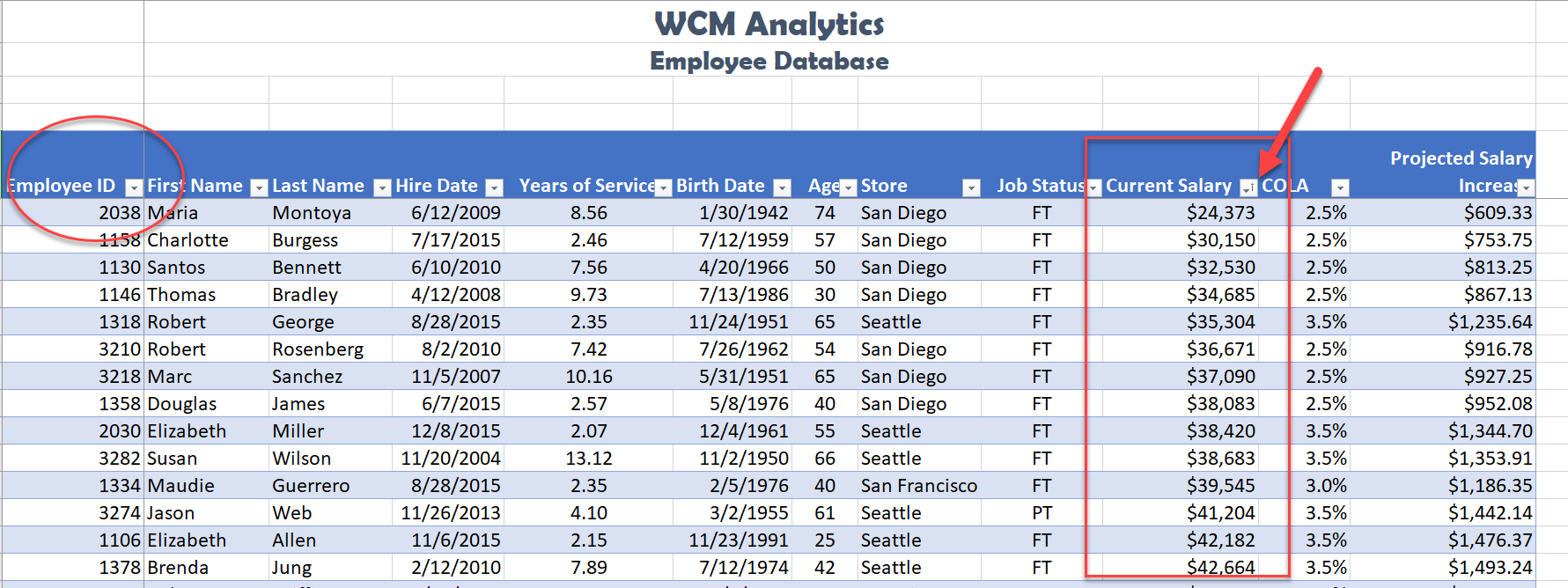
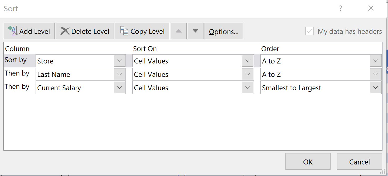
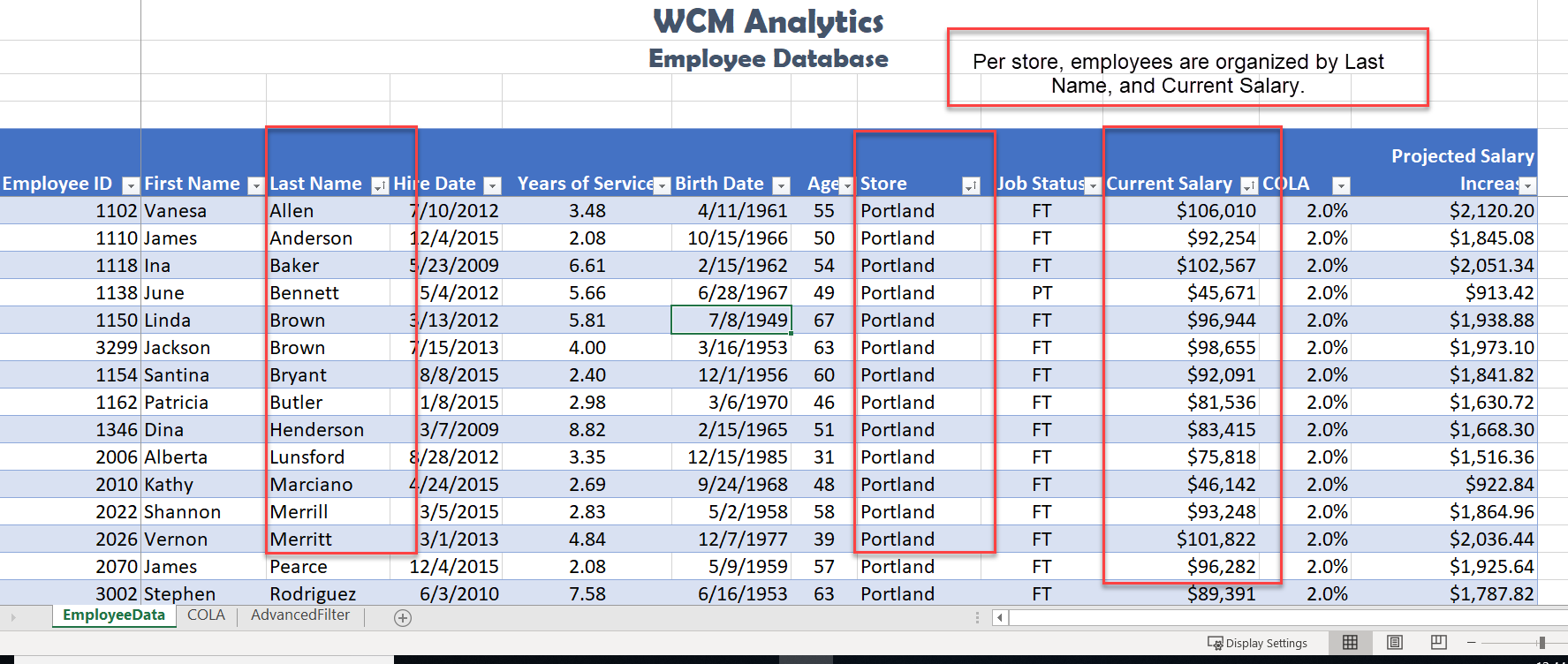
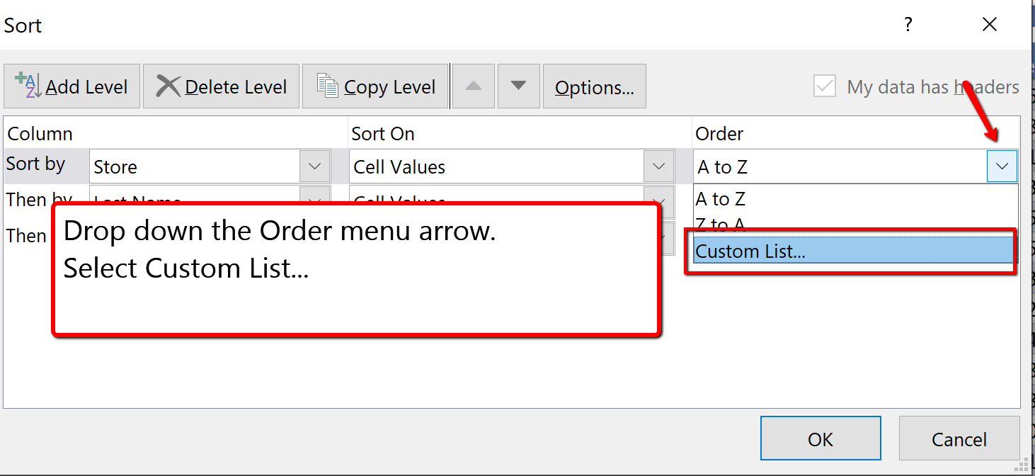
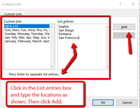
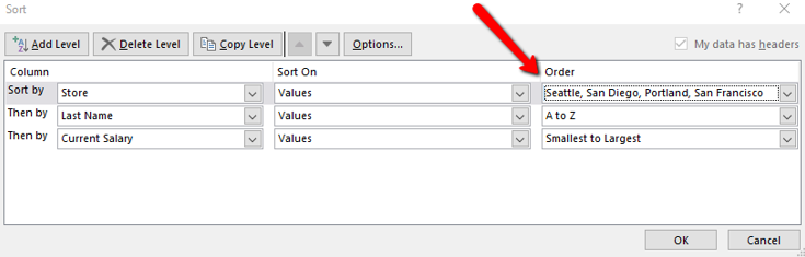
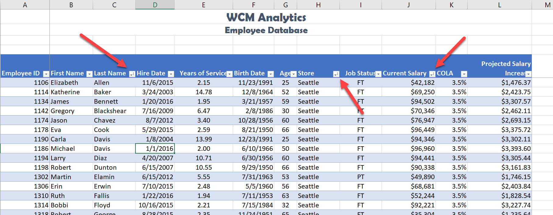
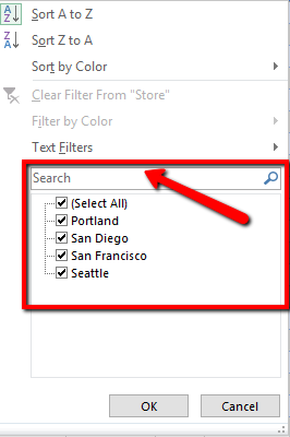
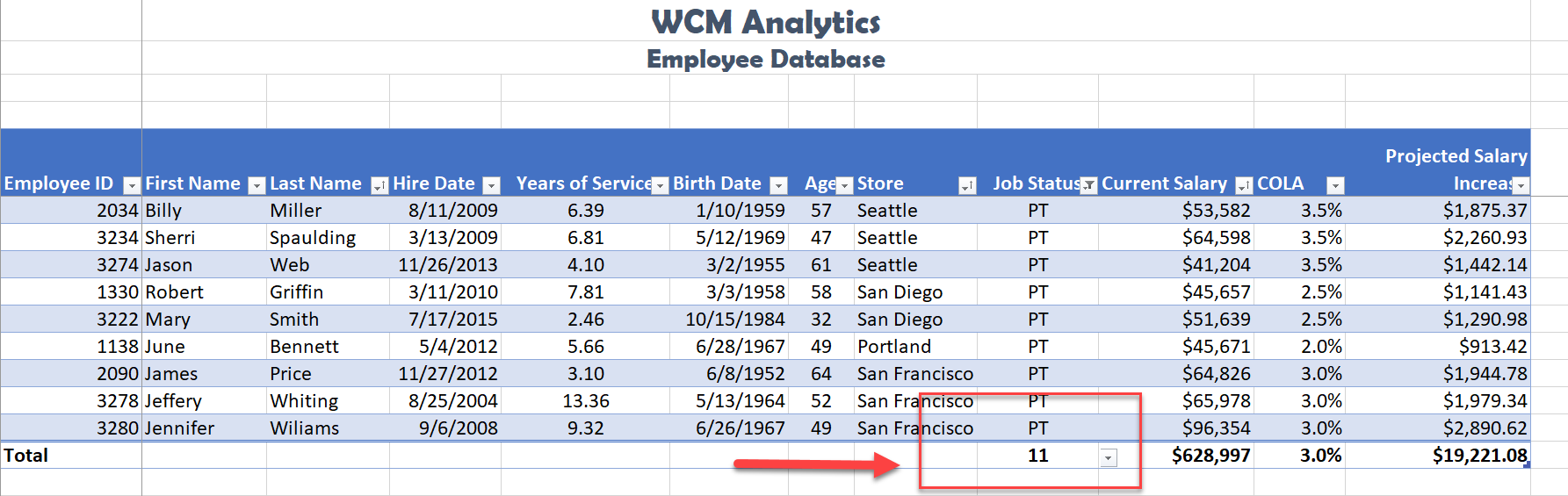
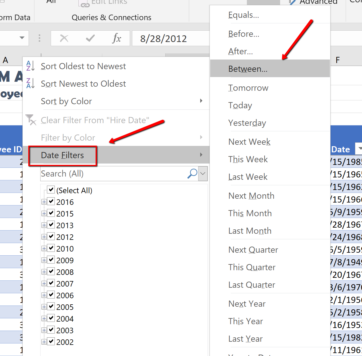
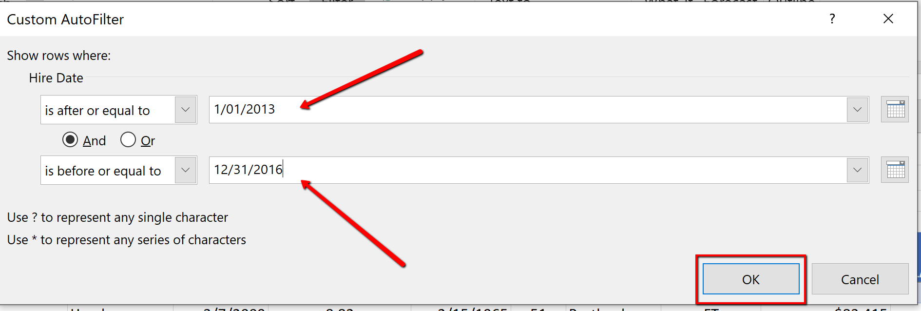
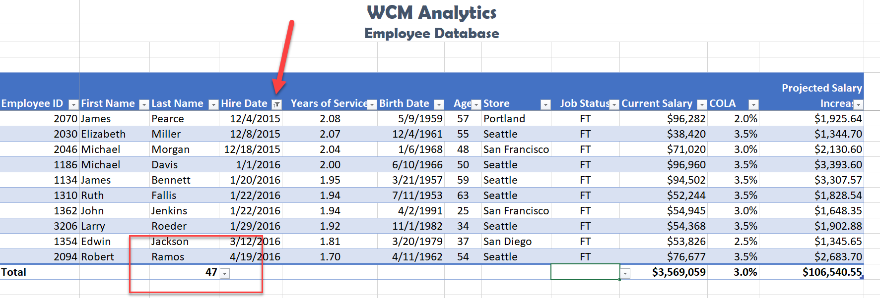
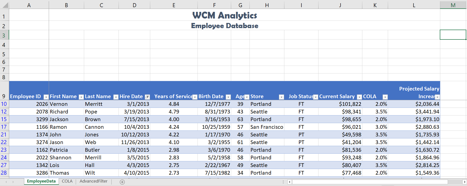
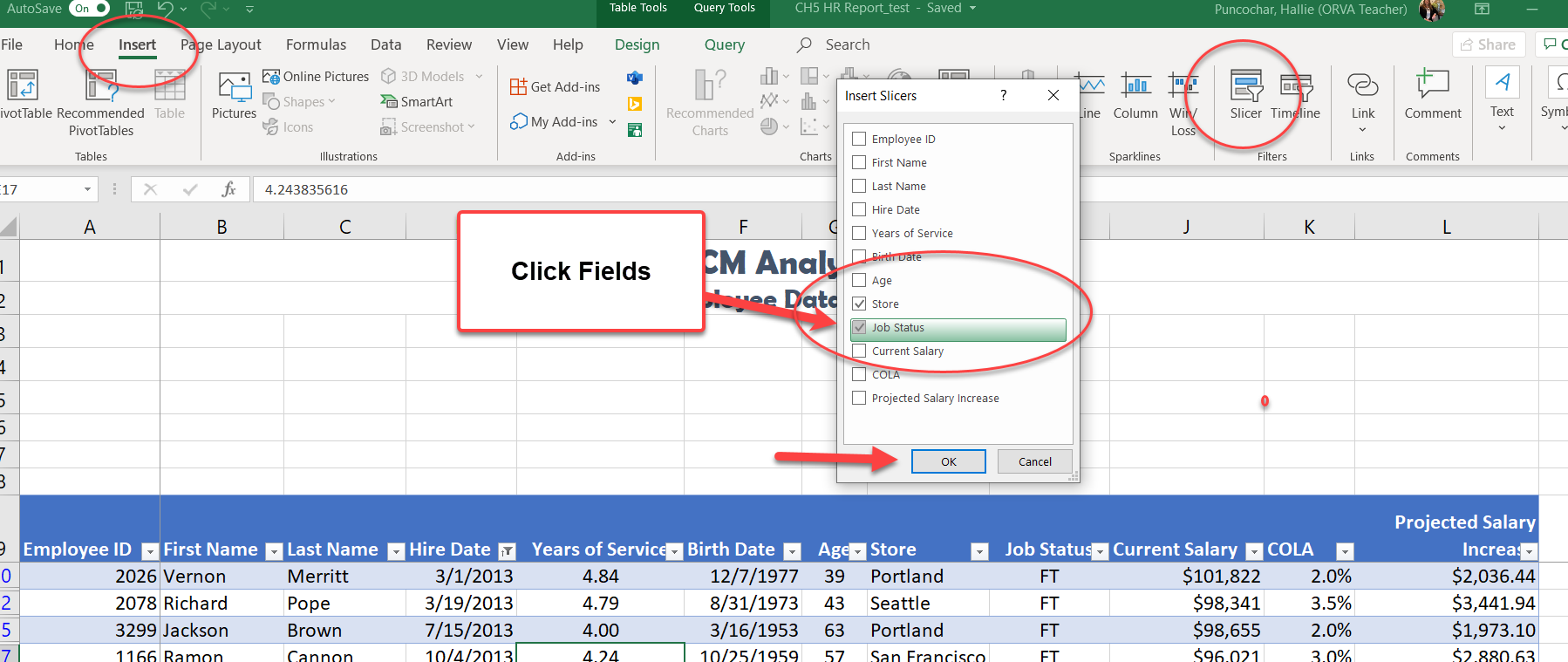
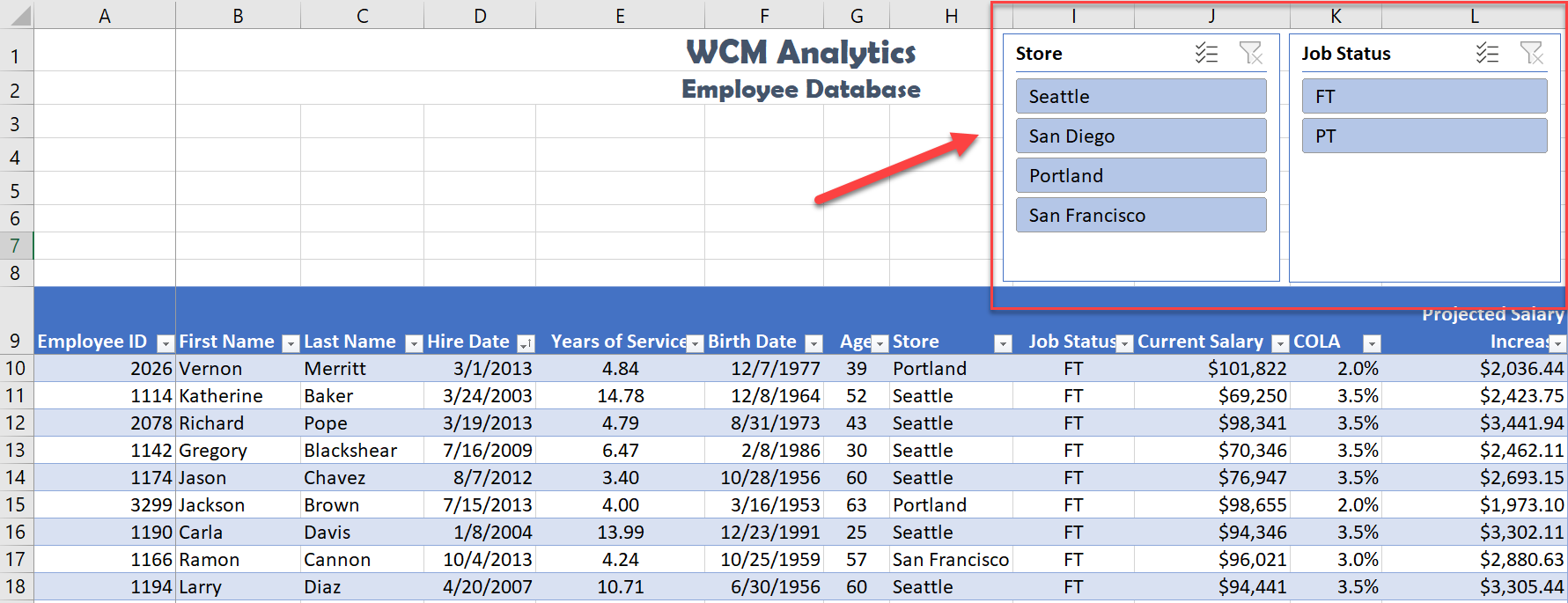
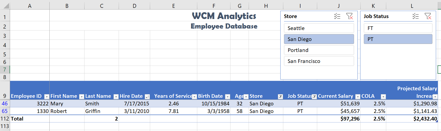
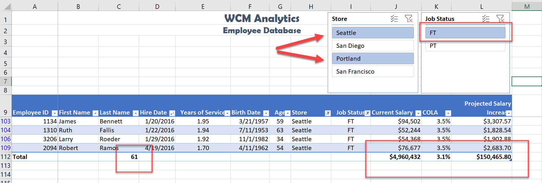
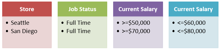
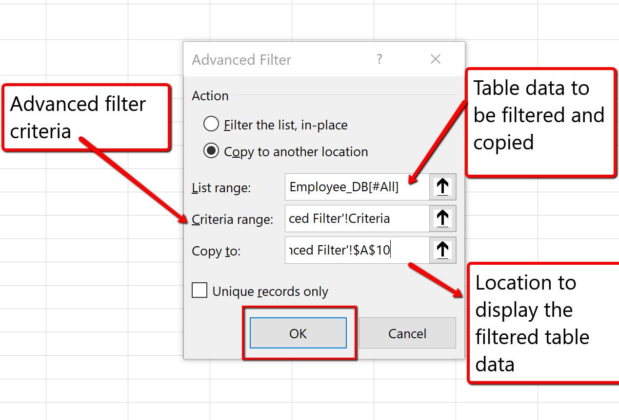
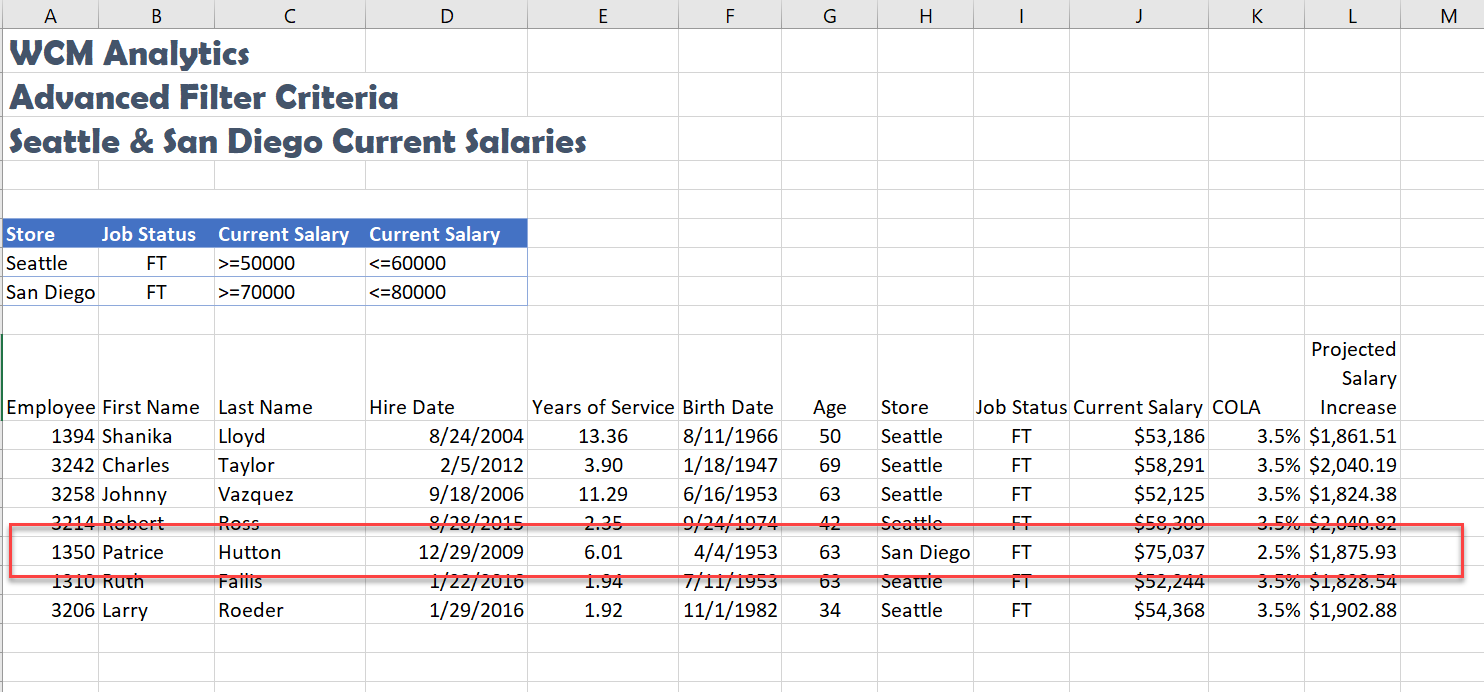
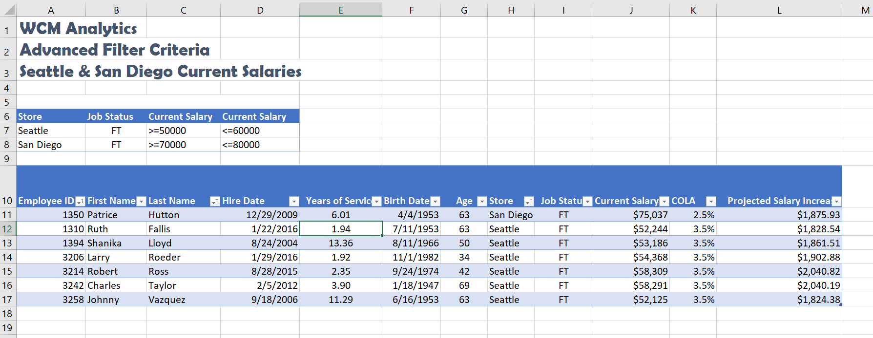
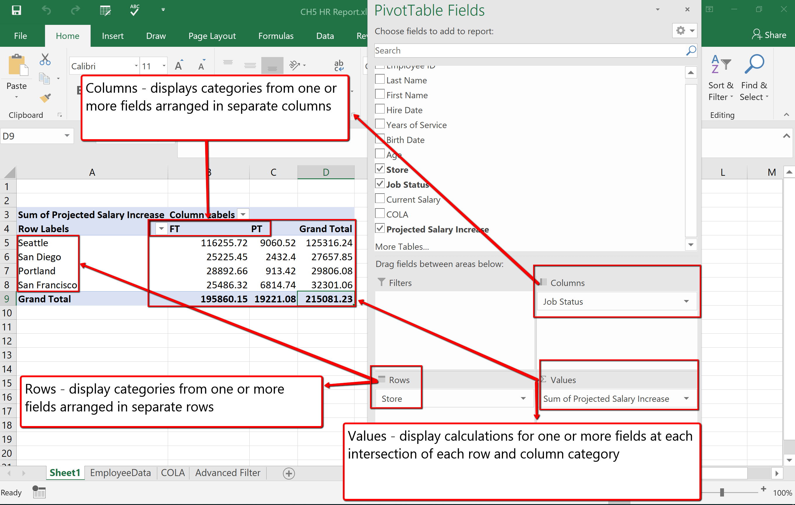
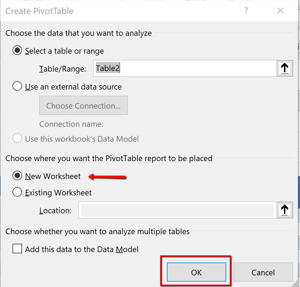
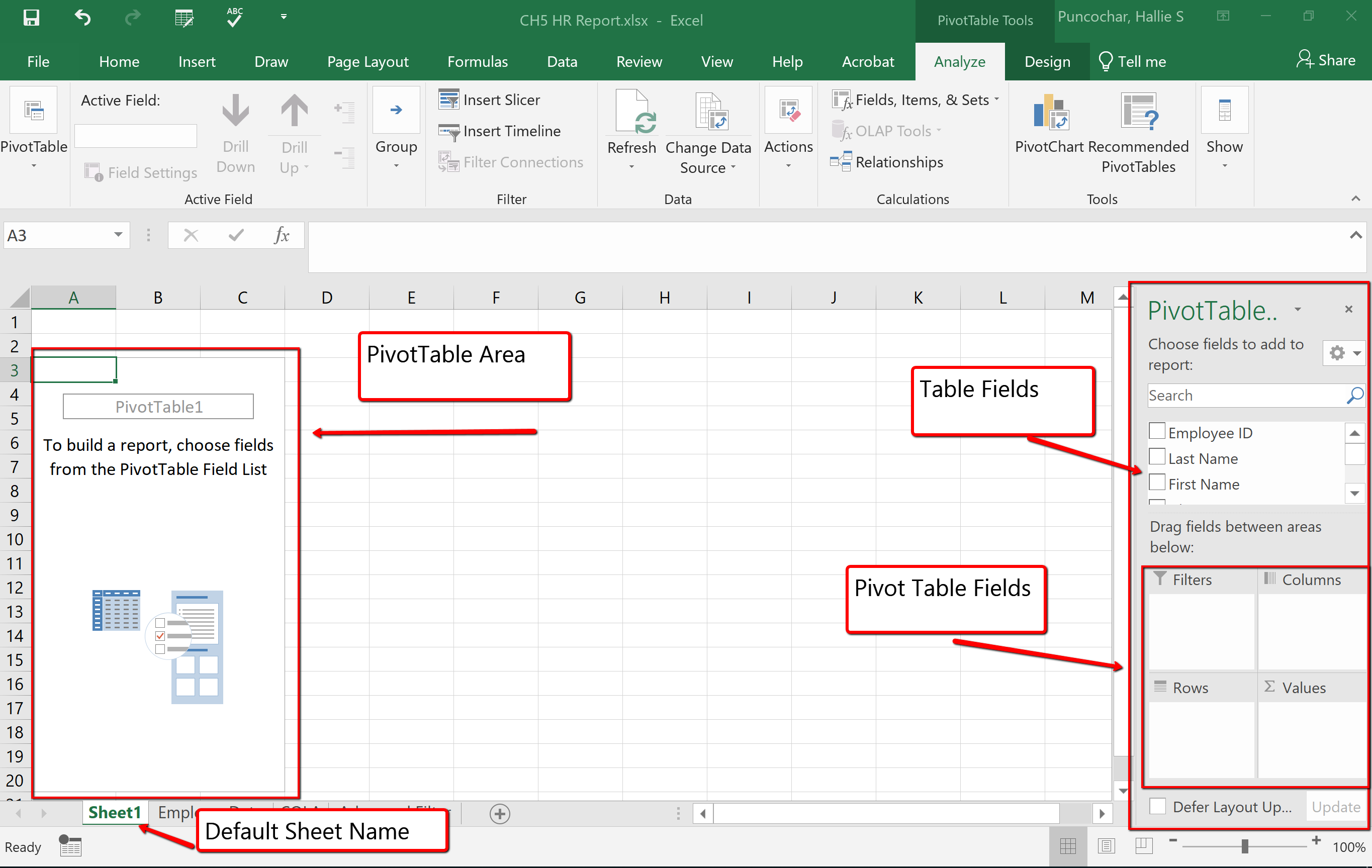
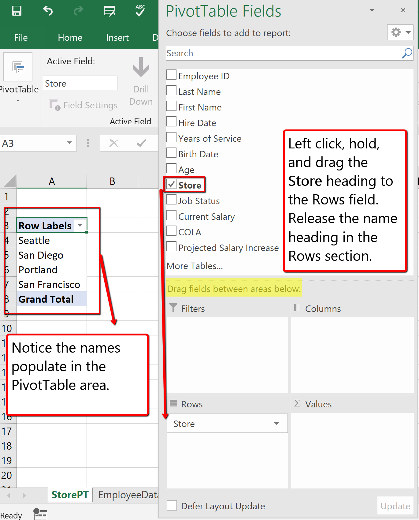
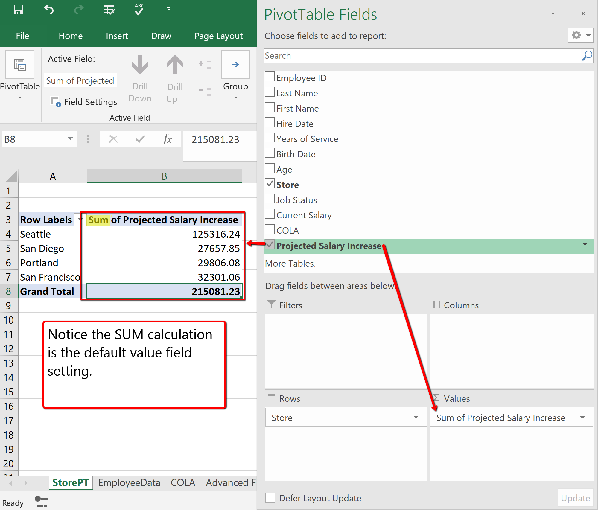
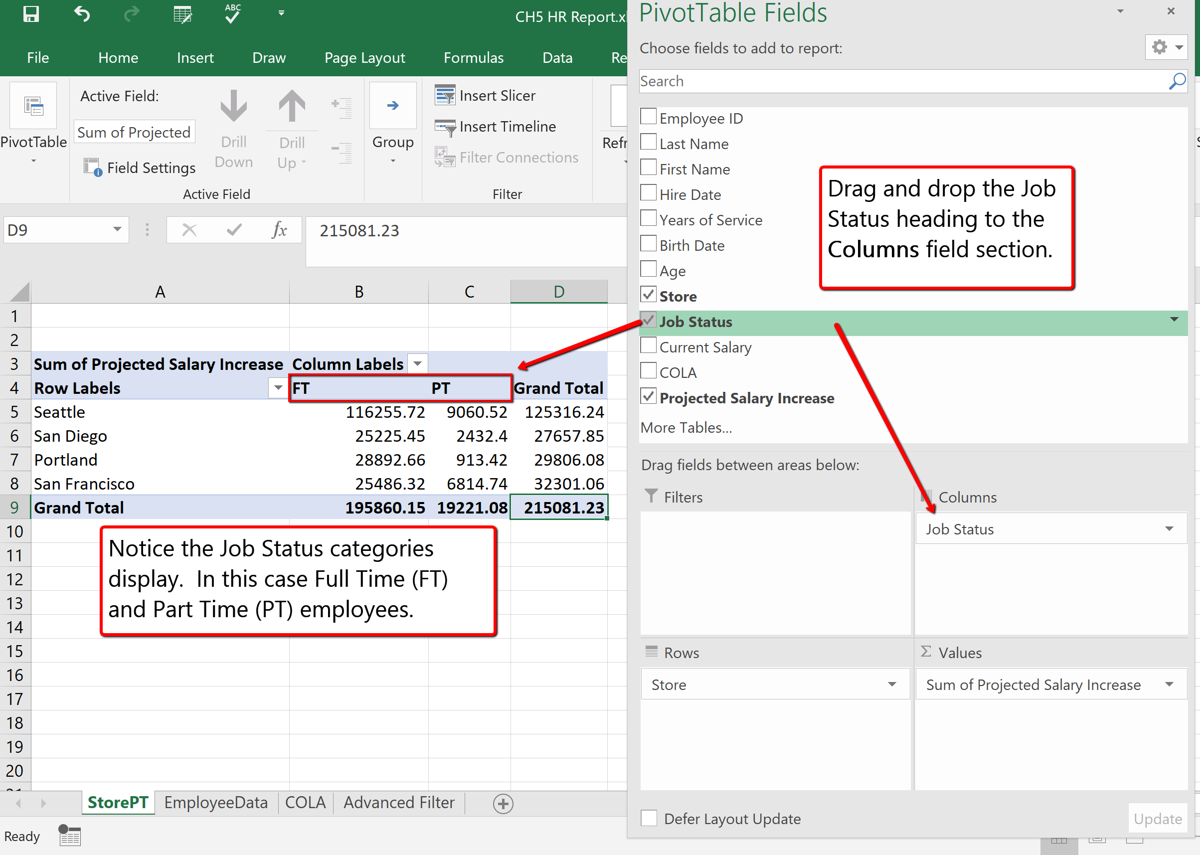
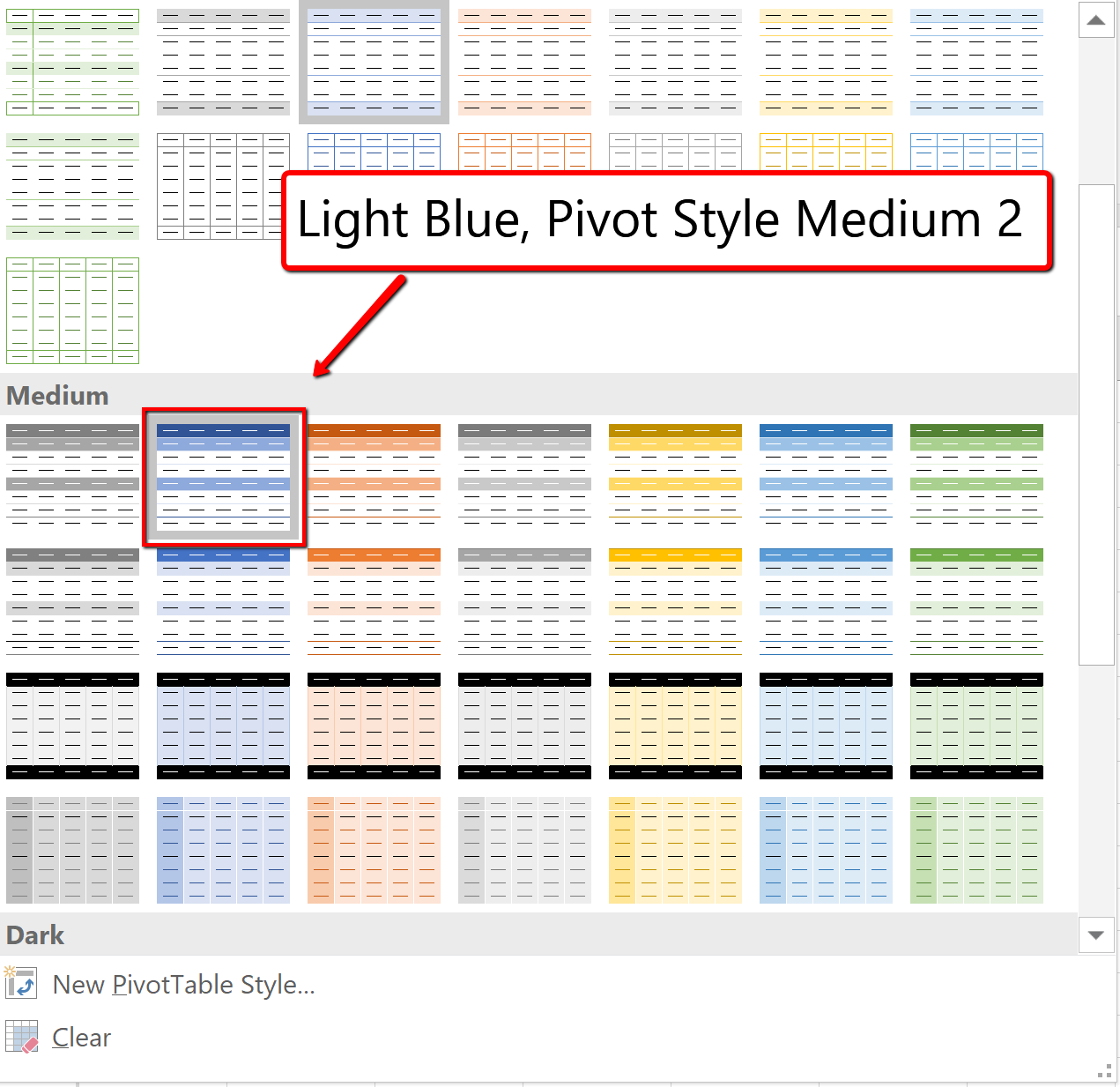
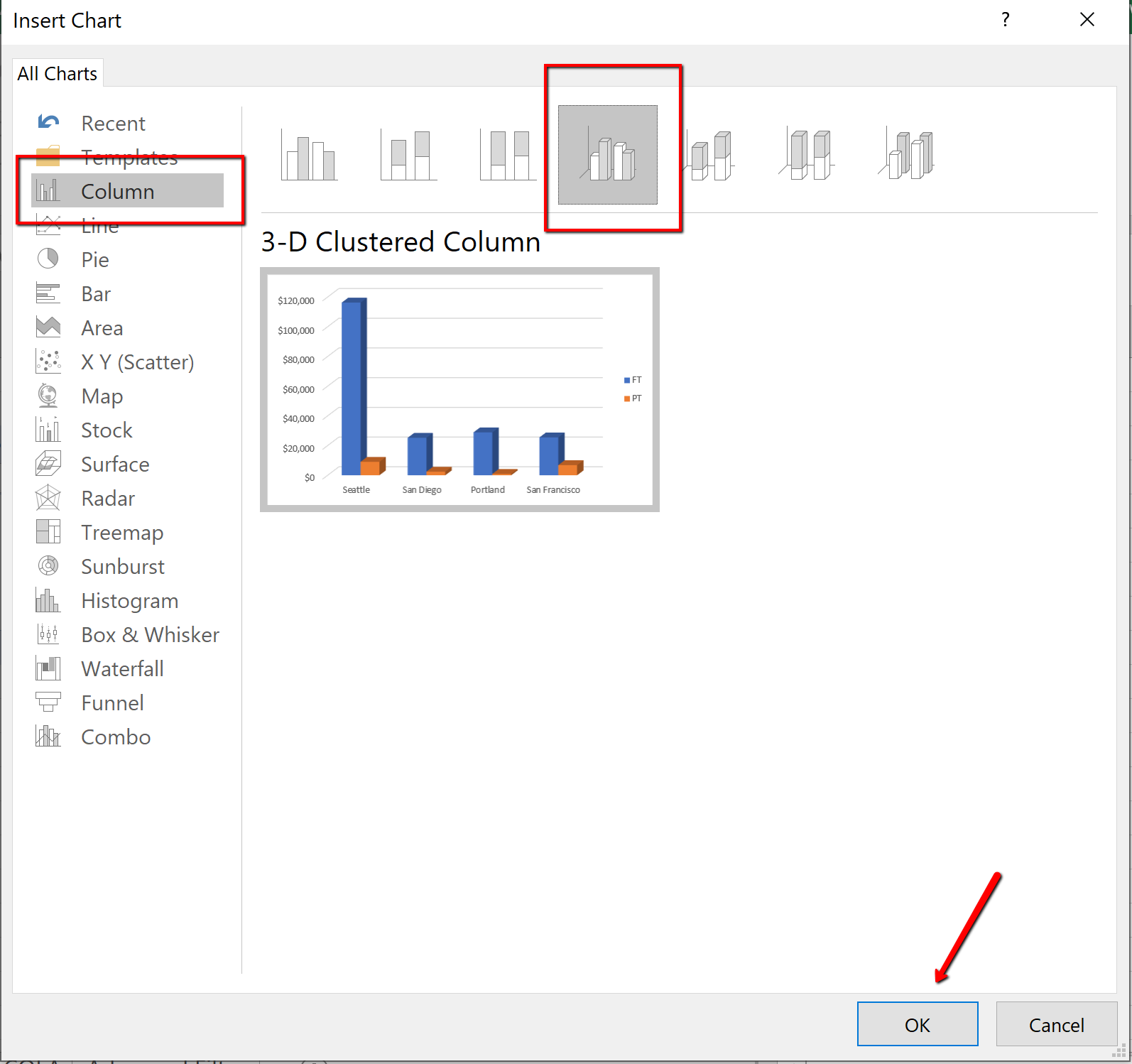
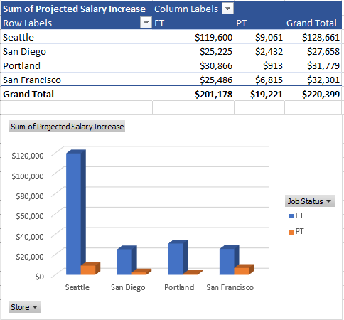
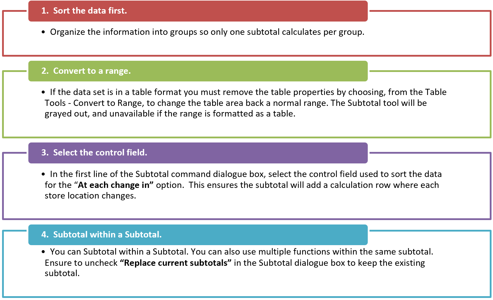
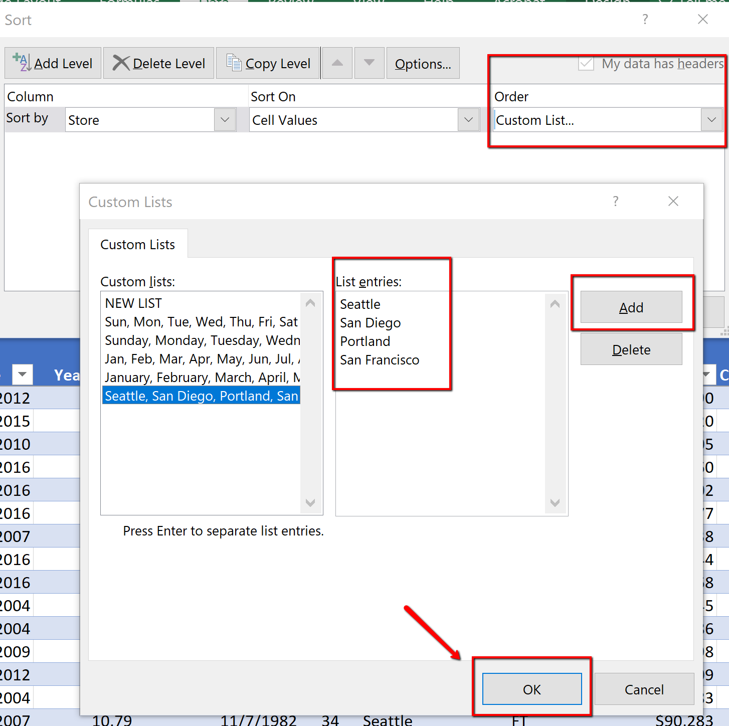
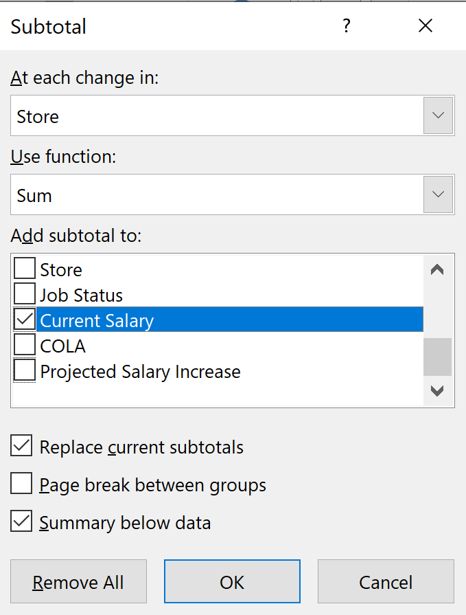
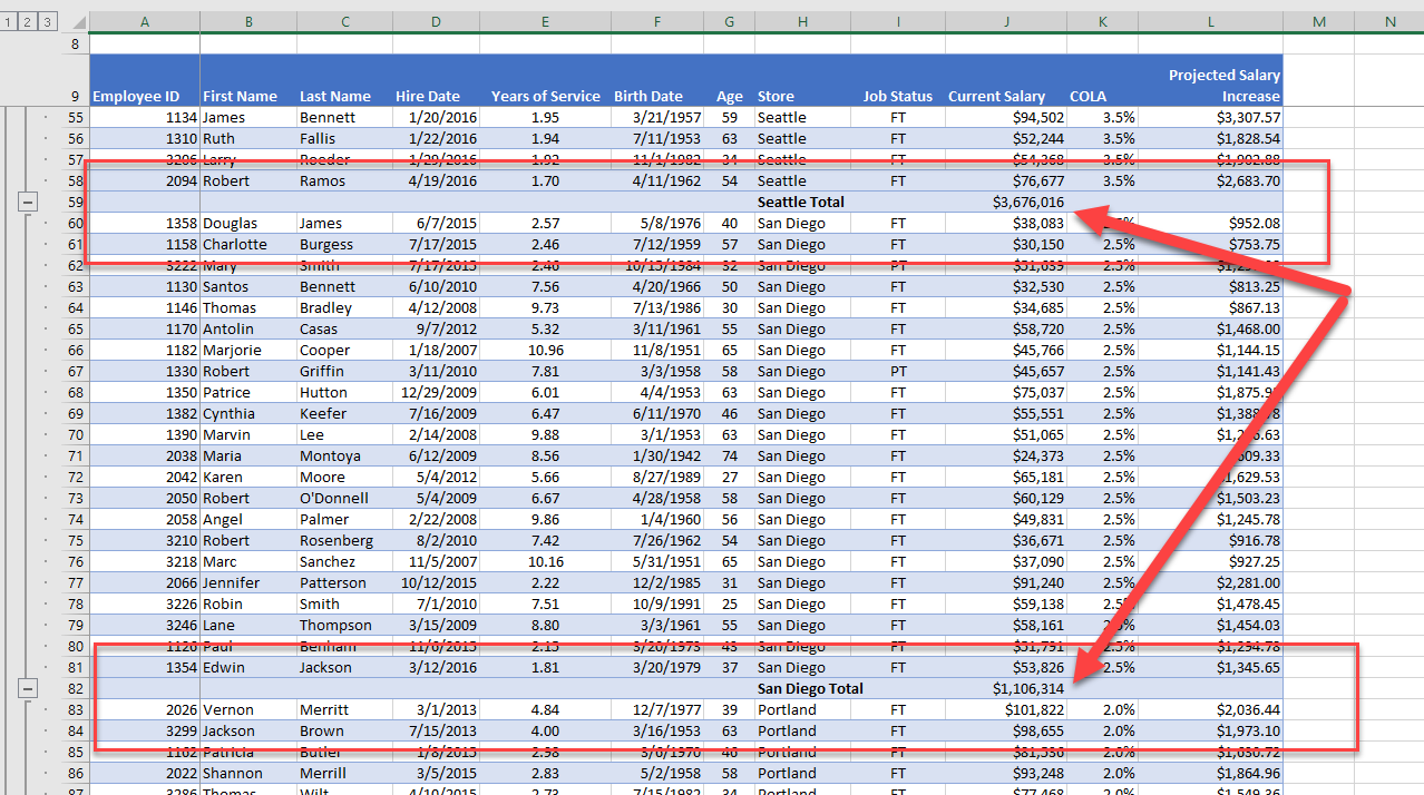
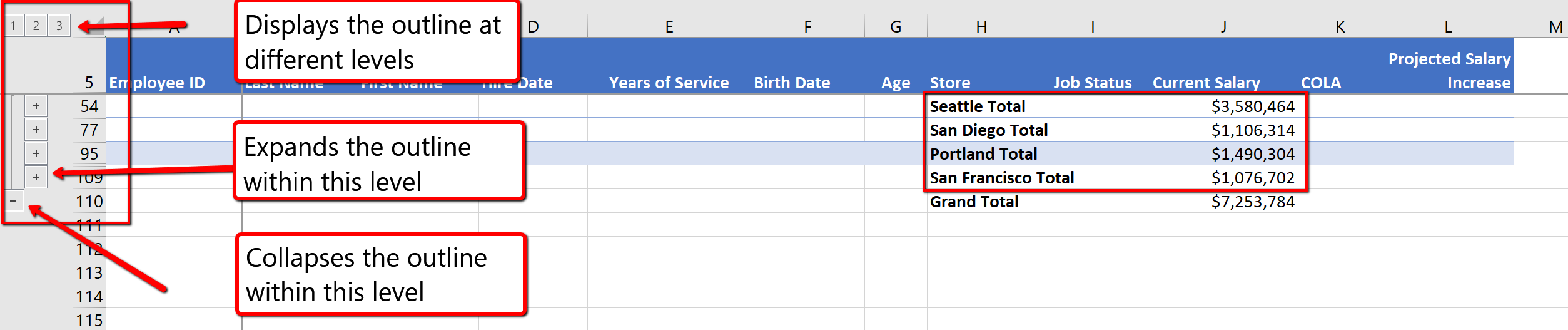
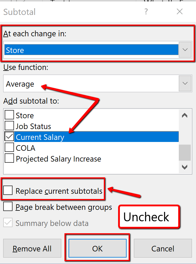


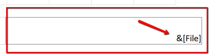
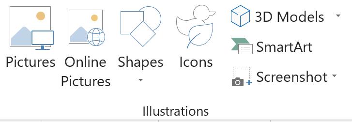
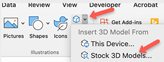


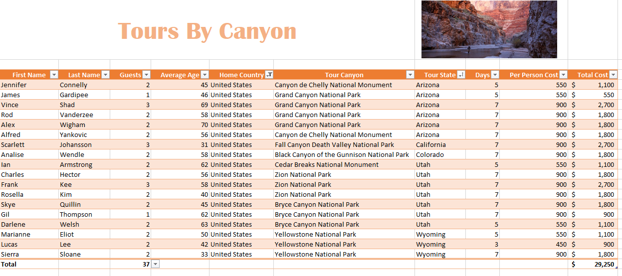
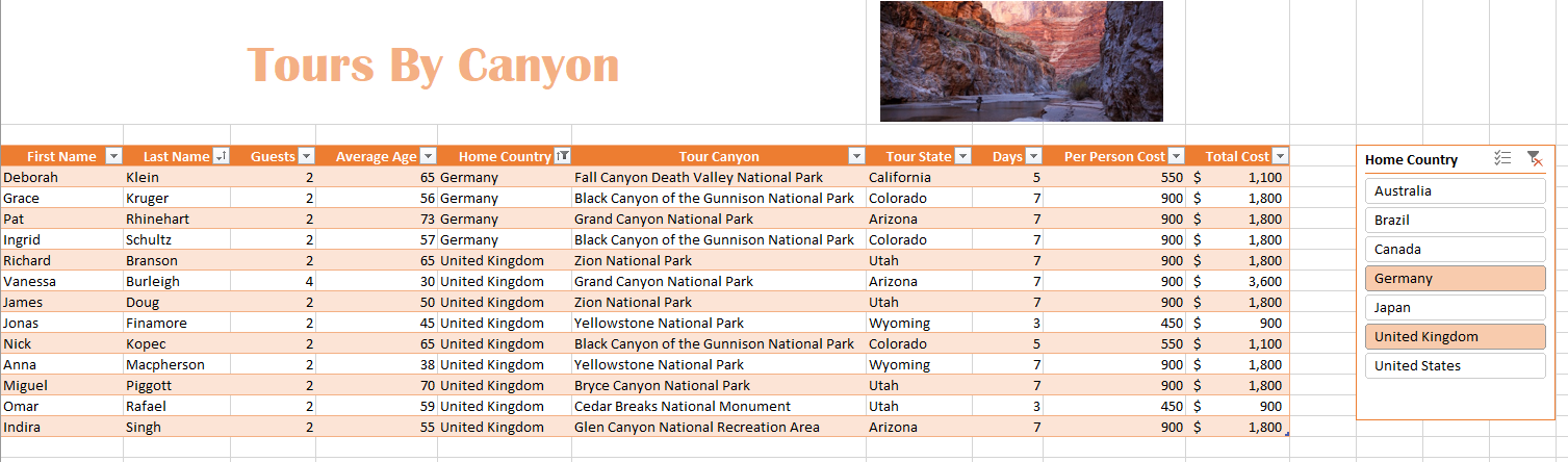
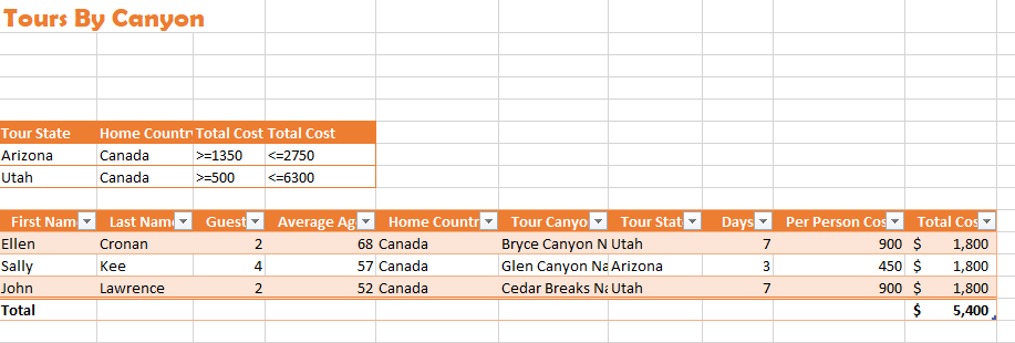
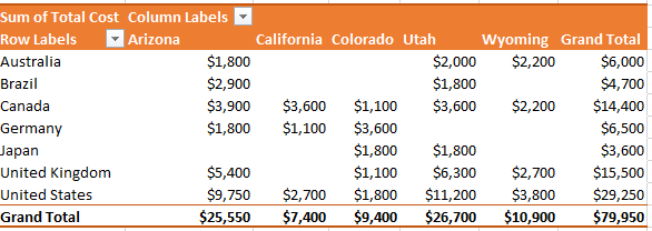
![Group of 12 months is circled in black and text is bold indicating they are grouped. [Group] is added to CH6 Personal Budget file name at top right.](https://openoregon.pressbooks.pub/app/uploads/sites/152/2020/06/Figure_6.4_Grouped_Sheets.png)

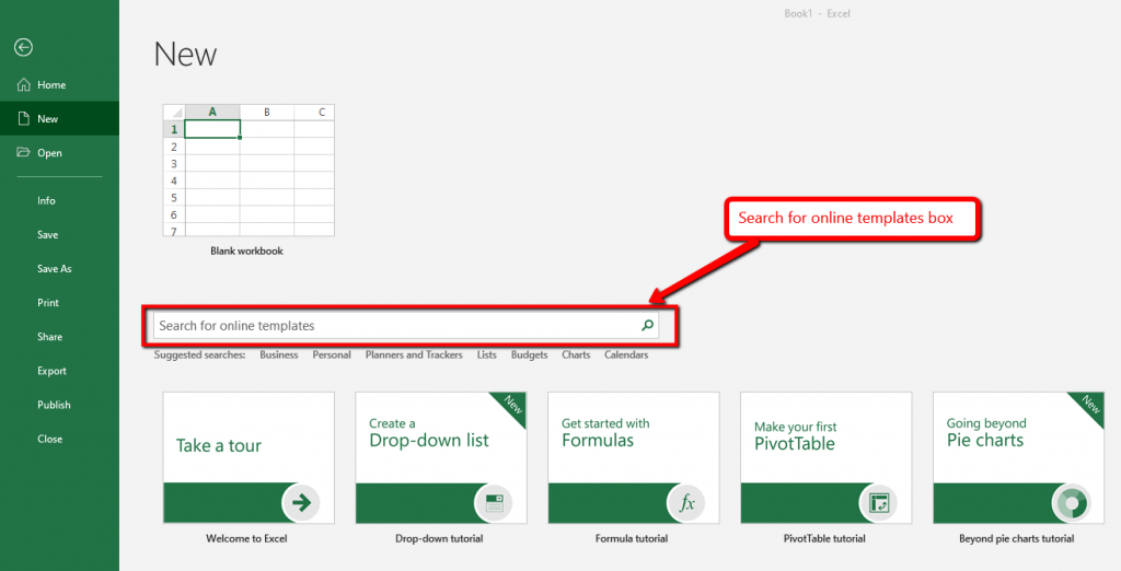

![Footer dialog box shows options with 3 fields below: Left section, Center section, Right section. Center section is only one with data "&[Tab]".](https://openoregon.pressbooks.pub/app/uploads/sites/152/2016/10/Figure_6.12_Insert_Worksheet_Name.png)