Introductory Business Statistics with Interactive Spreadsheets - 1st Canadian Edition

Introductory Business Statistics with Interactive Spreadsheets - 1st Canadian Edition

Using Interactive Microsoft Excel Templates

Mohammad Mahbobi and Thomas K. Tiemann

Mohammad Mahbobi

BCcampus

Victoria, B.C.

1

Dedication

The adapted version of this textbook is dedicated to my father, Ghasemali, for his support and encouragement, and especially for the opportunities that he opened up for me when I was in high school, and to my wife, Maryam, with whom I share credit for every goal I have achieved.

– Mohammad Mahbobi

Contents

2

About the Book

About this Adaptation

Introductory Business Statistics with Interactive Spreadsheets – 1st Canadian Edition was adapted by Mohammad Mahbobi from Thomas K. Tiemann’s textbook, Introductory Business Statistics. For information about what was changed in this adaptation, refer to the copyright statement at the bottom of the home page. This adaptation was funded by BCcampus Open Education.

BCcampus Open Education began in 2012 as the B.C. Open Textbook Project with the goal of making post-secondary education in British Columbia more accessible by reducing students’ costs through the use of open textbooks and other OER. BCcampus supports the post-secondary institutions of British Columbia as they adapt and evolve their teaching and learning practices to enable powerful learning opportunities for the students of B.C. BCcampus Open Education is funded by the British Columbia Ministry of Advanced Education, Skills & Training, and the Hewlett Foundation.

Open educational resources (OER) are teaching, learning, and research resources that, through permissions granted by the copyright holder, allow others to use, distribute, keep, or make changes to them. Our open textbooks are openly licensed using a Creative Commons licence, and are offered in various e-book formats free of charge, or as printed books that are available at cost.

For more information about open education in British Columbia, please visit the BCcampus Open Education website. If you are an instructor who is using this book for a course, please fill out our Adoption of an Open Textbook form.

A note from the original author: Thomas K. Tiemann

I have been teaching introductory statistics to undergraduate economics and business students for almost 30 years. When I took the course as an undergraduate, before computers were widely available to students, we had lots of homework, and learned how to do the arithmetic needed to get the mathematical answer. When I got to graduate school, I found out that I did not have any idea of how statistics worked, or what test to use in what situation. The first few times I taught the course, I stressed learning what test to use in what situation and what the arithmetic answer meant.

As computers became more and more available, students would do statistical studies that would have taken months to perform before, and it became even more important that students understand some of the basic ideas behind statistics, especially the sampling distribution, so I shifted my courses toward an intuitive understanding of sampling distributions and their place in hypothesis testing. That is what is presented here—my attempt to help students understand how statistics works, not just how to “get the right number”.

3

Introduction

From the Adapting Author – Introduction to the 1st Canadian Edition

In the era of digital devices, interactive learning has become a vital part of the process of knowledge acquisition. The learning process for the gadget generation students, who grow up with a wide range of digital devices, has been dramatically affected by the interactive features of available computer programs. These features can improve students’ mastery of the content by actively engaging them in the learning process. Despite the fact that many commercialized software packages exist, Microsoft Excel is yet known as one of the fundamental tools in both teaching and learning statistical and quantitative techniques.

With these in mind, two new features have been added to this textbook. First, all examples in the textbook have been Canadianized. Second, unlike the majority of conventional economics and business statistics textbooks available in the market, this textbook gives you a unique opportunity to learn the basic and most common applied statistical techniques in business in an interactive way when using the web version. For each topic, a customized interactive template has been created. Within each template, you will be given an opportunity to repeatedly change some selected inputs from the examples to observe how the entire process as well as the outcomes are automatically adjusted. As a result of this new interactive feature, the online textbook will enable you to learn actively by re-estimating and/or recalculating each example as many times as you want with different data sets. Consequently, you will observe how the associated business decisions will be affected. In addition, most commonly used statistical tables that come with conventional textbooks along with their distributional graphs have been coded within these interactive templates. For instance, the interactive template for the standard normal distribution provides the value of the z associated with any selected probability of z along with the distribution graph that shows the probability in a shaded area. The interactive Excel templates enable you to reproduce these values and depict the associated graphs as many times as you want, a feature that is not offered by conventional textbooks. Editable files of these spreadsheets are available in the appendix of the web version of this textbook (http://opentextbc.ca/introductorybusinessstatistics/) for instructors and others who wish to modify them.

It is highly recommended that you use this new feature as you read each topic by changing the selected inputs in the yellow cells within the templates. Other than cells highlighted in yellow, the rest of the worksheets have been locked. In the majority of cases the return/enter key on your keyboard will execute the operation within each template. The F9 key on your keyboard can also be used to update the content of the template in some chapters. Please refer to the instructions within each chapter for further details on how to use these templates.

From the Original Author

There are two common definitions of statistics. The first is “turning data into information”, the second is “making inferences about populations from samples”. These two definitions are quite different, but between them they capture most of what you will learn in most introductory statistics courses. The first, “turning data into information,” is a good definition of descriptive statistics—the topic of the first part of this, and most, introductory texts. The second, “making inferences about populations from samples”, is a good definition of inferential statistics—the topic of the latter part of this, and most, introductory texts.

To reach an understanding of the second definition an understanding of the first definition is needed; that is why we will study descriptive statistics before inferential statistics. To reach an understanding of how to turn data into information, an understanding of some terms and concepts is needed. This first chapter provides an explanation of the terms and concepts you will need before you can do anything statistical.

Before starting in on statistics, I want to introduce you to the two young managers who will be using statistics to solve problems throughout this book. Ann Howard and Kevin Schmidt just graduated from college last year, and were hired as “Assistants to the General Manager” at Foothill Mills, a small manufacturer of socks, stockings, and pantyhose. Since Foothill is a small firm, Ann and Kevin get a wide variety of assignments. Their boss, John McGrath, knows a lot about knitting hosiery, but is from the old school of management, and doesn’t know much about using statistics to solve business problems. We will see Ann or Kevin, or both, in every chapter. By the end of the book, they may solve enough problems, and use enough statistics, to earn promotions.

Data and information, samples and populations

Though we tend to use data and information interchangeably in normal conversation, we need to think of them as different things when we are thinking about statistics. Data is the raw numbers before we do anything with them. Information is the product of arranging and summarizing those numbers. A listing of the score everyone earned on the first statistics test I gave last semester is data. If you summarize that data by computing the mean (the average score), or by producing a table that shows how many students earned A’s, how many B’s, etc. you have turned the data into information.

Imagine that one of Foothill Mill’s high profile, but small sales, products is Easy Bounce, a cushioned sock that helps keep basketball players from bruising their feet as they come down from jumping. John McGrath gave Ann and Kevin the task of finding new markets for Easy Bounce socks. Ann and Kevin have decided that a good extension of this market is college volleyball players. Before they start, they want to learn about what size socks college volleyball players wear. First they need to gather some data, maybe by calling some equipment managers from nearby colleges to ask how many of what size volleyball socks were used last season. Then they will want to turn that data into information by arranging and summarizing their data, possibly even comparing the sizes of volleyball socks used at nearby colleges to the sizes of socks sold to basketball players.

Some definitions and important concepts

It may seem obvious, but a population is all of the members of a certain group. A sample is some of the members of the population. The same group of individuals may be a population in one context and a sample in another. The women in your stat class are the population of “women enrolled in this statistics class”, and they are also a sample of “all students enrolled in this statistics class”. It is important to be aware of what sample you are using to make an inference about what population.

How exact is statistics? Upon close inspection, you will find that statistics is not all that exact; sometimes I have told my classes that statistics is “knowing when its close enough to call it equal”. When making estimations, you will find that you are almost never exactly right. If you make the estimations using the correct method however, you will seldom be far from wrong. The same idea goes for hypothesis testing. You can never be sure that you’ve made the correct judgement, but if you conduct the hypothesis test with the correct method, you can be sure that the chance you’ve made the wrong judgement is small.

A term that needs to be defined is probability. Probability is a measure of the chance that something will occur. In statistics, when an inference is made, it is made with some probability that it is wrong (or some confidence that it is right). Think about repeating some action, like using a certain procedure to infer the mean of a population, over and over and over. Inevitably, sometimes the procedure will give a faulty estimate, sometimes you will be wrong. The probability that the procedure gives the wrong answer is simply the proportion of the times that the estimate is wrong. The confidence is simply the proportion of times that the answer is right. The probability of something happening is expressed as the proportion of the time that it can be expected to happen. Proportions are written as decimal fractions, and so are probabilities. If the probability that Foothill Hosiery’s best salesperson will make the sale is .75, three-quarters of the time the sale is made.

Why bother with statistics?

Reflect on what you have just read. What you are going to learn to do by learning statistics is to learn the right way to make educated guesses. For most students, statistics is not a favourite course. Its viewed as hard, or cosmic, or just plain confusing. By now, you should be thinking: “I could just skip stat, and avoid making inferences about what populations are like by always collecting data on the whole population and knowing for sure what the population is like.” Well, many things come back to money, and its money that makes you take stat. Collecting data on a whole population is usually very expensive, and often almost impossible. If you can make a good, educated inference about a population from data collected from a small portion of that population, you will be able to save yourself, and your employer, a lot of time and money. You will also be able to make inferences about populations for which collecting data on the whole population is virtually impossible. Learning statistics now will allow you to save resources later and if the resources saved later are greater than the cost of learning statistics now, it will be worthwhile to learn statistics. It is my hope that the approach followed in this text will reduce the initial cost of learning statistics. If you have already had finance, you’ll understand it this way—this approach to learning statistics will increase the net present value of investing in learning statistics by decreasing the initial cost.

Imagine how long it would take and how expensive it would be if Ann and Kevin decided that they had to find out what size sock every college volleyball player wore in order to see if volleyball players wore the same size socks as basketball players. By knowing how samples are related to populations, Ann and Kevin can quickly and inexpensively get a good idea of what size socks volleyball players wear, saving Foothill a lot of money and keeping John McGrath happy.

There are two basic types of inferences that can be made. The first is to estimate something about the population, usually its mean. The second is to see if the population has certain characteristics, for example you might want to infer if a population has a mean greater than 5.6. This second type of inference, hypothesis testing, is what we will concentrate on. If you understand hypothesis testing, estimation is easy. There are many applications, especially in more advanced statistics, in which the difference between estimation and hypothesis testing seems blurred.

Estimation

Estimation is one of the basic inferential statistics techniques. The idea is simple; collect data from a sample and process it in some way that yields a good inference of something about the population. There are two types of estimates: point estimates and interval estimates. To make a point estimate, you simply find the single number that you think is your best guess of the characteristic of the population. As you can imagine, you will seldom be exactly correct, but if you make your estimate correctly, you will seldom be very far wrong. How to correctly make these estimates is an important part of statistics.

To make an interval estimate, you define an interval within which you believe the population characteristic lies. Generally, the wider the interval, the more confident you are that it contains the population characteristic. At one extreme, you have complete confidence that the mean of a population lies between – ∞ and + ∞ but that information has little value. At the other extreme, though you can feel comfortable that the population mean has a value close to that guessed by a correctly conducted point estimate, you have almost no confidence (“zero plus” to statisticians) that the population mean is exactly equal to the estimate. There is a trade-off between width of the interval, and confidence that it contains the population mean. How to find a narrow range with an acceptable level of confidence is another skill learned when learning statistics.

Hypothesis testing

The other type of inference is hypothesis testing. Though hypothesis testing and interval estimation use similar mathematics, they make quite different inferences about the population. Estimation makes no prior statement about the population; it is designed to make an educated guess about a population that you know nothing about. Hypothesis testing tests to see if the population has a certain characteristic—say a certain mean. This works by using statisticians’ knowledge of how samples taken from populations with certain characteristics are likely to look to see if the sample you have is likely to have come from such a population.

A simple example is probably the best way to get to this. Statisticians know that if the means of a large number of samples of the same size taken from the same population are averaged together, the mean of those sample means equals the mean of the original population, and that most of those sample means will be fairly close to the population mean. If you have a sample that you suspect comes from a certain population, you can test the hypothesis that the population mean equals some number, m, by seeing if your sample has a mean close to m or not. If your sample has a mean close to m, you can comfortably say that your sample is likely to be one of the samples from a population with a mean of m.

Sampling

It is important to recognize that there is another cost to using statistics, even after you have learned statistics. As we said before, you are never sure that your inferences are correct. The more precise you want your inference to be, either the larger the sample you will have to collect (and the more time and money you’ll have to spend on collecting it), or the greater the chance you must take that you’ll make a mistake. Basically, if your sample is a good representation of the whole population—if it contains members from across the range of the population in proportions similar to that in the population—the inferences made will be good. If you manage to pick a sample that is not a good representation of the population, your inferences are likely to be wrong. By choosing samples carefully, you can increase the chance of a sample which is representative of the population, and increase the chance of an accurate inference.

The intuition behind this is easy. Imagine that you want to infer the mean of a population. The way to do this is to choose a sample, find the mean of that sample, and use that sample mean as your inference of the population mean. If your sample happened to include all, or almost all, observations with values that are at the high end of those in the population, your sample mean will overestimate the population mean. If your sample includes roughly equal numbers of observations with “high” and “low” and “middle” values, the mean of the sample will be close to the population mean, and the sample mean will provide a good inference of the population mean. If your sample includes mostly observations from the middle of the population, you will also get a good inference. Note that the sample mean will seldom be exactly equal to the population mean, however, because most samples will have a rough balance between high and low and middle values, the sample mean will usually be close to the true population mean. The key to good sampling is to avoid choosing the members of your sample in a manner that tends to choose too many “high” or too many “low” observations.

There are three basic ways to accomplish this goal. You can choose your sample randomly, you can choose a stratified sample, or you can choose a cluster sample. While there is no way to insure that a single sample will be representative, following the discipline of random, stratified, or cluster sampling greatly reduces the probability of choosing an unrepresentative sample.

The sampling distribution

The thing that makes statistics work is that statisticians have discovered how samples are related to populations. This means that statisticians (and, by the end of the course, you) know that if all of the possible samples from a population are taken and something (generically called a “statistic”) is computed for each sample, something is known about how the new population of statistics computed from each sample is related to the original population. For example, if all of the samples of a given size are taken from a population, the mean of each sample is computed, and then the mean of those sample means is found, statisticians know that the mean of the sample means is equal to the mean of the original population.

There are many possible sampling distributions. Many different statistics can be computed from the samples, and each different original population will generate a different set of samples. The amazing thing, and the thing that makes it possible to make inferences about populations from samples, is that there are a few statistics which all have about the same sampling distribution when computed from the samples from many different populations.

You are probably still a little confused about what a sampling distribution is. It will be discussed more in the chapter on the Normal and t-distributions. An example here will help. Imagine that you have a population—the sock sizes of all of the volleyball players in the South Atlantic Conference. You take a sample of a certain size, say six, and find the mean of that sample. Then take another sample of six sock sizes, and find the mean of that sample. Keep taking different samples until you’ve found the mean of all of the possible samples of six. You will have generated a new population, the population of sample means. This population is the sampling distribution. Because statisticians often can find what proportion of members of this new population will take on certain values if they know certain things about the original population, we will be able to make certain inferences about the original population from a single sample.

Univariate and multivariate statistics statistics and the idea of an observation

A population may include just one thing about every member of a group, or it may include two or more things about every member. In either case there will be one observation for each group member. Univariate statistics are concerned with making inferences about one variable populations, like “what is the mean shoe size of business students?” Multivariate statistics is concerned with making inferences about the way that two or more variables are connected in the population like, “do students with high grade point averages usually have big feet?” What’s important about multivariate statistics is that it allows you to make better predictions. If you had to predict the shoe size of a business student and you had found out that students with high grade point averages usually have big feet, knowing the student’s grade point average might help. Multivariate statistics are powerful and find applications in economics, finance, and cost accounting.

Ann Howard and Kevin Schmidt might use multivariate statistics if Mr McGrath asked them to study the effects of radio advertising on sock sales. They could collect a multivariate sample by collecting two variables from each of a number of cities—recent changes in sales and the amount spent on radio ads. By using multivariate techniques you will learn in later chapters, Ann and Kevin can see if more radio advertising means more sock sales.

Conclusion

As you can see, there is a lot of ground to cover by the end of this course. There are a few ideas that tie most of what you learn together: populations and samples, the difference between data and information, and most important, sampling distributions. We’ll start out with the easiest part, descriptive statistics, turning data into information. Your professor will probably skip some chapters, or do a chapter toward the end of the book before one that’s earlier in the book. As long as you cover the chapters “Descriptive Statistics and frequency distributions”, “The normal and the t-distributions”, “Making estimates” and that is alright.

You should learn more than just statistics by the time the semester is over. Statistics is fairly difficult, largely because understanding what is going on requires that you learn to stand back and think about things; you cannot memorize it all, you have to figure out much of it. This will help you learn to use statistics, not just learn statistics for its own sake.

You will do much better if you attend class regularly and if you read each chapter at least three times. First, the day before you are going to discuss a topic in class, read the chapter carefully, but do not worry if you understand everything. Second, soon after a topic has been covered in class, read the chapter again, this time going slowly, making sure you can see what is going on. Finally, read it again before the exam. Though this is a great statistics book, the stuff is hard, and no one understands statistics the first time.

1

Chapter 1. Descriptive Statistics and Frequency Distributions

This chapter is about describing populations and samples, a subject known as descriptive statistics. This will all make more sense if you keep in mind that the information you want to produce is a description of the population or sample as a whole, not a description of one member of the population. The first topic in this chapter is a discussion of distributions, essentially pictures of populations (or samples). Second will be the discussion of descriptive statistics. The topics are arranged in this order because the descriptive statistics can be thought of as ways to describe the picture of a population, the distribution.

Distributions

The first step in turning data into information is to create a distribution. The most primitive way to present a distribution is to simply list, in one column, each value that occurs in the population and, in the next column, the number of times it occurs. It is customary to list the values from lowest to highest. This simple listing is called a frequency distribution. A more elegant way to turn data into information is to draw a graph of the distribution. Customarily, the values that occur are put along the horizontal axis and the frequency of the value is on the vertical axis.

Ann is the equipment manager for the Chargers athletic teams at Camosun College, located in Victoria, British Columbia. She called the basketball and volleyball team managers and collected the following data on sock sizes used by their players. Ann found out that last year the basketball team used 14 pairs of size 7 socks, 18 pairs of size 8, 15 pairs of size 9, and 6 pairs of size 10 were used. The volleyball team used 3 pairs of size 6, 10 pairs of size 7, 15 pairs of size 8, 5 pairs of size 9, and 11 pairs of size 10. Ann arranged her data into a distribution and then drew a graph called a histogram. Ann could have created a relative frequency distribution as well as a frequency distribution. The difference is that instead of listing how many times each value occurred, Ann would list what proportion of her sample was made up of socks of each size.

You can use the Excel template below (Figure 1.1) to see all the histograms and frequencies she has created. You may also change her numbers in the yellow cells to see how the graphs will change automatically.

An interactive or media element has been excluded from this version of the text. You can view it online here: https://opentextbc.ca/introductorybusinessstatistics/?p=77


Figure 1.1 Interactive Excel Template of a Histogram – see Appendix 1.

Notice that Ann has drawn the graphs differently. In the first graph, she has used bars for each value, while on the second, she has drawn a point for the relative frequency of each size, and then “connected the dots”. While both methods are correct, when you have values that are continuous, you will want to do something more like the “connect the dots” graph. Sock sizes are discrete, they only take on a limited number of values. Other things have continuous values; they can take on an infinite number of values, though we are often in the habit of rounding them off. An example is how much students weigh. While we usually give our weight in whole kilograms in Canada (“I weigh 60 kilograms”), few have a weight that is exactly so many kilograms. When you say “I weigh 60”, you actually mean that you weigh between 59 1/2 and 60 1/2 kilograms. We are heading toward a graph of a distribution of a continuous variable where the relative frequency of any exact value is very small, but the relative frequency of observations between two values is measurable. What we want to do is to get used to the idea that the total area under a “connect the dots” relative frequency graph, from the lowest to the highest possible value, is one. Then the part of the area under the graph between two values is the relative frequency of observations with values within that range. The height of the line above any particular value has lost any direct meaning, because it is now the area under the line between two values that is the relative frequency of an observation between those two values occurring.

You can get some idea of how this works if you go back to the bar graph of the distribution of sock sizes, but draw it with relative frequency on the vertical axis. If you arbitrarily decide that each bar has a width of one, then the area under the curve between 7.5 and 8.5 is simply the height times the width of the bar for sock size 8: .3510*1. If you wanted to find the relative frequency of sock sizes between 6.5 and 8.5, you could simply add together the area of the bar for size 7 (that’s between 6.5 and 7.5) and the bar for size 8 (between 7.5 and 8.5).

Descriptive statistics

Now that you see how a distribution is created, you are ready to learn how to describe one. There are two main things that need to be described about a distribution: its location and its shape. Generally, it is best to give a single measure as the description of the location and a single measure as the description of the shape.

Mean

To describe the location of a distribution, statisticians use a typical value from the distribution. There are a number of different ways to find the typical value, but by far the most used is the arithmetic mean, usually simply called the mean. You already know how to find the arithmetic mean, you are just used to calling it the average. Statisticians use average more generally — the arithmetic mean is one of a number of different averages. Look at the formula for the arithmetic mean:

\mu = \dfrac{\sum{x}}{N}

All you do is add up all of the members of the population, \sum{x}, and divide by how many members there are, N. The only trick is to remember that if there is more than one member of the population with a certain value, to add that value once for every member that has it. To reflect this, the equation for the mean sometimes is written:

\mu = \dfrac{\sum{f_i(x_i)}}{N}

where fi is the frequency of members of the population with the value xi.

This is really the same formula as above. If there are seven members with a value of ten, the first formula would have you add seven ten times. The second formula simply has you multiply seven by ten — the same thing as adding together ten sevens.

Other measures of location are the median and the mode. The median is the value of the member of the population that is in the middle when the members are sorted from smallest to largest. Half of the members of the population have values higher than the median, and half have values lower. The median is a better measure of location if there are one or two members of the population that are a lot larger (or a lot smaller) than all the rest. Such extreme values can make the mean a poor measure of location, while they have little effect on the median. If there are an odd number of members of the population, there is no problem finding which member has the median value. If there are an even number of members of the population, then there is no single member in the middle. In that case, just average together the values of the two members that share the middle.

The third common measure of location is the mode. If you have arranged the population into a frequency or relative frequency distribution, the mode is easy to find because it is the value that occurs most often. While in some sense, the mode is really the most typical member of the population, it is often not very near the middle of the population. You can also have multiple modes. I am sure you have heard someone say that “it was a bimodal distribution“. That simply means that there were two modes, two values that occurred equally most often.

If you think about it, you should not be surprised to learn that for bell-shaped distributions, the mean, median, and mode will be equal. Most of what statisticians do when describing or inferring the location of a population is done with the mean. Another thing to think about is using a spreadsheet program, like Microsoft Excel, when arranging data into a frequency distribution or when finding the median or mode. By using the sort and distribution commands in 1-2-3, or similar commands in Excel, data can quickly be arranged in order or placed into value classes and the number in each class found. Excel also has a function, =AVERAGE(…), for finding the arithmetic mean. You can also have the spreadsheet program draw your frequency or relative frequency distribution.

One of the reasons that the arithmetic mean is the most used measure of location is because the mean of a sample is an unbiased estimator of the population mean. Because the sample mean is an unbiased estimator of the population mean, the sample mean is a good way to make an inference about the population mean. If you have a sample from a population, and you want to guess what the mean of that population is, you can legitimately guess that the population mean is equal to the mean of your sample. This is a legitimate way to make this inference because the mean of all the sample means equals the mean of the population, so if you used this method many times to infer the population mean, on average you’d be correct.

All of these measures of location can be found for samples as well as populations, using the same formulas. Generally, μ is used for a population mean, and x is used for sample means. Upper-case N, really a Greek nu, is used for the size of a population, while lower case n is used for sample size. Though it is not universal, statisticians tend to use the Greek alphabet for population characteristics and the Roman alphabet for sample characteristics.

Measuring population shape

Measuring the shape of a distribution is more difficult. Location has only one dimension (“where?”), but shape has a lot of dimensions. We will talk about two,and you will find that most of the time, only one dimension of shape is measured. The two dimensions of shape discussed here are the width and symmetry of the distribution. The simplest way to measure the width is to do just that—the range is the distance between the lowest and highest members of the population. The range is obviously affected by one or two population members that are much higher or lower than all the rest.

The most common measures of distribution width are the standard deviation and the variance. The standard deviation is simply the square root of the variance, so if you know one (and have a calculator that does squares and square roots) you know the other. The standard deviation is just a strange measure of the mean distance between the members of a population and the mean of the population. This is easiest to see if you start out by looking at the formula for the variance:

\sigma^2 = \dfrac{\sum{(x-\mu)^2}}{N}

Look at the numerator. To find the variance, the first step (after you have the mean, μ) is to take each member of the population, and find the difference between its value and the mean; you should have N differences. Square each of those, and add them together, dividing the sum by N, the number of members of the population. Since you find the mean of a group of things by adding them together and then dividing by the number in the group, the variance is simply the mean of the squared distances between members of the population and the population mean.

Notice that this is the formula for a population characteristic, so we use the Greek σ and that we write the variance as σ2, or sigma square because the standard deviation is simply the square root of the variance, its symbol is simply sigma, σ.

One of the things statisticians have discovered is that 75 per cent of the members of any population are within two standard deviations of the mean of the population. This is known as Chebyshev’s theorem. If the mean of a population of shoe sizes is 9.6 and the standard deviation is 1.1, then 75 per cent of the shoe sizes are between 7.4 (two standard deviations below the mean) and 11.8 (two standard deviations above the mean). This same theorem can be stated in probability terms: the probability that anything is within two standard deviations of the mean of its population is .75.

It is important to be careful when dealing with variances and standard deviations. In later chapters, there are formulas using the variance, and formulas using the standard deviation. Be sure you know which one you are supposed to be using. Here again, spreadsheet programs will figure out the standard deviation for you. In Excel, there is a function, =STDEVP(…), that does all of the arithmetic. Most calculators will also compute the standard deviation. Read the little instruction booklet, and find out how to have your calculator do the numbers before you do any homework or have a test.

The other measure of shape we will discuss here is the measure of skewness. Skewness is simply a measure of whether or not the distribution is symmetric or if it has a long tail on one side, but not the other. There are a number of ways to measure skewness, with many of the measures based on a formula much like the variance. The formula looks a lot like that for the variance, except the distances between the members and the population mean are cubed, rather than squared, before they are added together:

sk = \dfrac{\sum{(x-\mu)^3}}{N}

At first, it might not seem that cubing rather than squaring those distances would make much difference. Remember, however, that when you square either a positive or negative number, you get a positive number, but when you cube a positive, you get a positive and when you cube a negative you get a negative. Also remember that when you square a number, it gets larger, but that when you cube a number, it gets a whole lot larger. Think about a distribution with a long tail out to the left. There are a few members of that population much smaller than the mean, members for which (x – μ) is large and negative. When these are cubed, you end up with some really big negative numbers. Because there are no members with such large, positive (x – μ), there are no corresponding really big positive numbers to add in when you sum up the (x – μ)3, and the sum will be negative. A negative measure of skewness means that there is a tail out to the left, a positive measure means a tail to the right. Take a minute and convince yourself that if the distribution is symmetric, with equal tails on the left and right, the measure of skew is zero.

To be really complete, there is one more thing to measure, kurtosis or peakedness. As you might expect by now, it is measured by taking the distances between the members and the mean and raising them to the fourth power before averaging them together.

Measuring sample shape

Measuring the location of a sample is done in exactly the way that the location of a population is done. However, measuring the shape of a sample is done a little differently than measuring the shape of a population. The reason behind the difference is the desire to have the sample measurement serve as an unbiased estimator of the population measurement. If we took all of the possible samples of a certain size, n, from a population and found the variance of each one, and then found the mean of those sample variances, that mean would be a little smaller than the variance of the population.

You can see why this is so if you think it through. If you knew the population mean, you could find \sum{\dfrac{(x-\mu)^2}{n}} for each sample, and have an unbiased estimate for σ2. However, you do not know the population mean, so you will have to infer it. The best way to infer the population mean is to use the sample mean x. The variance of a sample will then be found by averaging together all of the \sum{\dfrac{(x-\bar{x})^2}{n}}.

The mean of a sample is obviously determined by where the members of that sample lie. If you have a sample that is mostly from the high (or right) side of a population’s distribution, then the sample mean will almost for sure be greater than the population mean. For such a sample, \sum{\dfrac{(x-\bar{x})^2}{n}} would underestimate σ2. The same is true for samples that are mostly from the low (or left) side of the population. If you think about what kind of samples will have \sum{\dfrac{(x-\bar{x})^2}{n}} that is greater than the population σ2, you will come to the realization that it is only those samples with a few very high members and a few very low members — and there are not very many samples like that. By now you should have convinced yourself that \sum{\dfrac{(x-\bar{x})^2}{n}} will result in a biased estimate of σ2. You can see that, on average, it is too small.

How can an unbiased estimate of the population variance, σ2, be found? If \sum{\dfrac{(x-\bar{x})^2}{n}} is on average too small, we need to do something to make it a little bigger. We want to keep the \sum{(x-\bar{x})^2}, but if we divide it by something a little smaller, the result will be a little larger. Statisticians have found out that the following way to compute the sample variance results in an unbiased estimator of the population variance:

s^2 = \dfrac{\sum{(x-\bar{x})^2}}{n-1}

If we took all of the possible samples of some size, n, from a population, and found the sample variance for each of those samples, using this formula, the mean of those sample variances would equal the population variance, σ2.

Note that we use s2 instead of σ2, and n instead of N (really nu, not en) since this is for a sample and we want to use the Roman letters rather than the Greek letters, which are used for populations.

There is another way to see why you divide by n-1. We also have to address something called degrees of freedom before too long, and the degrees of freedom are the key in the other explanation. As we go through this explanation, you should be able to see that the two explanations are related.

Imagine that you have a sample with 10 members, n=10, and you want to use it to estimate the variance of the population from which it was drawn. You write each of the 10 values on a separate scrap of paper. If you know the population mean, you could start by computing all 10 (x – μ)2. However, in the usual case, you do not know μ, and you must start by finding x from the values on the 10 scraps to use as an estimate of m. Once you have found x, you could lose any one of the 10 scraps and still be able to find the value that was on the lost scrap from the other 9 scraps. If you are going to use x in the formula for sample variance, only 9 (or n-1) of the x’s are free to take on any value. Because only n-1 of the x’s can vary freely, you should divide \sum{(x-\bar{x})^2} by n-1, the number of (x’s) that are really free. Once you use x in the formula for sample variance, you use up one degree of freedom, leaving only n-1. Generally, whenever you use something you have previously computed from a sample within a formula, you use up a degree of freedom.

A little thought will link the two explanations. The first explanation is based on the idea that x, the estimator of μ, varies with the sample. It is because x varies with the sample that a degree of freedom is used up in the second explanation.

The sample standard deviation is found simply by taking the square root of the sample variance:

s=\surd[\dfrac{\sum{(x-\bar{x}})^2}{n-1}]

While the sample variance is an unbiased estimator of population variance, the sample standard deviation is not an unbiased estimator of the population standard deviation — the square root of the average is not the same as the average of the square roots. This causes statisticians to use variance where it seems as though they are trying to get at standard deviation. In general, statisticians tend to use variance more than standard deviation. Be careful with formulas using sample variance and standard deviation in the following chapters. Make sure you are using the right one. Also note that many calculators will find standard deviation using both the population and sample formulas. Some use σ and s to show the difference between population and sample formulas, some use sn and sn-1 to show the difference.

If Ann wanted to infer what the population distribution of volleyball players’ sock sizes looked like she could do so from her sample. If she is going to send volleyball coaches packages of socks for the players to try, she will want to have the packages contain an assortment of sizes that will allow each player to have a pair that fits. Ann wants to infer what the distribution of volleyball players’ sock sizes looks like. She wants to know the mean and variance of that distribution. Her data, again, are shown in Table 1.1.

Table 1.1 Ann’s Data
Size Frequency
6 3
7 24
8 33
9 20
10 17

The mean sock size can be found:
=\dfrac{3*6+24*7+33*8+20*9+17*10}{97} = 8.25

To find the sample standard deviation, Ann decides to use Excel. She lists the sock sizes that were in the sample in column A (see Table 1.2) , and the frequency of each of those sizes in column B. For column C, she has the computer find for each of \sum{(x-\bar{x})^2} the sock sizes, using the formula (A1-8.25)2 in the first row, and then copying it down to the other four rows. In D1, she multiplies C1, by the frequency using the formula =B1*C1, and copying it down into the other rows. Finally, she finds the sample standard deviation by adding up the five numbers in column D and dividing by n-1 = 96 using the Excel formula =sum(D1:D5)/96. The spreadsheet appears like this when she is done:

Table 1.2 Sock Sizes
A B C D E
1 6 3 5.06 15.19
2 7 24 1.56 37.5
3 8 33 0.06 2.06
4 9 20 0.56 11.25
5 10 17 3.06 52.06
6 n= 97 Var = 1.217139
7 Std.dev = 1.103.24

Ann now has an estimate of the variance of the sizes of socks worn by basketball and volleyball players, 1.22. She has inferred that the population of Chargers players’ sock sizes has a mean of 8.25 and a variance of 1.22.

Ann’s collected data can simply be added to the following Excel template. The calculations of both variance and standard deviation have been shown below. You can change her numbers to see how these two measures change.

An interactive or media element has been excluded from this version of the text. You can view it online here: https://opentextbc.ca/introductorybusinessstatistics/?p=77


Figure 1.2 Interactive Excel Template to Calculate Variance and Standard Deviation – see Appendix 1.

Summary

To describe a population you need to describe the picture or graph of its distribution. The two things that need to be described about the distribution are its location and its shape. Location is measured by an average, most often the arithmetic mean. The most important measure of shape is a measure of dispersion, roughly width, most often the variance or its square root the standard deviation.

Samples need to be described, too. If all we wanted to do with sample descriptions was describe the sample, we could use exactly the same measures for sample location and dispersion that are used for populations. However, we want to use the sample describers for dual purposes: (a) to describe the sample, and (b) to make inferences about the description of the population that sample came from. Because we want to use them to make inferences, we want our sample descriptions to be unbiased estimators. Our desire to measure sample dispersion with an unbiased estimator of population dispersion means that the formula we use for computing sample variance is a little different from the one used for computing population variance.

2

Chapter 2. The Normal and t-Distributions

The normal distribution is simply a distribution with a certain shape. It is normal because many things have this same shape. The normal distribution is the bell-shaped distribution that describes how so many natural, machine-made, or human performance outcomes are distributed. If you ever took a class when you were “graded on a bell curve”, the instructor was fitting the class’s grades into a normal distribution—not a bad practice if the class is large and the tests are objective, since human performance in such situations is normally distributed. This chapter will discuss the normal distribution and then move on to a common sampling distribution, the t-distribution. The t-distribution can be formed by taking many samples (strictly, all possible samples) of the same size from a normal population. For each sample, the same statistic, called the t-statistic, which we will learn more about later, is calculated. The relative frequency distribution of these t-statistics is the t-distribution. It turns out that t-statistics can be computed a number of different ways on samples drawn in a number of different situations and still have the same relative frequency distribution. This makes the t-distribution useful for making many different inferences, so it is one of the most important links between samples and populations used by statisticians. In between discussing the normal and t-distributions, we will discuss the central limit theorem. The t-distribution and the central limit theorem give us knowledge about the relationship between sample means and population means that allows us to make inferences about the population mean.

The way the t-distribution is used to make inferences about populations from samples is the model for many of the inferences that statisticians make. Since you will be learning to make inferences like a statistician, try to understand the general model of inference making as well as the specific cases presented. Briefly, the general model of inference-making is to use statisticians’ knowledge of a sampling distribution like the t-distribution as a guide to the probable limits of where the sample lies relative to the population. Remember that the sample you are using to make an inference about the population is only one of many possible samples from the population. The samples will vary, some being highly representative of the population, most being fairly representative, and a few not being very representative at all. By assuming that the sample is at least fairly representative of the population, the sampling distribution can be used as a link between the sample and the population so you can make an inference about some characteristic of the population.

These ideas will be developed more later on. The immediate goal of this chapter is to introduce you to the normal distribution, the central limit theorem, and the t-distribution.

Normal Distributions

Normal distributions are bell-shaped and symmetric. The mean, median, and mode are equal. Most of the members of a normally distributed population have values close to the mean—in a normal population 96 per cent of the members (much better than Chebyshev’s 75 per cent) are within 2 σ of the mean.

Statisticians have found that many things are normally distributed. In nature, the weights, lengths, and thicknesses of all sorts of plants and animals are normally distributed. In manufacturing, the diameter, weight, strength, and many other characteristics of human- or machine-made items are normally distributed. In human performance, scores on objective tests, the outcomes of many athletic exercises, and college student grade point averages are normally distributed. The normal distribution really is a normal occurrence.

If you are a skeptic, you are wondering how can GPAs and the exact diameter of holes drilled by some machine have the same distribution—they are not even measured with the same units. In order to see that so many things have the same normal shape, all must be measured in the same units (or have the units eliminated)—they must all be standardized. Statisticians standardize many measures by using the standard deviation. All normal distributions have the same shape because they all have the same relative frequency distribution when the values for their members are measured in standard deviations above or below the mean.

Using the customary Canadian system of measurement, if the weight of pet dogs is normally distributed with a mean of 10.8 kilograms and a standard deviation of 2.3 kilograms and the daily sales at The First Brew Expresso Cafe are normally distributed with μ = $341.46 and σ = $53.21, then the same proportion of pet dogs weigh between 8.5 kilograms (μ – 1σ) and 10.8 kilograms (μ) as the proportion of daily First Brew sales that lie between μ – 1σ ($288.25) and μ ($341.46). Any normally distributed population will have the same proportion of its members between the mean and one standard deviation below the mean. Converting the values of the members of a normal population so that each is now expressed in terms of standard deviations from the mean makes the populations all the same. This process is known as standardization, and it makes all normal populations have the same location and shape.

This standardization process is accomplished by computing a z-score for every member of the normal population. The z-score is found by:

z = (x - \mu)/\sigma

This converts the original value, in its original units, into a standardized value in units of standard deviations from the mean. Look at the formula. The numerator is simply the difference between the value of this member of the population x, and the mean of the population μ. It can be measured in centimeters, or points, or whatever. The denominator is the standard deviation of the population, σ, and it is also measured in centimetres, or points, or whatever. If the numerator is 15 cm and the standard deviation is 10 cm, then the z will be 1.5. This particular member of the population, one with a diameter 15 cm greater than the mean diameter of the population, has a z-value of 1.5 because its value is 1.5 standard deviations greater than the mean. Because the mean of the x’s is μ, the mean of the z-scores is zero.

We could convert the value of every member of any normal population into a z-score. If we did that for any normal population and arranged those z-scores into a relative frequency distribution, they would all be the same. Each and every one of those standardized normal distributions would have a mean of zero and the same shape. There are many tables that show what proportion of any normal population will have a z-score less than a certain value. Because the standard normal distribution is symmetric with a mean of zero, the same proportion of the population that is less than some positive z is also greater than the same negative z. Some values from a standard normal table appear in Table 2.1


Table 2.1 Standard Normal Table
Proportion below .75 .90 .95 .975 .99 .995
z-score .674 1.282 1.645 1.960 2.326 2.576

You can also use the interactive cumulative standard normal distributions illustrated in the Excel template in Figure 2.1. The graph on the top calculates the z-value if any probability value is entered in the yellow cell. The graph on the bottom computes the probability of z for any given z-value in the yellow cell. In either case, the plot of the appropriate standard normal distribution will be shown with the cumulative probabilities in yellow or purple.

An interactive or media element has been excluded from this version of the text. You can view it online here: https://opentextbc.ca/introductorybusinessstatistics/?p=79


Figure 2.1 Interactive Excel Template for Cumulative Standard Normal Distributions – see Appendix 2.

The production manager of a beer company located in Delta, BC, has asked one of his technicians, Kevin, “How much does a pack of 24 beer bottles usually weigh?” Kevin asks the people in quality control what they know about the weight of these packs and is told that the mean weight is 16.32 kilograms with a standard deviation of .87 kilograms. Kevin decides that the production manager probably wants more than the mean weight and decides to give his boss the range of weights within which 95% of packs of 24 beer bottles falls. Kevin sees that leaving 2.5% (.025 ) in the left tail and 2.5% (.025) in the right tail will leave 95% (.95) in the middle. He assumes that the pack weights are normally distributed, a reasonable assumption for a machine-made product, and consulting a standard normal table, he sees that .975 of the members of any normal population have a z-score less than 1.96 and that .975 have a z-score greater than -1.96, so .95 have a z-score between ±1.96.

Now that he knows that 95% of the 24 packs of beer bottles will have a weight with a z-score between ±1.96, Kevin can translate those z’s. By solving the equation for both +1.96 and -1.96, he will find the boundaries of the interval within which 95% of the weights of the packs fall:

1.96=(x-36.32)/.87

Solving for x, Kevin finds that the upper limit is 18.03 kilograms. He then solves for z=-1.96:

-1.96=(x-36.32)/.87

He finds that the lower limit is 14.61 kilograms. He can now go to his manager and tell him: “95% of the packs of 24 beer bottles weigh between 14.61 and 18.03 kilograms.”

The central limit theorem

If this was a statistics course for math majors, you would probably have to prove this theorem. Because this text is designed for business and other non-math students, you will only have to learn to understand what the theorem says and why it is important. To understand what it says, it helps to understand why it works. Here is an explanation of why it works.

The theorem is about sampling distributions and the relationship between the location and shape of a population and the location and shape of a sampling distribution generated from that population. Specifically, the central limit theorem explains the relationship between a population and the distribution of sample means found by taking all of the possible samples of a certain size from the original population, finding the mean of each sample, and arranging them into a distribution.

The sampling distribution of means is an easy concept. Assume that you have a population of x’s. You take a sample of n of those x’s and find the mean of that sample, giving you one x. Then take another sample of the same size, n, and find its x. Do this over and over until you have chosen all possible samples of size n. You will have generated a new population, a population of x’s. Arrange this population into a distribution, and you have the sampling distribution of means. You could find the sampling distribution of medians, or variances, or some other sample statistic by collecting all of the possible samples of some size, n, finding the median, variance, or other statistic about each sample, and arranging them into a distribution.

The central limit theorem is about the sampling distribution of means. It links the sampling distribution of x’s with the original distribution of x’s. It tells us that:

(1) The mean of the sample means equals the mean of the original population, μx = μ. This is what makes x an unbiased estimator of μ.

(2) The distribution of x’s will be bell-shaped, no matter what the shape of the original distribution of x’s.

This makes sense when you stop and think about it. It means that only a small portion of the samples have means that are far from the population mean. For a sample to have a mean that is far from μx, almost all of its members have to be from the right tail of the distribution of x’s, or almost all have to be from the left tail. There are many more samples with most of their members from the middle of the distribution, or with some members from the right tail and some from the left tail, and all of those samples will have an x close to μx.

(3a) The larger the samples, the closer the sampling distribution will be to normal, and

(3b) if the distribution of x’s is normal, so is the distribution of x’s.

These come from the same basic reasoning as (2), but would require a formal proof since normal distribution is a mathematical concept. It is not too hard to see that larger samples will generate a “more bell-shaped” distribution of sample means than smaller samples, and that is what makes (3a) work.

(4) The variance of the x’s is equal to the variance of the x’s divided by the sample size, or:

\sigma^2_x = \sigma^2/n

therefore the standard deviation of the sampling distribution is:

\sigma_x = \sigma/\sqrt{n}

While it is a difficult to see why this exact formula holds without going through a formal proof, the basic idea that larger samples yield sampling distributions with smaller standard deviations can be understood intuitively. If \sigma_{\bar{x}} = \sigma_{\bar{x}}/\sqrt{n}  then \sigma_{\bar{x}} < \sigma_A. Furthermore, when the sample size n rises, σ2x gets smaller. This is because it becomes more unusual to get a sample with an x that is far from μ as n gets larger. The standard deviation of the sampling distribution includes an (x – μ) for each, but remember that there are not many x’s that are as far from μ as there are x’s that are far from μ, and as n grows there are fewer and fewer samples with an x far from μ. This means that there are not many (x – μ) that are as large as quite a few (x – μ) are. By the time you square everything, the average is going to be much smaller that the average (x – μ)2, so \sigma_{\bar{x}} is going to be smaller than σx. If the mean volume of soft drink in a population of 355 mL cans is 360 mL with a variance of 5 (and a standard deviation of  2.236), then the sampling distribution of means of samples of nine cans will have a mean of 360 mL and a variance of 5/9=.556 (and a standard deviation of 2.236/3=.745).

You can also use the interactive Excel template in Figure 2.2 that illustrates the central limit theorem. Simply double click on the yellow cell in the sheet called CLT(n=5) or in the yellow cell of the sheet called CLT(n=15), and then click enter. Do not try to change the formula in these yellow cells. This will automatically take a sample from the population distribution and recreate the associated sampling distribution of x. You can repeat this process by double clicking on the yellow cell to see that regardless of the population distribution, the sampling distribution of x is approximately normal. You will also realize that the mean of the population, and the sampling distribution of x are always the same.

An interactive or media element has been excluded from this version of the text. You can view it online here: https://opentextbc.ca/introductorybusinessstatistics/?p=79


Figure 2.2 Interactive Excel Template for Illustrating the Central Limit Theorem – see Appendix 2.

Following this same line of reasoning, you can see in the Figure 2.2 template that when you do the resampling processes with n=5 and then n=15, the sampling error becomes smaller. You can also observe, when you change the sample size from 5 to 15 (moving from sheet CLT(n=15) to CLT(n=5)), that as the sample size gets larger, the variance and standard deviation of the sampling distribution get smaller. Just remember that as sample size grows, samples with an x that is far from μ get rarer and rarer, so that the average (x – μ)2 gets smaller. The average (x – μ)2 is the variance.

Back to the soft drink example. If larger samples of soft drink bottles are taken, say samples of 16, even fewer of the samples will have means that are very far from the mean of 360 mL. The variance of the sampling distribution when n=16 will therefore be smaller. According to what you have just learned, the variance will be only 5/16=.3125 (and the standard deviation will be 2.236/4=.559). The formula matches what logically is happening; as the samples get bigger, the probability of getting a sample with a mean that is far away from the population mean gets smaller, so the sampling distribution of means gets narrower and the variance (and standard deviation) get smaller. In the formula, you divide the population variance by the sample size to get the sampling distribution variance. Since bigger samples means dividing by a bigger number, the variance falls as sample size rises. If you are using the sample mean to infer the population mean, using a bigger sample will increase the probability that your inference is very close to correct because more of the sample means are very close to the population mean. There is obviously a trade-off here. The reason you wanted to use statistics in the first place was to avoid having to go to the bother and expense of collecting lots of data, but if you collect more data, your statistics will probably be more accurate.

The t-distribution

The central limit theorem tells us about the relationship between the sampling distribution of means and the original population. Notice that if we want to know the variance of the sampling distribution we need to know the variance of the original population. You do not need to know the variance of the sampling distribution to make a point estimate of the mean, but other, more elaborate, estimation techniques require that you either know or estimate the variance of the population. If you reflect for a moment, you will realize that it would be strange to know the variance of the population when you do not know the mean. Since you need to know the population mean to calculate the population variance and standard deviation, the only time when you would know the population variance without the population mean are examples and problems in textbooks. The usual case occurs when you have to estimate both the population variance and mean. Statisticians have figured out how to handle these cases by using the sample variance as an estimate of the population variance (and using that to estimate the variance of the sampling distribution). Remember that is an unbiased estimator of σ2. Remember, too, that the variance of the sampling distribution of means is related to the variance of the original population according to the equation:

\sigma^2_x = \sigma^2/n

So the estimated standard deviation of a sampling distribution of means is:

% estimated\;\sigma_x = s/\sqrt{n}

Following this thought, statisticians found that if they took samples of a constant size from a normal population, computed a statistic called a t-score for each sample, and put those into a relative frequency distribution, the distribution would be the same for samples of the same size drawn from any normal population. The shape of this sampling distribution of t’s varies somewhat as sample size varies, but for any n, it’s always the same. For example, for samples of 5, 90% of the samples have t-scores between -1.943 and +1.943, while for samples of 15, 90% have t-scores between ± 1.761. The bigger the samples, the narrower the range of scores that covers any particular proportion of the samples. That t-score is computed by the formula:

t=(x-\mu)/(s/\sqrt{n})

By comparing the formula for the t-score with the formula for the z-score, you will be able to see that the t is just an estimated z. Since there is one t-score for each sample, the t is just another sampling distribution. It turns out that there are other things that can be computed from a sample that have the same distribution as this t. Notice that we’ve used the sample standard deviation, s, in computing each t-score. Since we’ve used s, we’ve used up one degree of freedom. Because there are other useful sampling distributions that have this same shape, but use up various numbers of degrees of freedom, it is the usual practice to refer to the t-distribution not as the distribution for a particular sample size, but as the distribution for a particular number of degrees of freedom (df). There are published tables showing the shapes of the t-distributions, and they are arranged by degrees of freedom so that they can be used in all situations.

Looking at the formula, you can see that the mean t-score will be zero since the mean x equals μ. Each t-distribution is symmetric, with half of the t-scores being positive and half negative because we know from the central limit theorem that the sampling distribution of means is normal, and therefore symmetric, when the original population is normal.

An excerpt from a typical t-table is shown in Table 2.2. Note that there is one line each for various degrees of freedom. Across the top are the proportions of the distributions that will be left out in the tail–the amount shaded in the picture. The body of the table shows which t-score divides the bulk of the distribution of t’s for that df from the area shaded in the tail, which t-score leaves that proportion of t’s to its right. For example, if you chose all of the possible samples with 9 df, and found the t-score for each, .025 (2 1/2 %) of those samples would have t-scores greater than 2.262, and .975 would have t-scores less than 2.262.

Table 2.2 A Sampling of  a Student’s t-Table
df prob = .10 prob = .05 prob – .025 prob = .01 prob = .005
1 3.078 6.314 12.70 13.81 63.65
5 1.476 2.015 2.571 3.365 4.032
6 1.440 1.943 2.447 3.143 3.707
7 1.415 1.895 2.365 2.998 3.499
8 1.397 1.860 2.306 2.896 3.355
9 1.383 1.833 2.262 2.821 3.250
10 1.372 1.812 2.228 2.764 3.169
20 1.325 1.725 2.086 2.528 2.845
30 1.310 1.697 2.046 2.457 2.750
40 1.303 1.684 2.021 2.423 2.704
Infinity 1.282 1.645 1.960 2.326 2.58

In Table 2.2, a sampling of a student’s t-table, it shows the probability of exceeding the value in the body.  With 5 df, there is a .05 probability that a sample will have a t-score > 2.015.

For a more interactive t-table, along with the t-distribution, follow the Excel template in Figure 2.3. You can simply change the values in the yellow cells to see the cut-off point of the t-table, and its associated distribution.

An interactive or media element has been excluded from this version of the text. You can view it online here: https://opentextbc.ca/introductorybusinessstatistics/?p=79


Figure 2.3 Interactive Excel Template of a t-Table – see Appendix 2.

Since the t-distributions are symmetric, if 2 1/2% (.025) of the t’s with 9 df are greater than 2.262, then 2 1/2% are less than -2.262. The middle 95% (.95) of the t’s, when there are 9 df, are between -2.262 and +2.262. The middle .90 of t-scores when there are 14 df are between ±1.761, because -1.761 leaves .05 in the left tail and +1.761 leaves .05 in the right tail. The t-distribution gets closer and closer to the normal distribution as the number of degrees of freedom rises. As a result, the last line in the t-table, for infinity df, can also be used to find the z-scores that leave different proportions of the sample in the tail.

What could Kevin have done if he had been asked, “How much does a pack of 24 beer bottles weigh?” and could not easily find good data on the population? Since he knows statistics, he could take a sample and make an inference about the population mean. Because the distribution of weights of packs of 24 beer bottles is the result of a manufacturing process, it is almost certainly normal. The characteristics of almost every manufactured product are normally distributed. In a manufacturing process, even one that is precise and well controlled, each individual piece varies slightly as the temperature varies somewhat, the strength of the power varies as other machines are turned on and off, the consistency of the raw material varies slightly, and dozens of other forces that affect the final outcome vary slightly. Most of the packs, or bolts, or whatever is being manufactured, will be very close to the mean weight, or size, with just as many a little heavier or larger as there are a little lighter or smaller. Even though the process is supposed to be producing a population of “identical” items, there will be some variation among them. This is what causes so many populations to be normally distributed. Because the distribution of weights is normal, Kevin can use the t-table to find the shape of the distribution of sample t-scores. Because he can use the t-table to tell him about the shape of the distribution of sample t-scores, he can make a good inference about the mean weight of a pack of 24 beer bottles. This is how he could make that inference:

STEP 1. Take a sample of n, say 15, packs of beer bottles and carefully weigh each pack.

STEP 2. Find x and s for the sample.

STEP 3 (where the tricky part starts). Look at the t-table, and find the t-scores that leave some proportion, say .95, of sample t’s with n-1 df in the middle.

STEP 4 (the heart of the tricky part). Assume that the sample has a t-score that is in the middle part of the distribution of t-scores.

STEP 5 (the arithmetic). Take the x, s, n, and t’s from the t-table, and set up two equations, one for each of the two table t-values. When he solves each of these equations for µ, he will find an interval that he is 95% sure (a statistician would say “with .95 confidence”) contains the population mean.

Kevin decides this is the way he will answer the question. His sample contains packs of beers with weights of:

16.25, 15.89, 16.25, 16.35, 15.9, 16.25, 15.85, 16.12, 17.16, 18.17, 14.15, 16.25, 17.025, 16.2, 17.025

He finds his sample mean, x = 16.32 kilograms, and his sample standard deviation (remembering to use the sample formula), s = .87 kilograms. The t-table tells him that .95 of sample t’s with 14 df are between ±2.145. He solves these two equations for μ:

+2.145 = (36.32 - \mu)/(.87/\sqrt{14})\;\;\;and\;\;\;-2.145 = (36.32 - \mu)/(.87/\sqrt{14})

finding μ= 15.82 kilograms and μ= 16.82 kilograms. With these results, Kevin can report that he is “95 per cent sure that the mean weight of a pack of 24 beer bottles is between 15.82 and 16.82 kilograms”. Notice that this is different from when he knew more about the population in the previous example.

Summary

A lot of material has been covered in this chapter, and not much of it has been easy. We are getting into real statistics now, and it will require care on your part if you are going to keep making sense of statistics.

The chapter outline is simple:

We will soon see that statisticians have learned about other sampling distributions and how to use them to make inferences about populations from samples. It is through these known sampling distributions that most statistics is done. It is these known sampling distributions that give us the link between the sample we have and the population that we want to make an inference about.

3

Chapter 3. Making Estimates

The most basic kind of inference about a population is an estimate of the location (or shape) of a distribution. The central limit theorem says that the sample mean is an unbiased estimator of the population mean and can be used to make a single point inference of the population mean. While making this kind of inference will give you the correct estimate on average, it seldom gives you exactly the correct estimate. As an alternative, statisticians have found out how to estimate an interval that almost certainly contains the population mean. In the next few pages, you will learn how to make three different inferences about a population from a sample. You will learn how to make interval estimates of the mean, the proportion of members with a certain characteristic, and the variance. Each of these procedures follows the same outline, yet each uses a different sampling distribution to link the sample you have chosen with the population you are trying to learn about.

Estimating the population mean

Though the sample mean is an unbiased estimator of the population mean, very few samples have a mean exactly equal to the population mean. Though few samples have a mean exactly equal to the population mean m, the central limit theorem tells us that most samples have a mean that is close to the population mean. As a result, if you use the central limit theorem to estimate μ, you will seldom be exactly right, but you will seldom be far wrong. Statisticians have learned how often a point estimate will be how wrong. Using this knowledge you can find an interval, a range of values that probably contains the population mean. You even get to choose how great a probability you want to have, though to raise the probability, the interval must be wider.

Most of the time, estimates are interval estimates. When you make an interval estimate, you can say, “I am z per cent sure that the mean of this population is between x and y“. Quite often, you will hear someone say that they have estimated that the mean is some number “± so much”. What they have done is quoted the midpoint of the interval for the “some number”, so that the interval between x and y can then be split in half with + “so much” above the midpoint and – “so much” below. They usually do not tell you that they are only “z per cent sure”. Making such an estimate is not hard— it is what Kevin did at the end of the last chapter. It is worth your while to go through the steps carefully now, because the same basic steps are followed for making any interval estimate.

In making any interval estimate, you need to use a sampling distribution. In making an interval estimate of the population mean, the sampling distribution you use is the t-distribution.

The basic method is to pick a sample and then find the range of population means that would put your sample’s t-score in the central part of the t-distribution. To make this a little clearer, look at the formula for t:

t=(\bar{x}-\mu)/(s/\sqrt{n})

where n is your sample’s size and x and s are computed from your sample. μ is what you are trying to estimate. From the t-table, you can find the range of t-scores that include the middle 80 per cent, or 90 per cent, or whatever per cent, for n-1 degrees of freedom. Choose the percentage you want and use the table. You now have the lowest and highest t-scores, x, s, and n. You can then substitute the lowest t-score into the equation and solve for μ to find one of the limits for μ if your sample’s t-score is in the middle of the distribution. Then substitute the highest t-score into the equation, and find the other limit. Remember that you want two μ’s because you want to be able to say that the population mean is between two numbers.

The two t-scores are almost always ± the same number. The only heroic thing you have done is to assume that your sample has a t-score that is “in the middle” of the distribution. As long as your sample meets that assumption, the population mean will be within the limits of your interval. The probability part of your interval estimate, “I am z per cent sure that the mean is between…”, or “with z confidence, the mean is between…”, comes from how much of the t-distribution you want to include as “in the middle”. If you have a sample of 25 (so there are 24 df), looking at the table you will see that .95 of all samples of 25 will have a t-score between ±2.064; that also means that for any sample of 25, the probability that its t is between ±2.064 is .95.

As the probability goes up, the range of t-scores necessary to cover the larger proportion of the sample gets larger. This makes sense. If you want to improve the chance that your interval contains the population mean, you could simply choose a wider interval. For example, if your sample mean was 15, sample standard deviation was 10, and sample size was 25, to be .95 sure you were correct, you would need to base your mean on t-scores of ±2.064. Working through the arithmetic gives you an interval from 10.872 to 19.128. To have .99 confidence, you would need to base your interval on t-scores of ±2.797. Using these larger t-scores gives you a wider interval, one from 9.416 to 20.584. This trade-off between precision (a narrower interval is more precise) and confidence (probability of being correct), occurs in any interval estimation situation. There is also a trade-off with sample size. Looking at the t-table, note that the t-scores for any level of confidence are smaller when there are more degrees of freedom. Because sample size determines degrees of freedom, you can make an interval estimate for any level of confidence more precise if you have a larger sample. Larger samples are more expensive to collect, however, and one of the main reasons we want to learn statistics is to save money. There is a three-way trade-off in interval estimation between precision, confidence, and cost.

At Delta Beer Company in British Columbia, the director of human resources has become concerned that the hiring practices discriminate against older workers. He asks Kevin to look into the age at which new workers are hired, and Kevin decides to find the average age at hiring. He goes to the personnel office and finds out that over 2,500 different people have worked at this company in the past 15 years. In order to save time and money, Kevin decides to make an interval estimate of the mean age at date of hire. He decides that he wants to make this estimate with .95 confidence. Going into the personnel files, Kevin chooses 30 folders and records the birth date and date of hiring from each. He finds the age at hiring for each person, and computes the sample mean and standard deviation, finding x = 24.71 years and s = 2.13 years. Going to the t-table, he finds that .95 of t-scores with df=29 are between ±2.045. You can alternatively use the interactive Excel template in Figure 3.1 to find the same value for t-scores. In doing this, you can enter df=29 and choose alpha=.025. The reason you select .025 is that Kevin is constructing an interval estimate of the mean age. Therefore, the actual value of alpha to find out the correct t-score is .025=(1-.95)/2.

An interactive or media element has been excluded from this version of the text. You can view it online here: https://opentextbc.ca/introductorybusinessstatistics/?p=82


Figure 3.1 Interactive Excel Template for Determining the t-Values Cut-off Point – see Appendix 3.

He solves two equations:

\pm{2.045} = (24.71 - \mu)/(2.13/\sqrt{30})

and finds that the limits to his interval are 23.91 and 25.51. Kevin tells the HR director: “With .95 confidence, the mean age at date of hire is between 23.91 years and 25.51 years.”

Estimating the population proportion

There are many times when you, or your boss, will want to estimate the proportion of a population that has a certain characteristic. The best known examples are political polls when the proportion of voters who would vote for a certain candidate is estimated. This is a little trickier than estimating a population mean. It should only be done with large samples, and adjustments should be made under various conditions. We will cover the simplest case here, assuming that the population is very large, the sample is large, and that once a member of the population is chosen to be in the sample, it is replaced so that it might be chosen again. Statisticians have found that, when all of the assumptions are met, there is a sample statistic that follows the standard normal distribution. If all of the possible samples of a certain size are chosen, and for each sample the proportion of the sample with a certain characteristic, p, is found, a z-statistic can then be computed using the formula:

z = (p-\pi)/(\sqrt{(p(1-p)/n})

where π = proportion of population with the characteristic and will be distributed normally. Looking at the bottom line of the t-table, .90 of these z’s will be between ±1.645, .99 will be between ±2.326, etc.

Because statisticians know that the z-scores found from samples will be distributed normally, you can make an interval estimate of the proportion of the population with the characteristic. This is simple to do, and the method is parallel to that used to make an interval estimate of the population mean: (1) choose the sample, (2) find the sample p, (3) assume that your sample has a z-score that is not in the tails of the sampling distribution, (4) using the sample p as an estimate of the population π in the denominator and the table z-values for the desired level of confidence, solve twice to find the limits of the interval that you believe contains the population proportion p.

At the Delta Beer Company, the director of human resources also asked Ann Howard to look into the age at hiring at the plant. Ann takes a different approach than Kevin and decides to investigate what proportion of new hires were at least 35. She looks at the personnel records and, like Kevin, decides to make an inference from a sample after finding that over 2,500 different people have worked at this company at some time in the last 15 years. She chooses 100 personnel files, replacing each file after she has recorded the age of the person at hiring. She finds 17 who were 35 or older when they first worked at the Delta Beer Company. She decides to make her inference with .95 confidence, and from the last line of the t-table finds that .95 of z-scores lie between ±1.96. She finds her upper and lower bounds:

Screen Shot 2015-04-14 at 2.21.59 PM

\pi = .17-(.038)(1.96) = .095

and she finds the other boundary:

Screen Shot 2015-04-14 at 2.22.04 PM

\pi = .17-(.038)(-1.96) = .245

She concludes, that with .95 confidence, the proportion of people who have worked at Delta Beer Company who were over 35 when hired is between .095 and .245. This is a fairly wide interval. Looking at the equation for constructing the interval, you should be able to see that a larger sample size will result in a narrower interval, just as it did when estimating the population mean.

Estimating population variance

Another common interval estimation task is to estimate the variance of a population. High quality products not only need to have the proper mean dimension, the variance should be small. The estimation of population variance follows the same strategy as the other estimations. By choosing a sample and assuming that it is from the middle of the population, you can use a known sampling distribution to find a range of values that you are confident contains the population variance. Once again, we will use a sampling distribution that statisticians have discovered forms a link between samples and populations.

Take a sample of size n from a normal population with known variance, and compute a statistic called χ2 (pronounced chi square) for that sample using the following formula:

\chi^2 = (\sum{(x-\bar{x})^2})/(\sigma^2)

You can see that χ2 will always be positive, because both the numerator and denominator will always be positive. Thinking it through a little, you can also see that as n gets larger, χ2 will generally be larger since the numerator will tend to be larger as more and more (x – x)2 are summed together. It should not be too surprising by now to find out that if all of the possible samples of a size n are taken from any normal population, χ2 is computed for each sample, and those χ2 are arranged into a relative frequency distribution, the distribution is always the same.

Because the size of the sample obviously affects χ2, there is a different distribution for each different sample size. There are other sample statistics that are distributed like χ2, so, like the t-distribution, tables of the χ2 distribution are arranged by degrees of freedom so that they can be used in any procedure where appropriate. As you might expect, in this procedure, df = n-1. A portion of a χ2 table is reproduced below in Figure 3.2. You can use the following interactive Excel template to find the cut-off point for χ2. In this template, you have a choice to enter df and select the upper tail of the distribution; the appropriate χ2 will be created along with its graph.

An interactive or media element has been excluded from this version of the text. You can view it online here: https://opentextbc.ca/introductorybusinessstatistics/?p=82


Figure 3.2 Interactive Excel Template for Determining the χ2 Cut-off Point – see Appendix 3.

Variance is important in quality control because you want your product to be consistently the same. The quality control manager of Delta Beer Company, Peter, has just returned from a seminar called “Quality Beer, Quality Profits”. He learned something about variance and has asked Kevin to measure the variance of the volume of the beer bottles produced by Delta. Kevin decides that he can fulfill this request by taking random samples directly from the production line. Kevin knows that the sample variance is an unbiased estimator of the population variance, but he decides to produce an interval estimate of the variance of the volume of beer bottles. He also decides that .90 confidence will be good until he finds out more about what Peter wants.

Kevin goes and finds the data for the volume of 15 randomly selected bottles of beer, and then gets ready to use the χ2 distribution to make a .90 confidence interval estimate of the variance of the volume of the beer bottles. His collected data are shown below in millilitres:

370.12, 369.25, 372.15, 370.14, 367.5, 369.54, 371.15, 369.36, 370.4, 368.95, 372.4, 370, 368.59, 369.12, 370.25

With his sample of 15 bottles, he will have 14 df Using the Excel template in Figure 3.2 above, he simply enters .05 with 14 df one time, and .975 with the same df another time in the yellow cells. He will find that .95 of χ2 are greater than 6.571 and only .05 are greater than 23.685 when there are 14 df This means that .90 are between 6.57 and 23.7. Assuming that his sample has a χ2 that is in the middle .90, Kevin gets ready to compute the limits of his interval. This time Kevin uses the Excel spreadsheet’s built-in functions to calculate variance and standard deviation of the sample data. He uses both VAR.S, and STDEV.S. to calculate both sample variance and standard deviation. He comes up with 1.66 as sample variance, and 1.29 mL as his sample standard deviation.

Kevin then takes the χ2 formula and solves it twice, once by setting χ2 equal to 6.57:

\chi^2 = 6.571 = 1.66/{\sigma_2}

Solving for σ2, he finds one limit for his interval is .253. He solves the second time by setting χ2 equal to 23.685:

23.685 = 1.66/{\sigma_2}

and find that the other limit is .07. Armed with his data, Kevin reports to the quality control manager that “with .90 confidence, the variance of volume of bottles of beer is between .07 and .253”.

Summary

What does this confidence stuff mean anyway? In the example we did earlier, Ann found that “with .95 confidence…” What exactly does “with .95 confidence” mean? The easiest way to understand this is to think about the assumption that Ann had made that she had a sample with a z-score that was not in the tails of the sampling distribution. More specifically, she assumed that her sample had a z-score between ±1.96; that it was in the middle 95 per cent of z-scores. Her assumption is true 95% of the time because 95% of z-scores are between ±1.96. If Ann did this same estimate, including drawing a new sample, over and over, in .95 of those repetitions, the population proportion would be within the interval because in .95 of the samples the z-score would be between ±1.96. In .95 of the repetitions, her estimate would be right.

4

Chapter 4. Hypothesis Testing

Hypothesis testing is the other widely used form of inferential statistics. It is different from estimation because you start a hypothesis test with some idea of what the population is like and then test to see if the sample supports your idea. Though the mathematics of hypothesis testing is very much like the mathematics used in interval estimation, the inference being made is quite different. In estimation, you are answering the question, “What is the population like?” While in hypothesis testing you are answering the question, “Is the population like this or not?”

A hypothesis is essentially an idea about the population that you think might be true, but which you cannot prove to be true. While you usually have good reasons to think it is true, and you often hope that it is true, you need to show that the sample data support your idea. Hypothesis testing allows you to find out, in a formal manner, if the sample supports your idea about the population. Because the samples drawn from any population vary, you can never be positive of your finding, but by following generally accepted hypothesis testing procedures, you can limit the uncertainty of your results.

As you will learn in this chapter, you need to choose between two statements about the population. These two statements are the hypotheses. The first, known as the null hypothesis, is basically, “The population is like this.” It states, in formal terms, that the population is no different than usual. The second, known as the alternative hypothesis, is, “The population is like something else.” It states that the population is different than the usual, that something has happened to this population, and as a result it has a different mean, or different shape than the usual case. Between the two hypotheses, all possibilities must be covered. Remember that you are making an inference about a population from a sample. Keeping this inference in mind, you can informally translate the two hypotheses into “I am almost positive that the sample came from a population like this” and “I really doubt that the sample came from a population like this, so it probably came from a population that is like something else”. Notice that you are never entirely sure, even after you have chosen the hypothesis, which is best. Though the formal hypotheses are written as though you will choose with certainty between the one that is true and the one that is false, the informal translations of the hypotheses, with “almost positive” or “probably came”, is a better reflection of what you actually find.

Hypothesis testing has many applications in business, though few managers are aware that that is what they are doing. As you will see, hypothesis testing, though disguised, is used in quality control, marketing, and other business applications. Many decisions are made by thinking as though a hypothesis is being tested, even though the manager is not aware of it. Learning the formal details of hypothesis testing will help you make better decisions and better understand the decisions made by others.

The next section will give an overview of the hypothesis testing method by following along with a young decision-maker as he uses hypothesis testing. Additionally, with the provided interactive Excel template, you will learn how the results of the examples from this chapter can be adjusted for other circumstances. The final section will extend the concept of hypothesis testing to categorical data, where we test to see if two categorical variables are independent of each other. The rest of the chapter will present some specific applications of hypothesis tests as examples of the general method.

The strategy of hypothesis testing

Usually, when you use hypothesis testing, you have an idea that the world is a little bit surprising; that it is not exactly as conventional wisdom says it is. Occasionally, when you use hypothesis testing, you are hoping to confirm that the world is not surprising, that it is like conventional wisdom predicts. Keep in mind that in either case you are asking, “Is the world different from the usual, is it surprising?” Because the world is usually not surprising and because in statistics you are never 100 per cent sure about what a sample tells you about a population, you cannot say that your sample implies that the world is surprising unless you are almost positive that it does. The dull, unsurprising, usual case not only wins if there is a tie, it gets a big lead at the start. You cannot say that the world is surprising, that the population is unusual, unless the evidence is very strong. This means that when you arrange your tests, you have to do it in a manner that makes it difficult for the unusual, surprising world to win support.

The first step in the basic method of hypothesis testing is to decide what value some measure of the population would take if the world was unsurprising. Second, decide what the sampling distribution of some sample statistic would look like if the population measure had that unsurprising value. Third, compute that statistic from your sample and see if it could easily have come from the sampling distribution of that statistic if the population was unsurprising. Fourth, decide if the population your sample came from is surprising because your sample statistic could not easily have come from the sampling distribution generated from the unsurprising population.

That all sounds complicated, but it is really pretty simple. You have a sample and the mean, or some other statistic, from that sample. With conventional wisdom, the null hypothesis that the world is dull, and not surprising, tells you that your sample comes from a certain population. Combining the null hypothesis with what statisticians know tells you what sampling distribution your sample statistic comes from if the null hypothesis is true. If you are almost positive that the sample statistic came from that sampling distribution, the sample supports the null. If the sample statistic “probably came” from a sampling distribution generated by some other population, the sample supports the alternative hypothesis that the population is “like something else”.

Imagine that Thad Stoykov works in the marketing department of Pedal Pushers, a company that makes clothes for bicycle riders. Pedal Pushers has just completed a big advertising campaign in various bicycle and outdoor magazines, and Thad wants to know if the campaign has raised the recognition of the Pedal Pushers brand so that more than 30 per cent of the potential customers recognize it. One way to do this would be to take a sample of prospective customers and see if at least 30 per cent of those in the sample recognize the Pedal Pushers brand. However, what if the sample is small and just barely 30 per cent of the sample recognizes Pedal Pushers? Because there is variance among samples, such a sample could easily have come from a population in which less than 30 per cent recognize the brand. If the population actually had slightly less than 30 per cent recognition, the sampling distribution would include quite a few samples with sample proportions a little above 30 per cent, especially if the samples are small. In order to be comfortable that more than 30 per cent of the population recognizes Pedal Pushers, Thad will want to find that a bit more than 30 per cent of the sample does. How much more depends on the size of the sample, the variance within the sample, and how much chance he wants to take that he’ll conclude that the campaign did not work when it actually did.

Let us follow the formal hypothesis testing strategy along with Thad. First, he must explicitly describe the population his sample could come from in two different cases. The first case is the unsurprising case, the case where there is no difference between the population his sample came from and most other populations. This is the case where the ad campaign did not really make a difference, and it generates the null hypothesis. The second case is the surprising case when his sample comes from a population that is different from most others. This is where the ad campaign worked, and it generates the alternative hypothesis. The descriptions of these cases are written in a formal manner. The null hypothesis is usually called Ho. The alternative hypothesis is called either H1 or Ha. For Thad and the Pedal Pushers marketing department, the null hypothesis will be:

Ho: proportion of the population recognizing Pedal Pushers brand < .30

and the alternative will be:

Ha: proportion of the population recognizing Pedal Pushers brand >.30

Notice that Thad has stacked the deck against the campaign having worked by putting the value of the population proportion that means that the campaign was successful in the alternative hypothesis. Also notice that between Ho and Ha all possible values of the population proportion (>, =, and < .30) have been covered.

Second, Thad must create a rule for deciding between the two hypotheses. He must decide what statistic to compute from his sample and what sampling distribution that statistic would come from if the null hypothesis, Ho, is true. He also needs to divide the possible values of that statistic into usual and unusual ranges if the null is true. Thad’s decision rule will be that if his sample statistic has a usual value, one that could easily occur if Ho is true, then his sample could easily have come from a population like that which described Ho. If his sample’s statistic has a value that would be unusual if Ho is true, then the sample probably comes from a population like that described in Ha. Notice that the hypotheses and the inference are about the original population while the decision rule is about a sample statistic. The link between the population and the sample is the sampling distribution. Knowing the relative frequency of a sample statistic when the original population has a proportion with a known value is what allows Thad to decide what are usual and unusual values for the sample statistic.

The basic idea behind the decision rule is to decide, with the help of what statisticians know about sampling distributions, how far from the null hypothesis’ value for the population the sample value can be before you are uncomfortable deciding that the sample comes from a population like that hypothesized in the null. Though the hypotheses are written in terms of descriptive statistics about the population—means, proportions, or even a distribution of values—the decision rule is usually written in terms of one of the standardized sampling distributions—the t, the normal z, or another of the statistics whose distributions are in the tables at the back of statistics textbooks. It is the sampling distributions in these tables that are the link between the sample statistic and the population in the null hypothesis. If you learn to look at how the sample statistic is computed you will see that all of the different hypothesis tests are simply variations on a theme. If you insist on simply trying to memorize how each of the many different statistics is computed, you will not see that all of the hypothesis tests are conducted in a similar manner, and you will have to learn many different things rather than the variations of one thing.

Thad has taken enough statistics to know that the sampling distribution of sample proportions is normally distributed with a mean equal to the population proportion and a standard deviation that depends on the population proportion and the sample size. Because the distribution of sample proportions is normally distributed, he can look at the bottom line of a t-table and find out that only .05 of all samples will have a proportion more than 1.645 standard deviations above .30 if the null hypothesis is true. Thad decides that he is willing to take a 5 per cent chance that he will conclude that the campaign did not work when it actually did. He therefore decides to conclude that the sample comes from a population with a proportion greater than .30 that has heard of Pedal Pushers, if the sample’s proportion is more than 1.645 standard deviations above .30. After doing a little arithmetic (which you’ll learn how to do later in the chapter), Thad finds that his decision rule is to decide that the campaign was effective if the sample has a proportion greater than .375 that has heard of Pedal Pushers. Otherwise the sample could too easily have come from a population with a proportion equal to or less than .30.

Table 4.1 The Bottom Line of a t-Table, Showing the Normal Distribution
alpha .1 .05 .03 .01
df infinity 1.28 1.65 1.96 2.33

The final step is to compute the sample statistic and apply the decision rule. If the sample statistic falls in the usual range, the data support Ho, the world is probably unsurprising, and the campaign did not make any difference. If the sample statistic is outside the usual range, the data support Ha, the world is a little surprising, and the campaign affected how many people have heard of Pedal Pushers. When Thad finally looks at the sample data, he finds that .39 of the sample had heard of Pedal Pushers. The ad campaign was successful!

A straightforward example: testing for goodness-of-fit

There are many different types of hypothesis tests, including many that are used more often than the goodness-of-fit test. This test will be used to help introduce hypothesis testing because it gives a clear illustration of how the strategy of hypothesis testing is put to use, not because it is used frequently. Follow this example carefully, concentrating on matching the steps described in previous sections with the steps described in this section. The arithmetic is not that important right now.

We will go back to Chapter 1, where the Chargers’ equipment manager, Ann, at Camosun College, collected some data on the size of the Chargers players’ sport socks. Recall that she asked both the basketball and volleyball team managers to collect these data, shown in Table 4.2.

David, the marketing manager of the company that produces these socks, contacted Ann to tell her that he is planning to send out some samples to convince the Chargers players that wearing Easy Bounce socks will be more comfortable than wearing other socks. He needs to include an assortment of sizes in those packages and is trying to find out what sizes to include. The Production Department knows what mix of sizes they currently produce, and Ann has collected a sample of 97 basketball and volleyball players’ sock sizes. David needs to test to see if his sample supports the hypothesis that the collected sample from Camosun college players has the same distribution of sock sizes as the company is currently producing. In other words, is the distribution of Chargers players’ sock sizes a good fit to the distribution of sizes now being produced (see Table 4.2)?

Table 4.2 Frequency of Sock Sizes Worn by Basketball and Volleyball Players
Size Frequency Relative Frequency
6 3 .031
7 24 .247
8 33 .340
9 20 .206
10 17 .175

From the Production Department, the current relative frequency distribution of Easy Bounce socks in production is shown in Table 4.3.

Table 4.3 Relative Frequency Distribution of Easy Bounce Socks in Production
Size Relative Frequency
6 .06
7 .13
8 .22
9 .3
10 .26
11 .03

If the world is unsurprising, the players will wear the socks sized in the same proportions as other athletes, so David writes his hypotheses:

Ho: Chargers players’ sock sizes are distributed just like current production.

Ha: Chargers players’ sock sizes are distributed differently.

Ann’s sample has n=97. By applying the relative frequencies in the current production mix, David can find out how many players would be expected to wear each size if the sample was perfectly representative of the distribution of sizes in current production. This would give him a description of what a sample from the population in the null hypothesis would be like. It would show what a sample that had a very good fit with the distribution of sizes in the population currently being produced would look like.

Statisticians know the sampling distribution of a statistic that compares the expected frequency of a sample with the actual, or observed, frequency. For a sample with c different classes (the sizes here), this statistic is distributed like χ2 with c-1 df. The χ2 is computed by the formula:

sample\;chi^2 = \sum{((O-E)^2)/E}

where

O = observed frequency in the sample in this class

E = expected frequency in the sample in this class

The expected frequency, E, is found by multiplying the relative frequency of this class in the Ho hypothesized population by the sample size. This gives you the number in that class in the sample if the relative frequency distribution across the classes in the sample exactly matches the distribution in the population.

Notice that χ2 is always > 0 and equals 0 only if the observed is equal to the expected in each class. Look at the equation and make sure that you see that a larger value of χ2 goes with samples with large differences between the observed and expected frequencies.

David now needs to come up with a rule to decide if the data support Ho or Ha. He looks at the table and sees that for 5 df (there are 6 classes—there is an expected frequency for size 11 socks), only .05 of samples drawn from a given population will have a χ2 > 11.07 and only .10 will have a χ2 > 9.24. He decides that it would not be all that surprising if the players had a different distribution of sock sizes than the athletes who are currently buying Easy Bounce, since all of the players are women and many of the current customers are men. As a result, he uses the smaller .10 value of 9.24 for his decision rule. Now David must compute his sample χ2. He starts by finding the expected frequency of size 6 socks by multiplying the relative frequency of size 6 in the population being produced by 97, the sample size. He gets E = .06*97=5.82. He then finds O-E = 3-5.82 = -2.82, squares that, and divides by 5.82, eventually getting 1.37. He then realizes that he will have to do the same computation for the other five sizes, and quickly decides that a spreadsheet will make this much easier (see Table 4.4).

Table 4.4 David’s Excel Sheet
Sock Size Frequency in Sample Population Relative Frequency Expected Frequency = 97*C (O-E)^2/E
6 3 .06 5.82 1.3663918
7 24 .13 12.61 10.288033
8 33 .22 21.34 6.3709278
9 20 .3 29.1 2.8457045
10 17 .26 25.22 2.6791594
11 0 .03 2.91 2.91
97 χ2 = 26.460217

David performs his third step, computing his sample statistic, using the spreadsheet. As you can see, his sample χ2 = 26.46, which is well into the unusual range that starts at 9.24 according to his decision rule. David has found that his sample data support the hypothesis that the distribution of sock sizes of the players is different from the distribution of sock sizes that are currently being manufactured. If David’s employer is going to market Easy Bounce socks to the BC college players, it is going to have to send out packages of samples that contain a different mix of sizes than it is currently making. If Easy Bounce socks are successfully marketed to the BC college players, the mix of sizes manufactured will have to be altered.

Now review what David has done to test to see if the data in his sample support the hypothesis that the world is unsurprising and that the players have the same distribution of sock sizes as the manufacturer is currently producing for other athletes. The essence of David’s test was to see if his sample χ2 could easily have come from the sampling distribution of χ2’s generated by taking samples from the population of socks currently being produced. Since his sample χ2 would be way out in the tail of that sampling distribution, he judged that his sample data supported the other hypothesis, that there is a difference between the Chargers players and the athletes who are currently buying Easy Bounce socks.

Formally, David first wrote null and alternative hypotheses, describing the population his sample comes from in two different cases. The first case is the null hypothesis; this occurs if the players wear socks of the same sizes in the same proportions as the company is currently producing. The second case is the alternative hypothesis; this occurs if the players wear different sizes. After he wrote his hypotheses, he found that there was a sampling distribution that statisticians knew about that would help him choose between them. This is the χ2 distribution. Looking at the formula for computing χ2 and consulting the tables, David decided that a sample χ2 value greater than 9.24 would be unusual if his null hypothesis was true. Finally, he computed his sample statistic and found that his χ2, at 26.46, was well above his cut-off value. David had found that the data in his sample supported the alternative χ2: that the distribution of the players’ sock sizes is different from the distribution that the company is currently manufacturing. Acting on this finding, David will include a different mix of sizes in the sample packages he sends to team coaches.

Testing population proportions

As you learned in Chapter 3, sample proportions can be used to compute a statistic that has a known sampling distribution. Reviewing, the z-statistic is:

z = (p-\pi)/\sqrt{\dfrac{(\pi)(1-\pi)}{n}}

where

p = the proportion of the sample with a certain characteristic

π = the proportion of the population with that characteristic

\sqrt{\dfrac{(\pi)(1-\pi)}{n}} = the standard deviation (error) of the proportion of the population with that characteristic

As long as the two technical conditions of  π*n and (1-π)*n are held, these sample z-statistics are distributed normally so that by using the bottom line of the t-table, you can find what portion of all samples from a population with a given population proportion, π, have z-statistics within different ranges. If you look at the z-table, you can see that .95 of all samples from any population have z-statistics between ±1.96, for instance.

If you have a sample that you think is from a population containing a certain proportion, π, of members with some characteristic, you can test to see if the data in your sample support what you think. The basic strategy is the same as that explained earlier in this chapter and followed in the goodness-of-fit example: (a) write two hypotheses, (b) find a sample statistic and sampling distribution that will let you develop a decision rule for choosing between the two hypotheses, and (c) compute your sample statistic and choose the hypothesis supported by the data.

Foothill Hosiery recently received an order for children’s socks decorated with embroidered patches of cartoon characters. Foothill did not have the right machinery to sew on the embroidered patches and contracted out the sewing. While the order was filled and Foothill made a profit on it, the sewing contractor’s price seemed high, and Foothill had to keep pressure on the contractor to deliver the socks by the date agreed upon. Foothill’s CEO, John McGrath, has explored buying the machinery necessary to allow Foothill to sew patches on socks themselves. He has discovered that if more than a quarter of the children’s socks they make are ordered with patches, the machinery will be a sound investment. John asks Kevin to find out if more than 35 per cent of children’s socks are being sold with patches.

Kevin calls the major trade organizations for the hosiery, embroidery, and children’s clothes industries, and no one can answer his question. Kevin decides it must be time to take a sample and test to see if more than 35 per cent of children’s socks are decorated with patches. He calls the sales manager at Foothill, and she agrees to ask her salespeople to look at store displays of children’s socks, counting how many pairs are displayed and how many of those are decorated with patches. Two weeks later, Kevin gets a memo from the sales manager, telling him that of the 2,483 pairs of children’s socks on display at stores where the salespeople counted, 826 pairs had embroidered patches.

Kevin writes his hypotheses, remembering that Foothill will be making a decision about spending a fair amount of money based on what he finds. To be more certain that he is right if he recommends that the money be spent, Kevin writes his hypotheses so that the unusual world would be the one where more than 35 per cent of children’s socks are decorated:

Ho: π decorated socks < .35

Ha: π decorated socks > .35

When writing his hypotheses, Kevin knows that if his sample has a proportion of decorated socks well below .35, he will want to recommend against buying the machinery. He only wants to say the data support the alternative if the sample proportion is well above .35. To include the low values in the null hypothesis and only the high values in the alternative, he uses a one-tail test, judging that the data support the alternative only if his z-score is in the upper tail. He will conclude that the machinery should be bought only if his z-statistic is too large to have easily come from the sampling distribution drawn from a population with a proportion of .35. Kevin will accept Ha only if his z is large and positive.

Checking the bottom line of the t-table, Kevin sees that .95 of all z-scores associated with the proportion are less than -1.645. His rule is therefore to conclude that his sample data support the null hypothesis that 35 per cent or less of children’s socks are decorated if his sample (calculated) z is less than -1.645. If his sample z is greater than -1.645, he will conclude that more than 35 per cent of children’s socks are decorated and that Foothill Hosiery should invest in the machinery needed to sew embroidered patches on socks.

Using the data the salespeople collected, Kevin finds the proportion of the sample that is decorated:

\pi = 826/2483 = .333

Using this value, he computes his sample z-statistic:

z = (p-\pi)/(\sqrt{\dfrac{(\pi)(1-\pi)}{n}}) = (.333-.35)/(\sqrt{\dfrac{(.35)(1-.35)}{2483}}) = \dfrac{-.0173}{.0096} = -1.0811

All these calculations, along with the plots of both sampling distribution of π and the associated standard normal distributions, are computed by the interactive Excel template in Figure 4.1.

An interactive or media element has been excluded from this version of the text. You can view it online here: https://opentextbc.ca/introductorybusinessstatistics/?p=84


Figure 4.1 Interactive Excel Template for Test of Hypothesis – see Appendix 4.

Kevin’s collected numbers, shown in the yellow cells of Figure 4.1., can be changed to other numbers of your choice to see how the business decision may be changed under alternative circumstances.

Because his sample (calculated) z-score is larger than -1.645, it is unlikely that his sample z came from the sampling distribution of z’s drawn from a population where π < .35, so it is unlikely that his sample comes from a population with π < .35. Kevin can tell John McGrath that the sample the salespeople collected supports the conclusion that more than 35 per cent of children’s socks are decorated with embroidered patches. John can feel comfortable making the decision to buy the embroidery and sewing machinery.

Testing independence and categorical variables

We also use hypothesis testing when we deal with categorical variables. Categorical variables are associated with categorical data. For instance, gender is a categorical variable as it can be classified into two or more categories. In business, and predominantly in marketing, we want to determine on which factor(s) customers base their preference for one type of product over others. Since customers’ preferences are not the same even in a specific geographical area, marketing strategists and managers are often keen to know the association among those variables that affect shoppers’ choices. In other words, they want to know whether customers’ decisions are statistically independent of a hypothesized factor such as age.

For example, imagine that the owner of a newly established family restaurant in Burnaby, BC, with branches in North Vancouver, Langley, and Kelowna, is interested in determining whether the age of the restaurant’s customers affects which dishes they order. If it does, she will explore the idea of charging different prices for dishes popular with different age groups. The sales manager has collected data on 711 sales of different dishes over the last six months, along with the approximate age of the customers, and divided the customers into three categories. Table 4.5 shows the breakdown of orders and age groups.


Table 4.5 Food Orders by Age Group 
Orders
Fish Veggie Steak Spaghetti Total
Age Groups Kids 26 21 15 20 82
Adults 100 74 60 70 304
Seniors 90 45 80 110 325
Total 216 140 155 200 711

The owner writes her hypotheses:

Ho: Customers’ preferences for dishes are independent of their ages

Ha: Customers’ preferences for dishes depend on their ages

The underlying test for this contingency table is known as the chi-square test. This will determine if customers’ ages and preferences are independent of each other.

We compute both the observed and expected frequencies as we did in the earlier example involving sports socks where O = observed frequency in the sample in each class, and E = expected frequency in the sample in each class. Then we calculate the expected frequency for the above table with i rows and j columns, using the following formula:

image3

This chi-square distribution will have (i-1)(j-1) degrees of freedom. One technical condition for this test is that the value for each of the cells must not be less than 5. Figure 4.2 provides the hypothesized values for different levels of significance.

The expected frequency, Eij, is found by multiplying the relative frequency of each row and column, and then dividing this amount by the total sample size.  Thus,

image4

For each of the expected frequencies, we select the associated total row from each of the age groups, and multiply it by the total of the same column, then divide it by the total sample size. For the first row and column, we multiply (82 *216)/711=24.95. Table 4.6 summarizes all expected frequencies for this example.

Table 4.6 Food Orders by Expected Frequencies
Orders
Fish Veggie Steak Spaghetti Total
Age Groups Kids 24.95 16.15 17.88 23.07 82
Adults 92.35 59.86 66.27 85.51 304
Seniors 98.73 63.99 70.85 91.42 325
Total 216 140 155 200 711

Now we use the calculated expected frequencies and the observed frequencies to compute the chi-square test statistic:

image6

We computed the sample test statistic as 21.13, which is above the 12.592 cut-off value of the chi-square table associated with (3-1)*(4-1) = 6 df at .05 level. To find out the exact cut-off point from the chi-square table, you can enter the alpha level of .05 and the degrees of freedom, 6, directly into the yellow cells in the following interactive Excel template (Figure 4.2). This template contains two sheets; it will plot the chi-square distribution for this example and will automatically show the exact cut-off point.

An interactive or media element has been excluded from this version of the text. You can view it online here: https://opentextbc.ca/introductorybusinessstatistics/?p=84


Figure 4.2 Interactive Excel Template for Determining Chi-Square Cut-off Point – see Appendix 4.

The result indicates that our sample data supported the alternative hypothesis. In other words, customers’ preferences for different dishes depended on their age groups. Based on this outcome, the owner may differentiate price based on these different age groups.

Using the test of independence, the owner may also go further to find out if such dependency exists among any other pairs of categorical data. This time, she may want to collect data for the selected age groups at different locations of her restaurant in British Columbia. The results of this test will reveal more information about the types of customers these restaurants attract at different locations. Depending on the availability of data, such statistical analysis can also be carried out to help determine an improved pricing policy for different groups in different locations, at different times of day, or on different days of the week. Finally, the owner may also redo this analysis by including other characteristics of these customers, such as education, gender, etc., and their choice of dishes.

Summary

This chapter has been an introduction to hypothesis testing. You should be able to see the relationship between the mathematics and strategies of hypothesis testing and the mathematics and strategies of interval estimation. When making an interval estimate, you construct an interval around your sample statistic based on a known sampling distribution. When testing a hypothesis, you construct an interval around a hypothesized population parameter, using a known sampling distribution to determine the width of that interval. You then see if your sample statistic falls within that interval to decide if your sample probably came from a population with that hypothesized population parameter. Hypothesis testing also has implications for decision-making in marketing, as we saw when we extended our discussion to include the test of independence for categorical data.

Hypothesis testing is a widely used statistical technique. It forces you to think ahead about what you might find. By forcing you to think ahead, it often helps with decision-making by forcing you to think about what goes into your decision. All of statistics requires clear thinking, and clear thinking generally makes better decisions. Hypothesis testing requires very clear thinking and often leads to better decision-making.

5

Chapter 5. The t-Test

In Chapter 3, a sampling distribution, the t-distribution, was introduced. In Chapter 4, you learned how to use the t-distribution to make an important inference, an interval estimate of the population mean. Here you will learn how to use that same t-distribution to make more inferences, this time in the form of hypothesis tests. You will learn how to use the t-test in three different types of hypotheses. You will also have a chance to use the interactive Excel templates to apply the t-test in alternative situations. Before we start to learn about those tests, a quick review of the t-distribution is in order.

The t-distribution

The t-distribution is a sampling distribution. You could generate your own t-distribution with n-1 degrees of freedom by starting with a normal population, choosing all possible samples of one size, n, computing a t-score for each sample, where:

t = (\bar{x} -\mu)/(s/\sqrt{n})

x = the sample mean

μ = the population mean

s = the sample standard deviation

n = the size of the sample

When you have all of the samples’ t-scores, form a relative frequency distribution and you will have your t-distribution. Luckily, you do not have to generate your own t-distributions because any statistics book has a table that shows the shape of the t-distribution for many different degrees of freedom. As introduced in Chapter 2, Figure 5.1 reproduces a portion of a typical t-table within an interactive Excel template.

An interactive or media element has been excluded from this version of the text. You can view it online here: https://opentextbc.ca/introductorybusinessstatistics/?p=96


Figure 5.1 Interactive Excel Template for Determining Cut-off Point of a t-Table – see Appendix 5.

When you look at the formula for the t-score, you should be able to see that the mean t-score is zero because the mean of the x’s is equal to μ. Because most samples have x’s that are close to μ, most will have t-scores that are close to zero. The t-distribution is symmetric, because half of the samples will have x’s greater than μ, and half less. As you can see from the table, if there are 10 df, only .005 of the samples taken from a normal population will have a t-score greater than +3.17. Because the distribution is symmetric, .005 also have a t-score less than -3.17. Ninety-nine per cent of samples will have a t-score between ±3.17. Like the example in Figure 5.1, most t-tables have a picture showing what is in the body of the table. In Figure 5.1, the shaded area is in the right tail, the body of the table shows the t-score that leaves the α in the right tail. This t-table also lists the two-tail α above the one-tail where p = .xx. For 5 df, there is a .05 probability that a sample will have a t-score greater than 2.02, and a .10 probability that a sample will have a t-score either > +2.02 or < -2.02.

There are other sample statistics that follow this same shape and can be used as the basis for different hypothesis tests. You will see the t-distribution used to test three different types of hypotheses in this chapter, and in later chapters, you will see that the t-distribution can be used to test other hypotheses.

Though t-tables show how the sampling distribution of t-scores is shaped if the original population is normal, it turns out that the sampling distribution of t-scores is very close to the one in the table even if the original population is not quite normal, and most researchers do not worry too much about the normality of the original population. An even more important fact is that the sampling distribution of t-scores is very close to the one in the table even if the original population is not very close to being normal as long as the samples are large. This means that you can safely use the t-distribution to make inferences when you are not sure that the population is normal as long as you are sure that it is bell-shaped. You can also make inferences based on samples of about 30 or more using the t-distribution when you are not sure if the population is normal. Not only does the t-distribution describe the shape of the distributions of a number of sample statistics, it does a good job of describing those shapes when the samples are drawn from a wide range of populations, normal or not.

A simple test: Does this sample come from a population with that mean?

Imagine that you have taken all of the samples with n=10 from a population for which you knew the mean, found the t-distribution for 9 df by computing a t-score for each sample, and generated a relative frequency distribution of the t’s. When you were finished, someone brought you another sample (n=10) wondering if that new sample came from the original population. You could use your sampling distribution of t’s to test if the new sample comes from the original population or not. To conduct the test, first hypothesize that the new sample comes from the original population. With this hypothesis, you have hypothesized a value for μ, the mean of the original population, to use to compute a t-score for the new sample. If the t for the new sample is close to zero—if the t-score for the new sample could easily have come from the middle of the t-distribution you generated—your hypothesis that the new sample comes from a population with the hypothesized mean seems reasonable, and you can conclude that the data support the new sample coming from the original population. If the t-score from the new sample is far above or far below zero, your hypothesis that this new sample comes from the original population seems unlikely to be true, for few samples from the original population would have t-scores far from zero. In that case, conclude that the data support the idea that the new sample comes from some other population.

This is the basic method of using this t-test. Hypothesize the mean of the population you think a sample might come from. Using that mean, compute the t-score for the sample. If the t-score is close to zero, conclude that your hypothesis was probably correct and that you know the mean of the population from which the sample came. If the t-score is far from zero, conclude that your hypothesis is incorrect, and the sample comes from a population with a different mean.

Once you understand the basics, the details can be filled in. The details of conducting a hypothesis test of the population mean — testing to see if a sample comes from a population with a certain mean — are of two types. The first type concerns how to do all of this in the formal language of statisticians. The second type of detail is how to decide what range of t-scores implies that the new sample comes from the original population.

You should remember from the last chapter that the formal language of hypothesis testing always requires two hypotheses. The first hypothesis is called the null hypothesis, usually denoted Ho. It states that there is no difference between the mean of the population from which the sample is drawn and the hypothesized mean. The second is the alternative hypothesis, denoted Ha or H1. It states that the mean of the population from which the sample comes is different from the hypothesized value. If your question is “does this sample come from a population with this mean?”, your Ha simply becomes μ ≠ the hypothesized value. If your question is “does this sample come from a population with a mean greater than some value”, then your Ha becomes μ > the hypothesized value.

The other detail is deciding how “close to zero” the sample t-score has to be before you conclude that the null hypothesis is probably correct. How close to zero the sample t-score must be before you conclude that the data support Ho depends on the df and how big a chance you want to take that you will make a mistake. If you decide to conclude that the sample comes from a population with the hypothesized mean only if the sample t is very, very close to zero, there are many samples actually from the population that will have t-scores that would lead you to believe they come from a population with some other mean—it would be easy to make a mistake and conclude that these samples come from another population. On the other hand, if you decide to accept the null hypothesis even if the sample t-score is quite far from zero, you will seldom make the mistake of concluding that a sample from the original population is from some other population, but you will often make another mistake—concluding that samples from other populations are from the original population. There are no hard rules for deciding how much of which sort of chance to take. Since there is a trade-off between the chance of making the two different mistakes, the proper amount of risk to take will depend on the relative costs of the two mistakes. Though there is no firm basis for doing so, many researchers use a 5 per cent chance of the first sort of mistake as a default. The level of chance of making the first error is usually called alpha (α) and the value of alpha chosen is usually written as a decimal fraction — taking a 5 per cent chance of making the first mistake would be stated as α. When in doubt, use α.

If your alternative hypothesis is not equal to, you will conclude that the data support Ha if your sample t-score is either well below or well above zero, and you need to divide α between the two tails of the t-distribution. If you want to use α=.05, you will support Ha if the t is in either the lowest .025 or the highest .025 of the distribution. If your alternative is greater than, you will conclude that the data support Ha only if the sample t-score is well above zero. So, put all of your α in the right tail. Similarly, if your alternative is less than, put the whole α in the left tail.

The table itself can be confusing even after you know how many degrees of freedom you have and if you want to split your α between the two tails or not. Adding to the confusion, not all t-tables look exactly the same. Look at a typical t-table and you will notice that it has three parts: column headings of decimal fractions, row headings of whole numbers, and a body of numbers generally with values between 1 and 3. The column headings are labelled p or area in the right tail, and sometimes α. The row headings are labelled df, but are sometimes labelled ν or degrees of freedom. The body is usually left unlabelled, and it shows the t-score that goes with the α and degrees of freedom of that column and row. These tables are set up to be used for a number of different statistical tests, so they are presented in a way that is a compromise between ease of use in a particular situation and usability for a wide variety of tests. By using the interactive t-table along with the t-distribution provided in Figure 5.1, you will learn how to use other similar tables in any textbook. This template contains two sheets. In one sheet you will see the t-distribution plot, where you can enter your df and choose your level in the yellow cells. The red-shaded area of the upper tail of the distribution will adjust automatically. Alternatively, you can go to the next sheet, where you will have access to the complete version of the t-table. To find the upper tail of the t-distribution, enter df and α level into the yellow cells. The red-shaded area on the graph will adjust automatically, indicating the associated upper tail of the t-distribution.

In order to use the table to test to see if “this sample comes from a population with a certain mean,” choose α and find the number of degrees of freedom. The number of degrees of freedom in a test involving one sample mean is simply the size of the sample minus one (df = n-1). The α you choose may not be the α in the column heading. The column headings show the right tail areas—the chance you’ll get a t-score larger than the one in the body of the table. Assume that you had a sample with ten members and chose α = .05. There are nine degrees of freedom, so go across the 9 df row to the .025 column since this is a two-tail test, and find the t-score of 2.262. This means that in any sampling distribution of t-scores, with samples of ten drawn from a normal population, only 2.5 per cent (.025) of the samples would have t-scores greater than 2.262—any t-score greater than 2.262 probably occurs because the sample is from some other population with a larger mean. Because the t-distributions are symmetrical, it is also true that only 2.5 per cent of the samples of ten drawn from a normal population will have t-scores less than -2.262. Putting the two together, 5 per cent of the t-scores will have an absolute value greater the 2.262. So if you choose α=.05, you will probably be using a t-score in the .025 column. The picture that is at the top of most t-tables shows what is going on. Look at it when in doubt.

LaTonya Williams is the plant manager for Eileen’s Dental Care Company (EDC), which makes dental floss in Toronto, Ontario. EDC has a good, stable workforce of semi-skilled workers who package floss, and are paid by piecework. The company wants to make sure that these workers are paid more than the local average wage. A recent report by the local Chamber of Commerce shows an average wage for machine operators of $11.71 per hour. LaTonya must decide if a raise is needed to keep her workers above the average. She takes a sample of workers, pulls their work reports, finds what each one earned last week, and divides their earnings by the hours they worked to find average hourly earnings. Those data appear in Table 5.1.

Table 5.1 Sample of Hourly Wage Paid at EDC Company
Worker Wage (dollars/hour)
Smith 12.65
Wilson 12.67
Peterson 11.9
Jones 10.45
Gordon 13.5
McCoy  12.95
Bland 11.77

LaTonya wants to test to see if the mean of the average hourly earnings of her workers is greater than $11.71. She wants to use a one-tail test because her question is greater than not unequal to. Her hypotheses are:

image \$11.71" title="H_o: \mu \leq \$11.71\;and\;H_a: \mu > \$11.71" class="latex mathjax">

As is usual in this kind of situation, LaTonya is hoping that the data support Ha, but she wants to be confident that it does before she decides her workers are earning above average wages. Remember that she will compute a t-score for her sample using $11.71 for μ. If her t-score is negative or close to zero, she will conclude that the data support Ho. Only if her t-score is large and positive will she go with Ha. She decides to use α=.025 because she is unwilling to take much risk of saying the workers earn above average wages when they really do not. Because her sample has n=7, she has 6 df. Looking at the table, she sees that the data will support Ha, the workers earn more than average, only if the sample t-score is greater than 2.447.

Finding the sample mean and standard deviation, x = $10.83 and s = $.749, LaTonya computes her sample t-score:

t=(\bar{x}-\mu)/(s/\sqrt{n})=(10.83-11.71)/(.749/\sqrt{7})=1.48

Because her sample t is not greater than +2.447, the H0 is not rejected, indicating that LaTonya concludes that she will have to raise the piece rates EDC pays in order to be really sure that mean hourly earnings are above the local average wage.

If LaTonya had simply wanted to know if EDC’s workers earned the same as other workers in the area, she would have used a two-tail test. In that case, her hypotheses would have been:

H_o: \mu = \$11.71\;and\;H_a: \mu \neq \$11.71

Using α=.10, LaTonya would split the .10 between the two tails since the data support Ha if the sample t-score is either large and negative or large and positive. Her arithmetic is the same, her sample t-score is still 1.41, but she now will decide that the data support Ha only if it is outside ±1.943. In this case, LaTonya will again reject H0, and conclude that the EDC’s workers do not earn the same as other workers in the area.

An alternative to choosing an alpha

Many researchers now report how unusual the sample t-score would be if the null hypothesis were true rather than choosing an α and stating whether the sample t-score implies the data support one or the other of the hypotheses based on that α. When a researcher does this, he is essentially letting the reader of his report decide how much risk to take of making which kind of mistake. There are even two ways to do this. If you look at a portion of any textbook t-table, you will see that it is not set up very well for this purpose; if you wanted to be able to find out what part of a t-distribution was above any t-score, you would need a table that listed many more t-scores. Since the t-distribution varies as the df. changes, you would really need a whole series of t-tables, one for each df. Fortunately, the interactive Excel template provided in Figure 5.1 will enable you to have a complete picture of the t-table and its distribution.

The old-fashioned way of making the reader decide how much of which risk to take is to not state an α in the body of your report, but only give the sample t-score in the main text. To give the reader some guidance, you look at the usual t-table and find the smallest α, say it is .01, that has a t-value less than the one you computed for the sample. Then write a footnote saying, “The data support the alternative hypothesis for any α > .01.”

The more modern way uses the capability of a computer to store lots of data. Many statistical software packages store a set of detailed t-tables, and when a t-score is computed, the package has the computer look up exactly what proportion of samples would have t-scores larger than the one for your sample. Table 5.2 shows the computer output for LaTonya’s problem from a typical statistical package. Notice that the program gets the same t-score that LaTonya did, it just goes to more decimal places. Also notice that it shows something called the p-value. The p-value is the proportion of t-scores that are larger than the one just computed. Looking at the example, the computed t statistic is 1.48 and the p-value is .094. This means that if there are 6 df, a little more than 9 per cent of samples will have a t-score greater than 1.48. Remember that LaTonya used an α = .025 and decided that the data supported Ho, the p-value of .094 means that Ho, would be supported for any α less than .094. Since LaTonya had used α = .025, this p-value means she does not find support for Ho.

Table 5.2 Output from Typical Statistical Software for LaTonya’s Problem
Hypothesis test: Mean
Null hypothesis: Mean = $11.71
Alternative: greater than
Computed t statistic = 1.48
p-value = .094

The p-value approach is becoming the preferred way to present research results to audiences of professional researchers. Most of the statistical research conducted for a business firm will be used directly for decision making or presented to an audience of executives to aid them in making a decision. These audiences will generally not be interested in deciding for themselves which hypothesis the data support. When you are making a presentation of results to your boss, you will want to simply state which hypothesis the evidence supports. You may decide by using either the traditional α approach or the more modern p– value approach, but deciding what the evidence says is probably your job.

Another t-test: do these two (independent) samples come from populations with the same mean?

One of the other statistics that has a sampling distribution that follows the t-distribution is the difference between two sample means. If samples of one size (n1) are taken from one normal population and samples of another size (n2) are taken from another normal population (and the populations have the same standard deviation), then a statistic based on the difference between the sample means and the difference between the population means is distributed like t with n1 + n2 – 2 degrees of freedom. These samples are independent because the members in one sample do not affect which members are in the other sample. You can choose the samples independently of each other, and the two samples do not need to be the same size. The t-statistic is:

T-statistic

where

xi = the mean of sample i

μi = the mean of population i

s2 = the pooled variance

ni = the size of sample i

The usual case is to test to see if the samples come from populations with the same mean, the case where (μ1 – μ2) = 0. The pooled variance is simply a weighted average of the two sample variances, with the weights based on the sample sizes. This means that you will have to calculate the pooled variance before you calculate the t-score. The formula for pooled variance is:

Formula for pooled variance

To use the pooled variance t-score, it is necessary to assume that the two populations have equal variances. If you are wondering about why statisticians make a strong assumption in order to use such a complicated formula, it is because the formula that does not need the assumption of equal variances is even more complicated, and reduces the degrees of freedom in the final statistic. In any case, unless you have small samples, the amount of arithmetic needed means that you will probably want to use a statistical software package for this test. You should also note that you can test to see if two samples come from populations that are any hypothesized distance apart by setting (μ1 – μ2) equal to that distance.

In a report published in a 2001 issue of University Affairs,Frank, T. (2001, February). New study says grades are inflated at Ontario universities. University Affairs, 29. Frank claimed that researchers found a drop in the number of students getting low grades in most courses, and an increase in the number getting high grades (Frank, 2001). This issue is also known as grade inflation. Nora Alston chairs the Economics Department at Oaks College, and the Dean has sent her a copy of the report with a note attached saying, “Is this true here at Oaks? Let me know.” Dr. Alston is not sure if the Dean would be happier if economics grades were higher or lower than other grades, but the report claims that economics grades are lower. Her first stop is the Registrar’s office.

She has the clerk in that office pick a sample of 10 class grade reports from across the college spread over the past three semesters. She also has the clerk pick out a sample of 10 reports for economics classes. She ends up with a total of 38 grades for economics classes and 51 grades for other classes. Her hypotheses are:

H_o: \mu_{econ} - \mu_{other} \geq 0

H_a: \mu_{econ} - \mu_{other} < 0

She decides to use α = .05$ .

This is a lot of data, and Dr. Alston knows she will want to use the computer to help. She initially thought she would use a spreadsheet to find the sample means and variances, but after thinking a minute, she decided to use a statistical software package. The one she is most familiar with is called SAS. She loads SAS onto her computer, enters the data, and gives the proper SAS commands. The computer gives her the output shown in Table 5.3.

Table 5.3 The SAS System Software Output for Dr. Alston’s Grade Study
TTFST Procedure
Variable: GRADE
Dept N Mean Dev Std Error Minimum Maximum
Econ 38 2.28947 1.01096 .16400 0 4.00000
Variance t df Prob>[t]
Unequal -2.3858 85.1 .0193
Equal -2.3345 87.0 .0219
For Ho: Variances are equal, f=1.35, df[58.37], Prob>f=.3485

Dr. Alston has 87 df, and has decided to use a one-tailed, left tail test with α = .05$. She goes to her t-table and finds that 87 df does not appear, the table skipping from 60 to 120 df. There are two things she could do. She could try to interpolate the t-score that leaves .05 in the tail with 87 df, or she could choose between the t-value for 60 and 120 in a conservative manner. Using the conservative choice is the best initial approach, and looking at her table she sees that for 60 df .05 of t-scores are less than -1.671,and for 120 df, .05 are less than -1.658. She does not want to conclude that the data support economics grades being lower unless her sample t-score is far from zero, so she decides that she will accept Ha if her sample t is to the left of -1.671. If her sample t happens to be between -1.658 and -1.671, she will have to interpolate.

Looking at the SAS output, Dr. Alston sees that her t-score for the equal variances formula is -2.3858, which is well below -1.671. She concludes that she will tell the Dean that economics grades are lower than grades elsewhere at Oaks College.

Notice that SAS also provides the t-score and df for the case where equal variances are not assumed in the unequal line. SAS also provides a p-value, but it is for a two-tail test because it gives the probability that a t with a larger absolute value, >|T|, occurs. Be careful when using the p-values from software: notice if they are one-tail or two-tail p-values before you make your report.

A third t-test: do these (paired) samples come from the sample population?

Managers are often interested in before and after questions. As a manager or researcher, you will often want to look at longitudinal studies, studies that ask about what has happened to an individual as a result of some treatment or across time. Are they different after than they were before? For example, if your firm has conducted a training program, you will want to know if the workers who participated became more productive. If the work area has been rearranged, do workers produce more than before? Though you can use the difference of means test developed earlier, this is a different situation. Earlier, you had two samples that were chosen independently of each other; you might have a sample of workers who received the training and a sample of workers who had not. The situation for this test is different; now you have a sample of workers, and for each worker, you have measured their productivity before the training or rearrangement of the work space, and you have measured their productivity after. For each worker, you have a pair of measures, before and after. Another way to look at this is that for each member of the sample you have a difference between before and after.

You can test to see if these differences equal zero, or any other value, because a statistic based on these differences follows the t-distribution for n-1 df when you have n matched pairs. That statistic is:

T-distribution for matched pairs

where

D = the mean of the differences in the pairs in the sample

δ = the mean of the differences in the pairs in the population

sD = the standard deviation of the differences in the sample

n = the number of pairs in the sample

It is a good idea to take a minute and figure out this formula. There are paired samples, and the differences in those pairs, the D’s, are actually a population. The mean of those D’s is δ. Any sample of pairs will also yield a sample of D’s. If those D’s are normally distributed, then the t-statistic in the formula above will follow the t-distribution. If you think of the D’s as being the same as x’s in the t-formula at the beginning of the chapter, and think of δ as the population mean, you should realize that this formula is really just that basic t formula.

Lew Podolsky is division manager for Dairyland Lighting, a manufacturer of outdoor lights for parking lots, barnyards, and playing fields. Dairyland Lighting organizes its production work by teams. The size of the team varies somewhat with the product being assembled, but there are usually three to six in a team, and a team usually stays together for a few weeks assembling the same product. Dairyland Lighting has two new plants: one in Oshawa, Ontario, and another in Osoyoos, British Columbia, that serves their Canadian west coast customers. Lew has noticed that productivity seems to be lower in Osoyoos during the summer, a problem that does not occur at their plant in Oshawa. After visiting the Osoyoos plant in July, August, and November, and talking with the workers during each visit, Lew suspects that the un-air-conditioned plant just gets too hot for good productivity. Unfortunately, it is difficult to directly compare plant-wide productivity at different times of the year because there is quite a bit of variation in the number of employees and the product mix through the year. Lew decides to see if the same workers working on the same products are more productive on cool days than hot days by asking the local manager, Dave Mueller, to find a cool day and a hot day from the previous fall and choose ten work teams who were assembling the same products on the two days. Dave sends Lew the data found in Table 5.4.

Table 5.4  Lew Podolsky’s Data for the Air-Conditioning Decision
Team leader Output—cool day Output—hot day Difference (cool-hot)
November 14 July 20
Martinez 153 149 4
McAlan 167 170 -3
Wilson 164 155 9
Burningtree 183 179 4
Sanchez 177 167 10
Lilly 162 150 12
Cantu 165 158 7

Lew decides that if the data support productivity being higher on cool days, he will call in a heating/air-conditioning contractor to get some cost estimates so that he can decide if installing air conditioning in the Osoyoos plant is cost effective. Notice that he has matched pairs data — for each team he has production on November 14, a cool day, and on July 20, a hot day. His hypotheses are:

image 0" title="H_o: \delta \leq 0\;and\;H_a: \delta > 0" class="latex mathjax">

Using α = .05 in this one-tail test, Lew will decide to call the engineer if his sample t-score is greater than 1.943, since there are 6 df. Using the interactive Excel template in Figure 5.2, Lew finds:

image

image

and his sample t-score is

Sample t-score part 1
and

Sample t-score part 2

An interactive or media element has been excluded from this version of the text. You can view it online here: https://opentextbc.ca/introductorybusinessstatistics/?p=96


Figure 5.2 Interactive Excel Template for Paired t-Test – see Appendix 5.

All these calculations can also be done in the interactive Excel template in Figure 5.2. You can add the two columns of data for cool and hot days and set your α level. The associated t-distribution will automatically adjust based on your data and the selected level of α. You can also see the p-value in the dark blue, and the selected α in the red-shaded areas on this graph. Because his sample t-score is greater than 1.943, or the p-value is less than the alpha, Lew gets out the telephone book and looks under air conditioning contractors to call for some estimates.

Summary

The t-tests are commonly used hypothesis tests. Researchers often find themselves in situations where they need to test to see if a sample comes from a certain population, and therefore test to see if the sample probably came from a population with that certain mean. Even more often, researchers will find themselves with two samples and want to know if the samples come from the same population, and will test to see if the samples probably come from populations with the same mean. Researchers also frequently find themselves asking if two sets of paired samples have equal means. In any case, the basic strategy is the same as for any hypothesis test. First, translate the question into null and alternative hypotheses, making sure that the null hypothesis includes an equal sign. Second, choose α. Third, compute the relevant statistics, here the t-score, from the sample or samples. Fourth, using the tables, decide if the sample statistic leads you to conclude that the sample came from a population where the null hypothesis is true or a population where the alternative is true.

The t-distribution is also used in testing hypotheses in other situations since there are other sampling distributions with the same t-distribution shape. So, remember how to use the t-tables for later chapters.

Statisticians have also found how to test to see if three or more samples come from populations with the same mean. That technique is known as one-way analysis of variance. The approach used in analysis of variance is quite different from that used in the t-test. It will be covered in Chapter 6.

6

Chapter 6. F-Test and One-Way ANOVA

F-distribution

Years ago, statisticians discovered that when pairs of samples are taken from a normal population, the ratios of the variances of the samples in each pair will always follow the same distribution. Not surprisingly, over the intervening years, statisticians have found that the ratio of sample variances collected in a number of different ways follow this same distribution, the F-distribution. Because we know that sampling distributions of the ratio of variances follow a known distribution, we can conduct hypothesis tests using the ratio of variances.

The F-statistic is simply:

F = s^2_1 / s^2_2

where s12 is the variance of sample 1. Remember that the sample variance is:

s^2 = \sum(x - \overline{x})^2 / (n-1)

Think about the shape that the F-distribution will have. If s12 and s22 come from samples from the same population, then if many pairs of samples were taken and F-scores computed, most of those F-scores would be close to one. All of the F-scores will be positive since variances are always positive — the numerator in the formula is the sum of squares, so it will be positive, the denominator is the sample size minus one, which will also be positive. Thinking about ratios requires some care. If s12 is a lot larger than s22, F can be quite large. It is equally possible for s22 to be a lot larger than s12, and then F would be very close to zero. Since F goes from zero to very large, with most of the values around one, it is obviously not symmetric; there is a long tail to the right, and a steep descent to zero on the left.

There are two uses of the F-distribution that will be discussed in this chapter. The first is a very simple test to see if two samples come from populations with the same variance. The second is one-way analysis of variance (ANOVA), which uses the F-distribution to test to see if three or more samples come from populations with the same mean.

A simple test: Do these two samples come from populations with the same variance?

Because the F-distribution is generated by drawing two samples from the same normal population, it can be used to test the hypothesis that two samples come from populations with the same variance. You would have two samples (one of size n1 and one of size n2) and the sample variance from each. Obviously, if the two variances are very close to being equal the two samples could easily have come from populations with equal variances. Because the F-statistic is the ratio of two sample variances, when the two sample variances are close to equal, the F-score is close to one. If you compute the F-score, and it is close to one, you accept your hypothesis that the samples come from populations with the same variance.

This is the basic method of the F-test. Hypothesize that the samples come from populations with the same variance. Compute the F-score by finding the ratio of the sample variances. If the F-score is close to one, conclude that your hypothesis is correct and that the samples do come from populations with equal variances. If the F-score is far from one, then conclude that the populations probably have different variances.

The basic method must be fleshed out with some details if you are going to use this test at work. There are two sets of details: first, formally writing hypotheses, and second, using the F-distribution tables so that you can tell if your F-score is close to one or not. Formally, two hypotheses are needed for completeness. The first is the null hypothesis that there is no difference (hence null). It is usually denoted as Ho. The second is that there is a difference, and it is called the alternative, and is denoted H1 or Ha.

Using the F-tables to decide how close to one is close enough to accept the null hypothesis (truly formal statisticians would say “fail to reject the null”) is fairly tricky because the F-distribution tables are fairly tricky. Before using the tables, the researcher must decide how much chance he or she is willing to take that the null will be rejected when it is really true. The usual choice is 5 per cent, or as statisticians say, “α – .05″. If more or less chance is wanted, α can be varied. Choose your α and go to the F-tables. First notice that there are a number of F-tables, one for each of several different levels of α (or at least a table for each two α’s with the F-values for one α in bold type and the values for the other in regular type). There are rows and columns on each F-table, and both are for degrees of freedom. Because two separate samples are taken to compute an F-score and the samples do not have to be the same size, there are two separate degrees of freedom — one for each sample. For each sample, the number of degrees of freedom is n-1, one less than the sample size. Going to the table, how do you decide which sample’s degrees of freedom (df) are for the row and which are for the column? While you could put either one in either place, you can save yourself a step if you put the sample with the larger variance (not necessarily the larger sample) in the numerator, and then that sample’s df determines the column and the other sample’s df determines the row. The reason that this saves you a step is that the tables only show the values of F that leave α in the right tail where F > 1, the picture at the top of most F-tables shows that. Finding the critical F-value for left tails requires another step, which is outlined in the interactive Excel template in Figure 6.1. Simply change the numerator and the denominator degrees of freedom, and the α in the right tail of the F-distribution in the yellow cells.

An interactive or media element has been excluded from this version of the text. You can view it online here: https://opentextbc.ca/introductorybusinessstatistics/?p=103


Figure 6.1 Interactive Excel Template of an F-Table – see Appendix 6.

F-tables are virtually always printed as one-tail tables, showing the critical F-value that separates the right tail from the rest of the distribution. In most statistical applications of the F-distribution, only the right tail is of interest, because most applications are testing to see if the variance from a certain source is greater than the variance from another source, so the researcher is interested in finding if the F-score is greater than one. In the test of equal variances, the researcher is interested in finding out if the F-score is close to one, so that either a large F-score or a small F-score would lead the researcher to conclude that the variances are not equal. Because the critical F-value that separates the left tail from the rest of the distribution is not printed, and not simply the negative of the printed value, researchers often simply divide the larger sample variance by the smaller sample variance, and use the printed tables to see if the quotient is “larger than one”, effectively rigging the test into a one-tail format. For purists, and occasional instances, the left-tail critical value can be computed fairly easily.

The left-tail critical value for x, y degrees of freedom (df) is simply the inverse of the right-tail (table) critical value for y, x df. Looking at an F-table, you would see that the F-value that leaves α – .05 in the right tail when there are 10, 20 df is F=2.35. To find the F-value that leaves α – .05 in the left tail with 10, 20 df, look up F=2.77 for α – .05, 20, 10 df. Divide one by 2.77, finding .36. That means that 5 per cent of the F-distribution for 10, 20 df is below the critical value of .36, and 5 per cent is above the critical value of 2.35.

Putting all of this together, here is how to conduct the test to see if two samples come from populations with the same variance. First, collect two samples and compute the sample variance of each, s12 and s22. Second, write your hypotheses and choose α . Third find the F-score from your samples, dividing the larger s2 by the smaller so that F>1. Fourth, go to the tables, find the table for α/2, and find the critical (table) F-score for the proper degrees of freedom (n-1 and n-1). Compare it to the samples’ F-score. If the samples’ F is larger than the critical F, the samples’ F is not “close to one”, and Ha the population variances are not equal, is the best hypothesis. If the samples’ F is less than the critical F, Ho, that the population variances are equal, should be accepted.

Example #1

Lin Xiang, a young banker, has moved from Saskatoon, Saskatchewan, to Winnipeg, Manitoba, where she has recently been promoted and made the manager of City Bank, a newly established bank in Winnipeg with branches across the Prairies. After a few weeks, she has discovered that maintaining the correct number of tellers seems to be more difficult than it was when she was a branch assistant manager in Saskatoon. Some days, the lines are very long, but on other days, the tellers seem to have little to do. She wonders if the number of customers at her new branch is simply more variable than the number of customers at the branch where she used to work. Because tellers work for a whole day or half a day (morning or afternoon), she collects the following data on the number of transactions in a half day from her branch and the branch where she used to work:

Winnipeg branch: 156, 278, 134, 202, 236, 198, 187, 199, 143, 165, 223

Saskatoon branch: 345, 332, 309, 367, 388, 312, 355, 363, 381

She hypothesizes:

H_o: \sigma^2_W = \sigma^2_S

H_a: \sigma^2_W \neq \sigma^2_S

She decides to use α – .05. She computes the sample variances and finds:

s^2_W =1828.56

s^2_S =795.19

Following the rule to put the larger variance in the numerator, so that she saves a step, she finds:

F = s^2_W/s^2_S = 1828.56/795.19 = 2.30

An interactive or media element has been excluded from this version of the text. You can view it online here: https://opentextbc.ca/introductorybusinessstatistics/?p=103


Figure 6.2 Interactive Excel Template for F-Test – see Appendix 6.

Using the interactive Excel template in Figure 6.2 (and remembering to use the α – .025 table because the table is one-tail and the test is two-tail), she finds that the critical F for 10,8 df is 4.30. Because her F-calculated score from Figure 6.2 is less than the critical score, she concludes that her F-score is “close to one”, and that the variance of customers in her office is the same as it was in the old office. She will need to look further to solve her staffing problem.

Analysis of variance (ANOVA)

The importance of ANOVA

A more important use of the F-distribution is in analyzing variance to see if three or more samples come from populations with equal means. This is an important statistical test, not so much because it is frequently used, but because it is a bridge between univariate statistics and multivariate statistics and because the strategy it uses is one that is used in many multivariate tests and procedures.

One-way ANOVA: Do these three (or more) samples all come from populations with the same mean?

This seems wrong — we will test a hypothesis about means by analyzing variance. It is not wrong, but rather a really clever insight that some statistician had years ago. This idea — looking at variance to find out about differences in means — is the basis for much of the multivariate statistics used by researchers today. The ideas behind ANOVA are used when we look for relationships between two or more variables, the big reason we use multivariate statistics.

Testing to see if three or more samples come from populations with the same mean can often be a sort of multivariate exercise. If the three samples came from three different factories or were subject to different treatments, we are effectively seeing if there is a difference in the results because of different factories or treatments — is there a relationship between factory (or treatment) and the outcome?

Think about three samples. A group of x’s have been collected, and for some good reason (other than their x value) they can be divided into three groups. You have some x’s from group (sample) 1, some from group (sample) 2, and some from group (sample) 3. If the samples were combined, you could compute a grand mean and a total variance around that grand mean. You could also find the mean and (sample) variance within each of the groups. Finally, you could take the three sample means, and find the variance between them. ANOVA is based on analyzing where the total variance comes from. If you picked one x, the source of its variance, its distance from the grand mean, would have two parts: (1) how far it is from the mean of its sample, and (2) how far its sample’s mean is from the grand mean. If the three samples really do come from populations with different means, then for most of the x’s, the distance between the sample mean and the grand mean will probably be greater than the distance between the x and its group mean. When these distances are gathered together and turned into variances, you can see that if the population means are different, the variance between the sample means is likely to be greater than the variance within the samples.

By this point in the book, it should not surprise you to learn that statisticians have found that if three or more samples are taken from a normal population, and the variance between the samples is divided by the variance within the samples, a sampling distribution formed by doing that over and over will have a known shape. In this case, it will be distributed like F with m-1, nm df, where m is the number of samples and n is the size of the m samples altogether. Variance between is found by:

Variance between

where xj is the mean of sample j, and x is the grand mean.

The numerator of the variance between is the sum of the squares of the distance between each x’s sample mean and the grand mean. It is simply a summing of one of those sources of variance across all of the observations.

The variance within is found by:

Variance within

Double sums need to be handled with care. First (operating on the inside or second sum sign) find the mean of each sample and the sum of the squares of the distances of each x in the sample from its mean. Second (operating on the outside sum sign), add together the results from each of the samples.

The strategy for conducting a one-way analysis of variance is simple. Gather m samples. Compute the variance between the samples, the variance within the samples, and the ratio of between to within, yielding the F-score. If the F-score is less than one, or not much greater than one, the variance between the samples is no greater than the variance within the samples and the samples probably come from populations with the same mean. If the F-score is much greater than one, the variance between is probably the source of most of the variance in the total sample, and the samples probably come from populations with different means.

The details of conducting a one-way ANOVA fall into three categories: (1) writing hypotheses, (2) keeping the calculations organized, and (3) using the F-tables. The null hypothesis is that all of the population means are equal, and the alternative is that not all of the means are equal. Quite often, though two hypotheses are really needed for completeness, only Ho is written:

H_o: m_1=m_2=\ldots=m_m

Keeping the calculations organized is important when you are finding the variance within. Remember that the variance within is found by squaring, and then summing, the distance between each observation and the mean of its sample. Though different people do the calculations differently, I find the best way to keep it all straight is to find the sample means, find the squared distances in each of the samples, and then add those together. It is also important to keep the calculations organized in the final computing of the F-score. If you remember that the goal is to see if the variance between is large, then its easy to remember to divide variance between by variance within.

Using the F-tables is the third detail. Remember that F-tables are one-tail tables and that ANOVA is a one-tail test. Though the null hypothesis is that all of the means are equal, you are testing that hypothesis by seeing if the variance between is less than or equal to the variance within. The number of degrees of freedom is m-1, nm, where m is the number of samples and n is the total size of all the samples together.

Example #2

The young bank manager in Example 1 is still struggling with finding the best way to staff her branch. She knows that she needs to have more tellers on Fridays than on other days, but she is trying to find if the need for tellers is constant across the rest of the week. She collects data for the number of transactions each day for two months. Here are her data:

Mondays: 276, 323, 298, 256, 277, 309, 312, 265, 311

Tuesdays: 243, 279, 301, 285, 274, 243, 228, 298, 255

Wednesdays: 288, 292, 310, 267, 243, 293, 255, 273

Thursdays: 254, 279, 241, 227, 278, 276, 256, 262

She tests the null hypothesis:

H_o: m_m=m_{tu}=m_w=m_{th}

and decides to use α – .05. She finds:

m = 291.8

tu = 267.3

w = 277.6

th = 259.1

and the grand mean = 274.3

She computes variance within:

[(276-291.8)2+(323-291.8)2+…+(243-267.6)2+…+(288-277.6)2+…+(254-259.1)2]/[34-4]=15887.6/30=529.6

Then she computes variance between:

[9(291.8-274.3)2+9(267.3-274.3)2+8(277.6-274.3)2+8(259.1-274.3)2]/[4-1]

= 5151.8/3 = 1717.3

She computes her F-score:

F-score

An interactive or media element has been excluded from this version of the text. You can view it online here: https://opentextbc.ca/introductorybusinessstatistics/?p=103


Figure 6.3 Interactive Excel Template for One-Way ANOVA – see Appendix 6.

You can enter the number of transactions each day in the yellow cells in Figure 6.3, and select the α. As you can then see in Figure 6.3, the calculated F-value is 3.24, while the F-table (F-Critical) for α – .05 and 3, 30 df, is 2.92. Because her F-score is larger than the critical F-value, or alternatively since the p-value (0.036) is less than α – .05, she concludes that the mean number of transactions is not equal on different days of the week, or at least there is one day that is different from others. She will want to adjust her staffing so that she has more tellers on some days than on others.

Summary

The F-distribution is the sampling distribution of the ratio of the variances of two samples drawn from a normal population. It is used directly to test to see if two samples come from populations with the same variance. Though you will occasionally see it used to test equality of variances, the more important use is in analysis of variance (ANOVA). ANOVA, at least in its simplest form as presented in this chapter, is used to test to see if three or more samples come from populations with the same mean. By testing to see if the variance of the observations comes more from the variation of each observation from the mean of its sample or from the variation of the means of the samples from the grand mean, ANOVA tests to see if the samples come from populations with equal means or not.

ANOVA has more elegant forms that appear in later chapters. It forms the basis for regression analysis, a statistical technique that has many business applications; it is covered in later chapters. The F-tables are also used in testing hypotheses about regression results.

This is also the beginning of multivariate statistics. Notice that in the one-way ANOVA, each observation is for two variables: the x variable and the group of which the observation is a part. In later chapters, observations will have two, three, or more variables.

The F-test for equality of variances is sometimes used before using the t-test for equality of means because the t-test, at least in the form presented in this text, requires that the samples come from populations with equal variances. You will see it used along with t-tests when the stakes are high or the researcher is a little compulsive.

7

Chapter 7. Some Non-Parametric Tests

Remember that you use statistics to make inferences about populations from samples. Most of the techniques statisticians use require that two assumptions are met. First, the population that the sample comes from is normal. Second, whenever means and variances were computed, the numbers in the data are cardinal or interval, meaning that the value given an observation not only tells you which observation is larger or smaller, but how much larger or smaller. There are many situations when these assumptions are not met, and using the techniques developed so far will not be appropriate. Fortunately, statisticians have developed another set of statistical techniques, non-parametric statistics, for these situations. Three of these tests will be explained in this chapter. These three are the Mann-Whitney U-test, which tests to see if two independently chosen samples come from populations with the same location; the Wilcoxon rank sum test, which tests to see if two paired samples come from populations with the same location; and Spearman’s rank correlation, which tests to see if two variables are related. The Mann-Whitney U-test is also presented in an interactive Excel template.

What does non-parametric mean?

To a statistician, a parameter is a measurable characteristic of a population. The population characteristics that usually interest statisticians are the location and the shape. Non-parametric statistics are used when the parameters of the population are not measurable or do not meet certain standards. In cases when the data only order the observations, so that the interval between the observations is unknown, neither a mean nor a variance can be meaningfully computed. In such cases, you need to use non-parametric tests. Because your sample does not have cardinal, or interval, data, you cannot use it to estimate the mean or variance of the population, though you can make other inferences. Even if your data are cardinal, the population must be normal before the shape of the many sampling distributions are known. Fortunately, even if the population is not normal, such sampling distributions are usually close to the known shape if large samples are used. In that case, using the usual techniques is acceptable. However, if the samples are small and the population is not normal, you have to use non-parametric statistics. As you know, “there is no such thing as a free lunch”. If you want to make an inference about a population without having cardinal data, or without knowing that the population is normal, or with very small samples, you will have to give up something. In general, non-parametric statistics are less precise than parametric statistics. Because you know less about the population you are trying to learn about, the inferences you make are less exact.

When either (1) the population is not normal and the samples are small, or (2) when the data are not cardinal, the same non-parametric statistics are used. Most of these tests involve ranking the members of the sample, and most involve comparing the ranking of two or more samples. Because we cannot compute meaningful sample statistics to compare to a hypothesized standard, we end up comparing two samples.

Do these populations have the same location? The Mann-Whitney U-test

In Chapter 5, “The t-Test”, you learned how to test to see if two samples came from populations with the same mean by using the t-test. If your samples are small and you are not sure if the original populations are normal, or if your data do not measure intervals, you cannot use that t-test because the sample t-scores will not follow the sampling distribution in the t-table. Though there are two different data problems that keep you from using the t-test, the solution to both problems is the same, the non-parametric Mann-Whitney U-test. The basic idea behind the test is to put the samples together, rank the members of the combined sample, and then see if the two samples are mixed together in the common ranking.

Once you have a single ranked list containing the members of both samples, you are ready to conduct a Mann-Whitney U-test. This test is based on a simple idea. If the first part of the combined ranking is largely made up of members from one sample, and the last part is largely made up of members from the other sample, then the two samples are probably from populations with different averages and therefore different locations. You can test to see if the members of one sample are lumped together or spread through the ranks by adding up the ranks of each of the two groups and comparing the sums. If these rank sums are about equal, the two groups are mixed together. If these ranks sums are far from equal, each of the samples is lumped together at the beginning or the end of the overall ranking.

Willy works for an immigration consulting company in Ottawa that helps new immigrants who apply under the Canadian federal government’s Immigrant Investor Program (IIP). IIP facilitates the immigration process for those who choose to live in small cities. The company tasked Willy to set up a new office in a location close to the places where more potential newcomer investors will choose to settle down. Attractive small cities (less than 100,000 population) in Canada offer unique investing opportunities for these newcomers. After consulting with the company, Willy agrees that the new regional office for the immigration consulting services will be moved to a smaller city.

Before he starts looking at office buildings and other major factors, Willy needs to decide if more small cities for which the newcomers are qualified are located in the eastern or the western part of Canada. Willy finds his data on www.moneysense.ca/canadas-best-places-to-live-2014-full-ranking, which lists the best cities for living in Canada. He selects the top ten small cities from the list on this website. Table 7.1 shows the top 18 Canadian small cities along with their populations and ranks.

Table 7.1 Top 18 Canadian Small Cities along with Their Populations and Ranks
Row Cities Populations Locations Ranks
1 St. Albert, AB 64,377 West 1
2 Strathcona County, AB 98,232 West 2
3 Boucherville, QC 41,928 East 6
4 Lacombe, AB 12,510 West 17
5 Rimouski, QC 53,000 East 18
6 Repentigny, QC 85,425 East 20
7 Blainville, QC 57,058 East 21
8 Fredericton, NB 99,066 East 22
9 Stratford, ON 32,217 East 23
10 Aurora, ON 56,697 East 24
11 North Vancouver, B.C. (District Municipality) 88,085 West 25
12 North Vancouver, B.C. (City) 51,650 West 28
13 Halton Hills, ON 62,493 East 29
14 Newmarket, ON 84,902 East 31
15 Red Deer, AB 96,650 West 33
16 West Vancouver, B.C. 44,226 West 36
17 Brossard, QC 83,800 East 38
18 Camrose, AB 18,435 West 40

Ten of the top 18 are in the east, and eight are in the west, but these ten represent only a sample of the market. It looks like the eastern places tend to be higher in the top ten, but is that really the case? If you add up the ranks, the ten eastern cities have rank sum of 92 while the western cities have a rank sum of 79, but there are more eastern cities, and even if there were the same number, would that difference be due to a different average in the rankings, or is it just due to sampling?

The Mann-Whitney U-test can tell you if the rank sum of 79 for the western cities is significantly less than would be expected if the two groups really were about the same and 10 of the 18 in the sample happened to be from the same group. The general formula for computing the Mann-Whitney U for the first of two groups is:

U_1 = n_1n_2 + [n_1(n_1 + 1)]/2 - T_1

where

T1 = the sum of the ranks of group 1

n1 = the number of members of the sample from group 1

n2 = the number of members of the sample from group 2

This formula seems strange at first, but a little careful thought will show you what is going on. The last third of the formula, –T1, subtracts the rank sum of the group from the rest of the formula. What is the first two-thirds of the formula? The bigger the total of your two samples, and the more of that total that is in the first group, the bigger you would expect T1 to be, everything else being equal. Looking at the first two-thirds of the formula, you can see that the only variables in it are n1 and n2, the sizes of the two samples. The first two-thirds of the formula depends on the how big the total group is and how it is divided between the two samples. If either n1 or n2 gets larger, so does this part of the formula. The first two-thirds of the formula is the maximum value for T1, the rank sum of group 1. T1 will be at its maximum if the members of the first group were all at the bottom of the rankings for the combined samples. The U1 score then is the difference between the actual rank sum and the maximum possible. A bigger U1 means that the members of group 1 are bunched more at the top of the rankings and a smaller U1 means that the members of group 1 are bunched near the bottom of the rankings so that the rank sum is close to its maximum. Obviously, a U-score can be computed for either group, so there is always a U1 and a U2. If U1 is larger, U2 is smaller for a given n1 and n2 because if T1 is smaller, T2 is larger.

What should Willy expect if the best cities are in one region rather than being evenly distributed across the country? If the best cities are evenly distributed, then the eastern group and the western group should have U’s that are close together, since neither group will have a T that is close to either its minimum or its maximum. If one group is mostly at the top of the list, then that group will have a larger U since its T will be small, and the other group will have a smaller U since its T will be large. U1 + U2 is always equal to n1n2, so either one can be used to test the hypothesis that the two groups come from the same population. Though there is always a pair of U-scores for any Mann-Whitney U-test, the published tables only show the smaller of the pair. Like all of the other tables you have used, this one shows what the sampling distribution of U’s is like.

The sampling distribution, and this test, were first described by H.B. Mann and D.R. Whitney (1947).Mann, H.B., & Whitney, D.R. (1947). On a test of whether one or two random variables is stochastically larger than the other. Annals of Mathematical Statistics, 18, 50-60. While you have to compute both U-scores, you only use the smaller one to test a two-tailed hypothesis. Because the tables only show the smaller U, you need to be careful when conducting a one-tail test. Because you will accept the alternative hypothesis if U is very small, you use the U computed for that sample, which Ha says is farther down the list. You are testing to see if one of the samples is located to the right of the other, so you test to see if the rank sum of that sample is large enough to make its U small enough to accept Ha. If you learn to think through this formula, you will not have to memorize all of this detail because you will be able to figure out what to do.

Let us return to Willy’s problem. He needs to test to see if the best cities in which to locate the office are concentrated in one part of the country or not. He can attack his problem with a hypothesis test using the Mann-Whitney U-test. His hypotheses are:

Ho: The distributions of eastern and western city rankings among the “best places for new investors” are the same.

Ha: The distributions are different.

Remembering the formula from above, he finds his two U-values:

He calculates the U for the eastern cities:

U_E=8\times10+\dfrac{10\times11}{2}-92=43

and for the western cities:

U_W=8\times10+\dfrac{8\times9}{2}-79=37

The smaller of his two U-scores is Uw = 37. This is known as a Mann-Whitney test statistic. Because 37 is larger than 14, his decision rule tells him that the data support the null hypothesis that eastern and western cities rank about the same. All these calculations can also be performed within the interactive Excel template provided in Figure 7.1.

An interactive or media element has been excluded from this version of the text. You can view it online here: https://opentextbc.ca/introductorybusinessstatistics/?p=104


Figure 7.1 Interactive Excel Template for the Mann-Whitney U-Test – see Appendix 7.

This template has two worksheets. In the first worksheet, named “DATA”, you need to use the drop-down list tab under column E (Locations), select Filter, and then checkmark East. This will filter all the data and select only cities located in eastern Canada. Simply copy (Ctrl+c) the created data from the next column F (Ranks). Now, move to the next worksheet, named “Mann-Whitney U-Test”, and paste (Ctrl+v) into the East column. Repeat these steps to create your data for western cities and paste them into the West column on the Mann-Whitney U-Test worksheet. As you paste these data, the ranks of all these cities will instantly be created in the next two columns. In the final step, type in your alpha, either .05 or .01. The appropriate final decision will automatically follow. As you can see on the decision cell in the template, Ho will not be rejected. This result indicates that we arrive at the same conclusions as above: Willy decides that the new regional immigration consulting office can be in either an eastern or western city, at least based on the best places for new investors to Canada. The decision will depend on office cost and availability, airline schedules, etc.

Testing with matched pairs: the Wilcoxon signed ranks test

During your career, you will often be interested in finding out if the same population is different in different situations. Do the same workers perform better after a training session? Do customers who used one of your products prefer the “new improved” version? Are the same characteristics important to different groups? When you are comparing the same group in two different situations, you have “matched pairs”. For each member of the population or sample you have what happened under two different sets of conditions.

There is a non-parametric test using matched pairs that allows you to see if the location of the population is different in the different situations. This test is the Wilcoxon signed ranks test. To understand the basis of this test, think about a group of subjects who are tested under two sets of conditions, A and B. Subtract the test score under B from the test score under A for each subject. Rank the subjects by the absolute size of that difference, and look to see if those who scored better under A are mostly lumped together at one end of your ranking. If most of the biggest absolute differences belong to subjects who scored higher under one of the sets of conditions, then the subjects probably perform differently under A than under B.

The details of how to perform this test were published by Frank Wilcoxon (1945).Wilcoxon, F. (1945). Individual comparisons by ranking methods. Biometrics, 1(6), 80-83. He found a method to find out if the subjects who scored better under one of the sets of conditions were lumped together or not. He also found the sampling distribution needed to test hypotheses based on the rankings. To use Wilcoxon’s test, collect a sample of matched pairs. For each subject, find the difference in the outcome between the two sets of conditions and then rank the subjects according to the absolute value of the differences. Next, add together the ranks of those with negative differences and add together the ranks of those with positive differences. If these rank sums are about the same, then the subjects who did better under one set of conditions are mixed together with those who did better under the other set of conditions, and there is no difference. If the rank sums are far apart, then there is a difference between the two sets of conditions.

Because the sum of the rank sums is always equal to [N(N-1)]/2], if you know the rank sum for either the positives or the negatives, you know it for the other. This means that you do not really have to compare the rank sums; you can simply look at the smallest and see if it is very small to see if the positive and negative differences are separated or mixed together. The sampling distribution of the smaller rank sums when the populations the samples come from are the same was published by Wilcoxon. A portion of a table showing this sampling distribution is in Table 7.2.

Table 7.2 Sampling Distribution
One-Tail Significance .05 .025 .01
Two-Tail Significance .1 .05 .02
Number of Pairs, N
5 0
6 2 0
7 3 2 0
8 5 3 1
9 8 5 3
10 10 8 5

Wendy Woodruff is the president of the Student Accounting Society at Thompson Rivers University (TRU) in Kamloops, BC. Wendy recently came across a study by Baker and McGregor [Empirically assessing the utility of accounting student characteristics, unpublished, 1993] in which both accounting firm partners and students were asked to score the importance of student characteristics in the hiring process. A summary of their findings is in Table 7.3.

Table 7.3 Data on Importance of Student Attributes
Attribute Mean: Student Rating Mean: Big Firm Rating
High Accounting GPA 2.06 2.56
High Overall GPA .08 -.08
Communication Skills 4.15 4.25
Personal Integrity 4.27 7.5
Energy, drive, enthusiasm 4.82 3.15
Appearance 2.68 2.31
Data source: Baker and McGregor

Wendy is wondering if the two groups think the same things are important. If the two groups think that different things are important, Wendy will need to have some society meetings devoted to discussing the differences. Wendy has read over the article, and while she is not exactly sure how Baker and McGregor’s scheme for rating the importance of student attributes works, she feels that the scores are probably not distributed normally. Her test to see if the groups rate the attributes differently will have to be non-parametric since the scores are not normally distributed and the samples are small. Wendy uses the Wilcoxon signed ranks test.

Her hypotheses are:

Ho: There is no true difference between what students and Big 6 partners think is important.

Ha: There is a difference.

She decides to use a level of significance of .05. Wendy’s test is a two-tail test because she wants to see if the scores are different, not if the Big 6 partners value these things more highly. Looking at the table, she finds that, for a two-tail test, the smaller of the two sums of ranks must be less than or equal to 2 to accept Ha.

Wendy finds the differences between student and Big 6 scores, and ranks the absolute differences, keeping track of which are negative and which are positive. She then sums the positive ranks and sums the negative ranks. Her work is shown in Table 7.4.

Table 7.4 The Worksheet for the Wilcoxon Signed Ranks Test
Attribute Mean Student Rating Mean Big Firm Rating Difference Rank
High Accounting GPA 2.06 2.56 -.5 -4
High Overall GPA .08 -.08 .16 2
Communication Skills 4.15 4.25 -.1 -1
Personal Integrity 4.27 7.5 -2.75 -6
Energy, drive, enthusiasm 4.82 3.15 1.67 5
Appearance 2.68 2.31 .37 3
sum of positive ranks = 2+5+3=10
sum of negative ranks = 4+1+6=11
number of pairs=6

Her sample statistic, T, is the smaller of the two sums of ranks, so T=10. According to her decision rule to accept Ha if T < 2, she decides that the data support Ho that there is no difference in what students and Big 6 firms think is important to look for when hiring students. This makes sense, because the attributes that students score as more important, those with positive differences, and those that the Big 6 score as more important, those with negative differences, are mixed together when the absolute values of the differences are ranked. Notice that using the rankings of the differences rather than the size of the differences reduces the importance of the large difference between the importance students and Big 6 partners place on personal integrity. This is one of the costs of using non-parametric statistics. The Student Accounting Society at TRU does not need to have a major program on what accounting firms look for in hiring. However, Wendy thinks that the discrepancy in the importance in hiring placed on personal integrity by Big 6 firms and the students means that she needs to schedule a speaker on that subject. Wendy wisely tempers her statistical finding with some common sense.

Are these two variables related? Spearman’s rank correlation

Are sales higher in those geographic areas where more is spent on advertising? Does spending more on preventive maintenance reduce downtime? Are production workers with more seniority assigned the most popular jobs? All of these questions ask how the two variables move up and down together: When one goes up, does the other also rise? When one goes up does the other go down? Does the level of one have no effect on the level of the other? Statisticians measure the way two variables move together by measuring the correlation coefficient between the two.

Correlation will be discussed again in the next chapter, but it will not hurt to hear about the idea behind it twice. The basic idea is to measure how well two variables are tied together. Simply looking at the word, you can see that it means co-related. If whenever variable X goes up by 1, variable Y changes by a set amount, then X and Y are perfectly tied together, and a statistician would say that they are perfectly correlated. Measuring correlation usually requires interval data from normal populations, but a procedure to measure correlation from ranked data has been developed. Regular correlation coefficients range from -1 to +1. The sign tells you if the two variables move in the same direction (positive correlation) or in opposite directions (negative correlation) as they change together. The absolute value of the correlation coefficient tells you how closely tied together the variables are; a correlation coefficient close to +1 or to -1 means they are closely tied together, a correlation coefficient close to 0 means that they are not very closely tied together. The non-parametric Spearman’s rank correlation coefficient is scaled so that it follows these same conventions.

The true formula for computing the Spearman’s rank correlation coefficient is complex. Most people using rank correlation compute the coefficient with a computer program, but looking at the equation will help you see how Spearman’s rank correlation works. It is:

r_s=1-(\dfrac{6}{n(n^2-1)})(\sum{d^2})

where:

n = the number of observations

d = the difference between the ranks for an observation

Keep in mind that we want this non-parametric correlation coefficient to range from -1 to +1 so that it acts like the parametric correlation coefficient. Now look at the equation. For a given sample size n, the only thing that will vary is Σd2. If the samples are perfectly positively correlated, then the same observation will be ranked first for both variables, another observation ranked second for both variables, etc. That means that each difference in ranks d will be zero, the numerator of the fraction at the end of the equation will be zero, and that fraction will be zero. Subtracting zero from one leaves one, so if the observations are ranked in the same order by both variables, the Spearman’s rank correlation coefficient is +1. Similarly, if the observations are ranked in exactly the opposite order by the two variables, there will many large d2’s, and Σd2 will be at its maximum. The rank correlation coefficient should equal -1, so you want to subtract 2 from 1 in the equation. The middle part of the equation, 6/n(n2-1), simply scales Σd2 so that the whole term equals 2. As n grows larger, Σd2 will grow larger if the two variables produce exactly opposite rankings. At the same time, n(n2-1) will grow larger so that 6/n(n2-1) will grow smaller.

Located in Saskatchewan, Robin Hood Company produces flour, corn meal, grits, and muffin, cake, and quickbread mixes. In order to increase its market share to the United States, the company is considering introducing a new product, Instant Cheese Grits mix. Cheese grits is a dish made by cooking grits, combining the cooked grits with cheese and eggs, and then baking the mixture. It is a southern favourite in the United States, but because it takes a long time to cook, it is not served much anymore. The Robin Hood mix will allow someone to prepare cheese grits in 20 minutes in only one pan, so if it tastes right, the product should sell well in the southern United States along with other parts of North America. Sandy Owens is the product manager for Instant Cheese Grits and is deciding what kind of cheese flavouring to use. Nine different cheese flavourings have been successfully tested in production, and samples made with each of those nine flavourings have been rated by two groups: first, a group of food experts, and second, a group of potential customers. The group of experts was given a taste of three dishes of “homemade” cheese grits and ranked the samples according to how well they matched the real thing. The customers were given the samples and asked to rank them according to how much they tasted like “real cheese grits should taste”. Over time, Robin Hood has found that using experts is a better way of identifying the flavourings that will make a successful product, but they always check the experts’ opinion against a panel of customers. Sandy must decide if the experts and customers basically agree. If they do, then she will use the flavouring rated first by the experts. The data from the taste tests are in Table 7.5.

Table 7.5 Data from Two Taste Tests of Cheese Flavourings
 Flavouring Expert Ranking Consumer Ranking
NYS21 7 8
K73 4 3
K88 1 4
Ba4 8 6
Bc11 2 5
McA A 3 1
McA A 9 9
WIS 4 5 2
WIS 43 6 7

Sandy decides to use the SAS statistical software that Robin Hood has purchased. Her hypotheses are:

Ho: The correlation between the expert and consumer rankings is zero or negative.

Ha: The correlation is positive.

Sandy will decide that the expert panel does know best if the data support Ha that there is a positive correlation between the experts and the consumers. She goes to a table that shows what value of the Spearman’s rank correlation coefficient will separate one tail from the rest of the sampling distribution if there is no association in the population. A portion is shown in Table 7.6.

Table 7.6 Some One-Tail Critical Values for Spearman’s Rank Correlation Coefficient
n α=.05 α=.025 α=.10
5 .9
6 .829 .886 .943
7 .714 .786 .893
8 .643 .738 .833
9 .6 .683 .783
10 .564 .648 .745
11 .523 .623 .736
12 .497 .591 .703

Using α = .05, going across the n = 9 row in Table 7.6, Sandy sees that if Ho is true, only .05 of all samples will have an rs greater than .600. Sandy decides that if her sample rank correlation is greater than .600, the data support the alternative, and flavouring K88, the one ranked highest by the experts, will be used. She first goes back to the two sets of rankings and finds the difference in the rank given each flavour by the two groups, squares those differences, and adds them together, as shown in Table 7.7.

Table 7.7 Sandy’s Worksheet
Flavouring Expert ranking Consumer ranking Difference d²
NYS21 7 8 -1 1
K73 4 3 1 1
K88 1 4 -3 9
Ba4 8 6 2 4
Bc11 2 5 -3 9
McA A 3 1 2 4
McA A 9 9 0 0
WIS 4 5 2 3 9
WIS 43 6 7 -1 1
Sum 38

Then she uses the formula from above to find her Spearman rank correlation coefficient:

1- [6/(9)(92-1)][38] = 1 - .3166 = .6834

Her sample correlation coefficient is .6834, greater than .600, so she decides that the experts are reliable and decides to use flavouring K88. Even though Sandy has ordinal data that only rank the flavourings, she can still perform a valid statistical test to see if the experts are reliable. Statistics have helped another manager make a decision.

Summary

Though they are less precise than other statistics, non-parametric statistics are useful. You will find yourself faced with small samples, populations that are obviously not normal, and data that are not cardinal. At those times, you can still make inferences about populations from samples by using non-parametric statistics.

Non-parametric statistical methods are also useful because they can often be used without a computer, or even a calculator. The Mann-Whitney U-test and the t-test for the difference of sample means test the same thing. You can usually perform the U-test without any computational help, while performing a t-test without at least a good calculator can take a lot of time. Similarly, the Wilcoxon signed rank test and Spearman’s rank correlation are easy to compute once the data have been carefully ranked. Though you should proceed to the parametric statistics when you have access to a computer or calculator, in a pinch you can use non-parametric methods for a rough estimate.

Notice that each different non-parametric test has its own table. When your data are not cardinal, or your populations are not normal, the sampling distributions of each statistic is different. The common distributions, the t, the χ2, and the F, cannot be used.

Non-parametric statistics have their place. They do not require that we know as much about the population, or that the data measure as much about the observations. Even though they are less precise, they are often very useful.

8

Chapter 8. Regression Basics

Regression analysis, like most multivariate statistics, allows you to infer that there is a relationship between two or more variables. These relationships are seldom exact because there is variation caused by many variables, not just the variables being studied.

If you say that students who study more make better grades, you are really hypothesizing that there is a positive relationship between one variable, studying, and another variable, grades. You could then complete your inference and test your hypothesis by gathering a sample of (amount studied, grades) data from some students and use regression to see if the relationship in the sample is strong enough to safely infer that there is a relationship in the population. Notice that even if students who study more make better grades, the relationship in the population would not be perfect; the same amount of studying will not result in the same grades for every student (or for one student every time). Some students are taking harder courses, like chemistry or statistics; some are smarter; some study effectively; and some get lucky and find that the professor has asked them exactly what they understood best. For each level of amount studied, there will be a distribution of grades. If there is a relationship between studying and grades, the location of that distribution of grades will change in an orderly manner as you move from lower to higher levels of studying.

Regression analysis is one of the most used and most powerful multivariate statistical techniques for it infers the existence and form of a functional relationship in a population. Once you learn how to use regression, you will be able to estimate the parameters — the slope and intercept — of the function that links two or more variables. With that estimated function, you will be able to infer or forecast things like unit costs, interest rates, or sales over a wide range of conditions. Though the simplest regression techniques seem limited in their applications, statisticians have developed a number of variations on regression that greatly expand the usefulness of the technique. In this chapter, the basics will be discussed. Once again, the t-distribution and F-distribution will be used to test hypotheses.

What is regression?

Before starting to learn about regression, go back to algebra and review what a function is. The definition of a function can be formal, like the one in my freshman calculus text: “A function is a set of ordered pairs of numbers (x,y) such that to each value of the first variable (x) there corresponds a unique value of the second variable (y)” (Thomas, 1960).Thomas, G.B. (1960). Calculus and analytical geometry (3rd ed.). Boston, MA: Addison-Wesley.. More intuitively, if there is a regular relationship between two variables, there is usually a function that describes the relationship. Functions are written in a number of forms. The most general is y = f(x), which simply says that the value of y depends on the value of x in some regular fashion, though the form of the relationship is not specified. The simplest functional form is the linear function where:

Linear function

α and β are parameters, remaining constant as x and y change. α is the intercept and β is the slope. If the values of α and β are known, you can find the y that goes with any x by putting the x into the equation and solving. There can be functions where one variable depends on the values values of two or more other variables where x1 and x2 together determine the value of y. There can also be non-linear functions, where the value of the dependent variable (y in all of the examples we have used so far) depends on the values of one or more other variables, but the values of the other variables are squared, or taken to some other power or root or multiplied together, before the value of the dependent variable is determined. Regression allows you to estimate directly the parameters in linear functions only, though there are tricks that allow many non-linear functional forms to be estimated indirectly. Regression also allows you to test to see if there is a functional relationship between the variables, by testing the hypothesis that each of the slopes has a value of zero.

First, let us consider the simple case of a two-variable function. You believe that y, the dependent variable, is a linear function of x, the independent variable — y depends on x. Collect a sample of (x, y) pairs, and plot them on a set of x, y axes. The basic idea behind regression is to find the equation of the straight line that comes as close as possible to as many of the points as possible. The parameters of the line drawn through the sample are unbiased estimators of the parameters of the line that would come as close as possible to as many of the points as possible in the population, if the population had been gathered and plotted. In keeping with the convention of using Greek letters for population values and Roman letters for sample values, the line drawn through a population is:

Linear function

while the line drawn through a sample is:

y = a + bx

In most cases, even if the whole population had been gathered, the regression line would not go through every point. Most of the phenomena that business researchers deal with are not perfectly deterministic, so no function will perfectly predict or explain every observation.

Imagine that you wanted to study the estimated price for a one-bedroom apartment in Nelson, BC. You decide to estimate the price as a function of its location in relation to downtown. If you collected 12 sample pairs, you would find different apartments located within the same distance from downtown. In other words, you might draw a distribution of prices for apartments located at the same distance from downtown or away from downtown. When you use regression to estimate the parameters of price = f(distance), you are estimating the parameters of the line that connects the mean price at each location. Because the best that can be expected is to predict the mean price for a certain location, researchers often write their regression models with an extra term, the error term, which notes that many of the members of the population of (location, price of apartment) pairs will not have exactly the predicted price because many of the points do not lie directly on the regression line. The error term is usually denoted as ε, or epsilon, and you often see regression equations written:

Regression equation

Strictly, the distribution of ε at each location must be normal, and the distributions of ε for all the locations must have the same variance (this is known as homoscedasticity to statisticians).

Simple regression and least squares method

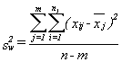
In estimating the unknown parameters of the population for the regression line, we need to apply a method by which the vertical distances between the yet-to-be estimated regression line and the observed values in our sample are minimized. This minimized distance is called sample error, though it is more commonly referred to as residual and denoted by e. In more mathematical form, the difference between the y and its predicted value is the residual in each pair of observations for x and y. Obviously, some of these residuals will be positive (above the estimated line) and others will be negative (below the line). If we add all these residuals over the sample size and raise them to the power 2 in order to prevent the chance those positive and negative signs are cancelling each other out, we can write the following criterion for our minimization problem:

image7

S is the sum of squares of the residuals. By minimizing S over any given set of observations for x and y, we will get the following useful formula:

b=\frac{\sum{(x-\bar{x})(y-\bar{y})}}{\sum{(x-\bar{x})^2}}

After computing the value of b from the above formula out of our sample data, and the means of the two series of data on and y, one can simply recover the intercept of the estimated line using the following equation:

image9

For the sample data, and given the estimated intercept and slope, for each observation we can define a residual as:

image11

Depending on the estimated values for intercept and slope, we can draw the estimated line along with all sample data in a yx panel. Such graphs are known as scatter diagrams. Consider our analysis of the price of one-bedroom apartments in Nelson, BC. We would collect data for y=price of one bedroom apartment, x1=its associated distance from downtown, and x2=the size of the apartment, as shown in Table 8.1.

Table 8.1 Data for Price, Size, and Distance of Apartments in Nelson, BC
y = price of apartments in $1000
x1 = distance of each apartment from downtown in kilometres
x2 = size of the apartment in square feet
y x1 x2
55 1.5 350
51 3 450
60 1.75 300
75 1 450
55.5 3.1 385
49 1.6 210
65 2.3 380
61.5 2 600
55 4 450
45 5 325
75 0.65 424
65 2 285

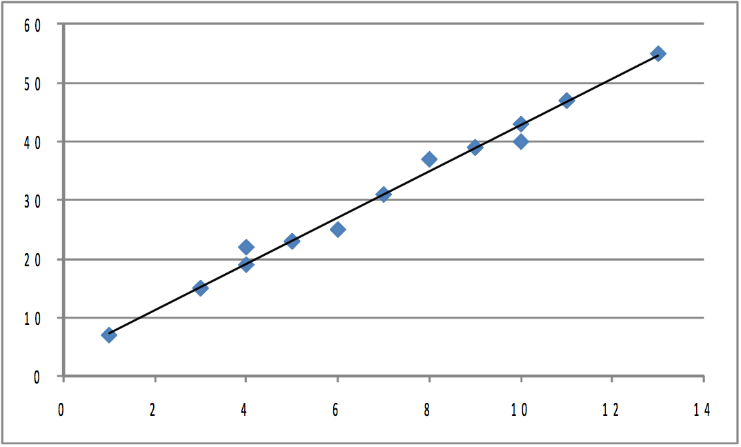
The graph (shown in Figure 8.1) is a scatter plot of the prices of the apartments and their distances from downtown, along with a proposed regression line.

Figure8-1
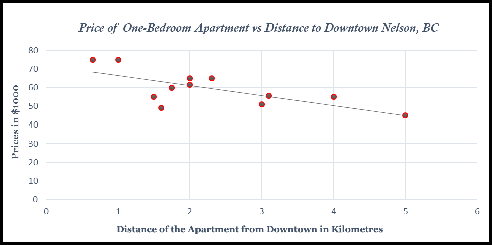
Figure 8.1 Scatter Plot of Price, Distance from Downtown, along with a Proposed Regression Line

In order to plot such a scatter diagram, you can use many available statistical software packages including Excel, SAS, and Minitab. In this scatter diagram, a negative simple regression line has been shown. The estimated equation for this scatter diagram from Excel is:

image13

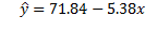
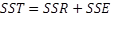
Where a=71.84 and b=-5.38. In other words, for every additional kilometre from downtown an apartment is located, the price of the apartment is estimated to be $5380 cheaper, i.e. 5.38*$1000=$5380. One might also be curious about the fitted values out of this estimated model. You can simply plug the actual value for x into the estimated line, and find the fitted values for the prices of the apartments. The residuals for all 12 observations are shown in Figure 8.2.

Residuals_Simple Regression
Figure 8.2

You should also notice that by minimizing errors, you have not eliminated them; rather, this method of least squares only guarantees the best fitted estimated regression line out of the sample data.

In the presence of the remaining errors, one should be aware of the fact that there are still other factors that might not have been included in our regression model and are responsible for the fluctuations in the remaining errors. By adding these excluded but relevant factors to the model, we probably expect the remaining error will show less meaningful fluctuations. In determining the price of these apartments, the missing factors may include age of the apartment, size, etc. Because this type of regression model does not include many relevant factors and assumes only a linear relationship, it is known as a simple linear regression model.

Testing your regression: does y really depend on x?

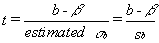
Understanding that there is a distribution of y (apartment price) values at each x (distance) is the key for understanding how regression results from a sample can be used to test the hypothesis that there is (or is not) a relationship between x and y. When you hypothesize that y = f(x), you hypothesize that the slope of the line (β in y = α + βx + ε) is not equal to zero. If β was equal to zero, changes in x would not cause any change in y. Choosing a sample of apartments, and finding each apartment’s distance to downtown, gives you a sample of (x, y). Finding the equation of the line that best fits the sample will give you a sample intercept, α, and a sample slope, β. These sample statistics are unbiased estimators of the population intercept, α, and slope, β. If another sample of the same size is taken, another sample equation could be generated. If many samples are taken, a sampling distribution of sample β’s, the slopes of the sample lines, will be generated. Statisticians know that this sampling distribution of b’s will be normal with a mean equal to β, the population slope. Because the standard deviation of this sampling distribution is seldom known, statisticians developed a method to estimate it from a single sample. With this estimated sb, a t-statistic for each sample can be computed:

T-statistic

where n = sample size

m = number of explanatory (x) variables

b = sample slope

β= population slope

sb = estimated standard deviation of b’s, often called the standard error

These t’s follow the t-distribution in the tables with nm-1 df.

Computing sb is tedious, and is almost always left to a computer, especially when there is more than one explanatory variable. The estimate is based on how much the sample points vary from the regression line. If the points in the sample are not very close to the sample regression line, it seems reasonable that the population points are also widely scattered around the population regression line and different samples could easily produce lines with quite varied slopes. Though there are other factors involved, in general when the points in the sample are farther from the regression line, sb is greater. Rather than learn how to compute sb, it is more useful for you to learn how to find it on the regression results that you get from statistical software. It is often called the standard error and there is one for each independent variable. The printout in Figure 8.3 is typical.

Simple_Regression
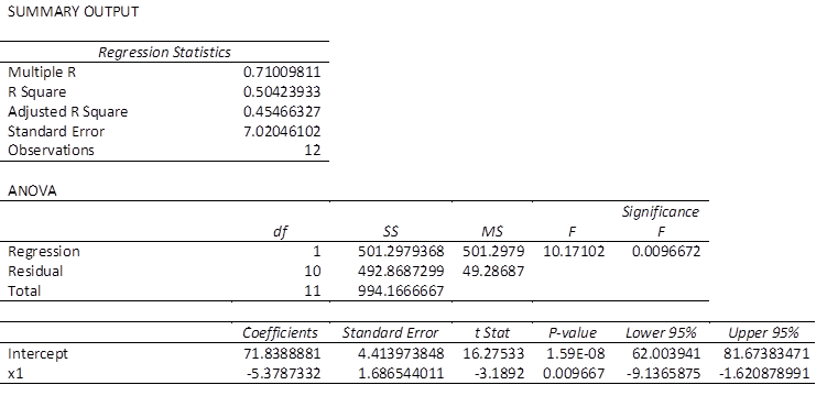
Figure 8.3 Typical Statistical Package Output for Linear Simple Regression Model

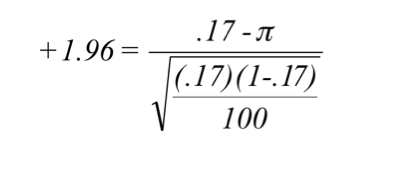
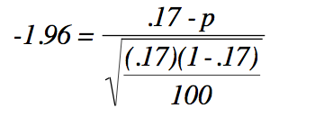
You will need these standard errors in order to test to see if y depends on x or not. You want to test to see if the slope of the line in the population, β, is equal to zero or not. If the slope equals zero, then changes in x do not result in any change in y. Formally, for each independent variable, you will have a test of the hypotheses:

H_o: \beta = 0

H_a: \beta \neq 0

If the t-score is large (either negative or positive), then the sample b is far from zero (the hypothesized β), and Ha should be accepted. Substitute zero for b into the t-score equation, and if the t-score is small, b is close enough to zero to accept Ha. To find out what t-value separates “close to zero” from “far from zero”, choose an alpha, find the degrees of freedom, and use a t-table from any textbook, or simply use the interactive Excel template from Chapter 3, which is shown again in Figure 8.4.

An interactive or media element has been excluded from this version of the text. You can view it online here: https://opentextbc.ca/introductorybusinessstatistics/?p=118


Figure 8.4 Interactive Excel Template for Determining t-Value from the t-Table – see Appendix 8.

Remember to halve alpha when conducting a two-tail test like this. The degrees of freedom equal n – m -1, where n is the size of the sample and m is the number of independent x variables. There is a separate hypothesis test for each independent variable. This means you test to see if y is a function of each x separately. You can also test to see if β > 0 (or β < 0) rather than β ≠ 0 by using a one-tail test, or test to see if β equals a particular value by substituting that value for β when computing the sample t-score.

Testing your regression: does this equation really help predict?

To test to see if the regression equation really helps, see how much of the error that would be made using the mean of all of the y’s to predict is eliminated by using the regression equation to predict. By testing to see if the regression helps predict, you are testing to see if there is a functional relationship in the population.

Imagine that you have found the mean price of the apartments in our sample, and for each apartment, you have made the simple prediction that price of apartment will be equal to the sample mean, y. This is not a very sophisticated prediction technique, but remember that the sample mean is an unbiased estimator of population mean, so on average you will be right. For each apartment, you could compute your error by finding the difference between your prediction (the sample mean, y) and the actual price of an apartment.

As an alternative way to predict the price, you can have a computer find the intercept, α, and slope, β, of the sample regression line. Now, you can make another prediction of how much each apartment in the sample may be worth by computing:

\hat{y} = \alpha + \beta(distance)

Once again, you can find the error made for each apartment by finding the difference between the price of apartments predicted using the regression equation ŷ, and the observed price, y. Finally, find how much using the regression improves your prediction by finding the difference between the price predicted using the mean, y, and the price predicted using regression, ŷ. Notice that the measures of these differences could be positive or negative numbers, but that error or improvement implies a positive distance.

Coefficient of Determination

If you use the sample mean to predict the amount of the price of each apartment, your error is (yy) for each apartment. Squaring each error so that worries about signs are overcome, and then adding the squared errors together, gives you a measure of the total mistake you make if you want to predict y. Your total mistake is Σ(yy)2. The total mistake you make using the regression model would be Σ(y-ŷ)2. The difference between the mistakes, a raw measure of how much your prediction has improved, is Σ(ŷy)2. To make this raw measure of the improvement meaningful, you need to compare it to one of the two measures of the total mistake. This means that there are two measures of “how good” your regression equation is. One compares the improvement to the mistakes still made with regression. The other compares the improvement to the mistakes that would be made if the mean was used to predict. The first is called an F-score because the sampling distribution of these measures follows the F-distribution seen in Chapter 6, “F-test and One-Way ANOVA”. The second is called R2, or the coefficient of determination.

All of these mistakes and improvements have names, and talking about them will be easier once you know those names. The total mistake made using the sample mean to predict, Σ(yy)2, is called the sum of squares, total. The total mistake made using the regression, Σ(y-ŷ)2, is called the sum of squares, error (residual). The general improvement made by using regression, Σ(ŷy)2 is called the sum of squares, regression or sum of squares, model. You should be able to see that:

sum of squares, total = sum of squares, regression + sum of squares, error (residual)

\sum{(y-\bar{y})^2} = \sum{(ŷ-\bar{y})^2} + \sum{(y-ŷ)^2}

In other words, the total variations in y can be partitioned into two sources: the explained variations and the unexplained variations. Further, we can rewrite the above equation as:

image17

where SST stands for sum of squares due to total variations, SSR measures the sum of squares due to the estimated regression model that is explained by variable x, and SSE measures all the variations due to other factors excluded from the estimated model.

Going back to the idea of goodness of fit, one should be able to easily calculate the percentage of each variation with respect to the total variations. In particular, the strength of the estimated regression model can now be measured. Since we are interested in the explained part of the variations by the estimated model, we simply divide both sides of the above equation by SST, and we get:

image18

We then isolate this equation for the explained proportion, also known as R-square:

image19

Only in cases where an intercept is included in a simple regression model will the value of R2 be bounded between zero and one. The closer R2 is to one, the stronger the model is. Alternatively, R2 is also found by:

R-Square

This is the ratio of the improvement made using the regression to the mistakes made using the mean. The numerator is the improvement regression makes over using the mean to predict; the denominator is the mistakes (errors) made using the mean. Thus R2 simply shows what proportion of the mistakes made using the mean are eliminated by using regression.

In the case of the market for one-bedroom apartments in Nelson, BC, the percentage of the variations in price for the apartments is estimated to be around 50%. This indicates that only half of the fluctuations in apartment prices with respect to the average price can be explained by the apartments’ distance from downtown. The other 50% are not controlled (that is, they are unexplained) and are subject to further research. One typical approach is to add more relevant factors to the simple regression model. In this case, the estimated model is referred to as a multiple regression model.

While R2 is not used to test hypotheses, it has a more intuitive meaning than the F-score. The F-score is the measure usually used in a hypothesis test to see if the regression made a significant improvement over using the mean. It is used because the sampling distribution of F-scores that it follows is printed in the tables at the back of most statistics books, so that it can be used for hypothesis testing. It works no matter how many explanatory variables are used. More formally, consider a population of multivariate observations, (y, x1, x2, …, xm), where there is no linear relationship between y and the x’s, so that y ≠ f(y, x1, x2, …, xm). If samples of n observations are taken, a regression equation estimated for each sample, and a statistic, F, found for each sample regression, then those F’s will be distributed like those shown in Figure 8.5, the F-table with (m, nm-1) df.

An interactive or media element has been excluded from this version of the text. You can view it online here: https://opentextbc.ca/introductorybusinessstatistics/?p=118


Figure 8.5 Interactive Excel Template of an F-Table – see Appendix 8.

The value of F can be calculated as:

Sum of squares regression / sum of squares residual

Improvement made / mistakes still made

Value of F

where n is the size of the sample, and m is the number of explanatory variables (how many x’s there are in the regression equation).

If Σ(ŷy)2 the sum of squares regression (the improvement), is large relative to Σ(ŷy)3, the sum of squares residual (the mistakes still made), then the F-score will be large. In a population where there is no functional relationship between y and the x’s, the regression line will have a slope of zero (it will be flat), and the ŷ will be close to y. As a result very few samples from such populations will have a large sum of squares regression and large F-scores. Because this F-score is distributed like the one in the F-tables, the tables can tell you whether the F-score a sample regression equation produces is large enough to be judged unlikely to occur if y ≠ f(y, x1, x2, …, xm). The sum of squares regression is divided by the number of explanatory variables to account for the fact that it always decreases when more variables are added. You can also look at this as finding the improvement per explanatory variable. The sum of squares residual is divided by a number very close to the number of observations because it always increases if more observations are added. You can also look at this as the approximate mistake per observation.

H_0: y \neq f(y,x_1,x_2,\cdots,x_m)

To test to see if a regression equation was worth estimating, test to see if there seems to be a functional relationship:

H_a: y = f(y,x_1,x_2,\cdots,x_m)

This might look like a two-tailed test since Ho has an equal sign. But, by looking at the equation for the F-score you should be able to see that the data support Ha only if the F-score is large. This is because the data support the existence of a functional relationship if the sum of squares regression is large relative to the sum of squares residual. Since F-tables are usually one-tail tables, choose an α, go to the F-tables for that α and (m, nm-1) df, and find the table F. If the computed F is greater than the table F, then the computed F is unlikely to have occurred if Ho is true, and you can safely decide that the data support Ha. There is a functional relationship in the population.

Now that you have learned all the necessary steps in estimating a simple regression model, you may take some time to re-estimate the Nelson apartment model or any other simple regression model, using the interactive Excel template shown in Figure 8.6. Like all other interactive templates in this textbook, you can change the values in the yellow cells only. The result will be shown automatically within this template. For this template, you can only estimate simple regression models with 30 observations. You use special paste/values when you paste your data from other spreadsheets. The first step is to enter your data under independent and dependent variables. Next, select your alpha level. Check your results in terms of both individual and overall significance. Once the model has passed all these requirements, you can select an appropriate value for the independent variable, which in this example is the distance to downtown, to estimate both the confidence intervals for the average price of such an apartment, and the prediction intervals for the selected distance. Both these intervals are discussed later in this chapter. Remember that by changing any of the values in the yellow areas in this template, all calculations will be updated, including the tests of significance and the values for both confidence and prediction intervals.

An interactive or media element has been excluded from this version of the text. You can view it online here: https://opentextbc.ca/introductorybusinessstatistics/?p=118


Figure 8.6 Interactive Excel Template for Simple Regression – see Appendix 8.

Multiple Regression Analysis

When we add more explanatory variables to our simple regression model to strengthen its ability to explain real-world data, we in fact convert a simple regression model into a multiple regression model. The least squares approach we used in the case of simple regression can still be used for multiple regression analysis.

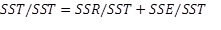
As per our discussion in the simple regression model section, our low estimated R2 indicated that only 50% of the variations in the price of apartments in Nelson, BC, was explained by their distance from downtown. Obviously, there should be more relevant factors that can be added into this model to make it stronger. Let’s add the second explanatory factor to this model. We collected data for the area of each apartment in square feet (i.e.,  x2). If we go back to Excel and estimate our model including the new added variable, we will see the printout shown in Figure 8.7.

multiple regression
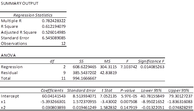
Figure 8.7 Excel Printout

The estimates equation of the regression model is:

predicted price of apartments= 60.041 – 5.393*distance + .03*area

This is the equation for a plane, the three-dimensional equivalent of a straight line. It is still a linear function because neither of the x’s nor y is raised to a power nor taken to some root nor are the x’s multiplied together. You can have even more independent variables, and as long as the function is linear, you can estimate the slope, β, for each independent variable.

Before using this estimated model for prediction and decision-making purposes, we should test three hypotheses. First, we can use the F-score to test to see if the regression model improves our ability to predict price of apartments. In other words, we test the overall significance of the estimated model. Second and third, we can use the t-scores to test to see if the slopes of distance and area are different from zero. These two t-tests are also known as individual tests of significance.

To conduct the first test, we choose an α = .05. The F-score is the regression or model mean square over the residual or error mean square, so the df for the F-statistic are first the df for the regression model and, second, the df for the error. There are 2 and 9 df for the F-test. According to this F-table, with 2 and 9 df, the critical F-score for α = .05 is 4.26.

The hypotheses are:

H0: price ≠ f(distance, area)

Ha: price = f(distance, area)

Because the F-score from the regression, 6.812, is greater than the critical F-score, 4.26, we decide that the data support Ho and conclude that the model helps us predict price of apartments. Alternatively, we say there is such a functional relationship in the population.

Now, we move to the individual test of significance. We can test to see if price depends on distance and area. There are (n-m-1)=(12-2-1)=9 df. There are two sets of hypotheses, one set for β1, the slope for distance, and one set for β2, the slope for area. For a small town, one may expect that β1, the slope for distance, will be negative, and expect that β2 will be positive. Therefore, we will use a one-tail test on β1, as well as for β2:

H_a: \beta _1 <0 \qquad H_a:\beta _2<0

Since we have two one-tail tests, the t-values we choose from the t-table will be the same for the two tests. Using α = .05 and 9 df, we choose .05/2=.025 for the t-score for β1 with a one-tail test, and come up with 2.262. Looking back at our Excel printout and checking the t-scores, we decide that distance does affect price of apartments, but area is not a significant factor in explaining the price of apartments. Notice that the printout also gives a t-score for the intercept, so we could test to see if the intercept equals zero or not.

Alternatively, one may go ahead and compare directly the p-values out of the Excel printout against the assumed level of significance (i.e., α = .05). We can easily see that the p-values associated with the intercept and price are both less than alpha, and as a result we reject the hypothesis that the associated coefficients are zero (i.e., both are significant). However, area is not a significant factor since its associated p-value is greater than alpha.

While there are other required assumptions and conditions in both simple and multiple regression models (we encourage students to consult an intermediate business statistics open textbook for more detailed discussions), here we only focus on two relevant points about the use and applications of multiple regression.

The first point is related to the interpretation of the estimated coefficients in a multiple regression model. You should be careful to note that in a simple regression model, the estimated coefficient of our independent variable is simply the slope of the line and can be interpreted. It refers to the response of the dependent variable to a one-unit change in the independent variable. However, this interpretation in a multiple regression model should be adjusted slightly. The estimated coefficients under multiple regression analysis are the response of the dependent variable to a one-unit change in one of the independent variables when the levels of all other independent variables are kept constant. In our example, the estimated coefficient of price of an apartment in Nelson, BC, indicates that — for a given size of apartment— it will drop by 5.248*1000=$5248 for every one kilometre that the apartment is away from downtown.

The second point is about the use of R2 in multiple regression analysis. Technically, adding more independent variables to the model will increase the value of R2, regardless of whether the added variables are relevant or irrelevant in explaining the variation in the dependent variable. In order to adjust the inflated R2 due to the irrelevant variables added to the model, the following formula is recommended in the case of multiple regression:

image

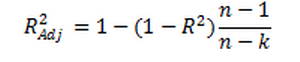
where n is the sample size, and k is number of the estimated parameters in our model.

Back to our earlier Excel results for the multiple regression model estimated for the apartment example, we can see that while the R2 has been inflated from .504 to .612 due to the new added factor, apartment size,  the adjusted R2 has dropped the inflated value to .526. To understand it better, you should pay attention to the associated p-value for the newly added factor. Since this value is more than .05, we cannot reject the hypothesis that the true coefficient of apartment size (area) is significantly different from zero. In other words, in its current situation, apartment size is not a significant factor, yet the value of R2 has been inflated!

Furthermore, the adjusted R2 indicates that only 61.2% of variations in price of one-bedroom apartments in Nelson, BC, can be explained by their locations and sizes. Almost 40% of the variations of the price still cannot be explained by these two factors. One may seek to improve this model, by searching for more relevant factors such as style of the apartment, year built, etc. and add them in to this model.

Using the interactive Excel template shown in Figure 8.8, you can estimate a multiple regression model. Again, enter your data into the yellow cells only. For this template you are allowed to use up to 50 observations for each column. Like all other interactive templates in this textbook, you use special paste/values when you paste your data from other spreadsheets. Specifically, if you have fewer than 50 data entries, you must also fill out the rest of the empty yellow cells under X1, X2, and Y with zeros. Now, select your alpha level. By clicking enter, you will not only have all your estimated coefficients along with their t-values, etc., you will also be guided as to whether the model is significant both overall and individually. If your p-value associated with F-value within the ANOVA table is not less than the selected alpha level, you will see a message indicating that your estimated model is not overall significant, and as a result, no values for C.I. and P.I. will be shown. By either changing the alpha level and/or adding more accurate data, it is possible to estimate a more significant multiple regression model.

An interactive or media element has been excluded from this version of the text. You can view it online here: https://opentextbc.ca/introductorybusinessstatistics/?p=118


Figure 8.8 Interactive Excel Template for Multiple Regression Model – see Appendix 8.

One more point is about the format of your assumed multiple regression model. You can see that the nature of the associations between the dependent variable and all the independent variables may not always be linear. In reality, you will face cases where such relationships may be better formed by a nonlinear model. Without going into the details of such a non-linear model, just to give you an idea, you should be able to transform your selected data for X1, X2, and Y before estimating your model. For instance, one possible multiple regression non-linear model may be a model in which both the dependent and independent variables have been transformed to a natural logarithm rather than a level. In order to estimate such a model within Figure 8.5, all you need to do is transform the data in all three columns in a separate sheet from level to logarithm. In doing this, simply use =log(say A1) where in cell A1 you have the first observation of X1, and =log(say B1),…. Finally, simply cut and special paste/value into the yellow columns within the template. Now you have estimated a multiple regression model with both sides in a non-linear form (i.e., log form).

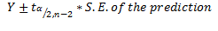
Predictions using the estimated simple regression

If the estimated regression line fits well into the data, the model can then be used for predictions. Using the above estimated simple regression model, we can predict the price of an apartment a given distance to downtown. This is known as the prediction interval or P.I. Alternatively, we may predict the mean price of the apartment, also known as the confidence interval or C.I., for the mean value.

In predicting intervals for the price of an apartment that is six kilometres away from downtown, we simply set x=6 , and substitute it back into the estimated equation:

y=71.84-5.38\times 6 = \$39.56

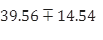
You should pay attention to the scale of data. In this case, the dependent variable is measured in $1000s. Therefore, the predicted value for an apartment six kilometres from downtown is 39.56*1000=$39,560. This value is known as the point estimate of the prediction and is not reliable, as we are not clear how close this value is to the true value of the population.

A more reliable estimate can be constructed by setting up an interval around the point estimate. This can be done in two ways. We can predict the particular value of y for a given value of xor we can estimate the expected value (mean) of y, for a given value of x. For the particular value of y, we use the following formula for the interval:

image21

where the standard error, S.E., of the prediction is calculated based on the following formula:

image22

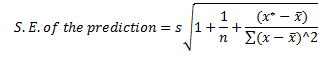
In this equation, x* is the particular value of the independent variable, which in our case is 6, and is the standard error of the regression, calculated as:

image23

From the Excel printout for the simple regression model, this standard error is estimated as 7.02.

The sum of squares of the independent variable,

sum of Sq of indep

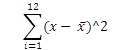
can also be calculated as shown in Figure 8.9.
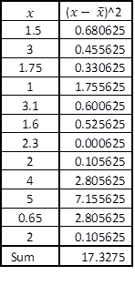
image24
Figure 8.9

All these calculated values can be substituted back into the formula for the S.E. of the prediction:

C.I.

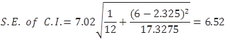
Now that the S.E. of the confidence interval has been calculated, you can pick up the cut-off point from the t-table. Given the degrees of freedom 12-2=10, the appropriate value from the t-table is 2.23. You use this information to calculate the margin of error as 6.52*2.23=14.54. Finally, construct the prediction interval for the particular value of the price of an apartment located six kilometres away from downtown as:

C.I._VALUES

This is a compact version of the prediction interval. For a more general version of any confidence interval for any given confidence level of alpha, we can write:

Confidence Interval

Intuitively, for say a .05 level of confidence, we are 95% confident that the true parameter of the population will be within these two lower and upper limits:

Confidence Interval

Based on our simple regression model that only includes distance as a significant factor in predicting the price of an apartment, and for a particular apartment six kilometres away from downtown, we are 95% confident that the true price of an apartments in Nelson, BC, is between $25,037 and $54,096, with a width of $29,059. One should not be surprised there is such a wide width, given the fact that the coefficient of determination of this model was only 50%, and the fact that we have selected a distance far away from the mean distance from downtown. We can always improve these numbers by adding more explanatory variables to our simple regression model. Alternatively, we can predict only for the numbers as much as possible close to the downtown area.

Now we estimate the expected value (mean) of y for a given value of x, the so-called prediction interval. The process of constructing intervals is very similar to the previous case, except we use a new formula for S.E. and of course we set up the intervals for the mean value of the apartment price (i.e., =59.33).

P.I.

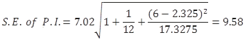
You should be very careful to note the difference between this formula and the one introduced earlier for S.E. for predicting the particular value of y for a given value of x. They look very similar but this formula comes with an extra 1 inside the radical!

The margin of error is then calculated as 2.179*3.82=8.32. We use this to set up directly the lower and upper limits of the estimates:
P.I._VALUES

Thus, for the average price of apartments located in Nelson, BC, six kilometres away from downtown, we are 95% confident that this average price will be between $18,200 and $60,920, with a width of $47,720. Compared with the earlier width for C.I., it is obvious that we are less confident in predicting the average price. The reason is that the S.E. for the prediction is always larger than the S.E. for the confidence interval.

This process can be repeated for all different levels of x, to calculate the associated confidence and prediction intervals. By doing this, we will have a range of lower and upper levels for both P.I.s and C.I.s. All these numbers can be reproduced within the interactive Excel template shown in Figure 8.8. If you use a statistical software such as Minitab, you will directly plot a scatter diagram with all P.I.s and C.I.s as well as the estimated linear regression line all in one diagram. Figure 8.10 shows such a diagram from Minitab for our example.

image35
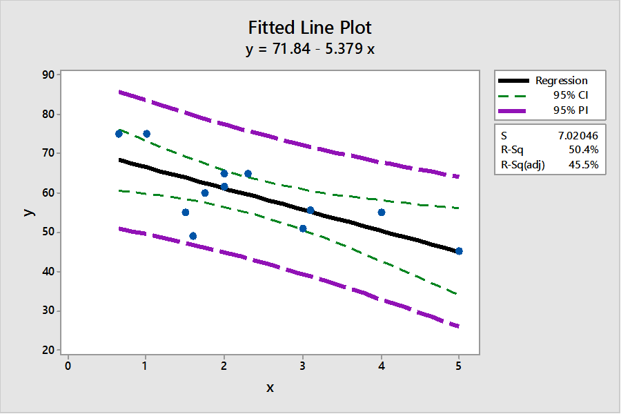
Figure 8.10 Minitab Plot for C.I. and P.I.

Figure 8.10 indicates that a more reliable prediction should be made as close as possible to the mean of our observations for x. In this graph, the widths of both intervals are at the lowest levels closer to the means of x and y.

You should be careful to note that Figure 8.10 provides the predicted intervals only for the case of a simple regression model. For the multiple regression model, you may use other statistical software packages, such as SAS, SPSS, etc., to estimate both P.I. and C.I. For instance, by selecting x1=3, and x2=300, and coding these figures into Minitab, you will see the results as shown in Figure 8.11. Alternatively, you may use the interactive Excel template provided in Figure 8.8 to estimate your multiple regression model, and to check for the significance of the estimated parameters. This template can also be used to construct both the P.I. and C.I. for the given values of x1=3, and x2=300 or any other values of your choice. Furthermore, this template enables you to test if the estimated multiple regression model is overall significant. When the estimated multiple regression model is not overall significant, this template will not provide the P.I. and C.I. To practice this case, you may want to change the yellow columns of x1 and x2 with different random numbers that are not correlated with the dependent variable. Once the estimated model is not overall significant, no prediction values will be provided.
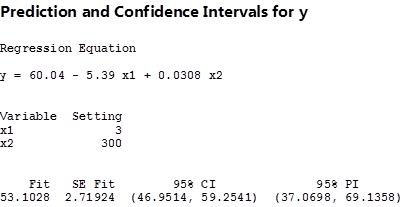
prediction intervals multiple regression
Figure 8.11

The 95% C.I., and P.I. figures in the brackets are the lower and upper limits of the intervals given the specific values for distance and size of apartments. The fitted value of the price of apartment, as well as the standard error of this value, are also estimated.

We have just given you some rough ideas about how the basic regression calculations are done. We left out other steps needed to calculate more detailed results of regression without a computer on purpose, for you will never compute a regression without a computer (or a high-end calculator) in all of your working years. However, by working with these interactive templates, you will have a much better chance to play around with any data to see how the outcomes can be altered, and to observe their implications for the real-world business decision-making process.

Correlation and covariance

The correlation between two variables is important in statistics, and it is commonly reported. What is correlation? The meaning of correlation can be discovered by looking closely at the word—it is almost co-relation, and that is what it means: how two variables are co-related. Correlation is also closely related to regression. The covariance between two variables is also important in statistics, but it is seldom reported. Its meaning can also be discovered by looking closely at the word—it is co-variance, how two variables vary together. Covariance plays a behind-the-scenes role in multivariate statistics. Though you will not see covariance reported very often, understanding it will help you understand multivariate statistics like understanding variance helps you understand univariate statistics.

There are two ways to look at correlation. The first flows directly from regression and the second from covariance. Since you just learned about regression, it makes sense to start with that approach.

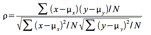
Correlation is measured with a number between -1 and +1 called the correlation coefficient. The population correlation coefficient is usually written as the Greek rho, ρ, and the sample correlation coefficient as r. If you have a linear regression equation with only one explanatory variable, the sign of the correlation coefficient shows whether the slope of the regression line is positive or negative, while the absolute value of the coefficient shows how close to the regression line the points lie. If ρ is +.95, then the regression line has a positive slope and the points in the population are very close to the regression line. If r is -.13 then the regression line has a negative slope and the points in the sample are scattered far from the regression line. If you square r, you will get R2, which is higher if the points in the sample lie very close to the regression line so that the sum of squares regression is close to the sum of squares total.

The other approach to explaining correlation requires understanding covariance, how two variables vary together. Because covariance is a multivariate statistic, it measures something about a sample or population of observations where each observation has two or more variables. Think of a population of (x,y) pairs. First find the mean of the x’s and the mean of the y’s, μx and μy. Then for each observation, find (xμx)(yμy). If the x and the y in this observation are both far above their means, then this number will be large and positive. If both are far below their means, it will also be large and positive. If you found Σ(xμx)(yμy), it would be large and positive if x and y move up and down together, so that large x’s go with large y’s, small x’s go with small y’s, and medium x’s go with medium y’s. However, if some of the large x’s go with medium y’s, etc. then the sum will be smaller, though probably still positive. A Σ(xμx)(y – μy) implies that x’s above μx are generally paired with y’s above μy, and those x’s below their mean are generally paired with y’s below their mean. As you can see, the sum is a measure of how x and y vary together. The more often similar x’s are paired with similar y’s, the more x and y vary together and the larger the sum and the covariance. The term for a single observation, (xμx)(yμy), will be negative when the x and y are on opposite sides of their means. If large x’s are usually paired with small y’s, and vice versa, most of the terms will be negative and the sum will be negative. If the largest x’s are paired with the smallest y’s and the smallest x’s with the largest y’s, then many of the (xμx)(yμy) will be large and negative and so will the sum. A population with more members will have a larger sum simply because there are more terms to be added together, so you divide the sum by the number of observations to get the final measure, the covariance, or cov:

Population covariance

The maximum for the covariance is the product of the standard deviations of the x values and the y values, σxσy. While proving that the maximum is exactly equal to the product of the standard deviations is complicated, you should be able to see that the more spread out the points are, the greater the covariance can be. By now you should understand that a larger standard deviation means that the points are more spread out, so you should understand that a larger σx or a larger σy will allow for a greater covariance.

Sample covariance is measured similarly, except the sum is divided by n-1 so that sample covariance is an unbiased estimator of population covariance:

sample \ cov= \frac{\sum{(x-\bar{x})(y-\bar{y})}}{(n-1)}

Correlation simply compares the covariance to the standard deviations of the two variables. Using the formula for population correlation:

image

or
Screen Shot 2015-07-29 at 3.10.09 PM

At its maximum, the absolute value of the covariance equals the product of the standard deviations, so at its maximum, the absolute value of r will be 1. Since the covariance can be negative or positive while standard deviations are always positive, r can be either negative or positive. Putting these two facts together, you can see that r will be between -1 and +1. The sign depends on the sign of the covariance and the absolute value depends on how close the covariance is to its maximum. The covariance rises as the relationship between x and y grows stronger, so a strong relationship between x and y will result in r having a value close to -1 or +1.

Covariance, correlation, and regression

Now it is time to think about how all of this fits together and to see how the two approaches to correlation are related. Start by assuming that you have a population of (x, y) which covers a wide range of y-values, but only a narrow range of x-values. This means that σy is large while σx is small. Assume that you graph the (x, y) points and find that they all lie in a narrow band stretched linearly from bottom left to top right, so that the largest y’s are paired with the largest x’s and the smallest y’s with the smallest x’s. This means both that the covariance is large and a good regression line that comes very close to almost all the points is easily drawn. The correlation coefficient will also be very high (close to +1). An example will show why all these happen together.

Imagine that the equation for the regression line is y=3+4x, μy = 31, and μx = 7, and the two points farthest to the top right, (10, 43) and (12, 51), lie exactly on the regression line. These two points together contribute ∑(xμx)(yμy) =(10-7)(43-31)+(12-7)(51-31)= 136 to the numerator of the covariance. If we switched the x’s and y’s of these two points, moving them off the regression line, so that they became (10, 51) and (12, 43), μx, μy, σx, and σy would remain the same, but these points would only contribute (10-7)(51-31)+(12-7)(43-31)= 120 to the numerator. As you can see, covariance is at its greatest, given the distributions of the x’s and y’s, when the (x, y) points lie on a straight line. Given that correlation, r, equals 1 when the covariance is maximized, you can see that r=+1 when the points lie exactly on a straight line (with a positive slope). The closer the points lie to a straight line, the closer the covariance is to its maximum, and the greater the correlation.

As the example in Figure 8.12 shows, the closer the points lie to a straight line, the higher the correlation. Regression finds the straight line that comes as close to the points as possible, so it should not be surprising that correlation and regression are related. One of the ways the goodness of fit of a regression line can be measured is by R2. For the simple two-variable case, R2 is simply the correlation coefficient r, squared.

Screen Shot 2015-03-19 at 3.12.14 PM
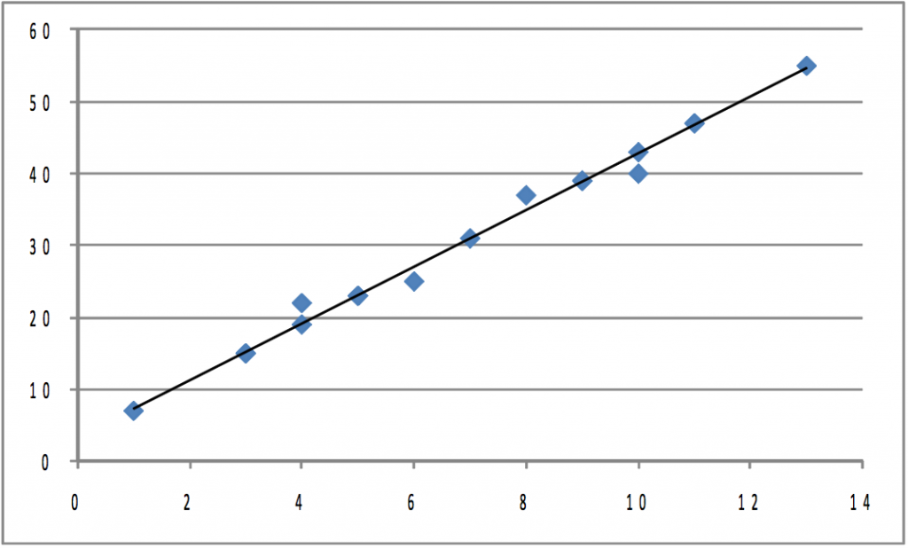
Figure 8.12 Plot of Initial Population

Correlation does not tell us anything about how steep or flat the regression line is, though it does tell us if the slope is positive or negative. If we took the initial population shown in Figure 8.12, and stretched it both left and right horizontally so that each point’s x-value changed, but its y-value stayed the same, σx would grow while σy stayed the same. If you pulled equally to the right and to the left, both μx and μy would stay the same. The covariance would certainly grow since the (xμx) that goes with each point would be larger absolutely while the (yμy)’s would stay the same. The equation of the regression line would change, with the slope b becoming smaller, but the correlation coefficient would be the same because the points would be just as close to the regression line as before. Once again, notice that correlation tells you how well the line fits the points, but it does not tell you anything about the slope other than if it is positive or negative. If the points are stretched out horizontally, the slope changes but correlation does not. Also notice that though the covariance increases, correlation does not because σx increases, causing the denominator in the equation for finding r to increase as much as covariance, the numerator.

The regression line and covariance approaches to understanding correlation are obviously related. If the points in the population lie very close to the regression line, the covariance will be large in absolute value since the x’s that are far from their mean will be paired with y’s that are far from theirs. A positive regression slope means that x and y rise and fall together, which also means that the covariance will be positive. A negative regression slope means that x and y move in opposite directions, which means a negative covariance.

Summary

Simple linear regression allows researchers to estimate the parameters — the intercept and slopes — of linear equations connecting two or more variables. Knowing that a dependent variable is functionally related to one or more independent or explanatory variables, and having an estimate of the parameters of that function, greatly improves the ability of a researcher to predict the values the dependent variable will take under many conditions. Being able to estimate the effect that one independent variable has on the value of the dependent variable in isolation from changes in other independent variables can be a powerful aid in decision-making and policy design. Being able to test the existence of individual effects of a number of independent variables helps decision-makers, researchers, and policy-makers identify what variables are most important. Regression is a very powerful statistical tool in many ways.

The idea behind regression is simple: it is simply the equation of the line that comes as close as possible to as many of the points as possible. The mathematics of regression are not so simple, however. Instead of trying to learn the math, most researchers use computers to find regression equations, so this chapter stressed reading computer printouts rather than the mathematics of regression.

Two other topics, which are related to each other and to regression, were also covered: correlation and covariance.

Something as powerful as linear regression must have limitations and problems. There is a whole subject, econometrics, which deals with identifying and overcoming the limitations and problems of regression.

1

Appendix: Interactive Spreadsheets - Editable

The interactive spreadsheets used throughout this book have been locked except for select cells that allow the student and reader to practice specific concepts by entering, deleting, and then re-entering numbers. It was necessary to do this in order to maintain the integrity of the concepts and formulas being presented.

However, because this textbook is covered by an open license, these spreadsheets must also be available in editable form. Unlocked versions of all spreadsheets used in this textbook are listed below by chapter and figure number, and downloadable in the web version of this textbook.

Chapter 1

Figure 1.1 Interactive Excel Template of a Histogram

Figure 1.2 Interactive Excel Template to Calculate Variance and Standard Deviation

Chapter 2

Figure 2.1 Interactive Excel Template for Cumulative Standard Normal Distributions

Figure 2.2 Interactive Excel Template for Illustrating the Central Limit Theorem

Figure 2.3 Interactive Excel Template of a t-Table

Chapter 3

Figure 3.1 Interactive Excel Template for Determining the t-Values Cut-off Point

Figure 3.2 Interactive Excel Template for Determining the χ2 Cut-off Point

Chapter 4

Figure 4.1 Interactive Excel Template for Test of Hypothesis

Figure 4.2 Interactive Excel Template for Determining Chi-Square Cut-off Point

Chapter 5

Figure 5.1 Interactive Excel Template for Determining Cut-off Point of a t-Table

Figure 5.2 Interactive Excel Template for Paired t-Test

Chapter 6

Figure 6.1 Interactive Excel Template of an F-Table

Figure 6.2 Interactive Excel Template for F-Test

Figure 6.3 Interactive Excel Template for One-Way ANOVA

Chapter 7

Figure 7.1 Interactive Excel Template for the Mann-Whitney U-Test

Chapter 8

Figure 8.4 Interactive Excel Template for Determining t-Value from the t-Table

Figure 8.5 Interactive Excel Template of an F-Table

Figure 8.6 Interactive Excel Template for Simple Regression

Figure 8.8 Interactive Excel Template for Multiple Regression Model

2

About the Authors

Adapting Author

Mohammad Mahbobi is a faculty of Economics at the School of Business and Economics, Thompson Rivers University (TRU) in British Columbia, Canada. He earned a B.Sc. in Economics, and a MSc. in Economic Systems Analysis from Shahid Beheshti University (formerly known as National University of Iran), and a Ph.D. from University of Saskatchewan, Canada. For over 25 years, he has been teaching statistics and econometrics for Economics and Business students.

Mo_Pic
Mohammad Mahbobi

Original Author

Thomas K. Tiemann is Jefferson Pilot Professor of Economics at Elon University in North Carolina, USA. He earned an AB in Economics at Dartmouth College and a PhD at Vanderbilt University. He has been teaching basic business and economics statistics for over 30 years, and tries to take an intuitive approach, rather than a mathematical approach, when teaching statistics. He started working on this book 15 years ago, but got sidetracked by administrative duties. He hopes that this intuitive approach helps students around the world better understand the mysteries of statistics.

3

Versioning History


This page provides a record of edits and changes made to this book since its initial publication in the B.C. Open Textbook Collection. Whenever edits or updates are made in the text, we provide a record and description of those changes here. If the change is minor, the version number increases by 0.01. If the edits involve substantial updates, the version number increases to the next full number.

The files posted by this book always reflect the most recent version. If you find an error in this book, please fill out the Report an Open Textbook Error form.

Version Date Change Details
1.00 December 7, 2015 Book added to the BC Open Textbook Collection
1.01 June 6, 2019 Updated the book’s theme. The styles of this book have been updated, which may affect the page numbers of the PDF and print copy. Added a Versioning History page.
1.02 June 23, 2020 Updated the copyright information and front matter. Listed the adapting author’s name as an author, which was missing. Updated the copyright and publishing information and the front matter to conform with BCcampus style. Updated the book cover.