
Professional Web Accessibility Auditing Made Easy by Digital Education Strategies, The Chang School is licensed under a Creative Commons Attribution-ShareAlike 4.0 International License, except where otherwise noted.
Professional Web Accessibility Auditing Made Easy by Digital Education Strategies, The Chang School is licensed under a Creative Commons Attribution-ShareAlike 4.0 International License, except where otherwise noted.
This resource was created by the Digital Education Strategies (DES) team at the G. Raymond Chang School for Continuing Education at Ryerson University to address a need for professional development training for web developers on web accessibility. The topic is of critical importance for technical programs offered by post-secondary institutions, though rarely covered in formal education.
This resource is an adaptation of the massive open online course (MOOC) of the same name, developed by The Chang School, and offered through the Canvas Network in 2016/2017.
The Digital Education Strategies team was responsible for all aspects of this resource’s production, including instructional design, web development, video production, and editing.
Special thanks go to DES team member Greg Gay for authoring the content. Greg has been in the web accessibility field since the mid-1990s as an auditor and as the lead on many research and development projects that push the boundaries of accessibility in information technology. He has been involved in e-learning just as long with more than 20 online courses to his name.
Funding for this project was provided by the Government of Ontario’s Enabling Change Program. An advisory committee made up of experts from the disability and accessibility community in the Toronto area provided feedback and support in conceptualizing the offering.
Although the context for this resource is Ontario, Canada, and it includes some discussion of the Accessibility for Ontarians with Disabilities Act (AODA), it will be relevant to a global audience. Accessibility as it applies to the AODA applies in other jurisdictions through the Web Content Accessibility Guidelines (WCAG 2.0), which the AODA web accessibility requirements are based upon.
Though aimed at educating web developers about accessibility, the learning materials here will be of interest to anyone who wants to understand how barriers on the Web affect access for people with disabilities. What you’ll learn here goes well beyond accommodating people with disabilities. Like many other so-called adaptations (e.g., curb cuts discussed in Unit 1), efforts that go into making the Web more accessible to people with disabilities make it more usable for everyone.
Likewise, the business arguments for accessibility are about more than complying with the law or accommodating people with disabilities. They are about reaching the broadest audience possible. People with disabilities have family and friends who together will go elsewhere if they are unable to effectively access a website. When you consider that people with disabilities make up nearly 15% of the population (WHO), including family, relatives, and acquaintances, that number can reach 50% of the population. Most businesses can’t afford to serve only 50% of their potential customer base.
Web accessibility, and digital accessibility in general, just makes good sense, no matter how you look at it.
What are people saying?
Welcome to Professional Web Accessibility Auditing Made Easy! By the time you finish reviewing the materials here, and trying the activities, you should be able to:
In order to practice what you’re learning as you follow along here, you will need to use the following software:
For those who would like to go beyond what they’ve learned in the materials here, The Chang School has created a series of resources on web accessibility for different audiences:
The information presented here and any related materials referred to in the content are for instructional purposes only and should not be construed as legal advice on any particular issue, including compliance with relevant laws. We specifically disclaim any liability for any loss or damage any reader may suffer as a result of the information contained.
By the end of this unit, you should be able to:
This is aimed at those who are responsible for implementing accessibility on an organization’s website. These people tend to be web developers (sometimes referred to as webmasters) but may also include web content editors and web designers who are comfortable using HTML, CSS, and to some degree, JavaScript.
Web developers should focus on understanding the technical content, but also be familiar with the general content. That is, all of the information here will be relevant to you.
If you are not a web developer, depending on your background and level of comfort with web technologies, you may choose to skip over the technical parts, presented within the content in blue boxes and marked as Technical. Review the Table of Contents for a full list of topics. You can focus your study on the general content, completing the activities and setting up a Web Accessibility Auditing Toolkit, and, having made your way through all the reading and activities, come away with a good understanding of the requirements for developing accessible web content.
As we mentioned earlier, depending on your role in your company or organization, different parts of the material may be more relevant to you than others. We’ve tried to identify the technical content in particular so you can pass over these parts if they are less relevant to you or you are trying to budget your time. To help you navigate to the information most relevant to your needs, we have colour-coded and labelled the technical content as follows. Content that does not appear in coloured boxes is aimed at everyone.
 To support your understanding of the materials, the fictional story of an Ontario-based company, Lulu’s Lollipops, has been weaved throughout the content to add a sense of realism. The story unfolds as Lulu investigates the steps involved in improving the accessibility of the Lulu’s Lollipops website. In the story you will hear about Lulu’s team members – people just like you who want to learn more about web accessibility. Imagine that Lulu’s team have all downloaded this resource as a book. Lulu has a webmaster, who will closely follow the Technical information that is shared. Lulu also has a number of Customer Service Representatives, who, as part of their role in supporting clients, have a general interest in ensuring that the company and its website serve the needs of everyone. Visit the current Lulu’s Lollipops Website to familiarize yourself with it. You will be conducting an accessibility audit of the site in a later unit.
Throughout the content, we’ve also identified elements that should be added to the Web Accessibility Auditing Toolkit you will be assembling. These elements will include links to resource documents and online tools used during auditing activities, as well as software or browser plugins that you may need to install. These will be identified in a green Toolkit box like the following:
Throughout you will see important or notable information highlighted and labelled in Key Point boxes like the one that follows. These will include “must know” information, as well as less obvious considerations and interesting points.
Try This boxes contain activities designed to get you thinking or give you firsthand experience with something you’ve just read about.
Lulu’s Lollipops is a thriving business, with 52 employees, based out of Hamilton, Ontario, Canada. Lulu’s business is primarily web-based and has been operating for ten years selling lollipops of various shapes, sizes, colours, and flavours. A representative of a charitable organization has approached Lulu about placing a large order for lollipops that would be part of an upcoming fundraising campaign. As part of the charity’s mandate, the representative has asked about the accessibility of Lulu’s website to ensure that staff from different chapters of the charity can easily place orders. Lulu realizes that she has never really considered the accessibility of her website and, based on a recommendation from a friend, Lulu decides to enrol herself and a number of her team members in Web Accessibility Auditing Made Easy.
As a business owner, Lulu understands that there are some provincial guidelines she should consider as she works to accommodate the needs of her potential client (the charitable organization), but she still wonders why it makes sense to modify the website that has already served her company so well for over 10 years. Lulu and her team need to think about three important things: “curb cuts,” the business case, and the AODA. Read on to learn more about these compelling factors related to investment in web accessibility. View the Lulu’s Lollipops website.
Think about “curb cuts,” a great example of what is often thought of as universal design. Curb cuts were originally added to streets to accommodate those in wheelchairs so they could get from the road up onto a sidewalk and vice versa. But curb cuts are helpful for many people — not just those in wheelchairs. A person pushing a baby stroller can now easily get to the sidewalk. A person riding a bike can get more easily onto the sidewalk where the bike lockups are located. An elderly person who may have difficulty stepping up on a curb or who may be using a walker now has a smooth gradient and can walk onto the sidewalk rather than climb onto it. Curb cuts were designed to help those in wheelchairs but have come to benefit many.
From a web accessibility perspective, most of the accessibility features you might add to a website will have that so-called “curb cut effect.” For example, the text description one might include with an image to make the image’s meaning accessible to a person who is blind also makes it possible for search engines to index the image and make it searchable. It allows a person on a slow Internet connection to turn images off and still get the same information. Or, it allows a person using a text-based browser, on a cell phone for instance, to access the same information as those using a typical visual browser. Virtually every such feature that might be put in place in web content to accommodate people with disabilities will improve access and usability for everyone else.
Karl Groves wrote an interesting series of articles in 2011 and 2012 that looked at the reality of business arguments for web accessibility. He points out that any argument needs to answer affirmatively at least one of the following questions:
He outlines a range of potential arguments for accessibility:
What accessibility really boils down to is “quality of work,” as Groves states. So, in approaching web accessibility, one may be better off not thinking so much in terms of reducing the risk of being sued or losing customers because your site takes too long to load, but rather that the work you do is quality work and the website you present to your potential customers is a quality website.
Video: The Business Case for Accessibility

A YouTube element has been excluded from this version of the text. You can view it online here: https://pressbooks.library.ryerson.ca/pwaa/?p=1152
Readings and References:
If you’d like to learn more about business cases, here are a few references:
Video: AODA Background

A YouTube element has been excluded from this version of the text. You can view it online here: https://pressbooks.library.ryerson.ca/pwaa/?p=1152
For those in Ontario, Canada, we’ll provide occasional references to the Accessibility for Ontarians with Disabilities Act (AODA). If you’re from outside Ontario, you might compare the AODA’s web accessibility requirements with those in your local area. They will be similar in many cases, likely based on the W3C WCAG 2.0 Guidelines. The goal in Ontario is for all obligated organizations to meet the Level AA accessibility requirements of WCAG 2.0 by 2021, which, ultimately, is the goal of most international jurisdictions.
The AODA provided the motivation to create this resource, based on the MOOC course of the same name. All businesses and organizations in Ontario with more than 50 employees (and all public sector organizations) are now required by law to make their websites accessible to people with disabilities (currently at WCAG 2.0 Level A). Many businesses still don’t know what needs to be done in order to comply with the new rules. This resource hopes to fill some of that need.
The AODA has its roots in the Ontario Human Rights Code, introduced in 1990. It essentially made it illegal to discriminate based on disability (among other forms of discrimination). The development of the AODA began in earnest in 1994 with the emergence of the Ontarians with Disabilities Act (ODA). Its aim was to legislate the removal and prevention of barriers that inhibit people with disabilities from participating as full members of society, improving access to employment, goods and services, and facilities. The act was secured as law in 2001.
With the election of a new government in 2003, the movement that brought us the ODA sought to strengthen the legislation. The Accessibility Standards Advisory Council was established, and the AODA was passed as law in 2005, and in July of 2011 the Integrated Accessibility Standards Regulation (IASR) brought together the five standards of the AODA, covering Information and Communication, Employment, Transportation, and Design of Public Spaces, in addition to the original Customer Service standard.
The AODA sets out to make Ontario fully accessible by 2025, with an incremental roll-out of accessibility requirements over a period of 20 years. These requirements span a whole range of accessibility considerations — from physical spaces to customer service, the Web, and much more.
Our focus here is on access to the Web. The timeline set out in the AODA requires government and large organizations to remove all barriers in web content between 2012 and 2021. The timeline for these requirements is outlined in the table below. Any new or significantly updated information posted to the Web must comply with the given level of accessibility by the given date. This includes both Internet and intranet sites. Any content developed prior to January 1, 2012 is exempt.
| Level A | Level AA | |
|---|---|---|
| Government | January 1, 2012 (except live captions and audio description) | January 1, 2016 (except live captions and audio description), January 1, 2020 (including live captions and audio description) |
| Designated Organizations* | Beginning January 1, 2014, new websites and significantly refreshed websites must meet Level A (except live captions and audio description) | January 1, 2021 (except live captions and audio description) |
| *Designated organizations means every municipality and every person or organization as outlined in the Public Service of Ontario Act 2006 Reg. 146/10, or private companies or organizations with 50 or more employees, in Ontario. | ||
For more about the AODA you can review the following references:
Readings and References:

The Toolkit you will assemble will be made up of various tools and resources you can use when assessing web content. It will include links to documents, tools, and examples you can refer to as needed while auditing.
For the first activity, create a folder in your browser’s bookmarks/favourites area called “Accessibility Toolkit.” You will add the tools and resources introduced here to this folder.
Remember that suggestions for your Toolkit throughout the content will be highlighted in green and labelled “Toolkit.”
In this unit, in order to provide a foundation for your studies and activities, we identify and explain the key considerations and aspects of web accessibility review work. This overview will include topics such as:
We will look at numerous non-technical and technical aspects of web accessibility auditing. The following sections will provide a foundation of understanding for the units that follow.
Watch the following video from the Government of Australia that summarizes web accessibility. Although the video is from Australia, its ideas are applicable globally. Visit the YouTube site for the video to find the described transcript in full.
Video: Web Accessibility

A YouTube element has been excluded from this version of the text. You can view it online here: https://pressbooks.library.ryerson.ca/pwaa/?p=1166
© Department of Social Services, Australian Government.
Released under the terms of a Standard YouTube License. All rights reserved.
There are many ways to assess accessibility that are not technical in nature. Some of these will be introduced here and expanded on in the units that follow. These strategies simply require some thought, reflection, and ultimately, common sense.
Lulu is feeling very positive about the idea that her business, and the website of which she is so proud, could soon be more accessible and easier for all of her customers to use. This brings her to the predictable question of “Where do we begin?” Lulu should start by getting a firm grasp on “the big picture” in terms of what barriers people might encounter on her website and why. From there she can begin to build practical knowledge that will support her next steps. Take a look at the content that follows to better understand the foundation of information that Lulu and her team will require. In order to understand what web accessibility auditing tests for and why, it is helpful to have a basic understanding of a range of disabilities and their related barriers with respect to the consumption of web content.
Not all people with disabilities encounter barriers on the Web, and those with different types of disabilities encounter different types of barriers. For instance, if a person is in a wheelchair they may encounter no barriers at all in web content. A person who is blind will experience different barriers than a person with limited vision. Different types of disabilities and some of their commonly associated barriers are described here.
Watch the following video to see how students with disabilities experience the Internet.
Video: Experiences of a Student with Disabilities

A YouTube element has been excluded from this version of the text. You can view it online here: https://pressbooks.library.ryerson.ca/pwaa/?p=1172
© Jared Smith. Released under the terms of a Standard YouTube License. All rights reserved.
In this video, David Berman talks about types of disabilities and their associated barriers.
Video: Web Accessibility Matters: Difficulties and Technologies: Avoiding Tradeoffs

A YouTube element has been excluded from this version of the text. You can view it online here: https://pressbooks.library.ryerson.ca/pwaa/?p=1172
© davidbermancom. Released under the terms of a Standard YouTube License. All rights reserved.
People who are blind tend to face many barriers in web content, given the visual nature of the Web. They will often use a screen reader to access their computer or device and may use a refreshable Braille display to convert text to Braille.
Common barriers for this group include:
For a quick look at how a person who is blind might use a screen reader like JAWS to navigate the Web, watch the following video.
Video: Accessing the Web Using Screen Reading Software

A YouTube element has been excluded from this version of the text. You can view it online here: https://pressbooks.library.ryerson.ca/pwaa/?p=1172
© rscnescotland. Released under the terms of a Standard YouTube License. All rights reserved.
People with low vision are often able to see web content if it is magnified. They may use a screen magnification program to increase the size and contrast of the content to make it more visible. They are less likely to use a screen reader than a person who is blind, though in some cases they will. People with low vision may rely on the magnification or text customization features in their web browser, or they may install other magnification or text reading software.
Common barriers for this group include:
See the following video for a description of some of the common barriers for people with low vision.
Video: Creating an Accessible Web
")
A YouTube element has been excluded from this version of the text. You can view it online here: https://pressbooks.library.ryerson.ca/pwaa/?p=1172
© Media Access Australia. Released under the terms of a Standard YouTube License. All rights reserved.
Most people who are Deaf tend to face barriers where audio content is presented without text-based alternatives and encounter relatively few barriers on the Web otherwise. Those who are Deaf and blind will face many more barriers, including those described for people who are blind. For those who communicate with American Sign Language (ASL) or other sign languages, such as Langue des signes québécoise (LSQ), the written language of a website may produce barriers similar to those faced when reading in a second language.
Common barriers for this group include:
Mobility-related disabilities are quite varied. As mentioned earlier, one could be limited to a wheelchair for getting around and face no significant barriers in web content. Those who have limited use of their hands or who have fine motor impairments that limit their ability to target elements in web content with a mouse pointer may not use a mouse at all. Instead, they might rely on a keyboard or perhaps their voice, along with switches to control mouse clicks, to control movement through web content.
Common barriers for this group include:
Learning and cognitive-related disabilities can be as varied as mobility-related disabilities, perhaps more so. These disabilities can range from a mild reading-related disability to very severe cognitive impairments that may result in limited use of language and difficulty processing complex information. For most of the disabilities in this range, there are some common barrier and others that only affect those with more severe cognitive disabilities.
Common barriers for this group include:
More specific disability-related issues include:
While we generally think of barriers in terms of access for people with disabilities, there are some barriers that impact all types of users, though these are often thought of in terms of usability. Usability and accessibility go hand-in-hand. Adding accessibility features improves usability for others. Many people, including those who do not consider themselves to have a specific disability (such as those over the age of 50) may find themselves experiencing typical age-related loss of sight, hearing, or cognitive ability. Those with varying levels of colour blindness may also fall into this group.
Some of these usability issues include:
To learn more about disabilities and associated barriers, read the following:
Gaining awareness of the potential for barriers in web content takes many forms. Perhaps you read a book to educate yourself. Maybe your workplace has sponsored training in this area. Or, you may know someone who experiences these barriers firsthand and who has shared their frustrations or insights with you. In Lulu’s case, a prospective client drew her attention to the issue. No matter how you gain your awareness, it is important that breaking down the barriers becomes both common sense and common practice.
If you’ve never used assistive technology yourself, or interacted with someone who does, take a moment for the video below and visit his YouTube channel The Blind Film Critic for a humorous look at being blind.
Video: How a Blind Person Uses a Computer

A YouTube element has been excluded from this version of the text. You can view it online here: https://pressbooks.library.ryerson.ca/pwaa/?p=1194
© The Tommy Edison Experience. Released under the terms of a Standard YouTube License. All rights reserved.
It is important for Lulu and her team to realize that the barriers that exist in their web content are not necessarily unique and that one thing that simplifies the job of a web accessibility auditor is that there are a relatively small number of issues that occur over and over again. Being aware of these common barriers means it is often possible to quickly scan through content and identify most accessibility issues. Lulu and her webmaster should become familiar with the following list of the top ten potential barriers to watch for, and you should too! It is by no means a complete list, but represents the most common accessibility problems.
Images without a text description will be inaccessible to those who are blind. Text descriptions are typically added using the "alt" attribute with the HTML img element. Note that the length of alt text should be no longer than 125 characters. Screen readers will typically stop reading the text at that point. If a longer description is needed, there are a variety of ways to describe the image further, either in the surrounding text, in a figure caption, or using the ARIA attribute aria-describedby. ARIA will be discussed further in Unit 8. In each case alt would still be used to provide a brief description and refer to the longer description elsewhere.
Technical: Using the alt attribute to refer to a longer description <img src="abelincoln.jpg" alt="Abraham Lincoln at his desk, see description below" / >

In the image above, Abraham Lincoln is preparing the text for the Emancipation Proclamation. Several others are seated around the desk, consulting with Lincoln on the document.
Images of text will also be inaccessible to blind users, and also potentially inaccessible to people with low vision, who may attempt to magnify the image resulting in the text often degrading to the point that it becomes unreadable. People with reading disabilities who use reading software may also have trouble with images of text as they cannot be read by the software.
There are occasions where images are strictly decorative or contain no useful information. In such cases the alt attribute should still be used, but its value left empty (i.e., alt=""). This forces a screen reader to ignore the image. If an empty alt attribute is not included, screen readers will read the file name of the image, which can interfere with comprehension of the surrounding information, or leave a screen reader user wondering if they are missing something in the image.
People who are blind are not likely to use a mouse when operating a computer (though there are some that do). Most rely exclusively on a keyboard to navigate through page features. Any element that only operates with a mouse will not be accessible to blind users. People with limited mobility may rely on a keyboard. People with low vision may also rely on keyboard access. “Power users” also tend to use a keyboard to navigate more than average users. Usability will be affected for all of these people when keyboard access is missing.
Figure: Drag and Drop elements should be controlled by keyboard, or an equivalent alternate provided
People who are blind and using a screen reader to navigate through web content will have a feature in the screen reader to list the headings on a page, so they can potentially jump to any one of those headings and begin reading. The list of headings also provides a good overview of the content on the page, making it easier to find specific information. When “heading-like” presentation of text is used (e.g., making the text bold and large), the structure provided by proper headings will be missing, requiring these users to navigate through the entire page to discover its content. This greatly increases the effort needed to move through web content. Always be sure proper HTML headings are used to represent page sections instead of styled text.
Technical: Using proper headings:
Accessible:
<h1>The Last Chapter</h1>
Inaccessible:
<p style="font-size:22pt; font-weight:bold;">The Last Chapter</p>
Likewise, headings should not be used to style large bold text, where the text is not a heading or section title. This creates confusion when listening to a heading list with a screen reader.
Like headings, screen readers can list all of the links on a page to gather a summary of the resources that lead from it. If the link list is made up of meaningless phrases like “click here” or “this link” or “more”, little or no useful information is provided to the screen reader user. For most users, meaningless links like this make content more difficult to use. If you are able to see, imagine yourself coming across these links and having to read through the surrounding text to figure out where the link leads, or having to click the link to discover its destination.
Screen readers will recognize a properly-formatted list using HTML ordered or unordered list markup (OL or UL), announcing the list and the number of list items, and indicating one’s position in the list while navigating through it. This information helps with memory and comprehension. Without the proper list markup, more effort is often required to comprehend a list of items.
You have already been introduced to two potential ways to navigate within pages, using headings and links. There are a variety of other ways to move around within pages, such as providing “bypass links,” often created to allow assistive technology users to skip over repetitive elements like navigation menus, and jump to an anchor further down the page. ARIA landmarks can also be used for this purpose, assigning specific roles to elements (e.g., banner, navigation, main) that can be listed by screen readers and directly jumped to (e.g., <div role="main">...</div>). Without ways to navigate within a page, screen reader users may be required to move through the content in sequence from beginning to end to find the information they are looking for, which requires a lot of unnecessary effort.
Providing good contrast between text and the background on which it appears is important for a variety of reasons. For those with low vision, or for older readers, text may become unreadable if it does not contrast well with the background. Using an image as a background can also be problematic, particularly when content resizes and text moves over various shades of dark and light, making parts of the text difficult to read.
The visibility of the cursor’s focus indicator is also important when navigating using a keyboard. Someone with low vision who may have the screen magnified several times may find it easier to navigate with a keyboard than a mouse. If they are unable to see where the keyboard focus is located, keyboard navigation becomes difficult or unusable.
As an example, you may come across a feature that uses a green start button and a red stop button. Some colour blind users or those with low vision may not be able to tell the buttons apart. Adding the words “Start” to the green button, and “Stop” to the red button provides the extra indicator in addition to colour.
It is quite common nowadays for organizations to host their video collections with services like YouTube or Vimeo. It is important that any meaningful spoken dialogue in the videos be captioned so the content of the audio track is available to those who cannot hear it. Obviously this will include people who are Deaf, but it might also include people watching the video in a noisy environment, or watching with the sound turned down where quiet is necessary.
YouTube now provides automated captioning. It takes the audio track from the video and uses voice-recognition technology to convert the sound to text. This can be a handy feature to quickly caption a video, but video producers must not rely on automated caption to provide captions for their videos. The accuracy rate in many cases will be quite low, to the point where the captions make no sense.
The automated captions can be used as a starting point for manually-generated captions, but are not considered to be an acceptable alternative to the audio track in a video for accessibility purposes. There are a variety of free tools now available, such as YouTube’s caption editor or the Amara caption editor, that make it relatively easy for anyone to create captions.
Here’s an example of what can happen with automated captions.
Video: When YouTube Automatic Closed Captioning Goes Wrong

A YouTube element has been excluded from this version of the text. You can view it online here: https://pressbooks.library.ryerson.ca/pwaa/?p=1196
© McMaster Libraries. Released under the terms of a Standard YouTube License. All rights reserved.
It is very common nowadays for parts of web pages to update automatically with new information, such as news feeds or Twitter feeds, for example. Screen readers typically take a static snapshot of a web page before they start reading, so any new information that might be added to a page after loading will generally go unnoticed. When updated content is presented on a site, it must be formatted in such a way that screen reader users are informed of the changes.
Fortunately, with the emergence of ARIA, providing the updates to screen readers is relatively simple. Developers must add a “live region” where updating information is present, using the “aria-live” attribute within the element containing the updating information.
<div aria-live="polite">updating information goes here</div>Note that the value for aria-live specifies when the content of the region gets announced. The “polite” value in the example means the updates are announced when the screen reader is not reading something else. You may also use the value “assertive” which interrupts the screen reader to read the updating information. Developers can also add the aria-relevant and aria-atomic attributes to define what gets read when a live region updates: aria-relevant set to “additions” for new content, “removals” for items removed, and “all” to announce both, and aria-atomic set to “false” to announce only the changes, or “true” to announce the live region as a whole.
When navigating through tables containing data using a screen reader, it is often necessary for screen reader users to know the column or row headers to determine the meaning of data in a table data cell, particularly for larger tables where it is difficult to track one’s location auditorily in the table. For table header cells to be readable from within a data cell (TD) they must be marked as a proper table header cell (TH).
For more detailed information and further reading, you may wish to review:
Readings and References:
“What types of testing might a web accessibility auditor do on my site, and what should my webmaster and I learn about them?” Lulu wonders. It is recommended practice to use both automated and manual testing when reviewing the accessibility of web content. Let’s begin with automated testing.
There are many automated web accessibility testing tools available with varying degrees of accuracy and coverage. They will be introduced here in general terms, and covered in more detail in the unit Automated Testing Tools.
Using automated tools to assess web accessibility does not take much technical knowledge, but one often must have some understanding of web accessibility to be able to interpret the reports these tools generate.
Most automated testing tools will take a URL from a website, extract the HTML from the page at that URL, then run a collection of test algorithms to detect the presence or absence of particular features in the HTML. For example, if a checker detects an img element, it will run several tests on that element to determine if the “alt” attribute is present, whether it is empty or not, how long the value is, and so on. What they cannot do is tell whether the alt text accurately describes the image, or whether the image is an image of text. In most cases, when HTML is involved, automated checkers are good at detecting missing accessibility features and detecting the presence of features that may create barriers. When meaning is involved, automated checkers do not do well. A human will generally need to make those decisions.
Different automated accessibility checkers can do different things. Here are some examples:
Regardless of the features automated checkers have, you cannot rely on them to find all potential barriers in web content. A human being must also be a part of the checking process and make decisions on potential issues, particularly when meaning is involved.
In addition to the typical web accessibility checkers, there are a variety of other tools you can use to test specific aspects of accessibility.
Colour Contrast Checkers: Colour contrast checkers can be used to determine whether colour being used in web content provides enough contrast to be readable for those with low vision or colour blindness. These tools take two colour codes (e.g., #ffffff for white, #000000 for black) and use a contrast algorithm to produce a colour contrast ratio. Many colour testing tools can be found on the Web, others can be installed as a plugin for a browser, and still others are built into web accessibility checkers.
Readability Testing Tools: There are also a variety of readability testing tools that can be used to determine the level of education one might require to effectively understand the text in web content. These tools run a series of algorithms that take characteristics of text like the length of words, the density of longer words, the length of sentences, the number of clauses in sentences, etc., and generate a score. For public web content the recommended reading level is about grade 9, or lower-level high school.
Markup Validation Tools: Markup validation tools are also available on the Web, and they are often found in HTML authoring tools used to create content for the Web. These tools will determine whether the HTML is valid, or well-formed and compliant with a formal grammar set out in HTML specifications. These tools essentially identify broken or incorrect usage of HTML that could potentially affect assistive technologies’ ability to read web content effectively.
These tools and others will be looked at in more detail in the units following.
In addition to the many automated tools you might use when auditing web accessibility, there are also a variety of manual tests or strategies you can employ to identify potential barriers in web content. Some of these are very simple, quick, and easily done by anyone.
Tab key testing and other manual tests will be covered in the unit Manual Testing Strategies.
Another manual test strategy that should be used during web auditing is to navigate through web content with a screen reader. Screen readers are useful for identifying accessibility and usability issues. You can easily determine that an image is missing alt text, for instance, if the screen reader reads a file name, or reads nothing at all when it comes across the image. Usability issues can also be identified that automated and manual tests may not identify. For example, if a dynamic error message is injected into a page after some interaction fails, like the messages shown below each field in the login form below, you may see the message but not hear it with the screen reader. In such a case the feedback may need ARIA (discussed in Web Accessibility Initiative – Accessible Rich Internet Applications (WAI-ARIA) ) added to make the message readable, which might only be confirmed by listening to a screen reader’s output.
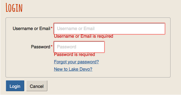
Figure: Login form with dynamically injected error messages below form fields where required information is missing
We will look at using screen readers and other assistive technologies during accessibility testing in more detail in the unit Assistive Technology Testing.
Though in many cases using automated and manual testing strategies is sufficient to identify and address potential accessibility issues, it can be helpful to have users with disabilities, or others such as older users, use a site in addition to the other auditing strategies. Actual users can turn up a variety of potential usability issues.
Depending on the audience a site serves, user testers might include a few different people with different accessibility needs, such as a person who is blind using a screen reader, a person with low vision using a magnifier, or perhaps a person with motor impairments using speech recognition and switches to navigate through web content.
User testing will be covered in depth in the unit User Testing.
While you are testing with automated tools or other manual strategies, it is often helpful and sometimes necessary to look at the HTML markup to confirm, or investigate further, potential barriers tools or strategies have turned up. All browsers have a View Source feature (or something equivalent) to view the HTML underlying a web page. Though using View Source is one potential way to view the HTML markup, it can be time-consuming to find specific bits of HTML associated with potential barriers that have been identified.
A better strategy for examining code is to use the Inspect Element feature most browsers today provide. You can typically right click on the element you want to view (such as an image), then choose “Inspect Element” to look at the HTML and CSS used to display the image. Look at the markup of the image element to see whether the alt attribute is present and what its value is, as well as what other attributes it might contain (e.g., ARIA attributes that may be present to address a potential barrier a checker has identified).
A browser’s developer tools (e.g., Chrome’s DevTools or tools in Firefox Developer Edition) provide a whole variety of information about the markup of a page in addition to being able to examine specific elements in the HTML.
Examining the code with the built-in inspector or with a plugin is a good way to find colour codes in the style sheets associated with a web page when doing colour contrast evaluation.
We will look at code examination in more detail in the section Code Examination and Repair.
It is often necessary to adjust code manually while auditing, and to retest to come up with solutions to correct accessibility issues. Using the browser’s developer tools, it’s possible to dynamically adjust the HTML markup and CSS to test possible solutions, perhaps running potential fixes through a screen reader, before making recommendations. Firefox Quantum (Developer Edition), Chrome, Internet Explorer, Edge, and Safari all have tools that allow you to dynamically adjust code.
When writing web accessibility reports it can be helpful to provide small code snippets to demonstrate to developers what needs to be done to correct an issue, or at least describe the code changes in written words. Having good knowledge of HTML, CSS, and JavaScript is a prerequisite to providing solutions in your accessibility reports.
We will talk more about code repair in the section Code Examination and Repair. The video below provides an introduction to code examination and repair using a browser’s Inspect view.
Video: Code Examination and Repair

A YouTube element has been excluded from this version of the text. You can view it online here: https://pressbooks.library.ryerson.ca/pwaa/?p=1240
We will introduce you to ChromeVox, the screen reader we will be using, early on, so you have plenty of opportunity to practice using it. It will be a key tool used in auditing the accessibility of web content, and will be used in the activity for this unit.
For day-to-day screen reader testing, ChromeVox (particularly the ChromeVox plugin for the Chrome web browser) is our screen reader of choice because of its simple installation and configuration, ability to work across computer platforms, and the fact that it’s free and open source.
Technical: One reason ChromeVox works well for accessibility testing is its good support for ARIA. We will cover ARIA in greater detail in the unit Other Accessibility Standards. ARIA is still a relatively new technology, and as of late 2019, it is still being supported inconsistently across available screen readers. When developing for the Web, do use ARIA as it is intended to be used as documented in the ARIA Specification, and test it with ChromeVox.
You will still want to test with JAWS or perhaps NVDA, as these are most likely to be used by blind users. You may, however, find that what works in ChromeVox does not work with the other screen readers. So, for the time being, it may be necessary to provide workarounds when developing custom web elements, so they will work across technologies, with the assumption that these other technologies will catch up eventually.
While a relatively small number of screen reader users currently use ChromeVox, it is a highly effective tool for developers when testing web content. Also, ChromeVox is tailored to work with elements of Google Drive, so even for users of other screen readers, ChromeVox may be preferable when compiling Google Docs, Sheets, and Slides.
Toolkit: Visit the Chrome store while using the Chrome web browser to install the ChromeVox screen reader. It will be a key element of your Toolkit.
The videos below will help show you how to install and begin using ChromeVox.
Video: Installing ChromeVox

A YouTube element has been excluded from this version of the text. You can view it online here: https://pressbooks.library.ryerson.ca/pwaa/?p=1242
Video: ChromeVox Demo

A YouTube element has been excluded from this version of the text. You can view it online here: https://pressbooks.library.ryerson.ca/pwaa/?p=1242
© Google Open Online Education. Released under the terms of a Standard YouTube License. All rights reserved.
* The ChromeVox modifier key (i.e., Cvox) is set in Chrome’s Settings > Extensions > ChromeVox Options, typically set to Alt or Ctrl.
| Task | Task Description | Keyboard Command |
|---|---|---|
| Default Reading | When a webpage loads, ChromeVox will read the element that takes focus on the page. Use the Cvox + arrow keys to read through content. Listen to the spoken output and note any inconsistencies from what one might expect to hear based on what is visible on the screen. | Cvox + up and down arrows |
| Tab Navigation | When a page has loaded, press the Tab key to navigate through operable element of the page like links and forms. Listen to the output when these elements are in focus, and note any elements that are clickable, but not focusable with the keyboard. Also listen for hidden elements such as bypass links or other elements that are not visible but are read aloud by ChromeVox. | Tab, Shift Tab |
| Navigate Through Headings | Step through all the headings on a page. Note whether all headings are announced as expected. Note the heading level announced. Are they sequenced to create semantic structure (i.e., nested in the proper order)? | Cvox + L + H then up/down arrows |
| Navigate Through Landmarks | Step through the landmarks, key navigation points on a page. Are all areas of the page contained in a landmarked region? Note any missing Landmarks. | Cvox + L + ; (semi-colon) then up/down arrows |
| List Links | List the links and navigate through them using the arrow keys, listen for meaningfulness, or listen for context when links are otherwise meaningless. | Cvox + L + L then up/down arrows |
| Navigate Through Forms | Navigate to forms on a page, then press the Tab or F keys to listen to each of the fields. Are fields announced effectively, including required fields? | Cvox + L + F then up/down arrows |
| Navigate Through Tables | Navigate to Tables on a page, press Enter to go to a table, press up/down arrow keys to move through cells in sequence (left to right, top to bottom), press Ctrl + Alt + arrow to move to adjacent cells, press Ctrl-Alt and 5 on the number pad to list column and row headers where applicable. Note whether header cells are read or not. Are fieldset labels announced, where applicable? | Cvox + L + T then up/down arrows then Enter to select Table Cvox + arrow to move within table Cvox +TH to announce headers |
NOTE: If you are a regular day-to-day screen reader user (i.e., you are blind or have significant vision loss and must use a screen reader) do the alternate activity below instead of this one. This first activity is for first-time, or novice, screen reader users, and those who do not use a screen reader on a regular basis.
This exercise will help you understand accessibility firsthand, by experiencing the Web as someone who is blind might experience it. If you have not already, go back to the ChromeVox section earlier in this unit, and setup ChromeVox yourself.
Be sure to review the ChromeVox Keyboard Commands [docx] before completing this activity, or have it printed off beside you for easy reference.
If you do not regularly use a screen reader, turn off your computer monitor while navigating through a familiar website with ChromeVox to experience what it’s like to access web content by screen reader only. Note some of your thoughts and feelings on this experience as self-reflection.
NOTE: This alternate activity is for people who use a screen reader on a regular basis. You are likely blind or have significant vision loss that requires you to use a screen reader to access your computer, and the Web. If you are not a regular screen reader user, do the activity above instead of this one.
The goal of the activity above is to help people who do not use a screen reader better understand the challenges of navigating the Web without being able to see what one is navigating through. If you are a regular screen reader user, you already know these challenges. Here are a few questions to consider as self-reflection about your experience:
Which of the following are automated accessibility checkers not good at identifying? Please select all that apply.
Which of the following groups of people with disabilities are least likely to face barriers in Web content? People who:
Which of the following were mentioned as key things to watch for when auditing the accessibility of Web content? Please select all that apply.
An interactive or media element has been excluded from this version of the text. You can view it online here:
https://pressbooks.library.ryerson.ca/pwaa/?p=1247
Now that Lulu has a better understanding of what a web accessibility audit entails and has decided with certainty to move forward with one, she is seeking a recommended resource that might allow her webmaster to familiarize herself more thoroughly with the features of accessible web content. Without a doubt, WCAG 2.0 is the resource that she is looking for. Review the content below to understand the significance and purpose of this critical element of Lulu’s, and your, toolkit.Though it is possible to conduct informal accessibility reviews with basic understanding of the types of barriers faced by people with disabilities, and knowledge of the common elements in web content that often produce barriers, a thorough, professional review requires a solid understanding of the W3C Web Content Accessibility Guidelines (WCAG 2.0 or WCAG 2.1, aka ISO/IEC 40500:2012).
This unit will introduce you to WCAG (pronounced “wuh-kag”), which provides the basis for most international accessibility rules and legislation, along with its supporting documents. WCAG should be a key element of your Web Accessibility Auditing Toolkit. You should develop a basic understanding of WCAG to start, then use it and its supporting documents as references while conducting your audits and build upon the basics as you go about auditing web content.
Watch the following video for a brief overview of WCAG 2.0.
Video: WCAG-WAI Basics

A YouTube element has been excluded from this version of the text. You can view it online here: https://pressbooks.library.ryerson.ca/pwaa/?p=1253
© Richard Fouchaux. Released under the terms of a Creative Commons Attribution license.
Accompanying the WCAG specification itself are a variety of documents that expand on the guidelines. The two types of documents we would like to draw your attention to are:
These documents are conveniently linked next to their corresponding guideline, as shown in the figure below.
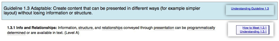
Figure: Links to supporting documents appear next to each guideline in WCAG 2.0
Required Reading: The 10 Key Guidelines of WCAG 2.0/2.1 have been summarized in a downloadable PDF document. Download the 10 Key Guidelines [PDF] document, and read through it to familiarize yourself with the manner in which WCAG 2.0/2.1 addresses the most common accessibility issues.
By the end of this unit, you will be able to:
If you are interested in knowing about the history behind WCAG, take a look at the timeline of milestones described below.
An interactive or media element has been excluded from this version of the text. You can view it online here:
https://pressbooks.library.ryerson.ca/pwaa/?p=1257
It was during the mid-1990s that web accessibility awareness began to take hold, first mentioned by Tim Berners-Lee in his keynote speech at the 1994 Second International World Wide Web conference in Chicago. The Unified Web Site Accessibility Guidelines were compiled shortly after that at the TRACE Centre at the University of Wisconsin-Madison in 1995. Version 8 of the Unified Web Site Accessibility Guidelines became the seed document for WCAG 1.0.
It was not until 1999 that the first version of the Web Content Accessibility Guidelines (WCAG 1.0) was released by the W3C’s Web Accessibility Initiative (WAI). This was a significant advancement in the promotion of an accessible web. With WCAG 1.0 it was possible to assess accessibility based on a standard, without the need to use applications like JAWS. That standard was also used by assistive technology (AT) developers (of screen readers, for instance) to better understand how AT should interact with content on the Web. One could then judge accessibility based on what the WCAG specification suggested should be done. But, there were problems with WCAG 1.0 that slowed its adoption. These problems would be addressed with the release of WCAG 2.0.
In 2008 WCAG 2.0 was released to address the shortcomings of its predecessor. One of the significant changes included technology independence. This meant that what might previously have been associated with a barrier in HTML content was now a barrier regardless of the technology used.
For example, “include alt text with images,” "alt" being an HTML attribute, became “include text alternatives for visual content,” with no reference to the technology presenting the content. WCAG 2.0 addressed accessibility across a whole range of web technologies, including things like Flash, Java, JavaScript, and other such technologies.
A second major change was the acceptance of JavaScript in WCAG 2.0 as a legitimate web technology. With WCAG 1.0, developers had to create alternatives to JavaScript elements they may have added to create interactivity in their web content. In other words, a website needed to operate with the same functionality if JavaScript was turned off in a user’s browser. This severely limited what developers could do while complying with WCAG 1.0 and became another contributing factor to the slow uptake of WCAG 1.0.
With the release of WCAG 2.0 this restriction was lifted. It is no longer a requirement to create alternatives to scripted features, though it is still a requirement to make those features accessible – certainly doable for most JavaScript interactivity we see in today’s websites.
Today we have a number of new additions to the collection of accessibility standards with the introduction of specifications such as WAI-ARIA (Accessible Rich Internet Applications). WAI-ARIA is an extension of HTML5, that allows developers to add information about roles, states, and properties to custom features they might create using JavaScript, that would have previously been inaccessible to AT users.
For example, a developer might wish to use a collection of <div> elements to create a form. This is certainly possible with some script added, but a <div> was never intended to be used as a form element or to be interactive for that matter. They have no role or states or properties that would indicate to an AT user they were in a form, unlike a <form> element in HTML, which has all those semantic characteristics built in by default.
ARIA now allows developers to assign a role="form" to a <div> to identify it as a form. A <div> used to create a checkbox could now have a role="checkbox" added, and aria-checked="true" set to have its role and state (checked or not checked) announced to AT the same way the standard HTML form elements get announced. We’ll talk a bit more about WAI-ARIA in unit 8, but for now know that it is perhaps the most significant accessibility technology to emerge in recent years.
When WCAG 2.0 was introduced in 2008, the iPhone had only just been released the year before, and it would not be until 2009 that it would be usable by blind individuals. WCAG 2.0 provided little guidance on developing accessible content to be accessed through mobile devices.
WCAG 2.1 is intended to fill that gap, producing guidelines to help developers comply with accessibility guidelines when developing mobile web and responsive designs for web content, among other things. WCAG 2.1 was released in June of 2018, adding one new guideline, and 17 new success criteria.
Recent Article by Scott Hollier, on changes in WCAG 2.1: WCAG 2.1: Reflections on the New Guidelines and Success Criteria.
In parallel with WCAG 2.1, project Silver has also been launched. Silver is the code name for WCAG 3.0. The focus of Silver is on integrating accessibility standards into the emerging Internet of Things (IoT). With everything from refrigerators, to home climate control systems, to security monitoring now connecting to the Internet, Silver is being developed to ensure these emerging technologies are accessible to everyone.
Why Silver? Silver’s element symbol is Ag, which represents Accessibility Guidelines.
The four guiding principles of WCAG say that web content must be Perceivable, Operable, Understandable, and Robust (POUR) in order to be accessible to people with disabilities.
Source: Introduction to Understanding WCAG 2.0
For content to be perceivable it must be possible to perceive it through multiple senses. While there are a variety of ways to provide alternatives perceivable through alternate senses (e.g., audio descriptions for visual content for those who are blind, or sign language interpretation of audio content for those who are Deaf), text alternatives are generally the best choice.
Text can be converted into a variety of forms. It can be read aloud by screen reading software or converted to braille for those who are blind. It can be translated into other languages for those reading in a second language or it can be magnified without losing its sharp appearance for those with low vision. Its colour can be changed easily to make it more readable for those who are colour blind, or need high contrast.
In the context of web accessibility, operability generally means that something is functional using a keyboard. If functional items are not keyboard operable, they will be inaccessible to many users.
Developers often create features that operate with a mouse, sometimes overlooking keyboard functionality. Most people accessing the Internet do use a mouse, but many do not. A person who is blind is unlikely to use a mouse, but will instead rely almost exclusively on keyboard access. Power users, often developers or programmers, also tend to be keyboard users, so usability is lost for this group as well when keyboard access is not programmed in.
Operable can also mean functional using one’s voice. Some people with severe motor impairments use voice recognition software along with switches (see figure below) to operate their computers and navigate the Web. This means there must be text associated with functional elements like graphical buttons, so one can speak the text to bring focus to an element, and those elements must be keyboard operable so a switch can be used to activate the element. Pressing a switch is much like pressing the Enter key or Spacebar on a keyboard, or clicking a mouse.
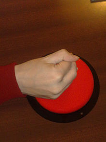
Figure: A button switch used to replicate a mouse click
Source: Wikipedia
Understandable refers to comprehending both the content and features of a website. Content that uses more complex or advanced language than is necessary may be difficult to understand for some people with disabilities, as well as those reading in a second language, or perhaps older users with diminishing cognitive abilities. Particularly for public access sites, the reading level of the language used should be minimized, using simpler language wherever possible.
A second aspect of understanding relates to the consistency and ease of use of the navigation elements on a site, reducing the number of navigation elements, and presenting these elements consistently throughout a website. This can improve usability for many users, including those who are blind, those with cognitive or learning disabilities, and older users.
A person who is blind and using a screen reader to navigate a site will often dedicate some effort to mapping to memory the navigation structure of a site, much like one might visualize traveling from point A to point B through a building or through city streets. If the navigation structure changes, it can often lead to confusion, and to having to map the navigation structure over again. If the navigation stays consistent, it only needs to be learned once, after which cognitive effort can focus on understanding the important content of a webpage or website.
Robust, as described by W3C, means that content works well across a wide range of Web and assistive technologies. This generally means using technology to standard. Web browsers and assistive technologies base their development around standards such as HTML, and are able to interpret content that is created in a standard way. When content varies from the standard, assistive technologies often have trouble interpreting it. Not all content must comply with the standards, but when custom content is created that does not comply, a secondary standardized version should be provided so the content “degrades gracefully.” Web content that degrades gracefully is intended to function best in the most current browsers and assistive technologies, and then as older, less feature-rich technologies view it, it should degrade in a way that is still functional, but with fewer features.
Technical: With the advent of WAI ARIA, it is now possible to veer from the standard, perhaps using HTML in new ways that were not initially intended. ARIA attributes can be used to describe the role, states, and properties of custom elements. For example, an HTML <div> element was never intended to be clickable, but with some JavaScript it is possible to add click functionality, though from an assistive technology’s perspective the <div> is just a container with no functionality.
A <div> has been used in a non-standard way in this case. ARIA can now be added to that customized <div> to give it a role="button" for instance, and made focusable adding a tabindex attribute, and made clickable by adding aria-pressed attribute to describe its state as pressed or not pressed, and so on.
There are other occasions where non-standard technologies such as embedded Flash objects or Java applets might be used. Though it is possible to make these objects somewhat accessible, they are often challenging to access and operate effectively with assistive technologies. In such cases alternatives are generally needed. Some Flash development tools, for instance, provide an option to generate an HTML version, though these tend to be static representations of what was interactive in the Flash. Where possible, HTML5, with CSS, scripting, and ARIA should be used to develop interactive content for the Web.
HTML5 and ARIA will be discussed in greater detail in unit 8.
Lulu’s webmaster has been reading through WCAG 2.0 and at times finds it overwhelming. However, if she understands the POUR principles, the 3 levels of conformance, and the success criteria associated with each guideline, she will have a solid basis upon which to build her skills in the realm of web accessibility.
To help the webmaster further frame her understanding of conformance, she should be reminded that, as an Ontario-based company, to achieve AODA compliance, Lulu’s Lollipops’ two main target years are 2014 (WCAG 2.0 Level A – except live captions and audio description), and 2021 (WCAG 2.0 Level AA – except live captions and audio description).
For further information regarding the specifics of AODA compliance, a link that may be of use to the Lulu’s webmaster and others in similar roles is the Integrated Accessibility Standards. For further information on WCAG compliance levels, read on.
In addition to being grouped by principles, WCAG is also grouped by level of conformance. These levels are described by W3C as follows:
1. Conformance Level: One of the following levels of conformance is met in full.
Note 1: Although conformance can only be achieved at the stated levels, authors are encouraged to report (in their claim) any progress toward meeting success criteria from all levels beyond the achieved level of conformance.
Note 2: It is not recommended that Level AAA conformance be required as a general policy for entire sites because it is not possible to satisfy all Level AAA Success Criteria for some content.
Source: Understanding Conformance
Conformance levels can be thought of in terms of their importance toward removing barriers with Level A being the most important. It is helpful to think of levels as things you must do, should do, and could do.
While Level A conformance is an honourable accomplishment, and will allow most people to access the content of a website, it is generally considered “minimal conformance.” If you are working with a limited budget (or no budget) this may be an acceptable level of accessibility, but it is generally accepted that most sites should strive for Level AA, and perhaps conform with a few of the Level AAA success criteria (defined below).
If you are working on a new website, Level AA should be the goal from the start. Assuming the developers know what needs to be done, there is very little extra effort required to jump from Level A to Level AA. If you are working with an existing site that is receiving an accessibility retrofit, then you may want to first aim for Level A, then with time resolve all Level AA issues. Generally speaking it is less costly to build a site to be accessible from the start, than it is to build a site and retrofit it later to conform.
Level AAA conformance is unattainable for many websites. While it is possible to conform with some of the requirements at this level, they can often be counter-productive or unnecessary. Take for instance the reading level requirement (WCAG success criterion 3.1.5). Public sites will want to strive to meet this guideline, to reach the broadest audience possible by reducing the reading level, but for other sites that focus on a particular, perhaps highly-educated audience, it may be impossible or even inadvisable to comply with this requirement. Imagine an advanced course in biomechanics written at a lower-level secondary school reading level required to satisfy this guideline. If it were possible, replacing the advanced terminology and jargon with low level paraphrasing would likely make the content unusable by the intended audience.
Success criteria are essentially accessibility requirements. For example, the success criterion for an image conforming with guideline 1.1 (see below), is providing an equivalent text alternative. Note the success criterion does not specify any technology-specific solution or strategy on how that equivalent text should be provided.
Alternatives for an image can take different forms, hence the techniques for satisfying success criteria. For success criterion 1.1.1 possible techniques might include providing alt text, including an image caption, or describing the image in the surrounding text and referring to the description in the alt text for the image. Each of these techniques potentially satisfies the requirements or success criteria of Guideline 1.1.
You may also notice techniques are grouped into Sufficient Techniques and Advisory Techniques. Sufficient techniques are those that reliably satisfy success criteria, while an advisory technique may not reliably satisfy success criteria but may be beneficial for improving usability or improving accessibility for specific users. Developers should apply sufficient techniques to satisfy success criteria, and where feasible also apply advisory techniques to improve accessibility or usability further.
There is a third category of techniques called Failures. These are not techniques to satisfy success criteria, but rather techniques that introduce barriers and thus should be avoided.
Source: W3C – Understanding Techniques for WCAG Success Criteria
In addition to meeting all the Level A or AA or AAA requirements before being able to claim conformance at one of these levels, there are other conformance requirements, listed here:
Once a website has addressed all the issues required for a certain level of conformance, it may be desirable to “claim” conformance, though there is no requirement that a claim be made in order to conform.
A basic claim must include the date the site was judged to be conformant. Because web content tends to change over time, conformance can typically only be claimed for a specific date (with exceptions such as numbered versions of web software). The basic claim must also include the specification or standard the site is claiming conformance with, and must include the level of conformance. A basic conformance claim may look like the following:
A conformance claim can be more extensive than just a basic claim like that described above. It can also provide documentation about the accessibility features found on a site, so those accessing the site with assistive technologies can read about these features rather than having to discover them on their own. This documentation is often found linked prominently in the navigation elements of a website, usually near the start of a page so it is easily found by assistive technology users, and is often labelled “Accessibility” or “Accessibility Statement.”
If the conformance claim does not apply to the whole site (e.g., there may be some older content that remains inaccessible), the scope of the claim should also be specified. For instance, add to the basic claim above, “…for any content added to the site after January 1, 2012.” The claim can also list known issues, if there are areas of the site that are known to be inaccessible, perhaps because there isn’t a suitable accessible alternative to a particular technology being used. For example, “…the video conferencing area of the site remains non-conformant due to the lack of an alternative accessible conferencing system.”
The Web Content Accessibility Guidelines (WCAG 2.1) include 13 guidelines, made up of 78 success criteria (or WCAG 2.0 has 12 guidelines, 61 success criteria). Not all of these guidelines are applicable to all websites, though there are some that are more frequently relevant than others.
Required Reading: Earlier in this unit, we encouraged you to become familiar with 10 Key Guidelines [PDF] that we provided in a downloadable document. If you have not already done so, please take the time now to download and read this document.
Now that you have an understanding of WCAG, we will introduce you to an accessibility auditing template. You can use the template to record issues when you conduct audits, but it also acts as a checklist to help commit the guidelines to memory. For now, review the layout and elements of the Web Auditing Review Template and add it to your Web Accessibility Auditing Toolkit.
Title: This field should indicate the type of review, either General, Template, or Detailed (to be covered in greater detail in the unit Web Accessibility Audit Reporting) and the guideline it is based on.
Location: The URL of the homepage of the site being reviewed.
Date: The date the review was finished.
Reviewer: The name of the person(s) who completed the review.
Guideline Reference: A link to the guideline(s) the review is based upon.
Tools Used During This Review: A list of the tools used in the review, including automated checkers, browsers, browser plugins, readability test tool, colour contrast test tool, screen readers, and any other tools used. Be sure to mention version numbers if applicable.
General Comments: An overview of the result of the WCAG 2.1 Review (below), outlining the key issues, why they are issues, with brief mention of potential solutions. This section is written for a general audience, minimizing the use of technical language.
WCAG 2.1 Review: The main content of the review. This is a list of WCAG 2.1 success criteria, each one’s conformance level (A, AA, AAA), the evaluation received (Pass, Fail, Pass?, Fail? N/A), and comments associated with the evaluations. These comments should identify accessibility issues relevant to the guideline, explain why an issue presents a barrier, and offer potential solutions to resolve issues. The review should be aimed at the web developers who will be resolving the issues identified and may contain technical language and sample code that can be replicated. Screenshots and other graphics can be used to enhance explanations given in the text of the comments.
There will likely be cases when borderline issues are identified, where it could be argued that some element may pass or fail the associated success criteria. In such cases “Pass?” (with the question mark) is used where the auditor is leaning toward a pass, but others might argue it fails. And, use “Fail?” where the auditor is leaning toward a fail, though others might argue it passes. One example might be a description for an image provided in an alt attribute that does not fully describe the meaningful information in the image. In such cases it is often a subjective decision by the auditor, commenting to the author of the alt text to review the text to determine whether it “adequately” describes the meaning one should take away from the image if it were being viewed. Questionable pass or fail is described more thoroughly in the example linked in the Toolkit box below.
Note that the AAA items are greyed out, as well as the two AA success criteria (1.2.4, 1.2.5) that are not required by AODA (this is relevant to Ontario-based participants). If you are auditing in a jurisdiction that requires these guidelines, you might choose to adjust the template by removing the grey for these two guidelines. Otherwise grey items are optional, though when reviewing content issues associated with these guidelines, recommendations can still be made to implement techniques associated with these guidelines to improve overall usability.
Other Notes: While not included in the template, there are occasions when a reviewer needs to comment on issues not associated with the accessibility of the site being reviewed. For instance, a reviewer might mention potential bugs that may have been identified, include information about posting an accessibility statement or provide details on next steps following the review, such as planning a follow-up review after issues are addressed, or arranging a time to address questions that arise from the report.
Appendix: While not included in the template, the Appendix should include a list of the pages sampled from the site that was reviewed.
In 2012 a General Review of Canvas was posted by OCAD University in Toronto, which was in the process of selecting a new LMS for the university. The review was posted publicly, so it works well as an example of what a completed review might look like.
This review looked at a series of tasks, like reading a post in the forums and posting a reply, reviewing test results and checking marks in the Gradebook, and so on (these scenarios were described in the appendices, missing from the publicly-posted review). The result of these scenarios were combined into a General Review (see the unit Web Accessibility Audit Reporting for a description of different types of reviews). Read through parts of the review to get an idea of the types of information it contains.
You might ask, if there are so many issues, why did we use Canvas to deliver the online course version of the content here? Following the publication of the review, Canvas did pay attention and put considerable effort into improving the accessibility of their system. In 2014, Canvas accessibility had been much improved, though with still a few areas where improvements could be made. Compared with other Learning Management Systems, the current version of Canvas fares well in terms of accessibility.
Now that you have been introduced to the key guidelines you’ll refer to often when conducting accessibility reviews, it will be necessary for you to expand on your understanding of WCAG 2.1 by eventually reading through the full specification (if possible, before completing the reading and activities here).
To become comfortable with WCAG 2.1 and its associated documentation, try this Scavenger Hunt challenge. Below is a list of barriers that you’ll likely see on many websites. For each barrier, find a relevant guideline and match a sufficient technique (with its ID) to remove the barrier. How to Meet WCAG 2.1 is a good reference.
Happy hunting!
Barrier: Pre-recorded video does not audibly describe meaningful visual activity
Technique ID: G78: Providing a second, user-selectable, audio track that includes audio descriptions.
Which WCAG 2.0 level of conformance is considered the generally agreed upon level that organizations should aim for when addressing the accessibility of their websites?
Which TWO of these guidelines are considered the most important in terms of reducing the greatest number of potential barriers, according to “10 Key Guidelines” introduced in Unit 2?
Which of the following are NOT principles of WCAG 2.0? Please select all that apply.
An interactive or media element has been excluded from this version of the text. You can view it online here:
https://pressbooks.library.ryerson.ca/pwaa/?p=1298
In this unit and the next, we will move from the general overview to look more closely at the necessary tools and strategies for assessing the accessibility of web content. Specifically, we will examine:
Building on the general understanding of automated review tools introduced in the unit Aspects of Web Accessibility Auditing, this unit focuses on a few specific tools that you will want to add to your toolkit. We won’t cover all the potential tools you might use, but rather focus on learning how to use some of the popular tools. Feel free to explore beyond those introduced here.
The first group of tools we will look at are automated accessibility checkers. These are typically web-based tools that take a URL or a copied HTML page, scan through the HTML and run a variety of tests to determine the presence or absence of accessibility features. We will look at:
We’ll list a few others too, that you may want to investigate on your own.
After familiarizing yourself with the automated accessibility testing tools, we’ll look at a few other automated tools for:
By the end of this unit, you will be able to:
Automated accessibility checkers are a must in your Web Accessibility Auditing Toolkit, though it is important to understand their limitations. Think of an automated accessibility checker like a spell checker in a word processor. Though a good start for identifying misspelled words, a person must still read through the text to ensure words have been used correctly (e.g., where “there” is used in place of “their”). For now, human judgement must also be involved for any potential barriers that involve assessing meaning. For example, automated checkers can identify ambiguous phrases like “click here” or “this link” used as link text, but a person needs to determine whether this text accurately describes the link’s destination or function. Similarly, a person must decide whether alt text or a long description for an image accurately describes the meaningful information in the image, something automated checkers cannot currently do.
You may also want to make use of multiple accessibility checkers and compare results. See the Activity at the end of this unit for an exercise comparing automated accessibility checkers.
Another limitation worth noting is that automated checkers are unlikely to identify with certainty whether accessible equivalents are available for web content that has been flagged as a potential barrier. A human perspective is required to make the association between equivalent elements. However, the site provider may offer an accessible HTML version of the page as well. An automated checker would not recognize the connection between the barrier and its accessible alternative, but a person would.
Toolkit: Add the public version of AChecker Web Accessibility Checker to your Toolkit.
In the public version, you can set up an account and do your automated accessibility testing. See below for details on downloading and installing your own version.
Fun Fact! AChecker was originally developed as an Enabling Change project, the same fund that supported the development of the materials here.
First released in 2005, AChecker was created with the goal of providing an accessibility checking tool that was 100% transparent, interactive, customizable, and free. AChecker makes use of the Open Accessibility Checks (OAC), which is a collection of checks based on all web accessibility guidelines available globally. Currently, there are a total of 310 OAC checks employed by AChecker.
AChecker has specific features for public users, registered users, administrators, and developers. To take advantage of these features, you should first create an account on the public AChecker site, if you are not planning to install a version of your own (see below). Follow the link you added to your Toolkit above, and click “Register” to create an account. Creating an account will allow you to save your accessibility reviews, and generate an AChecker seal for sites that pass its review.
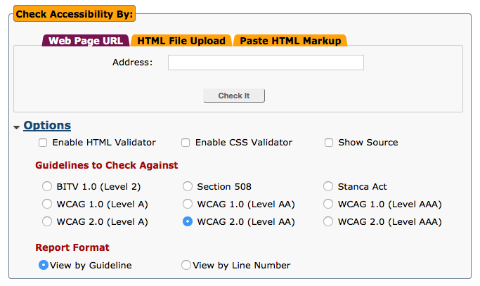
Figure: AChecker screenshot showing the main interface for conducting accessibility reviews
For more about using AChecker, watch the following video:
Video: Using AChecker to Test Web Accessibility

A YouTube element has been excluded from this version of the text. You can view it online here: https://pressbooks.library.ryerson.ca/pwaa/?p=1311
© Greg Gay. Released under the terms of a Standard YouTube License. All rights reserved.
Technical
Installation Instructions
Installing from GitHub or If You Plan to Contribute
If you are familiar with using GitHub, you can clone the most current source code from there. This version often has new features not available yet in the public site, or in the downloadable version of the software, though it may be less stable than the publicly-distributed version. If you would like to participate in AChecker’s development, or you would like to add your own accessibility checks, or perhaps fix a bug you’ve found, working from GitHub is the way to have your work added to the public source code.
Another popular free accessibility checker is WAVE, developed by WebAIM at the Center for Persons with Disabilities at Utah State University. It is a web service, similar to AChecker, though without much of the interactivity and customizability. Those who prefer a visual presentation of the issues, as opposed to the list presentation of AChecker, may find WAVE easier to use.
WAVE is similar to AChecker in the following respects:
WAVE produces a report by reproducing the page that was reviewed, inserting a variety of icons into the content to identify errors (known problems) and alerts (potential problems), as well as the accessibility features that are present. Clicking on any of the icons will provide a brief description and a link to additional information.
Explore the links listed here to get an idea of the range of accessibility checkers currently available, and the variation in these types of tools. Add them to your Web Accessibility Auditing Toolkit if you find them useful.
For basic accessibility testing, you may find these free tools useful.
For larger sites, or for in-depth testing across a website, these enterprise level accessibility testing tools may be helpful.
Collections of accessibility testing tools can be found through the following resources.
A quick search of the Internet for “colour contrast test” should turn up a variety of tools you can use to test contrast. Here, we will mention the WebAIM Color Contrast Checker, but if you prefer another, you can add it to your Toolkit.
You may recall from the unit Introduction to WCAG 2.0 that WCAG 2.0 Guidelines 1.4.3 and 1.4.6 address accessibility issues associated with colour contrast. These two guidelines are presented below. Note the contrast ratios at each level (4.5:1 & 3:1 at Level AA and 7:1 & 4.5:1 at Level AAA for smaller and larger text respectively).
1.4.3 Contrast (Minimum): The visual presentation of text and images of text has a contrast ratio of at least 4.5:1, except for the following (Level AA):
1.4.6 Contrast (Enhanced): The visual presentation of text and images of text has a contrast ratio of at least 7:1, except for the following (Level AAA):
Some accessibility checkers will have colour contrast evaluation built into them (e.g., AChecker), but others will not.
Technical:
There are many colour contrast evaluators from which you may choose to support your contrast testing (see some suggestions below). Using any of these tools requires gathering the colour codes from the elements being evaluated. There are a variety of ways to find these codes, though the easiest is to use a browser’s “Inspect” feature. You can inspect the colours in the right frame, as shown in the figure below.
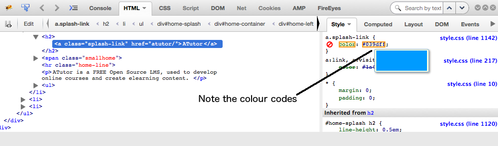
Figure: Inspect panel showing the colour codes in the Style pane to the right
Once you’ve tested a few colour combinations you’ll quickly develop a “feel” for good contrast, and be able to quickly scan a page and identify where contrast may not be sufficient. You can test the specific colours associated with those elements you’ve identified in a scan. There are tools, however, that will evaluate all the colours on a page (e.g., AChecker) – this may be preferable if you are reviewing a site that seems to have multiple contrast issues.
For a walk through the WebAIM colour contrast checker, watch the following video:
Video: Checking Colour Contrast

A YouTube element has been excluded from this version of the text. You can view it online here: https://pressbooks.library.ryerson.ca/pwaa/?p=1317
In the figure below you can see the foreground colour (#007ac6) and background colour (#ffffff) codes entered into the respective fields. Below that you will see the compliance status for Normal and Large text, at Level AA and Level AAA. In this case the colours contrast well enough to pass at Level AA (4.57:1), but for smaller text the contrast ratio fails at Level AAA. Sites should aim for Level AA contrast, but if feasible try for Level AAA compliance.
Note the lighten and darken links next to the colour input field. You can click these (on the test site) to adjust the colours so they will pass, then take the resulting colour codes and replace the existing codes to adjust the colour on the site being evaluated so it complies.
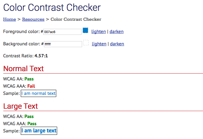
Figure: The WebAIM Colour Contrast Checker
Here are a few other colour contrast testers you may want to experiment with:
Web content authors should use the simplest language possible for the following reasons:
Though appropriate reading level is identified as a Level AAA requirement in WCAG 2.0, this is one Level AAA guideline that most public sites should aim to meet in order to reach the broadest possible audience.
The WCAG 2.0 guideline that is relevant to readability is 3.1.5:
3.1.5 Reading Level: When text requires reading ability more advanced than the lower secondary education level after removal of proper names and titles, supplemental content, or a version that does not require reading ability more advanced than the lower secondary education level, is available. (Level AAA)
Automated accessibility checkers like AChecker and WAVE do not test for readability.
You can find a variety of readability test tools by searching the Web for “readability test.” These tools run a variety of algorithms that measure things like word length, number of syllables per word, and sentence length, to come up with a readability score. We have selected one example here for you to include in your Toolkit: The Readability Test Tool.
This tool, like most others, will allow you to enter a URL to a webpage, or paste text into a text area. The output from the test appears in the figure below. In this case the reading level is about grade 10, in the range acceptable to pass Guideline 3.1.5. The first area lists a series of readability indices, calculated using various combinations of the characteristics of the text on the page. If you visit the tool’s site, the measures for these indices are listed. Below the indices is a list of the characteristics of the text content. All of these elements are averaged to come up with an average grade level score.
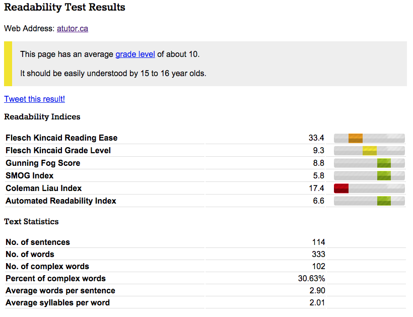
Figure: Readability Test Results from the Readability Test Tool
Many HTML editing tools will have markup validation built into them, so you can test the validity of the code while creating it, but since most sites are dynamically assembled parts, these built-in validators have limited usefulness. It is necessary to validate markup after the code has been generated into a webpage using tools like the W3C’s HTML Validator. This is a tool you should add to your Toolkit.
The WCAG 2.0 Guideline that deals with markup validation is Guideline 4.1.1. Note that Parsing is a Level A requirement, so despite the fact that some “careless” code may get by without affecting accessibility, markup validation needs to be done in order to comply with WCAG 2.0. The guideline is reproduced below for your reference.
4.1.1 Parsing: In content implemented using markup languages, elements have complete start and end tags, elements are nested according to their specifications, elements do not contain duplicate attributes, and any IDs are unique, except where the specifications allow these features. (Level A)
Note: Start and end tags that are missing a critical character in their formation, such as a closing angle bracket or a mismatched attribute value quotation mark are not complete.
Markup validation ensures that the HTML of web content is well formed, and used in a way that is compliant with the HTML specifications. It is important that HTML be clean and properly structured for the following reasons:
Markup validation should be done as early as possible in the web accessibility auditing process. It can help rule out apparent barriers when testing content with assistive technologies, so it is helpful to validate the HTML before doing any screen reader testing. We’ll talk more about screen reader testing in the section Screen Reader Testing.
In reality it can be difficult to achieve 100% validation, and sometimes it may be necessary to let markup errors go. Below are some examples of situations that might require a developer’s and/or auditor’s judgement.
ARIA in an XHTML document: Developers may wish to use ARIA in an XHTML document, which will fail validation because ARIA is not a part of the XHTML specification (it’s part of HTML5). Using ARIA in XHTML can enhance accessibility, so as an auditor you may choose to ignore these validation errors.
HTML5 Elements: If HTML5 elements such as nav are being used to create a navigation bar, validation will produce warnings if the ARIA role="navigation" is used in that element. Thenav element is supposed to already have a role of navigation built in. In reality, though, there is still inconsistent support for the nav element, so developers will often add role="navigation" as a fallback for technologies that do not identify nav correctly. From an accessibility perspective, it does not hurt to have the redundant roles in HTML5 elements.
External Services: Another common validation issue occurs when developers use external services within markup that injects third party HTML into the code of a site. Google ads from Adwords, for instance, tend to introduce validation errors, though these errors have no bearing on accessibility.
In all of the above cases, judgement is needed to decide whether the invalid markup creates a potential barrier or not, and whether these errors should be reported in a web accessibility audit. Such errors can cause a site to fail at Level A, which can have legal implications in jurisdictions that require Level A compliance. They can also have implications for auditors who choose to ignore these errors and pass a site at Level A, despite the HTML not validating.
Much like the automated accessibility checkers, it is possible to have the validator assess markup via URL, file upload, or by pasting in HTML. Note that the HTML must be a full HTML document, with all the necessary components including a DOCTYPE declaration, an opening HTML element, a HEAD element and Title, as well as opening and closing BODY elements and a closing HTML element at the end of the document.
When running the validator there are a variety of settings that can be adjusted, though the default settings are usually sufficient. One option you may want to enable is “Show Source” which prints out the HTML of the page, making it easier to identify exactly where issues occur in the page. This option and others are shown in the screenshot of the W3C Validator that follows. The W3C Validator will also identify some accessibility issues, such as images missing alt text or use of duplicate IDs within the content.
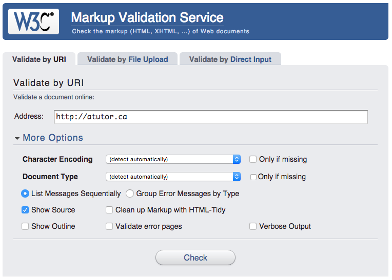
Figure: The W3C Markup Validation Service opening screen, with various options displayed
If you have had an opportunity to begin experimenting with the AChecker and/or WAVE automated accessibility review tools, consider these questions for self-reflection:
Please follow the directions below and then select all applicable options:
Please follow the directions below and then select the correct option:
“Though reading level is a Level AAA requirement in WCAG, this is one Level AAA guideline that most public sites should aim for to reach the broadest possible audience. Generally speaking Web content authors should use the simplest language possible (within reason). Simple text will translate more easily for those who may wish to read the site in a different language. It will be more accessible to those with lower levels of education, or for those reading in a second language. And for a general audience, most readers will appreciate simpler language over unnecessary use of “big” words. Being able to explain things in simple language for most, is a more intelligent use of language than loading it with jargon, complex terminology, and unnecessarily complicated words and sentences.”
Please follow the directions below and then select the correct option:
Based on the evaluations that you did in the Question 3, which of the following issues did both checkers identify? Please select all that apply.
An interactive or media element has been excluded from this version of the text. You can view it online here:
https://pressbooks.library.ryerson.ca/pwaa/?p=1325
In addition to automated testing and testing with assistive technologies (AT), manual testing is an important part of web accessibility auditing. A number of simple manual tests will be introduced so you can quickly get a general sense of the accessibility of a website and identify key issues with just a cursory scan. For the developers taking this course, more complex manual testing will also be introduced, involving the examination of source code and dynamically tweaking code to test potential solutions.
The manual testing strategies discussed in this module include:
By the end of this unit, you will be able to:
The Tab Key Navigation test is often used with the “Select All” test (discussed on the next page) to confirm whether items that were not selected are keyboard operable, but this test can also be used on its own. Place the cursor at the very start of the HTML content (sometimes tricky), or in the browser’s location field or address bar, then press the Tab key repeatedly and watch as the cursor moves through the content of the page. Make the following observations:
Technical: These elements are often custom features built with non-standard HTML and JavaScript. In such cases you can recommend the use of standard HTML where possible or suggest the developer add keyboard focus for the element by adding tabindex="0" to the HTML, and add keyboard events, in addition to the existing mouse events, to the programming that controls the functionality of the feature.
For drop down menus like those described in #4 above, also watch for Tab key navigation moving through the items in the submenus, but the submenus not visibly opening. This will be confusing for low vision keyboard users who are following the focus indicator to keep track of where they are within the page.

Figure: Scenario in which the menus only function with a mouse click (see Lulu’s Lollipops)
The “Select All” test can help identify elements in web content that are not keyboard accessible. The key command for “Select All” in Windows is Ctrl-A, and for Mac is Command-A.
After pressing the “select all” key command for the operating system you are using to select the content of a webpage, scan over the page looking for elements that are not selected. In the two screenshots below, the first has nothing yet selected, and the second is the result of pressing the “select all” key combination.
Compare “Before Select All” above, with “After Select All” below and notice the elements that do not have the blue background colour in the latter version.

Figure: Screenshot prior to selecting to compare with the screenshot below
Figure: Screenshot after selecting showing elements that do not appear to be selected
In the second screenshot, the Feedback tab located on the right does not appear to be selected and is missing the blue background colour that appears when other elements are selected. That tab should be investigated further to see if it is keyboard operable. The appearance of not being selected does not necessarily mean such elements are not keyboard operable, but warrants further testing. This testing can be done by using the Tab Key Navigation test described on the previous page. Using Tab key navigation you can confirm that the Feedback tab on the right is indeed not keyboard operable. It may then be appropriate to identify the tab as a potential barrier when reporting on the site. Do search the screen for other ways to get to the Feedback form. There may be an accessible alternative elsewhere on the page, in which case it may be acceptable for the Feedback tab to be inaccessible, as long as the alternative is relatively easy to access.
Once you have discovered a potential barrier, you can identify where the problem is occurring in the HTML markup. In the screenshot below, the feedback tab (1) on the right of the screen is examined by right clicking and choosing “Inspect Element with Firebug”” (2). Note: Firebug is now deprecated, but you can do the same thing with selecting “Inspect Element” from the menu. You will notice the code associated with the feature is highlighted in the code window (3) to the lower left. Click on the Edit button (4) to edit that HTML to test possible solutions.
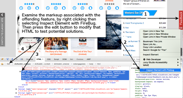
Figure: Steps to examine and modify code to test potential accessibility solutions
In the case above, the Tab Key Navigation test revealed that the Feedback tab would not receive focus, thus could not be operated with a keyboard. A simple fix for this is to add tabindex="0" to the main element containing the tab. Once added, without reloading the page, the Tab Key Navigation test is conducted again to see if the tab now takes keyboard focus. It does, though it is still not possible to operate the tab, which requires modifying the associated JavaScript.
Figure: Result of adding tabindex="0"
After clicking the Edit button, the selected code from above is opened for editing. In this case tabindex="0" has been added to test whether this adds keyboard focus to the Feedback tab (which it does).
For a look at other tools for examining code, watch the following video on the Chrome accessibility audits.
Video: The new way to test accessibility with Chrome DevTools

A YouTube element has been excluded from this version of the text. You can view it online here: https://pressbooks.library.ryerson.ca/pwaa/?p=1349
© Google Chrome Developers. Released under the terms of a Creative Commons Attribution license.
Another element of web content that is typically examined manually is multimedia. There are three potential accommodations that can be found with various media: captions, audio description, and transcripts (and combinations of these, depending on the media).
All video with meaningful spoken dialogue must include captions that reproduce the verbal elements of the video. Depending on the jurisdiction you are in, video may also require audio description (referred to as described video for television) – an audio track added to the video that describes the action or context of the video that one would not be able to determine by listening. The third element is an optional transcript, made available as a separate file that can be downloaded or reviewed online on its own.
Adding captions to a video is a fairly straightforward process, with the right tools. Services like YouTube provide built-in tools that allow video producers to add captions directly through the YouTube video manager. Many video production programs also include tools for creating captions. The Amara caption editor, which will also caption YouTube videos, can be used to caption videos from other sources on the Web. It generates a caption file that can be imported into video editors or players, to quickly add captions. It is also relatively straightforward to convert the caption file into a transcript, by removing the time codes from the caption file.
One word of caution regarding services that provide automated captions: these captions do not satisfy the success criterion associated with Guideline 1.2.2 Captions (Prerecorded) Level A. They may be a helpful strategy to consider in cases when a video must be posted in a hurry; however, in many cases these automated captions have a very high error rate, and provide little accommodation for those who require them. Only human-generated captions are acceptable to meet the requirements of this guideline. One of the most useful aspects of automated captions is that they are a good starting point for human-generated captions. They can be exported from YouTube into Amara where they can be refined, then exported back to YouTube. However, the more errors automated captions have in them, the less useful they become as a starting point for human-generated captions. With an error rate of about 35% or worse, you are better off captioning from scratch.
For more on how to use the YouTube and Amara caption editors, view the videos below.
Video: How to Add Closed Caption Subtitles on YouTube 2015

A YouTube element has been excluded from this version of the text. You can view it online here: https://pressbooks.library.ryerson.ca/pwaa/?p=1351
© Noah’s World!!!. Released under the terms of a Standard YouTube License. All rights reserved.
Video: Captioning with Amara Caption Editor

A YouTube element has been excluded from this version of the text. You can view it online here: https://pressbooks.library.ryerson.ca/pwaa/?p=1351
© Amara Subtitles. Released under the terms of a Standard YouTube License. All rights reserved.
Examining the accessibility of audio content is straightforward. When audio with meaningful spoken information is presented, a transcript must be provided.
It is also possible in some cases to caption an audio track if it is being presented in a player that supports captioned audio. Provide captioned audio where possible, but also be sure to include a transcript.
Figure: Example of captioned audio
You may also find the following tools useful when auditing web accessibility. Though we won’t go into any detail here, you may optionally install these add-ons and extensions and explore their capabilities.
For this activity you will need the Chrome web browser. Be sure to install it now if you have not already. You will need it in the next unit as well. Visit the Chrome Web Store using the Chrome web browser, and install the ColorPick Eyedropper and the WAVE Chrome Extension. Explore the features of these tools and think about how they might be used during web accessibility auditing activities.
The “Tab Key Navigation test” is useful for identifying a variety of potential barriers. From those uses listed below, select all that the Tab Key Navigation test would identify.
Which of the following potential barriers would the “Select All test” be useful in identifying? Select all that apply.
To examine the HTML markup associated with a potential barrier that has been identified using the Tab Key Navigation or Select All tests, a recommended approach would be to use:
When reviewing video content for accessibility, which of the following alternatives does WCAG 2.0 suggest should be provided? Select all that apply.
An interactive or media element has been excluded from this version of the text. You can view it online here:
https://pressbooks.library.ryerson.ca/pwaa/?p=1357
In this unit we will look more closely at assistive technology testing, and particularly testing with a screen reader, and in the next unit we will look at strategies for including people with disabilities as part of a web accessibility audit. Specifically, we will examine:
Many of Lulu’s potential clients might use assistive technology to access her site, so to help ensure the success of Lulu’s “barrier-breaking” efforts, it is important to assess how the site and these devices interact.
There is a wide range of assistive technologies (AT) that people use to access the Web, from browser-based tools for magnifying text, to screen readers that read back text content, to various types of hardware such as braille displays, or switches and scanners that can be used by those with limited physical mobility to control keyboard and mouse actions.
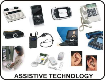
Figure: Examples of assistive technology
Source: Intro2AT
While web accessibility guidelines are written to be technology neutral, and intended to remove the need for testing with specific AT, there are times when manual testing with AT may be necessary. Screen readers are most commonly used for manual AT testing. You were introduced to the ChromeVox screen reader in the section ChromeVox Screen Reader. We will introduce you to some other common screen readers and discuss their strengths and limitations. We will also examine their compatibility across web browsers, operating systems, devices, and with various web accessibility technologies.
By the end of this unit, you will be able to:
In this course, we focus specifically on the ChromeVox screen reader add-on for the Chrome web browser because of its simplicity, support for standards, and its availability across platforms and being free, open source software. We will also introduce you to a number of other screen readers and provide a summary of the main keyboard commands you might use during screen reader testing.
For new or inexperienced users, learning to operate a screen reader can be difficult, particularly if you are not using one on a regular basis. Memorizing the basic commands provided in the upcoming pages is often enough for screen reader testing purposes, though there is much more functionality in screen readers that is not discussed here. You are encouraged to explore the full range of features screen readers have to offer as time allows.
ChromeVox is ideal for developers and auditors, though it does have its limitations, and it is a good idea to do final screen reader testing with one of the more broadly used screen readers like JAWS, Window Eyes, NVDA, or VoiceOver, and across multiple browsers and devices. What may seem accessible with one combination of browser and screen reader, may not necessarily have the same accessibility across other combinations.
There are a variety of screen readers available for different operating systems, whether you are using Windows, Mac, Linux, iOS, or Android, and there are a few web-based screen readers. The more common screen readers are listed below for reference.
Screen readers should not be confused with Text-to-Speech (TTS) applications. Though both read text content aloud, TTS only reads content text, such as the text on this page, and not the menus or interface of the browser or reader application displaying the page. Screen readers also read content text, but they also read aloud elements of the browser’s interface and elements of the operating system, as well as provide ways to navigate the content, with features for listing headings, links, or tables, for example. These features are not typically found in TTS applications.
For a more thorough list of screen readers, see Wikipedia’s Screen Reader entry.
Important to Note: Many of the listings at this Wikipedia link are not actually screen readers, but rather Text-to-Speech (TTS) programs. The two should not be confused. TTS programs generally only read text selected from content, while screen readers tend to read all elements of the operating system they run on, or all elements in web content.
It is rarely possible to test with every screen reader available, so it is a good idea to choose the screen readers you use strategically. Understanding screen reader usage patterns can help you decide which one(s) to test with.
WebAIM has been conducting screen reader user surveys since 2009, with the latest results from October 2019 (as of this writing). The 2019 WebAIM Screen Reader User Survey notes that 72.5% of respondents used more than one desktop/laptop screen reader on a regular basis, with NVDA (72.4%), JAWS (61.7%), and VoiceOver (47.1%) in the lead. This was the first year NVDA usage exceeded JAWS usage. With built-in screen readers like VoiceOver on Mac, and free open source screen readers like NVDA – both much improved in recent years – many users are opting for these less expensive options. JAWS, though highly functional, is expensive software and can be out of reach for some who need screen reader technology.
Microsoft’s Narrator first made an appearance in the 2017 survey with 21.4% respondents reporting using it commonly on a desktop/laptop. In 2019, Microsoft Narrator usage increased to 30.3%. In 2015 its usage was so low that it wasn’t even mentioned by name, but because of significant improvements in Windows 10 it has been gaining users.
The previous 2015 survey reflected a significant dip in JAWS and NVDA usage in favour of Window-Eyes and ZoomText that isn’t repeated in the 2017 or 2019 results. The 2017 survey attributes the difference to the respondents’ demographics: “What happened in 2015? Essentially, the survey was distributed to a much broader audience, with many ZoomText and Window-Eyes users recruited to respond. Window-Eyes was also offered freely with Microsoft Office before the 2015 survey, but has since been discontinued.”
Figure: Usage patterns of commonly used screen readers
Source: WebAIM Screen Reader User Survey #8
Mobile screen reader usage has increased exponentially over the years, from just 12% in 2009 to 88% in 2017 (statistic not available in 2019). VoiceOver is a clear market leader on mobile platforms (commonly used by 69% of respondents in 2017, up to 71.2% in 2019), followed by TalkBack for Android (29.5% in 2017, up to 33% in 2019). Keep this in mind when screen reader testing. Testing with mobile screen readers should be considered.
The following table from WebAIM shows changes in screen readers commonly used for desktop and laptop computers between 2009 and 2019.
| Screen Reader | 2009 | 2015 | 2017 | 2019 |
|---|---|---|---|---|
| JAWS | 75.2% | 43.7% | 66.0% | 61.7% |
| NVDA | 25.6% | 41.4% | 64.9% | 72.4% |
| VoiceOver | 14.6% | 30.9% | 39.6% | 47.1 |
| Window-Eyes | 23.5% | 29.6% | 4.7% | 1.2% |
| ZoomText | 7.5% | 27.5% | 6.0% | 5.5% |
| System Access or System Access To Go | 22.3% | 6.9% | 4.0% | 3.5% |
| ChromeVox | n/a | 2.8% | 5.1% | 4.7% |
| Narrator | n/a | n/a | 21.4% | 30.3% |
| Other | 7.7% | 6.5% | 6.4% | 6.0% |
While screen readers are the most common assistive technology used in web accessibility testing, there are others that merit consideration when performing web accessibility audits. Fortunately, when AT testing is required, the issues that are identified while testing with a screen reader are often similar to issues that may arise with other AT.
Listed below are some of the more common assistive technologies that may be included in accessibility testing, perhaps as part of user testing, covered in the unit User Testing, to gather additional usability feedback across a range of diverse users.
Screen magnification software is often used by people with low vision to make text and images larger and more visible. Some screen magnifiers, such as ZoomText, function much like a screen reader, with audio output in addition to magnifying the content. Issues that create barriers for those using screen readers often also arise with screen magnification.
For a sampling of different brands and types of magnifiers, you may wish to review the videos below.
Video: Introducing ZoomText 11

A YouTube element has been excluded from this version of the text. You can view it online here: https://pressbooks.library.ryerson.ca/pwaa/?p=1381
© aisquared. Released under the terms of a Standard YouTube License. All rights reserved.
Video: Windows 7 Magnifier

A YouTube element has been excluded from this version of the text. You can view it online here: https://pressbooks.library.ryerson.ca/pwaa/?p=1381
© Better Living Through Technology. Released under the terms of a Standard YouTube License. All rights reserved.
Video: Mac OS X Accessibility – Magnifier

A YouTube element has been excluded from this version of the text. You can view it online here: https://pressbooks.library.ryerson.ca/pwaa/?p=1381
© Todd Boniface. Released under the terms of a Standard YouTube License. All rights reserved.
Technical: Operating systems such as Mac, Windows, as well as iOS and Android, have screen magnification programs built into them. While they don’t have all the capabilities of a full-fledged screen magnifier such as ZoomText, they are often sufficient to meet the needs of low vision users. In terms of potential accessibility issues, there are relatively few because these tools magnify the screen, as opposed to the content itself, so the content magnifies regardless of whether it was created in a way that would allow it to be resized. What may be problematic for magnifier users are low grade images, particularly those containing text, which tend to degrade when magnification is applied.
Another type of magnification is built into web browsers. Until recently, browser magnification would increase the size of text only, leaving images and other elements of the content at their original size. Now however, most browser magnification works like the screen magnifiers mentioned above, magnifying the entire browser window as opposed to the content within the window. As a result text and images, and other content elements, magnify at the same rate. At least for the short term, until all older browsers are replaced by newer ones that magnify the window instead of just the text, some users will still have trouble with magnification.
When testing content magnification with a browser, test with just the text magnified. In Firefox for instance, in the ViewZoom menu there is an option to Zoom the text only. If when testing in this mode the text does not increase in size, or the text size increases but other elements on the page do not, this may be an indication that elements have been sized with absolute measures using pixel (px) or point (pt) measures, rather than using relative measures such as percent (%) or “em” measures. The latter relative measures applied to content elements will resize these elements at the same rate as the text when using browser text magnification, while those sized with absolute measures typically will remain the same size.
Voice recognition is being built into a range of systems and is not only for those who require it as an assistive technology. Take Siri, for instance, on iOS devices. Windows has built-in speech recognition and even Google allows you to simply speak your search terms. So, creating content that will be accessible by voice means that all operable elements in web content should include text that is readable by AT.
A range of users who are perhaps unable to use a mouse or keyboard can use voice recognition software instead to operate their computers. Within web content it is also possible to speak commands. To activate a link or a button, one would speak the text of these elements to bring focus to and activate the element. Barriers occur when these elements do not contain readable text, such as an image used as a button without alt text, or a navigation element created with images, again without alt text.
One of the more popular voice recognition applications is Dragon NaturallySpeaking. It can be used to navigate through web content or to control a computer’s operating system. The following NaturallySpeaking Demo will give you a brief look at how voice recognition works.
Video: Web Accessibility 101 Dragon NaturallySpeaking Demo

A YouTube element has been excluded from this version of the text. You can view it online here: https://pressbooks.library.ryerson.ca/pwaa/?p=1381
© Ilana Benish. Released under the terms of a Standard YouTube License. All rights reserved.
By alternative input we mean devices or software other than a mouse and keyboard, which allow users to control their computer and navigate the Web. You have already been introduced to voice recognition, which takes one’s voice as input.
There are many devices that can take the place of a mouse and a keyboard; voice recognition, onscreen keyboards, a head mouse, and various types of switches. The following video will give you an idea of how these technologies are used. The person in the video has no use of his arms and legs and uses his computer to perform complex tasks with the help of an onscreen keyboard, a sip and puff switch, and a head mouse.
Video: Head-Designed

A YouTube element has been excluded from this version of the text. You can view it online here: https://pressbooks.library.ryerson.ca/pwaa/?p=1381
© AssistiveWare. Released under the terms of a Standard YouTube License. All rights reserved.
In terms of identifying accessibility issues that affect those using alternative input, there are relatively few when compared to barriers that might be faced by screen reader users. A few to watch for include:
NOTE: If you are a regular day-to-day screen reader user (i.e., you are blind or have significant vision loss) use your own screen reader for this activity instead of ChromeVox.
Ideally, accessibility features will be invisible to typical users so they do not interfere with their user experience. In addition to using a screen reader to identify accessibility problems, it is an important tool for identifying features that add to the accessibility of a website, so when reporting you are not identifying potential barriers that may have hidden alternatives.
In this activity practice using ChromeVox to identify hidden accessibility features in a website. Refer back to ChromeVox Screen Reader in the section ChromeVox Screen Reader, and have the keyboard commands list beside you when completing this activity.
Hint: Some of the features to listen for are WAI-ARIA enabled elements. You may need to examine the HTML source to determine what they are, or use the Chrome Inspect tool to see how WAI-ARIA is being used.
According to the data from the WebAIM Screen Reader Survey, when it comes to screen readers commonly used, which of the following screen readers experiences the least usage?
Based on your Chapter 5 readings, which screen reader makes use of a rotor for accessing different features of Web content, such as headings, lists, tables and links?
Which of the screen readers introduced in this Unit are open source software? Choose all that apply.
An interactive or media element has been excluded from this version of the text. You can view it online here:
https://pressbooks.library.ryerson.ca/pwaa/?p=1393
While user testing is not a necessary element of a web accessibility audit, it can still be of value. This is because user testing can provide useful information about the usability of web content that an expert accessibility auditor may not discover through a technical audit.
Going back to the “Curb Cut” discussion introduced in the section Why Learn about Web Accessibility Auditing?, user testing with people with disabilities is a good way to identify usability issues in general, that affect all users. Issues are typically “amplified” for people with disabilities, making them easier to identify than might be the case with other users who may work around usability issues.
There are a variety of ways to approach user testing, ranging from having colleagues with disabilities provide feedback on web content to highly controlled scientific studies that recruit randomly sampled control and experimental groups, exposing them to content that is and is not accessible to study the difference in their behaviour.
While we will not address testing at the level of scientific studies, this unit will look at the benefits and challenges associated with user testing, and provide some guidelines to help you design user testing scenarios that provide useful feedback on accessible designs without incurring extensive additional costs.
By the end of this unit, you will be able to:
User testing in web accessibility auditing projects is a good idea, though who to include and when needs some thoughtful consideration. You should not attempt to generalize results when only a small number of users are involved. Testing with users will help identify issues for a particular user, or groups of users with similar disabilities, but may not be relevant to people with other types of disabilities, those with the same disabilities who use different assistive technologies (AT), or those with different levels of expertise with the Web and their AT. Nonetheless, involving just a few experienced AT users can provide valuable input for your audit.
If you plan to involve user testers in the auditing process, they should be included after the auditing against all relevant standards has been done, and the resulting recommendations have been implemented. At that point the accessibility of the site should be relatively good, so the focus can be aimed at improving usability.
In some cases, if web accessibility auditing involves incremental testing during the development of a new website or a web application, it is useful to include user testers from the start of the development process. This can help avoid costly issues later on in the development by identifying accessibility and usability problems early on in the design phase of a development project.
In most cases user testers should have average to expert web and AT knowledge to produce the best feedback. This helps reduce issues that arise due to not knowing how to use AT effectively. Later in this unit we’ll look at screening user testers. There are cases however, when you may want to include novice AT users, if for instance you are working with a site that caters to specific disability groups. Sites such as these are often visited by novice users, thus should be functional with just basic web and AT experience.
When choosing user testers, it is helpful to select a group based on the assistive technology they are using. Choose screen reader users, magnifier users, alternative input users, text to speech users, voice recognition users, and so on, rather than choosing based on disability. You might also choose people who do not use assistive technologies. For example, some people may use browser-based adaptations to access web content, and older users can provide useful information about common age-related visual, auditory, physical, and cognitive changes that affect their ability to access the Web.
It is not uncommon for people who have not previously worked with people with disabilities to feel a little unsure of themselves, sometimes uncertain how to interact, or worried about saying the wrong thing. The best approach, not surprisingly, is simply to interact as you would with anyone:
For more about interacting with people with disabilities see the following resources:
Readings and References: Interacting with People with Disabilities
Video: Disability Sensitivity Training Video

A YouTube element has been excluded from this version of the text. You can view it online here: https://pressbooks.library.ryerson.ca/pwaa/?p=1402
© dcgovernment. Released under the terms of a Standard YouTube License. All rights reserved.
Video: Stupid Questions Not to Ask a Disabled Person

A YouTube element has been excluded from this version of the text. You can view it online here: https://pressbooks.library.ryerson.ca/pwaa/?p=1402
© BBC Three. Released under the terms of a Standard YouTube License. All rights reserved.
It’s relatively easy to find user testers through social media groups, disability and accessibility mailing lists, university accessibility services, or organizations that serve people with disabilities. People with disabilities tend to be receptive to testing when you are improving accessibility, and are often willing to refer you to other potential testers.
After all the work that she and her team have done, Lulu realizes that one potential source of referrals for user testers may in fact be the organization who approached Lulu’s Lollipops to inquire about their accessibility in the first place!
It is important that user testers be screened for particular characteristics, including good understanding of web technologies, as well as proficiency using their respective AT. This is necessary, in most cases, to ensure that issues that testers’ experience during testing are attributable to problems with the web content or application being tested, and not the result of inexperience with the Web or limited expertise with the AT being used.
There are a number of questions that you can ask that will help gauge a user tester’s level of knowledge.
The two main categories of questions to cover in screening user testers are:
Toolkit: Download the User Tester Screening Questions [docx] and add it to your Toolkit. Note that the template includes instructional commentary that you should remove if you distribute the questions to potential users. Though these questions can be a good indicator of a tester’s level of understanding, keep in mind that users may exaggerate their experience or not be aware of their level of understanding. Additional questions or observation may be needed once the user is in front of a computer using their assistive technology.
For another approach to screening users for accessibility testing, visit the following resource: Recruiting Screener.
Thanks to some helpful referrals from her client, Lulu has reached out and contacted a number of people to assist with user testing. Now she is ready to plan her testing. To conduct your user testing, in most cases you will want to develop a “test protocol” that details the activities and the steps taken to test a particular set of features. Most testing sessions with users should not exceed one hour, so a test protocol should provide a number of relatively short scenarios that can be completed in 5-10 minutes, allowing time between each scenario for a few questions to probe the user’s experience.
One of the best ways to gather information about a user’s experience using your web content is to have them talk aloud as they complete tasks. Record verbal responses as well as any emotional responses or facial expression in a log. You can also ask simple questions like “what were you thinking when…?” to determine their thoughts. It may be preferable to video or audio record sessions and analyze them afterwards so you as the observer can focus your attention on guiding and probing the tester’s thoughts.
Note: If you plan to video or audio record testing sessions, always be sure to inform user testers of this fact.
As an example of a potential user testing protocol, we will look at the plans put together to user test Lake Devo, a web-based role playing game used by students at Ryerson University to design and play out various scenarios related to their subject of study. The Lake Devo website has recently undergone extensive improvements for accessibility.
A couple of screen reader users who had not used Lake Devo previously were recruited to complete a series of tasks that would test the accessibility and usability of key features in the software. Both were skilled JAWS users and knowledgeable about web technology. They were both also students in online courses at the university.
The testers were told they would receive compensation in the form of a $100 CAD prepaid credit card. Regardless of whether the testers completed all the scenarios, they received their compensation.
Before starting the testing session, the Observer (in this case the web developer) provided a description of Lake Devo, its purpose, its main features, and an overview of how it might be used to develop a role playing movie. Each user tester was informed at the start of the session that if at anytime they needed a break, felt uncomfortable or wished to discontinue testing, they were free to do so.
Then the Observer introduced the scenarios the tester would be asked to complete and how the session would unfold. For each of the scenarios, the Observer essentially “trained” the user testers by doing the following:
Scenario 1: Watch the web accessibility movie and answer a skill-testing question
[no login required] low effort
Scenario 2: Create a new character
[login required] medium effort
You will note that each of the scenarios carefully step the user testers through a specific process on the Lake Devo website. In cases like this one, existing documentation such as the “Help” area of the website often provides a good starting point for writing up the steps involved in a given test scenario.
There are a range of ways you can record your own observations when watching user testers complete activities. You might use an informal strategy, like taking anecdotal notes, then expand on those notes after the session. As mentioned previously, you may wish to videotape the sessions, then after the sessions are complete, watch the videos and create notes. Or, you could create a blended observation strategy, recording specific behaviours in a spreadsheet based on the scenarios, with codes to indicate particular behaviours or observations, with space to add anecdotal notes, and perhaps in addition record the sessions so it is possible to go back through the session later to provide clarifications on recorded observations.
The following is an example of a record sheet, based on the Lake Devo Testing – Scenario 1 introduced on the previous page. Notice a short description of the task in the first column, a coded level of effort in the second column ranging from 1 (no difficulty) to 5 (unable to complete task). In the third column record the tester’s comments as they think aloud, and in the final column record the observer’s comments.
Spend a few moments with your favorite search engine and find agencies or resources in your area that might help you find people with disabilities to assist with user testing. Document three potential sources in your area, including the name of the organization, and why you think it would be a good source. Some sources might include:
When selecting user testers, which of the following prerequisite skills or knowledge should recruits have? Choose all that apply.
When developing a test protocol, which of the following features should it have? Choose all that apply.
When recording observations during a user testing session, which of the following strategies might be used. Choose all that apply.
During a user testing session which of the following should an observer not do? Choose all that apply.
An interactive or media element has been excluded from this version of the text. You can view it online here:
https://pressbooks.library.ryerson.ca/pwaa/?p=1421
Having greatly improved their awareness of how to identify and test for barriers in their web content, Lulu and her team quickly realized that proper documentation of this work would be necessary in order to make the most of their accessibility improvement efforts. As such, they next turned their attention to tracking and reporting. The first six units introduced you to web accessibility auditing, went through the WCAG 2.0 guidelines, and covered the tools and methods for conducting accessibility reviews.
Building on this foundation, this unit will explore what to do with the results of the accessibility testing tools. Specifically, we will look at:
After identifying accessibility issues, the next step is to inform the website’s owner or developer so that they may begin to remove barriers. This is accomplished by producing an audit report.
This unit will introduce reporting strategies that can be used to:
ObjectivesBy the end of this unit, you will be able to.
Different situations will require different types of web accessibility audits or reviews. More detailed information on each type of review is provided in the pages that follow. However, here are some questions that may assist you when deciding what type of audit to conduct:
Balancing context, motivation, and budget will often guide the approach you’ll take as an auditor, giving clients what will serve them best. Depending on the answers to the questions above, it may happen that a series of reviews are offered to a client, beginning informally and building to more detailed reviews.
Lulu is interested in making improvements to the accessibility of her web content for both compliance-related and business reasons. If Lulu was your client, what types of audits and related reports might you offer her in order to optimize the accessibility outcomes for her website?
An informal review is a quick scan of a website to identify obvious accessibility issues. While these reviews do not represent exhaustive audits, they are useful for a variety of purposes.
An informal review is often attached to a quote for a formal accessibility audit, providing some introductory information to a client to give them a better idea of the types of issues on their website before they commit to the formal review. An informal review can be helpful in justifying a formal review.
Informal reviews often occur as part of a conversation, perhaps with a member of an organization who is responsible for managing an organization’s image, or with a developer who is planning or reviewing design activities. These reviews will often involve a couple of quick tests, like the Tab Key Navigation test, or passing a page through an automated accessibility checker, or quickly examining the code where suspected issues may be present, or running a page through a screen reader. These quick reviews often turn up a number of potential barriers that help get a discussion started on next steps toward making web content accessible.
The following is an example of the types of issues that might be documented in an informal review. Characteristics of an informal review could include (in this example):
Hi John,
Here’s a quick summary of the potential issues found on your registration site. If you like, we can arrange a time to talk about these issues, and the possibility of conducting a formal review that will address these and other potential issues in more detail to ensure that as many people as possible are able to access your site and to register.
I’ve identified some issues and offered suggestions for possible fixes where applicable:
aria-required="true" to the required input fields.aria-describedby="[id]" to associate the description in the hidden spans with the respective input field.role="alert" in the div containing the message.role="alert" to the span containing the message.title="close credit card details".
A Template Audit is perhaps the most impactful of the different types of audits that will be discussed here.
These audits focus on the common elements throughout a website, such as the navigation, header, footer, menus, and the layout in general. They are often quick to complete, taking only a few hours, and often involve looking at only a single page. There are occasions when multiple templates might be reviewed, such as the home page, which often differs from other pages, as well as one or two unique layouts from other pages on a website.
In the screenshot below you can see the areas of a page outlined. For a Template Audit, the Main Navigation, the Header (i.e,. Banner), the Side Menu, and the Footer area are reviewed. The Main Content Area would be ignored for now, to be reviewed as part of a General Audit.
Figure: Typical template elements include the header, the side menu, banner, main content area, complementary content, and the footer
Using the sample site template displayed in the figure above, examine all the features except the main content area. The following series of tests can be followed to audit the common elements of the template. This same series of tests would be used for General and Detailed Audits as well, but rather than focusing on elements of a single page in the case of a Template Audit, these steps would be followed for each page that is being reviewed as part of an audit.
Visit the Web Accessibility Showcase to follow along while we walk through a page audit. Open the audit template so you can add notes to it as you are following along. Each of the following test strategies include a multimedia alternative to the text of the walk through.
Note regarding the following videos: The videos that appear in the section below are considered to be “media alternatives for text” and as such they do not require captions. The text itself provides the text equivalents for the videos (See Guideline 1.2.2). Nonetheless, we have captioned them here. If you encounter videos used in this way, without captions, they need not be identified in an audit report as a potential barrier, as long as they are listed as media alternatives.
Video: Tab Key Accessibility Testing

A YouTube element has been excluded from this version of the text. You can view it online here: https://pressbooks.library.ryerson.ca/pwaa/?p=1438
Video: Automated Accessibility Checking

A YouTube element has been excluded from this version of the text. You can view it online here: https://pressbooks.library.ryerson.ca/pwaa/?p=1438
Video: HTML Validation

A YouTube element has been excluded from this version of the text. You can view it online here: https://pressbooks.library.ryerson.ca/pwaa/?p=1438
Video: Testing Accessibility with ChromeVox

A YouTube element has been excluded from this version of the text. You can view it online here: https://pressbooks.library.ryerson.ca/pwaa/?p=1438
Video: Check Colour Contrast

A YouTube element has been excluded from this version of the text. You can view it online here: https://pressbooks.library.ryerson.ca/pwaa/?p=1438
Scan the page for potential colour contrast issues. Though the page should not have any, the grey text on the grey background in the footer area appears suspicious. Determine the colour codes, using your browser’s Inspect Element feature, and run those colours through a colour contrast tester to confirm they provide sufficient contrast. (Guideline 1.4.3, Level AA, Guideline 1.4.6, Level AAA)
A General Audit is a review of a sample of content from the main content areas of a website, the results of which are generalized to the whole site. It is usually too time-consuming and expensive to review all pages on a website; many pages would be similar which would result in a very long repetitive report. Generalizing results to the whole site should be emphasized in the audit report.
Reviewing a representative sample of pages is the most efficient approach for a General Audit. When choosing pages for the sample, be sure to include pages that are key to the operation of the website, such as:
Also choose pages with different types of content such as:
The sample should provide a complete cross-section of the different types of content on the site.
Depending on the size of the site, and the different types of content it contains, a sample might include 10 pages for a smaller site, and up to 20–25 pages for a larger site with a broad variety of content. For more information about choosing a representative sample, refer to the Website Accessibility Conformance Evaluation Methodology produced by the W3C.
When choosing pages for the sample, a thorough scan of the site should be done by methodically clicking from page to page, viewing the content quickly, and copying the URL and title for each of the pages that will be included in the sample. It is often helpful to choose the sample pages in cooperation with the developers of the website, who will have a better idea of the types of content found on the site, and where they might be located within a complex site structure. Alternatively, you can scan through the site yourself, gather the sample, and send that list to the owner of the site for their confirmation of whether the sample is representative of the content on the site.
If a Template Audit has not been conducted, elements of the template will need to be included as part of the General Audit. A Template Audit should be recommended to a client to avoid complicating a General Audit.
You should estimate how much of your time will be required for the audit before beginning. Your general sense of the complexity of the content on the sample pages, the number of issues identified while assembling the sample, whether a Template Audit will accompany the General Audit, as well as the effort required to gather the sample will all help you to establish a rough time-per-page estimate. A simple site with basic content may take 10–15 minutes per page, while larger, more complex sites may take an hour or more per page. Performing a review and writing a report on 15 website pages might take a total of 10 to 15 hours.
With your first few audits, time estimates will likely be higher. As you begin accumulating reports, there will be elements that can be reused to save time. For example, the executive summary will tend to follow the same format, introducing the report, providing a description of the report and how to use it, with just the summary of key issues changing from report to report. You will also find that similar issues will arise from website to website, and the descriptions for those issues can also be reused in many cases. Likewise, when describing solutions to issues within reports, the time you initially invest to develop solutions is time you will save later on.
Assuming a Template Audit is being conducted along with the General Audit, the audit procedure will be much like that of a Template Audit, but in this case will focus on the main content area of each of the sampled pages (see figure on the previous “Template Audits” page). The high level procedures are reiterated here; refer back to the procedure outlined with the Template Audit for details.
In most cases testing the main content is much simpler than testing the templates. The main content tends to be less complex so it is likely that a quick scan will yield no issues. For example, an article presented on a website may simply be a collection of headings and paragraph text; checking the headings to be sure they are HTML headings and nested properly takes only a few moments. On the other hand, if the site has more complex elements and there are issues with those elements, it may take just a few moments to discover the issues, but significantly more time to describe them.
For a more detailed look at web accessibility auditing methods, see the following resource.
A third type of web accessibility audit is a Detailed Audit. This type of audit is conducted on a particular feature of a website or on a particular process. All aspects of the accessibility of the feature or process are examined.
Detailed Audits may be part of a series of audits that include a Template and General Audit or they may be conducted on their own. A Detailed Audit may be conducted on a standalone web application as a whole, where a vendor or developer wishes to certify the accessibility of their product. Alternatively, a Detailed Audit may be conducted on a particular collection of pages that serve a particular purpose within a site.
The procedure for conducting a Detailed Audit is much like that of a Template or General Audit, with the added review of the process or transition elements of the process associated with a feature or application.
A Detailed Audit begins by identifying all pages or screens associated with the feature(s) to be reviewed. Think of this collection of pages as representing a path through the site a visitor might take to reach an ultimate destination. For example, consider a shopping cart application used within a larger community website. The community site may include a registration screen, a login screen, a user home page, and the cart itself may include a product selection page, an invoice page, a checkout page, and a credit card submission page, among others. All of these pages together represent a process that must be accessible as a whole before the cart application can be judged conformant.
Each page of the process of making a purchase with the cart application is reviewed independently and as part of the whole process. Individual pages are evaluated much like a content page would be assessed in a General Audit. For example, can a screen reader user easily navigate through a collection of products and make a selection from the product page?
It is also important to evaluate the transitions between screens in the process of making a purchase. For example, if a user wants to find out more details about a product and opens a details window, once the user has finished with the details window and closes it, are they able to easily find their way back to their position in the products page from which the details were opened? Or, after making a selection from the product screen and being directed to the checkout screen, is there sufficient feedback provided to indicate the product selection was successful, without having to spend too much time searching through the content of the checkout screen to make that determination? These types of accessibility issues are part of the process, rather than part of the content. Both content and process need to be considered as a whole in a Detailed Audit.
The scope of a Detailed Audit can vary quite significantly from audit to audit. Assessing the accessibility of a whole web application, for instance, can take weeks or more to complete. When estimating the time required to complete a Detailed Audit, a strategy similar to the sampling process in a General Audit is helpful. Create a list of each of the pages or screens to be reviewed, do some initial informal review to get a sense of the level of accessibility and the complexity of the elements to be reviewed. Come up with a base time-per-page and multiply that by the number of pages to be assessed to estimate the effort required for the audit.
When conducting Detailed Audits of web applications, it is important to note a software version number in the report. A Detailed Audit will only apply to a specific version of the software or to a specific feature on a website on a particular date. Because software and websites change over time, it is only appropriate to assign conformance on a particular “date identified” snapshot of the features or functionality being reviewed.
The final type of audit to be introduced here is a Follow-Up Audit, which occurs some time after the initial Template, General, or Detailed Audits have been issued. After the site’s developers have gone through the audit to understand the issues and the steps needed to address accessibility problems, you will likely want to arrange a time to answer any questions that arise. Once their questions are answered, developers will go ahead and fix the issues in your report and will likely want a Follow-Up Audit to confirm that the fixes have successfully removed the barriers identified and that no new barriers have been introduced.
Often just a single Follow-Up Audit is required, though there may be a need for multiple audits. When estimating time required for questions and the follow-up review(s), an hour or two is usually enough for questions and a follow-up or two adds about 20% to the cost of the project.
As the reviewer, start a new audit with a fresh copy of the audit template and go through the issues identified in the initial audit report, confirming that each has been addressed. While confirming, watch out for any new issues that may have been introduced. Document any remaining or new issues in the Follow-Up Audit report.
Assuming the outcome of the Follow-Up Audit confirms that all of the issues identified in the initial audit report have been addressed, you may choose to issue a conformance claim; this might include a conformance seal, either those issued by the W3C or perhaps your own company seal. Refer to the “WCAG 2.0 Conformance Levels” in unit 2 for additional details on issuing conformance claims.
Publicly posting conformance claims is optional and not posting a claim does not in any way affect conformance. Many organizations choose not to make public claims. They should still, however, provide documentation on the accessibility features found on the site and describe their goal to reach and maintain Level AA conformance.
In the unit Introduction to WCAG 2.0, you were introduced to the “Web Auditing Review Template” and the elements it contains. Here we will look more closely at the “WCAG 2.0 Review” elements of the report: the Executive Summary and the Appendices. Download a copy of the Canvas LMS General Review [PDF] and follow along.
The General Comments in the Canvas LMS audit can also be thought of as the Executive Summary, and provides an overview of the report.
General Comments or an Executive Summary will commonly include:
In this case the scope of the audit is the student facing components of the LMS, presented below:
Scope:
“This evaluation looks at the accessibility and usability of the student facing components of the Canvas LMS. It is not an exhaustive review of all features, but rather more general coverage of the accessibility and usability of the student features as a whole.”
Following the scope comes a description of the key issues that have been identified in the report. These are typically the more significant Level A issues that would result in barriers to access for a given group of users, or issues that are recurring throughout the site or application being reviewed. Depending on the scope of the review, this can be anywhere from a few paragraphs to a few pages.
Finally, the General Comments describe the Evaluation terms, before leading into the full WCAG 2.0 Review.
Evaluation Terms:
“In places throughout the review, “Fail?” or “Pass?” have been used where a fail or pass is questionable. “Pass?” is used in places where a single instance of a barrier has been identified, perhaps an oversight, or where it could be argued that an item might fail or pass, typically a minor issue, leaning toward a Pass. “Fail?” is used in cases where an item could be argued as a fail or pass, leaning toward a fail. In all cases, developers should consider the recommendations made to remove any potential argument.”
The WCAG 2.0 Review area of an audit report is a table formatted into 4 columns and 62 rows. Each row represents one of the WCAG 2.0 guidelines. The four columns present the following key elements of the review:
Continuing to look at the Comments section in more detail, you will see that some graphics have been added to explain issues more clearly, particularly where the written explanations may be too complicated or technical for some people to understand, or in places where a key issue needs to be highlighted. And, there are times when just pointing to an issue in a graphic is more effective than trying to describe it in words.
Take Success Criterion 1.4.3 in the Canvas LMS review for instance. In the explanation of the first issue, it can be difficult to pinpoint exactly which colours are problematic. An added graphic explanation, like the figure below, makes it clear which colours are being referred to almost instantly upon viewing the image. In fact, one may be able to understand the issue based on the graphic without needing to read the text explanation.
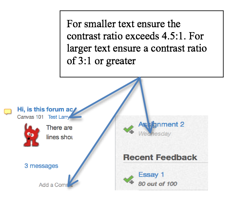
Figure: Example of a graphic used to enhance the explanation of an issue
The collection of graphics in the report as a whole can act as a summary of the main issues. If you scan through just the graphics in the report, you will notice they address most of the main issues.
When describing an issue, always include:
For each type of issue, reasoning need only be provided once. Examine the following description of an issue and note these elements in the description.
Issue described
Reason why it’s an issue
Potential solution(s)
In the main calendar view, the days of the week that appear in the top row should be marked up with table headers (th). Currently when navigating the data cells for each day, Assistive Technology users hear only the number, with no indication of the day of the week. The scope="col" attribute could be added in each header cell to help ensure day of the week is announced with each number.
For a General Review, the Appendices should include a list of the pages sampled for the review, including the page title and URL.
For a Detailed Review, the Appendices should include a list of page titles and their associated URLS for the process or feature being reviewed. This might include a description of a user scenario that was tested, such as the process of making a purchase (described earlier).
The Appendices may also contain information not directly related to the accessibility review, such as pointing out potential bugs, providing recommendations on processes for addressing issues outlined in the report, or outlining strategies to address accessibility of web content as part of everyday business practice.
Based on what you learned in this unit, conduct an informal review of the Lulu’s Lollipops website, and write a brief report (maximum two pages). Re-read the Sample Informal Review from earlier in this unit to understand what, and how much information to include in your Informal Review. The goal should be to encourage a formal review.
Which of the following is not a type of audit that was covered in this Chapter? Please select all that apply.
What is the time limit on the validity of a Web accessibility conformance review for a website?
Which of the following elements would be reviewed in a Template Audit? Please select all that apply.
Which of the following elements would be reviewed in a General Audit, assuming a Template Audit had already been conducted? Please select all that apply.
An interactive or media element has been excluded from this version of the text. You can view it online here:
https://pressbooks.library.ryerson.ca/pwaa/?p=1478
At a recent planning meeting with her management team, Lulu was reminded of one additional consideration with respect to her website. Lulu hopes to expand her business more widely to international markets. She wonders if her website is in compliance with accessibility requirements in other jurisdictions. Because the learning and work that Lulu and her team have been doing is anchored in the WCAG 2.0 guidelines, she will meet the compliance requirements of most regions across North America and the rest of the world. However, it would be beneficial for those at Lulu’s Lollipops and for you to become familiar with a few additional guidelines that may be relevant in specific contexts and situations.
So far WCAG 2.0 has been the main guideline we have used for auditing web accessibility. In most cases it will be the guideline of choice, though there are others to be aware of that might also be referenced as part of web accessibility auditing projects. In this unit we will look at:
We will also look at how rules and legislation around the world have adopted WCAG 2.0 as the basis for various international laws that dictate web accessibility requirements in many countries. As a result of this adoption, it is possible through courses like this one to train developers and auditors with one set of instructions. Ultimately, the good news is that what you learn in this course will be applicable for a broad range of country-specific accessibility requirements.
ObjectivesBy the end of this unit, you will be able to:
The W3C Web Content Accessibility Guideline (WCAG 2.0) has become broadly accepted as the definitive source for web accessibility rules around the world, with many jurisdictions adopting it verbatim, or with minor adjustments, as the basis for accessibility laws that remove discrimination against people with disabilities on the web. The following is a listing of some of the countries that have adopted WCAG 2.0.
This course has been created in the context of the AODA, which came into effect in 2005 with the goal of making Ontario the most inclusive jurisdiction in the world by 2025. Part of this 20 year rollout involved educating businesses in Ontario, many of which are now obligated by the Act to make their websites accessible, first at Level A between 2012 and 2014, and at Level AA between 2016 and 2021.
The AODA adopts WCAG 2.0 for its web accessibility requirements, with the exception of two guidelines:
Otherwise, AODA adopts WCAG 2.0 verbatim.
In 2011, the Government of Canada (GOC) introduced its most recent set of web accessibility standards, made up of four sub-standards that replace the previous Common Look and Feel 2.0 standards. The Standard on Web Accessibility adopts WCAG 2.0 as its web accessibility requirements, with the exception of Guideline 1.4.5 Images of Text (Level AA) in cases where “essential images of text” are used, in cases where “demonstrably justified” exclusions are required, and for any archived web content. The standard applies only to Government of Canada websites.
In 2014 the British Columbia government released Accessibility 2024, a 10-year action plan designed around 12 building blocks intended to make the province the most progressive in Canada for people with disabilities. Accessible Internet is one of those building blocks. The aim is to have all B.C. government websites meet WCAG 2.0 AA requirements by the end of 2016.
The ADA does not have any specific technical requirements upon which it requires websites to be accessible; however, there have been a number of cases where organizations that are considered to be “places of public accommodation” have been sued due to the inaccessibility of their websites (e.g., Southwest Airlines, AOL), where the defendant organization was required to conform with WCAG 2.0 Level A and Level AA guidelines.
There is a proposed revision to Title III of the ADA (Federal Register Volume 75, Issue 142, July 26, 2010) that would, if passed, require WCAG 2.0 Level A and AA conformance to make web content accessible under ADA.
Section 508 is part of the U.S. Rehabilitation Act and its purpose is to eliminate barriers in information technology, applying to all Federal Agencies that develop, procure, maintain, or use electronic and information technology. Any company that sells to the U.S. Government must also provide products and services that comply with the accessibility guidelines Section 508 describes in the Act.
These guidelines were originally based on a subset of the WCAG 1.0 guidelines, which was recently updated to adopt WCAG 2.0 Level A and AA guidelines as new requirements for those obligated through Section 508.
Readings and References:
The Equality Act in the UK does not specifically address how web accessibility should be implemented, but does, through Section 29(1), require that those who sell or provide services to the public must not discriminate against any person requiring the service. Effectively, preventing a person with a disability from accessing a service on the web constitutes discrimination.
Sections 20 and 29(7) of the Act make it an ongoing duty of service providers to make “reasonable adjustments” to accommodate people with disabilities. To this end the British Standard Institution (BSI) provides a code of practice (BS 8878) on web accessibility, based on WCAG 1.0.
Readings and References:
For more about BSI efforts, watch the following video:
Video: BSI Documentary – Web Accessibility World Standards Day

A YouTube element has been excluded from this version of the text. You can view it online here: https://pressbooks.library.ryerson.ca/pwaa/?p=1486
© BSI Group. Released under the terms of a Standard YouTube License. All rights reserved.
Throughout Europe a number of countries have their own accessibility laws, each based on WCAG 2.0. In 2010 the European Union itself introduced web accessibility guidelines based on WCAG 2.0 Level AA requirements. The EU Parliament passed a law in 2014 that requires all public sector websites, and private sector websites that provide key public services, to conform with WCAG 2.0 Level AA requirements, with new content conforming within one year, existing content conforming within three years, and multimedia content conforming within five years.
This does not mean, however, that all countries in the EU must now conform. The law now goes before the EU Council, where heads of state will debate it, which promises to draw out adoption for many years into the future, if it gets adopted at all.
Readings and References:
In Italy the Stanca Act 2004 (Disposizioni per favorire l’accesso dei soggetti disabili agli strumenti informatici) governs web accessibility requirements for all levels of government, private firms that are licensees of public services, public assistance and rehabilitation agencies, transport and telecommunications companies, as well as ICT service contractors.
The Stanca Act has 22 technical accessibility requirements originally based on WCAG 1.0 Level A guidelines, updated in 2013 to reflect changes in WCAG 2.0.
In Germany, BITV 2.0 (Barrierefreie Informationstechnik-Verordnung), which adopts WCAG 2.0 with a few modifications, requires accessibility for all government websites at Level AA (i.e., BITV Priority 1).
Accessibility requirements in France are specified in Law No 2005-102, Article 47, and its associated technical requirements are defined in RGAA 3 (based on WCAG 2.0). It is mandatory for all public online communication services, public institutions, and the State, to conform with RGAA (WCAG 2.0).
Readings and References:
The web accessibility laws in Spain are Law 34/2002 and Law 51/2003, which require all government websites to conform with WCAG 1.0 Priority 2 guidelines. More recently UNE 139803:2012 adopts WCAG 2.0 requirements, and mandates government and government funded organizations, as well as organizations larger than 100 employees, or with a trading column greater than 6 million Euros, or those providing financial, utility, travel/passenger, or retail services online to comply with WCAG Level AA requirements.
(see: Legislation in Spain )
Readings and References:
Though not specifically referencing the Web, the Disability Discrimination Act of 1992 section 24 makes it unlawful for a person who provides goods, facilities or services to discriminate on the grounds of disability. This law was tested in 2000, when a blind man successfully sued the Sydney Organizing Committee for the Olympic Games (SOCOG) when its website prevented him from purchasing event tickets.
The Australian Human Rights and Equal Opportunity Commission (HREOC) shortly after released World Wide Web Access: Disability Discrimination Act Advisory Notes. These were last updated in 2014 and though they do not have direct legal force, they do provide web accessibility guidance for Australians on how to avoid discriminatory practices when developing web content, based on WCAG 2.0.
For more about international web accessibility laws, see the following resources:
Authoring tools come in many forms. Some familiar web-based examples of authoring tools include blogs (e.g., WordPress), wikis (e.g., Mediawiki), content management systems (e.g., Drupal), learning management systems (e.g., Canvas), document authoring tools (e.g., Google Docs), and video production environments (e.g., YouTube). Some other tools that are not web-based include HTML editors (e.g., Adobe Dreamweaver), video authoring tools (e.g., Camtasia Studio), and document authoring tools (e.g., Microsoft Word) that are all capable of creating content for the Web.
In addition to providing guidance on developing web content that is accessible through WCAG 2.0, the Web Accessibility Initiative (WAI) has introduced the Authoring Tool Accessibility Guidelines (ATAG 2.0) which provide guidance for web authoring tool developers to ensure that:
ATAG 2.0 guidelines are sorted by levels of importance, much like WCAG 2.0. Because ATAG 2.0 covers tools that are not web-based, it does not specifically refer to “accessibility supported” requirements like those of WCAG 2.0 because those refer to web-based strategies that are supported by assistive technology.
ATAG 2.0 conformance for authoring tools is more complex than WCAG 2.0 conformance for web content, as it subsumes WCAG 2.0 and adds a range of requirements specific to authoring tools.
Partial ATAG 2.0 process component conformance is also possible in cases where additional add-on components would be needed to claim full conformance. For example, if the tool does not provide accessibility checking capability (a requirement for ATAG 2.0 conformance), it can claim partial conformance if it is possible to add a plugin that provides accessibility checking. Partial conformance can also be claimed when the platform limits compliance. For example, if a tool runs on multiple operating systems, and conformance is possible on one platform (e.g., Windows) that has an add-on accessibility checking service available, but a similar service is not available for the system run on on a different platform (e.g., Linux), a platform limitation conformance claim can be made.
More details about conformance claims can be found in the ATAG 2.0 specifications itself:
Readings and References: ATAG 2.0 Conformance Claims
Part A of ATAG 2.0 provides guidance on making the authoring tool user interface accessible. Generally speaking, these guidelines reflect WCAG 2.0 with the addition of accessibility requirements for tools that are not web-based.
The four top level guidelines in Part A are as follows:
Part B of ATAG 2.0 focuses on guidelines for creating tools that are able to generate WCAG 2.0 conformant web content. It too has four top level guidelines, and a series of sub-guidelines for each. For a full listing of these guidelines, refer to the the full ATAG specification.
<head> area and <title> element, as well as a <body> area, and it must validate based on a given HTML specification.In cases where you may be auditing a browser application like Chrome or Firefox, a plugin, a web-based mobile app, or perhaps a video or audio player like Quicktime or Windows Media Player, UAAG 2.0 (currently in draft form) should be referenced. These guidelines are aimed primarily at the developers of web browsers, browser extensions, and media players, but also at assistive technology developers so they understand the types of accessibility information to expect from UAAG 2.0 compliant user agents.
The UAAG 2.0 specifications are structured much like WCAG 2.0 and ATAG 2.0 are, and include principles, guidelines, and success criteria. Conformance levels are also much the same, with Levels A (minimum), AA (recommended) and AAA (advanced). WCAG 2.0, ATAG 2.0, and UAAG 2.0 are a collection of guidelines, together guiding the development of accessible web content, tools for creating accessible web content, and tools for viewing web content in accessible ways.
Though UAAG 2.0 is currently a W3C draft specification, it should be used instead of UAAG 1.0, as it reflects the advances in web technologies since UAAG 1.0 was released in 2002. Changes may still occur in the specification, though these are not anticipated to be significant.
UAAG 2.0 has 5 principles:
In the primary guidelines listed below, you will see that many directly reflect WCAG 2.0 recommendations. For example, WCAG 2.0 requires that visual elements in web content have text alternatives (WCAG 2.0 – G1.1.1) and UAAG 2.0 requires that user agents (browsers, etc.) provide access to those alternatives (UAAG 2.0 – G1.1).
For a look at the full set of UAAG 2.0 recommendations, visit the draft specification and resources at the following links:
In 2008, the ISO/IEC (International Standards Organization/International Electrotechnical Commission) released the initial version of the AccessForAll (AFA) standards. AFA is based on the AccessForAll 2.0 work undertaken at the IMS Global Learning Consortium, along with the Inclusive Design Research Centre at OCAD University in Toronto. For those familiar with Universal Design for Learning (UDL) principles, AFA is similar in its approach. It sets out guidelines for developing adaptable learning content that matches how different learners learn, often creating the same learning experience in multiple forms.
The goal of AFA is to match learning content to the specific needs of each learner and this concept is not new. Where learning content is involved, web accessibility audits might include recommendations to provide multiple versions of the same content, so a wider range of people can access the content depending on their individual needs. Here are some examples:
In terms of evaluating web accessibility based on AccessForAll, it may be too early to start making AFA recommendations, given very few systems have yet implemented the standards. AFA is a rather complex set of standards, given the range of potential needs and preferences and the variety of ways content can be presented. The following is an overview of the three standards that make up AccessForAll.
Watch the following video for a demonstration of AccessForAll in ATutor and AContent. AFA enhanced content is easily created in either system, and easily moved between the systems.
Video: IMS common Cartridge with AccessForAll

A YouTube element has been excluded from this version of the text. You can view it online here: https://pressbooks.library.ryerson.ca/pwaa/?p=1510
© atutorspaces. Released under the terms of a Creative Commons Attribution license.
The AccessForAll Standards can be downloaded from the ISO website, for those who wish to investigate further:
Readings and References:
WAI-ARIA is perhaps the most significant web accessibility technology to come along since the introduction of WCAG 1.0. It allows developers of web applications or custom web interactivity to define specific roles, states, and properties for custom made interactions that assistive technologies are able to understand. Though WAI-ARIA is aimed primarily at developers, others should at least understand where and when it gets used.
WAI-ARIA is a W3C specification that defines a collection of attributes that can be used within HTML elements to add semantic information. For example, a developer may want to create a navigation menu, often using HTML list markup to structure the menu items and JavaScript to control which elements of the menu to display at any given time. Without using WAI-ARIA, such a menu may be accessible in the sense that an AT user could navigate through its elements and open menu items, but they will be announced by the AT as a collection of nested lists. By adding ARIA menu roles to these list elements, AT will announce them as parts of a menu, whether they are opened or closed, and whether they have submenus, and so on.
When auditing custom web interactivity, a screen reader like ChromeVox should be used to navigate through a tool or widget to determine whether WAI-ARIA has been used to add roles, states and properties to the feature. You can also examine the code using the Inspect tool in various browsers, to see what ARIA is being used to operate the tool and watch the ARIA update dynamically, as states and properties change. In audit reports, recommendations can be made to use ARIA to make elements more meaningful, thus more usable by AT users. Refer to Guideline 4.1.2 (Level A).
The full WAI-ARIA specification and WAI-ARIA authoring practices can be found on the W3C website. At least scan through these documents to familiarize yourself with their contents so you can refer back to them in your audits when making ARIA related recommendations.
Toolkit: Bookmark these two documents to add them to your tool kit.
The following is an HTML excerpt from a large main navigation menu that has been marked up with WAI-ARIA. The markup contains the basic ARIA attributes used to create an AT usable main menu. Read through the comments in the box below, and examine the markup it describes to develop your understanding of how WIA-ARIA is used.
Technical: An example of a main menu created with HTML unordered list markup.
The first line of markup below creates a container around the menu, gives it a role of navigation, is describe with the text in the menu_keys span element below referenced using aria-describedby, and is made keyboard focusable with tabindex="0". When accessed with a screen reader, it announces itself as navigation and describes to the user how to navigate through the menu.
<div role="navigation" aria-describedby="menu_keys" tabindex="0">
<span id="menu_keys" style="font-size:0;">
 Main Menu: Use arrow keys to move left and right and
 up and down through menus
</span>
The menu itself is a basic nested unordered list. JavaScript injects the ARIA dynamically. The ULs are given a role of menubar, list items are given a role of menuitem. Where a nested list occurs ( which is a submenu) aria-haspopout is set to true to indicate to the screen reader that a submenu is present. The aria-activedescendant is set to the ID of the parent element of the submenu that currently has focus.
<ul id="nav" role="menubar" aria-describedby="menukeys">
<li role="menuitem">Home </li>
<li id="activeItem" role="menuitem" aria-haspopout="true">
  Courses and Programs
  <ul role="menubar" aria-activedescendant="activeItem">
	<li role="menuitem" aria-haspopout="true">Areas of Interest
	  <ul>
            <li role="menuitem">Information Technology</li>
		<li role="menuitem">Communication and Media</li>
		<li role="menuitem">Business Systems and Strategies</li>
		…
	 </ul>
	</li>
   …
  </ul>
</li>
…
</ul>
</div>
To see the menu in action, view the following video. Listen closely to how the menu is announced by ChromeVox.
Video: WIA-ARIA Main Navigation

A YouTube element has been excluded from this version of the text. You can view it online here: https://pressbooks.library.ryerson.ca/pwaa/?p=1512
The menu in the video above uses the MooTools accessible dropdown menu scripts to inject the appropriate ARIA attributes when they are needed. Fortunately many of the common interactions, like menus, accordions, and tabpanels for instance, have open source scripts available to quickly add in the appropriate ARIA.
Though ARIA is a necessity for developers who create custom interactivity for the Web, there are times when it should and should not be used.
Do use ARIA:
Do not use ARIA:
Technical: Here are some WAI-ARIA attributes that are used often and are relatively easy to understand.
This attribute is very useful for adding instructions or descriptions of web elements for AT users. In the menu example above, aria-describedby is used to provide instructions on using the menu, in that case referencing a hidden span element containing a description of keyboard navigation.
It could also be used to provide extra information about a particular feature, such as describing the format for a password form field. If the password must include numbers, letters, and special characters, that text might be positioned after the password field in a span element and through its ID attribute, referenced using aria-describedby in the input element for the password field. With the example markup below, a screen reader would announce the label for the password field, followed by format for the password. Without referencing the format span element, this information may go unnoticed by AT users.
<label for="pass">Password</label>
<input type="password" id="pass" aria-describedby="format">
<span id="format">
 must contain numbers, letters, and special characters
</span>
The aria-live attribute, often referred to as a live region, must be used in places where information is dynamically updating on a page, without the page itself reloading. Otherwise AT users are unlikely to notice that changes are occurring. The aria-live attribute can be set to “polite,” as seen in the code snippet below, in which case a screen reader will wait until a break in the screen reader’s output to read the content. Or, aria-live can be set to “assertive” in which case a screen reader will interrupt whatever is being read to read the changes within the live region. Live regions are useful for things like news feeds (e.g., Twitter or news sites), live chat applications, social media streams, rotating banners or other kinds of auto-updating information.
<div id="news_feed" aria-live="polite">
 //updating content goes here
</div>
On the other hand, the role="alert" attribute, often called an ARIA alert, is a special type of assertive live region, that should be used in places where feedback is being presented. If, for example, a required field in a form is left empty, and an error message is injected immediately below the field to indicate the error (like that in the code snippet below), these types of feedback messages are good candidates for ARIA alerts. Otherwise such messages may go unnoticed by AT users. Or, after successfully submitting a form to register, for instance, the message that appears on the page after submitting the form indicating the registration was successful, would also be a good candidate for an ARIA alert.
<div id="username_feedback" role="alert">
 <p style="color:red;">Username field cannot be empty.</p>
</div>
ARIA provides a whole range of roles that can be used to assign a functional application to particular HTML elements. You have already been introduced to the the “alert” role, and the roles associated with a navigation menu.
There is a particular set of roles that are referred to as landmarks. These should be used carefully throughout a user interface to define regions throughout that UI. Screen readers are able to list these landmarks and users can jump to any one of them to navigate directly to a relevant area of a page.
Where landmarks are used, all areas of a page should be contained within a landmarked region. These regions, introduced back in Unit 2 (2.4.1 Provide Ways to Navigate), are presented again here:
Full list of landmark roles:
Though the HTML tabindex attribute has been around since HTML4, for use with specific HTML elements, with HTML5 it can be used with any element to add keyboard focus to elements that do not normally receive focus, using tabindex="0".
In the code for the menu above, you will notice tabindex in the opening div element. Normally divs do not receive keyboard focus. In the case of the menu, adding focus to the container div is needed for the description referred to by aria-describedby to be read. When the div receives focus, the screen reader will announce “Main Menu: Use arrow keys to move left and right and up and down through menus.”
The aria-expanded state is used for menus that have toggles to open and close submenus, and also to inform AT users whether a menu item has a submenu, and whether that submenu is open or not.
The following markup is from a side menu, with toggles to open and close sections of the menu. You will notice that aria-expanded is set to true, indicating to AT that a submenu is open following this element. If the submenu were closed, aria-expanded would be set to false, updated dynamically by the JavaScript that controls interactivity of the side menu.
<span id="acc_tab_2170"
 class="navtoggler active"
 tabindex="0"
 aria-expanded="true"
 role="tab"
 aria-selected="false">
 Archived Calendars
</span>
When forms are formatted in a way that prevents the use of the HTML label element to explicitly associate a label with a form field, only then should aria-label be used to label the form element. If label can be used, it should be used instead of the ARIA version.
A good example of a case where aria-label might be used is on a search form. These forms usually do not include a label element.
<form>
 <input type="text" id="search" aria-label="Enter search terms" />
</form>
This attribute can be used with non-standard forms to associate a label or multiple labels with a form field. For example, you may have a data entry form laid out in a table, like that in the figure below, in which the content of the table header cells provides labels for multiple input fields.
Consider the following table, in which the content of the header cells provides labels for each form input field in the column below. In the markup that follows the figure, you can see how aria-labelledby has been used to assign the values in the header cells as labels for each form element.
| Name | Login | |
|---|---|---|
John Smith | js@smail.com | jsmith |
Figure: A table used to layout a data entry form.
<table>
 <tr>
   <th id="name_label">Name</th>
   <th id="email_label">Email</th>
   <th id="login_label">Login</th>
 </tr>
 <tr>
   <td><input type="text" id="name" aria-labelledby="name_label"/></td>
   <td><input type="text" id="email" aria-labelledby="email_label"/></td>
   <td><input type="text" id="loginl" aria-labelledby="login_label"/></td>
 </tr>
…
</table>
If there is the option to use the label element over using aria-labelledby, then label should be used. If both label and aria-labelledby are used on the same input element, aria-labelledby will override the label.
Spend a few moments researching relevant (if any) web accessibility compliance requirements in the jurisdiction where you live.
Which of the following are elements of the ISO/IEC 24751 AccessForAll Standards? Please select all that apply.
Which of the following are W3C specifications? Please select all that apply.
An interactive or media element has been excluded from this version of the text. You can view it online here:
https://pressbooks.library.ryerson.ca/pwaa/?p=1524
Congratulations! You have reached the end.
The goal of Professional Web Accessibility Auditing Made Easy has been to build your knowledge and develop your skills so you will be able to:
Unit 1 provided an overview of the many aspects of web accessibility auditing, creating a foundation that the rest of the materials here are built upon. You started assembling your Web Accessibility Auditing Toolkit, which would grow into a collection of tools, references, and resources to support your accessibility auditing activities.
Unit 2 introduced you to the W3C Web Content Accessibility Guidelines (WCAG 2.0). First the four principles were introduced, which state that web content must be: Perceivable, Operable, Understandable, and Robust. You were also introduced to conformance levels and success criteria: Level A are criteria that must be addressed or barriers will be created; Level AA are criteria that should be addressed or content will be difficult to use for some; and Level AAA are criteria that could be addressed to improve usability further. With that in mind, the 10 Key Guidelines were introduced to familiarize you with the more common accessibility issues found in web content.
Unit 3 covered a variety of automated tools that support web auditing activities. First, the AChecker and WAVE accessibility checkers were compared, and a variety of other similar tools were introduced for you to explore. You were also introduced to tools for evaluating colour contrast, for validating HTML markup, and for determining the reading level that visitors to a website would need to effectively understand the content.
Unit 4 introduced a number of manual test strategies that complement automated tests, and assistive technology reviews. You were introduced to the Tab Navigation and the Select All tests, useful for quickly identifying keyboard accessibility issues and other potential barriers. Tools such as Developer Tools were introduced as a means of examining HTML markup to help identify specific issues in the code of a website.
Unit 5 looked at Assistive Technologies (AT), focusing on getting set up with ChromeVox as a tool for doing day-to-day screen reader testing. You also learned about other popular screen readers like JAWS, NVDA, and VoiceOver, as well as other types of AT such as magnification programs, voice recognition, and alternative input devices.
Unit 6 showed us aspects of web accessibility that go beyond the typical web accessibility audit, addressing considerations associated with user testing. User testing can provide valuable information about the usability of web content, though there are a number of considerations that must be addressed when selecting user testers (such as experience with web content and level of assistive technology expertise) to ensure results are meaningful. Strategies were also introduced for developing user testing protocols, and observing and recording testers’ behaviours during user testing sessions.
Unit 7 explored the next step in the auditing process after testing: accessibility reporting. Different types of audit reports were covered, including Informal, Template, General, and Detailed reports, each of which serve different purposes depending on the needs of the organization and the type of web content being reviewed. You took a tour of the Canvas 2012 General Review, which introduced the elements of an accessibility audit report.
Unit 8 built on what you learned about accessibility guidelines in Unit 2, introducing international standards and regulations based on WCAG 2.0. You were also introduced to other types of accessibility standards for authoring tools (ATAG 2.0), user agents such as browsers and assistive technologies (UAAG 2.0), and WAI-ARIA, which provides tools developers can use to create accessible custom web interactions.
This resource has been made possible with the help of many others.
Funding for this project was provided by the Government of Ontario’s Enabling Change Program.
Human resources were provided by the Digital Education Strategies team at the G. Raymond Chang School for Continuing Education at Ryerson University in Toronto, Canada, including an instructional designer, web developer, and production editor. Contributors include:
Which of the following are automated accessibility checkers not good at identifying? Please select all that apply.
Feedback: Checkers are not good at assessing meaning, such as the meaningfulness of link text, image descriptions, or page titles. They are good at identifying issues that can be determined by searching the HTML code for missing elements or attributes, like the lack of an alt attribute with an image, or a title element with no content in it.
Which of the following groups of people with disabilities are least likely to face barriers in web content? People who:
Feedback: People who use a wheelchair will often face no barriers in web content, assuming they have use of their hands.
Which of the following were mentioned as key things to watch for when auditing the accessibility of web content? Please select all that apply.
Feedback: Missing text alternatives for images, elements that lack keyboard access, headings created using bold text instead of proper heading markup, and text that does not contrast well with its background are common barriers thus have been listed as key issues to watch for. Text that is too complex is less frequent and is a less critical Level AAA issue, and content that flashes or flickers is uncommon, so these have not been listed as key issues. These latter issues should still be considered, however.
In typical circumstances, the following techniques are generally most relevant. However, others are possibly better in different situations. Likewise, there are some techniques that may be listed with the relevant guideline for a particular barrier that are not relevant to the barrier being addressed (FLASH and SL techniques for instance).
Which WCAG 2.0 level of conformance is considered the generally agreed upon level that organizations should aim for when addressing the accessibility of their websites?
Feedback: Most jurisdictions now suggest aiming for Level AA conformance for web content. And, where feasible, organizations should implement as many Level AAA strategies as possible.
Which TWO of these guidelines are considered the most important in terms of reducing the greatest number of potential barriers, according to “10 Key Guidelines” introduced in unit 2?
Feedback: As described in the 10 Key Guidelines, providing text alternatives for Non-Text Content and ensuring that all functional elements are Keyboard Accessible will reduce the greatest number of potential barriers.
Which of the following are NOT principles of WCAG 2.0? Please select all that apply.
Feedback: The four WCAG 2.0 principles are: Perceivable, Operable, Understandable, and Robust. Reproducible and Predictable are not WCAG 2.0 principles.
Identify which pairs of foreground and background colours provide sufficient contrast to pass Guideline 1.4.3. Assume the foreground text is a 12 point font.
The overall reading grade level required to effectively understand the paragraph.
“Though reading level is a Level AAA requirement in WCAG, this is one Level AAA guideline that most public sites should aim for to reach the broadest possible audience. Generally speaking web content authors should use the simplest language possible (within reason). Simple text will translate more easily for those who may wish to read the site in a different language. It will be more accessible to those with lower levels of education, or for those reading in a second language. And for a general audience, most readers will appreciate simpler language over unnecessary use of ‘big’ words. Being able to explain things in simple language for most, is a more intelligent use of language than loading it with jargon, complex terminology, and unnecessarily complicated words and sentences.”
The difference between the number of known problems identified in AChecker and the number of errors identified by WAVE?
Based on the evaluations that you did in the Question 3, which of the following issues did both checkers identify? Please select all that apply.
The “Tab Key Navigation test” is useful for identifying a variety of potential barriers. From those uses listed below, select all that the Tab Key Navigation test would identify.
Feedback: The Tab Key Navigation test is useful for identifying focus visibility. You should be able to see the focus move through the content as you press the Tab key. It is also useful for identifying elements that are not keyboard operable (i.e., those that are skipped over while pressing the Tab key). While following the focus, it is possible to observe the focus order, which should move from left to right and top to bottom.
Which of the following potential barriers would the “Select All test” be useful in identifying? Select all that apply.
Feedback: The Select All test is good for identifying elements that are not keyboard operable, though it should be combined with the Tab Key Navigation test to confirm that elements not selected do not actually operate with a keyboard.
To examine the HTML markup associated with a potential barrier that has been identified using the Tab Key Navigation or Select All tests, a recommended approach would be to use:
When reviewing video content for accessibility, which of the following alternatives does WCAG 2.0 suggest should be provided? Select all that apply.
This is a list of many of the accessibility features collected from the Showcase Demo Site homepage. There may be others.
role="banner" landmark is set for header arearole="navigation" + aria-label="showcase" announces “Showcase Navigation”aria-live="polite" on the ik-menu-mobile and ik-menu divs announce instructions for using the side menu: “Use tab key to enter menu, up and down arrow keys to navigate, left and right to open or collapse submenues, space or enter to select.”role="menu" and tabindex="0" announce sidemenu as a menu and adds keyboard focusrole="menuitem" is added to describe list items as menu items in the side menuaria-haspopup="true" is used to indicate menuitems with a submenuaria-hidden="true" is used to hide submenus when inactivearia-labels describe menu items instead of the href they contain, which are set to tabindex="-1" to remove them from the tab orderaria-live="assertive" starts the carousel announcing labels while rotating, and announcing navigation instructions when focus is receivedaria-live="off" stops the carousel from announcing after focus is removedrole="presentation" and aria-hidden="true" are used to hide carousel dot navigation from screen readersaria-label provides text descriptions for each slide in the carousel on the home pagetabindex="0" toggles with tabindex="-1" to control focus in the side menurole="main" landmark and tabindex="0" announce the main content area and make it focusablearia-hidden="true" (or false) and tabindex="0" show and hide tabpanelsaria-labelledby uses the heading above to label the accordion panelsrole="tablist" and aria-multiselectable="true" are used with a definition list (<dl>) to define the accordion with multiple sections that can be opened simultaneouslyaria-controls and role="tab" are used with <dt> to define as a tab, which control an associated <dd>aria-expanded is used to announce the <dd> state as expanded or collapsedaria-hidden="true" (and false) is used when accordion tabpanels are visible or hiddentabindex="0" is added to <dd> tabpanels to make them focusablerole="tabpanel" is added to <dd> to define is as tabpanel in the accordionrole="complimentary" landmark is added to the right-side accordionrole="contentinfo" landmark is added to the footer areaAccording to the data from the WebAIM Screen Reader Survey, when it comes to screen readers commonly used, which of the following screen readers experiences the least usage?
Based on your unit 5 readings, which screen reader makes use of a rotor for accessing different features of web content, such as headings, lists, tables and links?
Which of the screen readers introduced in this unit are open source software? Choose all that apply.
When selecting user testers, which of the following prerequisite skills or knowledge should recruits have? Choose all that apply.
Feedback: User testers should have good knowledge of web technologies, and be able to use their assistive technology proficiently.
When developing a test protocol, which of the following features should it have? Choose all that apply.
Feedback: A test protocol should be made up a series of short tasks that can be completed in an hour or less.
When recording observations during a user testing session, which of the following strategies might be used? Choose all that apply.
Feedback: All of these strategies might be used for recording observations.
During a user testing session which of the following should an observer not do? Choose all that apply.
Feedback: An observer need not remain quiet, but instead ask questions and probe the tester’s thoughts where appropriate. Answering a phone call during a user testing session would be disrespectful of the tester.
Lulu, thank you for reviewing the above information. I look forward to meeting with you to discuss further how more users can access your website and buy your products.
Which of the following is not a type of audit that was covered in this unit? Please select all that apply.
Feedback: “Navigation” and “Content” reviews were not covered in this unit.
What is the time limit on the validity of a Web accessibility conformance review for a website?
Feedback: A conformance claim for a website is only valid on the date conformance was confirmed.
Which of the following elements would be reviewed in a Template Audit? Please select all that apply.
Feedback: The Main Content Area would be reviewed as part of a General Audit.
Which of the following elements would be reviewed in a General Audit, assuming a Template Audit had already been conducted? Please select all that apply.
Feedback: The other elements would be part of the Template Audit.
Which of the following are elements of the ISO/IEC 24751 AccessForAll Standards? Please select all that apply.
Feedback: Personal Needs and Preferences and Digital Resource Descriptions are Part 2 and Part3 of the ISO/IEC 24751 standards. Accessible Rich Internet Applications (ARIA), Hypertext Markup Language (HTML), Extensible Markup Language (XML) are W3C specifications, and Accessibility Evaluation and Repair are W3C techniques for implementing accessibility checkers and repair tools.
Which of the following are W3C specifications? Please select all that apply.
Feedback: WAI-ARIA, ATAG, UAAG, and WCAG are all W3C specifications. ISO/IEC 24751 is an ISO standard, and RGAA are the accessibility guidelines for France.
Toolkit:
The pages of this open education resource (OER) can be embedded directly into existing web pages using a standard iframe, or using a tool like the H5P iframe embedder if available. Once embedded, the navigation elements associated with Pressbooks, where the original version resides, and the title of the page are removed to provide a seamless integration.
The CSS associated with the iframe should set the width to 100%, and the height set manually for each page to remove the typical scrollbar that appears with an iframe.
The following example markup can be adapted. Or, in the case below, the content recap is embedded using the H5P iframe embedder:
<iframe src="https://pressbooks.library.ryerson.ca/pwaa/back-matter/book-recap/" style="border:none; width:100%;height:2800px;></iframe>
An interactive or media element has been excluded from this version of the text. You can view it online here:
https://pressbooks.library.ryerson.ca/pwaa/?p=2427